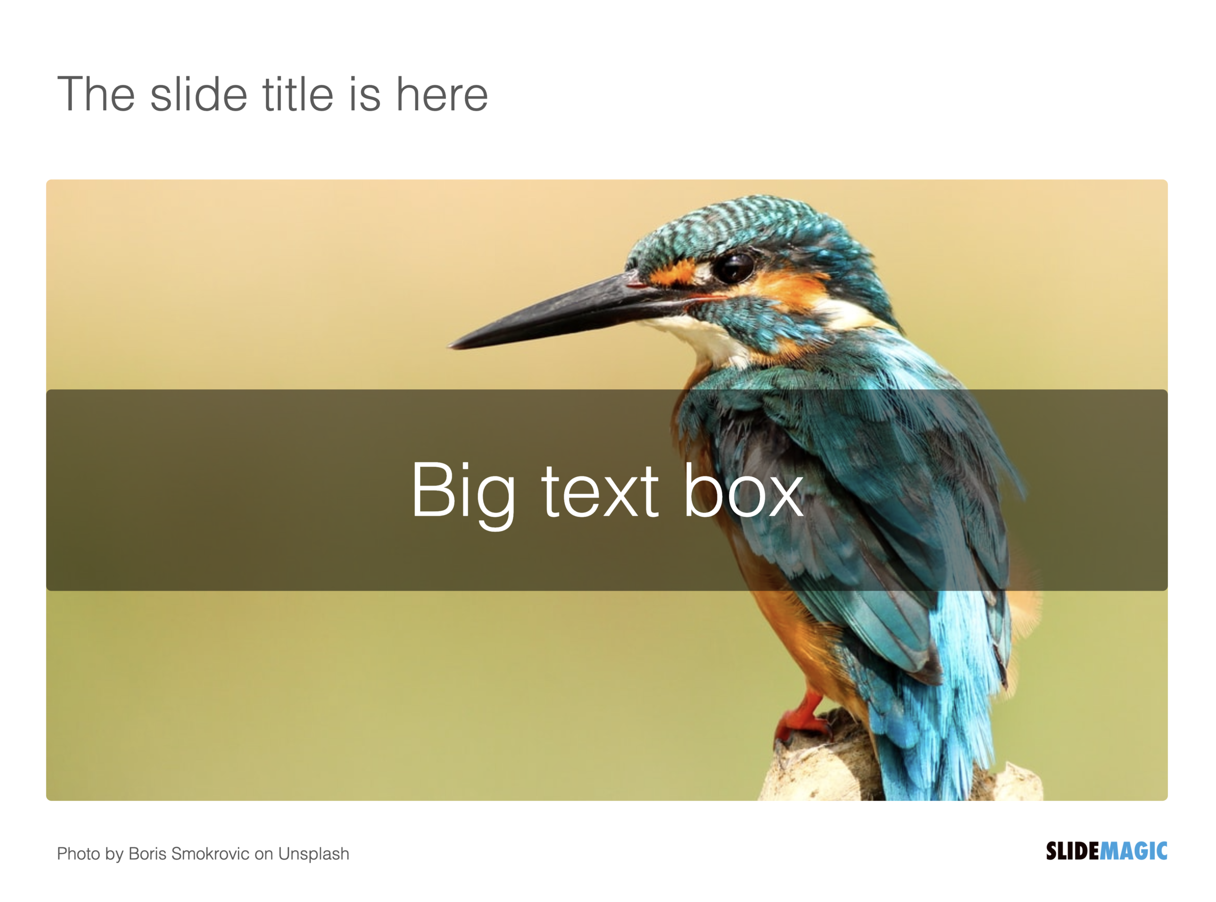
SlideMagic works with fixed positions for slide titles, subtitles, footnotes, and logos. Each slide looks organised, consistent, and the same.
Some slides call out for a slightly differently layout. Tracker pages for example. A simple text box that sites right in the middle of the screen. Up until now, SlideMagic would push these text boxes a bit down or to the right because of the required space for the slide title.
With a very simple check mark, I now created the option to remove titles from the slide on a slide-by-slide basis. It is a tiny adjustment to the user interface that can improve the look of layouts significantly. I am still putting a high hurdle when it comes to complicating SlideMagic. This is definitely not a complication!
While the user interface adjustment is easy, behind the scenes, there is a lot going on. Removing the the titles from a slide requires recropping of all the images on a slide. With SlideMagic’s new automatic cropping algorithm, this has now become possible. Imagine doing this for a slide with 40 client logos in a regular presentation design software, after which you come to the conclusion that the slide looked better with a title: re-cutting, re-cropping, re-distributing 40 images again. In SlideMagic, this is a button click.
You can check out the new features as of version 2.6.9
Photo by Boris Smokrovic on Unsplash


