Viewing entries in
Software

Organising application windows

Organising application windows

Yesterday I wrote about how difficult it is to keep your application windows organised across two very large monitors. Colleague Nick Smith pointed me to this neat utility: Divvy. It creates a pop up grid that allows you to position windows quickly. Available for both Windows and Mac OSX. This features should be baked into operating systems as a standard feature.

SlideMagic: a platform for magical presentations. Free student plan available. LEARN MORE
iPad Pro review

iPad Pro review

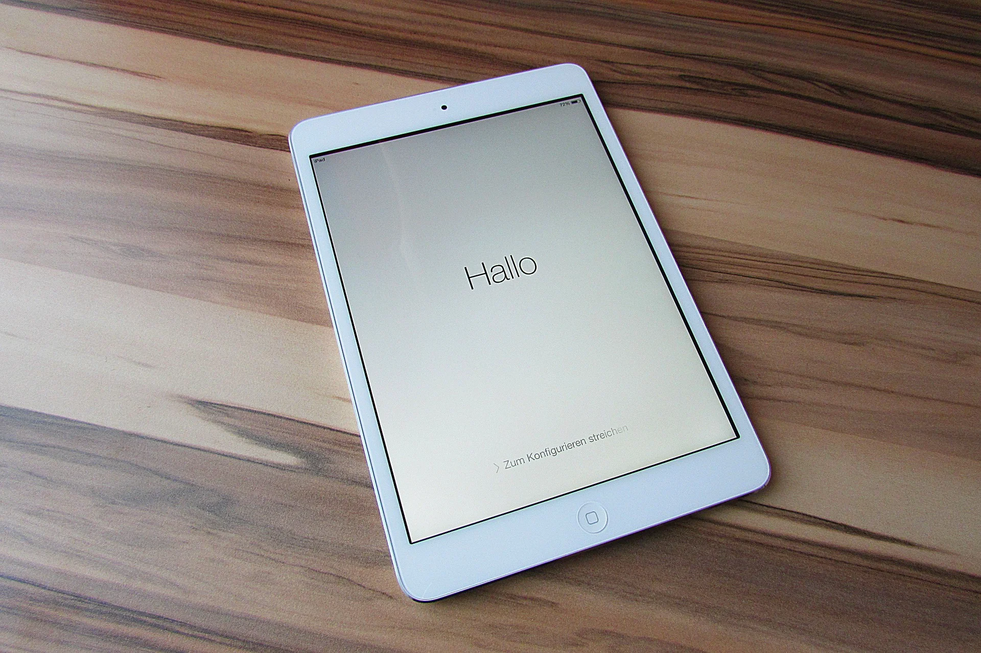
While I have been upgrading my phone fairly frequently over the past years, my iPad has pretty stayed the same for a long time. I got the first one with Retina display (the 3 I think), got frustrated with its weight and got a Mini as soon as that one was equipped with a Retina display. Last week, I got an iPad Pro 9.7. 

Why? I will be honest, screen size. I subscribe to many iPad magazines in niche categories (mountain biking, synthesizers if you are interested) and these smaller publications do not always have apps that adjust to small screen sizes. At 46, I found them increasingly hard to read. 

Also I was curious about the Apple Pencil and keyboard. The big iPad Pro tempted me, but I held out long enough to read the reviews of most users who found its size too bulky. So, here I am with an iPad Pro 9.7. 

The first thing that strikes you is the incredible screen this iPad has. My iPhone 6S looks poor next to it. Second is its weight. Feels the same as my old Mini, despite a much larger screen. 

The pencil is the first one that actually works for an iPad. Over the years I have tried many, many styli, and always found myself going back to paper. All my slide designs start as a sketch on a piece of paper, I like to make them big, so I burn through many trees in a month. I am hopeful that the pencil will finally end this waste. The real answer will come after a month of use or so. The pencil works nicely in the Apple Notes app, but really shines in the Paper app by 53.  The only drawback of the pencil is that there is nowhere to put it. I reviewed a leather designer cover I got for my iPad 3 to carry everything around.

Multi-tasking looks useful: you can now open 2 app windows side by side.

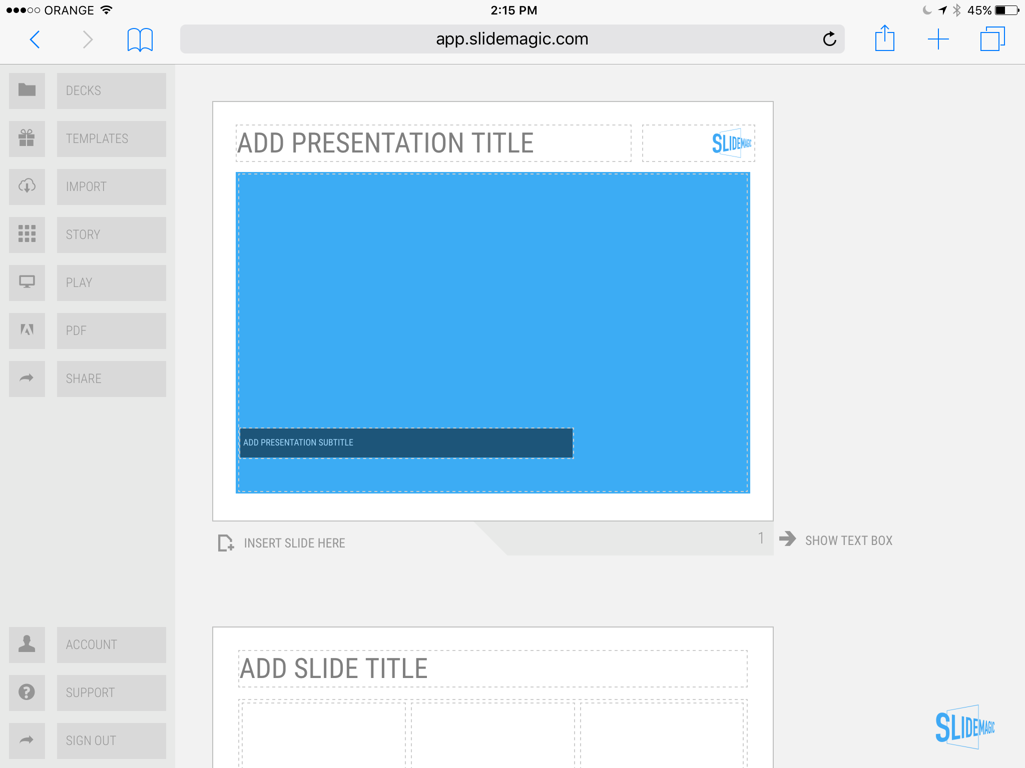
Finally, the keyboard. I never had a problem with typing on their iPad screen, what did bother me was the pop up window for the characters. That is now gone. Attach the keyboard and you have the full screen real estate of the app. I am writing this blog post on my iPad as we "speak". 

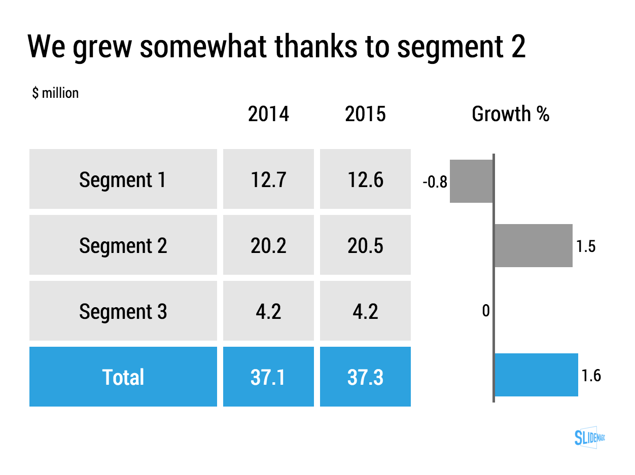
It is this keyboard that really makes my presentation design app SlideMagic work on an iPad. The text dialogue box is gone. More and more I am starting to think that SlideMagic could actually be the first presentation app that allows you to create slides on a tablet for real. 

I will report back after some time for the 10,000 km review

SlideMagic: a platform for magical presentations. Free student plan available. LEARN MORE
The shortcomings of application windows

The shortcomings of application windows

The main reason to design a new presentation app that is an alternative to PowerPoint (SlideMagic) is the flaw in the windows/mouse-based user interface design that has been with us since the end of the 1980s. Users can drag, move, place, distort, objects as they see fit. Inexperienced designers will get it wrong and put things in the wrong places.

Over my holiday, I have been listening to this Andreessen Horowitz podcast that discusses whether tablets are finally ready to eliminate the laptop:

Some other interesting points that came up:

  • "Where is my mouse?", the mouse pointer is actually not the most logical computer input device. After 2 decades we have gotten used to it, but is not perfect. In the 1980s, engineers combined multi-tasking and windows as one user interface concept. They are different.
  • Arranging and resizing application windows as actually not that user friendly. Most of the time, you want 1, 2, maybe 3 applications open in a convenient grid. (Similar to placing objects on a slide).
  • One of the big shortcomings of tablets today is the ability to create presentation slides (making small edits is not a problem). Maybe it is time to expand SlideMagic to work with touch screens :-)

Image from WikiPedia

SlideMagic: a platform for magical presentations. Free student plan available. LEARN MORE
The multiple uses of PowerPoint

The multiple uses of PowerPoint

Presenting slides in front of a big audience is just one application of PowerPoint, and probably not the one that is most commonly used. Here are a few others:

  • Corporate knowledge database
  • Product catalogue
  • Project management and planning tool
  • Word processor
  • Story boarding tool
  • Group brainstorming tool
  • Animation editor
  • System design tool
  • To do list and meeting minutes recording tool

A 1980s presentation design tool ended up being the operating system that power most communication inside a company.

SlideMagic: a platform for magical presentations. Free student plan available. LEARN MORE
Keynote for iCloud, a mini review

Keynote for iCloud, a mini review

I had the opportunity to spend some time in Keynote for iCloud last week. We were editing a Keynote file with many people and needed to stay on top of versions. Keynote for iCloud was the logical solution.

It is amazing to see how web apps have evolved. After a relatively long wait time to upload/open the presentation in the browser, it is almost as snappy as if you are working on a desktop app. Browsing through slides, dragging and dropping of images, all great.

The issue is that there are a few features missing compared to the desktop version that are really important to me:

  • Distributing objects horizontally and vertically. The one biggest mistake people make in slide design is incorrect alignment of objects on the slide. Keynote for iCloud has the "soft guides" that pop up when you drag an object, but as soon as you have to deal with a lot of boxes, there is no way to line things up properly. A similar problem happens in resizing table columns and rows (but you could argue that this is a power user feature that not many users will miss).
  • Manipulating themes, especially colours. You can't set them in Keynote for iCloud, your only choice is to pick a template when creating a new deck. When uploading an existing slide deck, the theme colours get copied, but only for shapes. In tables they do not appear. And in data charts you cannot set them either. 

A smaller issue is that an animation that my client created in the desktop version did not play in iCloud presentation mode. I am not a big fan of animations in presentations so in theory this is not a big deal. But, differences in PLAY mode can create unexpected surprises when you deliver an important pitch and all of a sudden your content is displayed differently in the heat of the discussion.

I suspect that Apple had to make decisions what features to include with the mobile version of iCloud in mind. But these 2 shortcomings forced me to take down the Keynote deck into the desktop version, warn my client not to touch the file, and upload it again after I was finished.

Two lessons here:

  1. Slide design software still does not get what are the key features needed for layman designers to make decent slides. (Which is why I created my presentation app Slidemagic which is all about grids and alignment)
  2. Users are demanding. If you offer a product under one brand, users expect all features that they have gotten used to, to appear on all platforms. I experience this myself with users who view my presentation app SlideMagic as an extension of PowerPoint and complain where the pie charts are.

Keynote for iCloud is not there yet, but it is getting close.

SlideMagic: a platform for magical presentations. Free student plan available. LEARN MORE
Presentations are short cuts

Presentations are short cuts

Many of a company's operational processes have become a lot more efficient over the past decades, partly with the help of automation and computers.

Above the factory floor, middle management of corporations gets more efficient as well. Computers take over routine tasks, and slide/dice data so it becomes easier to make decisions.

Human communication among decision makers is pretty inefficient. People are bad at formulating and selling their ideas. Presentations have helped though: they have replaced long-winded memos and forced people to get to the point faster. Visuals are easier to digest, and more importantly, it is faster to skip through useless pages of a presentation (PGDN, PGDN) than looking for "the meat" in a text document.

This realisation might help you with the design of your everyday presentations. It should look decent. It should get to the point. It should show interesting, unusual, unexpected facts and insights. You want to get to a decision, you are not aiming to publish a complete, scientific document.

Here is where my presentation app SlideMagic comes in, adding even more shortcuts to make corporate decision making more efficient, and less cumbersome, boring and time consuming.


Image from WikiPedia

SlideMagic: a platform for magical presentations. Free student plan available. LEARN MORE
PowerPoint 2016 now lets you customise toolbars

PowerPoint 2016 now lets you customise toolbars

In the latest PowerPoint 2016 software update, Microsoft started to fix one of the last remaining issues in a great product: customisation of the top tool bar. Here is a screen shot of what is new:

Things are limited to just these functions though. In PowerPoint 2011 it was possible to add any function you want to the top bar. File, save, and definitely print, are not the actions a PowerPoint user needs to access all the time. What I would like to see are buttons to align and distribute objects, and move things to the front and the back. Here is my toolbar from PowerPoint 2011:


Image from WikiPedia

SlideMagic: a platform for magical presentations. Free student plan available. LEARN MORE
It takes too much time...

It takes too much time...

Some new users of my presentation app SlideMagic complain that you cannot import any existing PowerPoint presentations, you have to start from scratch to design your pitch. "This will take me too much time!"

There are 2 reasons why SlideMagic does not import PowerPoint presentations (export is OK though):

  1. Technical: SlideMagic uses a very strict slide layout, which simply cannot be matched (automatically) to the wide variety of PowerPoint designs
  2. Behavioural: SlideMagic aims to make corporate communication simpler and less time consuming. The fact that it takes too much time to re-create a PowerPoint presentation one-for-one in SlideMagic probably says something about your presentation. SlideMagic has excellent tools and templates to take your message and show it in simpler form.

If you really need to import that one complex PowerPoint slide, you can always use a screen shot and import it as an image.


Image by Alexandre Duret-Lutz on Flickr


SlideMagic: a platform for magical presentations. Free student plan available. LEARN MORE
On stage, it does not matter anymore which software you used

On stage, it does not matter anymore which software you used

On Quora, I see questions like which presentation software did [company X] use at [event Y]. For the audience there is no difference. The same simple, good slide can be made in PowerPoint, Keynote, Google Slides, and Adobe InDesign. The exception is probably Prezi and its complex zooming capabilities.

The process that got you there makes a big difference though. How easy is it set up a basic presentation template (colours, fonts, positions of titles, page numbers, aspect ratio), how is it to create a basic slide layout other than a list of bullets, how easy is it to align items properly on a grid, how easy is to create basic data charts, how easy is it to keep everything consistent page after page, how easy is it to do basic image manipulation (cropping and repositioning).

Either the audience cannot tell in which program the presentation was made and you were either a design pro or have made a huge effort to master the software. Or, the audience can spot your software instantly (most likely PowerPoint), which means that you did not get much further than the standard slide template.

(A secret: you can get away with taking design short cuts in my presentation app SlideMagic and no one will notice).


Edgar Degas, Rehearsal on stage, 1874

SlideMagic: a platform for magical presentations. Free student plan available. LEARN MORE
Corporate language simplification is next

Corporate language simplification is next

A lot of the progress of humanity boils down to improving and simplifying communication. There were huge wins when we figured out how to speak and coordinate hunting strategies, learned how to read/write/print books, speak long distance instead of taking the ocean liner, video, etc. etc.

More subtle improvements happened as well. Clear, simple language impacts the premium/position that bosses, priests, doctors, lawyers, politicians, can command. Long-winded corporate memos and formal letters made way for informal emails and now messaging to get to the point, quickly.

What we lose in style, we gain in efficiency and clarity. Gone are the beautifully hand-written letters without grammatical errors. Now we have the universal "business English" with a tiny vocabulary, full of mistakes, and pronunciation can be whatever you see fit. The English might not be perfect, or sophisticated, its meaning is crystal clear.

The same happens to corporate language. Management consultants took a first stab at making memoranda logical and structured. The exhibits in these documents slowly become more important than the written words themselves. And now presentation software/slides has become the main language in which we do business.

We need a crisp, simple, visual language to get a business concept across. Everyone can understand it, everyone can use it. That's what I am trying to do in the presentation app SlideMagic.


Art: Pieter Breugel the Elder, The Tower of Bable, 1563

SlideMagic: a platform for magical presentations. Free student plan available. LEARN MORE
The broken Apple Keynote interface, is it me?

The broken Apple Keynote interface, is it me?

I have now created many, many client presentations in Apple Keynote. And most of the clients who request a presentation in Keynote rather than PowerPoint are proud that they are willing to use more design-oriented products. For many years, Apple Keynote was ahead of PowerPoint: a cleaner user interface, cleaner templates, those alignment guides that pop up when you want to position an object. And in addition, you were using the same product that Steve Jobs, the master presenter, was using for his slides.

With the latest release of PowerPoint, I think both applications are at par. With each one of them, you can create both beautiful presentations, and horrible decks full of bullet point slides.

The workflow of Keynote though makes me scratch my head. While more complicated tasks are taken care of very well, it is the basic functions such as changing fill colours, font colours, aligning, that drives me crazy. Too many clicks, and I am always looking where to click. Initially I though it was me, but after month and months of trying things are still not getting better.

PowerPoint has a more cluttered interface but after some time working with it your eyes look on locations/icons and you instantly click without having to think. The solution for both programs is clear: create space for one user customisable tool bar. PowerPoint for Mac had one, but it disappeared with the 2016 update, Keynote needs one.

The above partly informed the design of my own presentation design app SlideMagic. You actually need very few functions to create beautiful charts. Most reviews of software tools are still 1990 style: a comparison of features. What you really should be measuring is how fast/easy it is to get a decent end product. Hopefully Microsoft and Apple are not reading this post, so SlideMagic can keep its competitive advantage!


Image of an A380 cockpit from Wikipedia

SlideMagic: a platform for magical presentations. Free student plan available. LEARN MORE
Microsoft Excel versus Google Sheets

Microsoft Excel versus Google Sheets

In spreadsheets, I have now moved from Microsoft Excel to Google Sheets as my favourite app.

  • It is faster to fire up quickly for a small calculation doodle
  • It also snappier in use to do the basic things, entering data and moving around
  • It has some neat functions (like automatically cutting up a string and putting all words, numbers in subsequent columns)
  • While I don't believe in online collaboration of presentations, for models it is actually useful that all the people in the team have access to the laters numbers 24/7
  • Filing and naming of presentation documents is usually pretty organised. With spreadsheets however, I always lose that calculation I did, and the Google search function is really helpful here.

Part of this might be rooted in the way I use spreadsheets: basic functions only, even for the biggest models. I "grew up" with Lotus 123 and early on in my McKinsey career realised that errors in a valuation model can make a difference of billions of dollars. A simple model is far easier to debug because it allows you to see every step in the calculation.

SlideMagic: a platform for magical presentations. Free student plan available. LEARN MORE
Example PowerPoint conversions

Example PowerPoint conversions

Many of you are requesting PowerPoint conversions of the templates that ship with SlideMagic. You will see that the conversion works nicely, but that it is inconvenient to make structural slide edits in the PowerPoint version of the file, doing them in SlideMagic is much easier.

If you want to check out how converted SlideMagic presentations look, I have put the files all in this shared Google Drive folder.

SlideMagic: a platform for magical presentations. Free student plan available. LEARN MORE
Combining tables and data charts

Combining tables and data charts

Lining up a data chart and a table in PowerPoint or Keynote is very tricky. And that is a shame, because it is one of the most useful compositions to present data. Just tables, and you cannot really see the trends. Just data charts, and it all becomes cluttered.

I took the data from an earlier blog post and quickly turned it into a combined table/data chart. You can clone the slides I create in presentation app SlideMagic into your own SlideMagic account by clicking this link.

Screenshot 2015-11-29 11.37.34.png


SlideMagic: a platform for magical presentations. Free student plan available. LEARN MORE
The user is always right

The user is always right

Sometimes I get the strangest support questions by users of my presentation app SlideMagic. Obviously, the user did not explore the help pages, or did not try out all the menu options, or did not understand the philosophy behind SlideMagic. Initially, I felt like pointing that out. Now I figured out that it is my problem, not the user's.

User interface is entering an interesting phase. Mobile/tablet apps all look very cute but it is often incredibly difficult to find the most obvious functions. Desktop/laptop applications have become so bloated that obvious functions are hard to find, or are still in places "because they have always been there for the past 10 years" to serve the large install base of users. Every time I set up a new presentation, or create a new slide in PowerPoint I find myself doing a large number of repeat clicks (by now at incredible speed) that basically do very simple things (creating and aligning a grid of boxes for example).

I keep on trying to get it right.


Art: Vladimir Makovsky, Teacher Visiting a Village, 1897

SlideMagic: a platform for magical presentations. Free student plan available. LEARN MORE
Convert SlideMagic presentations to PowerPoint

Convert SlideMagic presentations to PowerPoint

Many people have asked for this feature. I might have found a partially automated solution for this. Partially means, slides are converted automatically, but the overall workflow is still manual.

Before I start investing a lot of resources (time and money) in developing a fully automated solution, I want to test demand. Soon, I will be adding a "PowerPoint" button to SlideMagic, but in the interim, you can email to (ppt at slidemagic dot com) an editable link of your presentation (generate it via the SHARE menu in SlideMagic) and we will send you back a PowerPoint file.

It is important to send the link using the SHARE function, nobody but you can open the links in your browser for privacy/security reasons.

Make sure that you have the Roboto Condensed font installed on your machine. It is a free font provided by Google

  1. Exit PowerPoint
  2. Go to the Roboto Condensed download page
  3. Tick the 400 and 700 boxes
  4. Download using the "arrow down" icon at the top right
  5. Double click the downloaded files to install the fonts
  6. Re-open PowerPoint

Roboto Condensed cannot be installed on iOS devices. If you want to edit your converted SlideMagic presentation in PowerPoint for iOS consider replacing the Roboto Condensed font for Helvetica Neue Condensed. Here is how to swap fonts across an entire presentation on a Mac. But hey, SlideMagic runs pretty well in Safari on iPad, no need to convert to PowerPoint for this.

Some disclaimers:

  • It is a partially manual solution, please be patient, delivery can be instant or take some time.
  • A human will open your presentation, we are nice people and unlikely to read it all in detail and/or post things on the Internet though. Still some corporate compliance regulations might have an issue with this
  • There might be glitches in the quality of the conversion, if so, we would like to hear about them.

You will see that the end result looks pretty decent and small text edits work great, but - and this is the reason I created SlideMagic - if you want to make fundamental edits to a SlideMagic slide in PowerPoint you will hit the limitations of PowerPoint. For example, adding a row or column to your grid and getting everything to line up nicely is a small operation. I suspect you will quickly go back into SlideMagic, do the edit there, and convert again. Hopefully, in the end you will just forget about the conversion and stay inside SlideMagic.

So, hopefully the option of converting your SlideMagic presentation to PowerPoint will give you increased confidence to try it out, there is nothing to lose, you can always fall back to good old PowerPoint.

Not a SlideMagic user yet? Sign up here.


SlideMagic: a platform for magical presentations. Free student plan available. LEARN MORE
Presentations on mobile devices - taking stock

Presentations on mobile devices - taking stock

Five years after the iPad launch let's take a step back and see what is actually happening in the world of presentation software and the use of mobile devices. My observations are based on the people I see around me everyday: startup employees (mostly mid 30s to 40s) and staff in big corporates (a bit older).

  • Designing. Apple has made a big inroad in terms of hardware, but it is still PowerPoint that runs on a laptop machine that is the preferred set up to create slides. I have not encountered anyone who uses a mobile device to do this. Apple Keynote is pretty much still a niche application.
  • Frankensteining / finding stuff. Cloud-based file systems can be confusing to use. I still do not understand exactly what happens when Keynote on iPad tells me it is converting a regular Keynote file. In practice, the file system that everyone is using is.... the email inbox and sent box. People with gmail can find stuff faster than Outlook users.
  • Viewing. Yes, more and more, people use their mobile devices to view a presentation. And it is not the iPad, a tablet, it is the mobile phone, where people squint to see what is in the slides. These are investors looking at a pitch deck, these are managers/superiors proving input on a slide. Think about it, this might be a more important audience for your slides than the ones sitting in conference room.
  • Emergency edits. Still laptop, although a tablet could work here, few people use it in a corporate setting.
  • Coffee chat, 1 on 1. Mostly laptop, I see fewer iPad/tablets than I saw 1-2 years ago.
  • Conference room. Laptop. The crappy VGA projector is being replaced by crappy LCD screens. Presentations that look beautiful on your retina display, look absolutely horrible on an LCD screen with poor resolution and overly bright settings. (Test, test, test). Advanced meeting rooms now allow you to airplay your presentations into the screen. People use their laptops to do this, not their mobile devices.
  • Big keynote. Conference laptop with a memory stick plugged in.

So what is really changing? People are viewing decks on mobile phones, especially busy people that might not be overly motivated to see your pitch (investors in round 0 of the due diligence process for example).

Presentation gurus like me used to discourage dense bullet points because you can't (too small) and don't want (too boring) to read them in the back row. Now it is a bit more subtle. You can't read small text on a mobile screen. But, more and more desks are read without a presenter being present and you actually need some text to explain things properly.

In SlideMagic, I encourage big, bold, but extremely simple designs (that will come through nicely on a mobile device), plus I left space on the side for a regular explanation paragraph.


Image on WikiPedia


SlideMagic: a platform for magical presentations. Free student plan available. LEARN MORE
How to recover lost PowerPoint 2016 files after a crash

How to recover lost PowerPoint 2016 files after a crash

Note: this blog post discusses PowerPoint 2016 for Mac.

PowerPoint 2016 is great, but it still crashes left right and centre, all the time. Autorecovery does not always work, and when you forgot to hit SAVE every 5 minutes in the heat of a presentation design project, you are stuck.

The good news: you can often recover data, even when PowerPoint thinks it is lost.

PowerPoint autosaves your files in the background, without your realising it. Make sure you have switched this on, you can set the save interval in PowerPoint settings:

Normally after a crash, PowerPoint will automatically restart and present you with the last file that was auto saved. Normally... If not, try the following.

  • In the Mac finder window, open the "Go" drop down, press ALT, to show the LIBRARY folder and click it.
  • Once in Library, go to  Containers > com.microsoft.Powerpoint > Data > Library > Preferences > AutoRecovery
  • Have a look at the files there and spot a file with a "_autorecover" ending to its name, taking into account the time it was saved.
  • Copy this file just to make sure
  • Rename this copied file with the ".pptm" extension at the end. Ignore all warnings you are presented with.
  • Double click the file and cross your fingers

There is no 100% guarantee this will work, but it is worth a try

One more tip: as soon as you see the small "spiral of death" spinning across the PowerPoint screen develop the instant reaction to take a screen shot of the application. If you are lucky and you grab the slide sorter window, you have captured a miniature icon of all your slides, which should save a lot of time recreating them. Worst case, you just got the thumbnails on the left of your screen that are in the regular slide editing window.

My presentation design tool SlideMagic is a PowerPoint alternative that does not work with files in the classical way. Things get saved into the cloud instantly. Feel free to try it out.


Art: Letters "Whaam" inspired by Roy Lichentstein

SlideMagic: a platform for magical presentations. Free student plan available. LEARN MORE
SlideMagic on iPad

SlideMagic on iPad

I have never been a big believer in focussed and productive presentation design on tablets, but presenting documents (mostly in 1-on-1 meetings) and making last minutes edits are important on mobile devices.

We are not making tablets a design priority, but have deployed some changes to the code that makes SlideMagic run pretty smoothly on an iPad (iPhone is still not optimal). Try it out and report back any bugs. Android tablet users, let me know what happens (I have not tried things out there yet).

With the large iPad Pro coming out later this year, there could be a brighter future for SlideMagic on iPad given the very simple menu structure we use.

Screen shot of SlideMagic on my iPad Mini 2

Screen shot of SlideMagic on my iPad Mini 2

SlideMagic: a platform for magical presentations. Free student plan available. LEARN MORE