Viewing entries in
Software

The state of productivity apps

The state of productivity apps

The reviews of the new iPad Pro are coming in: ten years after introduction this tablet device has caught up in performance with the average laptop. Most reviewers come to a similar conclusion: yes, the device is powerful, but it does not let me do the things I want it to do to replace a laptop completely. The enthusiasm for mobile devices as work tools seems to dampen a bit. I must admit that I am going through a similar process, re-adjusting priorities for where I want to take the SlideMagic app next after V1.0, the web app.

I have not solved the problem yet, nobody has, but here are some observations that I am taking into account and thinking about:

  • There are different user segments, consumers, professionals, and even within professionals there are differences: a blogger or tech reviewer has different computing needs then an investment analyst or a web designer.

  • A single user segment has different uses for a device that can overlap between segments. Presenting for a big audience, making quick edits in the taxi, walking through a few pages over a coffee, focussed slide design, crazy/creative concept development, brainstorming.

  • User experience is incredibly important, and even the smallest glitches, delays, or inefficiencies can become annoyances quickly. (Web user interfaces still cannot match those of a properly designed native app).

  • Some things can be done better with touch, but the good old mouse pointer has its value too. Fingers can be clumsy.

  • It is very hard for people to get used to new interface concepts, part of the reason why the basics of PowerPoint are pretty much the same as they were 20 years ago. This is also true for touch interfaces, personally I did not bother to learn all the 3 finger swipes and other gestures on my phone, tablet, or laptop track pad. In the same I way I never learned the keyboard short cuts on a desktop beyond CTRL-C and CTRL-V.

  • Cloud-based collaboration is still messy and confusing,. Multiple people editing the same master document is often not helpful. It is often not clear what you shared with whom, what access permissions, is the file, is it the folder, etc.

The solution is somewhere out there, but it is unlikely to follow broad generalisations and buzzwords such as “cloud”, “mobile first”. Then again, the 1995-based desktop app did not work either. I will keep on thinking.

Cover image by Elena Koycheva on Unsplash

SlideMagic: a platform for magical presentations. Free student plan available. LEARN MORE
Microsoft, please beef up the PowerPoint web app API

Microsoft, please beef up the PowerPoint web app API

There are 2 types of software approaches for writing add-ins for Microsoft Office applications: so called VSTOs, and web applications. VSTO is the older technology. It integrates deeply into Office and the Windows operating system, code is written in C#. This restriction to Windows is the reason that all PowerPoint plug ins and extensions run on Windows at the moment. The web application API is the newer approach, allowing you to code applications with standard Javascript/HTML.

This has huge advantages:

  • It runs on all platforms and devices, not just Windows.
  • Any coder who knows Javascript/HTML can hit the ground running with developing apps, a far bigger developer community than people who know their way around VSTO/C#.
  • It is a lot easier to integrate these Office web apps into existing web applications (such as SlideMagic).

I have a lot of ideas to extend PowerPoint beyond the current plugins that offer in-app access to stock photo sites but.... PowerPoint is at the bottom of the priority list when it comes to API development at Microsoft. Excel, Outlook, and to a certain extend Word, get priority. Specifically, the ability to manipulate slide content is very limited (put text in the currently selected text block, or place an image somewhere on the page).

PowerPoint is the key communication tool that is used in corporates (not Word). PowerPoint is tricky to master (50% to blame on software, 50% to blame on the "eye for design" that not everyone has). Combine these 2 and it is the biggest opportunity for 3rd party developers to make a change to business communication, make a financial return for both developers and Microsoft, and make PowerPoint stand out over Apple Keynote. 

I do not know the reason for this lower priority, it can be a deliberate strategic choice and/or a technical reason. I hope it is the first, because it can be fixed most easily.

This blog is read by many influencers in the presentation world, if you can, please reach out. I "signed" this online petition as well, but I am not sure how much wait it carriers, feel free to add your clicks.


Cover image by Henrikke Due on Unsplash

SlideMagic: a platform for magical presentations. Free student plan available. LEARN MORE
Stress-testing a new corporate PowerPoint template

Stress-testing a new corporate PowerPoint template

The PowerPoint template is usually an after-thought in a corporate brand image project. Business cards, letterheads, envelopes, are considered more important than the look & feel of almost any document that is exchanged among employees and external investors, clients, etc.

As a result, you will find the PowerPoint template guidelines at the back of the brand book, written in language that is aimed at a print designer, it uses non-standard fonts, and its programming was a copy paste from Adobe InDesign.

Here are some things you can do to stress-test a suggested PowerPoint template that is handed to you by your graphic design agency:

  • Click view, slide master, and see whether it contains dozens of layout slides that are leftovers from Microsoft's default master, ask why you need them
  • Check the file size of an empty presentation, any huge image hiding in the master?
  • Copy past an old presentation into the new master, see what happens. How much time do your employees have to spend fixing things?
  • Try an empty text box and an empty shape: what are the standard colours, standard fonts? Do the bullet points look decent, or do they come in weird shapes and/or colours
  • Are there any random guidelines all over the slide that no one needs?
  • Open the presentation on your children's computer, how does the template look? Especially the fonts
  • Create some bar and column charts. Are the colours and fonts correct? 
  • Open the deck on a Mac and see what happens
  • Try writing a big headline, maybe one that runs over 2 lines, are any logos or other slide items getting in the way?
  • Same for a big rectangular table, can you fit it, or is there a logo or other graphic element sitting in the one of the corners that gets covered?

Make the PowerPoint template one of the most important end products for your graphics design agency. And as a briefing, don't ask them to work on an empty slide, instead send them an actual presentation (i.e., slides with content) and ask them to design a look for them.

When in doubt, you can always use the empty master from the SlideMagic store (free), and adjust the accent colour, add your logo to the bottom right, and you are good to go.


Cover image by Estée Janssens on Unsplash

SlideMagic: a platform for magical presentations. Free student plan available. LEARN MORE
The smartphone snap

The smartphone snap

People re-use slides for different audiences. And 10 years ago, you would still be able to skip a few slides quickly when they contain confidential information if - by accident - you forgot to delete the product roadmap that you used in last week's Board meeting. (Or you forgot to mark them as "hidden").

The smart phone with super high resolution cameras means that nothing is safe anymore. There is the accidental smartphone snap, but also the professional "slide harvesters" diligently recording every slide in your deck. An HD video just needs a millisecond to capture the slide that is being skipped.

Here are some other confidentiality pitfalls to watch out for:

  • Data that still sits in the underlying Excel sheets, even when you take the data labels of your chart
  • Hidden slides in presentation mode that are there for everyone to see when you send a PowerPoint file
  • Speaker notes
  • Collaborator comments
  • File names or URL names that can still persist in a document even after its is PDF-ed
  • Tiny footnotes that give away important information

Cover image by Ben White on Unsplash

SlideMagic: a platform for magical presentations. Free student plan available. LEARN MORE
Saying no to "send info to Microsoft"

Saying no to "send info to Microsoft"

I am a huge fan of the improvements Microsoft has been making to PowerPoint over the last few years, it now outshines Keynote.

One thing though, is bothering me: after every recent update it is very hard to say "no" to the question whether Microsoft can record every single one of your clicks to make the program even better. You can simply accept or learn more.

On a Mac, I managed to make the window go away by repeatedly clicking on the red cross in the top left corner of the pop-up window, hopefully that registered as a "no".

SlideMagic: a platform for magical presentations. Free student plan available. LEARN MORE
Microsoft VBA versus Applescript

Microsoft VBA versus Applescript

I am dusting of my coding skills that were pretty much put on hold in the early 1990s and have started to program macros to automate the mechanics of the template store: creating individual slides and thumbnails for PowerPoint and Keynote in different aspect ratios of these design.

Things in the Microsoft Office ecosystem run smoothly ("VBA"), for Mac, a lot less so. Applescript is a language that aims to automate pretty much everything you can do in Mac OS. It has been around for a very long time, but it is falling short.

At first sight, the language looks very friendly, almost human-like. And here is a problem: human language is ambiguous. It is incredibly hard to use it to program computers. When I look at example Applescript code, it looks very easy to adjust and re-use, but it is an incredibly pain to get it actually working and iron out the last bugs. Writing macro scripts will never be something that the average Apple user will do, so you might as well stick to a programming language that an engineer can work with.

The second problem is the what Applescript can actually do. As Apple put development of Mac OS on the back burner and gave priority to its iOS devices, the functional power of Applescript has been watered down. Old tutorials online show functionality that has been removed in later versions of Keynote.

Now, I am not saying that all esoteric features should be supported in a scripting language, but I am struggling to get the most obvious and basic one that anyone wants to use a Keynote script for: batch conversion of PowerPoint files into Keynote.

I am not giving up, and will look for a solution. Let me know if you have any recent experience with Applescript and Keynote.


Cover image by Boris Stefanik on Unsplash

SlideMagic: a platform for magical presentations. Free student plan available. LEARN MORE
Flying through

Flying through

With a bit of Photoshop editing you can create an effect of a PowerPoint shape flying through some loop. I uploaded a new slide to the template store that uses this effect. Over the arrow, I positioned a second layer of the image, but just with a piece of rope with its background isolated. The arrow expanding outside the frame of the image (yes, I look those), adds to the motion feel in the slide.

Click the image to find the slide on the template store, subscribers can download it free of charge.


Cover image by Blake Wheeler on Unsplash

SlideMagic: a platform for magical presentations. Free student plan available. LEARN MORE
Years in columns, which way?

Years in columns, which way?

In financial statements, the most recent financial period is put first, and next to it is the previous period for comparison: 2017 - 2016. To the frustration of some accountants and CFOs, I insist on putting the years the other way around: 2016 - 2017.

  • The eye is used to moving left to right when looking at time series data
  • It makes tables match line or column graphs that are in the presentation
  • It makes it easer to compare data across 3 years or more

I am not trying to change the reporting practices for financial statements. In the annual accounts, the current year is the most important one. It needs to be accurate and is usually shown with far more digits (precision) than I would use in a presentation. A comparison to last year's numbers is almost an extra, not the main purpose of the page.

Every financial document has its own purpose and own audience: spreadsheets, financial statements and presentation decks. And among presentation decks you can distinguish between quick and dirty documents to discuss (early results), detailed financial information for the investor community, and more generic financial slides for a general company presentation. Different purpose, different slides.

If you want you can check out financial slides in PowerPoint in my template store. Subscribers can download them free of charge.

SlideMagic: a platform for magical presentations. Free student plan available. LEARN MORE
Starting to use the store myself

Starting to use the store myself

Recently, I have started to use the template store myself for the few bespoke design projects I still do for long standing clients (SlideMagic gave me a really attractive rate :-)). My hard drive is filled with 1000s of slides and still it is difficult to find a nice clean layout to use as a basis for slide number 1001.

Up until a few weeks ago, I started every slide pretty much from scratch, I have gotten pretty fast in setting up yet another 4x5 table grid. But even I can't beat search the store for "table" and re-download that slide again and hit the ground running.

I am continue to monitor which slides people decide to buy, and which slides are downloaded by subscribers. Many subscribers download a lot of slides right after they made the purchase, and then don't return for a couple of weeks. Initial downloads include slides that you can only use in very specific situations, like these sheep. They hardly ever download the same slide 2x. There could be 2 possible explanations:

  • Less likely: after that $99 annual subscription, you better make sure you get what you paid for, maybe the store will stop running somehow before the 12 months are up.
  • More likely: we have built up the habit of mining through old decks, and recycling slides into a new presentation.

As a designer who now uses its own store, I would encourage you to think Netflix, iStock, Spotify: your slides will always be there, and search is there to help you find the slide you need at the moment (and nothing else). Change your design process:

  • From: open your consolidated SlideMagic deck (which took time to assemble from all the individual slides you had to download), pick 20 designs you think you are going to need, see how you can tell your story with these 20 designs
  • To: scribble your story flow on a piece of paper, create a deck of empty slides with just titles, search the appropriate slide template on SlideMagic

It will take you less time, and you get better presentations. And remember: I am constantly adding new slides so your first burst download will run out of date soon.

Having said that, I am willing to look into a technical solution to combine multiple slide downloads in one deck, my commerce platform cannot handle that (yet).


Cover image by Henrik Dønnestad on Unsplash

SlideMagic: a platform for magical presentations. Free student plan available. LEARN MORE
Improved search

Improved search

Slowly, slowly, I am moving closer to the goal of creating a searchable slide bank bank that is actually useful. Here are the various steps that I have gone through:

  • Designing a slide template that looks good/professional AND blends in easily with existing corporate PowerPoint templates
  • Creating a "boxy" design language that is easy to manipulate and edit, even for non-designers
  • Cutting down the universe of slides to come to a collection of basic slides that can cover almost every possible common business concept that is out there
  • Anticipate the majority of possible search queries to find layouts for every possible angle
  • And now: find a smart grouping slides that creates a really smart way of suggesting related/similar slides

Below is an example of a product page in the store now:

Now that I have automated subscriptions, plus sorted out the search algorithms it is time to clear the last automation hurdle: VAT management globally for both consumer and enterprise customers (the EU has created a nightmare for small digital content stores as it is going after tech giants such as Apple). After that, all attention will be focussed on adding more slide content.

Cover image by Anthony Martino on Unsplash

SlideMagic: a platform for magical presentations. Free student plan available. LEARN MORE
How to format tables in PowerPoint

How to format tables in PowerPoint

Tables can carry more data than a data chart and as a result can be less effective in a presentation. For some situations though, there is no point trying to avoid using a table in PowerPoint. For example, when investors want to see the quarterly numbers, they expect to see a table.

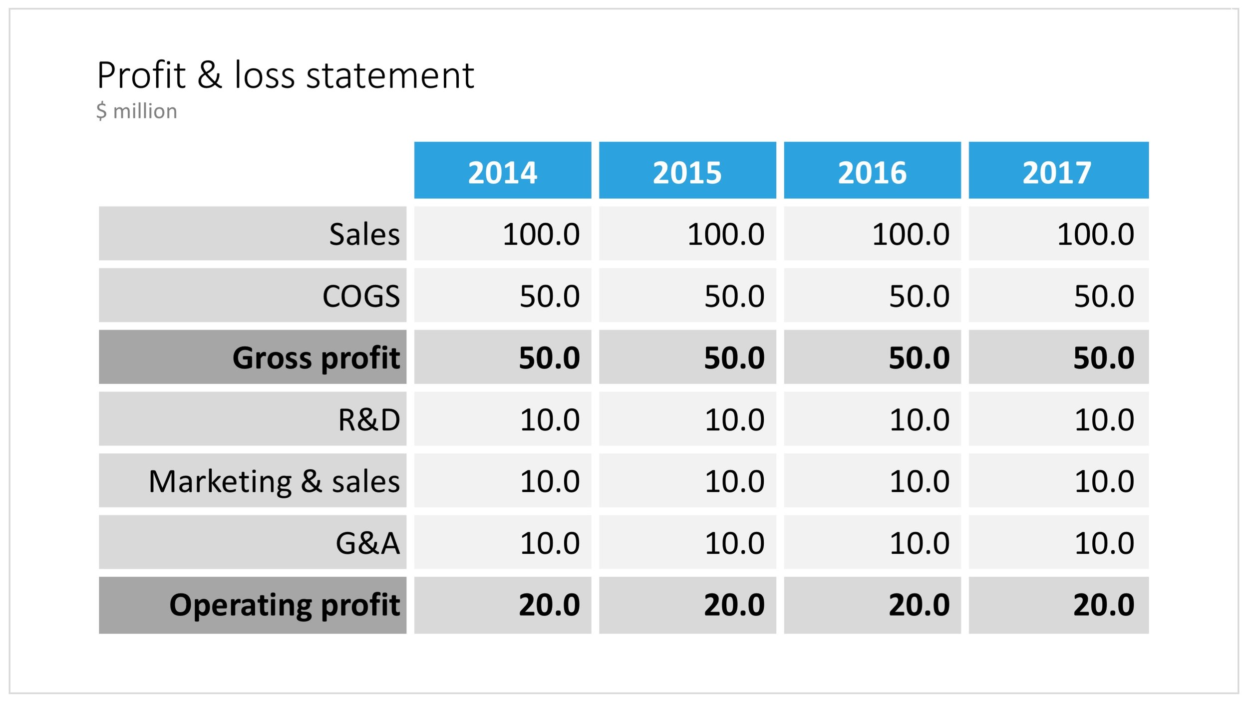
The way you format tables can make a huge difference in how your chart looks. When done well, a table can actually be an effective presentation slide. Have a look at the simple P&L table below.

A PowerPoint table to present a P&L

A PowerPoint table to present a P&L

This might look like a super simple slide design (it is), but a lot of thought and little tweaks have gone into its design. Let's take them one by one:

  • Colours have been adjusted to your own colour template, not the standard PowerPoint colours
  • Fonts have been matched to your current template (table can be stubborn sometimes and stick to Arial)
  • Instead of dark lines around boxes, I used lines that match the background colour, making cells a light colour of grey to stand out (or dark, black if you use that background)
  • Totals are bold, and a bit darker
  • The row labels are right aligned
  • The row labels are a bit darker than the cells
  • The data cells are right aligned
  • Numbers are rounded to the same amount of digits, so the dots line up
  • There are not too many digits in the table, enough to convey the data, but not too much to make it cluttered. If the numbers get too big, switch to thousands or millions.
  • There is a bit of inset in each cell, the text does not touch the edges
  • All the rows have the same height
  • All the data columns have the same width
  • The column headings are centered
  • The unit of measure is put at the top of the chart, not repeated inside the data values
  • The table covers the entire frame of the presentation template
  • Double check by hand/calculator: the numbers add up...

Excel can be an excellent starting point for a table. Pull the data values you want to show with the correct rounding into a new worksheet (tables for presenting are different from tables for analysing). Think hard about what rows you want show, consolidating/combining values that do not add to the overall message of your slide. Then copy-paste the whole thing into PowerPoint where it will show up as an ugly table. Go through the steps above to clean things up. Alternatively, you can apply a lot of similar formatting already in Excel, making your spreadsheet tables good enough to put straight on the projector. This is handy when your numbers update frequently.

Feel free to copy the design, or download this table from the template store. You search for more slides with tables as well.

SlideMagic: a platform for magical presentations. Free student plan available. LEARN MORE
PowerPoint vs Keynote in 2018

PowerPoint vs Keynote in 2018

Over the past few days I converted all the slides in the SlideMagic store from PowerPoint 4:3 into PowerPoint 16:9, Keynote 4:3, and Keynote 16:9. That was quite a bit of conversion and uploading work... As a result I got an even better understanding of the differences between PowerPoint and Keynote. Here is the 2018 version of the comparison.

Overall both programs are excellent, as you would expect from software that has been around this long. Bugs have been ironed out, and both programs have "learned" from each other to get to a good workflow. So the differences are not that major.

Where PowerPoint is stronger

  • Workflow for advanced users. I can customise the top tool bar with the functions I use most (aligning, distributing, moving things to the back, etc. see my full list of toolbar short cuts here). Also in Keynote it can get confusing at high speed to change colours of text and shape fills, too many clicks, and too many opportunities to get it wrong. The interface looks elegant, but it slows you down.
  • Data chart editing is better in PowerPoint with the full power of Excel behind it
  • Stretching of (groups of) shapes is predictable in PowerPoint: you can distort aspect ratios. Keynote is more restricting and protects the novice designer with stretching images. But, it does the same for large groupings of objects, as soon as you have a few connectors inside, it is no longer possible to stretch complex diagrams across the page, without also increasing its height. This cost me a lot of time to clean up my flow chart template for example. I could not understand when Keynote decides it is OK to stretch, and when not.
  • Complex connector diagrams run more smoothly in PowerPoint. Keynote is "smarter" and helps you pick/decide/suggest possible connector lines between shapes, but because of that, it is harder to convince it to something you want against its own suggestion. In more complex diagrams this becomes a problem.

Where Keynote is stronger

  • Cropping of images is more intuitive in Keynote
  • For the first time I really worked with the file manager (duplicating instead of "save as") and went into the version history of Keynote, no need to worry about saving, which was actually really convenient.

There are some charts which PowerPoint can make and Keynote not, I found out the hard way with my conversion effort:

  1. Slides that use 3D positioning of objects and text distortion
  2. Slides that use bevels and 3D lighting/shading. I am sure it is possible by carefully selecting the gradients, but there is no 1-click solution

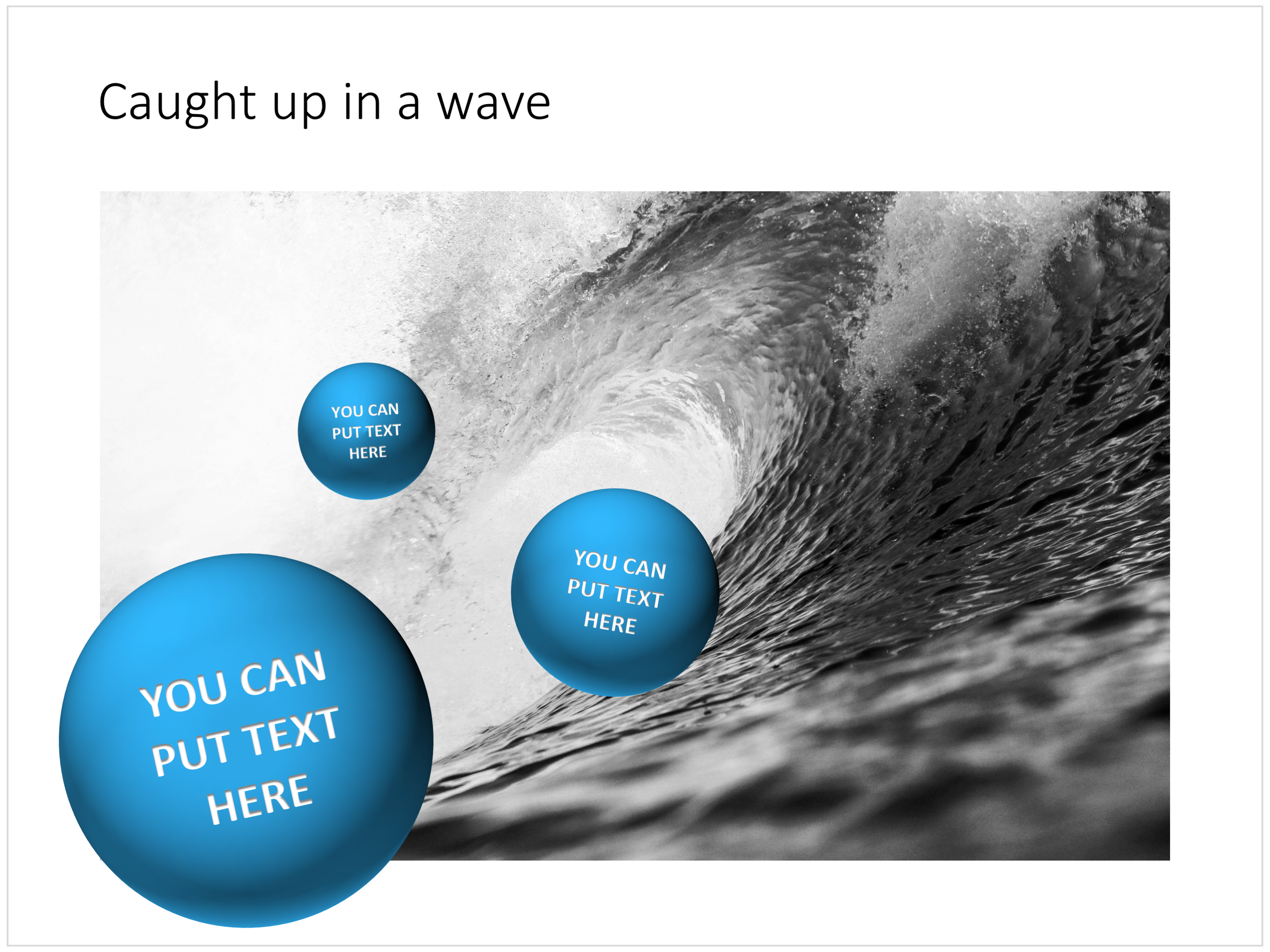
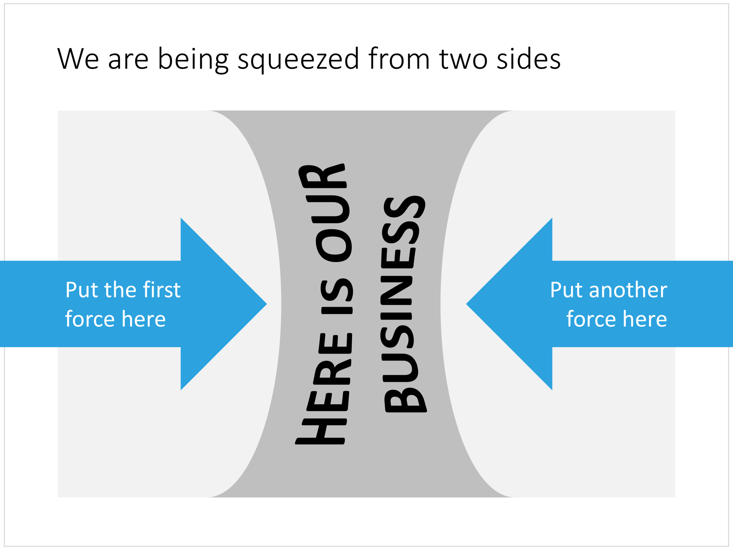
Both of these are not crucial to presentation design. In fact, too much 3D fire power in the hand of the layman designer might not beneficial to the quality of the slides. Below are examples of charts from my template store which are not available in Keynote because I simply could not covert them. (Click the images to be taken to the template store).

Balls bouncing on a big wave

Balls bouncing on a big wave

Domino pieces in PowerPoint

Domino pieces in PowerPoint

Proliferation of options

Proliferation of options

The start line: comparing two optionis

The start line: comparing two optionis

Black hole

Black hole

Squeezed

Squeezed


Cover image by Chris Sabor on Unsplash

SlideMagic: a platform for magical presentations. Free student plan available. LEARN MORE
Concentric circles in PowerPoint

Concentric circles in PowerPoint

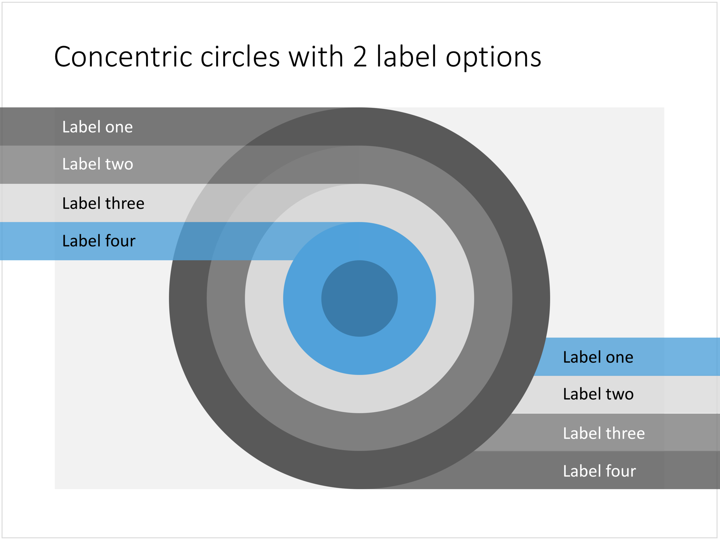
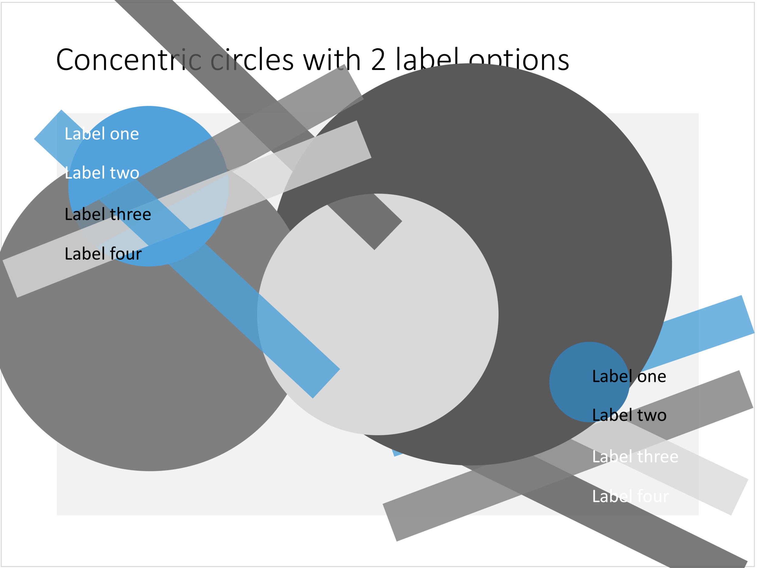
You can create very beautiful compositions by just using basic shapes and a few colours. Below is a presentation slide with concentric circles, and an image that shows how it is constructed. Feel free to borrow the design approach, or you can download the finished slide here.

This technique was often used by the Swiss graphics designers in the 1960s. You can use the slide concept below in a number of ways: show some sort of layering, show multiple layers of security or protection, show a whirl or rolling dynamic. You can take the labels of and just use the circles.

Concentric circles in PowerPoint

Concentric circles in PowerPoint

How to make concentric circles in PowerPoint

How to make concentric circles in PowerPoint

SlideMagic: a platform for magical presentations. Free student plan available. LEARN MORE
Bubble charts in PowerPoint and Keynote

Bubble charts in PowerPoint and Keynote

Bubble charts are useful to present and analyse very large datasets. The standard template in PowerPoint and Keynote still needs some adjustment to make the chart useful. In this bubble chart on the SlideMagic template store, I have tried to do the hard work for you.

This a reformatted version of the standard bubble chart that you will find in PowerPoint and Keynote, on top it has the layout of a 2x2 matrix. The bubble chart is useful when you want to compare a data series with 3 elements, across a large number of data points. Examples are countries, business units, regions, products, etc.

The first two elements will be plotted on a regular XY chart, the 3rd element is the size of the bubble. PowerPoint or Keynote do not support labelling of the bubble very well, which are put in manually.

A 2x2 matrix structure is put on top of the regular bubble chart, giving you 4 distinct quadrants to segment your bubbles in. In the current example, the quadrants have the same size, by putting the 2 axes right in the middle. To do so, you need to manage the ranges of the axes carefully. If this is not important to you, you can put the X and Y axes where they are relevant without worrying about this. Quadrants of unequal size will still look good.

I am working hard to make the store more useable. This layout is an example. There are 4 variants of the chart: PowerPoint, Keynote, both in 4:3 or 16:9. I tried to add all the right instructions about how to use the layout, and show many links to other relevant slides in the store. While working on your presentation, you can go back and forth between designs and get ideas on how to visualise the key messages of your presentation. Some layout suggestions, you might be able to create yourself, others you might already have bought and can re-use, or you can download a layout right away to add it to your library. SlideMagic will be a place that saves you time making your business presentations.

Cover image by Alejandro Alvarez on Unsplash

SlideMagic: a platform for magical presentations. Free student plan available. LEARN MORE
Most templates now available for Apple Keynote

Most templates now available for Apple Keynote

The template store now supports Apple Keynote, a drop down menu let's you make a selection between your preferred presentation software. Not all templates could be converted, Keynote is missing the 3D shape rotation feature of PowerPoint that I used in some of the slides.

The store now gives you the option to download templates either as a PowerPoint or Keynote file

The store now gives you the option to download templates either as a PowerPoint or Keynote file

Slides in Keynote look the same except for the font

Slides in Keynote look the same except for the font

The only adjustment I made was the font: switching it from PowerPoint's default Calibri to Helvetica Neue for  Keynote. I am keen to keep the look and feel of the charts as "standard" as possible to make it easy to integrate the design in the corporate presentation templates that people are using.

Under pressure!

Under pressure!

The slide above is a layering of 2 images that visualizes a big dam that is under pressure from something. You can use it either to show that something is about to burst, or the opposite, that defenses are strong and holding out well. I love the massive architectural scale of these hydro power installations, especially when you can highlight it with this tiny car driving across it. You can download this dam template here.

Looking for other visual concepts that are similar? You can try and search the store for "forces", "down", or this search "downward" and see what slides come up. That is my longer-term vision: no more boring bullet point charts, and no more searching for "where is that slide that I made 2 years ago", but rather have all the relevant designs ready at your finger tips. The search engine with design ideas is almost as important as the actual design itself.

Searching for "downward" in the template store

Searching for "downward" in the template store

SlideMagic: a platform for magical presentations. Free student plan available. LEARN MORE
How to cut out shapes out of images in PowerPoint

How to cut out shapes out of images in PowerPoint

PowerPoint can do Photoshop-like tricks. One of them: cutting shapes out of images. Here is how to do it:

  1. Drag your image on the slide

  2. Draw a shape on top of it (the freehand shape allows you to create a very precise shape)

  3. First select the image, then select the shape (shift click)

  4. Now select the Shape Format menu

  5. Click Merge Shapes

  6. Click Subtract

That's it. Below is a slide from the template store that uses this technique (you can download the ready-made slide if you want)

The final template slide

The final template slide

The making of

The making of

Photo by Joanna Kosinska on Unsplash

SlideMagic: a platform for magical presentations. Free student plan available. LEARN MORE
How to export PowerPoint slides as high res images on a Mac

How to export PowerPoint slides as high res images on a Mac

How to export PowerPoint slides as high res images on a Mac. See how by setting the slide width to 2998 things somehow seem to work.

SlideMagic: a platform for magical presentations. Free student plan available. LEARN MORE
Windows is at par

Windows is at par

Windows is at par. Every couple of years I am installing a Windows machine on my Mac, either to check how SlideMagic looks on corporate computers, and now, because I need access to Microsoft Office development features that are not available on a Mac. I went through Windows 8, then Windows 7, and now Windows 10.

SlideMagic: a platform for magical presentations. Free student plan available. LEARN MORE
My own clean PowerPoint template

My own clean PowerPoint template

PowerPoint templates get corrupted over time. It usually starts with a template that was designed by a print graphics designer as an after thought after designing the logo and the business cards: creating slide layouts without paying much attention to the technical issues of programming a template that can be (ab)used by thousands of employees. Then over, slowly but gradually, "foreign" templates infect the original until nothing is left of the original.

I go back to zero every time I design a new presentation. The file that I put up in the SlideMagic template store is pretty much the one I start every new presentation design project with. It is really simple. You can customise it with your own colours and you are good to go.

When creating a new slide, go to the "Layout" button in the top left of the menu to create a select a new slide layout.

SlideMagic: a platform for magical presentations. Free student plan available. LEARN MORE
Maps in Excel

Maps in Excel

Microsoft has been adding some new features in Excel recently (I am using the Mac version). I am so used to working with the software that I rarely look at new feature additions, unless they are staring me in the face.

One of buttons that got my attention are Bing maps: you can now plot data on locations in a map. You enter a table with locations and a numeric value, and they get plotted in the appropriate location. The map zooms in and out. When you drag the map from Excel into PowerPoint, it becomes a static image of the last zoom level.

I think this is very useful as an analysis tool for for example a retailer who wants to visualise stock levels across its stores.

Screenshot 2017-10-19 07.31.56.png

The implementation on a Mac is still a bit crude: it would be great if you could shade entire countries based on a value, conditional formatting. (I see that the Windows version is much more advanced).

Also, the graphical appearance of a Bing map is not designed with a presentation in mind. The map has lots of unnecessary clutter, and random geographical labels are displayed depending on zoom level, pretty much like the map you are staring at when the in-flight entertainment system is switched of just before your plane lands.

Hopefully the Mac version will be upgraded to the features of the Windows version soon.


SlideMagic: a platform for magical presentations. Free student plan available. LEARN MORE