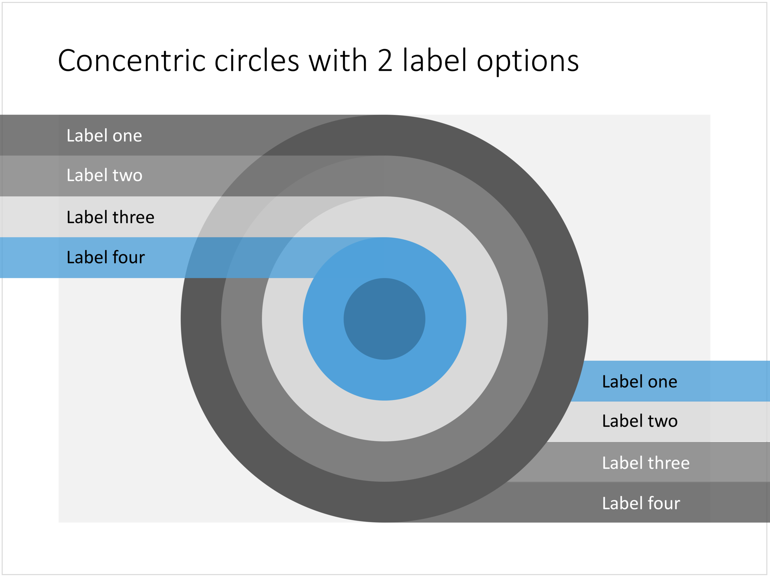
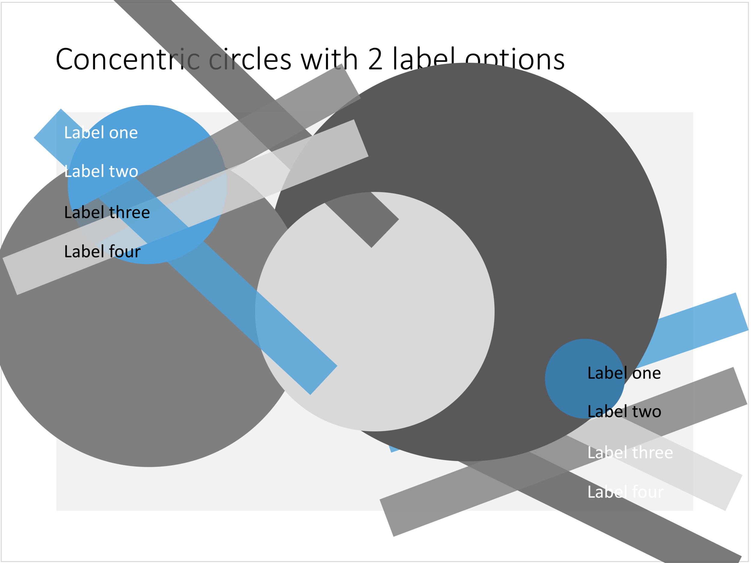
You can create very beautiful compositions by just using basic shapes and a few colours. Below is a presentation slide with concentric circles, and an image that shows how it is constructed. Feel free to borrow the design approach, or you can download the finished slide here.
This technique was often used by the Swiss graphics designers in the 1960s. You can use the slide concept below in a number of ways: show some sort of layering, show multiple layers of security or protection, show a whirl or rolling dynamic. You can take the labels of and just use the circles.


