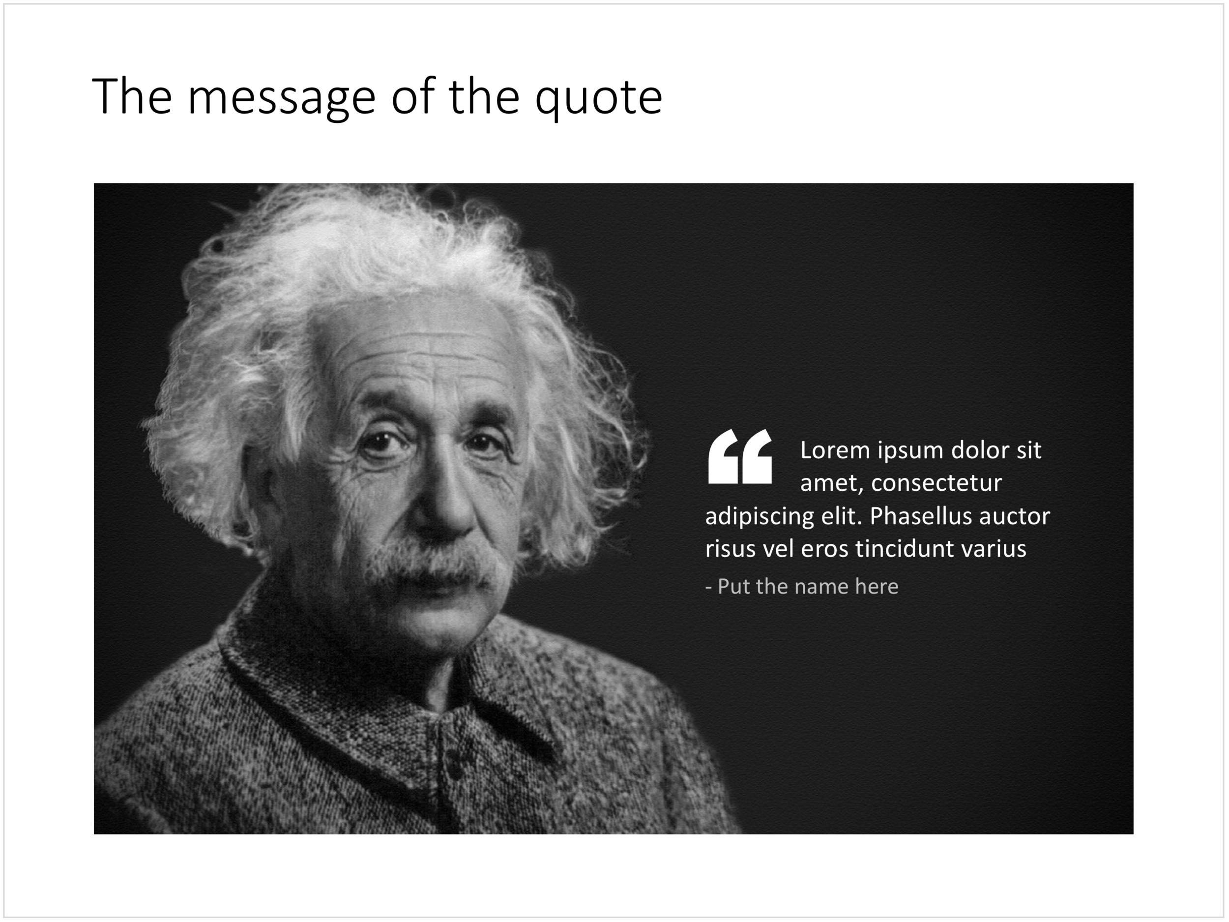
Quotes can add credibility to your presentation. If experts, celebrities, and/or customers agree with you, you must be right. But, not all quotes have equal weight. They have been overused in many PowerPoint decks. (Anyone can find a picture of a serious-looking person and get her to say what you want her to say in a few mouse clicks).
Here is a check list:
- The person needs to be relevant and credible (third tier social media "experts" do not carry much weight)
- The person needs to be identifiable ("Senior marketing executive at major high tech firm" can be anyone and is most likely you)
- The quote needs to be interesting, cut the buzzwords and marketing language, cut the cliches ("Wow, these guys really have a targeted value proposition that resonates with my medium-term return on investment objectives")
- The text needs to be long enough that it is specific, and short enough that it reads like a headline. A full page of verbatim will not come across
- The quote needs to be relevant, a generic motivational quote might not help close that enterprise software contract.
Quote slides are (and should be) pretty simple: a nice big image with a big text overlay. Still there are some things to watch out for. Below is a quote slide that I have added to the SlideMagic template store. Let's go through the design process.
- The image should have a calm background with enough "white" space for text. You don't need to be a Photoshop guru to extend the background of an image in PowerPoint, it is easy to add a black or white box next to images. You can use the colour picker to match the precise colour, or use semi transparent overlays for the best effects
- Make the quote symbol stand out. Regular quotes are too small, and the layout does not look good, as the quote pushes the start of the paragraph in. There are endless ways to do it and I settled on this one. One big quote at the beginning of the paragraph with a text indent. Take some time to find a quote in a good font. In the above slide, the text font is the Microsoft Office standard Calibri, but the quotes of this font don't look that "fat", I used Arial.
- This slide is a framed image slide, which gives me the opportunity to add a big headline at the top of the slide with the main message (the headline can say "Customers are really happy", the quote can say "With product [x], I no longer need to use a pencil".
Feel free to borrow the suggestions above, or you can download the finished slide here. The template store has related designs for quotes, or customers.


