Viewing entries in
Templates

Quick makeover: our high-tech industry matters

Quick makeover: our high-tech industry matters

I saw the following slide coming by in my Twitter feed (original post):

Here are some things I fixed:

  • Message in the title

  • 19.7% -> 20%

  • Simplification of the labels

(For those of you interested in the political context: Israel is fragmented in many population groups, the Israeli high-tech sector which is mostly secular, pro-democracy, situated around Tel Aviv, and not really represented in the current government is making the case that it generates a big chunk of the Israeli economy and is bank rolling many other sectors.)

SlideMagic: a platform for magical presentations. Free student plan available. LEARN MORE
COVID isolation policy

COVID isolation policy

A quick re-make of a graphic with the Israeli COVID isolation policy, here is the original

Below is my version in SlideMagic. I tilted the diagram, to put more emphasis on the timeline. Search for ‘COVID’ in the SlideMagic template bank and the slide will show up for you to use, either exactly as is, or as the basis for another timeline chart.

SlideMagic: a platform for magical presentations. Free student plan available. LEARN MORE
Another slide makeover

Another slide makeover

McKinsey’s social media activity provides an excellent stream of slides to work on. The one below could have come straight out of SlideMagic.

I created a proper SlideMagic version with a few improvements:

  • Emphasized the “from to” theme of the chart with arrows, and two contrasting colors, and a bigger distance between the two options

  • Lighten the colors a bit, especially the dark top row of the original puts a lot fo weight in the chart

  • Actually reduced the font size a bit to give the text more breathing space in the boxes

  • Re-shuffling the bars to get a more pleasing overall composition

  • I eliminated the left column, the audience can guess the description, to add more balance to the composition and gain some extra space

SlideMagic users can use this chart, simply search for a relevant keyword (operations, consulting), and it will pop up for you to adjust to your own project.

SlideMagic: a platform for magical presentations. Free student plan available. LEARN MORE
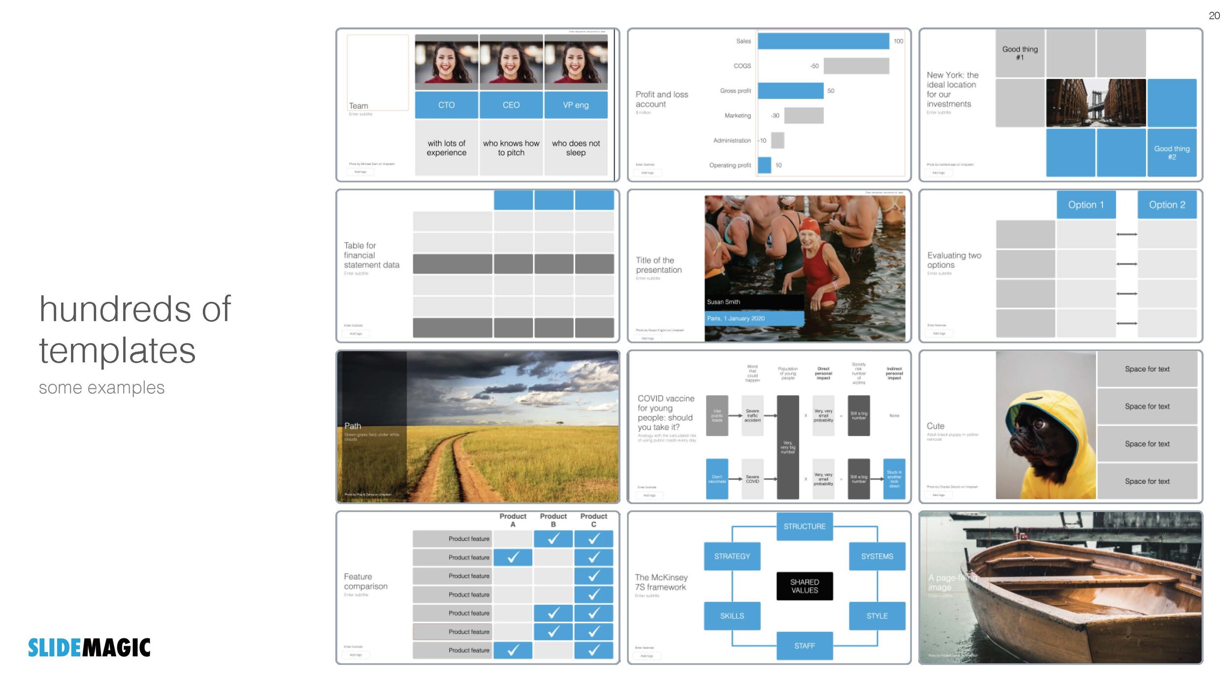
Different levels in presentation templates

Different levels in presentation templates

A “presentation template” is usually a PowerPoint file that new employees receive on their first they of work. There is more to a presentation template I think.

  1. Your corporate visual communication style/culture

    • Consulting firms: lots of complicated diagrams and frameworks, meant for solving a problem rather than presenting

    • Investment banks: dense text and tables with graphs, meant for reading rather than presenting

    • Consumer goods company: product packaging shots and bullets

    • University: list of bullets

    • Etc. etc.

  2. The actual software file that holds the basis layouts, logo, and colours (this is the one you get on the first day of your employment)

  3. Running versions of important presentation documents that get constantly updated and tweaked

    • Sales presentations, each for a different lead or a different customer segment

    • Quarterly results presentations with - well - different quarterly results

    • Strategic planning presentations, each one for a different product group

    • Etc. etc.

Most of the day-to-day presentation work in companies is in step 3, the tweaking of existing documents to update it for the latest sales meeting or board meeting. These presentations are in fact the “templates”, not the empty file.

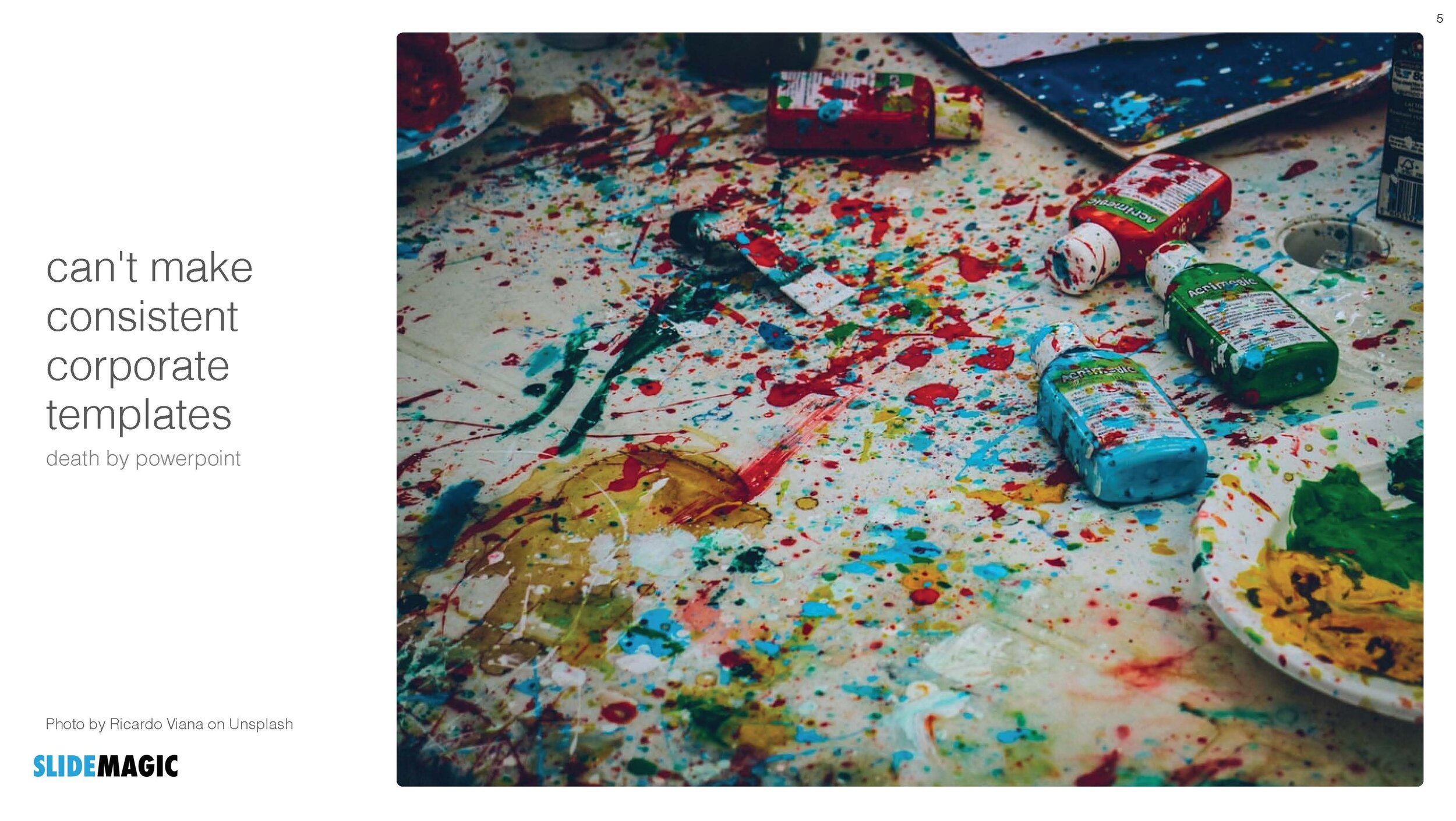
In most presentation design software the tweaking of an existing slide is tricky and over time a slide degrades after many iterations where users insert the wrong fonts, colours, and trip up a decent slide layout that worked for 5 boxes, but not for 6. (“Template rot”).

The above is true for both existing corporate presentations and shiny new templates purchased online. The latter look amazing fresh off the press, but it shows when a non-designer tried to fit it to her needs.

With SlideMagic we are trying to fix this. Make it easy to create decent looking presentations from scratch, but even more importantly, make it super easy to tweak this presentations, keeping everything aligned on an brand.

By fixing step 2 and 3, we hope to fix step 1 as well…

SlideMagic: a platform for magical presentations. Free student plan available. LEARN MORE
Explained: vaccine 90% effective, vaccinated still expected to be 50% of infected

Explained: vaccine 90% effective, vaccinated still expected to be 50% of infected

There is a lot of confusion here in vaccinated Tel Aviv, now that around 50% of people infected with COVID appear to be full vaccinated. Newspapers are heavily quoting the “64% i.s.o 90% for the Delta variant” which does not seem to be based on the correct calculation of vaccine effectiveness.

I used an explanation by Dvir Aran to make a slide that explains how it is expected that 50% of infected people are fully vaccinated, even with a 90% vaccine effectiveness.

The logic is as follows:

  • Take 100 people who are seriously exposed to the virus

  • Assume a 90% vaccination rate (the case for the at-risk population in Israel at the moment):

    • A small group is exposed: 10 people

    • A big group is protected 90 people

  • Assume a 90% vaccine effectiveness:

    • 10 out of 10 unvaccinated people will get infected

    • 8 out of the 90 vaccinated people will get infected

  • Of the total of 18 infected people, 8 will be fully vaccinated, so around 50/50

Of those 18, the majority of cases with symptoms and serious complications will be unvaccinated of course.

I have added this slide to the SlideMagic library, search for “COVID” and it will pop up, or download it here. Pro subscribers can convert this chart to PowerPoint, if you have to. (Students, you can claim a free membership!).

SlideMagic: a platform for magical presentations. Free student plan available. LEARN MORE
"Life by SlideMagic"

"Life by SlideMagic"

My amazing wife Anat Naschitz has always supported me in developing SlideMagic behind the scenes. Going forward, she will become more visible to the outside word. Recently, she created a deck to demo SlideMagic to a potential client. We have added these slides and the entire deck to the SlideMagic template database, so they all should be available in the SlideMagic app for you to use in your own presentation, simply search for “anat” and the slides will pop up.

SlideMagic: a platform for magical presentations. Free student plan available. LEARN MORE
An actual presentation as a template

An actual presentation as a template

Most companies have some sort of corporate PowerPoint presentation template sitting on the file system. It consists of a title page, some trackers, some bullet point layouts, some picture slides. The template probably looks ago, but as soon as employees start to use it, this is no longer the case.

Why?

  • Most templates are designed as an afterthought, after the logo, web site, letterhead and business card have been approved

  • PowerPoint templates are created by designers who understand graphics design, web/print design software, but NOT PowerPoint and as a result a lot of technicalities go wrong

  • But most importantly: templates are designed on a blank canvas, encouraging the designer to “do something” with all that white space.

A better approach: start with an actual presentation. The general company introduction, a product sales pitch, last quarter’s analyst presentation. Make that deck look perfect and put on the on the file system as a starting point.

  1. The template is designed around actual content, rather than content being forced to fit around a template

  2. Most companies need very specific templates. Consumer goods companies: products/packaging demos, market shares and sales across many channels, consumer research data. Pharma: scientific clinical trial data. Chemicals: process layouts, project maps. Consulting firms: fancy frameworks.

I am contemplating some new ideas for SlideMagic to make the above all a bit easier.

Photo by MagicPattern on Unsplash

SlideMagic: a platform for magical presentations. Free student plan available. LEARN MORE
Busy economics slide in SlideMagic

Busy economics slide in SlideMagic

I stumbled on the slide below by @ING_economics.

Screen Shot 2021-04-21 at 15.16.25.png

This is a slide intended for reading, rather than serve as the backdrop for a TED Talk. It can be improved on a number of fronts:

  • Move the aspect ratio to 16 x 9 to make more space for text in the boxes

  • Actually reduce the font size (we are reading anyway), to make the text fit better in the boxes, with more white space, and less irregular sentence wrapping

  • Make the rounded edges less extreme

  • Make the dark colour accents a bit less strong

  • And most importantly, fix those misalignments that make me cringe…

I did a quick re-do in SlideMagic, with is particularly powerful when it comes to text tables. I added the slide to the SlideMagic library, search for “economics” in the desktop and it will show up.

Screen Shot 2021-04-21 at 16.35.58.png

SlideMagic: a platform for magical presentations. Free student plan available. LEARN MORE
CMMI template

CMMI template

One of the users requested a template for the Capability Maturity Model Integration framework (more information on the site of ISACA’s CMMI Institute).

I worked of the following original (not created by CMMI):

Screen Shot 2021-04-18 at 13.04.47.png

Next to the general layout, there is also a lot of improvement possible in the text. Overlaps, and jargon can be removed. Here is the template that I added to SlideMagic, search for “CMMI” and it will pop up in the SlideMagic app.

Screen Shot 2021-04-18 at 13.07.15.png

This is my interpretation of the framework, and not endorsed by the Institute. But this reflects how I think you should treat all these diagrams by consulting firms, academics, and business schools: use and adapt them for your own situation. If the jargon does not make sense for you, take it out.

SlideMagic: a platform for magical presentations. Free student plan available. LEARN MORE
"What are the best presentation templates for business models?"

"What are the best presentation templates for business models?"

Some questions on Quora seem to be a setup for people with a solution to answer them. SlideMagic is not in the business of selling slide templates, still, I could not resist answering:

I think it is the wrong question to ask first. You should start with “What is my business model?”

A business model can have an endless number of options, no one is the same, hence it is hard to fit into a standard template. Even worse, trying to fit your business model into a PowerPoint template that actually does not fit gets your audience confused of what your business model actually is.

Once you have decided on your business model, you can find a suitable template, and it can be very simple and straightforward. For example, if you charge a set up fee, and an hourly rate, that is a table with 4 boxes… Clean simple, unambiguous.

Photo by Element5 Digital on Unsplash

SlideMagic: a platform for magical presentations. Free student plan available. LEARN MORE
Corporate title pages

Corporate title pages

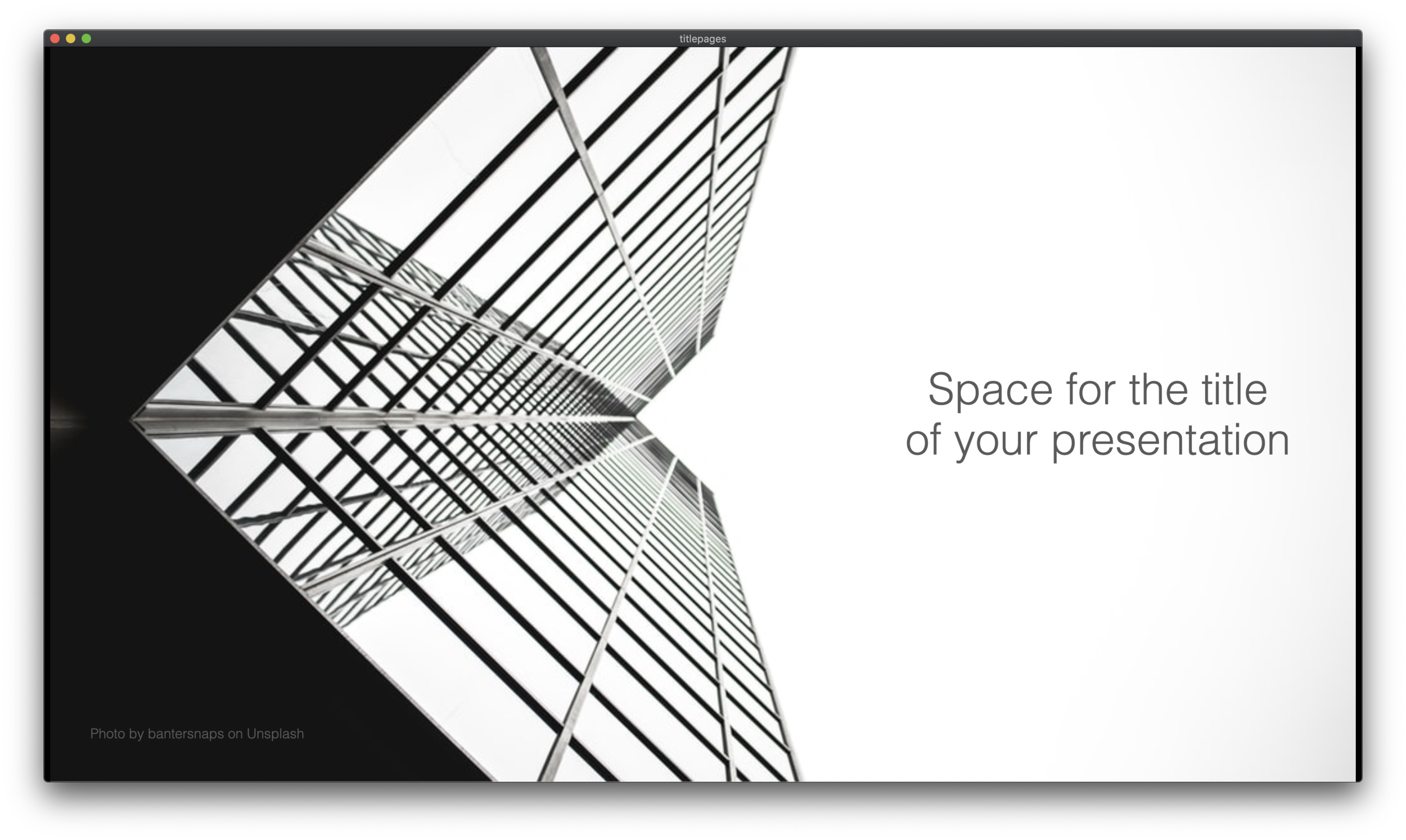
I added a number of new title pages to the SlideMagic slide template database: looking up in the downtown area of a city. The sky in the center of the image is a nice empty background for your text.

Screen Shot 2020-09-12 at 10.00.06.png
Screen Shot 2020-09-12 at 9.44.37.png

Typing “title” in the search bar of the SlideMagic desktop app now gives a lot of options to get you started with a title page for your presentation

Screen Shot 2020-09-12 at 10.08.45.png

Pick one of these designs (or an empty slide), and use the image search feature to add the image that you prefer

Screen Shot 2020-09-12 at 10.11.53.png

SlideMagic: a platform for magical presentations. Free student plan available. LEARN MORE
The point of masks

The point of masks

Social media is full of people arguing about masks. Part of the reason I think is that it is such a statement: “Look, I proudly wear one”, “Look, I proudly do not wear one”. I think masks deserve the benefits of the doubt, without becoming overly obsessed with it.

Leaving the debate to the side, and turning to graphics. My Twitter feed is full of diagrams such as this one below (found it here):

EgVOjrcXsAAHva9.jpeg

The masks and the faces look cute, but it is actually hard to understand the chart instantly. Using the SlideMagic approach to slide design (quick, to the point, good enough design), I came up with the following 2x2 that tries to make the same point:

Now the question is, did I put myself in the shoes of the audience? Maybe not every non-mask-wearing person is a former management consultant who prefers 2x2s… This slide is now available on the SlideMagic template bank, and you can access it free if you search for something like “mask” inside the app (v2.4.29 is the latest version).

See below how the desktop app adds dynamically generated slides to the search query. I am not running that on the server at the moment, since 1) it will take a lot of processing capacity that is now being done on individual user machines, 2) I do not consider the web store to be the optimal user experience: downloading slides, and then opening them in the app, but maybe I will change my mind at some stage in the future.

Screen Shot 2020-08-26 at 17.18.26.png

SlideMagic: a platform for magical presentations. Free student plan available. LEARN MORE
An OKR slide template (Objectives and Key Results)

An OKR slide template (Objectives and Key Results)

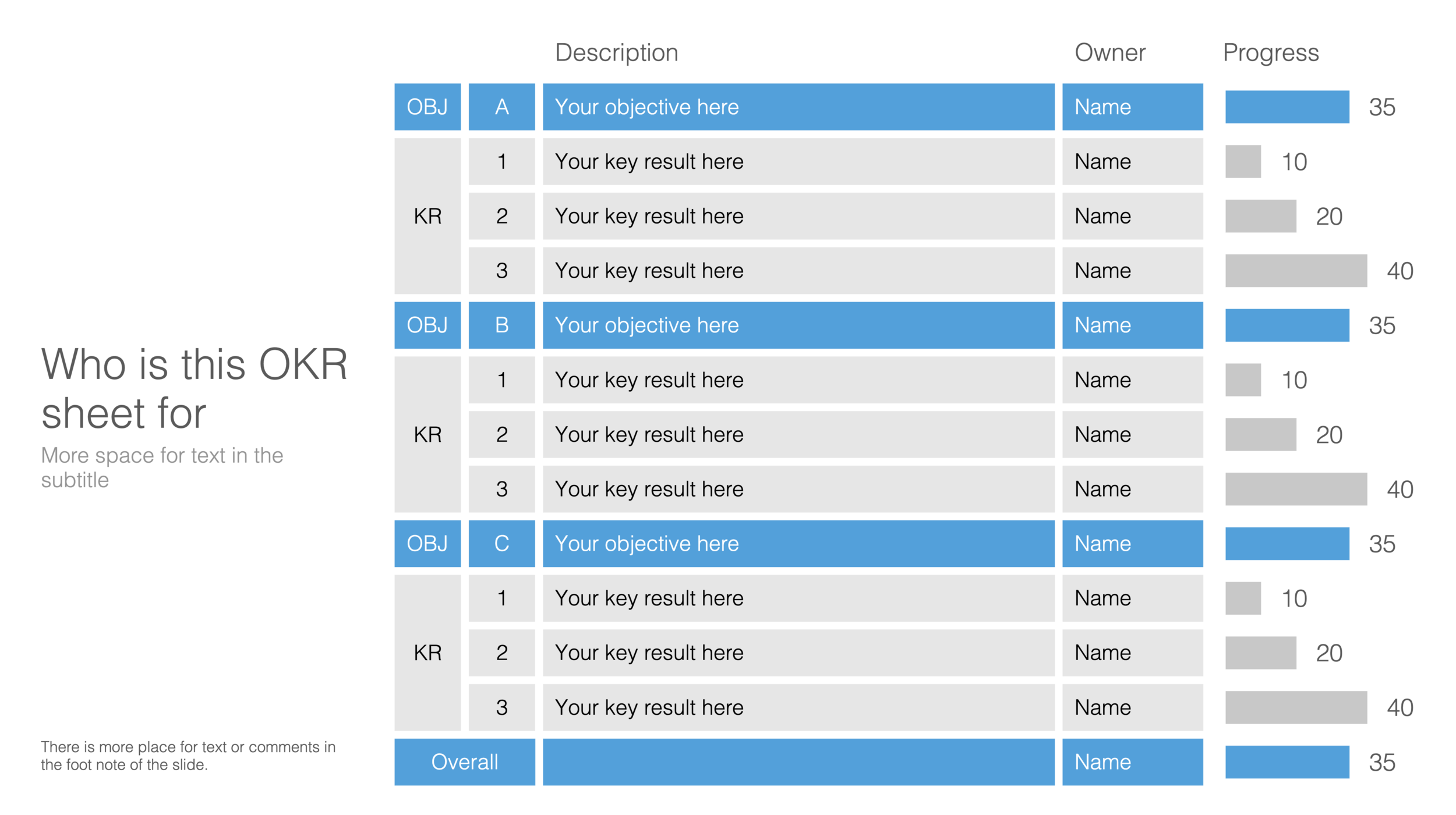
Not enough SlideMagic users have discovered that I try to respond to requests for new or missing templates. Today I added a template for an OKR sheet, Google’s approach to managing Objectives and Key Results.

SlideMagic is particularly useful for slides like this, it is easy to add rows, adjust the layout, and now those boring percentages can be visualised easy with a bar chart that always lines up with your table.

Screen Shot 2020-08-19 at 17.27.43.png

Search for “OKR” in the SlideMagic desktop app and it will pop up and ready to work on for free, alternatively, pro subscribers can download the template (in .magic or .pptx format) from the online template bank.

Let me know if you need more/different types of OKR templates.

SlideMagic: a platform for magical presentations. Free student plan available. LEARN MORE
The SlideMagic template bank now has an "unlimited" number of slides

The SlideMagic template bank now has an "unlimited" number of slides

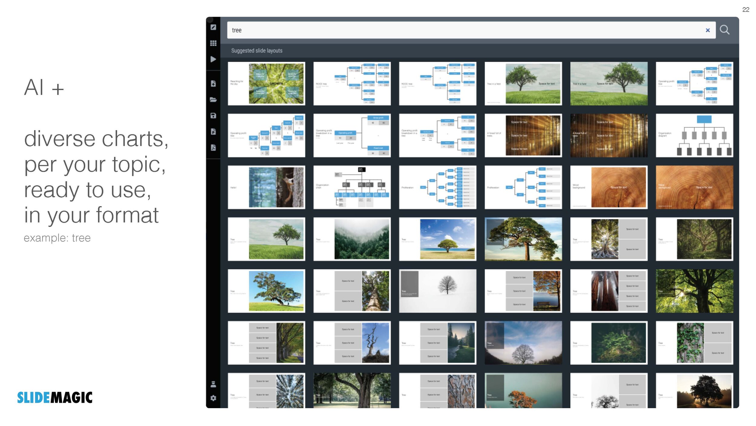
The latest version of the SlideMagic app (download) now has a feature that I wanted to implement for years: automatically generated slide templates.

The basic set of SlideMagic templates are closely related to my consulting background: lists, tables, frameworks, 2x2s, graphs, diagrams, etc. This set will grow into the thousands, but it still relatively small when it comes to the universe of slides.

There is a big long tail of slide designs that are impossible to design and store on a server: slides with backgrounds of an image: cities, buildings, buckets, cars, roads. It was already possible to search online for free images in SlideMagic, but now I took a step further.

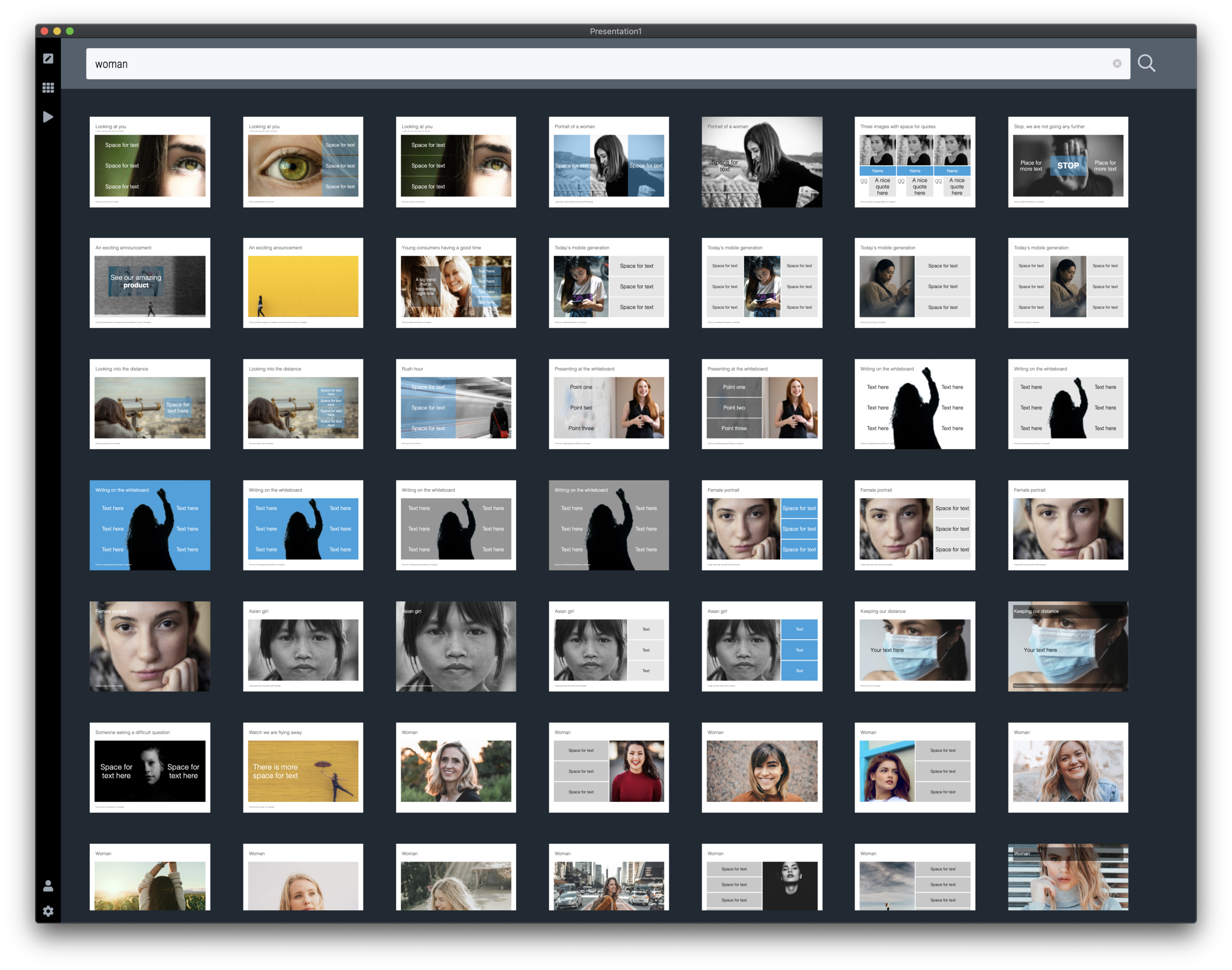
When you hit a search inside the app, first SlideMagic will serve you its own templates that best match your search criteria. But then, the app will add automatically generated layouts with relevant images after that. These slides do not sit on the server, they are generated on the fly. In the screen shots below, you can spot the break between the two types of slides, but you need to look carefully.

Screen Shot 2020-07-22 at 15.14.59.png
Screen Shot 2020-07-22 at 15.16.14.png
Screen Shot 2020-07-22 at 15.16.51.png

This feature is only available inside the SlideMagic and not yet implemented on the web site. I am just starting to scratch the surface of all of this, as usual: work on progress.

SlideMagic: a platform for magical presentations. Free student plan available. LEARN MORE
SlideMagic slide search results now in colour

SlideMagic slide search results now in colour

Another day, another improvement

I stuck to showing images on slide search results in black and white because I would be sure that the photos would not clash with the accent colour for the slide users had picked (most users will swap SlideMagic blue for their own logo colour). That worked, but it came at a price: slide templates all looked a bit sad. This is not only due to the greyscale colours, but also because of the way the greyscale filter was applied: many colours were translated into too dark tints of grey I think.

This morning I re-rendered the entire slide database (the server is still a bit tired) and images in slide templates now show up in colour.

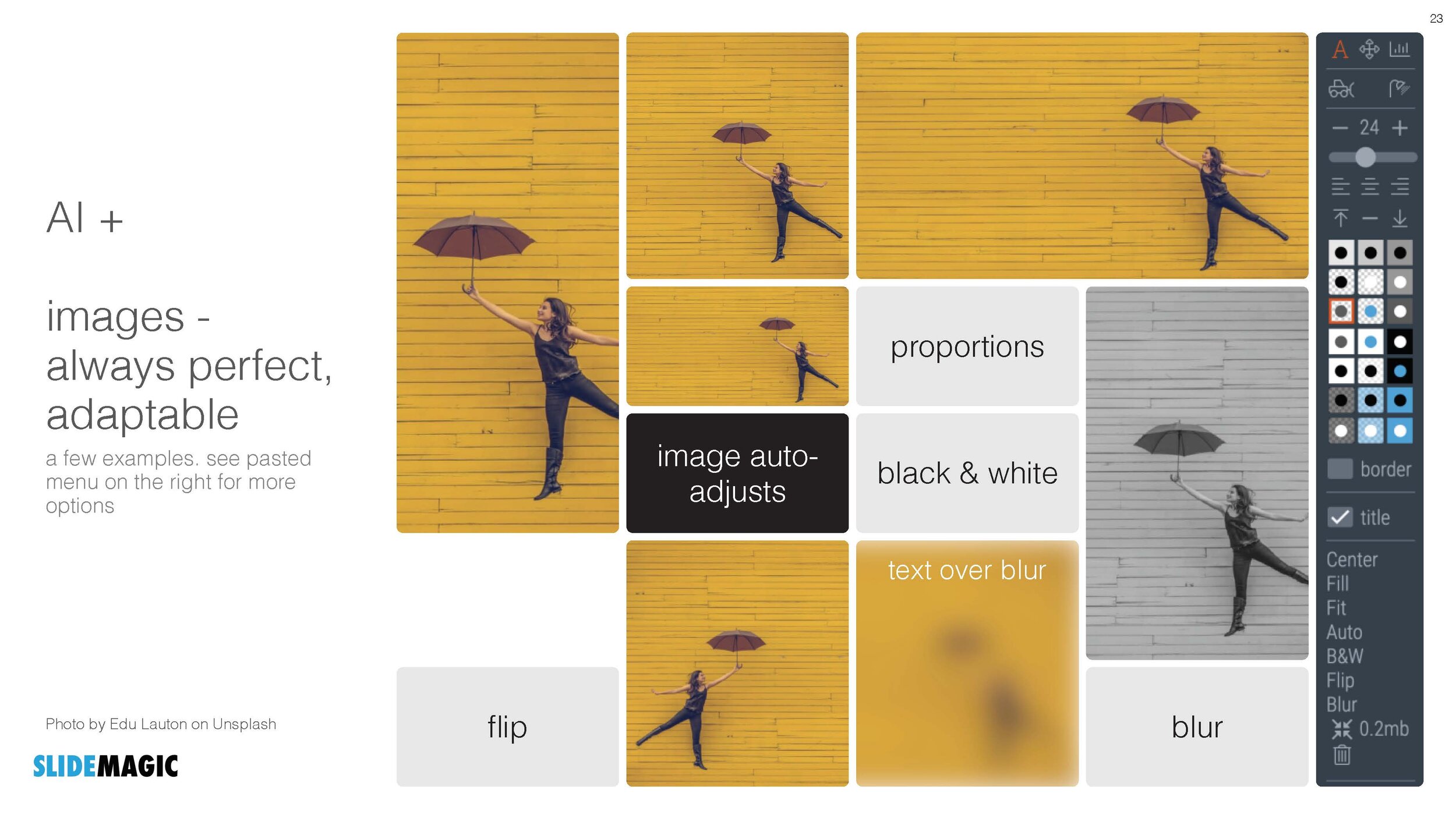
It is worth the trade-off I think. Of course it is possible to go back to a black and white image in the SlideMagic app, simple untick the ‘colour’ box and the image will show up as grey scale (you can always go back to colour if you want).

Screenshot 2020-07-21 10.05.06.png

The colour option is only available for the slides that I added more recently, after I switched off the colour option when ‘flattening’ or compressing slides. Obviously new templates will all appear in colour, or I will set them explicitly to black and white when I feel that it serves the slide’s message better.

This addition of colour coincides nicely with the more mature SlideMagic product I think, slowly but certainly it comes out in its full shiny colours :-)

Let me know what you think.


SlideMagic: a platform for magical presentations. Free student plan available. LEARN MORE
Slide template for a RACI matrix

Slide template for a RACI matrix

On request of a user, I have added templates with a RACI matrix to the SlideMagic database. (It does not happen often, but this is the first time I actually heard about this consulting framework, the responsibility assignment matrix). In SlideMagic it is super easy to manage all the columns and rows of the table. If your colleagues are not ready for SlideMagic yet, use the app to create the chart, then export to PowerPoint.

Screenshot 2020-07-05 12.46.16.png

SlideMagic: a platform for magical presentations. Free student plan available. LEARN MORE
Real estate (fund) pitch presentation template

Real estate (fund) pitch presentation template

SlideMagic is very suited to make decks that promote real estate projects or funds. It is easy to manage pictures of properties and add boxes with information about square feet and returns. I have added a template for a real estate fund pitch to get you started.

Screenshot 2020-06-14 08.38.41.png
download.png

Note that when searching for slide templates, you do not need to resort to keywords such as “real estate” (it will give some results now though), any layout that shows lists, or grids, or portfolios, or screenshots will do. Real estate presentations use very generic layouts.

SlideMagic: a platform for magical presentations. Free student plan available. LEARN MORE
Startup Board update deck

Startup Board update deck

You can now access entire slide decks (“stories”) from the home page of SlideMagic. A few days ago I added a slide deck template for a startup Board update. As I upload the new slide decks, individual slides will get added with the right tags to the slide database as well so they will pop up when you search for relevant layouts.

More slide decks to follow. Let me know if you have any special requests.

SlideMagic: a platform for magical presentations. Free student plan available. LEARN MORE
Closing the old template store, subscribers can move to the new one

Closing the old template store, subscribers can move to the new one

The new platform now includes the entire collection of the slides of my old Shopify templates store (and much more of course). Yes, it might be costing me SEO rankings, but I am going to close it down: multiple platforms are confusing for users, and hard to manage. Also the old store was difficult to use for subscribers who had to go through some check out process every time they want to download a slide.

For each paying subscriber with an active subscription, I have created an account on the new platform with a Pro subscription that expires at the same time your subscription on the old store did. I don’t store your passwords, so you have to go to slidemagic.com (this site), go to the log in page, and hit “forgot password”. After entering the email address you used for the old store, you should receive a link where you can create a new password (invisible to me).

I will keep the slide download option running on the platform, because that is what people are used to when it comes to buying presentation-related things online, but selling templates is not the main point of SlideMagic. The pro subscription also unlocks the full feature set of the downloadable presentation app. Try using it:

  • Super easy to customise templates

  • A lot, lot more templates available

  • PowerPoint export so your colleagues do not have to notice (of course you can tell them about the secret of SlideMagic).

If you are stuck email [email protected], and I am here to help.

Photo by Rhys Moult on Unsplash

SlideMagic: a platform for magical presentations. Free student plan available. LEARN MORE
Where are the bullet points?

Where are the bullet points?

A question I got from a SlideMagic 2.0 beta tester.

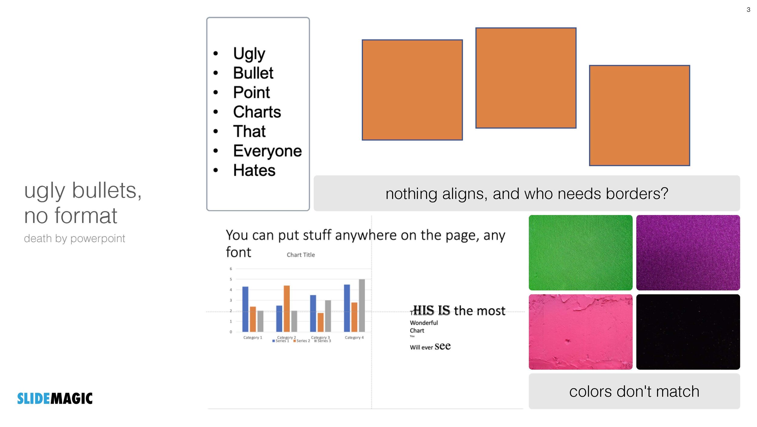
The answer: there aren’t any. I am trying to create a presentation design tool that changes people’s design habits. SlideMagic does not have built-in bullet point formatting options. It is meant to be that buzzer that reminds you to find an alternative design solution the moment you are about to fall back to your old habits.
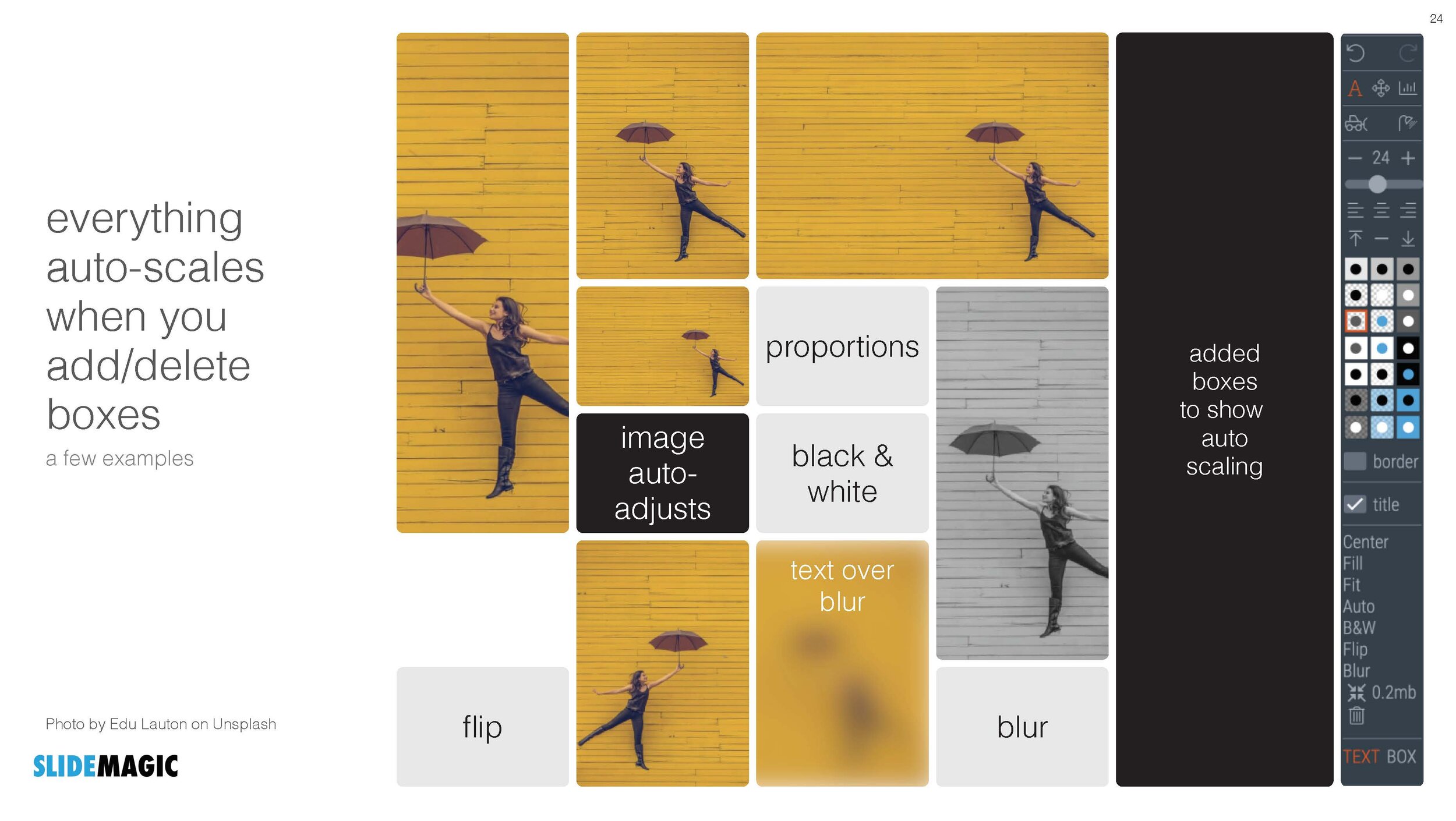
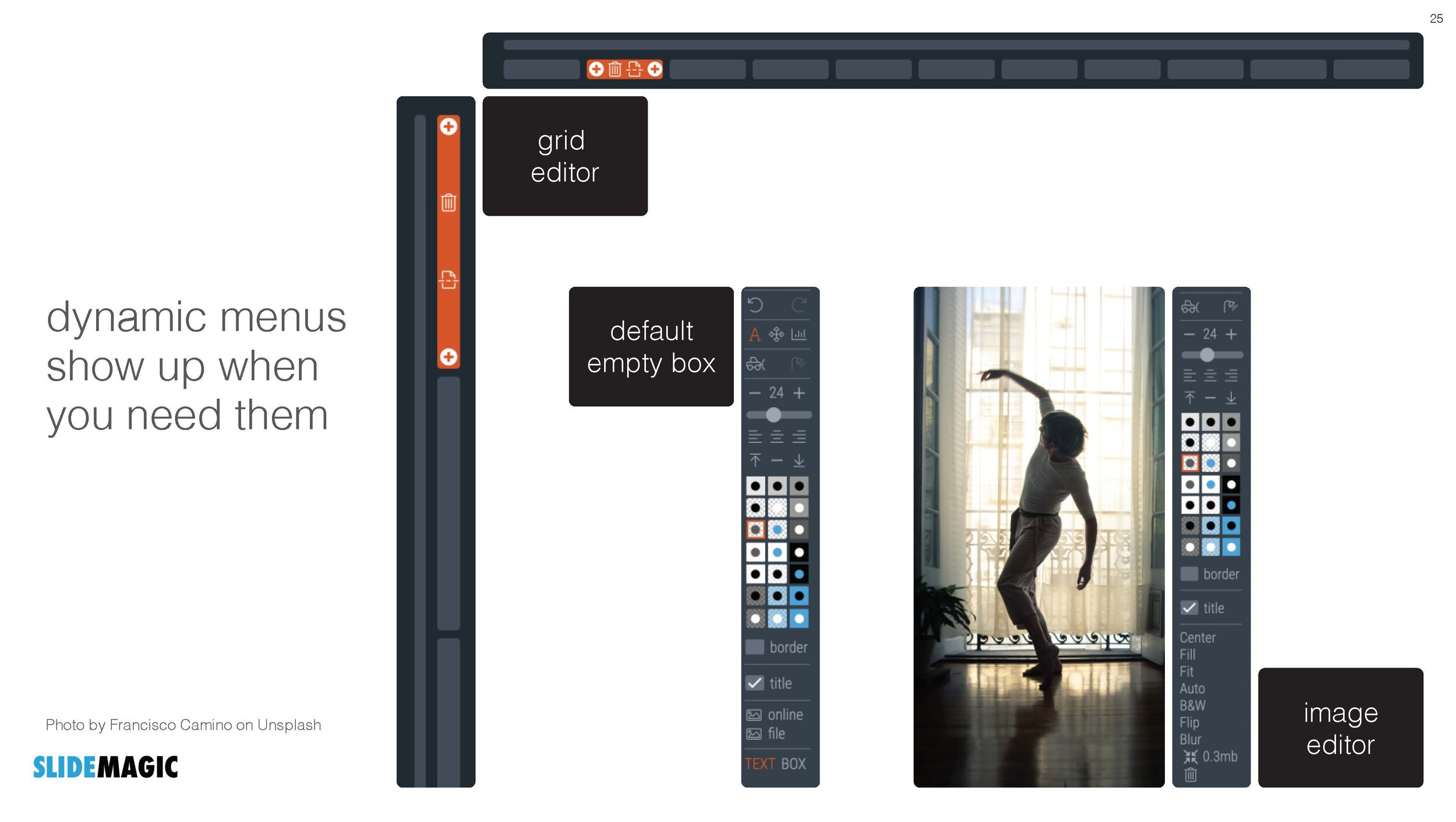
It is possible to create lists in SlideMagic though. Below a screen shot from a template search in the (still very small) slide library. If you need to make a list as a conscious design decision, you can, if you want to fill a box quickly with a number of bullet points, you can’t.

Maybe I am pushing things too far here, but I am not yet ready to give in.

Photo by Jon Tyson on Unsplash

SlideMagic: a platform for magical presentations. Free student plan available. LEARN MORE