Viewing entries in
Story

Let go

Let go

Some presentations stay in use for years. The designer has made small updates to slides, but overall the document has not changed. While the slides are more or less the same, the story probably has moved on.

Signs that this is the case:

  • The presenter puts the first slide on, and then runs the entire presentation without clicking to the next slide
  • The presenter discounts every slide, "what this slide really should say is [this] and [that]"
  • The presenter skips through the presentation

If this is happening, it is time to let go of the presentation and create a new one from scratch. A fresh presentation that follows the narrative of your latest story.

I tried doing this the other day, but when asked for feedback, I got the old presentation back with bullet point added here and there, because "it was more familiar to edit" than the new one. I am going to push back. 


SlideMagic: a platform for magical presentations. Free student plan available. LEARN MORE
Presenting the recommendations

Presenting the recommendations

After 3 months of hard work, your project is finished and you have been invited by the CEO to present the results. What to do?

  • Wrong: present the project process. This is the team, this is when we kicked off, then we did this, then we did that, then we involved this, then we did that.
  • Wrong: put the entire document in PowerPoint and present the full detail of all the analysis, wait with the conclusion until the very last slide
  • Wrong: give a very high level fluffy summary full of buzzwords

So what is right?

  • A very short background of the project and who was involved
  • A clear articulation of the decisions you want approved
  • Detailed backup/rationales for decisions that are not "no brainers" (a complicated trade off of multiple factors, an analysis with surprising/counter-intuitive results)

Not presenting all the work does not mean it was a waste of time. It was necessary work to get you to suggest the decisions.


Art: 1965/1 - ∞: Detail 2.289.862 - 2.307.403, Roman Opalka, Neue Nationalgalerie, Berlin, image by Esther Westerveld

SlideMagic: a platform for magical presentations. Free student plan available. LEARN MORE
3 steps to a good slide

3 steps to a good slide

Here are the basic 3 steps to come to a good presentation slide. And for 2, you do not have to be a stellar designer to get them right. For step 3, you can use my presentation design app SlideMagic)

  1. Decide on one message, one message only. Here is where most people go wrong: they try to put more than one idea on a slide. Too many things to grasp at once, too much content/clutter on the slide. Only if your message is: "There are 15 reasons why you should stop smoking") might you consider a list of 15 small bullet points.
  2. Decide on a basic slide structure. The only structure most people use is the list. But there are other (simple) ones that you should consider. A contrast (box on the left, box on the right), a ranking (bar chart), an overlap (Venn diagram), pros and cons (table), cause effect. They are not that hard to put on a slide.
  3. Get the design right. Now, here it might be trickier for the layman. Fixing alignment, proportions, grids, colours, white space, etc. etc. SlideMagic users won't have to worry much about this, for everyone else, here are some of the guidelines I have implemented in SlideMagic:
    1. Everything lines up 
    2. Everything lines up according to a grid
    3. Calm colours: one accent, lots of shades of grey
    4. Safe (sans serif) font
    5. Slides look similar in one presentation (positioning of titles, margins, etc.)

There is no reason to get 1. or 2. wrong, and you can learn 3. over time.


Art: Silver Landscape, Photocollage by Gordon Rice

SlideMagic: a platform for magical presentations. Free student plan available. LEARN MORE
Contract editing versus presentation editing

Contract editing versus presentation editing

In business, legal documents are edited in great detail. Exceptions here, clauses there, footnotes. It goes back and forth between parties. In this process that can take weeks, both sides get to know the text inside out. The dense text is actually a pretty useful format to communicate and avoid ambiguities.

Presentations are different. Most of the time, the audience sees the slides for the first time. Most of the time, they will see/internalise only part of the visual. Most of the time, the slide is a not a final legal document that will be signed right there and then. 

So editing/designing slides can be a bit different. Distracting tangents, bubbles with exceptions, tiny footnotes. These details will not really register, and worse: confuse the audience. Editing a presentation is different from editing a contract.


Art: Pieter Brueghel the Younger, The Village Lawyer or The Tax Collector's Office, 1626

SlideMagic: a platform for magical presentations. Free student plan available. LEARN MORE
Do you need the "Thank you" slide as the last page?

Do you need the "Thank you" slide as the last page?

Here in Israel everyone puts a "Thank you" slide as the last page of the presenting. Almost to thank the audience as it is impossible for the voice to be heard during the roaring applause. People ask me, should you use it?

It depends how.

The huge "thank you" with a big cheesy stock image of applause is definitely not the way to go. A dense page the repeats/summarises the entire presentation in detail also won't work.

You want to end any presentation with a strong upbeat message. The worst ending is, "well, this is it, we are running out of time, and I just managed to stay in my slot". It is better to put up a slide that puts in some call to action: "Sign up now to change the world!" or something.

For investor presentations, this is a bit harder. "Wire to this bank account" is pushing it too much. In these cases I actually put up a slide with a small/subtle "Thank you" (for your attention) title and the contact details of the person in charge of fund raising at the bottom. 

As a visual I tend to use the a memorable photo, graph, concept from the presentation that works as a memory shortcut to my entire story. 


"FolkRetabloRoomChalma" by Thelmadatter - Own work. Licensed under CC BY-SA 3.0 via Commons.
SlideMagic: a platform for magical presentations. Free student plan available. LEARN MORE
People catch up quickly

People catch up quickly

In many investor presentations, startups want to educate the audience first on a big trend that is happening. But, especially in consumer/internet, people catch up really quickly and you will loose the audience attention and your credibility of you spend time and slides on explaining things that everyone understands. 

Some examples I can remember (some of them from my time at McKinsey):

  • Home pages
  • Sticky eye balls
  • Portals
  • Market places
  • Social networks
  • Social media
  • Viral videos
  • Location-based services
  • Online video and the growth of bandwidth
  • Sharing economy

Smart VCs read the same blogs as you.


Art: Student at his desk, Pieter Codde, 1630

SlideMagic: a platform for magical presentations. Free student plan available. LEARN MORE
"This is how we always start"

"This is how we always start"

Your company changes rapidly, your pitch stays the same. I meet many company CEOs that started their company years ago, often at some startup pitch event. The story opening then was about them, in the absence of a real company. Years later, that same intro can often still be found in the presentation, just with an update of the sales and employee numbers.

Your pitch presentation should be one step ahead of your company, not one step behind.


Art: Lautrec, Woman at her toilette, 1889

SlideMagic: a platform for magical presentations. Free student plan available. LEARN MORE
The loooong Executive Summary on page 1

The loooong Executive Summary on page 1

The 14 bullet points with they key messages you want to give in a presentation is not a summary slide, it is the entire presentation.

  • Those 14 points are not messages, they are pieces of content, story elements. A presentation usually has 2-3 big points that qualify as messages
  • Nobody can remember 14 things
  • If you cram 14 points on a summary page, you have to write them down in a way that is too short, too generic, too vague (= not interesting)
  • If you discuss 14 points on a summary page, you have to spend too much time on each of them to explain things

What to do? Use the summary page to set the stage of your presentation, give a hint at an interesting, counter-intuitive, surprising conclusion, and say what it is you actually want. Then dive into the 14 story elements one by one, slide for slide, without summarising them beforehand.

So, the mistake of the 14 bullet point slide, is not the slide design. (The correct summary slide might actually consist of 3 bullet points), The mistake is the way you structured the presentation.


Art: Flaming June is a painting by Sir Frederic Leighton, produced in 1895

SlideMagic: a platform for magical presentations. Free student plan available. LEARN MORE
The right amount of information on a slide

The right amount of information on a slide

This is the hardest thing in presentation design. Many people fill up a slide with far too much detail. But others write such high level, abstract concepts, that the slide says nothing at all. What is the best middle ground?

Let's declutter a busy slide. This is a mental exercise I usually go through

  1. Cut out/cut through buzzwords and filler words 
  2. Cut out side tangents
  3. See how many points the slide wants to make. If it is just a sequential listing of independent story elements (i.e., the slide does not want to convey a relationship between them), we can them spread them out: each slide gets one point.
  4. If the elements have some sort of relationship in them, it is usually one of 2 kinds: a contrast, or a ranking of pro/cons of different options, or a cause/effect story of multiple factors influencing each other leading to a conclusion
  5. I try to draw the pro/con table or process flow diagram on a piece of paper so I understand what is actually going on. I draw multiple versions where I simplify things (combine rows/columns, swap rows/columns, boxes, arrows) until I get to a clean version of the message
  6. Now I go in slide design mode:
    1. First slide is a generic one: "our solution is better because we managed to paint the object blue instead of yellow. Yes it might not sound like it, but this is a big deal, let me explain why"
    2. This is followed by a number of slides where I explain key sub points in more detail
    3. Now that I have warmed up the audience, I can show a stylised version of my paper napkin that brings the whole thing together.

In all of this, step 5 is the crucial one. One little sketch like this can be the foundation on which an entire presentation is built.


Picture: live stock in Chicago, 1947

SlideMagic: a platform for magical presentations. Free student plan available. LEARN MORE
Principles come second

Principles come second

The logical flow for the presenter:

  1. These are my principles
  2. This is what I made based on them

The logical flow for the audience:

  1. What did she make?
  2. Why did she make it that way?

Don't sound like a professor who never gets to the point, even if you are a professor.


SlideMagic: a platform for magical presentations. Free student plan available. LEARN MORE
Mowing the grass

Mowing the grass

Presentations grow over time, stuff gets added over months, years, often by different users/designers.

  • The company started with 2 products, and these 2 products - at the time - seemed like a natural way to structure the story. Now with 7 products that story gets a bit boring. Maybe we need a different presentation structure all together?
  • In the beginning the company had 15 customers which we could nicely lay out on a page, now our 100+ customer list becomes a pain to maintain. Maybe we just show a map with countries where we have customers?
  • When we just moved in, we were really proud of our office and that big picture showed it. Five years later, having an office is not something that merits a slide.
  • In the beginning, the company was equal to its 2 founders. Now that 15-person team slide on page 3 seems a bit out of place.

When it is time to mow the lawn, do it.


Art: Vincent van Gogh, Patch of Grass, 1887

SlideMagic: a platform for magical presentations. Free student plan available. LEARN MORE
I am going to force feed my Executive Summary on you

I am going to force feed my Executive Summary on you

People often ask me what an appropriate summary presentation is to send a head of the actual presentation, the dreaded "Executive Summary".

Executive summaries and web landing pages have similar objectives. Keep the user hooked long enough to transfer the idea/messages and get her to do something at the end (click "BUY", or reply to the email and set up a meeting).

In web design, people have learned a lot. Use lots of white space, attractive images, links with inviting text that scream "click me", cut out boring non-essential information and put that on pages for people who want to look for it.

The Executive Summary though is still in the 1990s:

  • We expect tat our story is so boring that we need to drag the reader through it as long as we can
  • The solution: cut the amount of pages (maximum 2), anyone can read just 2 pages right?
  • Whoa, how do fit all this information on there: reduce font size
  • We need a big bold vision statement upfront (1 paragraph at least), a big bold vision statement really encourages the reader to keep on reading. Maybe there will be more big bold statements on page 2? Good stuff!
  • The it is important to link our idea to all the latest buzzwords, readers love to hear more of the things they read on the latest tech blogs. Even if it is vaguely related to your idea, put them all in there. Wow, this Executive Summary is all about these great trends? I have to read on!
  • After rereading the Executive Summary, we find that it sort falls out of the blue. We need to tie it into the big things that are happening in society. Mobile phone penetration is huge right now. Social media is changing the way we consume content. (This is especially true for younger people). Gartner and IDC have some good stats and quotes on this, let's add them. The reader must think: I want to read more about this!
  • The broader market (TAM) is just absolutely big. We are the only company in this space but the market will grow from $15b (2011 data) to $32.67b in 2014. This size market? These guys have discovered something that I completely missed, must read on.
  • Our technology is absolutely amazing. Let's start with the bottom architecture layer, and build it right up step by step. The "secret sauce" that makes us so scalable and flexible
  •  We are 1.5 pages in, time to introduce the idea. 
  • Oops, what about the team? Five bullets with CV summaries (don't forget the undergraduate degrees, and our hobbies).
  • Squeeze the margins a bit, it just fits.
  • Now copy paste selective paragraphs to put in the cover letter of the email.

This is clearly going to get someone excited (not). Think about your Executive Summary as a landing page that competes for the reader's attention. Make it visual. Make it presentation slides instead of text. Introduce what is you do early. Intrigue her on every page so she clicks through to the next one.

Force feeding Executive Summaries have not resulted in a lot of follow up meetings.


Art: Eduardo Zamacois y Zabala (circa 1841-1871), Taming the Donkey1868

SlideMagic: a platform for magical presentations. Free student plan available. LEARN MORE
Team slide, in the front or in the back?

Team slide, in the front or in the back?

Where to put the slide with the team? Early in the presentation, or towards the end? It depends.

  • If your team is one of the main assets of your startup, well, put it up front.
  • If the majority of your team is sitting physically in the presentation room, well, you might as well use the team slide upfront to introduce them
  • In other cases, I gravitate towards putting the team slide in the back, after your pitch of the big idea of your venture.

The team slide in a live presentation is different from a detailed bio

  • The presentation slide should emphasise what is remarkable about your team, and omit other details:
    • If your team worked at a lot of big, blue chip companies, splatter the slides with recognisable logos
    • If your team has a history of working together, show a time line with overlaps
    • If your team consists of brilliant scientists, show the awards they got
    • If your team has complementary skills, show the puzzle with all the pieces
  • The detailed bio is important as well, for people to read/study after the meeting. This can be a dense font 10 page that goes in the appendix of your presentation. You can include links to LinkedIn profiles as well on this page.

Art: Jacob Jordaens (1593–1678), The King Drinks

SlideMagic: a platform for magical presentations. Free student plan available. LEARN MORE
We are cool! (and you are not)

We are cool! (and you are not)

You are a hot social media startup and you need to sell your product to conservative, old-fashioned, traditional media publishers. What sales deck to use?

Here are the points that are usually emphasised in draft presentations that I see:

  • We are cool, you are not
  • "Social", "mobile" is eating the world, you are on the menu

Firstly, there is a good change that the people in the traditional media company you are speaking to already understand this (their bosses might not). Secondly, it is a bit offensive to put it that bluntly in people's face.

There are a number of other questions the media dinosaur might have which will be very important to close the sale:

  • Is this a financially stable company or will they go bankrupt tomorrow?
  • Are these people serious business partners, or just playing kids?
  • We might be uncool, but we still have 100 years of editorial integrity invested in our brand, will we throw that out of the window when working with you?
  • Is your product actually easy to use, how does it work day-to-day?
  • I like these guys, but how am I going to convince my boss?
  • I can see that all this stuff is interesting for 15 to 25 year olds, our readers are 45+

Even if your product is cool, you still need to show that you are a serious business partner. Spending all your slides on the obvious is a waste of the sales meeting.


Art: Ferdinand Lured by Ariel is a painting by John Everett Millais which depicts an episode from Act I, Scene II of Shakespeare's play The Tempest

SlideMagic: a platform for magical presentations. Free student plan available. LEARN MORE
Stuck in a mirror palace

Stuck in a mirror palace

When big corporates try to pitch a new business idea they can find themselves stuck in a mirror palace. Rather than pitching the idea fresh with a simple and clear angle, the try to describe the initiative by comparing and contrasting it against familiar frameworks. The result is a diluted story that sounds a lot like other big corporate presentations.

Examples of mirrors in the mirror palace:

  • Mission, vision, customer comes first, care for the environment stuff. It is all important but trying to squeeze that into your product pitch dilutes things a little
  • Traditional ways of segmenting the market and your competitors. Big technology research firms define labels for market segments, provide market sizing data for these segments. You have a problem when your product does not completely fit. Do not force fit it, but rather create your own version of the market view in your presentation and add a chart in the back that tries to show how things are related to the traditional view
  • Overloading the benefits. Adding feature after feature, benefit after benefit. There a particular risk when many people work on a presentation (often remotely) and provide input such as "add 'great ROI' somewhere on page 39",  Too many benefits = no benefits
  • Engineering approach to describing the world: everything is an architecture diagram. Great for planning and carving up software development work, not always the best framework to pitch your product.
  • Over-structuring and over-story-telling. When you re-hash and re-hash the story over and over again with many people you end up with a business school essay. A logical but boring description of the market, the opportunity, and the solution. But you might spend too much time on providing market background, and taking out some of that raw edge of your story.

One way to unstuck yourself is to get the most charismatic sales person to run the pitch verbally without slides, and without interruption, record, and craft a slide deck that can support that spontaneous story.


Art: Paulus Moreelse, Girl at a mirror, (1632)

SlideMagic: a platform for magical presentations. Free student plan available. LEARN MORE
Makeover of the Buffer pitch deck that landed them $500k

Makeover of the Buffer pitch deck that landed them $500k

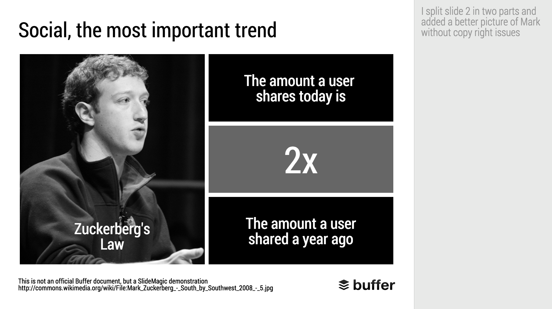
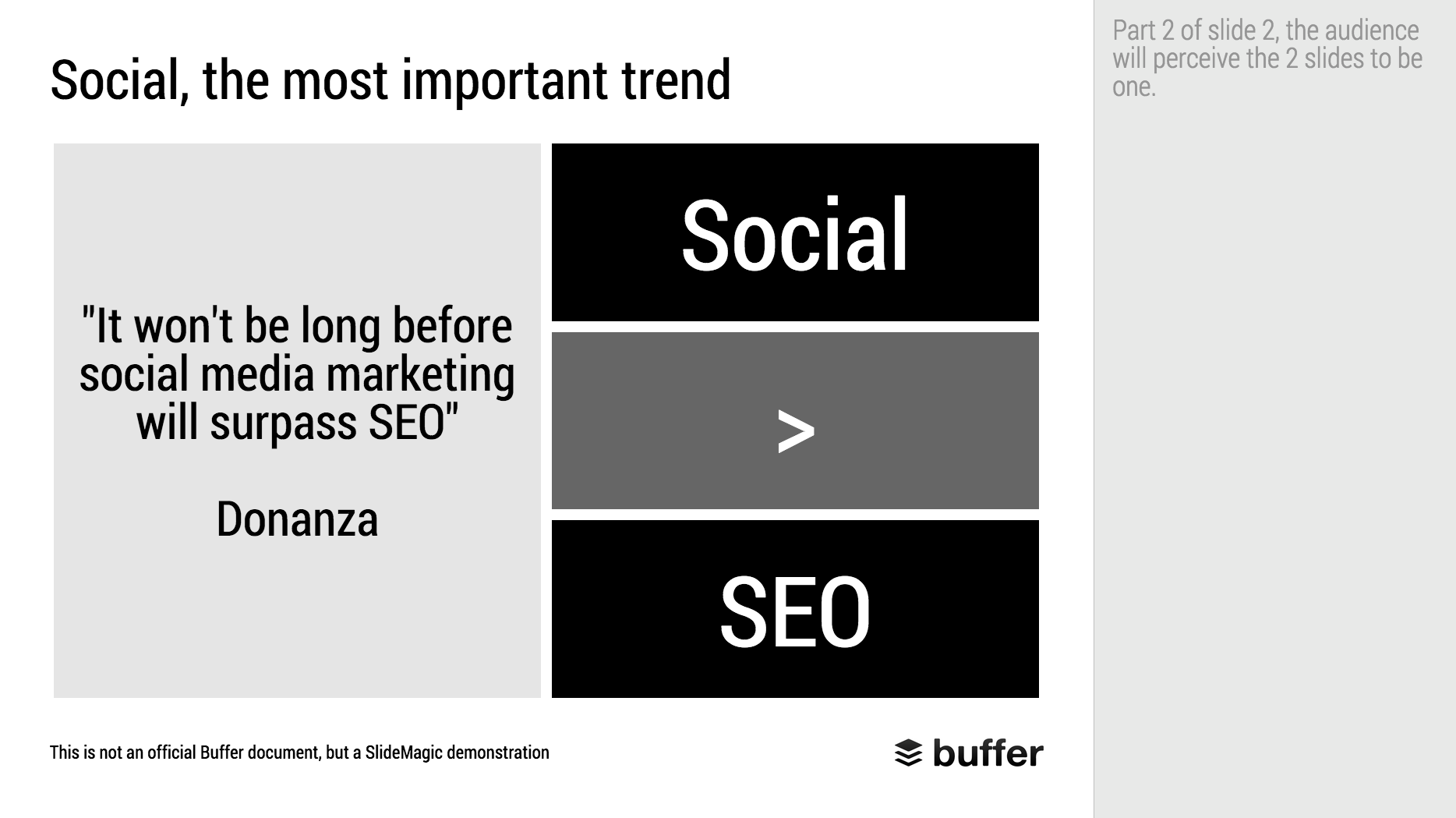
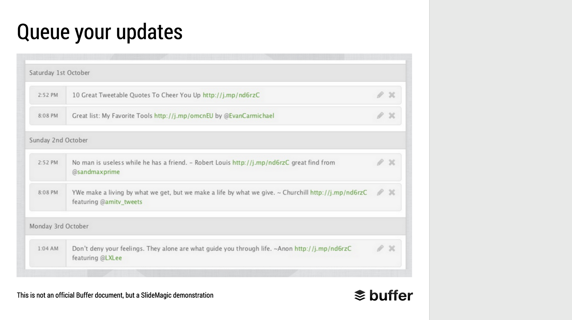
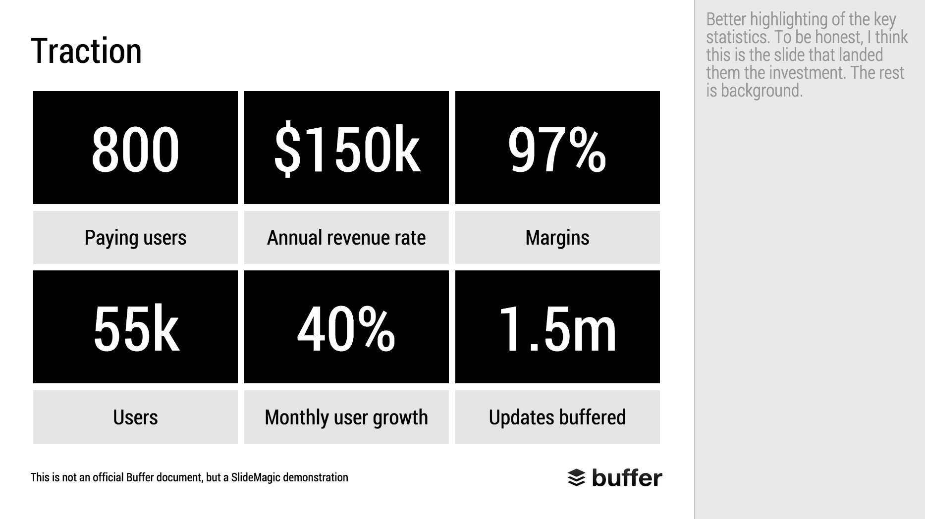
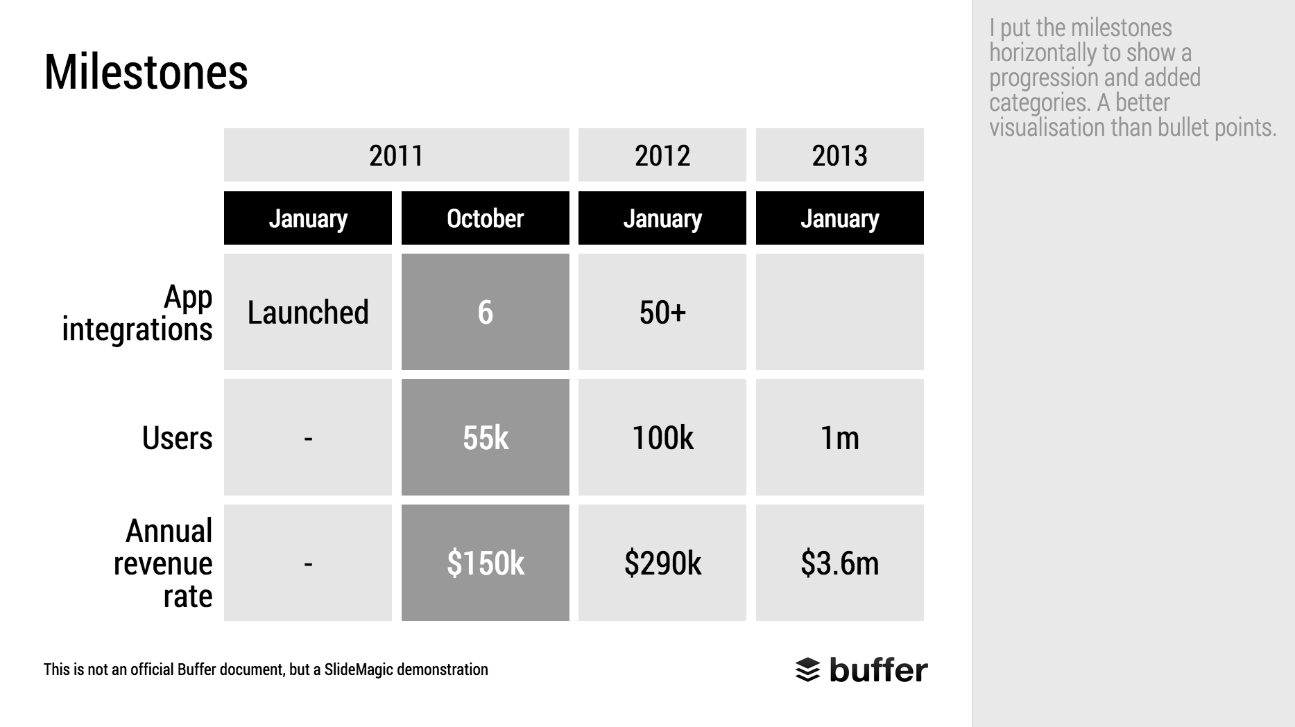
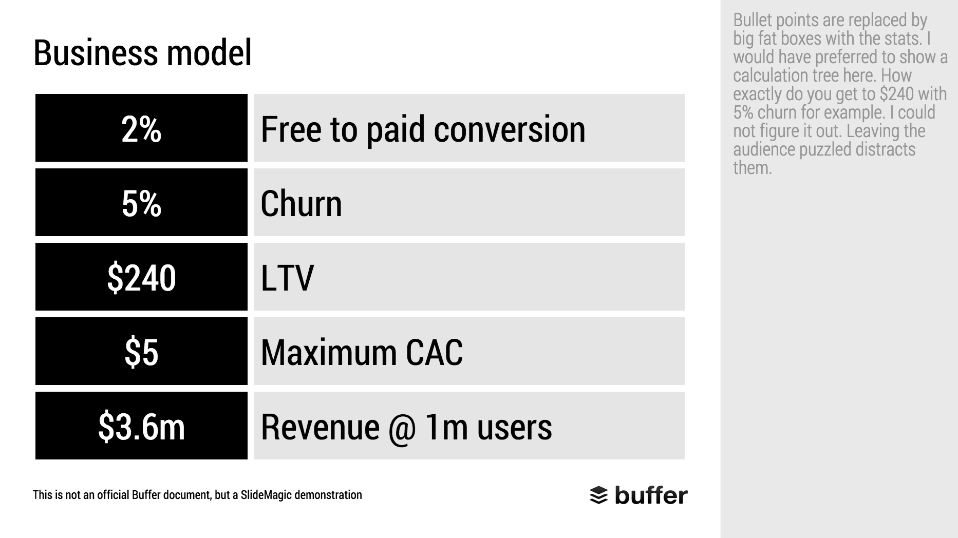
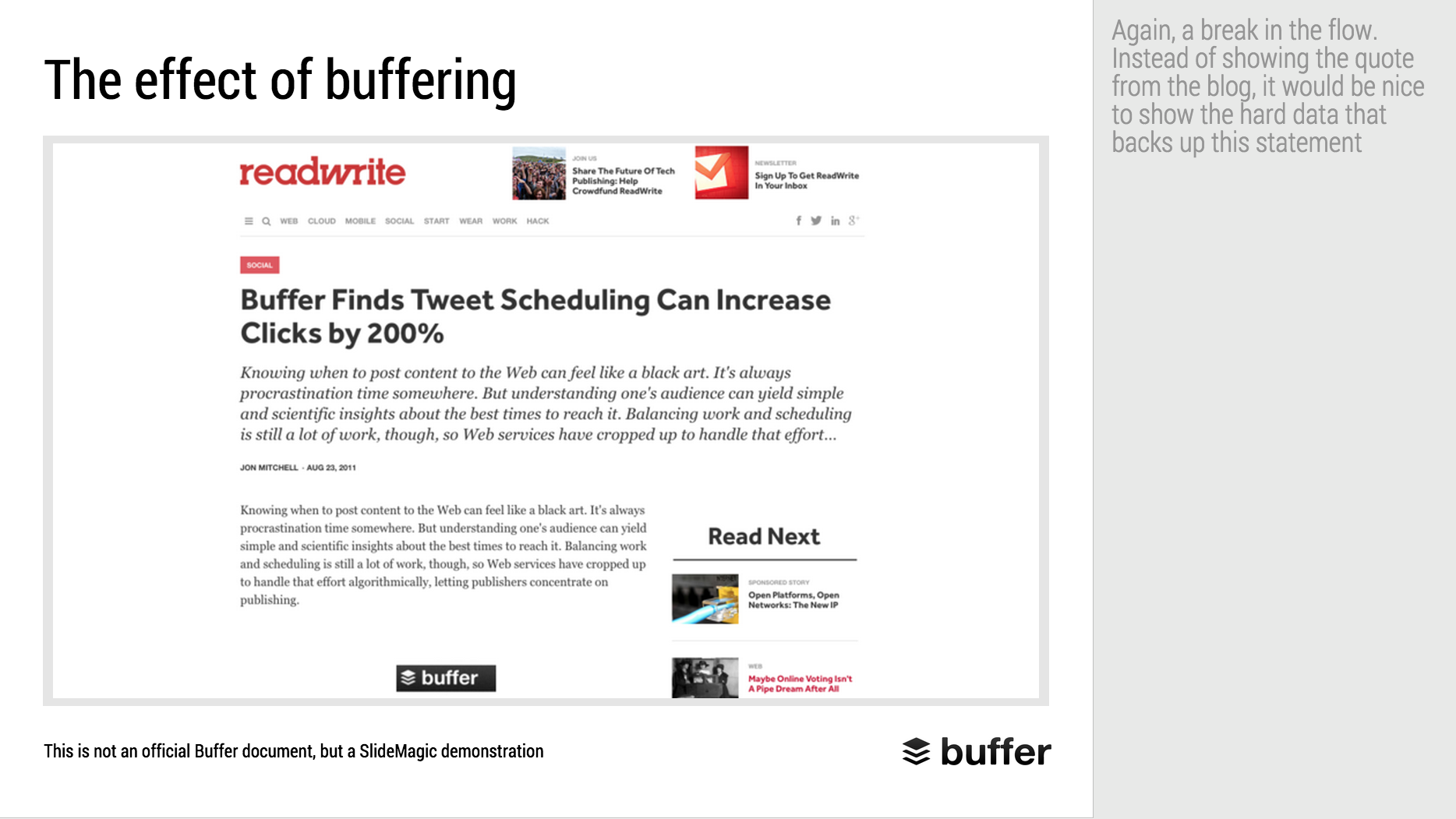
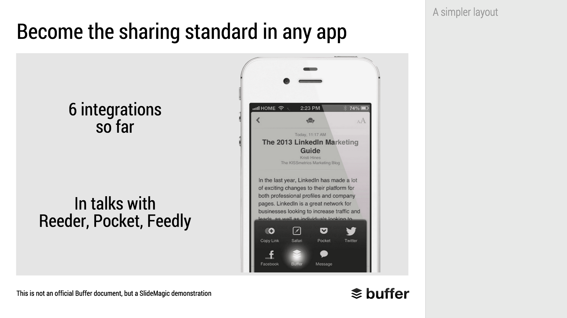
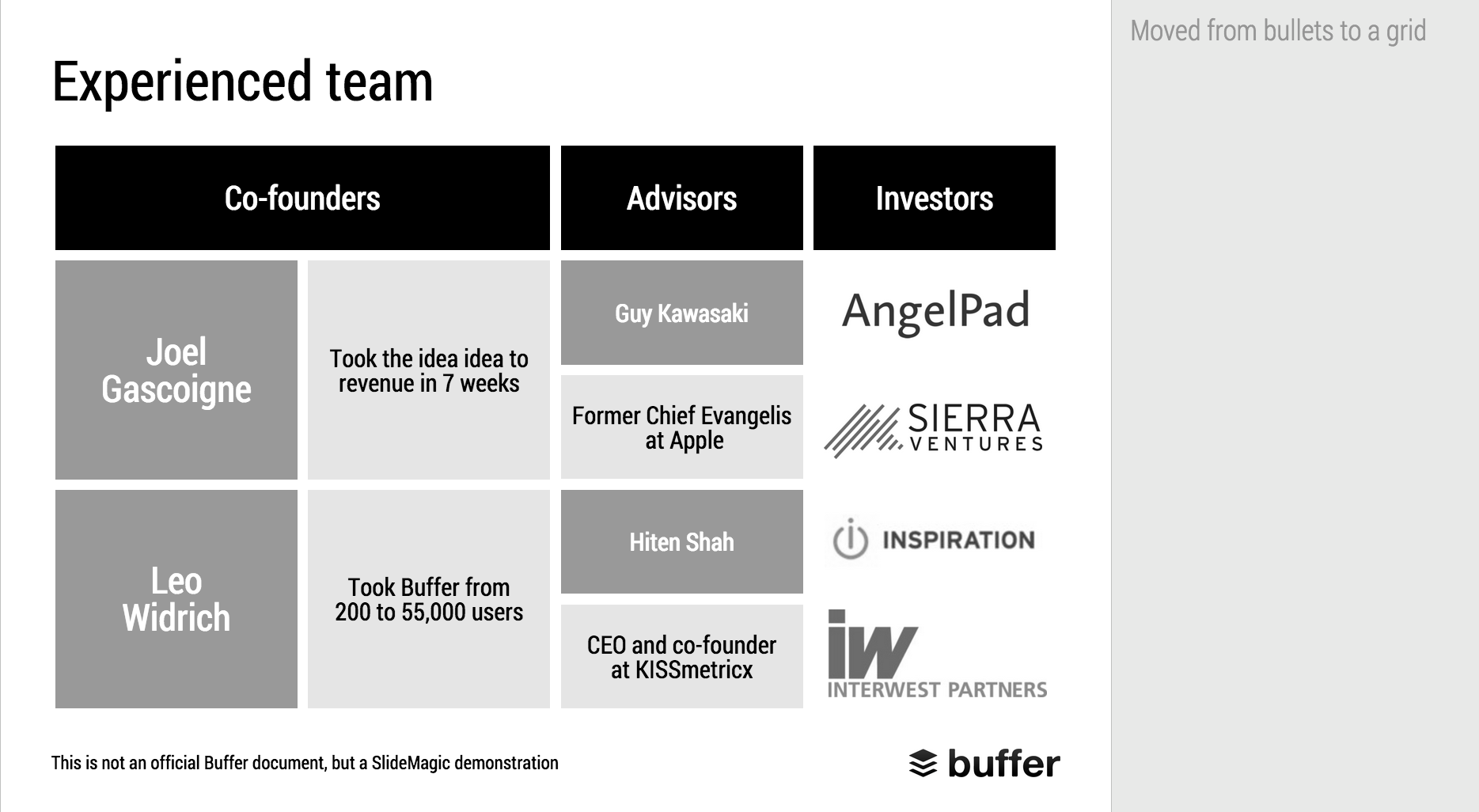
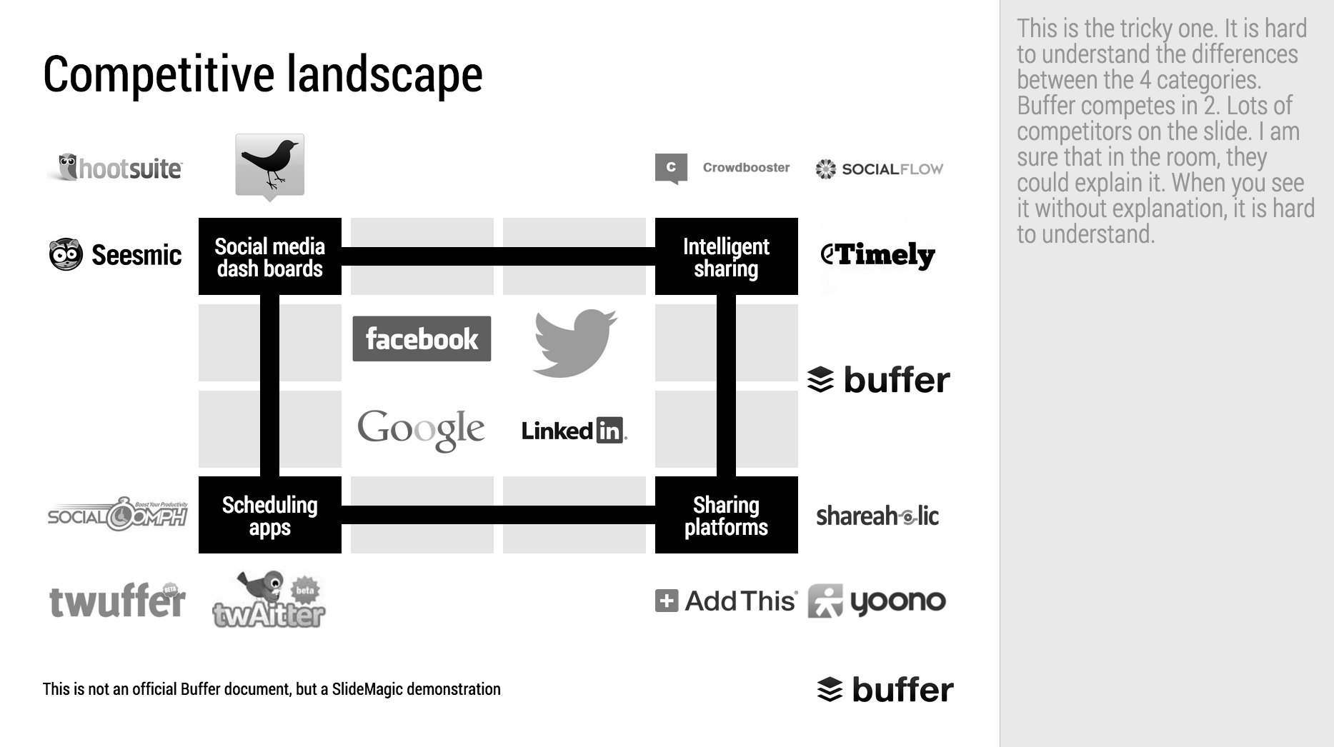
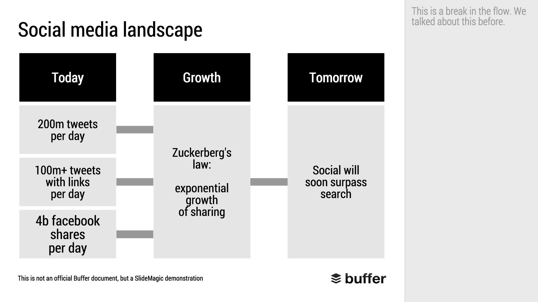
When Googling for examples of VC pitch decks, the on that Buffer used to raise $500k in 2013 ranks high. I decided to give it the SlideMagic treatment: how would the deck have looked when the slides would have been created in SlideMagic.

  • I changed the slide design to fit SlideMagic
  • I did not change the slide content
  • I did not change the story flow

I have a few comments on the slides that I have put in the SlideMagic explanation boxes.

Here is the original:

Here is the same deck in SlideMagic. You can clone this presentation to your own SlideMagic account by clicking this link and use some of the slide concepts in your own presentations. I have also added this presentation as a template in SlideMagic's template library.


Art: Johann Zoffany paints a group of Englishmen in Rome for the Grand Tour, united only by their wealth and love of art; unlike most conversation pieces, this was not a commissioned work


SlideMagic: a platform for magical presentations. Free student plan available. LEARN MORE
Reading, watching, listening, writing, presenting, telling

Reading, watching, listening, writing, presenting, telling

They are all different activities, they all require different slides:

  • Presenting and watching: The creator stands on stage with some visual support, the audience watches the performance. You have 3 types of slides:
    1. Slides that set the mood (a big picture/word/sentence)
    2. Slides that show a fact/trend
    3. Slides that show how things are related
  • Writing and reading. The creator writes text (facts and ideas held together by a story line), and the reader reads them, without assistance. Slides: text pages or bullet points.
  • Telling and listening. No slides, the creator imagines, translates to audio, the audience listens and reconstructs.

You see where it goes wrong. People use slides meant for reading to an audience that is watching.

The more I think about it, any slide that just lists stuff in a sequential order without any other relationship, should just be eliminated out of a presentation that is meant for watching and replaced by multiple "mood slide", "fact/trend", or "relationship" slides.

Fact and relationship slides could actually get complicated and busy in some cases. Bullet point slides of unrelated items can be incredibly clean and minimalist. The first are OK, the latter not.

I need to develop this quick thought a bit further in future blog posts.


Art: In England, artist Francis Barraud (1856-1924) painted his brother's dog Nipper listening to the horn of an early phonograph during the winter of 1898. Victor Talking Machine Company began using the symbol in 1900, and Nipper joined the RCA family in 1929.

SlideMagic: a platform for magical presentations. Free student plan available. LEARN MORE
Slide icons

Slide icons

Repeating the whole story of your presentation on the last slide is boring. You want to end with a "boom" and quickly remind people of the most important message in the presentation. I usually do that with repeating a key visual (just one). Using (the cliche) that a picture says more than a 1,000 words, the repeated image brings back the full richness of the discussion you had in one millisecond. Much more efficient than writing a bullet point.

If you have to repeat multiple messages, here is another trick: use small screen shots of slides. At the end, the audience does not need to be able to read the entire slide anymore. The thumbnail is a quick visual reminder of the content. Below an example that I created in SlideMagic.

I have added this slide design to the template file of all slides I created for the blog. You can open it in the SlideMagic app here and use it for your own designs. Just change the images.


Art: The Flute Concert of Sanssouci by Adolph Menzel, 1852, depicts Frederick playing the flute in his music room at SanssouciC. P. E. Bach accompanies him on the harpsichord.

SlideMagic: a platform for magical presentations. Free student plan available. LEARN MORE
Comcast pitching lessons

Comcast pitching lessons

The Comcast-Time Warner Cable merger fell through. Fred Wilson makes the case that this is probably a good thing, not so much because of consumer choice, but on the other side of the business: content providers trying to get through to consumers with their offering (Netflix, etc.).

This article in the NYT provides some interesting background on the failed $25m lobbying and pitching effort. Some quotes:

"He was smothering us with attention but he was not answering our questions"

"And I could not help but think that this is a $140 billion company with 130 lobbyists — and they are using all of that to the best of their ability to get us to go along"

1) If there are elephants in the room, huge obvious issues that need to be addressed, you have to deal with them, somehow. Avoiding the issue will not make the issue go away.

2) Beyond a certain point, "slick" is actually working against you, when you try to convince a human. (The same point I made with respect to highly sophisticated videos).


Art: The colossus, Francisco de Goya, 1808–1812

SlideMagic: a platform for magical presentations. Free student plan available. LEARN MORE