Viewing entries in
Story

Lost in translation

Lost in translation

Many presentations are good because there are many steps involved between the “source” and the “receiver”

  1. You have the story in your head as a complex set of ideas that are entangled and interdependent

  2. You start writing it down in short hand, which require you to “flatten” the multi dimensional story into a sequence.

  3. The sequence of bullet points now becomes a visualisation of your story. Instead of listening to a complex verbal argument, your eyes glance through the points and you can change the order at lightning speed. Cut, paste, slice, dice, until it looks good to you (without taking into account how it sounds).

  4. Many people stop here and jump to stage 6

  5. Now, chunks of this “visual” bullet point story get translated into visuals, another transformation: sentences, words, paragraphs get turned into visual compositions and graphs.

  6. The presentation to the audience is no longer your story, it is you translating the visuals back into sequential verbal text.

  7. The audience listens to the sound track of your slides and tries to reassemble the story that was in your head when you started the whole process.

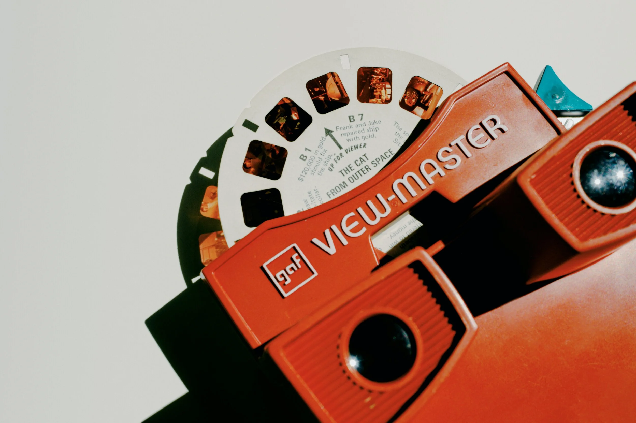
Photo by Eirik Skarstein on Unsplash

SlideMagic: a platform for magical presentations. Free student plan available. LEARN MORE
A bit less logic, a bit more story

A bit less logic, a bit more story

Most project or research result reports go like this:

  • Objective: what were you trying to do?

  • Approach: how did you do it?

  • Results: what is the data you got?

  • Conclusion: what did you find?

This is almost a chronological recording of your work. Logical, organized, exhaustive. Your peer scientist, boss,, teacher, will approve, you did the work thoroughly and got to some interesting findings.

It is not the most exciting structure though. Most novels or movies do not follow a chronological timeline. To make things more interesting, you need to take your audience through a story, which might mean breaking the logical flow a bit.

  • Conclusion: what did you find?

  • Objective: why was this so special, why was it never found before?

  • Results: what is the (tiny) subset of all your data that proves your point?

  • Approach: why was this so tricky to achieve, what hurdles did you overcome to get there?

The key to story writing in business is to pick off the questions your audience is likely to have next. The biggest one first (often surprisingly: “what are we talking about?”), which leads to the next big one (“Isn’t Google doing this already?”), which leads to the next one, (“That does not sound like a big deal to me?”), etc. etc.. The sequence of questions are different for each situation, depending on your topic and your audience.

The results upfront approach works well in business: leaving your audience guessing will just distract them. When it comes to movies, you might want to leave the plot reveal to the very end…

Photo by Daniel Cheung on Unsplash

SlideMagic: a platform for magical presentations. Free student plan available. LEARN MORE
Making it personal

Making it personal

Audience or customer segments can be very abstract. Mid thirty women in socio economic class C… C-level executives with operational responsibility.

To make things more personal, you can replace the abstract definition by someone you know that fits the segment. A friend, a colleague. What if I had to present to her?

Photo by Mario Purisic on Unsplash

SlideMagic: a platform for magical presentations. Free student plan available. LEARN MORE
Corporate vs consumer audience

Corporate vs consumer audience

Here is a fragment from the introduction of the upcoming Windows 11 operating system by Microsoft’s CEO Satya Nadella.

I think I sort of get what he trying to say, but it is not obvious. This looks like a derivative of the many internal Microsoft discussions that must have taken place how to position Windows against Mac OSX, iOS, and Android, but now with these names taken out. It makes sense for Microsoft employees that were part of these discussions, to a consumer, a bit less so.

He also builds up to a major message in the beginning that ends in making the “consumer agency” point. For most foreign English speakers, “agency” is usually a group of people that work in advertising (or even presentation design). The other meaning is not very well known and it is risky to make this the headline of your whole pitch.

SlideMagic: a platform for magical presentations. Free student plan available. LEARN MORE
Keeping the suspense

Keeping the suspense

The award ceremony of a piano competition builds up to the climax of announcing the #1. But keeping the suspense is not always right. In investor pitches, keeping your audience guessing what it is you actually do, is not a smart thing to do (previous post).

The other day I came across another situation where it did not really work. Email invitation: important org update during the weekly update call. So everyone expects the announcement of a promotion or departure of someone senior. Leave the anecdote, intro, buildup aside. Say what is happening in the first sentence, then provide compliments, congratulations, thank you’s.

Photo by Malcolm Lightbody on Unsplash

SlideMagic: a platform for magical presentations. Free student plan available. LEARN MORE
The spontaneous speech

The spontaneous speech

Here in Israel we had an eventful swearing in of a new government yesterday. The “swearing in” was preceded by a lot of swearing, heckling, and screaming. One of the members of parliament tossed his prepared speech and instead delivered a spontaneous one on the spot, denouncing the behavior of some of his colleagues.

In the world of presentations, many probably have observed this. You work for months on a document/presentation, think carefully about every slide, and then, when put on the spot without your slides, speaker notes and/or projector, you delivery the whole story eloquently and seemingly without any preparation.

Well, not really without preparation. You have been building this story for months in your head. Without the work, the spontaneous presentation would never have worked. It always a good health check for your presentation, “ditch the deck”, and scribble your story if you had to tell it right now without any support. Then compare notes honestly.

Spontaneous speeches are not for everyone. You need to have the plot very clearly in your mind and avoid being side tracked on tangents, losing your energy and ending the story without the punch.

Photo by Steve Johnson on Unsplash

SlideMagic: a platform for magical presentations. Free student plan available. LEARN MORE
The audience is always right

The audience is always right

Sometimes, you can be so absorbed in your own story that your forget to put in the obvious in your pitch deck.

Yesterday I overheard a healthcare VC reviewing a pitch deck for a new diagnostic tool. Pages and pages about the impressive team, the excellent trial results and robust data, until what the tool actually was diagnosing was revealed on page 15.

An investor who is scrolling through a deck to find an answer to an obvious question is not paying much attention to other information that is put on the slides.

Maybe in this case, this answer was actually written somewhere in page 1 of the deck, but remember that when it comes to presentations, the audience is always right.

Photo by Girl with red hat on Unsplash

SlideMagic: a platform for magical presentations. Free student plan available. LEARN MORE
Purging slides

Purging slides

Following on yesterday’s post, here are some examples of slides you could get rid of when you want to make your deck shorter, without diluting the message.

They key idea is to see the difference between an analysis deck and a story deck. The first is your working document and contains all the information, data, that you needed to get to your conclusion. Everything is organized, logical, referenced, backed up. The story deck’s sole purpose is to get your audience to do something, most of the times this will be moving on a sales or investment process to the next stage (i.e., land the invitation for a zoom call).

Some stuff that usually sits in your analysis deck, and is not essential in your story deck (in random order):

  • Detailed competitor analysis, especially when they follow a repetitive framework page after page, competitor after competitor

  • Historical analysis, all the milestones your company went through in the past 5 years

  • Market backgrounds that do not add insight to what is generally known (facebook user base developments, mobile phone penetration, etc.).

  • Any sort of business school framework that was once useful on a whiteboard, but now feels a bit forced because it does not exactly fit your situation (what the audience as you put up the SWOT slide)

  • Scenario and variance analysis and/or backup of financial assumptions

  • Screenshots of stages in your app that do not really differ from anyone else’s (the log in page for example)

  • Etc.

If your page does not ‘scream’ a very important message for your story, you can take it out.

But to contradict myself, sometimes the opposite is true. A seemingly incredibly boring detail can make all the difference to an informed audience. For example, some retention statistic that every investor in the SAAS market is looking at, or a specific statistical benchmark in your clinical trial results.

Happy purging.

Photo by JESHOOTS.COM on Unsplash

SlideMagic: a platform for magical presentations. Free student plan available. LEARN MORE
Three approaches to making your deck shorter

Three approaches to making your deck shorter

Overhead: “No, don’t summarize the presentation, putting more info on fewer slides will just make it harder to read, just send the whole thing”. I see a number of ways you can make a deck shorter.

Compressing. The common approach to shortening a presentation is to take the shortening literally: reduce the physical number of pages. Smaller fonts, combining the text chart and the bar chart on one page, etc. The resulting deck contains the same amount of information, and would in theory take the same amount of time to present.

Dumbing down. The second approach is to make the story simpler. Replace complex chart with simpler headlines, eliminating complex plot tangents. Your presentation shorter, but it lost some information.

Plot writing. Here you try to extract the story from the pile of data and slides. You view your presentation deck as a completely different document than your project presentation. It does not have to be exhaustive, the logic flow does not have to be business school strategy-like, not every strategic option deserves equal wait.

Most people start with compressing. Then, after reading presentation blogs like these, realize that pretty pictures and big words look so much better, but end up dumbing down their deck. Becoming a plot writer is the challenge.

Photo by Nery Montenegro on Unsplash

SlideMagic: a platform for magical presentations. Free student plan available. LEARN MORE
Your placeholder, not the audience's

Your placeholder, not the audience's

Some slides can stick around forever in a presentation. Over months, maybe even years, they turn into mental placeholders for you, the presenter. You see the slide from the corner of your eye, and you move effortlessly into a section of your pitch.

But the content of the slide might actually no longer resemble what you are speaking about for someone who sees it for the very first time. Time for some spring cleaning in your pitch deck.

Photo by Arno Smit on Unsplash

SlideMagic: a platform for magical presentations. Free student plan available. LEARN MORE
The last page = a billboard

The last page = a billboard

That’s the one that is sitting on the Zoom screen for 30 minutes when you take questions. Here are things that are a bit boring to look at during that time:

  • THANK YOU!

  • Q&A

  • Appendix

  • A super detailed recap of the entire presentation in 15 bullet points

  • A super detailed Gantt chart of the next steps

  • The chart with your weakest data that you had to pull up to answer a question

  • The chart with the calculation mistake that triggered a question

The last slide is a billboard that can get engraved in people’s memory like a Super Bowl ad (with a slightly smaller audience). So better choices are a memorable visual that you used somewhere in your presentation to explain the opportunity, a nice product shot. Make sure you navigate back to it when needed.

Photo by Jaxon Lott on Unsplash

SlideMagic: a platform for magical presentations. Free student plan available. LEARN MORE
Pop the suspense

Pop the suspense

I came across a pitch for a business idea that involves a few different businesses, with a number of different people.

The natural way to tell the story is a build-up: here is this interesting problem, that is a massive opportunity, that only we can solve with this interesting technology.

Investors are different from viewers of an action-packed thriller. The moment the “opening title” starts rolling, they start evaluating the investment opportunity, trying to identify the obvious strengths, the obvious weaknesses, and the question marks.

So for investors, you might have to skip to the last page of your thriller and uncover the mystery, before starting your pitch. Here are the 3 businesses, this is what they roughly do, and these are the people involved for each one of them. No let’s start from the beginning.

Photo by Quinn Buffing on Unsplash

SlideMagic: a platform for magical presentations. Free student plan available. LEARN MORE
Knowing your audience

Knowing your audience

A follow-up on yesterday’s post about convincing the center when it comes to COVID vaccines.

Most people who create presentations are not marketeers or PR professionals. They hear people (including presentation designers like me), talk about how important it is to think about your audience when crafting slides. And when thinking about the audience, they don’t have much sophisticated data. Insights are likely to be basic: “They do not believe that we can get traction with our search engine that needs to beat Google”.

Global Web Index did research in people’s attitudes towards a COVID vaccine, the results of the findings are put in this visualisation by Visual Capitalist. The main message to me about this pretty but busy graphic is that it is complex, things are not clear cut.

global-attitudes-towards-vaccines.jpg

Here is my summary of the segments, and a possible communication strategy. (You can find this slide in the online template bank, or search for ‘covid’ in the SlideMagic desktop app)

Screen Shot 2021-02-11 at 8.22.16.png

Most business presentations will not have the luxury of a detailed audience analysis, but it is an interesting thought process of running through an imaginary one.

SlideMagic: a platform for magical presentations. Free student plan available. LEARN MORE
"Let's put that slide in the appendix"

"Let's put that slide in the appendix"

These were the dreaded words of your McKinsey project manager when she ripped out your analysis masterpiece from page 10 to page 57 in the document. Then, as a junior analyst, I felt depressed as I interpreted this that my work has been for nothing.

Here are some things that project manager could have said in addition:

  • Most of the time, slides that communicate the answer are completely different from slides that show how you got to the answer.

  • Related: the project is moving on now, we have convinced the client that our assumptions are correct, now we need to get them to move and take action

  • Without that slide that sits now on page 57, we would never have gotten where we are now. If we still had to talk about that analysis on page 10, we probably were doing something wrong

Photo by Nana Smirnova on Unsplash

SlideMagic: a platform for magical presentations. Free student plan available. LEARN MORE
"This is the part I always skip..."

"This is the part I always skip..."

<click><click><click><click><click>

If you always skip that part, maybe it is time to reshuffle your slides to a flow that comes more natural to you.

There was probably nothing wrong with the original slide flow you used, but things can get stale:

  • You switched from a project flow, where the series of charts reflected the sequence of the project work, to the story that sells the outcome

  • You have a much more powerful presentation opening with a real life customer story than the usual market data slides that are sitting there

  • You are still using the same slides that you put in 3 years ago

  • The audience of your presentation has changed, they either have caught up and know more things now, or you are presenting to different people.

Time for spring cleaning of your pitch?

Photo by Jeremy Sallee on Unsplash

SlideMagic: a platform for magical presentations. Free student plan available. LEARN MORE
"Please send us the slides 1 month in advance"

"Please send us the slides 1 month in advance"

This tweet about a habit of conference organisers:

It does not make sense. Nobody prepares slides that long before a presentation, nobody reviews presentations 1 month in advance, and the request is probably not credible.

Why do conference organisers try?

  • To spot potential content disasters early

  • To spot potential time over-runs early

  • To spot potential layout disasters early (bullet points…)

  • To spot potential technical issues early (‘What, no Apple Keynote?”)

These are valid concerns and the solutions is possible somewhere in between.

  • Rather than sending a broadcast request, do some research about your speakers, leaving the pros, and focus on possible weak links with coaching (and hassle)

  • Ask for a draft of a “typical presentation” way in advance to get some sense of what is coming

  • Set a very credible deadline 2-3 days for the event (“we are building the conference hard drive”)

And, if you are a speaker and do not have a story on the shelf (it is the story that matters, not the slides), it is probably a good idea to start getting your head around what you want to say a few weeks in advance. Slides can be made in a couple of hours (try using SlideMagic, it is really easy), crafting a compelling story takes a lot longer. Starting to think about it early means that your brain worries about it, even when you are not actively aware of it and things will fall in place later.

Photo by Tim Gouw on Unsplash

SlideMagic: a platform for magical presentations. Free student plan available. LEARN MORE
Four ways to write a story

Four ways to write a story

My daughter is progressing through high school and is now asked more and more to write essays with her opinion. This got me to think about four levels of writing a story:

  1. Without having a clear idea of the answer/plot, you start jotting down your thoughts with the main objective of reaching the total word count, and buzzword count targets. This gets you a fail on an exam, and you can also compare this to an unprepared presenter “winging it”.

  2. You write a skeleton of the points you want to make, in the right order, with main headings and sub bullets, all in super short grammatically incorrect and incomplete language (because you are the only person who needs to understand it). This is probably what the high school teacher is trying to reverse engineer from the full essay when grading it: did she make the right points.

  3. The skeleton, but now expanded into proper language. It makes the point, it is logical and organised, it is grammatically correct, but also, it is pretty boring. This would be a typical exam submission of a student, or a management consulting report

  4. A convincing story, that abandons some of the logical rigour of the previous level and replaces it with an interesting flow, with some tension that resolves to the conclusion. As opposed to “winging it”, this is a story that a skilled salesperson can pull off on the fly without any slides or skeletons. Very few business documents or high school essays make it to this level.

Photo by Road Trip with Raj on Unsplash

SlideMagic: a platform for magical presentations. Free student plan available. LEARN MORE
Convincing the center

Convincing the center

The pattern repeats in demonstrations and political debates:

  • The other side is clueless

  • Everything the other side does , does not make sense

  • We are right, they are wrong (always)

  • Etc.

You will never convince people who are deeply attached to their beliefs. The people who can swing the majority are in the center. Questioning the intelligence and making fun of the people just across the line of the center (and their friends) is not going to make it easier for them to switch.

Preaching to the converted with a megaphone won’t help. Listening to, understanding, and engaging with the doubters possibly could.

This is true for political debates, but also for sales and investor pitches.

Photo by Chris Slupski on Unsplash

SlideMagic: a platform for magical presentations. Free student plan available. LEARN MORE
"Muppets"

"Muppets"

A while ago it was discovered that investment bank Goldman Sachs refers to unsophisticated, non-professional, retail investors as “muppets” and was deploying massive computing power to trade against them.

“Muppet” is an example of a business language shortcut: one word that summarises a pretty complex concept or customer segment. Short cuts can make internal communication in a company very efficient. Everyone knows exactly what is being discussed without having to resort to long descriptions that change from presentation to presentation.

To the outsider though, they have a different meaning. Many people complain about “buzzwords”, especially when shortcuts that don’t mean anything leak into external communication. Or worse, as in the case of Goldman Sachs, you end up offending a lot of people.

Young kids also find out that is extremely hard to change back nicknames into a more grown up name when you get older. The same is true for business shortcuts. Better choose them wisely at the beginning, because they might just get a wider audience than that first conference room meeting.

With respect to “muppets”. Yes, amateur investors might not understand the interest rate climate, yield curves, market overhang, and inflation risk. They make mistakes, but they could also have a hunch that that weird flat phone with a touch screen could end up being a really desirable product that will change people’s lives 10 years from now. An algorithm powered by a super computer probably would not make that call. Muppets are a nuanced segment with many sides to take in to consideration. Better pick a better word.

Photo by Crystal Jo on Unsplash

SlideMagic: a platform for magical presentations. Free student plan available. LEARN MORE
The side track trap

The side track trap

Now that I am teaching my kids how to code with the help of online courses I can see where instructors take the wrong turn. By now, I mastered the material myself, and can put myself in the position of someone who is trying to understand it (I was there myself a year ago).

One mistake is a side track trap. You introduce a completely new concept, but before explaining roughly what it is about, you introduce a few exceptions or unusual use cases where you could also apply this new concept, that the presenter has not fully introduced yet).

From a logic flow perspective, this could look great: we cover all the use cases together. From a teaching perspective, this is confusing. A reference video (‘How did that work again exactly?”), is different from a 101 introduction video.

I am not sure the instructor does this intentionally. Maybe videos get edited later and she needed to find a place to insert this specific concept, “plop”, this seems like the right spot.

Notice the difference between detail and side track. If you need to go into the details to explain something, a newbie can probably follow along as long as you stick to the one specific use case of pieces of information that reinforce each other. Leaving things at a high level (i.e., no details) but lots of different tangents can still be very confusing for the newbie.

This relates to the blog post earlier this week, where I discussed answering questions with the risk of tripping up your story line.

Photo by Jacob Meves on Unsplash

SlideMagic: a platform for magical presentations. Free student plan available. LEARN MORE