Creating more white space in a picture

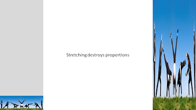
Many stock images lack sufficient white space for text. Stretching an image distorts the proportions.
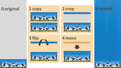
A trick to get around this problem:
  1. Copy the image
  2. Crop a small strip at the top of the image
  3. Flip the strip
  4. Stretch the strip only

SlideMagic: a platform for magical presentations. Free student plan available. LEARN MORE

Experimenting more with typography

I am creating a presentation for a client today that provides a very simple solution for a very complex problem. While moving around the letters in the words I saw an usual pattern:
  • completely different meanings
  • very similar words...
I need to find more of these.

SlideMagic: a platform for magical presentations. Free student plan available. LEARN MORE

Humor in your presentation - Add Letters

Add Letters is a site full with image generators. I noticed that they've added a few new images. My personal favorites are those related to The Simpsons. 

SlideMagic: a platform for magical presentations. Free student plan available. LEARN MORE

(Snow) white space to the extreme

Don't fill up your slides to the last square inch. Instead: leave white space (or negative space). Have the courage to write nothing, take a visual break. This ad for a ski resort takes it to the extreme, but makes its point brilliantly (large image here). Via Ads of the World.

SlideMagic: a platform for magical presentations. Free student plan available. LEARN MORE

"Open source funding" - business plan competition

I am a bit late in discovering this blog post by Mark Cuban. To enter the competition, post your business plan (presentation) in the open for everyone to steal, and Mark will select one for funding. It will be interesting to see the candidates and ultimately the winning presentation/idea.

SlideMagic: a platform for magical presentations. Free student plan available. LEARN MORE

I am starting to understand when to use 3D in PowerPoint

A user of PowerPoint 2007 has an enormous amount of 3D tools at his/her disposal. It is only after a year or so of working with this software that I start to understand how 3D could help get your message across.
Many 3D effects are NOT useful. Three dimensional graphs make it harder to match the data to the value axes. Adding "random" bevels, reflections and shadows to a PowerPoint object does not make it an elegant graphical element. The fact that PowerPoint can do it, does not mean you have to use it.
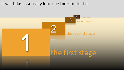
Why don't we use 3D for what it can do best: show distance? The example below shows a time line that we expect to last forever. 
Adding some 3D effects will make it much more powerful:
Other examples could be a landscape scattered with competitors battling for market share. Or a quadruple layer of defenses that can protect the intellectual property of a startup. 
Notice that you actually do not need any of the PowerPoint 2007 effects to create a 3D effect. It is all about positioning shapes, and reducing the size of objects and fonts as you come closer to the imaginary horizon.
Use 3D when you think two dimensions are not enough to tell your story.

SlideMagic: a platform for magical presentations. Free student plan available. LEARN MORE

PowerPoint template colors and color blindness

My Vincent van Gogh color set from a few days ago is not very good for people suffering from red-green color blindness. Use Vischeck to test your own templates. To do so, you need to "save as" a PowerPoint page as "PNG".
A side-benefit of this test is that you get sense of what happens if someone prints your presentation on a black & white printer. (But hey, the B&W white test is the easiest of all: print preview)
Somewhat related: an earlier post about designing presentations with people suffering from dyslexia in mind.
Via Richard Garber. A more elaborate post on Vischeck and PowerPoint in this post on the Indezine blog.

SlideMagic: a platform for magical presentations. Free student plan available. LEARN MORE

Lunarr Elements - "Twitter for beautiful images"

Somehow Stumbleupon has gotten too complicated for just dipping into a series of beautiful images now and then. Lunarr's Elements keeps it pure and simple. You can vote up and down images and follow (get followed by) people with similar visual tastes.

SlideMagic: a platform for magical presentations. Free student plan available. LEARN MORE

My presentations on SlideShare

Many people ask me for examples of my work. The problem is that most of it is highly confidential. Some of my presentations are in the public domain, and I have embedded them in this post. You should realize though that most of these presentations are designed for a big conference audience: large images, very little text. This is not the only style in which I can create presentations (see an earlier post about this issue). Having said that, here we go:

SlideMagic: a platform for magical presentations. Free student plan available. LEARN MORE

"Color me creative"

People have been talking a lot about how colors influence behavior. A study published in Science Magazine today added one more entry to the list.
  • Red: improves performance on detail-oriented tasks
  • Blue: stimulates creativy
The article goes on to discuss underlying causes. Stressful colors like red might enhance effectiveness of getting things done. Blue "calm" colors are better for coming up with that brilliant idea.
Regardless of whether these type of studies are right or not: picking a color scheme for your company look and feel (and/or your PowerPoint presentation) is a far more important decision than deciding the graphics of your logo.

SlideMagic: a platform for magical presentations. Free student plan available. LEARN MORE

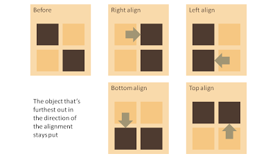
Which of the 2 objects will move when you align?

When you align 2 or more objects in PowerPoint, one will stay put while all the others move to line up. It is easy to predict which one will move. See the diagram below. Click on the image for a larger picture.

SlideMagic: a platform for magical presentations. Free student plan available. LEARN MORE

How to create Photoshop-style Image cut outs in PowerPoint

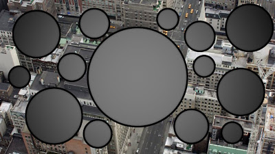
Photoshop has sophisticated tools for cutting our shapes from images. In PowerPoint you can reach similar effects by filling a shape with an image. 
When selecting a fill for a shape, choose "picture or texture fill" instead of a color:
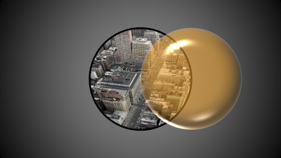
Alternatively, choose "slide background fill" to creat "holes" in your graphics.

SlideMagic: a platform for magical presentations. Free student plan available. LEARN MORE

Godin and Becker on planning for the end

Do you save the most important part of the meeting for the end, when everyone is already standing? See Seth's Godin full post here. Bert Decker added additional thoughts here. Things you should NOT do:
  1. Step back
  2. Look away
  3. Move on the last word
  4. Raise your hands
  5. Rush to collect your papers
  6. Blackball yourself

SlideMagic: a platform for magical presentations. Free student plan available. LEARN MORE

Using historical paintings as an inspiration for color schemes

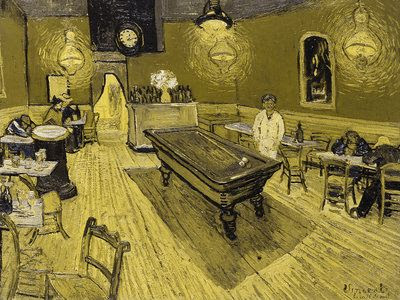
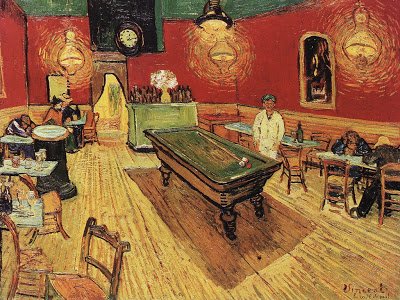
Great painters use colors to set the emotion of a painting. An example is Van Gogh's "Le Cafe de Nuit". He talks about this painting in one of his letters to his brother Theo:
I have tried to express the terrible passions of humanity by means of red and green. The room is blood red and dark yellow with a green billiard table in the middle; there are four lemon-yellow lamps with a glow of orange and green. Everywhere there is a clash and contrast of the most alien reds and greens, in the figures of little sleeping hooligans, in the empty dreary room, in violet and blue. The blood-red and the yellow-green of the billiard table, for instance, contrast with the soft tender Louis XV green of the counter, on which there is a rose nosegay. The white clothes of the landlord, watchful in a corner of that furnace, turn lemon-yellow, or pale luminous green.
It is interesting that Van Gogh talks about clashing colors, but the end result is in fact a very harmonious ensemble of colors.
Painters use intuition and a sharp eye for real-life images to create a suitable color scheme. You can "borrow" a bit of their genius by using painting as an input source for tools such as kuler to create your own color combinations. In fact, paintings might be a better source than images for this purpose.
The result is good, but not as perfect as the original. I miss the digital equivalent of the artist color pallete to mix and match colors as you go. I am starting to experiment though with going "off color scheme", injecting here and there colors in slides that do not fit 100% with the defined presentation colors.

SlideMagic: a platform for magical presentations. Free student plan available. LEARN MORE

How to build a presenter's confidence to depart from "overhead slide" presentations

Every day, I am working hard to convince my clients to switch to a presentation format that no longer resembles the hand-written overhead slides we used in the early 90s: lots, and lots, and lots of slides, pushed forward by remote control, big pictures, big fonts. The slides become the background animation of a speaker's performance. The best way to do it is by using an internal meeting, a low-risk setting to try it out. The annual company gathering, the annual sales rep conference, these are all great occasions. In these presentations I will use humor, images, and concepts that would never make it to an external presentation, but once the presenter has gone through the experience she is usually "sold". The way back to dense boring slides is closed. Subsequent external presentations will be more "serious", but never boring. One more member of the tribe.

SlideMagic: a platform for magical presentations. Free student plan available. LEARN MORE

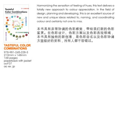
Great book "Tasteful Color Combinations" - not even available on Amazon

Found hidden away on a shelf in the book shop of the Tel Aviv Museum: "Tasteful Color Combinations" by Naomi Kuno. It is not even available on Amazon, that's why I have trouble finding a good web link to it.
The book contains 455 color schemes (with detailed RGB  and CMYK codes), organized in 14 chapters each with a different mood. ("Nostalgic and melanchology", "humanistic and natural" to name two). The first edition was published in Japan in 2004, and the English translation is not always perfect, adding to the charm of the book.
Some examples of colors schemes available (exact quotations from the book):
  • 241, Formal Kimono: the color of a patterned formal kimono for a married woman
  • 255, Homely: the cozy warm color of home where a cheerful laugh is always heard
  • 359, Glory and fame: glory and fame never fades away when quality is accompanied. The blue is for glory and the red and gold are for fame.
  • 370, Rococo -1: the elegant rococo period colors of Fragonard's paintings and dresses
  • 111, Ryugu castle: the color of a town of Ryugu castle in a deep sea, where princess Otohime and beautiful fish are said to inhabit, in a legend story of Japanese fantasy.
The colors of 111 below as an example:
I have used this book a number of times as a source of inspiration for finding color schemes for seed-level technology startups that need help developing their very first fund raising presentation. (Other techinques to find a good color scheme can be found here).
Here are the full details of the book in case you would like to try to order it:
Tasteful Color Combinations by Naome Kuno and FORMS Inc. / Color Intelligence Institute Published by Page One Publishing Private Limited, Singapore ISBN 978-981-245-228-3
SlideMagic: a platform for magical presentations. Free student plan available. LEARN MORE

Getting rid of image tags in PDF files

PDF is the preferred format for emailing out presentations:
  • Small file size
  • Clean presentation without the risk of an accidental edit
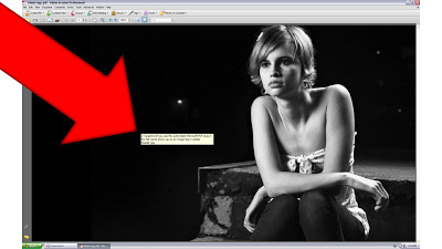
PDF conversions sometimes transfer the full file path and file name of an image in your presentation into a PDF image tag (see example below). Not very pretty.
To get rid of these image tags: Open the PDF file in Adobe Acrobat. [In version 8]: go to view, navigation panels, tags, click options, uncheck "Document is tagged PDF", re-save the file and they're gone.

SlideMagic: a platform for magical presentations. Free student plan available. LEARN MORE

Less is more: cut, cut, and cut words

Fewer words is more. The Word Wise blog posted a number of phrases that can be reduced to one word without losing meaning. (Copied in full here, but please do visit this interesing blog).
  • at all times - always
  • at the present time - now
  • because of the fact that - because
  • due to the fact that - because
  • for the purpose of - for
  • in order to - to
  • in spite of the fact that - though
  • prior to, in anticipation of - before
  • with regard to - about
  • on an annual basis - yearly
  • at this point in time - now
  • subsequent to - after
  • a large majority - most
  • be in a position to - can
  • in view of the fact that - because
  • in the event that - if
  • at your earliest convenience - soon
  • be in a position to - can
  • under the circumstances - because
There is a bigger trend here:
  1. Hand writing creates long texts, when we start we are often not quite sure how to get our point across. Mistakes are hard to correct
  2. Word processing allowed us to review (cut) text retrospectively
  3. (PowerPoint) graphics and images allow us to get rid of more text and replace them with a visual that "says more than a 1,000 words".
  4. The next step might be that we are letting go of the rules of grammar (similar to SMS messages, Tweets) in more official settings to deal with increasing information overload.
I have not (yet) reached step 4.

SlideMagic: a platform for magical presentations. Free student plan available. LEARN MORE

Using Rube Goldberg machines in your presenation

A Peugeot ad finally got me to the source of these brilliant cartoons of incredibly complex machines that perform very simple tasks through a sequence of carefully timed actions. No, they were not pioneered by Road Runner and The Coyote that's chasing him. Cartoonist such as Rube Goldberg and Heath Robinson are one of the most famous creators of these systems. Today, there still are many annual Rube Goldberg contests that challenge high school students to invent one of their own.
This Honda commercial from a few years ago is a beautiful example of how you can use Rube Goldberg-type effects in visual communication. How to use it in PowerPoint? Animating one of these machines is a challenge... Two suggestions.
  1. Build up audience anticipation. Use a simple cartoon to create a tension about something that is about to happen. The same way that a novelist leaves room for the reader to fill in the blank spaces. See an example on Nancy Duarte's blog: the hanging piano that is about to fall is a more powerful visual than that of a broken piano on the floor.
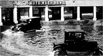
  2. "There must be a better way to do this". This is a concept I often need to get across in fund raising presentations for technology startups. Showing a very complex Rube Goldberg machine does the trick for me. (Another technique making the same point is using vintage images, here an "auto wash bowl" long before the automated car wash was invented).

SlideMagic: a platform for magical presentations. Free student plan available. LEARN MORE

Moving house - going offline

Hope to see you all back on the other side of the tunnel in a few days.

SlideMagic: a platform for magical presentations. Free student plan available. LEARN MORE