The joys of ALT ENTER

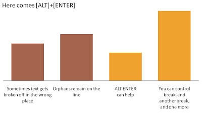
Pressing ALT ENTER in an Excel cell creates a soft page break, pushing the text down a line without "closing" the cell edit. You can use it to control line breaks in axis lables.
The other solution is to omit automated axis labels all together and put in your own standard PowerPoint text boxes under the bars in the chart.

SlideMagic: a platform for magical presentations. Free student plan available. LEARN MORE

Do good stuff

I am continuing to post some "lighter" material during this holiday week here in Israel. Gary Vaynerchuk shares my passion for (great) wine. Here is an entertaining 2 minute video encouraging you to go off and do great things. Watch how he builds his point up and pauses before he gives his recommendation how to stand out in the noise of social media. [Spoiler alert]. Writing "do great stuff" on a PowerPoint slide would not have created the same impact as this video.

SlideMagic: a platform for magical presentations. Free student plan available. LEARN MORE

Is time the new paper?

I am just reading this accurate blog post on Apollo Ideas: break up bullet point slides into multiple pages that focus on one idea each. Many of my clients object to this technique. "That's too many slides! I only have 25 minutes!" They are choosing the wrong metric; number of slides, kilos of printout, presentation file size, it does not matter. Time is the only relevant factor. When you have 25 minutes to present, you bring slide material that will not exceed 25 minutes. That could mean: 50 slides, 750 gram of handouts, 5 paper flip charts, or a 70MB file.

SlideMagic: a platform for magical presentations. Free student plan available. LEARN MORE

Book review - The Power Presenter

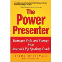
I just finished reading the book "The Power Presenter" by Jerry Weissman, a public speaking coach.
My main interest is in graphical slide design, so it is a bit unusual for me to be reviewing a book that is solely about delivery of speeches and presentations. Initially I found it a bit hard to get into the story of the book, but as I finished more and more chapters the entire plot of the book became clearer and by the time I read the last page I found that I learnt some real valuable lessons that will affect every presentation I will give in the future. The central objective of the book is to get rid of a presenter's adrenaline rush when presenting: the instinctive debate of the body whether to fight or flight a stressful situation. Rather than prescribing a number of dogmatic "presentation rules", Jerry suggests way to create a natural way to becoming a more confident speaker.
Central in his book is a concept called "ERA":
  • Eye connect: "only speak to eyes". Much more powerful than "don't turn your back to the audience", or "don't muffle your voice". It is a simple rule that everything you say, everything, should be said by looking a member of the audience straight in the eyes, waiting for eye contact, delivering the sentence, and then move on. No exception. Quite a challenge for a presenter, but it makes sense
  • Reach out with your hands and your body language to simulate the appearance of a hand shake
  • Animate, adding more drama and passion in the way you deliver your message
Especially the "eye connect" suggestion will change the way I deliver presentations in the future.
ERA is backed up by a lot of analysis of political speakers: Kennedy, Nixon, Gore, Reagon, Bush, and even Obama (however mostly focusing on his 2004 speech at the Democratic Convention). Sound bites are important for political speeches, and Jerry spends some time discussing cadence, rhythm, etc. to improve "slide-less" presentations.
When it comes to slides and graphics, Jerry bases his advice on a very conventional use of PowerPoint. The thing I like is how Jerry talks about "graphics synchronization", making sure that visuals are perfectly aligned with the speaker. Secondly he is an advocate of the "less is more" principle when it comes to slides.
I am less convinced on the slightly mechanical technique of "tell 'm what you're going to tell, tell 'm, tell'm what you just told" that he is suggesting for every slide. A bit mechanical. 
Jerry spends some time suggesting ways to deal with the uncertainty of "what slide's next" in a live presentation. Presenter view can solve this issue.
A great innovation is the access to online video clips of the speeches Jerry is discussing in the book (server bandwidth is a bit thin).
All in all a useful book about presentation delivery with many big (i.e, "ERA") and smaller pieces of advice of an experienced speaking coach.

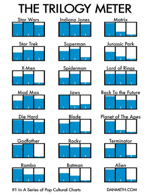
"The Power Presenter" is part of a trilogy, other books are Presenting to Win and In the Line of Fire.

SlideMagic: a platform for magical presentations. Free student plan available. LEARN MORE

When is enough enough?

Less is more. Resist the temptation to overdo slides. Like putting too much bass and treble in your HiFi system. Like a rich chocolate dessert. Like an oaked Chardonnay. Nice on first "attack", but then it starts to overpower you.
It is a holiday here in Israel, people are relaxing on a beautiful spring day. A bit of humor: artists commenting on when they consider their art work finished
Via Wooster Collective, a street art blog that is worth following. Things (language, images) sometimes get a little bit more rough over there than you will find here, but hey, it's art and there are some interesting visuals being discussed. (See a previous street art post on this blog)

SlideMagic: a platform for magical presentations. Free student plan available. LEARN MORE

A different approach to data visualization

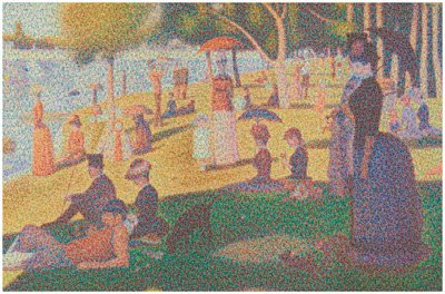
It is hard to get the magnitude of a huge number across on a slide. A $700bn bailout,how much is that? Photographer Chris Jordan takes a different approach. Repetitive patterns of miniaturized objects that form a bigger picture. Images have a political message, many of them try to put current "consumerism" into perspective.
The image below is inspired by Seurat's "un dimanche après-midi à l'Île de la Grande Jatte", and constructed from 106,000 softdrink cans.
Check out more of his images here. Via Village of Joy.

SlideMagic: a platform for magical presentations. Free student plan available. LEARN MORE

Stuck! - board games with simple PowerPoint shapes

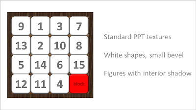
The basic PowerPoint shapes and textures can be used to re-create realistic looking board games. Here is a concept I used for a client that needed to show how its potential customers are being hindered to move around their IT infrastructure freely.

SlideMagic: a platform for magical presentations. Free student plan available. LEARN MORE

People get it - no need for SCREAMING emphasis

Sometimes you need to emphasize a very IMPORTANT !!! word in your slide (how to do underline in Blogger?).
Don't use all the tools you can use. In dense text, use italic, in PowerPoint slides make it bold, or change the color of the word. People will get it.

SlideMagic: a platform for magical presentations. Free student plan available. LEARN MORE

Esthetics in everything you do

Another ad found on Ads of the World: Samsung wide-angle CCTV.
Very good Photoshop work. Still, the resulting image is not esthetically pleasing. My personal rule: never let an ugly chart or image enter my PowerPoint presentation, ever.

SlideMagic: a platform for magical presentations. Free student plan available. LEARN MORE

Design doubles newspaper circulation - presentation lessons

Newspapers are in trouble. This TED video highlights how clever design can do miracles to the circulation of a newspaper. (For details about the presenter, see the original TED post).
Insights (for me) that reach beyond the world of newspapers:
  • There is no reason why you cannot totally turn traditional visual design upside down. Many PowerPoint slides still resemble 1990s hand-written overhead projector transparencies
  • Technology enables small firms/individual designers without big budgets to out-design big established brand names. It is all about ideas and creativity now, technical execution is not a differentiator anymore

SlideMagic: a platform for magical presentations. Free student plan available. LEARN MORE

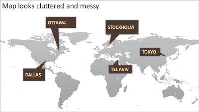
How to bring some order to a cluttered PowerPoint map

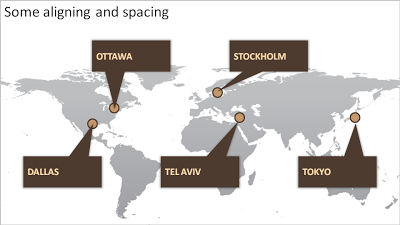
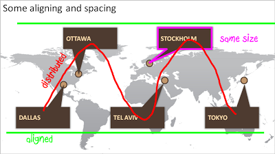
One of my clients is keen to show its new network of global support offices. Maps can look messy and random. Here are some simple things you can do to put things in order. We can not change the location of the planet's cities, we have control over PowerPoint shapes...

SlideMagic: a platform for magical presentations. Free student plan available. LEARN MORE

#PPT - let's try to create a presentation-focussed Tweet Deck channel

During a conference I discovered the power of a hash tag in Twitter. A constant flow of relevant updates around a topic or an event either in Twitter search or on Tweet Deck.
Let's use something for presentation design-related Tweets: #PPT? Short, memorable, relevant?

SlideMagic: a platform for magical presentations. Free student plan available. LEARN MORE

Chart concept - signs with a little humor

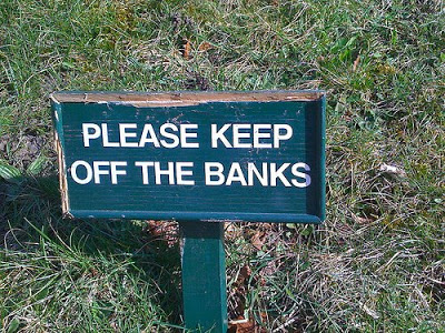
High-quality pictures of signs are great raw material for a presentation. They stand out by themselves, people are used to take a moment to read them and they could add some humor to your story:
  • Typos, or unusual text as an ice breaker for your audience
  • A correct message that is put out of context in a funny way in your presentation
The downside, they are very hard to find, but with a bit of creativity you can re-create them either by using a blank sign from a stock photography site, use a generator like AddLetters, or - even better - creating one of your own using PowerPoint shapes.
Here is a diffrent take on the credit crunch found on Noisy Decent Graphics:

SlideMagic: a platform for magical presentations. Free student plan available. LEARN MORE

Presentation lessons from watching a startup competition

I attended an Internet industry conference today and witnessed presenters in the final of a startup competition: a few minutes to present your company to a huge audience with a ruthless timer ticking away.
  • Putting your entire 30 minute story on 1 slide does not make it a 5 minute presentation
  • Accept that you cannot tell all: ruthlessly cut nuances, side tracks, feature lists. 
  • "Waste" some time upfront in establishing a connection with the audience. Maybe a quick hand voting. In the first few seconds people are "trying to figure you out" and are not paying attention to the content. "Is that a Danish accent?" If you give the punch line during this time, It will not stick
  • Assume your audience has absolutely no clue (about your company), but also assume that they are very intelligent at the same time. No buzz words. Clear explanations.
  • Use facts, numbers. But use them only once. Five minutes is too short a time to repeat the succes of that major customer you won last week
  • 500-1000 people is a huge crowd. Leave memorable contact details. "Out booth is outside", or a very simple email address.
  • Answer questions very, very briefly, don't go off on a tangent, or repeat the presentation you just gave.
  • Don't run out of time. Definitely don't make your punch line when bells start ringing and the screen behind you starts flashing to remind you that your time is up. Again the punch line will not stick

SlideMagic: a platform for magical presentations. Free student plan available. LEARN MORE

No need to put that huge "message arrow" on you slide

An excellent post on the "Tekst en Communicatie" blog by communication expert Louise Cornelis. It's in Dutch, so I will translate.
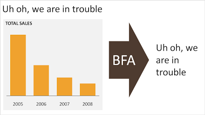
Louise discusses what she refers to as "the big f*cking arrow" or "BFA" (not all Dutch on her blog). A huge arrow in the middle of the slide, pointing at a block of text with the chart's conclusion. Apparently "BFA" has become a well-known acronym among chart designers in The Netherlands.
Her (and my) recommendation: get rid of it and stick to a clear title headline.

SlideMagic: a platform for magical presentations. Free student plan available. LEARN MORE

Google image search narrowed down by image color

An interesting find by the Google Operating System blog: using Google image search to find pictures with a certain color. It is not an official search option (yet), you need to adjust the Google URL manually:
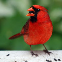
Finding red birds:
  • Enter "bird" in Google image search
  • Add "&imgcolor=red" to the Google URL so it looks like this: http://images.google.com/images?q=bird&imgcolor=red
  • Replace "red" with "blue", "green", "teal", "purple", "yellow", "orange", "pink", "white", "gray", "black" and "brown" to get other colors
Still, watch out for possible copy right violations or poor image quality when using pictures taken from Google in your PowerPoint presentations.
Thank you Ashish for pointing this out to me.

SlideMagic: a platform for magical presentations. Free student plan available. LEARN MORE

It's hard to find that perfect visual analogy

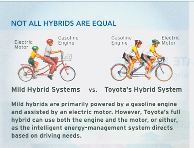
I came across this diagram in a print advertorial for Toyota hybrid cars (scanned it, could not find it online). Click on the image for a larger picture.
The diagram supports all the points in the text. Still:
  • The image looks a bit retro
  • You actually need to study it a bit to understand it
  • Race bikers can go fast, however they are by far not as powerful as a modern hybrid car...
  • The text below the image does not flow very well
In short, the image is probably good enough for an internal management presentation, but does not meet the bar for external advertising. It is hard to find that perfect image or illustration...

SlideMagic: a platform for magical presentations. Free student plan available. LEARN MORE

VC pitch resources updated

I added this presentation from Dave McClure to my list of useful links for pitching to VCs. It is an example of an unusual combination: poor graphics / great presentation. Usually poor graphics are made up for by a charismatic "live" presenter. In this case the presentation is great on its own as well.
For those who haven't seen my earlier posts about the topic, a repeat here:

SlideMagic: a platform for magical presentations. Free student plan available. LEARN MORE