George and Martha and leveraging audience anticipation

Weekend reading. I was reading some stories of George and Martha this weekend to my children, and was reminded of a great blog post by Nancy Duarte about leveraging your audience's anticipation in your presentation. Let them do a bit of the work as well, rather than just sitting down while being spoon-fed with content.

The "slide" with the grinning George is a more powerful one than Martha walking away to get a towel while the information conveyed is the same.
The images are scans from this book. Recommended for any parent.

SlideMagic: a platform for magical presentations. Free student plan available. LEARN MORE
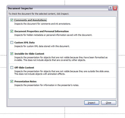
Oops, forgot to sanitize my speaker notes before emailing the presentation...

Speaker notes are a great tool to prepare a presentation. You can write out your thoughts in sentences, independent from the visual structure of your slide (sequential instead of parallel). In PowerPoint presenter view, you can display them on your own computer, while the audience only sees the clean slide.
Speaker notes are usually somewhat hidden. You can see them if you have the editing window open at the bottom of the slide edit screen, or when you print the notes pages. It is easy to forget that you've entered them.
Nonetheless, they are an integral part of the PPT file. You send the PPT, you send the notes. So be careful in case you use notes to add side comments like "note to self: do not bring up the poor 2008 performance! :-)". A sure guarantee that it will be brought up during the presentation. UPDATE: Akash Bhatia provides a wonderful solution in the comments. I have re-written my post below:
One solution could be to send a PDF version of your docoument. But there is a smart feature in PowerPoint 2007. Hit the Office button, select "prepare" and then click "inspect document". It lets you purge all kind of personal information from your presentation, including presenter notes. Make sure to save your file under a different name before saving.

SlideMagic: a platform for magical presentations. Free student plan available. LEARN MORE
Address your obvious weaknesses in investor presentations

Taking two more slides from my presentation about investor presentations.
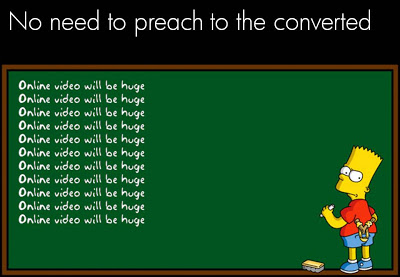
There is no point in going on, and on, and on about something that is already common knowledge. Everyone assumes that online video will be a huge market. (Of course, we could be collectively wrong). Don't spend your valuable presentation time on this.
On the contrary, focus on your obvious weaknesses. Highlighting weaknesses does not mean shooting yourself in the foot by bringing up details that harm your investment case. Instead, think what questions any intelligent human being would have when listening to your story. There is no avoiding. If you don't address them, the questions will remain.
"So, you are trying to build a page rank-based search engine?" "Yes, exactly, you picked that up fast. Let me show you our cool technology and some pretty impressive first search results" Wrong answer.

SlideMagic: a platform for magical presentations. Free student plan available. LEARN MORE
Cut to the chase in investor presentations

Most of the slides in my presentation about VC pitch lessons do not stand on their own. In a series of blog posts I will take some of them and add the full long-hand description of what they express.
Tell what you are about in the very first slide of the presentation. VCs like to put in you a box. If you don't do it for them, they will spend the time guessing while you deliver your carefully crafted buildup of the story. People who are busy guessing, do not register other content.
Telling what you are about is not the same as running the entire presentation on the first slide, and repeat the same story on the other 20 slides in the deck. "We are an online book store". "Aah, now I know". No more explanation needed.

SlideMagic: a platform for magical presentations. Free student plan available. LEARN MORE

Explaining the revenue hockey stick in funding presentations

One of the last pages in every venture capitalist funding presentation is the "hockey stick" of revenues and profits shooting through the roof. VCs expect a bit of optimism from a startup, but at the same time want to do a reality check on these numbers.
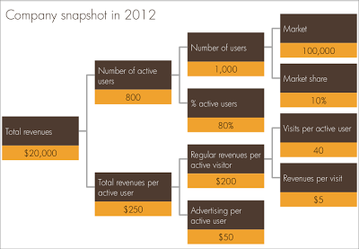
I often use a company snapshot, a tree of the key factors that add up/multiply to the projected revenue figure. Make sure the factors are real things you can touch: people, visits, etc.  CORRECTION: Also make sure the tree adds up and calculates through, something that cannot be said about the example below.

SlideMagic: a platform for magical presentations. Free student plan available. LEARN MORE
"Cover ups" as an alternative to build ups

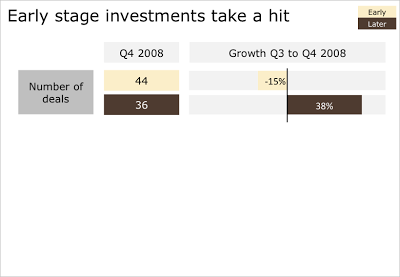
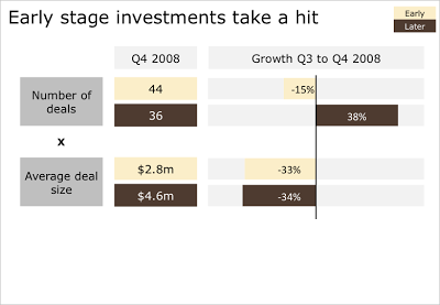
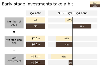
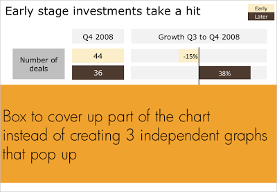
Sometimes you cannot avoid building up a busy data slide to take your audience through it step by step. In case of data-driven charts, it is tricky to create 3 independent graphs that are nicely aligned. I tend to create one big chart and use a white box to cover part of the information. Gradually I unveil more information by taking the white boxes off, instead of creating animations with new elements popping up. B.t.w. for those interested: the data above is the quarterly overview of VC investments in Israel, compiled in PwC's Money Tree report for Q4 2008.

SlideMagic: a platform for magical presentations. Free student plan available. LEARN MORE
We used to have something like this at McKinsey

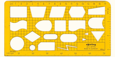
Information Aesthetics is talking about visualization nostalgia. Hey, we used to have a ruler like this at McKinsey. I will continue to look for one, or a picture. They were blue, had boxes for bar/column charts and pie diagrams, and a few triangles and arrows. 
The bad thing is that all your charts sort of looked the same. The good news was that, because you were trained to use this ruler, you always tried to find a graphical way to present your information, hardly ever resorting to bullet points.

SlideMagic: a platform for magical presentations. Free student plan available. LEARN MORE
Venture capitalists won't read your business plan...

An article about new research in the NYT confirms what I have been saying for a long time: detailed 50+ page business plans are not helping you to get venture capitalist funding. A short PowerPoint presentation is one crucial element of a mix of sources investors use to size up an entrepreneur.

SlideMagic: a platform for magical presentations. Free student plan available. LEARN MORE
Filling shapes with pictures

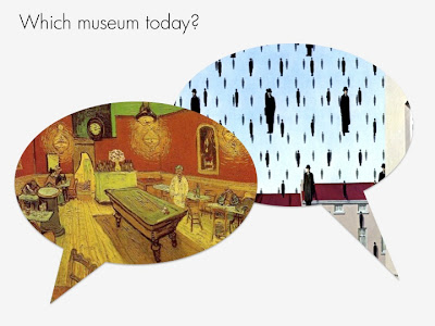
This ad from Ads of the World sparked some ideas. One, the image bubble with the contrasting thought is an interesting concept that can be used in PowerPoint charts.
Two, I am not using the ability to fill shapes with pictures enough. It's easy. In format shape, go to fill, and choose texture or picture, and off you go. The effect is best used with irregular shapes (clouds, stars, etc.) rather than plain rectangles.

SlideMagic: a platform for magical presentations. Free student plan available. LEARN MORE
Please help complete this Squidoo page for presenters

Squidoo is a tool developed by marketing guru Seth Godin that makes it easy to create overview web pages, a so called lens. I created one for presenters and need your help to complete it.
My aim is to create a useful collection of tools and resources for presenters. It would be impossible for me to maintain on my own. Instead, I am using the "Plex" technology that allows visitors to add links and vote them up or down.
Feel free to add, or vote up-down, blogs, books, gadgets, online tools, or suggest other categories that you want to see on the lens. The voting is less important here than the actual listing.
Revenues that the site generates (if you click through an Amazon link for example) are donated to charity.
Please visit the lens here on www.squidoo.com/stickyslides.

SlideMagic: a platform for magical presentations. Free student plan available. LEARN MORE
Don't let stock photo sites do the brain storming for you

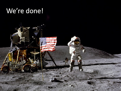
Everyone now knows how to get their hands on beautiful images. The next challenge to make your presentation stand out is to pick the right ones. I prefer to do the chart concept brainstorming myself, rather than relying on a stock image search engine to do it for me. We completed the project. Typing in "success" for "finish" will give you a stream of highly predictable and often cheesy images. "Man in suit raising his arms in victorious joy", "hiqh quality render of a character crossing the finish line". You/the human brain can do better than that. Think of the concept you want to make, all the way to the end. Then, search a highly specific (stock) image that goes with it. Armstrong waiving his hand on the moon, a bunch of empty, used coffee cups on a desk.
And remember, the right visual concept does not always involve an image.

SlideMagic: a platform for magical presentations. Free student plan available. LEARN MORE

Chart concept: you can't see what's under the surface

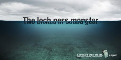
I often have to use a visual concept of the "tip of the ice berg", "things are different as they appear". The picture of an actual ice berg is the obvious choice to use. The Titanic archetype is deeply engrained in our collective memory.
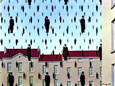
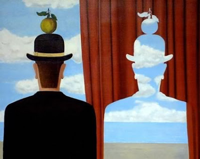
These Sanyo ads show how you can use typography to do the same thing. The first image replaces the image of an ice berg with the actual words, but it gets really interesting when removing the link to the ice berg all together and start using giant text cut in half. Big enough that you can actually read both sentences (sort of) easily.
Not very friendly to audience members with dyslexia though.
Via Ads of the World.

SlideMagic: a platform for magical presentations. Free student plan available. LEARN MORE
Switch off your parallel visual thinking - only rehearse out loud

You flick through the slides of your presentation on the way to the venue in the taxi. The slides look great, the story is perfectly clear.
Not anymore when you are on stage.
A live rehearsal is the only way to go. And not only to practice stance and eye contact (with the mirror in front of you).
You need to switch your brain from parallel to sequential processing. An image says more than a thousand words. If you look at your own slide it all fits together perfectly. That image, the diagram, those 2 words, the pressure of the 2 opposing arrows. For you (the slide designer), it triggers a complex set of thoughts in your brain. 
The audience does not have any of this. You need to translate that complex mental picture into a sequence of thoughts and sentences that allow your audience to get that same insight.
The only way to do that is to "switch off" your parallel visual thinking and start listening to your own sequential stream of words.

SlideMagic: a platform for magical presentations. Free student plan available. LEARN MORE

"Excuse my English" - slides that cannot stand on their own

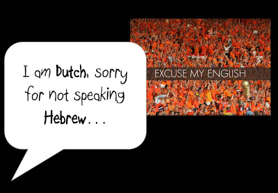
I put the slides I used for a presentation on SlideShare despite that they actually do not stand on their own very well. 
One piece of feedback I got is that I should not apologize for speaking poor English on the first slide. Rather as a presenter, you should radiate confidence. Makes perfect sense. This is actually not what the slide with the Dutch soccer supporters was meant to say... I was apologizing for not speaking Hebrew.
In this context, the mismatch was harmless and even funny. In other situations it might not be.
I enjoyed receiving so much positive feedback on the SlideShare slides. Thank you very much. The benefits of sharing the slides far outweigh the drawbacks in this case.

SlideMagic: a platform for magical presentations. Free student plan available. LEARN MORE

Slides from my guest lecture at the Technion

Last night, I gave a guest lecture to the Eclub of the Technion Institute in Haifa, Israel. We discussed presentation design in general, lessons for entrepreneurs wanting to pitch to venture capitalists for funding, and some PowerPoint makeover tricks
The slides are a perfect example of visuals that cannot stand on their own (without the presenter being present). Having said that, here they are:

SlideMagic: a platform for magical presentations. Free student plan available. LEARN MORE
Keep your images real

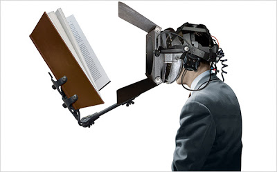
Today, Photoshop can do a lot, but it is still hard to make that perfect photo composition. Today, the New York Times used this image in an article about research to improve concentration. Nice Photoshop work, but:
  • The composition is good, but not perfect. Either do something that is 100% real, or completely not real (i.e., a photo cartoon)
  • The image catches attention ("what is that scary device attached to this person's head?"), but does not immediately create the link to concentration. A real image would have been better (5 builders NOT looking away from their work as a woman passes by for example).
Keep your images real.

SlideMagic: a platform for magical presentations. Free student plan available. LEARN MORE

[Israel-only] I will be speaking tomorrow May 6 at the Technion in Haifa

If you are around Haifa tomorrow evening you are welcome to join my talk to the Technion Entrepreneurs Club. The discussion will be about improving presentations in general, with a specific focus on VC pitches for startups. Tell the gate that you are here for the "entrepreneurs event"
Technion Industrial Engineering Building Room 216 Wednesday May 6 18:30 Directions can be found in the "about" section of this site.

SlideMagic: a platform for magical presentations. Free student plan available. LEARN MORE

2009: the year of stock image fatigue

Today I am writing a speech for a group of university students, so I had the luxury of being able to"go all the way" with creativity, not having to worry about whether visual concepts would be appropriate for the audience.
Eighty slides later, I got tired of many of the images I used and cut back on a lot of them.
  • Page after page of yet another stunningly beautiful image takes the attention away from the presenter and gives the audience the impression of reading a giant coffee table picture book
  • There is only so many funny or shocking images an audience can absorb. One "pie in the face" can be funny, one aggressive guy might be OK, but not ten slides like these. People don't like to look at close-ups of spiders.
  • Metaphors get forced: "I knew he would use that squashed orange to show that we are being squeezed by the competition."
  • Cost: 80 pages with a few trial images per page start to add up.
What you can do to overcome stock image fatigue:
  • (I passed level 0 already: cutting out the cheesy image)
  • Have the courage to go even more minimalistic: use a few words on a beautiful background color (experiment with light and elegant fonts, short words with are extremely large fonts)
  • Re-color stock images so they look more similar
  • Use images that are similar in style, for example just "retro" black & white shots throughout your presentation
  • Use real images from sources such as Flickr (check the license)

SlideMagic: a platform for magical presentations. Free student plan available. LEARN MORE