Chart make-over example, sorry Skype

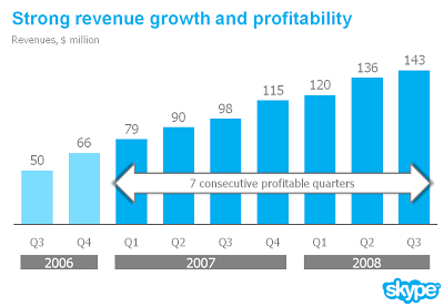
I am preparing a speech and needed a case example for a chart make over. Sorry to be picking on Skype again... A great color scheme plus a chart I discussed before. I have nothing against Skype, this is just for educational purposes.
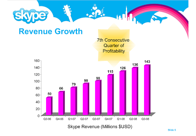
Here is a list of changes:
  • Reduce the template to a logo at the bottom right of the page, eliminating all other distracting elements. I really like white space.
  • Rigorous application of the corporate colors and fonts.
  • Simple column chart without 3D
  • No need for a vertical axis if you use data labels
  • Re-wrote the headline
  • Replaced the yellow star to give the text more connection to the numbers (still it would have been better to show the actual profit numbers)
  • Smiling, I made a typo in the revenues of Q1 2008
The idea is to make the data as calm as possible. Also note that through consistent use of corporate colors there is no need for additional "house style" graphical elements on the pace. You can see from a mile's distance that this is a Skype chart.

SlideMagic: a platform for magical presentations. Free student plan available. LEARN MORE

How to transfer fonts from a PC to a Mac

Fonts, PowerPoint and multiple computers do not mix. I have begun to go down the font slide: beautiful results but increasing complexity. Once you're on it, there is no way back:
  1. First level, just use one popular font, let's say Verdana (but it gets boring)
  2. Second level, group items together and "paste as PNG" back (but it is so hard to edit)
  3. Thid level, embed fonts with your PPT file
All was fine with level 3 untill I tried to use the PPT file on a Mac: disaster again. The "hardcore" solution:
For some reason, my Windows PC has far more fonts installed than my Mac. Font files are portable, they work on a PC and on a Mac. I simply copied all my PC font files and put them in a folder on my Mac desktop. If I need a font, I double click the relevant file, start PowerPoint over again and things are fixed.
Now where are these PC font files? Click "start", "run", type "%windir%\fonts" and they all show up. Select all, copy and paste them in a folder to be copied to the Mac. Done.

SlideMagic: a platform for magical presentations. Free student plan available. LEARN MORE

Learn from the Skype "how do we look guide"

A while ago I posted a fairly critical review of the abuse of the Skype PowerPoint template. The first sentence of my post however was: "Skype has a beautiful and very strong visual identity".
Spot on. Browse through this document with guidelines for creating documents in the "Skype look". You can learn from it even if you are not designing for Skype. Beautiful graphics. Nicely written to give you directions but leaving you enough creative room to make your own designs.

SlideMagic: a platform for magical presentations. Free student plan available. LEARN MORE

Gadget review: Logitech Presenter remote control

A remote control is an essential tool for any presenter. You do not have to go back to your computer all the time to look for the arrow keys to change the slide. This is especially important if you adopt a "Zen"-style presentation: lots and lots of images that change at a very high pace. I finally got one.
The Logitech 2.4 GHz Cordless Presenter does the job perfectly.
  1. Minimalist design, only the keys you really need: slide up/down, volume, screen "F5" and a button to black out the screen to talk to your audience without the distraction of slides.)
  2. The USB computer connection can be stored inside the device
  3. It has a stop watch to keep track of time
  4. It does (partly) work on the Mac (I run the latest Mac OS). Flipping through slides in both PowerPoint and Keynote, and changing volume is OK. The black screen and "F5" keys do not produce meaningful results (the opposite, they start inserting characters into your Keynote slides)
The device also has a built in laser pointer (although I am not a big fan of that nervously moving red dot on my slides).

SlideMagic: a platform for magical presentations. Free student plan available. LEARN MORE

Use images to tap into collective memory

You do not need to use data all the time to get a point across in your presentation. Sometimes a good image is enough to tap into our collective memory.

SlideMagic: a platform for magical presentations. Free student plan available. LEARN MORE

The outrageous SlideShare title page

In a big conference hall your title page should contain some useful information for the audience that is walking in ("Is this the right session?"). When designing for online presentations platforms (such as SlideShare), they need to grab the attention of the site visitor without patience. Pretty much like the posters you used to put up for your events near the coffee machine in university.
Here is my coffee machine poster for a lecture I will be giving at the Technion in Haifa, Israel next week. In case you are in the neighbourhood...

SlideMagic: a platform for magical presentations. Free student plan available. LEARN MORE

The emperor's new presentation is boring!

Two useful approaches to evaluate your presentation:
  1. Go in slide-sorter view to get a sense for how someone sitting in the back row will see your slides. If you can't follow them, they won't be able to either.
  2. Ask your 4-year old daughter. Although she cannot grasp the content, her intuitive reaction to the images is honest feedback about how boring your presentation really is (or not).

SlideMagic: a platform for magical presentations. Free student plan available. LEARN MORE

The global "ban comic sans" movement

Weekend reading. Comic sans is a font that resembles hand writing. Released by Microsoft in 1994, it was made popular through its standard inclusion in its Windows and Internet Explorer software. Graphics designers (with the sympathy of the Vincent Connare, creator of the font) started a movement "ban comic sans" as early as 1999 to stop the font from taking over more and more print and screen space around us. An entertaining summary of the history of the font and the efforts to put the genie back in the bottle can be found in this WSJ article.
What do I think? I agree that a comic-style font is not suitable for every occasion. When I have to use one, I prefer picking a more extreme comic font, like boopee. The problem with comic sans is that it is now so common that it has become boring. The same with Times New Roman...
Comic Sans from Sam and Anita on Vimeo.

SlideMagic: a platform for magical presentations. Free student plan available. LEARN MORE

McKinsey on the McKinsey cost curve

A decade of strategy consulting work at McKinsey has not made me a big believer in standard frameworks. Most business problem require a tailor-made approach without the buzz words and generic statements you find in most airport business best sellers.
There is another problem with frameworks: a framework to solve a business problem is usually not the framework to communicate a business solution. Problem solving and presentation are two different things.
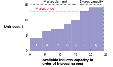
McKinsey's "enduring ideas" series periodically discusses one of the classic frameworks from the world of management consulting. This month it discussed the cost curve.
  • On the vertical axis you show the cost per unit
  • On the horizontal axis you line up the competitors in order of their production cost
  • (Unusual) you change the width of the column to reflect the production capacity of a player
  • Drawing a vertical line where capacity = demand shows you what the market price of the (commodity) product will be, and who is making money/who is not.
This framework is maybe an exception. A slightly modified column chart can serve both as a problem solving tool and a communication instrument. If there is incomplete information, 3 people can spend 2 months to develop it (running all the analysis), but once it is there, it shows what's going on in a (commodity) industry on one very insightful piece of paper (piece of PowerPoint slide). 

SlideMagic: a platform for magical presentations. Free student plan available. LEARN MORE
How to do a McKinsey-style source of change chart

How to do a McKinsey-style source of change chart

Some numbers today. The source of change is a tool to explain the delta between two numbers in terms of its components. Assume you need to get the story below across in a crisp presentation.

The first thing is to understand what's going on. Get some more information until you have the full picture in a clear table.

Now let's do the analysis. This is the tricky part, the text below does not do a good job in explaining this, you can click the spreadsheet for a bigger and more visual explanation.

  1. Calculate the profit in the "before" scenario using a formula that just uses inputs
  2. Now stretch each of the variables that change to their "after" value, jot down the value, and return the value back to its original number
  3. Repeat for all the variables and see what delta in profit you managed to explain.
  4. Calculate what is left to explain, and allocate that to the individual values.

Finally put the values in a

nice waterfall

chart.

SlideMagic: a platform for magical presentations. Free student plan available. LEARN MORE

PowerPoint make-over artist tricks for newbies

Sometimes it is not possible to create that perfect presentation. For example, your boss landed a pile of slides (written by someone else) on your desk, to be sent out in the next 3 hours after some "fixes".
The presentation below provides some tools for dammage control. Especially useful for PowerPoint files that are intended for offline reading, rather than TED-style ballroom presentations.
  • Use consistent colors. Even is the color scheme is not pretty, even is the color scheme is the standard PowerPoint one, recolor all objects with the same 2-3 colors, throughout the file
  • Align and distribute, wherever you can. Make boxes the same size
  • Wrap bullet points correctly (there are for sure too many bullet points in these type of last minute documents but not time to fix that now), cut words if you can 
  • Un-stretch photos, select format/reset to regain the original image and re-size them by dragging the corners to keep the proportions intact
  • Put all the titles in the same place using guides to prevent jumping titles. In the good old days, I used to hold a prinout of a document against the light to see whether everything is lined up
  • Stay inside your guides so that all charts look aligned.
Good luck. By the way, you can find the "For Dummies" book cover generator here. The "For Dummies" series contains a lot of books related to presentation design and communications. Here is the full liston Amazon, here is one:

SlideMagic: a platform for magical presentations. Free student plan available. LEARN MORE

They don't need to read it anyway

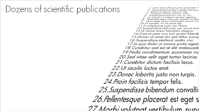
For some points you want to make in a presentation, it doesn't really matter whether the audience can read the content or not. Example: "here is my long list of scientific publications".
  • The text was simply "3-D rotated" in PowerPoint (make sure to set the perspective to the maximum 120 degrees). 
  • I left the text (that nobody will read) "bleeding" off the page to leave room for white space around the title line (that should be read)
  • In my case I filled the text box with nice lorem ipsum, but these charts are most powerful when you use actual text (that nobody will read): my actual list of publications with ISBN numbers and publication dates for example

SlideMagic: a platform for magical presentations. Free student plan available. LEARN MORE

Everyone can draw - iconic graphics

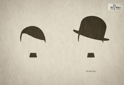
Look around you and see how powerful simple graphical shapes can be. The ad below is an example (text below Chaplin: "It's the hat.").
A larger image can be found here on Ads of the World.

SlideMagic: a platform for magical presentations. Free student plan available. LEARN MORE

Designers and developers sitting in a tree...

This presentation was uploaded to SlideShare yesterday. Simple colors. Beautiful fonts. No stock images. OK, some bullet points, but nicely formated. A great example of a presentation that can stand on its own, without the presenter being present. More on picking the right presentation style for the right presentation occasion in a previous post.

SlideMagic: a platform for magical presentations. Free student plan available. LEARN MORE

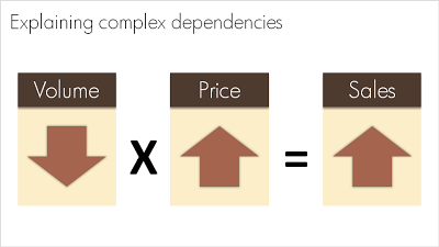
Basic equations to visualize complex dependencies

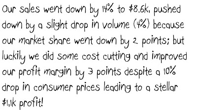
A question like "What happened to sales last year?" sometimes requires a complex answer. "Well, it is a bit complicated: volume went down, but then prices went up, but as a result sales were up". A simplified mathematical equation can help you visualize this.
Sometime in the near future I will post here how to do a proper "sources of change" analysis.

SlideMagic: a platform for magical presentations. Free student plan available. LEARN MORE

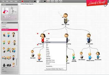
Lovely charts with Lovely Charts

Computer network diagrams are hard to make in PowerPoint. Finding the icons, positioning boxes, connecting them. The web application Lovely Charts might be a good solution. Also for flow diagrams, organization charts etc.
If you are in to designing network diagrams in PowerPoint, be sure to visit the Cisco icon library.
Via Armano

SlideMagic: a platform for magical presentations. Free student plan available. LEARN MORE

Meet Mr. Chicken and think about your PowerPoint template

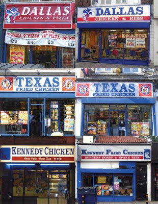
Amazing, there is one person who designed the "logos" and store fronts of almost 90% of all independent fried chicken outlets in the U.K. "Mr. Chicken" is interviewed here, there is even a book available on the phenomenon.
Amusing reading. However, it is not completely justified to pooh pooh these logo designs. Because they all look the same, they are actually pretty effective. If you find yourself in a U.K. high street looking for some fried chicken, you find one of these outlets in 2 seconds.
But, you do not want to be "Mr. Chicken" when it comes to your PowerPoint presentation. Get rid of the generic logo. Free up the screen real estate that is consumed by heavy banners with empty slogans. Instead, let people see the "what you have in store" with great content in your slides, all in a nice and consistent color scheme. 

SlideMagic: a platform for magical presentations. Free student plan available. LEARN MORE

Godin on VC pitches: "imminent success" around the corner

Seth Godin writes in his latest post about the importance of showing your imminent breakthrough:
If it's a foregone conclusion that you're going to break out, that all systems are go, then only an idiot wouldn't jump on board.
It didn't happen yet, but it is about to happen. Useful advice for people writing VC pitches.

SlideMagic: a platform for magical presentations. Free student plan available. LEARN MORE

Summary chart with 3 completely different data ranges

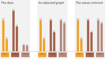
Sometimes you want to show 3 data sets in one chart with very different data ranges, for example:
  • 1,000s of customers
  • $ sticker price per unit
  • Number of products bought per customer
One solution:
  • Set the column of the first data point of each series to 100
  • Calculate the 2nd value relative to the 100
  • Manually paste data labels with the correct factors
The chart below gives an example:
  1. The first chart contains the unadjusted data
  2. The second chart shows the adjusted version
  3. The third charts shows the values I have entered in the PPT columns
Click on the example image below for a larger image.

SlideMagic: a platform for magical presentations. Free student plan available. LEARN MORE