Making the audience feel small

You probably have noticed as well that it is impossible to capture a wide panorama with a camera. "Look at this sunset over the sea! Where is my camera?!". The resulting image is often boring and lacks depth, the exact reason why so many stock images of panoramas fail to excite.

The human brain is not restricted by a small 2D screen. It senses distance/3D by blending the slightly different images from both eyes in to one. Eyes never sit still, they constantly move. We are standing at the inside of a gigantic sphere. Eyes compare the size of objects, to assess dimensions.

Handing out 3D goggles to your audience is not an option (at least not today), so the presentation designer has to resort to tricks to create 3D effects.

  • Pay attention to camera position (earlier post)
  • Put a known object in the image so people can relate the size of the whole to the familiar dimensions of the object (earlier post).
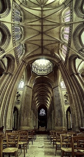
  • Or use effects like the one used in the image below. Stitching together multiple photographs to create on large, distorted image that gives the illusion of standing inside a sphere. Your eyes are really running up and down the image, just as you would do when you would stand inside the cathedral for yourself. Huge image by balondrotor here. (Earlier post on a similar but less spectacular version taken in the Notre Dame)


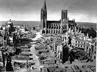
For those interested, the cathedral in question is the one in Coutances, Normandy, 20 km from this year's holiday home. This majestic old building stands in the middle of the city center that was largely rebuild after the July 1944 battles. It was almost unscathed.


I am not usually into Gothic architecture but this cathedral was an exception although is not usually included in the must-see lists. There is something to the proportions, the rhythm of the vertical lines and blending of light through the windows that creates an effect that I failed to capture on my own holiday photographs. This image gets close though.

Found via TwistedSifter, follow the link for images composition images.

SlideMagic: a platform for magical presentations. Free student plan available. LEARN MORE

All caps and sentence caps are harder to read

A very interesting analysis of why it is harder to read all caps text on UXMovement. All caps reduces the number of differentiators between words, and hence should only be used in short bites such as titles, logos or lables. I have been ranting about title caps as well before.


OK, sometimes I contradict myself, but all caps worked in this presentation with very few, short sentences.

SlideMagic: a platform for magical presentations. Free student plan available. LEARN MORE

Present to touch someone's heart

Today is a difficult day as we are about to bring my brother in law to his final resting place. Life is a short period of time in which we are granted the opportunity to make this world a better place. Ethan Naschitz has used his 48 years to the maximum. We will miss him.

A major event like this makes you think about what contributions you can make every day you have on this planet. In its purest form, a presentation is a tool to touch someone's heart, to make them excited about an idea, to bring positive change, to break with the beaten path.Think about that objective when opening PowerPoint and start designing the slides for your next presentation.

SlideMagic: a platform for magical presentations. Free student plan available. LEARN MORE

What really matters in PowerPoint template design

The design of the template should be simple: minimal graphics and logos, maximum screen space (see a previous post here). My favorite is really simple: a nicely designed title page followed by a completely white page for the rest of the deck.


So what does matter? The technical PowerPoint stuff that helps thousands of employees with only a very basic understanding of PowerPoint do the right thing. Before letting the genie out of the bottle and releasing a new template to the whole organization check the following:
  • Are the RGB codes of the color scheme coded correctly as standard colors? In 99% of all templates I see, PowerPoint offers the default blue, green, red color options when drawing a shape in a template. Easy to fix.
  • Are the drawing guides set up correctly so that people align objects correctly on the page? There should be guides that align with screen graphics, and guides that help users position objects on the screen. (Earlier post here)
  • Does the standard blank page pop up correctly when hitting "insert new slide"? Most templates are a bunch of example charts that people can use for inspiration. Nobody uses them, every one clicks "insert new slide" and - if not corrected - gets served the standard Microsoft chart with a big title and a hierarchy of bullets in Calibri font. To fix this, go into view slide master, delete most of the template charts on the left side of the screen and carefully re-design the key blank slide with the correct graphics, colors, and fonts. If you have courage, delete the standard bullet page.
  • Are the standard shapes set correctly? Draw a text box, set the font, right click it and set as default shape. Repeat for a shape (rectangle, anything) and focus on the color, the font, the outline, the shadow, etc. Right click and set as standard shape.
  • Are custom fonts embedded in the file? (PowerPoint Ninja post)
  • Are the page-filling images in title pages and separator pages compressed? If not, a presentation of 2 pages can already take up 5MB in hard disk space. Go into the slide master, select the image, and compress image sizes.
  • Are the data charts formats set up correctly? This is a bit more advanced but should really pay off. See an earlier post on fixing issues.
The best way to test all this is to distribute the template to handful of people and test before releasing it to the entire company.

SlideMagic: a platform for magical presentations. Free student plan available. LEARN MORE

Sartre, Beauvoir, and Miles Davis talking presentations

I just returned from a wonderful holiday in France and hope to pick up my posting habits soon. While in France, I read this interesting book: Parisians: An Adventure History of Paris
by Graham Robb (affiliate link). Robb uses a variety of styles and settings to describe famous characters living in Paris through the centuries. One chapter is a film-type script set in Cafe de Flore in Paris around 1948, a small fragment:


Beauvoir: He [Sartre] was invited to give a conference at the UNESCO. It was the first meeting of UNESCO, two or three years ago, in 1946. At the Sorbonne. The evening before, we went to the Scheherazade, with Koestler and Camus. And Sartre - you remember? - danced with Mme Camus, which was like watching a man lugging a sack of coal. He was very drunk, and he had to give his talk in the morning, but he had not written a line.
Miles Davis, pointing at Sartre: The teacher hadn't done his homework!
Beauvoir: Yes, and Camus, who was also drunk said, said, "You will have to do it without my help," and Sartre said, "I wish I could do it without my help."
Sartre, stubby fingers spread on the the table giggles.
Beauvoir: An then - he does not remember this - we had breakfast Chez Victor at Les Halles, soupe a l'oignon, huitres, vin blanc - and then it was dawn, and we stood on a bridge over the Seine, Sartre and me, and we were so sad about la tragedie de la conditione humaine - eh oui! - that we should throw ourselves into the river. But instead of that, I went home to my bed, and Sartre, he went to the Sorbonne to talk about la responsibilite de l'ecrivain...
Miles Davis: That's cool Jean-Paul. They knew you were talking straight because you hadn't prepared...
Beauvoir, shaking her head: No Sartre, he had everything already in his head.

SlideMagic: a platform for magical presentations. Free student plan available. LEARN MORE

Re-post: cutting up shapes

Cutting and pasting your object as a PNG image allows you to cut up regular PowerPoint shapes in random components. See an example here.

SlideMagic: a platform for magical presentations. Free student plan available. LEARN MORE

Re-post: keeping titles readable over busy images

A semi-transparent background shading greatly improves the readability of chart titles. See how to do it here.

SlideMagic: a platform for magical presentations. Free student plan available. LEARN MORE

Re-post: editing overlapping objects with the selection pane

One of the best-kept secrets of PowerPoint is the selection pane, that allows you to remove overlapping objects from a slide temporarily to make it easier to edit layers. Details here in a previous post.

SlideMagic: a platform for magical presentations. Free student plan available. LEARN MORE

Re-post: PowerPoint text in a circle

PowerPoint makes it possible to morph text in a circle, read the details here in this earlier post.

SlideMagic: a platform for magical presentations. Free student plan available. LEARN MORE

Holiday posting schedule

Over the next few weeks I will be spending more time with my family, and less online (similar to what I guess many of my readers will do). Posting frequency will drop, and I will be re-posting some earlier post that I think could be useful for readers that have only joined this community recently.

SlideMagic: a platform for magical presentations. Free student plan available. LEARN MORE

IPO presentation in the public domain

Insuline Medical is a medical device company that recently IPO-ed on the Tel Aviv stock exchange. Below is the company presentation I designed for potential investors. The challenge was that the audience of this presentation did not consist of venture capitalists with a deep specialization in medical technology, rather the content had to be adjusted to an institutional investor targeting the broader stock market.

My presentation design was translated into Hebrew by Eran Eisen.

SlideMagic: a platform for magical presentations. Free student plan available. LEARN MORE

The word "management"

These little annoyances in presentation design, the word "management" is one of them. You need it very often, it is relatively long, and it does not look good/readable when hyphenated. How many slides got a 2nd best design because of this word...

SlideMagic: a platform for magical presentations. Free student plan available. LEARN MORE