I am just looking at pictures of myself while presenting and realize that I forgot to take of these huge white name tags that you always have to wear in conferences... Well, it happens to the best of us.
Another situation where this produces poor pictures: group photos. A nice scatter of bright white, flash-reflecting squares smiling back at you. When you are posing in a group picture, ask everyone to put the tag in their pocket for a second.
SlideMagic: a platform for magical presentations. Free student plan available.LEARN MORE
The pillar template goes back to the early days of PowerPoint. A building structure is a useful concept to show that things are dependent on each other, and will already collapse if only one pillar is removed. Still, using a Greek temple will give your PowerPoint presentation that instant 1990s feel. I am not sure that is what you want...
SlideMagic: a platform for magical presentations. Free student plan available.LEARN MORE
A politician in a television interview can sometimes get away with giving an answer to a different question than the one that was asked her. Or filling time with some meaningless generic statements, after which a smile indicates that she is ready for the next question.
In a VC fundraising pitch (or an interview for a position) this does not work. If you think you need more time to get to an answer, think before speaking. You cannot parallel process coming up with an answer and speak coherently (both will be bad). If you hope that by repeating something what you said before you might manage to skip the difficult question, it will just bore the VC and make her impatient.
Sometimes it might be best to admit that you do not know or do not want to disclose it.
SlideMagic: a platform for magical presentations. Free student plan available.LEARN MORE
Venture capitalist Mark Suster has a blog with a large following, and is also active in producing video about venture funding and startups. A few days ago he hosted a live startup pitch for funding on his show. As I said before, I am a big fan of making (at least part of) the fund raising process more public. The 53 minute video is embedded below, I watched it and give some of my thoughts.
I have great respect for these entrepreneurs to be vulnerable and go with their pitch on video, and they were probably a lot more nervous than when sitting a conference room without a camera. I have made the comments below a bit sharper on purpose, in the hope that other people pitching for VC money can learn from them. In part I am helped by my Dutch/Israeli cultural environment where people use a slightly more direct style than in the US.
Look how Mark is forming an opinion about the business right in the first seconds. What is it that we talking about? Many investor presentation deck hold off the answer for too long.
The opening sentence full of buzz words gets cut short. Mark starts paraphrasing “Right, so you are a sort of eBay/Etsy widget for blogs”. It is indeed a better way of saying things, but hidden in this comment, Mark is already hinting at his major concern about the business. The presenters could have come out with a snappy/high-energy “OK, that you call it like that for now, but we have something amazing under the hood that makes us stand out in the middle of all these eCommerce giants, advertisers, and affiliate programs.”
Next thing, see how Mark is zooming in on the team. He asks them a very open question (tell me about your background) that gives his intuition time to size up these people, Mark just observes them more than he is listening. His attention for detail comes back when he asks questions about years. Are there holes in the CVs, are these people that have a success track record (or successful failures).
Mark wants to know how solid the team relationship is. The entrepreneurs could have read on his blog that Mark does not believe in startup competitions (people have not enough time to get to know each other before deciding to spend then ext 5 years of their life together. In the end Sahney responds to the challenge and says “Look, 5 weeks is not a weekend, and I know what I am doing”. Exactly the response Mark wanted. One more thing on team, listen how he probes whether there is no hard feelings about the decision who is CEO (Mark is listening and looking people in the eye).
Here Mark admits that he has already made up his mind. This is where pitchers need to stand on their feet. Guessing the major concerns and adjust the pitch to iron out the weak spots. It is hard to do I admit, to go off script.
Then comes the product demo, and it is only here that the big idea of the business comes out: the eCommerce engine is filled by the community of the blog itself. This should have been linked straight to the widget comment that Mark made upfront. Mark himself is actually drawing out a lot of the arguments for the business, clarifying points that the entrepreneurs make in more woolly language (everyone takes about community, engagement, when talking about social media and blogs).
My feel is that the first vertical segment that the team choose: mom bloggers does not resonate well with VCs like Mark. Just a personal style thing. You could strengthen how this technology could also be applied in less feminine content segments. (Mark himself starts talking about cameras, electronics).
Know the details. Mark probes with detailed questions about CPMs whether the team understand the fundamental business drivers of the business they are operating in.
The team interprets some of the business suggestions Mark makes as criticism. How you could help small bloggers with interpreting their visitor data. Mark is testing how these people would be to work with. Do they respond to ideas? Can they build on input? Can they admit that they are wrong? Sometimes, when Mark asks a question, the entrepreneur repeats part of an answer he has given before. You can see Mark getting a bit restless, and cutting over to another question. Sometimes it is better to admit that you do not know, or Mark had a great idea.
So, stepping back. I think the biggest lesson from this is to anticipate the big concerns that a VC will have with you, more or less admit some of these weaknesses, but have a story about you go about fighting against the odds. Part of that is technology and your business. But part of that is energy, will power, and enthusiasm that needs to jump across from the other end of the table. And maybe because of the uncomfortable video setting of this interview, that spark did not fully light up here.
As a feedback to Mark, do more of these video pitches, but find a format to make them shorter and punchier, that will make it more interesting for the video audience to watch, but increase the quality of the pitches and the interaction as well I think. I would not mind if Mark would be a bit less polite and a bit more direct. Still nice, but make it a real business discussion. Who knows, maybe one day Mark will host The Apprentice or American Idols for aspiring entrepreneurs...
SlideMagic: a platform for magical presentations. Free student plan available.LEARN MORE
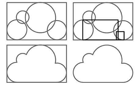
I often need a cloud shape in PowerPoint to draw a network diagram. The standard PowerPoint cloud is not very pretty. Here is a way to construct a new cloud shape in the style of the logo of the iCloud service by Apple.
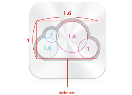
Takamasa Matsumoto originally discovered how the iCloud logo is infused with golden ratios. If you use these proportions to draw some basic shapes in PowerPoint, you can combine them using the shape union command (on the Mac right click the selected shapes, go into grouping and select union). You see that I use 2 extra rectangles to fill up the shape.
Here is the final result compared to the standard PowerPoint cloud shape, with heavier lines around the shape.
SlideMagic: a platform for magical presentations. Free student plan available.LEARN MORE
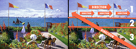
Every presentation slide should have a clear organization, and direct the eye. Paintings are a good example. Have a look at this painting by Monet: The garden at Sainte Adresse. It is clearly divided in 3 horizontal bands, has a strong diagonal cutting across, and the flags and steam clouds from the boats provide energy that leads the eye from left to right.
SlideMagic: a platform for magical presentations. Free student plan available.LEARN MORE
Back in the old days at McKinsey, your interviewing skills as a consultant on a team would be evaluated roughly on 3 levels: 1) you got the piece of information you needed (the market for [x] is $1bn, 2) you managed to get an insight that was completely new to the team, and 3) you actually made the interviewee realize something she did not know before.
Great journalists know exactly what questions to ask at what time in the interview. The interviewer draws out the story of the interviewee.
When designing a presentation think of your self as the interviewer. If you design something for someone else, then you can take it literally. If you design something for yourself, imagine interviewing yourself in front of a big audience.
Poor interview question: what five pieces of research support the assumption about the target market size? Good interview question: what, I thought only 5 people need this product, give me a feel for why this thing is huge? Poor interview question: "Now that we have spent the past 30 minutes analyzing the market, let me ask you: what do you actually want to achieve?" Good interview question: "before we dive in, tell us quickly what your ambition is". Poor interview question: "So let me re-phrase what I think your story is". Great interview question: "But is your story not a bigger one if we draw the parallel with this?"
Then you will have hit level 3, the interviewee walks out of the chair with a different perspective, and the re-designed presentation will be more than a beautification of existing slides. Which interview do you want to follow to the end, and which one will you skip with the mouse or remote control?
Have a look at the DressRush investor presentation, an entire pitch deck written as a web site, in the public domain. Some of my observations.
I like publicly available investor pitches. It fits in the wave of increasing transparency in the startup funding market. (Check out Angel List). Startups can dramatically increase their access to potential investors by making part of their content public. The first stage of a fund raising round does not have to be the closed meeting room of the VCs that happen to be located in the same city as you are. Obviously you would not put your core IP, financials, or other sensitive strategic content in a public presentation. Another option would be to make the sensitive part of your investor pitch on your web site pass word protected.
I like these airy web sites. Lots of white space and information that you can scroll through freely, up and down. I actually first skim the whole site in a few seconds, then go back up to start reading in more detail. This is so much better than the nervous clicking on a small button in a SlideShare window (especially when people design slides that -click- break up -click- a sentence -click- in 5 -click- slides.
It is still tricky to design from this new medium though. The DressRush example uses beautiful muted colors (interrupted here and there by images and facebook logos) and takes an infographic approach to investor pitches. On certain pages it works, on others it does not. In whatever direction the technology develops, you still will need to eye of a good designer to get your investor pitch right, also in HTML.
I will continue to follow these developments with interest.
SlideMagic: a platform for magical presentations. Free student plan available.LEARN MORE
Hardly anyone puts a valuation number on a PowerPoint slide in an M&A negotiation or an investor pitch. In publicly quoted companies there are legal constraints, but most of all: a buyer is unlikely to believe a number put up buy the seller. So how do you as a seller get the buyer to move in the right direction using a presentation?
The answer is: teach and spoon-feed the right assumptions. Someone on the buy-side is going to construct an Excel valuation model of your business. Put yourself in her shoes and guide her through the process.
What components of value are there? The business units of today. The future growth of these existing businesses, but remind her to include growth options beyond that as well.
Valuation models are forward looking, financial data looks backward. So it is important to teach the buy side how to model your business going forward without giving the answer. Instead suggest how the sales of your business works (it is all about number of stores and sales per square meter). Suggest some non-financial growth rates, or give an indication of your store opening program. Explain how the cost structure works. We can support 50 more stores without adding cost to our head quarters.
Give the sell-side a quick refresh about the theory of calculating discount rates. What should be taken into account. What ranges of values do you see?
The best way to prepare such a presentation is actually to design a valuation model yourself without inside information. It teaches you the process the other side will go through.
In short: spoon-feeding the sell-side a valuation model is much more powerful than arguing over the point estimate of the outcome.
Note: the above is written with a relatively mature company in mind that has reasonably steady and predictable cashflows. Early-stage venture valuations are a different subject matter.
SlideMagic: a platform for magical presentations. Free student plan available.LEARN MORE
Method 1 - emphasize subject: you can apply all bold, italics and underline effects, increase the font size, and pick a nice bright red character color (make sure you use all effects at the same time)
Method 2 - de-emphasize background: cut out all the visual clutter and distractions so that the point you want to make just appears by itself.
Guess which one I prefer?
SlideMagic: a platform for magical presentations. Free student plan available.LEARN MORE
I had a phone call with a potential client yesterday. He needed an investor presentation but also was interested in a full business plan.
There are different documents that both are called business plan. One is a stack of files (spreadsheets, gantt charts, PowerPoint slides) that contains the company financials/budget, competitive analysis, and development mile stones. In short: real content. It does not have to look pretty.
The second one is a long document created in Microsoft Word in which market research data is copy pasted (IDC says our market is $1bn), the company opportunity is described with lots of buzz words, and so forth.
You need the first one, you can forget about the second type of business plan. They take forever to write, they take forever to iterate, and as a result they are always out of date. No one reads long written text. Brad Feld and others have called them obsolete.
My client admitted that the business plan job was simply a matter of writing up material that was already there. He was willing to invest lots of money and 2.5 months of work with a consulting firm to have the document rubber stamped, paying for the logo on the front page.
I think it is a waste of money, time, and effort. If the only thing the consulting firm does is write down stuff that already exists, investors will look right though it and judge the investment opportunity based on your content, not the way in which it is written. If it is market data you are after, pay for the market data directly, rather than by hiring a consulting firm in the middle.
Instead, spend a fraction of the 2.5 months time on creating a running slideument of PowerPoint slides and Excel sheets that is the first type of business plan that I was talking about. Change pages as new information becomes available. This document is the messy business plan that you can send to an investor who has expressed a serious interest and would like to dive deep in round 2 or 3 of the due diligence.
The real investor presentation is written for an audience that does not know you very well yet (round 0). It draws on information from the business plan slide deck, but not fully. This presentation are the visuals you feel you miss when you start explaining your business to someone new in 10 to 20 minutes and should be designed from scratch.
Are consultants always a waste of money? Not always (watch out I am biased having been one myself). They can be useful when there is a very specific problem to crack. For example: should we enter market A or B? And then, a firm is only useful if it adds new insights that cannot be bought from market research. A clever market forecast model, interviews with industry experts.
Another type of consultant who might be worth paying for is not a big firm with a big name, but a retired senior executive in the industry segment you are working. She can provide a very valuable expert opinion. These type of project are usually very short, but worth the money. You are not paying for analytical ground work, you are paying for the judgement of 30 years of experience delivered to you in 2 weeks.
A story from the early 90s. Back then I had recently joined McKinsey as a Business Analyst and got involved in recruiting presentations at Dutch universities to try to convince more engineers to apply for a position. The slide deck covered it all: our offices, our expertise, our clients, our selection process.
Until one day we did a survey asking the audience to rank how useful this presentation was. The outcome: people already knew that we were probably very smart, worked with prestigious clients, were unlikely to starve because of lack of financial resources, and were very professional.
The questions the students had were: are you guys human or nerds, do you really have to work 80 hours a week, how on earth can a physics engineer be useful there? These questions you cannot really address on a slide, so we cut the introduction presentation to the minimum (to re-confirm what people already knew), and then switched off the projector and started talking about us as a person, and opening up the discussion for questions.
Preaching to the converted is a waste of time. Instead, use your presentation to address the issues the audience has.
SlideMagic: a platform for magical presentations. Free student plan available.LEARN MORE
I am linking to 2 posts related to venture capitalist Vinod Koshla today.
The first is about brutal honesty in investor presentations by Michael Arrington. He argues that indirect polite language because people are afraid to turn down a startup is not helping anyone (including the pitching startup).
The second is a blog post by speech coach Jerry Weisman: the 5 second test. If your (test) audience fails to produce the point of a slide when you hide at after 5 seconds, the slide is too complex. An audience trying to figure out what a slide means is not listening to the audio track.
In many of my investor presentations I mix slide design styles.
In the beginning, big images to catch the attention of the investor and make her feel the pain that you are trying to solve. These slides are good enough to put up in a big keynote address.
Later on, more dense slides follow with details of the technical architecture, the financials and the team experience. These work in a small conference room, but definitely not on a large stage.
The slide design is not completely consistent, but I find it works well for me.
SlideMagic: a platform for magical presentations. Free student plan available.LEARN MORE
How do you convince an overly confident, highly senior executive that it makes sense to rehearse tomorrow's presentation? “Me, hey, I have given thousands of presentations in my career, I will wing this one!”
Winging does not work, you need to know your substance in-and-out in order to be spontaneous. A presentation without rehearsing produces of one of two possible results: a poor performance, or a replay of the presentation you gave last time without emphasizing the new content in the deck.
I do not have the ultimate answer. You can say that Steve Jobs took days to rehearse a keynote. You can scare her and say that the analysts in the audience tomorrow see hundreds of presenters each year, and you better stand out. Or sometimes, people agree to go through the presentation with an outsider like me, the presentation designer, in a closed room where non of their subordinates have to hear the corrections we discuss.
What does work for you?
SlideMagic: a platform for magical presentations. Free student plan available.LEARN MORE
When your boss is editing your slides, there is a risk that she will add the same key message on every slide. She has not fully immersed herself in your story. She does not see the full context of the presentation. Time is short, too short in fact to study the presentation in detail.
Better make sure that the point “our architecture is flexible” gets mentioned a few times in the deck. Extra bullet on page 3, a nice bubble on the side on slide 7, foot note on page 15, and bold the flexibility point on the last page.
Have the courage to stand up and stop her.
SlideMagic: a platform for magical presentations. Free student plan available.LEARN MORE
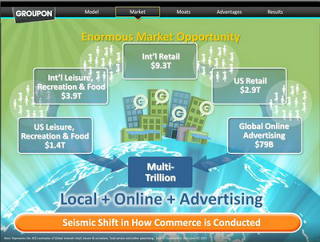
The investor presentation (both slides and video) of the upcoming Groupon IPO are online (link). Robin Wouters of TechCrunch has made a few screen shots of some of the slides. Usually these presentations are held in private meetings with potential investors, and I think it is great that they are now available for everyone to see.
Overall this is not a bad presentation, the presenters rehearsed, the slides are organized. There is still room for improvement though.
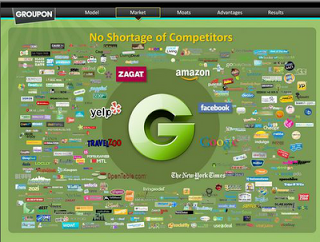
Slide design. The slides look like a beautification of a standard business presentation. The beautification is done professionally: sophisticated graphics and custom-made illustrations. Some of them look great (I love the slide with all the competitor logos). Still, Groupon could have gone further by designing the slides from scratch, making them simpler. For example, the slide right after the competitors on Wouter's page is not clear. Also, the template could have done without all the trackers that are repeated on every page page.
Examples. Groupon is a business that happens all the way down in the street, at a small merchant. Like retailing, detail is what matters. The case examples could have been featured more prominently. Bigger images of the restaurant, more specifics of the deal. When the VP Product goes through a long list of the detailed information that Groupon has available, it sounds abstract. Why not take one very specific example and show how shoppers for flowers have different habits in 2 streets of San Francisco. The specifics of the detail make the big point.
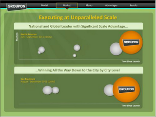
Elephants in the room. There has been lot of cynical press around the Groupon IPO. Questions about declining growth rates: there wasthe chart that should make every Groupon investor scared. Questions about margins. Questions about customer loyalty. These are the big issues of the company, and somehow the company should have made more effort to counter them. It is actually towards the end of the presentation by the VP Product, when he starts getting into all the new technologies Groupon has in the pipeline that could have really addressed this question. (The explanation of the technologies was a bit hard to follow though and needed more slide transitions.
Delivery. This was a staged presentation and although delivered well, you could still see that it sometimes was somewhat unnatural, especially when the CFO started to run through a large number of financial figures that were not presented on slides. It is passion though that is so important to get across, you could see the difference when the CEO talked about Groupon being the first company that has the scale to make local commerce a reality.
What do you think?
SlideMagic: a platform for magical presentations. Free student plan available.LEARN MORE
The new Apple 27" Thunderbolt display enables you to connect 2 giant external displays to a laptop, something that has not been possible until now without additional hardware.
Large screen real estate has its advantages. It is easier to design presentation slides when you have a large workspace in front of you. Extra space also enables you to open multiple windows, for example a PDF file with comments on the previous version of your presentation, or an Excel file with the data that need to go into your pie chart.
Now, 27" is a lot of space (2550x1440 pixels) and for most ordinary people, one screen will do. A presentation designer might actually need two (putting her in the same category as financial traders, air traffic controllers and social media addicts). I like to design on a clean and calm canvas. All the small windows with bits of information distract me. So I use that second screen as my messy desktop, literally pushing bits, pieces, and windows aside when I do not need them, preserving my pristine and uncluttered design environment in front of me.
Now some technical details. An Apple Thunderbolt screen can only be connected to a recent MacBook laptop that actually has a Thunderbolt port. But more importantly, the dual screen configuration only works on the most recent 15" and 17" MacBook pros, not on the 13" MacBook Pro, and not on the MacBook Air. (This might actually be an argument for getting a MacBook Pro over a MacBook Air) at the time of writing, October 2011).
You need to install a software update for your MacBook Pro, and a firmware update for your screen. Do one screen at a time: connect a screen, run software update, disconnect, connect the other, run software update.
Once everything is updated, I found that the hardware works almost perfectly. You connect one screen (with a combined Thunderbolt and charging cable, the laptop gets charged via your screen) to the laptop, and connect the second screen to the first screen. Via system preferences you need juggle to assign which screen is right, which is left, and which one of the two is the main screen.
The Thunderbolt screen multiplexes in a number of USB ports, Firewire ports, and LAN connectors on the back of the screen to which you can connect other hardware (nice for a MacBook Air with limited connectivity). The screen also contains an HD camera and speakers, so the screen is not just a screen, it is a big hardware extension for your laptop.
I said almost perfectly. There are some glitches. Each time you connect the laptop after you return from a meeting, your Mac seems to forget the configuration (left, right, main screen). Also, when the computer is asleep for a long time, I find that the hardware connected on the screen ports (keyboard in my case) is no longer recognized, and my Internet connection is killed. The only solution I have discovered so far is to disconnect the screens, wait everything to return to normal (i.e., Internet), then reconnect, and then reconfigure left, right, and main screen. Hopefully this bug gets fixed soon.
But all in all, worth an upgrade.
SlideMagic: a platform for magical presentations. Free student plan available.LEARN MORE
I am traveling back to Tel Aviv today, so no major presentation design insight today. Just a reminder though, that traveling can just clear your mind. Breaking away from routines is a great boost for creativity. Have a good weekend and speak to you next week.
SlideMagic: a platform for magical presentations. Free student plan available.LEARN MORE