Endless permutations

Here is a nice way to visualize an unlimited amount of possible combinations. The sanitized example below was designed for a client with a new digital media technology. You could create a similar concept with a suitcase combination lock, or maybe a slot machine.

SlideMagic: a platform for magical presentations. Free student plan available. LEARN MORE

Uncover versus popup

I am not a big fan of animation, spectacular effects do not support a serious business message and documents with animations do not convert well to PDF for emailing.

Sometimes there is no escaping though, especially when you need to explain components of a complex system. The best way to do this is to add elements one-by-one through a series of clicks.

The usual way to do this is to use pop-up animations. However, these can be cumbersome to edit: you often forget one item in a group, and have to start all over again.

There is an alternative: cover the critical elements in your slide with boxes and remove the boxes one by one. Easier to edit. You can even make it more sophisticated by given the boxes a 10% transparency: the viewer sees sort of what is coming, but not completely. When you want to PDF and email a version of your document, you simply delete all the boxes which leaves the full diagram intact.

SlideMagic: a platform for magical presentations. Free student plan available. LEARN MORE

Links to full screen YouTube videos

The most reliable way to include video in your presentation is to include it in your presentation file. Dragging a video file into Keynote for example creates huge file sizes, but you eliminate the hassle of having to save files in the same location.

A less elegant option, but one that saves space, is to rely on live YouTube links for playback. Here is an approach to do this:
  1. Play the video (in the highest resolution possible) and pause it at the moment you want to use for the placeholder image.
  2. Take a screen shot and paste the image into your slide
  3. Draw a big triangle and place it in the middle of your still image as a play button
  4. Insert the hyperlink to the YouTube video inside the triangle and you are done.
In presentation mode, you can click your play button triangle with the mouse and your browser will open to play the video.

By default, the video will play in the standard YouTube view with all the screen clutter around it. Here is a way to get a link that triggers a full screen view of a YouTube video.

The standard format of a YouTube URL is this: http://www.youtube.com/watch?v=R55e-uHQna0. Here is the trick. Replace the watch?v= bit with this v/ to get this result: http://www.youtube.com/v/R55e-uHQna0. Make this the link your play back triangle points to.

SlideMagic: a platform for magical presentations. Free student plan available. LEARN MORE

Need a simple planning tool

Business is going well and I am in need of a basic time planning tool. My work style has changed from one that is management consulting-like (1 project at a time, from start to finish), to a more erratic (creative?) work schedule. I take on many projects at the same time, ponder about creative approaches in parallel, and have become much, much faster in execution once I have the ideas for the killer slides in my head.

With all of this, it has become hard to get a good grip on my actual work load and give clients a realistic delivery date of a project. Most project planning tools available are designed for large projects executed by multi-person teams doing tasks that are defined in days and not hours. These tools also find it difficult to manage multi-tasking: one person who is working on more than one project at a time.

So, I wonder whether you have come across a tool that allows me to do the following:
  • Quickly add lots of short projects
  • Sync with a calendar to take into account holidays and other commitments
  • Put in hard deadlines for some projects, while leaving others open
  • Allow multi-tasking
I have been playing around with Omniplan and Clarizen, but these do not seem to do what I need.

SlideMagic: a platform for magical presentations. Free student plan available. LEARN MORE

Writing it on every page

Sometimes a senior executive comes in at the end of a presentation design process and starts making some “edits for clarity”. She probably does not have a lot of time to go through the deck in detail, but wants to make sure the key points are said. No better way to do this than adding the words “flexible solutions ” on as many pages as possible. Now the deck says at least what it is supposed to say.

When this happens, it is time to stand up for yourself.

SlideMagic: a platform for magical presentations. Free student plan available. LEARN MORE

So what?

The first day of your career at McKinsey, you learned about the concept of “So what?”. It meant asking yourself what the real point of a chart full with analysis was, and writing that down as the title.

A so what should be meaningful, and not simply stating a fact for example instead of “We are making a loss in France”, maybe it should read: “It is time to leave the French market”

Once you established what the so what of the chart is, you could then go on an cut down any facts, data, or analysis that was not essential to make the point.

If you identified the key messages correctly you would be able to understand a document by just reading the headlines, the content of the slides just backs up what the title says.

A useful day-one concept, I still use it pretty much every day.

SlideMagic: a platform for magical presentations. Free student plan available. LEARN MORE

Getting the most out of a designer

Designers can do good work, or can do great work. How can you get them to do great stuff?
  • Give them plenty of time. Introduce your pitch way before the deadline, build a relationship, start the actual work with enough head room for creativity and iterations. Good presentations are not born under deadline stress
  • Give them a broad briefing. Tell the story you want to tell in double the time you have. Give background about the story, the audience, the occasion. What goes in the design process, will come out.
  • Give them freedom. Very strict instructions will return your own presentation with the objects on the slide just a little bit better aligned.
  • Give them budget. If after a a long negotiation the designer utters “OK, I will try to squeeze it in” followed by a a sigh, it is unlikely that you just switched on all the creative genius that is present in the designer.
  • Give them a blank sheet of paper. Insisting on using an ugly corporate PowerPoint template is a set up to failure for the presentation design project.
  • Give them access. If the CEO needs to give a presentation, the CEO needs to talk to the designer directly. Chinese whispers through corporate hierarchies dilute the message.
  • Give them sleep. If you are working in different time zones, it can be tricky to find overlapping meeting times. A designer having to get (stay) up in the middle of the night is unlikely to do the best she can.
In short, managing design is not like managing a production line. Pushing, dragging, squeezing is not going to get you better results.

SlideMagic: a platform for magical presentations. Free student plan available. LEARN MORE

Presentation first

Presentation design often comes at the back of other marketing communication (advertising, scripts for brochures, white papers, and web sites). In many cases, marketing can benefit from the opposite approach. Visuals are much better to lay the foundation of a marketing story than text. And it is far easier to involve a CEO or other senior executive in a visual presentation design process, then force her to go through revisions of text. So a good presentation design project does not only give you a nice slide deck, it might well provide the inspiration for an entire marketing campaign.

SlideMagic: a platform for magical presentations. Free student plan available. LEARN MORE

Extreme perspective

Images get more interesting with a dramatic perspective. How to find them? Look for unusual camera angles, and put an object on the foreground to amplify the effect of depth. As it is done in this ad found on Ads of the World.


SlideMagic: a platform for magical presentations. Free student plan available. LEARN MORE

1st, 2nd, and 3rd order elements

Most financial or scientific data slides gave all visual elements equal weight.
  1. The big trend in the data (a declining line for example)
  2. The amounts are in EUR million
  3. The explanation that 2010 includes France
  4. The fact that 2011 results are still unaudited
  5. The source of the market data
  6. All data is to be treated confidential
This is not how the novice discovers your data. Make the first order element pop out, so people get the message without the clutter of all the other information. 

For the 2nd, 3rd order elements you can use smaller fonts, or - what I find most effective - use light grey font colors. Another options is to put a long wordy foot note at the bottom of the chart that has all the other bits in it, thereby avoiding the need to populate the slide with scattered text labels.

After people get the message and have questions they will look for more information and find everything they need.

SlideMagic: a platform for magical presentations. Free student plan available. LEARN MORE

You put in that P&L manually?

When people receive my analyst or investor presentations and they see a few years of P&L data entered manually one-by-one, they always ask me whether after all these years I have not found a more efficient way to do it. I have not.

While I punch in the numbers manually (which takes about 15 minutes by the way), I can do a lot of things in parallel:
  • Round up numbers
  • Shorten labels
  • Collapse labels and combine rows
  • Check whether everything adds up
A data table is worth that extra attention, instead of an Excel data dump, you get a visual that makes sense.

SlideMagic: a platform for magical presentations. Free student plan available. LEARN MORE

Filter Forge

I said before that it is a shame that PowerPoint (or Keynote) do not have these powerful replicators that you can find in motion graphics software. Filter Forge is a nice piece of software that plugs into PhotoShop and extends the range of filters you have available for your images.

Here is an example image I created for a client that has software that works across all possible versions of the highly fragmented Android mobile operating system.


Filter Forge is a platform on which users can contribute their own filters, the result is an endless library of filters, including the perspective distortion above, instagram-style retro filters, and filters that turn your images into cartoons or impressionist paintings.

It is not cheap, I bought the professional edition which is priced at $399.

SlideMagic: a platform for magical presentations. Free student plan available. LEARN MORE

Update on site availability

Thank you for checking my blog’s availability in this small online survey. Looking at the results, I see that many problems occur with people behind corporate firewalls. My client base actually includes some IT security companies and people are checking whether I managed to get myself blacklisted.

The domain blog.ideatransplant.com is a Google blogpost address in disguise. I started a discussion on the Google Blogger support forum here. If you want, you can add your issues to the discussion there.

SlideMagic: a platform for magical presentations. Free student plan available. LEARN MORE

I really need your help

Many readers are complaining that they cannot load my blog and only have access through the RSS feed. People say they get DNS errors. I have tried many things, but have not been able to pin down the problem. Could you do me a huge favor and click http://stickyslides.blogspot.com and http://blog.ideatransplant.com and, after that, fill out this short survey? Thank you!

If you are reading this in your RSS reader and actually have access issues to the site, here is the direct link to the web form.


SlideMagic: a platform for magical presentations. Free student plan available. LEARN MORE

Take lots of pictures

Related to yesterday’s post, here is a piece of advice: make it a habit to take cellphone images of workshops, site visits, conference, foreign visitors, a strategic deal signing, moving day to the new office, etc. throughout the year. I always find that when the moment comes for a new corporate presentation, the only office visual a client can produce is one of the entrance corridor with the receptionist in front of the company logo.

SlideMagic: a platform for magical presentations. Free student plan available. LEARN MORE

Making a good team introduction

This video by Before & After Magazine shows a great way how to visualize the team behind your company. I always think it is a shame that people do not invest in better photography for their presentations. How hard is it to get someone to hold a camera and take a group picture of your management team? It looks so much better than the inconsistently cropped, high school year book-like, images you usually see in a presentation.


I actually make the team description slide a bit more dense than other charts in a presentation. During the presentation the presenter will talk around the photo and introduce the team, the text in the boxes is for reading after the presentation.

 The Before & After Magazine has some nice graphics design instruction material on their site (some is free, some is not). Their YouTube channel is also worth checking out.

SlideMagic: a platform for magical presentations. Free student plan available. LEARN MORE

Keynote versus PowerPoint

The year 2012 could be the tipping point for Apple’s presentation design software Keynote. Only now I get multiple requests from clients to start designing presentations in this format. Especially smaller companies and startups who have the privilege to be able to decide on a 100% Mac IT infrastructure are the pioneers. So, over the past month it has been the first time that I had the opportunity to use Keynote on an industrial scale, on time critical presentation design projects.

Most Keynote versus PowerPoint evaluations on the web count the number of features, slide transition effects, or the quality of the built-in themes. So this is maybe the explanation why these features get some much prominence in marketing of both products. Personally, I find them the least important aspects of the software. What matters is how easy your workflow is: manipulating objects, changing the order of slides, managing images, creating and editing data charts. My review will focus more on these issues.

People say that the best Apple products are those that Steve Jobs used frequently personally, and Keynote is such a product, and it shows. The interface is lighter, fresher, simpler without PowerPoint’s baggage of older versions.

The concept of the inspector window with the properties of any object you click at (image, shape, graph, text) is incredibly useful and time saving compared to looking for the right menu in PowerPoint.

One of the biggest pains of PowerPoint 2011 are the drawing guides that you cannot lock. Re-size an object near the blue drawing guide, and tsjak, off she goes. Not so in Keynote. Aligning, positioning is all easier and cleaner.

With PowerPont I found it easier to customize my toolbars though. Centering, distributing, aligning multiple object requires going into a menu and clicking an option. And these are functions that you need to use all the time.

The concept of masking images with a shape is also a refreshing idea in Keynote instead of cropping in PowerPoint. Still, you need to get that mask right though, if you release the mouse to early the aspect ratio gets locked and you need to try all over again by removing the mask and putting a new one on.

Masters in PowerPoint quickly balloon into monsters, especially when you have Frankesteined (what?) a few presentations together. The Keynote master management is a lot cleaner, also making it easy to define standard shapes and data chart formats.

One thing that surprises me: it is not possible to move slides around in the light table view in Keynote. This does not make sense, it is a very important task in any presentation design software.

Data chart creating suffers from the same problem in both PowerPont and Keynote, the first chart appears with horrible chart fills, grid lines, tick marks and always need a lot of work to get it right. I think here PowerPoint has the upper hand with the built-in Excel chart engine. This engine also allows you to do some quick analysis on the side. This comes at a price though, I find the PowerPont/Excel combination often crashing when I do complex data chart analysis. (Oh, and there is that annoying double shadow in Keynote that requires some skill to get rid of)

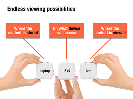
And finally, Keynote has tight integration with the iPad, making it easy to use a tablet device in one-on-one meetings. The iPad application also enables you to make slide edits, but because of the small form factor I expect those to be limited to correcting a type in the name of your client a few minutes before the meeting.

So in summary it is probably a narrow win for Keynote. But both programs have a few small things that still need to be ironed out. Obviously there is the learning curve to switch software. It took me probably a day to become fluent in Keynote, something that might take a bit longer if you are not a professional presentation designer...

SlideMagic: a platform for magical presentations. Free student plan available. LEARN MORE

Ranges versus point estimates

Things are never sure in business analysis. One option to deal with uncertainty is to use data ranges: $3-5m instead of ~$4m.

While it might be the correct approach to qualify your analysis, I do not find it visually pleasing. My approach would be to settle on a point estimate, and put a note on your slide that these numbers are estimates. It also easier to discuss with your audience, it is difficult to refer to ranges all the time: “Next year’s sales of $3-5m”.

One additional complication, ranges amplify when you add or subtract them. In the chart above, you see that 6.5 equals to a range of 4-9 instead of 6-7 for example. If this is the point you want to make, our sales forecast can fluctuate wildly because of things we do not know, then use the chart. If you just want to give a small range to show uncertainty about the exact value go for the point estimate.


And one more issue, a range of $1m more or less can be a big difference if you apply it to a small number, or a big one: 1-2 versus 10-11 for example. The first is a 100% variation, the second 10%. So, to do it correctly you have to write down in your chart: 1.0-1.1 and 10.0-11.0. All this just makes it too complicated to have a meaningful strategy discussion.

And another one: ranges are a pain to use in calculations, as seen in the slightly counter-intuitive column chart above. (See an earlier post on how to make water fall charts here).

Bottom line: I try to avoid ranges whenever I can.


SlideMagic: a platform for magical presentations. Free student plan available. LEARN MORE

Pick your battles when pitching

Arguing until the bitter end about small facts, when the VC thinks she right because she has a reliable source (in her opinion) is not a good idea. You might be right, BUT you will not convince her, you will do no good to your credibility, and you raise doubts about how the future CEO-Board Member relationship is going to pan out.

Better focus that energy in disagreements that are really worth arguing about. Pick your battles.

SlideMagic: a platform for magical presentations. Free student plan available. LEARN MORE

Write notes after the meeting

If you are reviewing your presentation with your boss, here is a thought. Write down your notes immediately after the meeting. It makes for a better 2-way conversation as you are not scribbling all the time looking down on a piece of paper, and strangely it makes you remember things better. This article in Wired explains how your brain is refreshing the memory that is only slightly faded, that process makes future recollection stronger:
Along these lines, Bjork also recommends taking notes just after class, rather than during — forcing yourself to recall a lecture’s information is more effective than simply copying it from a blackboard. You have to work for it. The more you work, the more you learn, and the more you learn, the more awesome you can become.
Note: this way of taking notes works for me, everyone is different, so do not pilot this on a very important meeting :-)

SlideMagic: a platform for magical presentations. Free student plan available. LEARN MORE