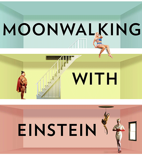
Star burst

The star burst is often used in retro advertising. You can pick one up from any stock image site to create a background for a composition with a lot of depth.

SlideMagic: a platform for magical presentations. Free student plan available. LEARN MORE

Photoshop/Illustrator CS6

Adobe has released its new Creative Suite 6 software (Photoshop, Illustrator, etc.). I am only a casual user of this software, my core design work is in PowerPoint and Keynote. Still now and then, I need capabilities that are not available in these slideware solutions and dive into the world of Adobe. I have been working with the software for a week now, and here are some of the features that might be interesting for a presentation designer:

In Photoshop CS6
  • Better context-aware fill and the ability to take objects entirely out of an image (not very useful), or move the object around in an image (very useful). I am desperately looking for a way to extend the background of an image, stock image photographers always crop to narrowly around a subject, leaving no space for text. The current tools are not there yet.
  • Sometimes it might be the hidden things that are best. I have just the impression that the general selection engine to isolated subjects from their backgrounds is better.
In Illustrator CS6
  • The pattern generation engine is much better. It is cumbersome to generate patterns of repeating objects in PowerPoint or Keynote. In Illustrator it is easy, and you can apply them to any shape as a fill. 
  • Photo tracing. It is now very simple to turn a photo or hand-drawn sketch into a scalable vector image. This will make it easy to convert images into more neutral silhouettes in presentations.
There are a lot more new features that will appeal to heavy users of both programs. Should you upgrade as a casual user? Your call. Since I am a professional presentation designer, I just install the latest software without really making the trade off every time. What do you think, if you have upgraded, was it worth the investment?

SlideMagic: a platform for magical presentations. Free student plan available. LEARN MORE

The best iPad stylus

I now have almost completely eliminated paper from my workflow after I switched to hand writing on the iPad. My meeting notes are better organized and searchable, and I can now make design doodles in multiple colors on which it is much easier to erase part of your sketch. I have tested 3 iPad styli extensively and the best one is the Adonit Jot:
  • The Cosmonaut is a cute, beautifully designed, fat pen that resembles a whiteboard marker. Nice for my kids to draw, but not suitable for writing or precision drawing. The fat tip makes it impossible to see what you are writing. I am also not a big fan of the rubbery material on the outside.
  • The Wacom stylus is built of quality materials, feels nice and light and writes comfortably. A close second. The soft tip wears off quickly.
  • The Adonit Jot is my favorite. A small, flat, transparent disk protects your screen while giving completely visibility what you are doing. A very nice, heavy build quality. The disk makes a clacking sound when you write, some if you might find this inappropriate in meetings with other people. I bought the Flip version that has a pen on the back (which I actually never use).
I did extensive research on the web before buying my own styli, and discovered that there is a huge difference in personal preferences. So you are likely to buy a few before finding the one that fits you best. (The links in this posts are affiliate links).

Some earlier posts about hand writing on the iPad:

SlideMagic: a platform for magical presentations. Free student plan available. LEARN MORE

Loud people in a meeting

Here is a strategy to sabotage new ideas in a meeting. Have a dominant personality. Be very loud. Make general statements. Distract attention from the point discussed. Avoid difficult questions. Shoot from the hip. Make personal attacks.

Such meeting dynamics requires careful presentation design. Identify all the key points you want to make. Make very bold, very simple, even simplified visuals to support each one. The objective is that the highly simple chart becomes a mental placeholder for the verbal discussion, its actual content is not that relevant (factual details can be in an appendix). Burying the sentence “Having 2 IT help desks in Luxembourg does not make sense” somewhere in a list of 7 bullet points does not help. Showing tiny Luxembourg on the map with 2 looming call center org charts will create that mental logo.

Now group all the discussion points in terms of importance and controversy. Then, create a final check list, overview map, pro/con table with a visual link to the mental place holders you created before. As soon as a random comment comes up, you can deflate it by pointing out that you already talked about it. As soon as someone tries to deviate the discussion you can point at it and say, we are now discussing this one.

Visual agendas can be more powerful than written or verbal ones to keep a discussion on track.

SlideMagic: a platform for magical presentations. Free student plan available. LEARN MORE

iPad "books"

Whenever there is an innovation in visual communication, people initially struggle how to use it best. Hand-written text scrolls did not have page numbers, spaces between words, or sentences. The first ads were either paintings or primitive, poorly designed pamphlets. Color and photography took some time to be used properly. It took 10 years or so after the arrival of PowerPoint before Garr Reynolds had his insight and write Presentation Zen, and he is still busy convincing the world to kill the bullet points as I am writing this.

So here we have this iPad and the iBooks writing platform that enables anyone to create apps that incorporate touch and can be read away from the office chair. I have started to write an app on this platform myself and am constantly changing my approach. I started with the concept of a book in my mind (pages of text with images), but then discovered all this other things you can do: Prezi-like zooming diagrams, embedded slideshows, videos, Keynote presentations, questions. This is not a book writing tool, it is a software development tool. All these visual tools were available before on the web: zooming images, videos, data visualization. But somehow they never made it as the basis for the development of visual stories. I think the fact that an iPad can be used away from the office chair/screen will change that.

Nancy Duarte recently ported her book Resonate over to the iBook platform and the result is beautiful. And it gives some good examples of how new visual techniques are more than just making content prettier or more spectacular. Many of the effects in the Wired magazine iPad edition are just like poorly used animations in PowerPoint or Keynote: interesting, but they do not add to the story. When Nancy analyzes a speech by Ronald Reagan, it is just very useful to be able to watch the actual thing alongside.

This app development platform has great potential beyond books. I can see uses in combined investor presentations and business plans, on-premise sales applications, product demos. But still I feel that I have the text scroll perspective, and the real innovative application will be discovered sometime in the near future.

SlideMagic: a platform for magical presentations. Free student plan available. LEARN MORE

Snapseed image editing

Back in the early days, you had to use aperture, shutter time, and chemicals to create special effects in images. Then came Photoshop, and now we see a stream of apps written for touch-based mobile devices. The success of Instagram has taught the amateur how to apply simple filters with the touch of a finger.

I am starting to use these applications for professional presentations, usually not to recover a poorly shot image (most stock images are of excellent quality), but to harmonize images across a presentation with a certain look and feel that is consistent.

Photoshop is still great for removing backgrounds from images, and inserting a 2D image onto a 3D surface. However, its artistic filters are far too dramatic. And making quality adjustments is tricky. It requires a lot of skill to darken a background, lighten a foreground or vice versa. You had to familiarize yourself with alpha channels and the fundamental ways digital images are stored.

Tel Aviv this week, on filter steroids
My favorite app so far is Snapseed. Next to the dramatic filters that I do not use, it has a set of easy tools that give great control over an image. Ambience to change the balance between foreground and background, sharpening to make images crisper, structure to emphasize texture without destroying the edges of a subject, and best of all, the ability to adjust these effects to part of the image. I find it easier to use and more powerful than iPhoto.

Initially I bought the iPad app, which made me purchase the Mac app as well.

Still, I need to rely on Photoshop to control the exact dimensions and DPIs of images. Software innovation by small independent companies comes at the price of a more complicated workflow.

SlideMagic: a platform for magical presentations. Free student plan available. LEARN MORE

Common pitfalls in IPO presentations

I was asked to mention common pitfalls in IPO presentations the other day. Here are some of my thoughts in random order

  • Using an internal strategy deck as the basis for your presentation, rather than starting from scratch. Internal presentations are targeted at insiders, IPO presentations are meant for people who do not suffer from the Curse of Knowledge.
  • Talking management speak, full of buzzwords. Institutional investors are sifting through investor pitches and data all day long, they are trained to cut out the noise. If you provide a lot of noise and padding, they automatically think there is no real substance to talk about.
  • Over-structuring, repeating, repeating again. In a short investor pitch tell a story, do not try to get investors to remember key facts by drilling it in their heads.
  • A generic investment thesis. Very high-level bullet points that could apply to just about any company: growth, profitability, etc. Diluting the core of what is special about your company with many, many other positives that are valid, but not that important. Like in marketing: too many benefits, no benefits.
  • Avoiding the elephant in the room. institutional investors probably are pretty well informed about your company, and the key questions they have (often shared with journalists and bloggers) are pretty clear. Your presentation should address those, maybe not explicitly (here are our weaknesses), but implicitly. These questions are the only thing that people are worried about.
  • Avoid the long-term growth options. There are legal restrictions to what extent management can provide business forecasts in an IPO filing, but that does not mean that you cannot educate investors on how you can think about valuing your business. Give a framework on what value components could be there for the long-term.
  • Focus only on the company, not on trends in broader society. Sometimes the key driver behind the success of a company is a fundamental shift on how people are operating, how things are changing in the world. Your IPO is an opportunity for an investor to invest in that trend. If that is the main driver, discuss it.
  • Confusing financial data. A 30 minute pitch is not enough time to go over the financial data in full detail. Still, there is no reason why you should confuse things instead. Give a good overall picture of the components of your company. Show how the revenue model is working. Show how the cost structure works. 
  • Forget the front line. Management talks about a company in terms of top line revenue, overall market share, but the real action is in the front lines. Give customer case examples, they are often a much more powerful illustration of the attractiveness of a business than top line figures.
  • Recording your presentation in front of a camera, without an audience. Unless you are a professional TV host, people find it difficult to look natural in front of a camera. Invite a small audience when you are video-ing your tape. If that is not possible, maybe tape some images of people on some chairs in the studio/conference room so you can imagine talking to the people who are listening/watching you later.

SlideMagic: a platform for magical presentations. Free student plan available. LEARN MORE

Popvideo iPhone projector

I speculated a few years ago about the potential of having a projector with you in your pocket. By that time, it was not yet possible to run presentations off your smartphone. Things have changed now and devices like the Popvideo pico projector for iPhone (comic sans alert) might be on their way to becoming a replacement for the crappy VGA corporate overhead projectors in conference rooms (the keynote hall is still too much of a challenge). I think there will never be a real market for projecting confidential business presentations on the walls of public places such as cafes. It might spur a new generation of graffiti or performance artists though...

SlideMagic: a platform for magical presentations. Free student plan available. LEARN MORE

Facebook IPO video

Facebook published its IPO video, you can watch it here. Some observations (in random order).

First of all, this video is so much more professional than the ones we saw before (Zynga, Groupon). Gone are the executives presenting their slides in slightly uncomfortable positions, and instead we see a streamlined performance of relaxed-looking people.

The videos work great to present the senior team, and to highlight case studies of selected clients (both huge corporations, and small businesses). Video is less good to present some of the extraordinary facts about Facebook. Making the point that Facebook is the American Idol final, times 2, but then every day for advertisers could be made stronger on a visual. But the video is loaded with these extraordinary statistics that could have been emphasized more, maybe at the expense of some of the product feature explanations (time line, news feed, etc.)

The video is also modest about putting Facebook in the development of the Internet. They could have claimed that Facebook is redefining the net, by putting a social layer on top of it. The video focusses most of the time on what Facebook is today. The investor wants to know what Facebook could be. The payment business for example, only comes out in minute 28 of the presentation. The legal council probably advised against speculating too much about the future of the company in an IPO presentation.

The financial section of the presentation is too short. Stats fly over the screen, and at no single point do you get a complete financial picture of Facebook. Growth, cost, margins. profits, cash flow. The designers of the video probably thought that the objective is to get people interested enough for them to seek out the detailed financial statements themselves.

The question is whether the video should have spent more time on addressing the key concerns that investors might have. We all know that Facebook is incredibly successful, and incredibly useful (I think 100% of investors considering an investment in Facebook use it themselves). But we do want to know is whether Facebook can be a profitable and growing business, and most of all whether it is worth paying $100b for.

So, all in all an incredibly professional video. My only comment would that they could have made it more targeted at the cynical investor.

SlideMagic: a platform for magical presentations. Free student plan available. LEARN MORE

Start with the story

When you start to write a college text book, or you are cutting up the project work for a team, you start with a structure: market, cost, competition, etc. When you start with a presentation, you start with the meat, the substance, the story, what you want to say. Big difference, often confused.

SlideMagic: a platform for magical presentations. Free student plan available. LEARN MORE

New Dropbox sharing

Sending big files as email attachments is increasingly cumbersome. Dropbox is an excellent alternative. It recently added a third option to share files with someone, it is my new favorit. Here are all 3 in a row:
  1. Shared folder. The recipient needs to install Dropbox (a barrier) and gets access to an entire directory on your computer. If she overwrites a file, your file gets changed too. This option is secure.
  2. Public folder links. You can send links to files in your public folder to other people. Anyone who has the link can access the file. If someone has your Dropbox user id, they could guess the name of a file, since the URLs are predictable. It is still hard, but not very secure. The recipient does not have to install Dropbox.
  3. Link sharing, the new one. It is now possible to get a sharing link for any file in Dropbox, not just the public folder. The link is garbled and very hard to guess. People can decide to view the file online (useful for mobile devices), or download it. The recipient cannot change the file, but if you do, the link points automatically to the latest version. If you want you can remove the link from Dropbox and other people can no longer access the file anymore. There is no need for the recipient to install Dropbox. Very useful.
The details are explained here.

SlideMagic: a platform for magical presentations. Free student plan available. LEARN MORE

Too good to be true

The other day I watched a startup CEO pitch, and his story sounded too good: “There are huge exits in my industry, a few IPOs, everyone uses this technology now, 5 similar companies in the world do really well and one is worth $1b”

“We started out 6 months ago and already have a great technology.”

While he convinced me that this is probably an attractive sector of the technology market to invest in, he also did not answer the elephant in the room question, “Are you arriving too late at the party?”

SlideMagic: a platform for magical presentations. Free student plan available. LEARN MORE

The hard bit

There are 3 levels in presentation design understanding:
  1. Spotting that a presentation looks really good (99% of people can do this)
  2. Spotting that a presentation actually does not look good (this is still relatively easy, although a surprising number of people, including some who call themselves designers, are unable to do this)
  3. Creating something that looks good, this is the really hard bit
A bit of modesty here: I too find myself stuck in level 2 often with my own work, pulling my hair out why it just does not come out right. In the end it is usually good, but it takes effort.

SlideMagic: a platform for magical presentations. Free student plan available. LEARN MORE

Most of your slides are a grid

In some presentation slides, the grid is obvious: a data table is an example. But also without the explicit lines of a table structure, you can recognize a grid in almost any composition you make. A diagram, the positioning of boxes on a slide, even a big picture with a few words of text. Recognize the grid structure, imagine the hidden lines and make sure everything lines up and is spaced out nicely. It will make for a much better slide composition.

If you are ready to dive in to hard core literature on the use of grids in graphics design, I can recommend the 1981 book Grid Systems (affiliate link) by Swiss graphics design master Josef Mueller-Brockmann (some of his poster design are in this Flickr set). The big issue for print designers is to juggle around text columns and images. Presentation slides are a bit different, but still the conceptual approach applies to them as well.

SlideMagic: a platform for magical presentations. Free student plan available. LEARN MORE

Visual memory

A year after discovering it, I finally got around to reading Moonwalking with Einstein (affiliate link), by Joshua Foer. A journalist gets fascinated by memory championships, and takes on the challenge to participate himself. On the way he explains how to train your memory, and puts memory in a historical context.

Why am I interested in these types of books? Presentations are all about helping people remember your story. We all know that forcing people to remember bullet points be repeating and repeating and repeating them does not work. The brain needs a visual story around which to store your message.


And it turns out that is exactly what memory champions do. They commit random numbers, names, facts, to rooms in virtual memory palaces in their brain. These palaces are often based on places the contestants know very well: a home, a school, a library. In these rooms, the objects are placed in the most outrageous (memorable) ways possible, including smells and sounds. After you put everything there, you can simply take a walk in your virtual memory palace and see all objects in front of you.

Scientists now think that the brain actually never forgets anything (capacity: 10-100TB). The problem is accessing the information. The brain needs an emotional stimulus (smell, visual) to unlock its memory. Slightly different than a indexed memory access of a computer. People think that we are so good at remembering places, locations, stories is survival: how to find a place with food, and then more importantly, how to find the way back home was a more useful skill in the stone age than remembering phone numbers.

With these techniques, you can teach yourself to remember thousands of unrelated items. And it just shows the power of the brain. Remembering is actually pretty simple when compared to the computing power it takes to coordinate hitting a baseball mid air.

Scientist think that forgetting is important for our mental well being. Just remembering everything is very stressful and distracting. That is the reason why some people with brain dammage can perform these extraordinary memory stunts.

The book gives interesting insight in our learning process. The brain is lazy and tries to put things in auto-pilot mode as soon as possible (driving a car for example). Once there, it does not consume a lot of energy, and does not cause distraction to do other tasks. Sometimes people experience this with learning. The cure to this is to move yourself outside the comfort zone, start trying, and most important of all make sure you are exposed to a direct feedback loop to tell your brain what worked, and what did not.

But what is the point of memorizing anything in the current time of abundant digital storage? The author argues that creativity in fact is future memory. You need to be able to provide sufficient hooks to stick new ideas, new insights to.

An interesting read.

SlideMagic: a platform for magical presentations. Free student plan available. LEARN MORE

Writing versus speaking

This blog post by YCombinator founder Paul Graham on writing versus speaking is worth reading start to finish.

What he says is probably inspired by the many conference speakers he saw. A big brand gets up the stage, unprepared, slightly rambling, but charismatic and full of catchy sound bites. In the end, when you look back, she actually did not say that much. Writing a good story is much harder.

This is what I encounter in presentation design every day. It is hard to design that story, but when you crack it, it often can be said in very little words but full of real content and insight.

But then again, I think that conference audiences are not always looking for that piece of insight or intellectual stimulation. Maybe they just want to laugh and have a good time.

SlideMagic: a platform for magical presentations. Free student plan available. LEARN MORE

Lego Simpsons

I love Lego. The ad below looks like a PowerPoint column chart, but also like the Simpsons family. It shows the power of imagination that many of us forget about when we grow up. (More ads here on Ads of the World).

SlideMagic: a platform for magical presentations. Free student plan available. LEARN MORE

Where to start?

Common presentation design wisdom is to start your design process by going analogue, sketching an outline on a piece of paper, on yellow stickers on a whiteboard, or in a mind mapping app. That is one of three components I start a presentation design with. Two others:
  1. A completely finished, random slide that is easy to make (a financial forecast for example) and just looks great to design the overall look and feel for the deck, yes going straight in to slide design software at hour 0
  2. A sketch of “killer chart”, a diagram that is the core of the whole story, the most important concept that needs to come across.
With these 3 pieces done, the biggest creative problems have been solved, and it boils down to executing your design.

SlideMagic: a platform for magical presentations. Free student plan available. LEARN MORE

Crappy fonts, better recall?

Here is an interesting piece of research published in Harvard Business Review: if you make text hard to read, people remember it better. Backed up by hard data. The possible explanation: when you go slower and you are less confident about understanding something, you concentrate more.

I agree with one of the commenters in the article: if you have to understand something, this might work. But if you are up against an audience who has better things to do than reading your material (i.e., a potential customer), I think you better make sure your material is readable.

What do you think, do you agree?

Thank you to to Akash Bhatia.

SlideMagic: a platform for magical presentations. Free student plan available. LEARN MORE

Mac screen to TV - wirelessly

I think that wireless video technology will transform home entertainment and the corporate conference room. In the latter, hopefully we might see the end of battles with laptops, cables, and projectors before we can get down to showing our presentation. It will take time before the last conference room is Airplay enabled, but I am keen to accelerate things.

It is already possible to Airplay iPhone and iPad screens on your Apple TV, but font issues still complicate the transfer of presentation files from computers to mobile devices. Currently, Airplay mirroring is not supported for Macs. The next version of Mac OSX will allow Airplay mirroring of Mac screens wirelessly to your Apple TV.

If you cannot wait, well, there is an app for that. Airparrot enables sending your Mac screen wirelessly to you Apple TV ($10). The app has many customization features, allowing you to adjust the performance/quality trade off and select which screens you want to transfer, or even which apps. You can switch off the cursor.


Still we are not yet living in the world of 1-click Airplaying of video. Television screens have a lower resolution than computer screens. So before using the app, you need to downgrade your Mac display to 1280x800, the closest to my Apple TV 1280x720 resolution. After that some fiddling with the screen remote to get the right aspect ratio. The resulting screen sharpness is OK, but not the pin-sharp feel you get from watching an HD movie. It is perfectly fine to play presentation slides (which are often 1024x768), but less than optimal for other applications.

Soon we will all laugh about this. Until then, a struggle to get rid of the cables.

SlideMagic: a platform for magical presentations. Free student plan available. LEARN MORE