Big graphical elements that are repeating on every page obstruct your slide design. Examples are legal disclaimers, company logos, banners, and yes: page numbers. I am not a purist here, and will most of the time put a tiny page number in light grey at the top right of the page. Too small for a keynote audience to see, but big enough to guide a page switch in a phone conversation.
SlideMagic: a platform for magical presentations. Free student plan available.LEARN MORE
MB: What puts you off when looking at a startup for possible investment? RB: Unnecessary hyperbole and polish — I much prefer raw authenticity
At first reading, this might suggest to save yourself some time and stop investing in your investor presentation. But I think the opposite is true: good presentation design is actually all about taking off the polish and bringing the raw story out, rather than shining everything up.
Slides with bullet points in fluffy language full of buzz words are polished. Minimalistic, beautifully designed visuals are raw. And this applies to all types of presentations, not just investor pitches.
SlideMagic: a platform for magical presentations. Free student plan available.LEARN MORE
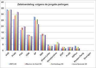
It is shocking to see that pre-election poll results on the cover of a large Dutch newspaper are presented in a plain standard Excel template and colours with one adjustment: add some 3D effects, which makes it even worse.
SlideMagic: a platform for magical presentations. Free student plan available.LEARN MORE
That was quite a speech by Michelle Obama at the Democratic Convention. Political objectives translated into human story telling. Call it the inverse strategy, rather than attacking your opponent directly and saying that he measures achievement only in terms of dollars, and will never be able to understand the hardship many Americans go through because he has never experienced it himself, portray your own situation as the exact opposite. Make all the accusations implicitly
Short sentences (fits in 140 characters), natural language, no buzzwords, lots and lots of real-life stories. You see the people in the audience completely glued to the stage, hearing what they wanted to hear.
SlideMagic: a platform for magical presentations. Free student plan available.LEARN MORE
Some stories are really good but complicated to explain. Here, a well-designed slide deck can make a big impact.
Other stories are relatively easy to explain, but have a few big questions inside them. In these cases, effort is better spent on providing answers to the questions, rather than investing it in making the slide deck look and flow better.
If you have limited resources, choose where you are.
SlideMagic: a platform for magical presentations. Free student plan available.LEARN MORE
Team bio slides in presentation often resemble a C.V.: lots of information, lots of buzzwords, lots of academic degrees from 30 years ago. All team bio slides look the same.
At a cocktail party, people use a different approach to introducing someone. Out comes a very quick, personal, and memorable description of a person. Every cocktail party introduction is different.
Try designing your team bio slide more like a cocktail party introduction, and less like a C.V. page.
Actually, add the full detail of the C.V. in font 10 as backup reading material at the end of your presentation, for reading, not presenting.
SlideMagic: a platform for magical presentations. Free student plan available.LEARN MORE
With the advent of Mac OSX Lion I moved to using a track pad for all those fancy swiping features. However, I am back to a regular mouse. For intensive design work, a track pad strains my wrist too much. You constantly need to lift your hand slightly above the track pad, which starts to hurt. Using a mouse, I can put my hand and wrist in a completely neutral position without straining any muscle.
SlideMagic: a platform for magical presentations. Free student plan available.LEARN MORE
You have limited time, you have limited budget, and you are not a natural-born designer. Still you can design an effective presentation. Keep it minimal and tasteful.
No bullet points
One big idea per slide
Use simple shapes without a border
Muted color palette (lots of greys, one bright accent color) without gradients
Non-cheesy stock images: high res and in correct aspect ratio
Arial font
White page, (small logo if you want at the bottom right)
People will recognise it was not designed by a professional, but they will get the message and respect you how you did this with such minimal tools.
SlideMagic: a platform for magical presentations. Free student plan available.LEARN MORE
I recently watched this video: The making of Aja, an album by Steely Dan released in the early 1970s. The movie shows how the bands 2 creative leaders Donald Fagen and Walter Becker going track by track, instrument by instrument, to get the album “beyond perfection”, as one of the studio musicians describes the process about halfway in the video.
Fagen and Becker were ruthless perfectionists, editing down guitar solos of the best players down to a few notes, swapping entire bands overnight, or adding a few high (1970s) synthesizer notes to make a flute sound a bit fuller.
Only when you get to a point that is beyond perfection can you start to improvise to give things that personal edge. And that is exactly the same for presentations: only when you have rehearsed in and out, you can deliver that truly relaxed and spontaneous presentation.
The movie is on Netflix, but to my surprise I also found a lower-quality version free online, the site seems legitimate:
I get that question often when presenting my deck loaded with impressionist paintings to a big corporate. Serious companies cannot make presentations like these.
Wrong. Visual presentations without bullet points can be highly professional, and highly serious. Just take a different theme than impressionist paintings.
Right. I do agree that being serious adds a design challenge. Everyone can Google image search a bunch of funny page-filling images together and add some outrageously big wacky fonts to them and call it a visual presentation. The challenge is to add some aesthetics, but it is an easy step to make once you have made the big leap of leaving bullet points behind.
SlideMagic: a platform for magical presentations. Free student plan available.LEARN MORE
Some startups have a technology platform that can be used in multiple markets, and often the startup is not completely clear (yet) about how to prioritise them. In a first 20-minute investor pitch this creates a highly confusing story; an investor can only take in so much information in 20 minutes and probably will not buy that a 5 person startup can conquer all these markets (she is probably right). Here is a potential solution:
In the first 20 minute cold pitch:
Set up your platform business situation
Pitch 1 (maybe 2) markets properly (the most promising ones)
Hint at further upside in the other markets (1 quick slide)
If that went well, elaborate more in follow-on meetings about the other opportunities and provide a discussion framework about possible prioritisation, and you can even ask the potential investor for advice.
Do not try to spring all 10 stories in the first 20 minutes, you will fail.
SlideMagic: a platform for magical presentations. Free student plan available.LEARN MORE
Prices for celebrity and news photos are incredibly high (check some of them on Getty Images). Why? Because the licensing options are set for high-volume print runs or web sites. Usually, presentations are different. The audience is relatively small (rarely above 100) and most presentations are a one-off event. So, producers of news and celebrity images are missing out on the presentation design market.
Enter a new web site: slideshots.com. It is a database of AFP images with EUR 2 licensing options for use in presentations. A great alternative for over-sued and cheesy stock images. And the license looks pretty flexible, even for use online on platforms such as SlideShare.
SlideMagic: a platform for magical presentations. Free student plan available.LEARN MORE
PowerPoint does weird things with URLs and email addresses. When you type in either, it turns them automatically into a hotlink (sometimes useful), but applies a highly ugly formatting (a bright color with underlined text). A slide is not a web page where links compete for your attention, make sure to tone down the formatting or remove the hyperlink all together.
SlideMagic: a platform for magical presentations. Free student plan available.LEARN MORE
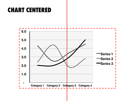
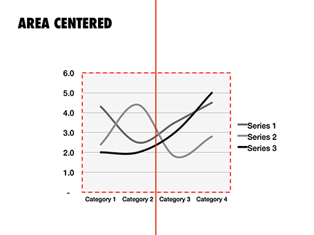
There are two ways to center a data chart on a slide: center the entire chart image including labels and legends, or center just the chart area, ignoring the labels. I prefer the latter.
SlideMagic: a platform for magical presentations. Free student plan available.LEARN MORE
A frightening, dramatic, stressful image can greatly enhance your message. But I would not use it on the cover page of your presentation. That page usually sits on the projector for a long time while the audience is walking in and you do not want to destroy their mood before your talk started. Use the stressful slide at a key moment inside your deck instead, it could even be one page 2, just not on page 1.
SlideMagic: a platform for magical presentations. Free student plan available.LEARN MORE
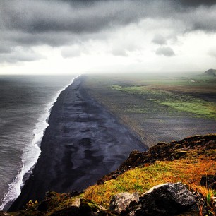
It has hard to grasp the magnitude of something with cold statistics. For example, this waterfall that I recently visited in Iceland drops 60m, but it is hard to imagine, unless you pay attention to the tiny people standing next to it.
Another example is this TED video by Ramesh Raskar, about photographing light traveling through an empty Coke bottle at a few trillion frames per second. At 3:50 the key statistic comes out: it would take a bullet fired from a gun 1 year to travel through the bottle if it was slowed down as the same rate as the light beam.
Do the same in your presentations. Tell stories with analogies to make it easier for people to understand big (or small) numbers.
Off topic: when photographing landscapes I usually resist the temptation of making that completely clean shot without any evidence of human presence in it. That small house, car, or person adds that critical sense of size to an object. When making a shot of a long-distance view, keep something close to the camera in the composition (a tree branch or something) to maintain the sense of distance.
SlideMagic: a platform for magical presentations. Free student plan available.LEARN MORE
I love Instagram to make interesting visualizations on the go. You can follow me, my user name is ideatransplant (surprise), examples of some recent snaps from Iceland are here. Filters are a key feature of Instagram that provoke diverging opinions: some people love them, some people wonder however why you would distort any image you take to make it look like 1977.
There is a middle way though. Filters can be used as shortcuts to legitimate photo corrections when you do not have time to open a photo editing program and fiddle with all the possible adjustment levers. Instagram filters are basically shortcuts or presets of a number of settings. Below are some examples:
Color balance: Hudson, Walden, Nashville make things more blue, more cold, Hefe, Kelvin, Rise make things more yellow/green, warmer
Contrast: X-pro II, Lo-Fi add more, Rise, Walden add less
Brightness: Sutro, Brannan make things darker, Amaro, Rise make things lighter.
Saturation: black and white obviously has none, Lo-Fi has lots
In most cases you need to try all of them to find a filter that offsets the imperfections of your hastily taken picture best. Used in this way filters are no longer distortions, but actually improve the look of your photo.
SlideMagic: a platform for magical presentations. Free student plan available.LEARN MORE
Probably one of the few areas where visuals do not contribute to more effective communication is on restaurant menus. When I stand outside a place and see a menu with an image of a greasy hamburger on a laminated piece of paper I decide to move on, because I have eaten in too many bad restaurants that use food photography on their menu. My brain has hardwired the relationship: food image on menu -> bad food.
The greasy hamburger image effect also applies to slides. The second you put your first one on the screen, people compare that visual to the 1,000s of other presentation slides they have seen. If it is a list of bullet points, you have lost your audience before you uttered your first sentence.
(P.S. I think typography is a big opportunity for bad restaurants: cut down on the images, replace the laminated menus with pictures for nice heavy paper with freshly printed menus (new every day) using lots of white space and a chique font, and business will boom in your tourist trap. But hey, if you are willing to put in this amount of effort into your business, why not start improving the food...)
SlideMagic: a platform for magical presentations. Free student plan available.LEARN MORE