Join me at Startup Reykjavik

I have been enjoying the most amazing holiday in Iceland this summer and will make a stop over at the Startup Reykjavik accelerator for a presentation about designing investor and sales presentations for startups.


Hopefully I can help the companies in the Startup Reykjavik program that are working hard on finalizing their investor pitches for follow-on funding. But Startup Reykjavik agreed to make the event open to the public, so if you are around you are invited to drop by.


This event is sponsored by Arion Bank, a major retail and commercial bank in Iceland that is working hard to support the startup economy here (more info about the bank).


The details of the event: Monday August 13, starting around 11:00-11:30 and will probably last 1-2 hours, Startup Reykjavik is based at 13 Ármúli.

SlideMagic: a platform for magical presentations. Free student plan available. LEARN MORE

Olympic infographics

The results from the Olympic Games are a great data source for infographic designers, here are 2 examples from the New York Times: one that I like, and one that I do not like.

The country medal count bubbles is cute but not very useful. It tests the reader’s geography knowledge to figure out what the countries are that have no data label inside them. A simple bar chart will do a much better job, and will leave space for a second bar chart: inhabitants per medal. You would always expect a country with a larger population to produce more medals.


This overview of 100m running medals over the past century is great though. It transforms the basic finish time data into something much more interesting, where on the 100m track would each runner be the moment the 2012 crosses the line. The NYT also created a nice video to analyze the results.


SlideMagic: a platform for magical presentations. Free student plan available. LEARN MORE

Sugar levels

It takes some skill to time the right amount of energy for your presentation. Presenting after a very heavy lunch will be difficult. Presenting on an empty stomach is the other extreme. I usually eat a granola bar around 30 minutes before I have to go on stage, to make sure that I am all fired up to go with a fresh shot of energy. Granola bars have a good sugar kick, but also provide some substance that is missing in many processed food snacks and candy.

SlideMagic: a platform for magical presentations. Free student plan available. LEARN MORE

Behind her back?

If you are pitching to a big corporate, it is important to understand how their decision making process works. For example: going behind someone‘back and talk to her superior could back fire.

Big corporates can be big bureaucracies, but not all departments work like this. It could be that the junior team member you just skipped sits next to her boss who is forwarding the email she just received from you straight back at her. They do exist inside big corporates, proper functioning teams with an open work culture.

Some people who are very high up in the corporate hierarchy might actually not have that much decision power. It depends on the type of business. For example, someone can be global marketing manager of a big soft drinks brand, and have a lot of responsibilities. However, it could be that most tactical decisions are actually taken at the country level, in the local subsidiaries in wich the parent holds a minority stake. In short, understand how your big corporate target works before planning your pitch strategy.

SlideMagic: a platform for magical presentations. Free student plan available. LEARN MORE

Torn

One of my clients is saving companies that are caught between two opposing forces. Here is the visual concept I used that explained the 4 contradictions.


SlideMagic: a platform for magical presentations. Free student plan available. LEARN MORE

Summer posting schedule

Over the next few weeks posting frequency will drop on the blog as I will be spending more time with my family and less time at the computer. I hope you all have a great summer as well.


Image credit: fridgeirsson

SlideMagic: a platform for magical presentations. Free student plan available. LEARN MORE

PowerPoint 2013 mini review

Everyone can install a preview of the new and upcoming Microsoft Office 2013 free of charge. Follow the process outlined here, and take into account some of the health warnings by Geetesh Bajaj (be especially careful with Outlook). I installed my version on a Parallels virtual PC on my Mac and limited my mini review to PowerPoint.

Probably on purpose, Microsoft made very little changes to the menu structure of PowerPoint. Anyone using PowerPoint 2010 will feel at home immediately. Everything stayed in the same place. The look and feel of Office 2013 has improved a lot: clean lines, fewer gradients, fewer shadows, light fonts. The UI radiates calm and good taste. Almost a bit too calm, as it can be hard sometimes to see the contrast of white slide backgrounds against the background of the design canvas. But overall, very good.

Microsoft has made the 16:9 aspect standard in PowerPoint 2013. This will work well with modern computer monitors, but I am actually not a big fan of designing slides in 16:9. It works great for movies, but for visuals I find a wide screen somewhat limiting. Also, old VGA conference room projection screens have a 4:3 ratio, and more importantly, I do not expect tablet devices to go to a 16:9 screen ratio.

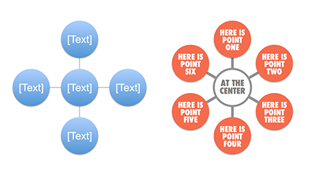
If there is one criticism for Microsoft, it would be the bullet point template: it is still there. You insert a new slide, and the bullets are waiting for you to be filled in. The entire slide master is still the messy collection of bullet point-based slide layouts with big page numbers and dates on every page. Maybe with PowerPoint 2016, this will be eliminated...


Back to the good news. Some nice and subtle improvements:
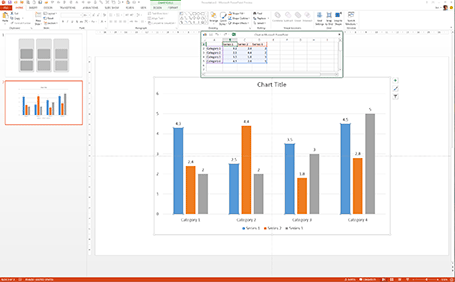
  • The standard data chart looks a lot better: lines are more refined and the standard tick marks are gone, axis labels are rounded up. Somehow data editing is a lot smoother than in PowerPoint 2010 where the integration with Excel can cause freezes and hick ups.
  • It is easier to create new drawing guides on the screen and set their spacing, no more looking for the ALT, CTRL, SHIFT key, I always forget which to pick. A simple context menu will do the trick
  • Speaking about context menus, Microsoft uses the horizontal screen real estate better, if you now right-click-format a shape, a box to the right of the screen pops up with the formatting options, similar to the inspector in Keynote.
  • The smart drawing guides have become smarter: when you drag a third copy of an object across the screen it now freezes when you reached the point where you aligned all 3 shapes at exactly the same distance (similar to what Keynote does).
  • The Calibri font range has been extended with a light variety. I have always argued that for on screen presentations, the selection of font weights available is more important than the actual fonts. If Arial would just come in 5 weights presentations would just look so much better (fat headlines, subtle text)
  • By default, images keep their aspect ratio, making it harder to distort them while re-sizing
  • There is now a commenting system on each slide, comments pop up in a vertical bar at the right, which is great to moderate a discussion right next to the slide without having to rely on the body of the email that you used to send the presentation
  • Office 2013 is completely integrated with Skydrive for online access to all your files stored in the cloud.
All in all this looks like an upgrade worth paying for.

SlideMagic: a platform for magical presentations. Free student plan available. LEARN MORE

Crappy paste-as-image

If you use a custom font just on one page of your presentation, it is better to use the text as an image, so viewers of your presentation do not have to install that font on their computers in order to see it. Microsoft PowerPoint gives the option of paste special, past as image but - at least on a Mac - the resulting graphic looks horrible. I simple make a screen shot of the text and paste that in.

SlideMagic: a platform for magical presentations. Free student plan available. LEARN MORE

Got into a fight

I usually do not get draw into a fight, the exception was recently when a client asked me to design a presentation that was a response to a presentation by a competitor that was a direct attack on the company.

The competitor document consisted of 5 pages of dense text with long sentences written in a style of two children complaining in front of the head teacher: “She says, but that is not true, then I say, you see that I am right?”. Lots of quotes, lots of complicated arguments, no numbers, no visuals.

My design was different. One simple headline per slide, one simple fact or illustration to support it. I did not discuss any features of my client, did not repeat the sales story of my client. Just corrected fact after fact after fact. I think it works pretty well, it is just a bit a waste of all that negative energy that goes into aggressive presentations.

SlideMagic: a platform for magical presentations. Free student plan available. LEARN MORE

Replicators

I have never been a fan of stock image photographers making pre-fab slide compositions, but in one area they can add value: digitally replicating items to infinity. See the attached image by higyou on Shutterstock. It is worthwhile visiting multiple stock image sites for these type of renderings, since they often can only be found exclusively on one site. Have a look at Filter Forge if you want to try to create these types of effects.


SlideMagic: a platform for magical presentations. Free student plan available. LEARN MORE

Nothing ever changes...

Here is a simple concept to visualize a problem that the cable television industry has: replacement cycles of hardware sitting in the people’s homes is really loooooong, especially compared to how often we upgrade our mobile devices. In this slide I used repetition plus cropped the years on both sides of the page to create that sense of continuity.

SlideMagic: a platform for magical presentations. Free student plan available. LEARN MORE

Changing PowerPoint shapes

Another hard to find feature in PowerPoint. It is possible to change a shape, for example turn a rectangle into an oval. Select the rectangle, go into the SmartArt menu, select the shapes button, and the select the shape you want instead.

SlideMagic: a platform for magical presentations. Free student plan available. LEARN MORE

Office 365: not there yet

I signed up for a trial of Microsoft Office 365, the cloud-based version of Microsoft Office to see whether it could be a work-around to get the Windows version of PowerPoint to run on my Mac. (There are a few bits missing in the Mac-version of PowerPoint).

Not every Office user is the same. For the corporate user that needs access to files on any device, plus the ability to make some small edits to Office documents that are created on desktop applications, the Office 365 offering makes perfect sense.

But Office 365 is not ready yet to become a core design platform. I tested only PowerPoint, and ran the web app in Google Chrome on Mac OSX, please correct me if some of the limitations were due to hardware/software issues:
  • The availability shapes and functions in PowerPoint are extremely limited when compared to the desktop version. Now, I am all in favor of cutting PowerPoint features but here basic elements were left out (creating data charts  or cropping pictures for example)
  • Fonts are a big issue, if purchased custom fonts that are installed on my computer, but they are not present on Microsoft's Office 365 server, so your presentations become garbled
  • The preview of slides are low-res and slightly blurry (I am using a 2500 pixel monitor), only when you click to edit an object does the full resolution kick in.
In a few years from now, Microsoft Office applications will run smoothly across devices and platforms, we need a little bit more patience.

SlideMagic: a platform for magical presentations. Free student plan available. LEARN MORE

Everyone can design

Advertising agency RPA made a bunch of Apple-style ads for common products, probably intending to show that the world would be boring of all ads looked like this. I actually disagree, and would welcome to see the clutter in advertising go.


You see how easy it is to create professional looking slides by just applying a bit of white space and picking the right crop for your images. You do not need to be an advertising professional to do this, you do not need sophisticated software to do this.


Via AdFreak.

SlideMagic: a platform for magical presentations. Free student plan available. LEARN MORE

Keynote discoveries

I am a PowerPoint veteran who only recently started to design presentations in Keynote. Here are some of the little things that were hard to find:
  • Connecting shapes with a line: select both shapes go to the insert menu and select connecting lines
  • Remove an image background: go to the format menu and select instant alpha
  • Edit an image (make it B&W for example): select the image and click the tiny button with the levers (next to the stroke buttons). 

SlideMagic: a platform for magical presentations. Free student plan available. LEARN MORE

The pitch bottleneck

Sometimes a startup idea is already stuck in the mind of a potential investor. I think pretty much any VC is convinced that ultimately mobile payments or social friend-to-friend shopping recommendations could be huge businesses. The bottle neck is: how to make it work. When you pitch your startup idea in one of these fields, you will be welcomed by a healthy dose of cynicism.  Do not waste your time on preaching to the converted, but have your pitch target the bottle neck in the mind of the investor.

SlideMagic: a platform for magical presentations. Free student plan available. LEARN MORE

Re-discovering Smart Art

Smart art inside PowerPoint is a semi-automated template engine for diagrams. It easy to add and remove boxes/bubbles, edit text. The idea is good, but I have not used them a lot:
  • The standard out-of-the-box formatting is ugly
  • Although there are many frameworks to chose from, none of them usually really work for my particular presentation problem
  • I have seen them too many times in presentations where designers simply dump in a smart art graphic to replace a bullet point chart (the result is still a bullet point chart that looks a bit different)
Recently, I have started to use smart art in my presentations, but in a different way. I use them to position objects on a slide by picking only the very basic configurations and reformat the slide items heavily so you can hardly recognize it is a smart art object anymore. An example below:
 

Well, I said before: your PowerPoint is really good PowerPoint if your audience cannot tell it is PowerPoint...

More about smart art on the Microsoft site, or over at the PowerPoint Ninja blog.

SlideMagic: a platform for magical presentations. Free student plan available. LEARN MORE

In between the lines

One of the most important criteria for an investor to invest in your business is you, the entrepreneur, and the in-person presentation is an excellent way to figure you out as a person. Information about all the other elements of your company is covered in the slides, your business plan and/or your website. Investors can read about your CV, but the only way to figure you out is attending that 45 minute presentation. What you present is important, but the other 50%, how you are as a person is also vital. How is to work with you as a Board member with you, the CEO, at the helm of the company?

Can you be trusted? Trust and integrity are one of the most important things a potential investor is looking for. And it does not really work to put a slide on the projector that says “I never lie”. The investor needs other clues that come out in between the lines of your slides. Maybe an investor knows the answer to a question, but asks it any way. If you do not know the answer it is better to say so than make something up. Do you start to gossip, leak information, to people you have just met 20 minutes ago? If you do it to the potential investor, you are likely to do it to others as well.

There is no upside in bending the truth. So maybe you were successful in getting away with some form of reality distortion in the pitch meeting, the investor will eventually find out during the extended due diligence in the weeks (or sometimes) months to come. You enter an exclusivity period, you continue to burn money, and at the end the investors finds out and withdraws from the deal (integrity issues are a huge red flag). Then you are left without an investor, without funds, and a tarnished reputation as you have to explain to other potential investors why this one pulled out. Your entire company is at risk.

How are you to work with? If you interpret every question or feedback as a major assault on your company that needs to be fought by “going for the kill” you will have convinced investors that you have strong will power and a lot of energy and determination. On the other, you lost valuable points as a person is open to constructive feedback from Board members. Sometimes it is good to admit that you do not know, acknowledge that certain suggestions could be useful, or if you disagree come up with thoughtful arguments. Again, your behavior tells the story, not what it is you actually say.

How do you treat your colleagues? If you present with your team it gives potential investors an excellent show case of you are as a people manager. Constantly silencing, or belittling your team will not get you points on this scale.

SlideMagic: a platform for magical presentations. Free student plan available. LEARN MORE

Smartphone screen shots

The best way to make a slide with a smartphone screenshot:

  • Get a stock image of a smartphone without the device maker brand (using Google Image search might get you into copy right issues)
  • Take the actual screenshot on your smartphone, in my case I use my iPhone browser to go to the web page and press the home and on/off button at the same time. Email yourself the image
  • And here comes the trick: apply a subtle inner shadow to the image. You see the difference in the image below, the left side one looks a little bit bland, the right side looks much more natural

SlideMagic: a platform for magical presentations. Free student plan available. LEARN MORE

The Idea Transplant blog turns 4

It all started with this post back in the summer of 2008. Now, 4 years and almost 1,200 posts later I have a great reader community, an international client base, and switched what I call myself from strategy consultant to presentation designer. Thank you for reading.

SlideMagic: a platform for magical presentations. Free student plan available. LEARN MORE