You cannot argue about taste, and there are no rules about what color combinations work or not. But somehow there are color schemes that come out great in a presentation, and with certain ones I have a very hard time making a deck look good. Here are my random experiences:
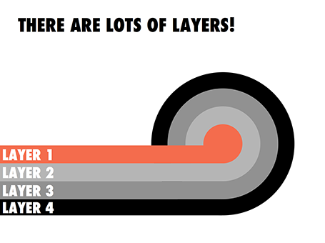
- Colour schemes with fewer contrasting colours in it tend to work better. You can create beautiful minimalist shades with grey shades and black, with a dash of a bright accent color here and there. In case of three (or more) contrasting colours, I tend to pick one of the three as my main accent color, and reduce the prominence of the other 2
- Deep colours work better than faded pastel ones. What looks great in print, might not work on a screen. Especially when you make the backgrounds of your slides white. Contradicting my first point, a series of deep colours can look great of they are related, and not contrasting. I have designed great looking decks with 5 to 7 related colours.
So, whenever you are thinking about new colours for your company, create a few presentation slides to evaluate options rather than deciding on the look of a logo. Logo colours can look great, but seeing them used in a business presentation is another challenge.
If you are going to work mainly with dark backgrounds, use that as your color testing ground. And vice-versa, if you find that your colours simply do not look good on white, switch to dark background presentations. I have applied this rescue trick a few times with clients.