Let me introduce her to you

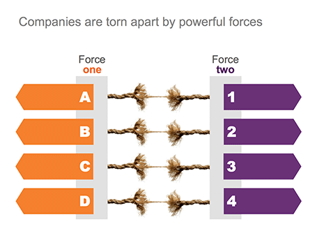
Team bio slides in presentation often resemble a C.V.: lots of information, lots of buzzwords, lots of academic degrees from 30 years ago. All team bio slides look the same.

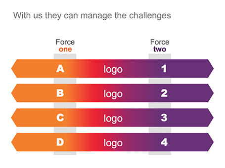
At a cocktail party, people use a different approach to introducing someone. Out comes a very quick, personal, and memorable description of a person. Every cocktail party introduction is different.

Try designing your team bio slide more like a cocktail party introduction, and less like a C.V. page.

Actually, add the full detail of the C.V. in font 10 as backup reading material at the end of your presentation, for reading, not presenting.

SlideMagic: a platform for magical presentations. Free student plan available. LEARN MORE

Trackpad U-turn: back to the mouse

With the advent of Mac OSX Lion I moved to using a track pad for all those fancy swiping features. However, I am back to a regular mouse. For intensive design work, a track pad strains my wrist too much. You constantly need to lift your hand slightly above the track pad, which starts to hurt. Using a mouse, I can put my hand and wrist in a completely neutral position without straining any muscle.

SlideMagic: a platform for magical presentations. Free student plan available. LEARN MORE

It does not have to be pretty

You have limited time, you have limited budget, and you are not a natural-born designer. Still you can design an effective presentation. Keep it minimal and tasteful.
  1. No bullet points
  2. One big idea per slide
  3. Use simple shapes without a border
  4. Muted color palette (lots of greys, one bright accent color) without gradients
  5. Non-cheesy stock images: high res and in correct aspect ratio
  6. Arial font
  7. White page, (small logo if you want at the bottom right)
People will recognise it was not designed by a professional, but they will get the message and respect you how you did this with such minimal tools.

SlideMagic: a platform for magical presentations. Free student plan available. LEARN MORE

Beyond perfection

I recently watched this video: The making of Aja, an album by Steely Dan released in the early 1970s. The movie shows how the bands 2 creative leaders Donald Fagen and Walter Becker going track by track, instrument by instrument, to get the album “beyond perfection”, as one of the studio musicians describes the process about halfway in the video.

Fagen and Becker were ruthless perfectionists, editing down guitar solos of the best players down to a few notes, swapping entire bands overnight, or adding a few high (1970s) synthesizer notes to make a flute sound a bit fuller.

Only when you get to a point that is beyond perfection can you start to improvise to give things that personal edge. And that is exactly the same for presentations: only when you have rehearsed in and out, you can deliver that truly relaxed and spontaneous presentation.

The movie is on Netflix, but to my surprise I also found a lower-quality version free online, the site seems legitimate:


Watch Classic Albums - Steely Dan - Aja in Music  |  View More Free Videos Online at Veoh.com

SlideMagic: a platform for magical presentations. Free student plan available. LEARN MORE

But we are a serious company!

I get that question often when presenting my deck loaded with impressionist paintings to a big corporate. Serious companies cannot make presentations like these.

Wrong. Visual presentations without bullet points can be highly professional, and highly serious. Just take a different theme than impressionist paintings.

Right. I do agree that being serious adds a design challenge. Everyone can Google image search a bunch of funny page-filling images together and add some outrageously big wacky fonts to them and call it a visual presentation.  The challenge is to add some aesthetics, but it is an easy step to make once you have made the big leap of leaving bullet points behind.

SlideMagic: a platform for magical presentations. Free student plan available. LEARN MORE

Story prioritization

Some startups have a technology platform that can be used in multiple markets, and often the startup is not completely clear (yet) about how to prioritise them. In a first 20-minute investor pitch this creates a highly confusing story; an investor can only take in so much information in 20 minutes and probably will not buy that a 5 person startup can conquer all these markets (she is probably right). Here is a potential solution:

In the first 20 minute cold pitch:
  • Set up your platform business situation
  • Pitch 1 (maybe 2) markets properly (the most promising ones)
  • Hint at further upside in the other markets (1 quick slide)
If that went well, elaborate more in follow-on meetings about the other opportunities and provide a discussion framework about possible prioritisation, and you can even ask the potential investor for advice.

Do not try to spring all 10 stories in the first 20 minutes, you will fail.

SlideMagic: a platform for magical presentations. Free student plan available. LEARN MORE

News photos for bargain prices

Prices for celebrity and news photos are incredibly high (check some of them on Getty Images). Why? Because the licensing options are set for high-volume print runs or web sites. Usually, presentations are different. The audience is relatively small (rarely above 100) and most presentations are a one-off event. So, producers of news and celebrity images are missing out on the presentation design market.


Enter a new web site: slideshots.com. It is a database of AFP images with EUR 2 licensing options for use in presentations. A great alternative for over-sued and cheesy stock images. And the license looks pretty flexible, even for use online on platforms such as SlideShare.

SlideMagic: a platform for magical presentations. Free student plan available. LEARN MORE

Pink URLs

PowerPoint does weird things with URLs and email addresses. When you type in either, it turns them automatically into a hotlink (sometimes useful), but applies a highly ugly formatting (a bright color with underlined text). A slide is not a web page where links compete for your attention, make sure to tone down the formatting or remove the hyperlink all together.

SlideMagic: a platform for magical presentations. Free student plan available. LEARN MORE

How to position a data chart

There are two ways to center a data chart on a slide: center the entire chart image including labels and legends, or center just the chart area, ignoring the labels. I prefer the latter.


SlideMagic: a platform for magical presentations. Free student plan available. LEARN MORE

Stress-inducing cover image?

A frightening, dramatic, stressful image can greatly enhance your message. But I would not use it on the cover page of your presentation. That page usually sits on the projector for a long time while the audience is walking in and you do not want to destroy their mood before your talk started. Use the stressful slide at a key moment inside your deck instead, it could even be one page 2, just not on page 1.

SlideMagic: a platform for magical presentations. Free student plan available. LEARN MORE

A double-edged sword

There are 2 benefits to using simple slides with little content and one focussed message:
  1. They are much more effective than busy complex slides (most of us believe this by now)
  2. They are a lot easier to design than busy complex slides (very few realize this)
Once you decide to adopt 1, your slide design skills have quadrupled instantly because of argument 2.

SlideMagic: a platform for magical presentations. Free student plan available. LEARN MORE

Putting things in perspective

It has hard to grasp the magnitude of something with cold statistics. For example, this waterfall that I recently visited in Iceland drops 60m, but it is hard to imagine, unless you pay attention to the tiny people standing next to it.


Another example is this TED video by Ramesh Raskar, about photographing light traveling through an empty Coke bottle at a few trillion frames per second. At 3:50 the key statistic comes out: it would take a bullet fired from a gun 1 year to travel through the bottle if it was slowed down as the same rate as the light beam.

Do the same in your presentations. Tell stories with analogies to make it easier for people to understand big (or small) numbers.

Off topic: when photographing landscapes I usually resist the temptation of making that completely clean shot without any evidence of human presence in it. That small house, car, or person adds that critical sense of size to an object. When making a shot of a long-distance view, keep something close to the camera in the composition (a tree branch or something) to maintain the sense of distance.

SlideMagic: a platform for magical presentations. Free student plan available. LEARN MORE

How to use Instagram filters

I love Instagram to make interesting visualizations on the go. You can follow me, my user name is ideatransplant (surprise), examples of some recent snaps from Iceland are here. Filters are a key feature of Instagram that provoke diverging opinions: some people love them, some people wonder however why you would distort any image you take to make it look like 1977.


There is a middle way though. Filters can be used as shortcuts to legitimate photo corrections when you do not have time to open a photo editing program and fiddle with all the possible adjustment levers. Instagram filters are basically shortcuts or presets of a number of settings. Below are some examples:
  • Color balance: Hudson, Walden, Nashville make things more blue, more cold, Hefe, Kelvin, Rise make things more yellow/green, warmer
  • Contrast: X-pro II, Lo-Fi add more, Rise, Walden add less
  • Brightness: Sutro, Brannan make things darker, Amaro, Rise make things lighter.
  • Saturation: black and white obviously has none, Lo-Fi has lots
In most cases you need to try all of them to find a filter that offsets the imperfections of your hastily taken picture best. Used in this way filters are no longer distortions, but actually improve the look of your photo.

SlideMagic: a platform for magical presentations. Free student plan available. LEARN MORE

Food photography

Probably one of the few areas where visuals do not contribute to more effective communication is on restaurant menus. When I stand outside a place and see a menu with an image of a greasy hamburger on a laminated piece of paper I decide to move on, because I have eaten in too many bad restaurants that use food photography on their menu. My brain has hardwired the relationship: food image on menu -> bad food.

The greasy hamburger image effect also applies to slides. The second you put your first one on the screen, people compare that visual to the 1,000s of other presentation slides they have seen. If it is a list of bullet points, you have lost your audience before you uttered your first sentence.

(P.S. I think typography is a big opportunity for bad restaurants: cut down on the images, replace the laminated menus with pictures for nice heavy paper with freshly printed menus (new every day) using lots of white space and a chique font, and business will boom in your tourist trap. But hey, if you are willing to put in this amount of effort into your business, why not start improving the food...)


SlideMagic: a platform for magical presentations. Free student plan available. LEARN MORE

Join me at Startup Reykjavik

I have been enjoying the most amazing holiday in Iceland this summer and will make a stop over at the Startup Reykjavik accelerator for a presentation about designing investor and sales presentations for startups.


Hopefully I can help the companies in the Startup Reykjavik program that are working hard on finalizing their investor pitches for follow-on funding. But Startup Reykjavik agreed to make the event open to the public, so if you are around you are invited to drop by.


This event is sponsored by Arion Bank, a major retail and commercial bank in Iceland that is working hard to support the startup economy here (more info about the bank).


The details of the event: Monday August 13, starting around 11:00-11:30 and will probably last 1-2 hours, Startup Reykjavik is based at 13 Ármúli.

SlideMagic: a platform for magical presentations. Free student plan available. LEARN MORE

Olympic infographics

The results from the Olympic Games are a great data source for infographic designers, here are 2 examples from the New York Times: one that I like, and one that I do not like.

The country medal count bubbles is cute but not very useful. It tests the reader’s geography knowledge to figure out what the countries are that have no data label inside them. A simple bar chart will do a much better job, and will leave space for a second bar chart: inhabitants per medal. You would always expect a country with a larger population to produce more medals.


This overview of 100m running medals over the past century is great though. It transforms the basic finish time data into something much more interesting, where on the 100m track would each runner be the moment the 2012 crosses the line. The NYT also created a nice video to analyze the results.


SlideMagic: a platform for magical presentations. Free student plan available. LEARN MORE

Sugar levels

It takes some skill to time the right amount of energy for your presentation. Presenting after a very heavy lunch will be difficult. Presenting on an empty stomach is the other extreme. I usually eat a granola bar around 30 minutes before I have to go on stage, to make sure that I am all fired up to go with a fresh shot of energy. Granola bars have a good sugar kick, but also provide some substance that is missing in many processed food snacks and candy.

SlideMagic: a platform for magical presentations. Free student plan available. LEARN MORE

Behind her back?

If you are pitching to a big corporate, it is important to understand how their decision making process works. For example: going behind someone‘back and talk to her superior could back fire.

Big corporates can be big bureaucracies, but not all departments work like this. It could be that the junior team member you just skipped sits next to her boss who is forwarding the email she just received from you straight back at her. They do exist inside big corporates, proper functioning teams with an open work culture.

Some people who are very high up in the corporate hierarchy might actually not have that much decision power. It depends on the type of business. For example, someone can be global marketing manager of a big soft drinks brand, and have a lot of responsibilities. However, it could be that most tactical decisions are actually taken at the country level, in the local subsidiaries in wich the parent holds a minority stake. In short, understand how your big corporate target works before planning your pitch strategy.

SlideMagic: a platform for magical presentations. Free student plan available. LEARN MORE

Torn

One of my clients is saving companies that are caught between two opposing forces. Here is the visual concept I used that explained the 4 contradictions.


SlideMagic: a platform for magical presentations. Free student plan available. LEARN MORE

Summer posting schedule

Over the next few weeks posting frequency will drop on the blog as I will be spending more time with my family and less time at the computer. I hope you all have a great summer as well.


Image credit: fridgeirsson

SlideMagic: a platform for magical presentations. Free student plan available. LEARN MORE