Handling an unfriendly audience

Audience members are not always friendly. Unfriendliness comes in 2 types:
  1. the civilised audience who is reluctant to agree with your proposal (I faced many of those as a management consultant) and  
  2. the heckler who is out there to interrupt and derail your presentation (probably on his own).
Audience 1. A fatal mistake with audiences that do not agree with you is to invite the full debate before you have had a chance to tell your story. Highlight all the points and data quickly before you get to some slide that presents the trade off your making. That trade off slide is very important. Many of these strategy debates go in circles and keep on repeating the same points. If you have written down the point on the slide you can point at it and say “You are right, I have captured that here.”. Group/isolate/give less space to the points everyone agrees to and focus on trading off the difficult ones.

Audience 2. Hecklers are difficult. The best strategy is to try to get the audience on your side. If you ask - after 3 detailed questions - whether the audience agrees that these points are better discussed one-on-one after the presentation, there is a good chance that the heckler will stay quiet.  In addition, after you answered the heckler’s question, turn away from her, and make eye contact with another person with a question.

SlideMagic: a platform for magical presentations. Free student plan available. LEARN MORE

Stick to your grid

The grid is the imaginary set of horizontal and vertical lines along which the objects on your slides are aligned. Breaking the grid is a key tool that designers use to add an interesting tension to a page layout. But in most cases, it is better just to stick to it. See the example below, your eye will immediately pick up that there is something wrong with the layout of these head shots.

SlideMagic: a platform for magical presentations. Free student plan available. LEARN MORE

Do I actually need a deck?

Good question, and the answer is “Not always”. TED talks are a good example of people delivering complex messages without the support of slides. But:
  • In order to give that naked talk, you need to understand your presentation insight-out, you need to live and breathe your presentation. In the early phase of your learning curve, slides will give you a good backbone to hold on to. You start by presenting your slides, you end by telling your story. A lot of practice can of course make you jump straight to the end of this process.
  • Certain types of information have to be conveyed visually. Examples are graphs with data, the latest quarterly results, or an image of a surgical procedure.
  • In many cases the live presentation is actually not the main purpose of why we design slides, often we send out material ahead of our discussion. It is hard to avoid slides, unless you have the confidence to email a short recorded video of you explaining your idea (without slides).

SlideMagic: a platform for magical presentations. Free student plan available. LEARN MORE

4:3-ing that LCD screen

Most people design their slides for a the 4:3 aspect ratio of older TV screens and computer monitors (I still think it is actually better than 16:9).

Increasingly conference rooms are using large 16:9 LCD screens that are much brighter than the traditional on screen projectors. And most of these 16:9 screens are set to stretch 4:3 input signals. As a result your slides will look bloated.

Grab that monitor remote (you cannot control this from your computer) and set the aspect ratio to 4:3 before you start presenting. The tech person present usually will say “What, you want those black bars?”. You can answer affirmative. Your slides will look much better, and if you use a black slide background, no one will even notice the black vertical bars.

P.S. Ancient post that touches on slide backgrounds.

SlideMagic: a platform for magical presentations. Free student plan available. LEARN MORE

A deck for a 5 hr meeting?

After my presentation in Barcelona last night, one of the audience members came up to me and asked whether for 5-hour presentations, you should take a different approach from the one that I had been advocating for the 20 minute investor pitch. Two answers:
  1. Break up your 5-hour presentation in blocks of high-energy and well-designed 20 minute pitches and discussion sessions.
  2. But better still: cut that 5 hours. Give people the opportunity to read things beforehand and just do a discussion rather than going through details for 5 hours. Obviously this might require a culture change in your organisation if people usually do not do their pre-meeting homework.
Kicking off my talk in Barcelona last night

SlideMagic: a platform for magical presentations. Free student plan available. LEARN MORE

No watermarks please

When graphic designers start with the design of a PowerPoint template, they are faced with a white page. A common way to fill it is with a faded, washed out, water mark. It might look OK on an empty page, but it will clash with any other object than a text bullet point. To be avoided.

Unless other prescribed corporate template elements that are hard to change, a water mark can be easily taken out, simply delete the graphic on the page, or cover it with a white box.

SlideMagic: a platform for magical presentations. Free student plan available. LEARN MORE

The tiny legend

Many consulting charts feature a tiny legend in the top-right corner that explains what the shading in the bar chart means (for example “Have no access to clean drinking water”). Often that is the whole point of the chart and that legend deserve to be made a bit more visible.

SlideMagic: a platform for magical presentations. Free student plan available. LEARN MORE

Making up some numbers

In many cases it is hard to give a real example of the cost savings someone can achieve with your product or service. Data is not public, or in case of a startup, you might not have that many customers yet. “Making up some numbers” does not sound like an ethical alternative, but it is a good strategy if you stick to some simple guidelines.

  • Explicitly say that it is a hypothetical example
  • Create a highly realistic artificial customer (1 owner, 3 trucks, 1 warehouse, $x million in annual revenues, etc.)
  • And most importantly: explain how you get to your cost savings. If possible break them down into a few simple categories, and use a highly simple and transparent way to quantify them (10 instead of 35 phone calls of 30 minutes each per week equals $x)
  • Make the spreadsheet as complicated as you want, but start with a blank PowerPoint/Keynote page to explain your calculation. 
  • Add everything up and see whether the cost reductions make sense as a % of the total
The main purpose of the case example is to explain how you got to the savings, not the absolute point estimate.

SlideMagic: a platform for magical presentations. Free student plan available. LEARN MORE

Over-complicating a framework

Yesterday I posted about a way to visualize a complex comparison (a hedge fund). Sometimes thought, the best things is just to simplify. “Here is a competitive landscape. These guys are bigger. These guys use a wholesale model (we are retail). These focus mainly on Asia. These market to younger consumers.” Interesting for PhD students that study your market, too much information for a first pitch to a potential investor. Aggregate things up to a simple grouping of competitors and complicate things in later discussions.

SlideMagic: a platform for magical presentations. Free student plan available. LEARN MORE

Concept: a third way

This slider chart is a great way to show a comparison between multiple concepts across multiple dimensions. I recently used it for a hedge fund with a new innovative investment process.

UPDATE: this slide concept can now be downloaded from the SlideMagic store
SlideMagic: a platform for magical presentations. Free student plan available. LEARN MORE

Nature takes over

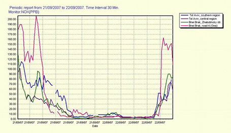
Yom Kippur (what?) in a big city in Israel is probably the only/place time in the world where you can experience the silence and (lack of) smells in a big urban community that you usually only find in an isolated nature reserve.  This graph is poorly formated but says it all: air pollution levels in Tel Aviv in 30 minute intervals.

SlideMagic: a platform for magical presentations. Free student plan available. LEARN MORE

The screen shot workflow

On a Mac, you can create a screenshot of a specific part of your screen. Pressing CMD-SHIFT-4 brings up a cross hair and you can select the area you want to capture.

Screen shots have become an essential part of my workflow. Rather than worrying how import PDF files, web sites, video stills, or other images into my presentation I just snap a picture of them. The same for exporting PowerPoint slides, the images on my blog are usually screen shots.

No more looking for files, no more worrying about file formats. I *heart* screen shots.

SlideMagic: a platform for magical presentations. Free student plan available. LEARN MORE

1996 presentation training

In the bottom of my office drawer I just found a small card with personalised suggestions for better presenting that I had to fill out after a communication training at McKinsey all the way back in 1996. All the usual things are there: stance, eye contact, etc.

But one things stands out and is so 1996/McKinsey: “Introduce the slide before putting it up” (remember we were still in the time of the overhead projector). McKinsey slides were incredibly busy and filled with data, so plopping that overhead sheet on the projector without warning would overwhelm the audience.

Instead, we had to introduce the message of the slide, show it, talk people through the various elements of the slide (what is on the axes, what the line means, etc. etc.), and maybe repeat the key point one more time.

Now 16 years later, my approach has completely changed. When you put up a slide, it should be completely self explanatory, cutting out unnecessary clutter and spreading out content of multiple slides if needed.

SlideMagic: a platform for magical presentations. Free student plan available. LEARN MORE

From screenshots to use case

How do you showcase your application in a 20 minute pitch? Doing a full, live demo is hardly ever an option:
  • Murphy’s Law will strike, and your Internet connection will break down, and if not, another technical issue will hit you
  • Some aspects of your app are interesting to show, others are boring and time consuming (loggin in, entering some data, etc.)
  • It is hard to stay focussed and on script in a live application, before you know you have lost yourself in an interesting feature and spent far too much time on your demo.
In a short VC pitch, doing a live demo is likely to take the energy and momentum out of our talk. The other solution is showing a bunch of screen shots. But how can we transform a series of uninspiring screen shots into an exciting use case of your product? Some steps to consider:
  • Base the whole section on a story. The best stories are real: find an actual customer, disguise everything so it is impossible to expose private information and build the entire screen shot demo on her case.
  • Alternate between regular visuals and screen shots. Use a map to show locations, use images taken in the street to give things a sense of place.
  • When using screen shots, crop out all the clutter that is irrelevant: operating system window bars, icons, browser navigations and put huge arrows or circles to focus the viewer attention to what you want to see them. Use big text to emphasise what you are doing and why it is so great (“We open an account in just one click”).
  • Throughout your story, stay consistent: the same user, the same location, the same issue she is trying to solve.
In this way you got yourself an engaging story that you can use beyond your investor presentation, it could be the corner stone of a customer presentation or even a web site slider. You can still bring the actual demo along, but use it only to point at it as proof that you have a working product. If the investor is interested, you can invite her for an in-depth, and longer meeting later.

SlideMagic: a platform for magical presentations. Free student plan available. LEARN MORE

Which color schemes work?

You cannot argue about taste, and there are no rules about what color combinations work or not. But somehow there are color schemes that come out great in a presentation, and with certain ones I have a very hard time making a deck look good. Here are my random experiences:
  • Colour schemes with fewer contrasting colours in it tend to work better. You can create beautiful minimalist shades with grey shades and black, with a dash of a bright accent color here and there. In case of three (or more) contrasting colours, I tend to pick one of the three as my main accent color, and reduce the prominence of the other 2
  • Deep colours work better than faded pastel ones. What looks great in print, might not work on a screen. Especially when you make the backgrounds of your slides white. Contradicting my first point, a series of deep colours can look great of they are related, and not contrasting. I have designed great looking decks with 5 to 7 related colours.
So, whenever you are thinking about new colours for your company, create a few presentation slides to evaluate options rather than deciding on the look of a logo. Logo colours can look great, but seeing them used in a business presentation is another challenge.

If you are going to work mainly with dark backgrounds, use that as your color testing ground. And vice-versa, if you find that your colours simply do not look good on white, switch to dark background presentations. I have applied this rescue trick a few times with clients.

SlideMagic: a platform for magical presentations. Free student plan available. LEARN MORE

Bullet points can be OK

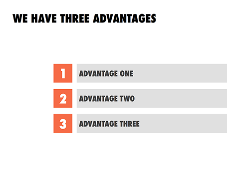
Some readers of my blog have become paranoid to use bullet points in a presentation (a good thing), but there are actually situations where putting 3 short sentences on a page is inevitable, or even a good solution for a slide.

These situations are when you want to express that something has a number of components. Breaking up those 3 advantages and give them one slide each enables you to explain them clearly individually, but the audience loses the overall perspective of how they are related.

In those cases - yes, it happens to the best - I revert to 3 short bullets.  But there are a few things you can do to keep things interesting:
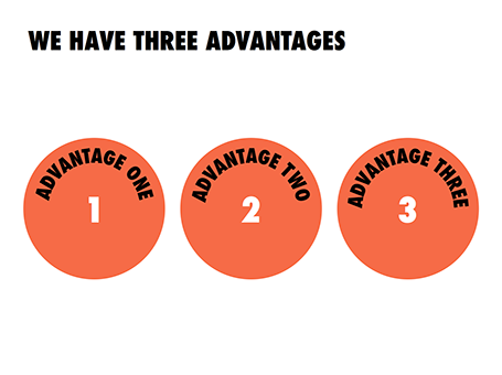
  • A massive visual anchor (like a big 1, 2, and 3) to show that you are talking about an overview slide
  • Really, really short descriptions just to introduce the ideas. The full explanations come in subsequent charts
  • Also, you can deviate from the traditional list and come up with other geometrical shapes ore layouts to make your three (short) points.

SlideMagic: a platform for magical presentations. Free student plan available. LEARN MORE

How to get started?

I recently answered a Quora question on what is the best way to get started with a VC/investor presentation. The answer applies to all presentations, not just investor presentations. Obviously, this is my preferred approach, yours might be different.
I use multiple approaches at the same time, in parallel:

  • Scribble a story line on paper, or an iPad mind mapping app (iThoughtsHD is good)
  • (Just because I like it) design a really beautiful cover page with a nice image and the right look and feel of the deck.
  • Dive straight in and try to craft that ultimate killer slide, the one that makes the most important point in your presentation and finish it all the way. BANG.

Then I continue to iterate: refining the story line, adding a chart here and there. I take lots of breaks in the entire process, designing a good deck can take a lapse time of about 2 weeks. This ensures that your creative energy stays fresh. Presentations made at gun point at 3AM before the 9AM meeting never look really good.

SlideMagic: a platform for magical presentations. Free student plan available. LEARN MORE

Speaking in Barcelona

I will be crossing the Mediterranean Sea and talking about designing a good VC/investor pitch presentation in Barcelona. It would be great to shake hands with readers in Spain.


The event is scheduled for October 3, at 19:00. The location still has to be finalised, maybe the campus of the IESE business school, or another central Barcelona location. The presentation will be in English, and is free of charge. You can sign up for the event here.

Thank you Conor Neill for connecting me to the Barcelona startup community. Thank you John  and Mel Kots for this nice and hazy picture of Gaudi’s master piece that is still under construction.

SlideMagic: a platform for magical presentations. Free student plan available. LEARN MORE

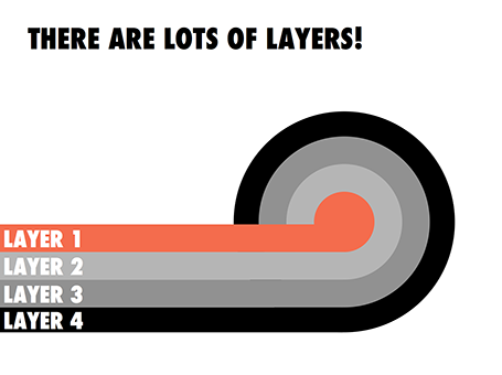
Lots of layers

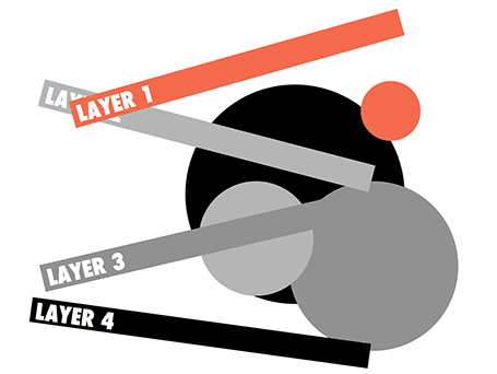
Here is a concept to label lots of layers in a circle without bending text, the second image shows with which components the first chart was created.


SlideMagic: a platform for magical presentations. Free student plan available. LEARN MORE

Your presentation objective?

To many, this might sound as an obvious question. “Hey, this deck is here to get my idea funded!” While this might be the ultimate goal of your presentation, it is usual to break down the process in its individual steps.

The objective of a short elevator-pitch-like-chat or coffee discussion is not to receive the investment, it is to get to the next meeting. And reaching that next stage involves intriguing your audience enough, maybe leaving out some of the tedious detail, while not forgetting to completely  nail that big elephant-in-the-room-issue (even if it means going into excruciating detail).

SlideMagic: a platform for magical presentations. Free student plan available. LEARN MORE