Shall we do a video?

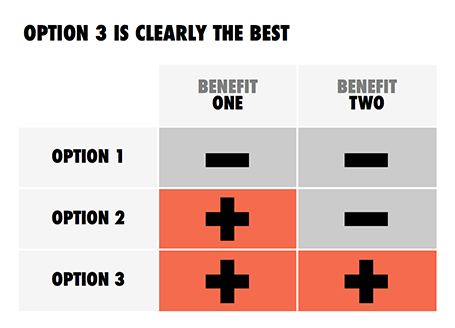
This question often comes up when we start discussing the first sketches of a presentation.

Videos are great, it is a studio quality recording of a presentation, you can do it over and over again until you get it perfectly right. In addition, you have more visual tools at your disposal to support your message.

Having said that, if there is no story, a flashy video is not going to change that. That is why I advise my clients to start with a regular presentation, slowly add more video-like slides to it (faster sequencing of images / shapes) and only then make the leap to video (and that can go in 2 stages, one a narrated recording of your video-like presentation slides, and two a professional animation).

SlideMagic: a platform for magical presentations. Free student plan available. LEARN MORE

B&W images

Converting all your images in a presentation to black and white can help even out the colours in the document. What is left is a series of slides in subtle shades of grey with your corporate color popping out to make a strong accent. I use that look a lot recently.

SlideMagic: a platform for magical presentations. Free student plan available. LEARN MORE

Keynote annoyances

I have now clocked a significant amount of hours designing slides in Apple Keynote. I love the program, but there are still a few annoyances that cannot be solved by adjusting your slide template or configuring other settings. Hopefully Apple will fix this in a new release (it has been a while):
  1. Selecting what you click, not what you cover with your selection triangle
  2. Make it easier to fill shapes quickly rather than having to go back to the inspector. I am always struggling with color windows and inspector settings
  3. Enable custom toolbars, especially with options to center and align things. Yes, the smart drawing guides are useful, but not useful enough. 

SlideMagic: a platform for magical presentations. Free student plan available. LEARN MORE

Too cute for investors

Unfortunately, in 2013 most investors are still male. Coming in with a cute deck (curly flower background, pastel colours, retro-chique font, etc.) is not going to get you points. Even if your product itself has to be cute (a cosmetics line for teenage girls for example) you can still separate things in your investor deck. Use more macho graphics for the serious business stuff, leaving the cute graphics for the product show case pages.

SlideMagic: a platform for magical presentations. Free student plan available. LEARN MORE

Freelancer versus big corporate

This week I lost a big presentation design project for a large enterprise. The issue was price. I think the client is going to give it a try on their own. The project involved the design of 4 days worth of presentations of the company's bid for a major tender. It was competitive against a handful of other major global enterprises.

Here is my postmortem analysis of why it went wrong.
  • Complexity cost. Big corporates create more expensive projects, it is the agency cost of being large. Lots of meetings, lots of stakeholders, that need to be kept in the loop.
  • Not seeing the value. The client spent a lot of money on months of management consultants, traveling experts back and forth across the Atlantic to develop the solution and create thousands of pages of material. The client probably thinks that the majority of the convincing power sits in this material and that the presentation is a small effort that comes at the back of it. I think that the presentation can make or break the sales process, and it is especially valuable to have an outsider frame the story completely fresh.
  • Big corporate negotiations. Large enterprise extract favourable terms from suppliers through their sheer size. They can offer very large purchase volumes. It is one of the main rationales for the corporate mergers and acquisitions. This works for factories with lots of spare capacity that are bound to a specific ration. Less for for a one-person operation with a steady flow of business that comes in from all over the globe via the Internet.
It is interesting to see that the most powerful presentation I design are often for smaller, more agile companies. With the exception of those cases where you can work directly with very senior management in a big corporate, in those cases you can get that creative flow that delivers great work.

Ok, I have written the frustration off my chest.

SlideMagic: a platform for magical presentations. Free student plan available. LEARN MORE

Pro tip: guitar in your office

I tend to work in focus bursts of 30 to 45 minutes (sorry, yes that is why I put my cell phone in a different room when you tried to call) after which my mental energy drops and my brain is looking for distraction.

I recently found the antidode to pointless facebook and Twitter browsing: put an accoustic guitar in your office, play for a few minutes, and dive back into your work. I do not miss reading about those 5 mistakes every designer makes...

SlideMagic: a platform for magical presentations. Free student plan available. LEARN MORE

Listen to the question

During a project briefing I usually take the role of the potential investor and start to ask questions that are not necessarily related to the page we are on. You try to understand the company, tick off the boxes that are obvious and are left with a few questions that are not clear. A good investor presentation should anticipate the investor’s thought process and provide the answers right at the moment they are needed, but hey, we are still at the briefing phase so no need to be perfect yet.

So, in a one on one meeting (where you can accomodate a slightly more chaotic story flow), when the investor asks you a question, answer it. Skipping/ignoring it and continuing to go down the list of product benefits (we are flexible, scalable, and deliver ROI) does not neutralize that nagging worry in the investor’s mind. Answering is probably not that difficult for you, acquiring the patience to listen is.


SlideMagic: a platform for magical presentations. Free student plan available. LEARN MORE

It is that simple

Sometimes, the story is just really simple, hence a simple chart.

SlideMagic: a platform for magical presentations. Free student plan available. LEARN MORE
Waterfall chart with negatives

Waterfall chart with negatives

My post about

how to create a McKinsey-style waterfall chart

is one of the most read on this blog. The method I showed breaks down when there are many negative numbers involved. The solution is a manual one, sketch your waterfall on a piece of paper, fill in all the numbers, and fiddle with colours until you get it right. Remove the automated data labels and put text boxes with the values instead. See the example below.

SlideMagic: a platform for magical presentations. Free student plan available. LEARN MORE

Infographic overload

This infographic by Synthesio about the positive side effects of the Burger King Twitter hack is a good example of what - in my opinion - is often wrong with infographics: too much noise (facts, breakdowns, inconsistent graphics), not enough signal.


A better visualisation would be a simple time line at the top, below that a horizontal bar with the Burger King logo, followed by a horizontal bar with the McDonald's logo, below that one stat (maybe number of mentions). This shows that as soon as the logo flips, traffic goes through the roof.

SlideMagic: a platform for magical presentations. Free student plan available. LEARN MORE

Demo <> Features

The application demo in your presentation is not meant to be a systematic overview of features. Instead, you want to give the investor/customer the most powerful impression of what the app can do. Dragging her through menus, sign-in pages, and settings gives a realistic impression of what it is like to work with your app, but it is a boring 5 minutes inside your 20 minute pitch.

Describe a problem , show what you would enter into a search box , show what a beautiful solution your apps produces instantly. Three screen shots instead of 15 pages of live demo which are better left for the next meeting.

SlideMagic: a platform for magical presentations. Free student plan available. LEARN MORE

Down a tangent too early

In the beginning of your presentation, the audience is trying to figure you out, and is forming a broad framework about what it is you are talking about. Watch out not to go off on a tangent too early in your story, your audience is not ready for it. Later in your talk, once the overall framework is established, it is perfectly fine to go on a little deviation.


For those interested: in geometry, the tangent is a line or surface that just touches a curve. After the connecting point both lines separate (Wikipedia).

SlideMagic: a platform for magical presentations. Free student plan available. LEARN MORE

LiveSurface 2

A few days ago I wrote about LiveSurface and their set of stock images with blank surfaces to put your own artwork on. On the site, I signed up for their new product: LiveSurface Context (request an invite here). It is a small program that takes care of the 3D manipulation of your artwork in order to fit it on the surface.

The experience is much better than the vanishing point filter in PhotoShop. No more guesswork to draw the guidelines, no more fiddling and copying/pasting to move your artwork. Everything is ultra-precise and with total control for the designer.


A few drawbacks though for the casual designer. You need to have a version of Adobe Illustrator installed on your machine (and more importantly, know the basics of how to work with it). Secondly, the service charges a subscription model that works if you need to use a lot of these compositions, but is not economical for infrequent use. And finally, the library of surface images is smaller than you would find on regular stock image sites.

All in all a good service, and as a professional designer, I might give it a try.

SlideMagic: a platform for magical presentations. Free student plan available. LEARN MORE

The stunning presentation opening

A question the other day: “What stunning visuals should I use to wake up the audience? I drew the speaking slot just after lunch...”. My answer was to pick an inspirational story (preferably personal) and tell it naturally, even without a single visual.

SlideMagic: a platform for magical presentations. Free student plan available. LEARN MORE

Out with the action verbs

At McKinsey, I was told to write my documents with action verbs: create strategy, draft business plan, begin execution, monitor progress. It is the correct way to write things, but space on a slide is scarce. More and more, I find myself violating the rule and writing the absolute minimum amount of words to get the idea across, every increase in font size is a plus.

SlideMagic: a platform for magical presentations. Free student plan available. LEARN MORE

"I am a headhunter"

Many of the spam email messages I receive start with a wobbly story about an ever changing world of social media confusion and making it very hard to understand what the spammer actually wants.

Good headhunters start their call well, with “I am a headhunter” which saves critical time that can be spent on pitching what they want.

SlideMagic: a platform for magical presentations. Free student plan available. LEARN MORE

Design inspiration

See how easy it is to use a classic design into a beautiful presentation template. A 1962 brochure designed by Josef Mueller-Brockmann (read more about him in this book), image of the girls by H-Huynh.


SlideMagic: a platform for magical presentations. Free student plan available. LEARN MORE

Stepping back

In the heat of the design process it is easy to let go of your ambition to design beautiful slides. Take a break, flip through a design coffee table book, and remember why work by great graphics designers looks so great.
  • White space, even if that means smaller font size
  • Custom fonts (if technology allows it)
  • Font weights (very thin, very heavy)
  • Font color (black, grey shades)
  • Words per line, where to break a line
  • Positioning of text on the canvas
  • Artistic, subtle, instead of blunt photography
  • Minimal use of colours
  • Leading between lines
  • Take it easy on drop shadows, gradients, and reflections
Nothing is rocket science here, just trying, and trying, until you have found out why it somehow does not look right...

SlideMagic: a platform for magical presentations. Free student plan available. LEARN MORE

The Pixar Pitch

In his latest book, Daniel Pink talks about 6 new ways to pitch an idea (video). One of the most interesting one is what he calls “The Pixar Pitch”, a story line that follows the typical plot of a Pixar animated movie:
Once upon a time [fill in blank]
One day [fill in blank]
Because of that [fill in blank]
Until finally [fill in blank]

SlideMagic: a platform for magical presentations. Free student plan available. LEARN MORE

Robosourcing

Over on the Daniel Pink blog, a brief discussion about robosourcing; software that automatically generates prose based on statistical information (sports, finance, etc.).

I do not consider that a bad thing. In fact, I believe that many human journalists just do that: take data that can be neatly summarised in a visual and dilute it into text that takes far longer to digest and often provides an incomplete picture.

I am looking for technology that goes the other way: take human prose and turn it into razor sharp visuals and tables.

SlideMagic: a platform for magical presentations. Free student plan available. LEARN MORE