Consultants cannot pitch

The other day I was asked to provide input on a pitch deck prepared by a respected consulting firm. The idea was the result of a consulting project, the results of which for document in a hefty, detailed, and structured document that everyone agrees was great for reading background material, but not really right for presenting/pitching. The team took the first step by cutting down the number slides (not changing them) in an executive summary presentation.

My advice for consultants who want to pitch: start from scratch and design a completely new presentation specifically aimed at selling, pitching, fundraising and leave the big data Bible as back up.

What goes usually wrong in executive summary decks that are created by chopping slides out of a master pack? Some examples.
  • The team has probably been working for months on the project and as a result, they see the discussion of the problem as totally trivial and cut down a lot on the charts that adress the issue, most of them probably generated early on in the project, or even during the project definition phase. The consultants forget that to the outsider who hears about the issues for the first time, it is not that trivial. On the contrary, it is often easier to pitch the problem, than to pitch the solution.
  • The problem section usually involves data, and consulting data charts are loaded with facts and figures and tables. Most consultants actually violate one of the cardinal rules of one message per slide. Go back to your drawing board and pick one statistic/trend that is really crucial to sell your problem and make a super clean/clear data chart that just shows that, nothing else
  • As we get to the solution the consultant often forget to describe what it actually is. We show histories of how the initiative has been used in other parts of the world, who is involved, but hey: what is it that you actually want to do? To the consultant it is obvious, to the audience not.
  • Describing the initiative or its impact can be done in dry text bullets with low emotional appeal. But why not use pictures? Show the project in action. Profile the people that benefited from it in big page filling images. Create human stories. People relate to this much better than dry data. Yes, I want to help this girl in the picture!
  • Consultants are always shy, and hesitant to take a strong position. (Yes, you could take option B but it has these disadvantages and it depends on this scenario C panning out that way). As a result, it is actually unclear what is expected from the audience: contribute this amount of money to do X, Y, and Z. Get over your shyness, and spell it out the call of action bluntly.
In short, make your deck more emotional, to the point, and put your own credibility on the line by selling the idea wholeheartedly. 

SlideMagic: a platform for magical presentations. Free student plan available. LEARN MORE

Micro economic charts

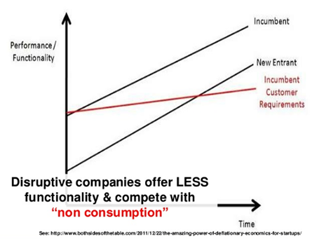
Line graphs with supply and demand shifts, pricing, are great for a round the table discussion of micro economics, but they are less suitable for presentations for large audiences. Take the example below. It takes time before you get the picture (what is on the axis, what do the crossing lines mean). Once you understand the framework you can have a great discussion about it. But in a big audience setting, not many people will get there, unless you build it up slowly, slowly one step at a time.


This image was taken from a presentation by Mark Suster, which in general was an excellent presentation. Not consistent in formatting, but I think the audience will forgive a busy VC harvesting charts from multiple sources, it is the content that matters.

SlideMagic: a platform for magical presentations. Free student plan available. LEARN MORE

First impression of iOS7 (design)

As I am making steady progress with the design of my PowerPoint killer app, I have become very interested in user interface design for mobile and big screen applications. Apple showed its new iOS7 design yesterday. (iOS7 is the operating system that runs iPhones and iPads). Some observations.

I love the flattening of the design, out with excessive shadows and fake textures. The use of transparency is clever, to get a sense of layers throughout any app you use on the phone.

But there are things that I think are less good. The color palette is very bright, almost screaming, and the home screen looks like a sparkling X-mas tree. The use of gradients is inconsistent, with different directions of light sources. Some icons have gradients, some have not. I am also no fan of the more pronounced rounded edges. Grids on some screens are not completely consistent. The thin font looks classy, but might be hard to read in glaring sun light. And finally, the look and feel is not consistent either across all applications (some apps look great, others less so).

In short, a big improvement over iOS6, but iOS8 might just iron out the current imperfections. Weirdly, I actually still think the minimalist design of Microsoft’s mobile platforms looks great in terms of use of grids, simple colours, and sharp edges.

But then, people say never to argue about taste...

The look and feel of PCs running Windows software has greatly influenced the design of PowerPoint slides. In the future, I expect the same influence from mobile platforms on the way the average amateur design will create presentation slides. Helvetica Neue Light will become a popular font.

SlideMagic: a platform for magical presentations. Free student plan available. LEARN MORE

Overcoming pitch fatigue

A post by VC Brad Feld about pitch fatigue: when people have told a story too many times, they get bored and lose the passion to present it with all they have got. Your audience hears the story for the first time though, and they probably evaluate you 50% based on content, and 50% on the emotional delivery of the story (your body language). A bored presenter will not convince. What can you do?
  • Do not run off a standard script like a tape recorder, but as you get more experienced with your story, deviate from predictable patterns
  • Make the story a dialogue rather than a monologue. Try to make it very specific to the audience. Use case examples, analogies that are tailor-made to that client, or that potential investor.
  • Now that you know the story in and out, you can rely less on slides and visuals. Make more eye contact, and tell your story verbally
  • Fire yourself up before the pitch, and think about the outcome you want to achieve, getting that investment or signing up that customer. The objective your meeting is not to deliver the pitch, it is to reach your objective. That should bring that spark of adrenaline back into your system
  • Make sure you are not physically tired (eat a snack 30 minutes before, have a coffee)
  • Do a make over of your deck, after 999 run throughs you have probably some pretty good ideas how to delivery the story better, but you somehow never have time to sit down and implement them. Create the time, and make more minimalist, bolder slides and create a piece of true art that makes you excited to deliver your pitch.

SlideMagic: a platform for magical presentations. Free student plan available. LEARN MORE

Prezi as an attention grabber

Sometimes, making the effort to communicate well is almost as good as doing the real thing. Effort gives you instant audience credit.

My wife is a venture capitalist and received her first Prezi investor pitch last week. “This movements make you a bit dizzy, but I must say that the team got points for trying something different”.

For this very short introduction presentation that was competing with an overloaded inbox full of other pitch decks, she was OK with some motion sickness. For a second, longer interaction this is probably not the case.

SlideMagic: a platform for magical presentations. Free student plan available. LEARN MORE

Scientists speaking over dinner

Yesterday evening I attended a dinner in honor of a famous scientist who received a honorary doctorate from Tel Aviv university. The setting was a beautiful coast-side villa of a successful businessmen, the audience: scientists and healthcare technology investors (corporate and venture capital). On the menu: some good food and 6 presentations. Here are some suggestions for scientists who get put “on the menu” for these types of events.

Investors. You have 6 minutes, you have 2 audiences: scientists and investors. This is probably not the right time to get insightful feedback from your science colleagues, however, you might hook the attention from a potential investor in your research you would not have met otherwise. So take the investor as your target audience and shape your content for her. Out with the detailed methodology, the detailed statistics, the history of your research, but in with the need (why is this such a horrible disease and how many people suffer from it), why is what you did so clever (other technologies fail, yours takes a fundamentally different approach), and why the early trial data shows that it works. And oh, if you are raising money for your project, say so.

Only charts when you need them. Six minutes: no bullet points, just pictures you need (statistical data, pictures of team members). Put black slides if you do not need the projector. A huge white screen in a dark garden completely overpowers the presenter.

Simplified statistics. Putting up the full scientifically responsible data chart over dinner is not effective. Laymen do not know how to read it. First explain what benchmark matters (survival rate for example). Then, make an incredibly simple char that compares the 2 benchmarks without the footnotes, n values, p values, standard deviation. All that can be discussed over coffee, not a glass of wine.

Stick to your time. If you have 6 minutes, use 6 minutes. Bringing along your 45 minute deck and trying to speed things up by talking faster and skipping slides does not create a compelling experience.

Stories. Put in some anecdotes to make your story more memorable.

Cut the gore. Images can be very powerful in presentations, but some medical photos are better be seen before dinner, not during.

SlideMagic: a platform for magical presentations. Free student plan available. LEARN MORE

More than 3 pages

Many presentation I come across start out great with the cover slide, and maybe a page or 2 after tat, then the whole thing slides back into bullet point mode. Why not continue the good work beyond page 3?

SlideMagic: a platform for magical presentations. Free student plan available. LEARN MORE

Skip the methodology

As a management consultant (or a scientist) you had to crack a very difficult issue: what approach to take to solve a particular problem or get to some insight. Once the approach was nailed, the rest of the work was relatively easy (sweat work rather than think work).

It is tempting to use this thought process as a structure of your presentation. Here is the problem, here is the theory behind it, here is our methodology, here is the data analysis, and finally, here is the conclusion. Most scientific papers are structured this way and kids get taught this approach in school/university.

This works if your audience also consists of management consultants and scientists. In most other cases, just talk about the problem you tried to solve (the actual one, not the approach issue) and then go straight to the conclusion and results.

SlideMagic: a platform for magical presentations. Free student plan available. LEARN MORE

Business models in a VC pitch

Fred Wilson wrote an interesting blog post yesterday about the sequence in which a startup should nail the following items:
  1. First the product
  2. Only then the strategy (who is your target market, and how are you reaching them)
  3. Only then the business model (how you charge for things)
Most VCs will ask you about the business model and strategy in your early-stage investor pitch. The true answer: “I do not know yet”. Stopping the discussion there is not a good answer. Making up something and selling it is the truth and the only truth might cost you credibility points.

The middle ground is better. Admit that things are early, and discuss 1-2 strategy/business models scenarios that seem sensible given the stage of development you are at and what you know about the market at the moment. It shows that you are a sane person and a trusted pair of hands as you embark with your investor on an uncertain journey in which everything will deviate from plan for sure.

A bit of ambiguity in your pitch is OK.

SlideMagic: a platform for magical presentations. Free student plan available. LEARN MORE

Too vague or too detailed?

The corporate strategy of a big company is always complex: many countries, many products, marketing, sales, manufacturing, organisation, finance, tax optimisation, M&A. Writing all that stuff down in an investor presentation does not make compelling prose.

Most companies understand that but swing the other way: a big vague broad mission statement that says we will conquer the world of [ENTER MARKET] and make the plant a better place at the same time.

Here is a potential middle ground. Start with the 3-5 really big ideas that will create growth for your company, pretty much like a startup would present its ambitious plans. Then follow with a more organised, structured, traditional overview of all the programs that are going on. Not to be discussed in detail, but merely to show that you have put them in place.

SlideMagic: a platform for magical presentations. Free student plan available. LEARN MORE

Trying out Medium

Medium is a new publishing platform and I gave it a try with a first post on how bad design habits from the 1990s still cause dammage today (overhead transparencies, word processors).

Medium allows you to create collections and I started one about presentation design, pitching ideas, and public speaking under the name “Seeing is believing”. Feel free to contribute.

Although I like the clean design and focus on writing of Medium, it is too early for me to give up the good old Blogger platform, with many of you reading my posts via RSS and email updates.

SlideMagic: a platform for magical presentations. Free student plan available. LEARN MORE

A bit of detail can help

The objective of a technology sales presentation is to convince your potential client of how great your product is, and how poor the competition.

Assumption: the above is actually true, which makes designing a presentation a lot easier.

One approach is to list all the benefits, and in a few more charts show that the competition does not have them (most of the times, without naming names explicitly). This story does not stick very well, a feature list that seem unrelated.

Better is to dive in a bit into the detail. Often technical products have one specific innovation, one characteristic of the architecture, one design approach that triggers all of the goodness mentioned above. Now that the customer understands this (and Einstein said that you can explain anything to everyone - even a 6 year old), it becomes a lot easier for her to understand the full picture.

SlideMagic: a platform for magical presentations. Free student plan available. LEARN MORE

Investor investor presentations

Yes, most venture capital (VC) and private equity (PE) investors need to rais money themselves, usually from institutional investors (large insurance companies and asset managers).

When pitching, these investors often make the same mistakes the companies pitching to them make.  The most common one: a story that is not very differentiated. Careful deal selection, deep involvement with your portfolio companies, really working with management. Institutional investors get pitched all the time by VC/PE funds that say exactly the same thing.

The best VC/PE investor pitches are those that tell a story about a really distinctive type of investor, where everything reinforces each other: the backgrounds of the investment team, the deals you picked, the exit track record. Some funds have great access to deal flow in the telecom industry, some funds are really good in bidding for privatizations, some are really good in turnarounds, some have a really deep understanding of bio molecular structures,  some have a unique skill in stitching together innovative financing structures. It is very rare that all of the above work for one fund.

SlideMagic: a platform for magical presentations. Free student plan available. LEARN MORE

Presentation lessons from TED

Chris Anderson is the curator of TED and has written an article with some excellent suggestion on how to give a presentation of TED-like quality. Some of the points discussed in the article:

  • Plan your story: beginning, middle, end
  • No jargon, keep things conversational, cut back on the ego, show that you are vulnerable
  • People do not relate to descriptions of organisations/institutions
  • Do not try to cover too much ground, you need to go into some level of detail to keep things interesting
  • Let the audience draw conclusions themselves, not everything has to be spoon-fed
  • Really, really, memorize your talk in order to be spontaneous. Sort-of memorising is the worst, you are not your improvising self, but the words do not flow either with frequent memory pauses giving away that you are playing off a script
  • When rehearsing, think what feedback you need to take in, and what not. Usually, experienced speakers give the most useful feedback
  • Stay relatively stationary on stage, emphasise with arm gestures, keep eye contact with a few people in the audience
  • Use slides only if you have to make a point that needs visual backup
  • When using video: keep it short, and think twice before including a sound track
  • Final advice: be yourself

SlideMagic: a platform for magical presentations. Free student plan available. LEARN MORE

The 1-1 institutional IR meeting

I am starting to work with the CEO of a very large company to design a presentation for 1-on-1 meetings with institutional investors. I am thinking of a presentation designed for iPad, or even a loose stack of slide print outs that can be randomly selected as the need comes up in the meeting.

The big story of the company can probably be explained verbally in a conversation, these slides that are typically included in a presentation for a big audience can be left out. But then, equity analysts are likely to have detailed questions that require factual backup slides that are denser in design than the ones you would typically use for a large audience investor update.

An interesting project.

SlideMagic: a platform for magical presentations. Free student plan available. LEARN MORE

DIY shapes

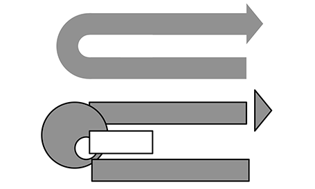
It is hard to get an arrow to point exactly right in PowerPoint. If the standard shapes fail, why not construct your own out of small individual bits. You can group the shape together, or create a new custom shape with one of the shape boolean functions (Windows instructions here, on a Mac: select 2 shapes, right click, go in the grouping menu).

SlideMagic: a platform for magical presentations. Free student plan available. LEARN MORE

Just a confidence booster?

Often, I see that the slide deck is just a confidence booster for the presenter of a new story. Having those beautifully designed slides behind you makes sure you will not s**w up. Over time, you become more and more confident in delivering the story, your slides get bolder and more minimalist, until finally, you do not need them anymore.

But, without that slide deck on day 1, you would not have gotten to that level of story telling...

SlideMagic: a platform for magical presentations. Free student plan available. LEARN MORE

Flowboard - presentations on iPad

Flowboard is a presentation design app for iPad. In the TechCrunch video below, the company CEO gives a quick demo of the product.


I am curious to hear your feedback on designing presentations on a tablet in a new app (using an iPad to display them is a no brainer). I can see the advantages of mobility, the touch interface, but on the other there are drawbacks: screen size, lack of navigation precision, incompatible file formats, and file management problems.

SlideMagic: a platform for magical presentations. Free student plan available. LEARN MORE

VC presentation parody

This cartoon of Nikola Tesla (who do you say?) pitching VCs highlights many of the dynamics that are happening in VC pitch meetings (unfortunately).


Two comments to this though:
  1. While entrepreneurs have no shortage of ideas to make a parody about VCs, I think VCs might have equally rich material to make fun of entrepreneurs pitching. 
  2. But more importantly, anticipate this sort of VC behaviour. In this video the entrepreneur did not manage to get across what it is that he is actually doing early enough, and as a result the investor focused more on their email. VCs probably make up their mind whether something is worth listening to in the first few minutes of your pitch, partly maybe because they are arrogant, but also partly because it is the only way to deal with thousands of ideas being thrown your way. Get that elevator pitch ready, and the objective of the elevator pitch is not to land the investment, but to get the attention for the next 20 minutes.

SlideMagic: a platform for magical presentations. Free student plan available. LEARN MORE