Writing in a box

Newspaper headline writers are masters in packing a lot of information in very few words, link bait bloggers write titles that people just have to click on.

In day-to-day business presentations, you might not have time, energy, budget to come up with an artistic visual master piece on every slide. The biggest difference to the quality of your slides might simply be your writing.
  1. Cut words that add no content: in order to, etc., avoid passive sentences (Harry was seated on by a bird), management cliche verbs (monetize/strategize/analyze/incentivize)
  2. Avoid long words (small/narrow boxes create uneven line breaks)
  3. Think carefully where you break a line, do it manually
  4. Work with labels, introduce a short catchy name for a more complex strategy, option early on in the presentation, so you do not have to repeat the enter-the-Indian-market-first sequence all the time. 
  5. Stay within the constraints, if you have 2 lines, do not make it 3.
  6. Emphasise the contrast between a series of boxes and cut text that is common to all of them: entry in China, launch in India, Japanese entry: becomes China, India, Japan
  7. If you have to, write exceptions or other details in a tiny footnote

SlideMagic: a platform for magical presentations. Free student plan available. LEARN MORE

Summer posting frequency

I will spending more time with my family over the coming weeks, so I might skip a post on some days. I hope you are all having relaxing summer.

SlideMagic: a platform for magical presentations. Free student plan available. LEARN MORE

Over edited

You write that paragraph, again, and again, and again. Share it with the team, incorporate the input, re-write, again, and again. In the end, you probably got a politically correct piece of prose, but at the same time you killed of the spontaneous, raw enthusiasm about why your company/idea is so great.

Maybe say the pitch out loud one more time and just write down what comes natural to you?

SlideMagic: a platform for magical presentations. Free student plan available. LEARN MORE

One chart, multiple levels

A good novel has multiple levels of depth, the basic story, below that the deeper themes.

In presentation design I often apply similar techniques. The top level message screams from the chart through the use of colours (target: the listener), but for the reader, there are ways to find richer information to back up the bold conclusions you draw.

One example could be a simple table of pros and cons. Big colour contrasts indicate "in favour" and "against" for each of the criteria, but small text inside the boxes that is not meant to be readable for a live audience gives the more detailed explanation.

For TED-like big budget presentations, you it is worth to take out the detail. But most business presentations are used in multiple settings, it is just more efficient to have one set of slides supporting both of them.

SlideMagic: a platform for magical presentations. Free student plan available. LEARN MORE

Meet me in Anchorage AK

I will be “presenting about presenting” in Anchorage, Alaska on August 14, at 17:30. The talk will be about how to pitch your ideas to investors. Details of the event can be found here on the page of AK Entrepreneurs Meetup community. Drop by if your are in the neighbourhood!

SlideMagic: a platform for magical presentations. Free student plan available. LEARN MORE

Human stories

I see that only a handful of my facebook friends follow Humans of New York: a photographer taking pictures of strangers in NYC, adding a little personal story. The way these stories are written is brilliant: an unexpected starter question, followed by a very short story, that usually ends in an unexpected twist or life lesson. Add them to your facebook feed if you have not already done so.

SlideMagic: a platform for magical presentations. Free student plan available. LEARN MORE

From social media war to dialogue

I live in a tense part of the world and have observed many discussions on social media where people trying to convince others they are right. I convince people for a living, so I am jotting down some thoughts below on how to engage in these discussions, and hopefully turn war-like exchanges into dialogues.

In order not to have this post hijacked by a political discussion, I am leaving my political viewpoints out here. Here we go in no particular order:
  1. Be polite, correct, calm, composed, rational. Nobody believes a screaming maniac.
  2. Listen, listen, listen and look for a very specific mistake, misconception that can be corrected. Generic statements that answer another point then the ones raised are not useful and ignored.
  3. Set your ambition level. You are unlikely to correct someone's fundamental beliefs in just 1 paragraph.
  4. Realise that your most important audience might not be the person you are interacting with, but rather the many more that glance over the comments, the secondary audience is bigger
  5. Make your point very personal, human, and show that there is a normal person on the other side of the line
  6. Nobody likes to see more detail of gory images or screaming graphics
  7. Be short and to the point, on social media, nobody reads long paragraphs. If your text is longer, add lots of paragraph breaks
  8. Be sure to engage/correct a big opinion leader with lots of followers/readers: polite, super short, very specific fact to correct a very specific mistake/misconception
  9. Use sources that are credible, close to the opposite site of you. Linking to a highly biassed patriotic web sites full of the wrong flags is not going to make people read them
  10. Highlight facts or details that are not widely known/used in the media
  11. Try not to start with me, me, me, but start with the opposing viewpoint and show why it is causing a problem. Understand the stereotype that the other side might have of you, and try to soften it (you can even refer to it directly).
If successful, you came across as a reasonable (maybe even nice) guy/girl who did not confirm a stereotype. And hopefully you started to turn a social media war into a social media dialogue.

SlideMagic: a platform for magical presentations. Free student plan available. LEARN MORE

It just does not look right

There is a component to visual design that cannot be learnt from studying books. On some presentations/slides I can spend a lot of time, because they simply do not look right, even if the content is pretty simple. And the worst thing, I cannot tell why.

After fiddling with a number of parameters, things can all of a sudden start to look acceptable:
  • Changing the balance in the colour scheme, often focusing on grey with just one strong accent colour, instead of using all the colours that are available in the corporate colour scheme.
  • Using lighter colour/shades in slide shapes
  • Making all images black and white
  • Endless repositioning of slide shapes to get the balance right
  • Reducing the font size (yes, you read it right), and/or rebalancing the number of words in one line
Why? I do not know, it somehow works...

SlideMagic: a platform for magical presentations. Free student plan available. LEARN MORE

In the stock photo business?

I would like to get in touch with business development people at stock photo web sites to talk about my upcoming presentation design web app, and maybe other ideas. Feel free to contact me at contact at ideatransplant dot com if you are interested.

SlideMagic: a platform for magical presentations. Free student plan available. LEARN MORE

Middle East friendships

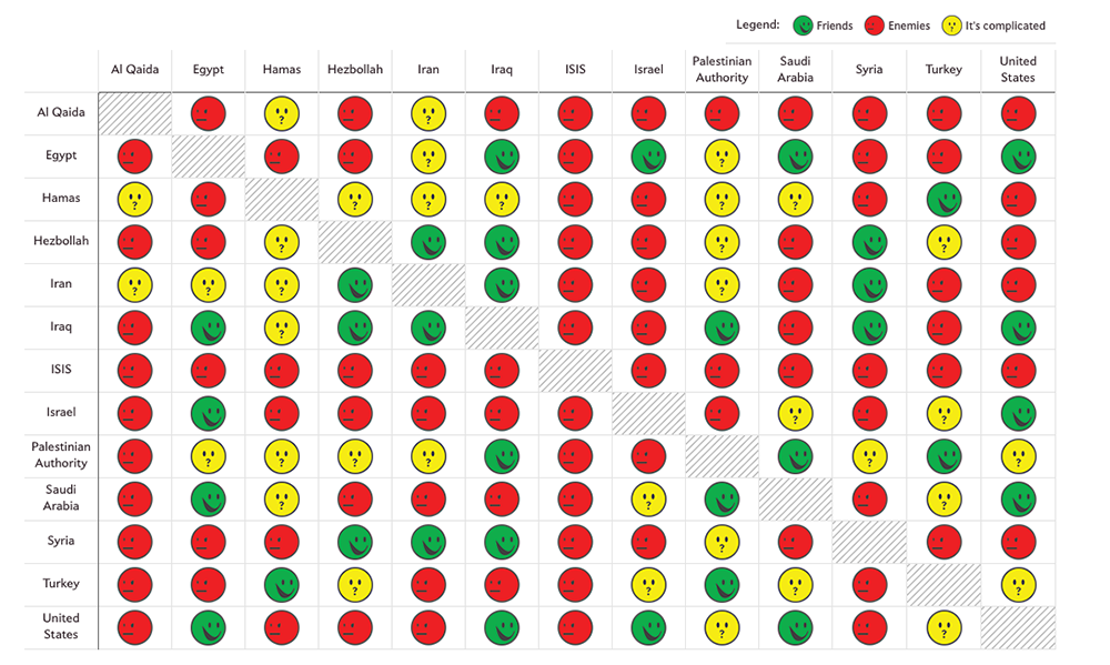
Slate created a beautiful map showing the complexities of the friendships in the Middle East:


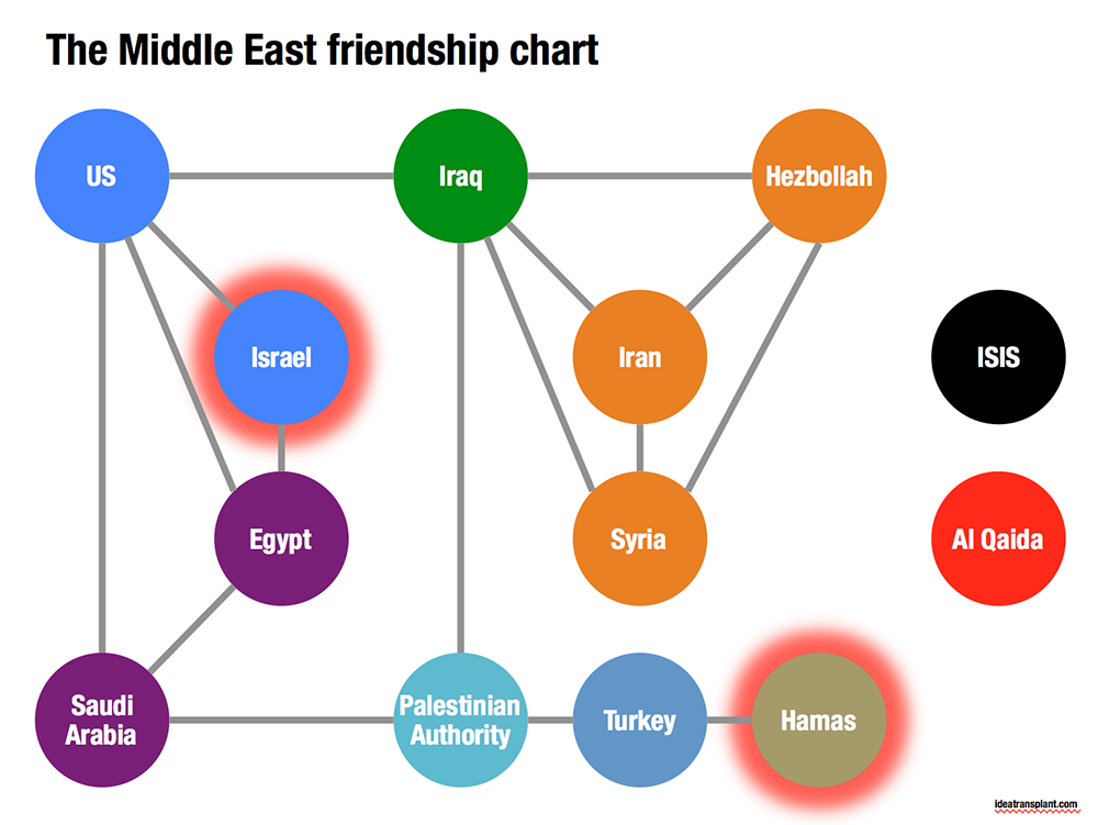
Go to the original here and click on each of the smileys for additional information. The message of this chart is clear: it is complicated. The same information can be displayed simpler by focusing on the just the green relationships. The following pattern emerges, highlighting among other things why it is so difficult to get Israel and Hamas to communicate.


SlideMagic: a platform for magical presentations. Free student plan available. LEARN MORE

Overwhelming images

Images are much better than words to amplify a message, but sometimes they can be too distracting. If people are staring in awe at this stunning photograph you found, they might just forget for a second about the message you are showing/talking about.


Image source

SlideMagic: a platform for magical presentations. Free student plan available. LEARN MORE

Twitter goes PPT

Twitter is keen to find ways to become more accessible to a broader audience, beyond the tech-savvy early adopters. The answer so far: images. Images grab the attention better than obscure hashtags and @ reply's, and - sneakily - provides a way around the 140 character limit on a Tweet.


The results, lots of poor visuals. This large headshot is an attention grabber, but I am not sure whether Twitter users will take the time to read through the dense bullet points.

SlideMagic: a platform for magical presentations. Free student plan available. LEARN MORE

Problem - solution

Most presentation design projects can be split up in components, you can even have different people work on the individual bits. Two components go hand in hand though: convincing/reminding the audience of the problem, and presenting your solution. The way you portray the problem should guide the way you show the solution. In fact, the best way to show the solution is the highlight the problem.

SlideMagic: a platform for magical presentations. Free student plan available. LEARN MORE

Do you have it all?

Business presentation design requirers a combination of skills:
  1. Content story: the strategy consultant. Somehow all the raw material, content need to be in place. All in a logical order, no holes, no overlaps, all the items of check list need to be ticked off: need/problem, solution, market, competitors, business model, financials, etc. etc.
  2. Slide layout: the designer. Colours, fonts, look and feel, white space, layout, image cropping/scaling/positioning, diagramming. 
  3. Data visualisation: the strategy consultant. Challenge one: pick the right message you want to emphasise from the thousands of options that a data set gives you. Challenge two: actually emphasise it with the right chart, the right colours, the right rounding.
  4. Pitch story: the movie director. Now take all the structured, analytical, and boring base material, and turn it into an exciting, emotional, convincing 20 minute pitch. (Note the difference between content story and pitch story)
  5. Outside reality check: seasoned business executive. What are the weaknesses in the story, what are the difficult (and/or obvious) questions the audience will ask, what elements of the story are totally obvious?
I was trained in 1 and 3, got 5 through the years, taught myself 2 (clean, good enough, but not at the level of a master illustrator), and trying my best at 4.

Many professional designers in the market will lack 1, 3, and 5: but they will still do fabulous work on presentations that have less hard core business content.

Many corporate executives lack 2, 3, and 4. They also will have trouble with number 5: being able to look at their story from a true outside perspective.

Management consultants lack 2 and 4.

SlideMagic: a platform for magical presentations. Free student plan available. LEARN MORE

I cannot read the footnote!

It is in tiny font, it has a light grey font, nobody can read it!

Perfect.

If the legal department insists on using footnotes, then they should be designed in such a way that someone who stands with her nose against the screen can read them. If you want to read them, you can, if you do not want to, you do not have to.

SlideMagic: a platform for magical presentations. Free student plan available. LEARN MORE

Quick starter guide

Most appliances comes with a user manual and a quick starter guide. The manual resembles most business presentations today, the quick starter guide is what you should aim to design.

Manual:
  • Long
  • Lots of words, long paragraphs, clumsy translations into multiple languages
  • Regulatory disclaimers
  • Logical structure
Quick starter guide:
  • Short
  • Visuals only (no need for languages)
  • Only info that matters (regulatory statements are out)
  • Story structure (the order of what needs to happen when you take the thing out of the box)

SlideMagic: a platform for magical presentations. Free student plan available. LEARN MORE

Speeching vs presenting

Many bullet point heavy presentations are in fact speeches. You read and correct every paragraph over and over again and after hours and hours of work you see that you got it exactly right this is what you want to say!

Congratulations, you have arrived at the starting point of your presentation design project, not its end.

SlideMagic: a platform for magical presentations. Free student plan available. LEARN MORE

Sending with a fresh head

Whenever I need to send out a version of a presentation, I tend to do it in the morning after I had a chance to glance over things one more time, making small corrections here and there. Sending a deck straight after a big design push leaves errors that can easily be fixed by a well-rested mind. Story flow design in particular gets a bit hazy when you are in the trenches to turn out one slide after another.

SlideMagic: a platform for magical presentations. Free student plan available. LEARN MORE

Interpreting feedback: Q&A

Continuing my post from yesterday about interpreting feedback and deciding who to ignore, and who to believe.

In very short presentations (15 minutes) you can get away with a small glitch in your story flow. Your audience will get the whole picture fairly quickly, even if there was a slide bump in the way you told the story. You like to tell the story this way, the test audience liked it the other way, so be it.

A big red flag though will come from the sort of (content, substance) questions people ask.
  • Do you find yourself answering a question by giving a completely new mini presentation on a white board to explain something fundamental to your idea? Time to incorporate this into the main presentation.
  • Does the test audience ask questions that are totally trivial to you? Example: the reasons why current solutions do not work. Maybe you are going to fast in the opening of your presentation. Time to back up and take it slower at the beginning.
  • Do people try to compare you to specific other players, competitors? It is rarely a good idea to overly emphasise your competitors in a presentation, but if an issue comes up all the time in Q&A, it is better to take it head on in your main story.
Questions are important indicators of whether the audience got your message, or not.

SlideMagic: a platform for magical presentations. Free student plan available. LEARN MORE

Interpreting feedback

Feedback can come from many different audiences, what to use, what to ignore? Some pointers.
  • Is the person credible?
  • Is the person honest?
  • Is the person the right target audience?
Your mother will be really honest, but she loves everything you do, and is (likely) to be not credible when it comes to evaluating pitches, and probably also not the right target audience (if you are not raising from very close friends and family)

Busy venture capitalists are credible, and the right target audience, but not always honest (especially if they just turned you down). A vague compliment, your presentation is great, it is just not the right fit for us, could still mean that the presentation was a disaster. Small generic comments such as suggestions to cut the amount of slides, make better visuals, focus more time on the pain point, can create a lot of work for you completely uproot your approach to the presentation, while not necessarily true.

A geeky engineer can be honest, credible, but not the right target audience. When she thinks everything is absolutely clear, the other 99% of people might not be able to understand it at all.

In short, it is OK to ignore feedback from people. On the other hand, look out for genuine useful feedback from people who are credible, honest, and fit right into your target audience.

SlideMagic: a platform for magical presentations. Free student plan available. LEARN MORE