PPT Roomba

SlideProof is a neat PowerPoint plug in that cleans your presentation of common small mistakes - automatically. Misaligned boxes, titles, wrong page numbers, you name it.  A bit like the Roomba vacuum clean robot, a spell checker on steroids. You have complete control over the changes though, so nothing unexpected will happen to your slides, which is crucial since my guess is that most of the vacuum cleaning of presentations will happen just before the live presentation.


Fixing small mistakes might not be crucial to get your message across, but it does make a huge difference in the overall impression you leave behind. A bit like polishing your shoes.

SlideProof only runs Windows so I did not have a chance to test drive it myself (I work on the Mac platform). Please share your experiences in the comments if you managed to check it out.

SlideMagic: a platform for magical presentations. Free student plan available. LEARN MORE

Visualising sentences

Many people write bullet point slides because they find it hard to come up with a visual composition of what they want to say. The trick: look at the basic action in your sentence:
  • We are the biggest: bar chart with ranking
  • We are going from [a] to [b], to boxes with an arrow in between
  • We are the best of both, Venn diagram
  • We are different, box on the left, box on the right
  • We are growing, line or column chart
  • We need to do a, b, c; gantt chart
  • We have the best looking product: pictures
  • Etc.

SlideMagic: a platform for magical presentations. Free student plan available. LEARN MORE

Data backups

A good presentation uses very simple data charts. Often, in the last minute, changes are made to the data: it is easy to change a number in PowerPoint here and there.

In most cases the first versions of these simple data charts were extracted from very complicated Excel sheets. And here is where the trouble starts. After a few PowerPoint iterations, the presentation and the backup model is no longer consistent. This is fine if the presentation was a one-off event, but most of the time, the Excel model will live on for future iterations.

The solution is to include a worksheet in your Excel model that pulls the data exactly as it goes in your charts. Put in the correct rounding, everything. Anyone who wants to change the numbers, need to make changes in the Excel model to get the numbers to change.

And yes, sometimes that might involve a goal seek.

If these charts frequently change, you might even consider designing a presentation in Excel. Excel has the same chart and shape design tools as PowerPoint, and you can create direct links between charts and work sheets without having to copy things across. See a previous post (2009) on this technique.

SlideMagic: a platform for magical presentations. Free student plan available. LEARN MORE

Automated journalism

The Associated Press will start using a bot to generate verbatim on company earnings reports. The system takes as input the financial data, and then recycles that into human stories: earnings went up 3%, which is 0.5% higher than the financial services average and leads to an expected gross margin of 46% in Q3.

I never understood the point of journalists spelling out information in sentences that is much better communicated in graphs. Proof is that this translation is easily automated. The only use I can see is in translating data to audio for people who cannot take their eyes of the traffic and still want to digest data.

Instead of using the bot, AP should invest in better data visualisation.

SlideMagic: a platform for magical presentations. Free student plan available. LEARN MORE

Tactics later

Some draft investor pitches I receive dive straight into the nuts and bolts of running the company, business model options, and roll out strategies.

But maybe it is better to first take the time to explain what your idea actually is. It may sound boring and obvious to you, but someone who has not spent the last 2 years working alongside you, these 10 minutes of explanation are a good investment.

Issues that are hugely important to you such as conversion rates, customer acquisition cost, go-to-market analysis can wait until you have managed to communicate what you are doing, what problem you are solving.

SlideMagic: a platform for magical presentations. Free student plan available. LEARN MORE

Data overload

In a recent project, I had to visualise the 5 year IT spend plan of a very large company: different business processes, different applications, different responsibilities, different timing, some were build, some were buy, different budgets.

Rather than pages of bullet point slides, I went for a simple table that showed the applications by business division, around 60 boxes. Then this - relatively complex - structure was repeated over and over again, each time with a different set of highlights and colour codings. After the first few repeats, the audience will slowly start to recognise the position of the applications on the grid, and i can introduce more complexity.

Here are some techniques to deal with complex tables and lots of different data set:
  • Colour: use similar colours to highlight similar items. Pick how you use colour: colour an entire box, add a coloured dot to a box, colour the line around a box. Use muted, calm colours for larger surfaces, use very bright, highly contrasting colours for small accent objects.
  • Semi-transparent white to cover parts of the table you do not need for a slide. Use shape booleans to cut out pieces of the cover.
  • Elimination: take the audience through a process where you throw out items bit by bit: here are the applications that we are not responsible for (out), here are the applications that we will not work on (out).
  • Re-order: Flip rows and columns until you get a layout where similar items are grouped together.
  • Shapes: squares, triangles, circles can make nice small objects to highlight different aspects.
In the meeting, try projecting the tables on a whiteboard, which allows you to make live markings on your slides.

SlideMagic: a platform for magical presentations. Free student plan available. LEARN MORE

Home screen clutter

The longer I use my iPhone, the fewer the apps change that I frequently use. So while these apps have been sitting for a long time on my phone home screen, I still make frequent mistakes in tapping the right one. Some lessons here that are also applicable to presentation design.
  • Colour is the first differentiating factor I look for (and the reason I make most mistakes: Apple Music and Strava, Twitter and Skype)
  • Cacophonies of colours do not work, newsstand, photos, are all recognised as colourful clutter
  • Complicated graphics, or trying to fit in typography does not work. Very simple shapes stand out. And surprisingly, shadows of human postures (Amazon Kindle, the local taxi hail app), the brains is somehow trained to recognise these.

SlideMagic: a platform for magical presentations. Free student plan available. LEARN MORE

The easy or the hard way

Maybe not very original, but this concept worked nicely in a client presentation (something related to lowering customer acquisition cost).

UPDATE: A variant of this slide design can now be downloaded from the SlideMagic store.

SlideMagic: a platform for magical presentations. Free student plan available. LEARN MORE

Speaking in Alaska

I am in the process of arranging a presentation in Anchorage, Alaska this August. Tentative schedule: Thursday August 14, 17:30. More details to be confirmed later. If you are from that part of the world, it would be great to meet in person.

SlideMagic: a platform for magical presentations. Free student plan available. LEARN MORE

License plate design

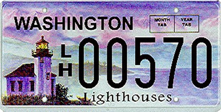
There is a parallel between the decline in license plate design as discussed in this article by William Morgan on Slate, and presentation slide design. Digital printing technology allows the addition of (background) graphics and unlimited use of colour. The result is a license plate that is unreadable and an ugly blob of graphical clutter on your car.


SlideMagic: a platform for magical presentations. Free student plan available. LEARN MORE

The future of office software

The announcement that online file storage and sharing platform Box is adding a note taking app is another indication how the world of office software is changing (and that includes presentation design).
  • Work and communication styles are becoming more informal. Overloaded with information, we want to get to the point, quickly, with buzzwords or formal verbal padding.
  • Documents need to be readable (and editable) on mobile devices. Even more important, people need to find a document quickly on every mobile device that happens to be closest in reach.
  • People work on documents asynchronously, in different locations, and in different time zones, without the need for a time consuming meeting to discuss small changes.
  • More and more senior executives will make direct edits into documents, cutting out the traditional feedback editing loops involving secretaries, junior analysts,  (who used to be the in-depth experts in Office software), and print-outs/faxes.
  • Ad-hoc presentations in small groups with random/frequent interruptions grow at the expense of orchestrated, big, planned presentations where we let the speaker finish before asking a polite question.
Software needs to follow culture.

SlideMagic: a platform for magical presentations. Free student plan available. LEARN MORE

Broken contact form

The contact form on my company website was broken for some reason, which might be the reason I did not get back to your message. Instead of forms, you can use the email contact_at_ideatransplant_dot_com to get in touch with me.

SlideMagic: a platform for magical presentations. Free student plan available. LEARN MORE

Start with a headline

Every story has a few key messages. And a message is not something like “We are a highly flexible, customer-satisfying, and scalable platform, that delivers return on marketing investment.” Things need to be more specific.

For example, you have a company pitch that makes your startup sound like - yet another - social network to the ignorant outsider, and you are not. Rather than making this important point verbally, explaining around the slides, it is better to take the issue head-on: write “We are not a social network” at the top of the slide and design the most powerful visual you can think of to visualize it.

Maybe use 2 charts. One can be incredibly simple: 2 circles, one says ”Social network”, the other “Us”. Then in the next slide (using the same headline) provide factual evidence/explanation why you are not. And factual evidence is not the same as writing a long bullet point: “We are not a social network” (duplicating the headline). You need to list some sort of feature comparison between social networks and your application.

SlideMagic: a platform for magical presentations. Free student plan available. LEARN MORE

Templates -> boredom

In big corporates, preparations for an important presentation often start with one person preparing the template for the presentation, emailing it around to all relevant business units to be filled out. The final presentation design is simply a matter of slapping the filled in templates together into one big, boring, 30MB, 200 page, 10-hour slide deck.

I am repeating my hobby horse here, this presentation is the problem solving deck that contains all the relevant data. The challenge now is to distill from all that information a compelling story. And that story might well have a different structure/flow for each business unit.

So, my suggested process:
  1. Yes, create that template, send it out
  2. Create the monster file, clean it up
  3. Have a conference call with each of the business units about the data
  4. Then, give them freedom to express their story in their own way, with their own slides, within a strict time constraint
  5. Share the monster document as backup/bed time reading
The word template can have 2 meanings. One is the standard background layout of a slide (many use banners, logos, and other graphics, I mostly use a white page), and the second one is a series of tables and data charts without numbers and/or words in them. In this post I refer to the latter.

SlideMagic: a platform for magical presentations. Free student plan available. LEARN MORE

One pen

Problem solving in a team can be really powerful. You split up the work to save time by working in parallel. You can discuss data, findings, and ideas with your team tapping into a collective brain that is bigger than yours.

I find that designing presentations though is best done by one person who has the pen. One style, one approach, one story flow, everything gets said once, everything that should be said gets included. Multiple captains on a ship create an inconsistent story.

That is also the reason that I am not a big believer in realtime office document collaboration, a feature that many software publishers try to implement. The fact that the Internet makes it possible does not mean that it is a good thing.

Team input is important, but only one person should have the pen to incorporate them into the story.

SlideMagic: a platform for magical presentations. Free student plan available. LEARN MORE

First complicate than simplify

In many presentation design projects, I start by building some sort of overview slide that is highly dense, complex, but has the whole story/solution on it. This enables me to shuffle things around, split things up, merge things, until I feel confident that I can move the other way: simplify. The designer has to go to the bottom of complexity in order to save the audience from having to do the same thing.

SlideMagic: a platform for magical presentations. Free student plan available. LEARN MORE

Mixing and matching

Before starting a presentation design project, I need some basic guidance from my clients: dark or light background, custom fonts or not, Mac or Windows. Useful information.

A few times, I made the mistake of asking design (not content) input on specific slide elements: this way of putting pictures or that way, this type of titles or that, black & white or colour. It somehow did not work. As a designer you need to select the entire design approach in a consistent way.

I sometimes see something similar in interior designs of houses: individual elements look OK, but the whole composition together does not make sense.

Mixing and matching gives mediocre results.

SlideMagic: a platform for magical presentations. Free student plan available. LEARN MORE

Slow down impatient clickers

Here is another argument against dense bullet points.

Most business presentations today are read on a screen (increasingly a tablet), rather than watched live. You might think that bullet points are actually good for reading on a screen. They are, BUT. People have become so impatient, and overloaded with presentations that they just “page down” a document quickly, reading the headline and thinking “OK, I get it, next...” [click] [click] [click]

The only way to slow that reader down is to break up that bullet point chart in multiple slides and write the important messages clear and in her face, supported by the right visual.

SlideMagic: a platform for magical presentations. Free student plan available. LEARN MORE

Bogged down

Often, detail can be good. Big-picture pitches are vague and generic, and sometimes even insulting to an intelligent audience. Diving in deep in selected aspects of your story shows that you know what you are talking about, and often, the big innovation might be coming from something very specific.

This is detail to adds to, builds on, one story line.

Details that distract from the main story confuse. Going off on a tangent, getting bogged down, are not going to help to convince an audience that comes in cold and which has barely had the time to get used to your funny sounding English accent.

Leave the side tracks for later (if at all), wait for the key idea to sink in.

SlideMagic: a platform for magical presentations. Free student plan available. LEARN MORE

App update

Regular readers will know that I am busy developing a “PowerPoint killer” web app in my spare time (and financed with my personal savings). Many of you have signed up to be part of an early testing group. Here is where I am at, at the moment.

The key innovation of the app will be the approach to designing slides, and that engine is now more or less up and running. I am very pleased with the result, it runs exactly as I have imagined it in my head and jotted it down in PowerPoint (my web design environment, believe it or not).

My clients do not know it, but I am slowly changing my approach to (PowerPoint) slide design in such as way that it will fit the design approach of the new app, and I am testing to see where the philosophy breaks down.

The slide design engine, cannot be tested on its down, hence development work is now focussing on getting the more trivial parts of the application working (presenting on a screen, managing files, etc.).

When this is finished, I will release the app to a very very limited testing crowd that will not be intimidated by unexpected bugs. The objective is to test whether the methodology appeals to more people than just myself. After the green light and a more robust design, I will open the app to more people.

Please be patient as I am trying to juggle time and financing carefully. Watch this space.

SlideMagic: a platform for magical presentations. Free student plan available. LEARN MORE