The look and feel

The look and feel of your presentation is important. It contributes to 2 important communication objectives:
  1. Helping to make sure that your audience actually understands what you want (believe or not, many presentations fail to reach this threshold).
  2. Helping to make the audience do something (buy your product, invite you to the next meeting in the fund raising process, etc.)
  3. Remember your story
For all three of the above you could go for a “wow”-style presentation with no money,  animations, slick graphics, and other visual effects spared to blow your audience out of the room 

But the look and feel signals other things about you as well:
  • Are you professional?
  • Are you prudent with the investments people put in you?
  • Are you trustworthy?
  • Etc.
Some of my clients want a dense bullet point deck because it looks similar to all the other serious consulting and banker presentations they have seen. For most business presentations, you need to find that middle ground between the two extremes.

SlideMagic: a platform for magical presentations. Free student plan available. LEARN MORE

Picfair

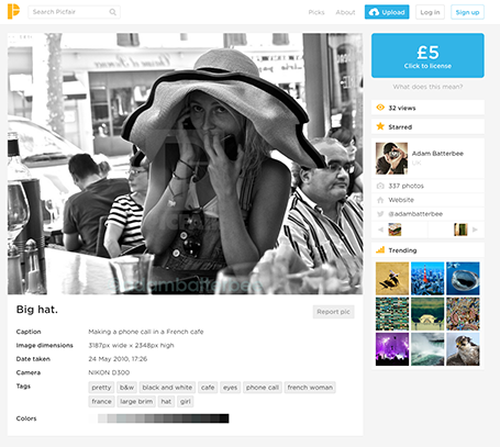
A new stock image site Picfair joins the crowded market. It is a market place where photographers set their own price for their work. You can search by theme and keywords.


The good: The site has not been invaded (yet?) by the producers of plastic, cheesy, generic stock images. Photographs are interesting, spontaneous, and original.

The bad: Because of the lack of stock libraries, the range is (still) limited, and this is not the site to find banal but practical images (a bucket on a white background).

Hopefully one of the many small sites that try to provide an alternative to the stock photo giants will rise to become a player that is big enough to serve as a one-stop-shop for quality images.

(Image in this screen shot by Adam Batterbee)

SlideMagic: a platform for magical presentations. Free student plan available. LEARN MORE

Cover letters

The cover letter of a fund raising letter for an academic institution I just received in the physical mail has the same mistakes as cover emails for fund raising presentations.
  • The first two paragraphs start with “I”
  • The letter is dated 4 weeks ago
  • These same paragraphs are full of generic marketing speak that all academic institutions are using, top-tier institution, remarkable faculty, break-through research, teaching excellence, prestigious awards.
  • Then comes the ask for funding
  • Then an appeal to share the values of the founders of the institution
  • The rest of the envelop contains reports and statistics (mostly text) on expensive, heavy paper
Here is what I would do different:
  1. Send the whole thing as a PDF document by email, heaving, expensive paper is not a good indicator that my money is spent wisely
  2. Write a very short first page: here is the annual fund raising mailing, we need your money to maintain our brand (and that means you, alumni, your own reputation). Obviously not as bluntly stated as here
  3. Add a very visual presentation: Images of the campus that remind my of my own time there, and see how it developed since then. Images of some students and/or faculty and the great things they are doing (the visual backup of the vague statements made in the letter). A visual presentation of the great things the institution is going to do with my money. Many tiny pictures/stories of students that have donated to build peer pressure to do the same.

SlideMagic: a platform for magical presentations. Free student plan available. LEARN MORE

Winging it

Fred Wilson can wing a presentation, scribble down 10 points, 10 minutes before going on stage, and delivering a great 10 minute presentation (see his blog post).

But is he really winging it? My guess is not. He has spoken about these issues dozens of time before, everything is completely prepared in his head. He just needs to decide what to talk about, and what not.

Fred cannot wing a presentation, neither can you.

SlideMagic: a platform for magical presentations. Free student plan available. LEARN MORE

Storytelling in business

Today, everyone is talking about “story telling” in presentations. That is great: stories are much more memorable than dry descriptive bullet points. But business presentations are not action-packed thriller movies, and when you force story telling on a business presentation, you will know, and the audience will know as well.

I take a pragmatic approach to story telling in business presentations. Rather than forcing myself to come up with a story, I take a step back and think about what makes a good story, and what makes a good story teller, and applies those elements to my business presentation.
  • Use human language, and cut all marketing speak and buzzwords
  • Establish some sort of connection to the audience before you dive into the content. Tell something personal that explains why you are passionate about the subject you are talking about.
  • At the starting point, set a setting, or a stage that is familiar to the audience. In a sales pitch, this is often the confirmation of a specific problem that a customer is facing.
  • From this starting point, build up to the surprise, the unexpected, the contrast. This tension makes a story stick. If possible you would go through multiple waves of the familiar setting, and the contrasting surprise. As a result you might well have to give up on your business school style logical presentation structure.

SlideMagic: a platform for magical presentations. Free student plan available. LEARN MORE

Redesigning the Meeker deck

The Business Week magazine asked presentation designer Emiland de Cubber to redesign the information-loaded slides of Mary Meeker’s annual State of the Internet deck. Here is the original:


You can see the result of the make-over here.

The Meeker presentation is a dense deck full of facts that can never be (and should never be) converted into a TED-style slide deck with a few words and some pretty pictures. And Emiland did a great job of making that information more visually powerful. Muted colours calm down the slides. The use of colours in the graphical language of KPCB eliminate the need to be reminded of KPCB by a huge logo on each page.

Here are some of my additional comments, the key point is that you can even be more radical in improving this presentation. These are all constructive ideas, Emiland did a great job!

I invite you to open the Business Week alongside this text, I am not sure whether I can copy all the slides into this post for copyright reasons.

The dark colour scheme does work better for large rooms and big projector screens. A huge wall of white light overpowers the stage presence of the presenter. However, I suspect the majority of the audience of this presentation will be sitting at a desk when watching the information, in that case sticking to the light background might keeps things more readable.

I disagree on the use of icons to simplify categories in slides. Icons simplify too much in these technical presentations. Instead, I would opt for dramatic text simplifications. Emiland did both, I would have taken the icons out, and put more emphasis on the shortened text. (The second make over example slide).

To contradict myself: there is room for icons, when you repeatedly need to speak about the same thing in a presentation. After using the icons depicting the same subject in a few slides, you can use it as shorthand in subsequent slides.

But things can be simplified more, that second slide makes two points that are very similar. If you want to say that we are still far below the 2000 bubble levels, you can as well take out one chart all together and stay with one series of columns. If you want to make a point of comparing number of companies, and financing volume, you can make an explicit chart showing the size / deal.

The next slide again mixes 2 things. To make the message of the imbalance of ad spent and time spent, I would have created two horizontal stacked bars, the trend will pop out much better. The second part of the chart is the analysis that shows the $30b opportunity. The way that this is calculated gets lost in the Emiland make-over. I would chop the chart in 2 slides, one to show the imbalance, one to explain the calculation.

The critical mass chart. What the original Meeker chart is missing is a visualisation that all of these 3 elements are required in sufficient quantity to make something happen. If 2 are big, but the 3rd is not, the thing will not take off. I do not have a visualisation ready in my head, a tricky one.

The education realities chart: even in a dense slide deck like this, I would break this up into 10 slides that hammer each of the facts home.

The last 3 slide make-overs are very well done. The messy images, yes get rid of them, I would have eliminated some of the stats as well, they do not mean much. The messaging one, these 2-axes charts always take a few seconds to interpret, it is better to avoid them. And finally, yes, good idea to introduce that 100% pie, two stacked columns would have been effective as well.

In short, nice work!

SlideMagic: a platform for magical presentations. Free student plan available. LEARN MORE

"We will do that verbally"

Entrepreneurs are often so deep into their own story that they leave the supporting visuals for some of the most fundamental points of their business idea out of the presentation. “Oh, why Amazon would not do this? Well, I have a great story to tell that I usually do verbally when displaying the agenda page.”

Stories are great, verbal explanations without visuals are great, BUT. My two arguments why it might be a good idea to back up your story with visuals (in particular relevant for an investor presentation):
  1. You want people to remember your story, and a big bold visual might help anchor the idea in the mind of your audience. The visual does not necessarily have to explain the idea, it should just trigger the memory when you bring up that story of the banana peel back up 3 weeks later.
  2. The argument for going further than a visual anchor point is that you often lose control of what happens to your file with slides after you have emailed it to an investor. It gets forwarded to partners in the firm, industry experts, etc. Just in case, it is a good idea that someone who did not sit in the room still can understand the idea behind your business.

SlideMagic: a platform for magical presentations. Free student plan available. LEARN MORE

Content before structure

The other day I had a potential client on the phone who was under time pressure. She asked me whether I could work on the structure/framework of the presentation (and the template) while in parallel they would start filling things in.

When you start a project and need to cut up work among multiple team members, a skeleton or presentation framework can be really helpful: someone works on the market, someone works on the competition, while someone else takes on the financials.

When you get to the stage where you have to present your conclusions to others (i.e., the analytical work is done), putting structure before content is wrong. As a presentation designer you need to know the content first, translate that into a story, and in the process you come up with a structure which is engaging and convincing, a structure that often will deviate from business school presentation templates, consulting pyramid structures and other logical frameworks.

Problem solving: structure first, then content.
Convincing: content first, then structure.

SlideMagic: a platform for magical presentations. Free student plan available. LEARN MORE

"Get it down to 8 slides"

People want to be helpful in giving feedback on your presentation, and often when you send a draft to an experienced executive she will say to cut it down to 8 slides. She sat in far too many boring meetings where eager young managers try to pitch ideas with endless and endless pages of bullet point slides. She probably has not read the content of your slides, and just looked at the page count.

We have discussed many times that a 50 page visual presentation can be presented in the same time as an 8 page bullet point deck, but there is something else here.

A bullet point deck can easily be compressed: reduce font size and combine 2 slides into 1. With carefully designed visual slides, this approach will not work. The moment you start cutting and combining, you are back in bullet point land.

Instead of agreeing page count, agree the time you have to present the story.

SlideMagic: a platform for magical presentations. Free student plan available. LEARN MORE

Clear versus stunning

In presentations, clear and stunning are not the same thing. I have seen many stunning infographics that are not clear at all. And more importantly, it is perfectly possible to make a clear and convincing business presentations without stunning visual effects.

Especially in business presentations, people often want to go for stunning first, and commission expensive graphics design or video creation work. It is wiser to hold of with this until you have a simple presentation that 1) makes it clear what you want (touch the head) (believe me, I have seen many presentations that do not even pass this hurdle) and 2) convinces people to do something (touches the heart).

SlideMagic: a platform for magical presentations. Free student plan available. LEARN MORE

"We need to animate that!"

The audience does not see the difference between 4 consecutive slides with different images, or 1 slides with 4 consecutive image build up, so there is no point in trying to cut slides by consolidating 4 images into one. Four slides are easier to edit, and four separate slides are easier to email as PDF.

SlideMagic: a platform for magical presentations. Free student plan available. LEARN MORE

NY Met puts collection online

The New York Metropolitan Museum of Art has put 400,000 super high resolution images of their collection online, free to use. Great for use in presentations.


SlideMagic: a platform for magical presentations. Free student plan available. LEARN MORE

Keynote with Dropbox/Box/Gmail

The new Keynote creates files that look like a single file on a Mac, but on other machine appear as a folder with multiple files in them. This has implications for online file sharing:
  • Gmail: emailing a Keynote file as attachment does not work
  • Box: file syncing, or sharing a download link does not work
  • Dropbox: seems to have fixed the issue.
Has anyone had issues or is it just me?

SlideMagic: a platform for magical presentations. Free student plan available. LEARN MORE

Screenshots are great

Aspect ratios, dots per inch, file formats and conversions, forgetting where you saved that file, these are all problems that are disrupting my creative workflow. More and more I just work with screen shots. If the image looks sharp on my big 27" monitor, I crop it as I want it, and use it in my presentation. It could have been a JPG, a PNG, a web page, a PDF document, a Keynote file, it does not matter. CMD-SHIFT-4- and “click”, done.

SlideMagic: a platform for magical presentations. Free student plan available. LEARN MORE

The green Mac OSX + button

The behaviour of the green + button at the top left of a window is unpredictable. I found out that option-clicking it will maximise the window to the full screen, every time, completely predictable, at last for non-Apple software (Keynote does not play along).

This has probably all to do with Apple’s full screen mode, the two arrows at the top right side of the screen. I use it rarely because this feature does not work very well with multiple monitors.

SlideMagic: a platform for magical presentations. Free student plan available. LEARN MORE

Bunkr presentation design app

The presentation creation and sharing app Bunkr has not appeared on my radar screen until recently. The company raised EUR 1m in a recent fund raising round. In the not too distant future, I am becoming a player in the market myself, so I am watching developments with interest.


I clicked around a little bit in the application and here is my impression. Things I like:
  • Snappy, fast, clean user interface
  • Nice intelligent rulers to snap your objects against
  • Social technology integration (Disqus comments on slides)
  • Online image search integration (Google images, Flickr), but watch those usage rights
  • Easy sharing and embedding
  • Different objects for titles and paragraphs, not just a text box
  • No bullet point template when you create a new slide
My main comment is, is that all PowerPoint alternatives in the market, still stick with the same fundamental approach to slide design and drawing on a computer screen that has been around since the 1980s. And that is the problem I am trying to solve 24/7, and it is not easy...

SlideMagic: a platform for magical presentations. Free student plan available. LEARN MORE

Confusing Keynote?

Apple is known for making beautiful and easy-to-use software, but I am struggling with the new Keynote, especially with the simple task of colouring shapes, and the text inside them. I always pick the wrong colour box, and need to switch a number of different menus to complete very basic actions.

From a UI design perspective the user interface looks perfectly clean and organised. For power-editing at very high speed, it breaks down. This is the reason that the QWERTY keyboard was invented: the logical thing would have been to make ABCDEF keyboards, at high speed though they are less efficient.

Maybe it is me or is it that “the emperor has no clothes”? I got used to working in a certain way? I am in my mid-40s and my ability to learn new UIs slows down? I am not a typical Keynote user and it works perfectly fine for everyone else?

SlideMagic: a platform for magical presentations. Free student plan available. LEARN MORE

Promoting a client: SCiO

[Off topic] One of my clients is running a Kickstarter campaign to fund their project: SCiO reads the chemical make-up of materials. It is a non-intrusive, no-touch optical sensor that connects to your smartphone. You can analyse your food (what is in it?, is it fresh?), medicines,  hand bags (is it real leather?), etc. With almost $1.5m in backing it is now one of the top 40 funded projects ever on Kickstarter. Check it out.

SlideMagic: a platform for magical presentations. Free student plan available. LEARN MORE

Polite VC feedback

A venture capitalist needs to turn down people all the time. Sometimes decisions are scientific, most of the times they are not. Sometimes they are made after extensive deliberations, most of the time in the first minutes of meeting you. It can be that they do not like the sector, do not believe in the idea, do not like you, have a bad day, do not believe that you can pull it of, anything.

When you ask them for feedback, most of them will not tell you the real story. But, VCs want to be helpful. So, some of them will give constructive feedback about your business or the presentation. Some feedback is helpful, some less so. When they do suggest that you include 5 more breakdowns in the year 5 revenue forecast, they were nice to you in giving you a suggestion, but I very much doubt that if you had included those numbers in your first presentation, she would have changed her mind.

Filter feedback and try to drill down to the real issue.

SlideMagic: a platform for magical presentations. Free student plan available. LEARN MORE

Business plan outlines

The Internet is full of business plan/investor pitch outlines (here is a nice one from Sequoia). Use these guidelines as a check list to see whether you covered all the content that investors expect. But do not stick to them too literally. A rigid, generic, structure kills the spontaneity of your specific story. Do not simply copy the sections of the structure and use them as (boring) headlines for your slides, instead write headlines that mean something (The Solution is not very meaningful). The text book approach to TAM calculation might not exactly fit your specific market.

All advice (including the one you will find on this blog) is given to help you. In the end, it is you who makes the call what to use, and what not.

SlideMagic: a platform for magical presentations. Free student plan available. LEARN MORE