Consolidation chart

This is a nice way to show consolidation in an industry. You can digest the chart in 2 ways: on the podium you see the big picture of consolidating financial institutions, reading in close-up on the screen, you can see the details. The chart could have been better if the width of the arrows would represent the assets under management of the banks, some of these acquisitions were bigger than others.


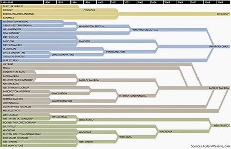
[Off topic] There is a populist discussion going on in the comments of the original post. I did a lot of strategy work in banking mergers and there are different ways to look at the concentration in an industry. The top level player count is an easy statistic, but what is more relevant is the choice that customers (especially small businesses) have on the ground. How many different bank branches are within a 10km range at any point in the US? If there are 30 banks, but each concentrate on a specific state, then the market looks very competitive, but on the ground, customers face a monopoly. On the other, if all 4 banks are represented in most small villages, the market could be competitive.

SlideMagic: a platform for magical presentations. Free student plan available. LEARN MORE

The best briefing

The worst presentation briefing (and as a result most time-consuming presentation design project) is a long deck of slides full of bullet points that have been shortened (hey, we learned about being concise) to such an extend that they have turned into meaningless, generic prose.

The best presentation briefing (and start of a rapid presentation design project): the audio track of a 15 minute video of the actual presentation, the existing slides are not really needed.

SlideMagic: a platform for magical presentations. Free student plan available. LEARN MORE

Adobe Voice

Adobe launched a new iPad app, Adobe Voice, that enables you to create narrated story videos. There are many apps that help you build animated videos, but this is one of the best I have seen.
  • It is incredibly simple to use (unlike most of Adobe software), with a beautiful user interface that breaks the conventional approach to video editing
  • It comes with dozens of pre-set story lines: tell what happened, follow a hero’s journey, share a growth moment, promote an idea, etc. Once a story line has been selected, the app prompts the user on each slide with a question to answer (why did the hero set out on his journey?).
  • After recording the audio, you can add images, icons, or text
  • The app comes with a large library of background templates and sounds.
There is an 80/20 rule here, in 20% of the time, you get your video 80% right. Still if you want to get to 100% perfection (something that you are confident to share professionally), you need to get put in the other 80% of the effort. Prepare your visuals and images, and prepare your script.

It is cute that this app was developed for iPad, but for professional use Adobe should create a browser version as well for desktop. It can have the exact UI (except for resizing of images etc.). It is a bit tricky to extract your creation out of your iPad at the moment, and usually people do not have their image databanks stored on iPad.


But overall, a nice app.

SlideMagic: a platform for magical presentations. Free student plan available. LEARN MORE

7 time zones away

Yesterday was Independence Day in Israel, so I was not working. One of the costs of working with international suppliers; random holidays. Other drawbacks: time zone differences, and in the case of Israel, a weekend that does not overlap (Friday Saturday here). By the time a west coast client gets in her office by 09:00 on Monday morning, I clocked already two full working days, and will be heading into the weekend 08:00 AM PST Thursday (3 days later).

But the set up has its advantages:
  • Overnight turnarounds, send of input, and you will see it all done the next morning you come into the office
  • A less stressful workflow, once time zones dictate that you need to organise yourself: I have focussed calls with US clients in my afternoon, and have the mornings to do productive work. There is no opportunity for disruptive, live, last minute changes
  • Building on that, an end to time consuming meetings. Input gets collected much more efficiently than in calendar disrupting meetings (maker schedule versus manager schedule).
It turns out that there is virtually no difference in the way I interact with a Tel Aviv or a San Francisco client, apart maybe from that first get-to-know-you meeting.

But: clients self select, people that do not like to work remotely with their suppliers probably do not turn out to be my clients. But hey, the world is a big place.

SlideMagic: a platform for magical presentations. Free student plan available. LEARN MORE

No audience is the same

A company presentation will be used for many different audiences: investors, Board meetings, sales meetings, people who know the company, people who see the company for the first time. There is the temptation to start working on a different presentation for each different audience. Resist.

First of all, I hope your story is the same for all these audiences. I have seen companies that want to change the story depending on who they pitch to. I think it is very hard to build a successful with an inconsistent market positioning and purpose. So let us assume that there is one story.

Even though different audiences require different amounts of detail for specific parts of the story, each audience still needs to put everything in that overarching framework. Leaving things out will break the flow of the story. So, even for highly a knowledgeable scientist audience, I would still put in one (place holder) chart to remind us all of the very basics of a certain medical condition.

From a practical point of view, it is also very difficult to maintain multiple versions of the same presentation. A small correction on page 10, needs to be duplicated everywhere.

The bottom line, I create one overall master deck and sit down for before every presentation meeting to cut down the presentation to size.

SlideMagic: a platform for magical presentations. Free student plan available. LEARN MORE

Cartoons need to be huge

Everyone loves reading cartoons, and they can make great content for presentation slides (watch the copy right). But for an audience to get the cartoon, they need to be able to read it. And given the scribbly nature of cartoon fonts, fonts sizes in the bubbles need to be bigger than what usually works on a regular slide (i.e, font 20 or up). If the bubble text has to be 20 points, that means that the overall image needs to be pretty large, often you do not have enough space for it.

When creating slides that are meant for emailing in advance and reading on a screen, font size is less of an issue.

To get the audience to focus on the cartoon, chop out all the usual slide clutter (titles, footers, logos), just a plain page with a cartoon graphic. Cartoons are usually busy graphics.

SlideMagic: a platform for magical presentations. Free student plan available. LEARN MORE

Stories need fewer slides

Many clients come to me with fact-packed presentations full of dense bullet point slides, I recommend to break up each slide into multiple visuals that carry just one message. The result: slide count can go five fold, but the time to present them stays the same.

Some clients come to me with stories (much more effective than dry business content), but again, they are written out in bullet points. Here, I advise to do the opposite: cut the number of slides. Put up a picture of the person, situation, place, you are taking about, and give the story verbally. We can read a fiction book without a single illustration and build a rich visualisation of the story right in your head.

If you need to send this presentation full of stories without you having the ability to explain, you might consider adding a small point 12 text box at the bottom of your image with the slide narrative in full sentences.

SlideMagic: a platform for magical presentations. Free student plan available. LEARN MORE

Boring frameworks

If your business has 15 sales channels, it makes sense to review their performance using the same framework: easy to compare, and you make sure that you are covering everything that needs to be covered.

If you work with management consultants, you will notice that they love this approach. You get presented with a framework, asked to fill it out and then - here is the mistake - the 15 analyses are put on the overhead projector for a nice morning-filling channel performance review session.

Analysis slides are not the same as presentation slides. Keep the boring, structured deck as reference material. But, when presenting: try to break the logical structure. Focus on what is different, remarkable, requires attention. And since each of the 15 channels are different, you will find that these stories do not fit into one framework.

SlideMagic: a platform for magical presentations. Free student plan available. LEARN MORE

How did she spot that?

When I just started out as a junior analyst at McKinsey I always wondered how my project manager was able to spot a mistake or inconsistency in my slides in a second. I had been working on this all night (sometimes literally), build all the spreadsheets, mastered all the detail, and in she comes and says after a few seconds: “that number looks wrong to me”, and yes, there was a bug in my analysis.

The secret is take some distance from your work. Look through the slides without connecting them to your Excel sheet. Sales numbers on page 3, should be the same as sales numbers on page 16. A soft drink can is unlikely to cost $50. Simple checks and a cool head.

If you do not check your slides, your manager, or your client will for sure.

SlideMagic: a platform for magical presentations. Free student plan available. LEARN MORE

Monthly reports in PPT

Many technology providers need to write some sort of monthly report with statistics for their clients. The bare output from their applications is too rough and does not contain conclusions, insights, follow-up actions and quantified $$$ savings.

So writing this report is a manual process: data gets uploaded into Excel, analysed, put in graphs in then all of this is put into: Microsoft Word.

Microsoft Word (or any word processor) is not a good tool for creating data reports. It does not have the page layout capabilities of Adobe Illustrator (have you ever tried to move a picture or graph around and see the surrounding text move in unpredictable ways?), and it does not have the graph editing capabilities of Excel.

The solution: create you monthly reports in PowerPoint: managing images and data graphs is much easier. And now that you have left word processing territory, why not cut the amount of blah blah text and force yourself to get to the point with fewer words. If people do not feel like reading long, dense presentations, do you think they have the energy to digest dozens of monthly report prose?

First, the type writer left the enterprise world, and now it is the time to say goodbye to the word processor and leave it to authors of books.

SlideMagic: a platform for magical presentations. Free student plan available. LEARN MORE

Movement in stills

Putting an image smack in the middle of your composition often kills the sense of action in your slide. Experiment with cropping to make things more interesting and dynamic.

SlideMagic: a platform for magical presentations. Free student plan available. LEARN MORE

Word repetition

Some busy charts can still be highly effective. See the one below about the declining relative income of wealth classes in the US. The repetitive “United States” could have been replaced with something visually calmer, but the current works actually pretty well.

See that this charts presents other information as well (which countries did well), but the viewer is unlikely to take notice (and she does not need to).


The original article in the New York Times can be found here.

SlideMagic: a platform for magical presentations. Free student plan available. LEARN MORE

Microsoft Office Mix

Microsoft is working to add interactive features to PowerPoint presentations: real-time hand writing, audio/video of the presenter for off line viewing, analytics (who looked at what slide for how long), etc. A more elaborate description here on ZD Net. At the moment, Mix is just an add-in, but it could be a preview of what directions Microsoft will be taking future versions of PowerPoint.

Microsoft has opened Mix for preview, but it requires PowerPoint 2013 (i.e., does not work on a Mac).

My hunch is that the world needs simpler presentation software (working on it), not more complicated, but I am open to be convinced of the opposite.

SlideMagic: a platform for magical presentations. Free student plan available. LEARN MORE

Funny

Most infographics are a bombastic compilations of overcomplicated, trying-too-hard, visualisations of facts that are not always that insightful. These simple graphs by Danish writer/artist duo Mikael Wulff and Anders Morgenthale are well executed and actually pretty funny.


A compilation of charts here on the Zero Hedge blog, and here is the web site of the original creators Wumo.

SlideMagic: a platform for magical presentations. Free student plan available. LEARN MORE

Where is that chart again?

The majority of slides in an average presentation are the bubble wrap that protects the real content. These slides are summary pages, set up pages, and lists of bullet points to remind the speaker what she should be saying next.

One indication that a slide is really needed is that you often look for them in one on one meetings. “Hey, wait, where is that email, with that attachment, with that special slide that I made a while ago.”

Spend more energy making slides like these.

SlideMagic: a platform for magical presentations. Free student plan available. LEARN MORE

"That took no time at all"

Many younger employees in big corporations have now understood that presentations with many slides that cover one point each are more effective than short presentations full of dense bullet point slides.

Their bosses might not be there yet.

I found an effective strategy to convince them: design the deck the way you want it, and have a test run. In 25 minutes, your boss understands that it takes the exact same time to present that longer presentation.

SlideMagic: a platform for magical presentations. Free student plan available. LEARN MORE

Visual shelf life

The other day I pointed out to a client that the colours of the corporate sign on top of the building were starting to fade. No, not that many customers of the company drive by the building every day (HQ is in Tel Aviv, customers are all over the globe), and yes, you can still read the sign and understand what company occupies the building. But still, it is the more subtle cultural signal of how the company sets its priorities, mostly influencing the employees who are making things happening every day.

The same applies to the look and feel of your presentations, if it looks worn out and tired, the audience might just think that the same is true for the company as a whole, and maybe their suspicion is right...

SlideMagic: a platform for magical presentations. Free student plan available. LEARN MORE

Zooming without Prezi

If you save your PowerPoint or Keynote file as a PDF and use an iPad with a PDF viewer to project your presentation, you can pinch and zoom into slides without sophisticated slide design techniques or special tools such as Prezi.

PowerPoint for iPad does not support it (yet).

SlideMagic: a platform for magical presentations. Free student plan available. LEARN MORE

The bar is rising

Compared to 10 years ago:
  • Your audience has sat through many more presentations
  • Your audience has watched many TED talks
  • Your audience has eliminated the patience to waste time digesting formal communications (big wordy business documents)
  • Your audience has probably seen/heard many ideas that are similar to yours
  • Your audience has become better at digesting information from multiple channels, devices, quickly
The bar is rising.

SlideMagic: a platform for magical presentations. Free student plan available. LEARN MORE

Bad form

Most form designs are a total disaster. Full of text (long prose) and cluttered, it is impossible to find the information you actually need. Especially if you are a non-Hebrew reader living in Israel, and need to pay a water bill online. The basics of 1) which web site to go, 2) what numbers to enter on the site, and 3) by when to pay are totally unclear.

There is a strong parallel with poorly designed presentation slides. Most forms are designed with the issuer in mind: it follows the structure of the IT infrastructure. Most forms follow a classical form template that has been used for decades, nobody is challenging whether a different layout might by more effective.  Most forms lack any form of human language.

SlideMagic: a platform for magical presentations. Free student plan available. LEARN MORE