Scientific slide analysis

Here is a piece of research that extracts the font sizes, fonts used, lines per slides, slides per presentation of a 1,000 random presentations downloaded from the Internet. Lots or Times New Roman, lots of text, tiny fonts, endlessly long presentations. We knew it intuitively, but now there is the hard data to back it up. Research by Tim Theman.

SlideMagic: a platform for magical presentations. Free student plan available. LEARN MORE

Place holder and data charts

I realised that most presentation slides I create fall in two categories:
  1. Data charts that have information in them that would be impossible to convey verbally (a graph, a table with financial information, a ranking of competitors)
  2. Place holders with some powerful visual (picture, typography) and is merely a placeholder for the story told by the presenter
Things go wrong if you mix them: showing hard core data with a cute picture will not work, putting up a detailed consulting framework as your place holder will not work.

SlideMagic: a platform for magical presentations. Free student plan available. LEARN MORE

The big idea slide

I usually start a presentation design project by digesting all the available information, listen to a verbal version of the pitch, Google for market and competitor information, create a slide template based on a straightforward slide (the profit and loss account for example), and let the whole thing cook in my mind for a while.

I know when I leave the “cooking” phase when I am able to draw up the key idea of the presentation in one slide. That one takes a long time to design, but when it is done, all other slides follow really quickly.

SlideMagic: a platform for magical presentations. Free student plan available. LEARN MORE

Skipping the manual

When buying a new product, nobody reads the manual from beginning to end. People are curious, they try things, go back to a specific page in the manual, and then try again.

Many subject experts want to write the definitive, descriptive manual of their idea. Instead, considering the audience wanting to skip it. How would they go about understanding your idea in a probing dialogue? Anticipate that thought flow and make it the structure of your next presentation.

SlideMagic: a platform for magical presentations. Free student plan available. LEARN MORE

Aide memoire

Many speakers use bullet points to remind themselves what story to tell the audience next. Turn back to audience, say “Uh, and also...” Read out bullet point. Turn back to the audience. Then, improvise (often a very engaging) story. These people actually do not need slides at all. The story is in their head, they just need to be prompted to get the flow going. Two solutions:
  1. Use simple speaker cards instead, and forget about slides all together
  2. Create highly visual prompts: a picture, a slide with just one word on it and use presenter view to avoid having to turn your back on the audience

SlideMagic: a platform for magical presentations. Free student plan available. LEARN MORE

Do not overdo it

A VC complained a about a Prezi presentation today: a combination of motion sickness and impatience (using 30 slides to make a totally obvious point that could be made in 1).

There is nothing wrong with Prezi if it is used right:
  • Use zooming effects to support your story: zoom in on a technical diagram for example, hop in and out of a time sequence, focus on parts of your product, highlight different areas of a map. Zooming for the sake of zooming is not helping anyone.
  • If you are in a small meeting, leverage the non-linear navigation to have a good interactive discussion. Random story sequence shifts for a big audience makes everyone miss the plot.
Everyone knows that 30 slides with 1 message is better than 1 slide with 30 bullet points. However, obvious points can still be made in 1 slide. I see a lot of presentations on Slideshare that use one spectacular photograph after another to [click] make [click] a [click] totally [click] obvious point (especially social media and/or mobile cliches).

SlideMagic: a platform for magical presentations. Free student plan available. LEARN MORE

Romanticising without apologies

After you told a story, try to avoid downplaying it: “Well, maybe I romanticised things a bit”, it is like a cold bucket of water for the audience. Decide the level of romanticising beforehand, and then stick to your choice without apologising and/or blushing.

SlideMagic: a platform for magical presentations. Free student plan available. LEARN MORE

The nose is a lie detector

When people make big statements in a presentation they get a bit nervous (“we are the cheapest solution in the market”) and often cannot suppress the urge to touch their nose to get rid of that subtle itchy feeling. Train yourself to be strong and do not touch your face when making big claims.

SlideMagic: a platform for magical presentations. Free student plan available. LEARN MORE

PowerPoint for iPad review

Yesterday, Microsoft finally released a full version of Office for iPad, including PowerPoint. Unlike a previous release for iPhone, this version allows you to create and edit documents.

I blogged before about the strategic mistake of Microsoft restricting its Office products for its own operating systems, and I think the recent change in CEO might have something to do with the sudden release of the iPad app which was rumoured to have been ready for a long time.

So what do I think? First of all, the design looks great. It is a good blend of the iOS environment with Microsoft-specific UI elements (ribbon). The app works fast/snappy and is intuitive to use.

The best thing is that finally PowerPoint will look normal when opening them on an iPad. Fonts work, no need for PDF-ing, or using specific apps such as SlideShark. This takes an important uncertainty out of business meetings. I had many instances where I needed to pull out a deck quickly and unexpectedly, and if an iPad is the only devices you have on you, you keep on apologising for the horrible look of your slides.

And I think this will be the main use of PowerPoint for iPad: showing presentations plus the occasional last minute text edit, or slide show re-order. Serious slide design work is not possible, first of all due to the small screen that is not comfortable to work on for a long time, and secondly because critical functions are missing when compared to the desktop app.

It was expected that Microsoft had to make compromises on what functionality to include, and more importantly, what to leave out. And understandably, there are a few big ones missing. You cannot edit/create data charts for example, which are a big deal in business presentations. Also it is not possible to edit the slide master, which means that any presentation you have to start from an existing document, (which is probably not a bad option).Microsoft did add things that I think are less important, it is possible to manage slide transition effects for example. Not really important in a business presentation.

There are simple, but really important things missing though. Auto-snap alignment of objects is not there. You drag objects around the slide and it is impossible to get them to line up perfectly. You will not see this on a small screen, but when you go on stage for a big audience, your whole slide will look garbled. Second critical function missing: cropping images. It is impossible to make a decent composition of multiple images on a slide. A big deal. Hopefully Microsoft (are you reading this?) will fix this in a subsequent release.

The delivery of presentations is very important on a mobile device, and Microsoft left out one important feature: Airplay. You need to get it to work via the iOS7 interface, and then it works fine, but Microsoft should have made it very prominent in the app. In a few years from now, the low resolution VGA office projectors will all be replaced by Airplay compatible devices (I predict).

Nice touches for presentation delivery are a button to black out the screen (and focus attention on the presenter), and a marker to annotate slides as you present them.

The file system you work in is the Microsoft 365 OneDrive, it is a shame that Microsoft does not allow support for iCloud, Google Drive, and Dropbox, but it is understandable that this feature did not make it because of strategic reasons. Microsoft finally got the insight that Office for iPad will lose them some sales of Windows tablets, but on the other hand might be their strongest weapon to have a change in the battle for enterprise cloud storage environments.

Inserting photos is done through the camera roll, or photo stream, and not via OneDrive. A bit cumbersome for business presentations, since the images you are likely to use are not the ones of your family trips.

Wrapping up, I think the PowerPoint for iPad is actually a really useful app for what it is designed for: displaying presentations in small meetings, and even for big audiences with the option for emergency slide edits. When Microsoft fixes the alignment of objects and image cropping it will be even better.

SlideMagic: a platform for magical presentations. Free student plan available. LEARN MORE

From 90 to 100 percent

Sometimes I work with really good presenters that already have a really good presentation. How to get from 90 to 100%?

My approach would be to sit in the audience of a real live presentation, or watch an entire presentation from start to finish on video. Then, create a series of slides that exactly mimic the story. Take out slides that do not really add anything and are just a prompt for the presenter to tell a story. Add black slides to switch off the projector all together. Use very simple graphics and words to support a story. Be a movie director and look at each frame of presenter and slide together.

SlideMagic: a platform for magical presentations. Free student plan available. LEARN MORE

You are not presenting slides

Back in the old days at McKinsey, my first project manager explained to me that I was supposed to “present the slide ” (Exhibit in McKinsey speak) to the client. This involved taking the audience (a small conference room) through all steps of the analysis.
And also we found... And then we found... And also we analysed... And also the team discovered...
Presenting a slide is probably still useful in internal team meetings among management consultants or scientists, but in most story-driven business presentations slides are there to support you in a subordinate role rather than claiming the lead role. The slides run in the background, as you tell your own story.

SlideMagic: a platform for magical presentations. Free student plan available. LEARN MORE

Presenter backgrounds

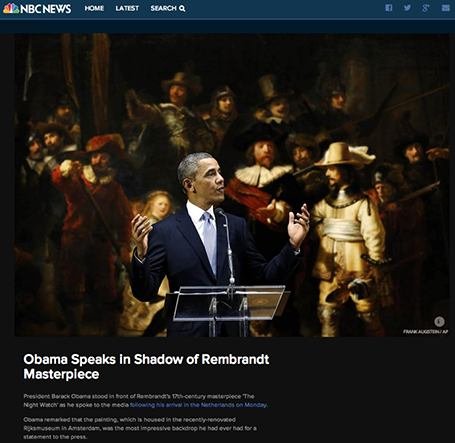
The Obama press conference yesterday in front of Rembrandt’s The Night Watch is an example of how a nice presenter background can make a big visual impact. The dark painting background looks great in close up photos, although less interesting from a distance.


Conference organisers should think beyond the curtain, blank wall, or list of sponsor logos.

SlideMagic: a platform for magical presentations. Free student plan available. LEARN MORE

Two screens

There are two adjustments in my IT setup that hugely increased my productivity: 1) move to a huge monitor, 2) add another monitor making a total of 3 screens: 2 big ones, 1 small one.

In this article, it is argued that 2 screens actually reduce productivity. I agree if you use the second one to check on your email, facebook, and Twitter streams. If you use the second screen for a different version of your presentation with comments, or the directory with the images you are using, a multi screen set up is a life saver.

Employees in large companies find it difficult to be productive, and when you look at people sitting in large open plan offices staring at tiny lap top screens, you understand why.

SlideMagic: a platform for magical presentations. Free student plan available. LEARN MORE

Demos need a story

A series of screenshots is a better way to give a product demo than a live demonstration of your product. You can control the flow better, skip the boring bits (logging in, etc.), and eliminate technology risk.

Many demos are a list of features: the user can do this, the user can do this, the user can do this. That is pretty boring. A better way to give a demo is to invent a story, or use a real life case example.

Set up the context, with some images. Put up the questions/issues the user has, and show how your product can solve them. Throughout the demo, stick to the same use case, use the same consistent data set.

Demos can be stories to.

SlideMagic: a platform for magical presentations. Free student plan available. LEARN MORE

Speed up

OK, you learned how to make visual presentations and now you have a beautiful deck with lots of slides full of powerful images.

The next thing is to adjust your presentation style. In the old days: people used to present a slide: take time to read the bullets, elaborate on the graphs, go off on a tangent, improvise a story. Each slide would be up for 5 minutes or more.

With a 50 slide visual deck, you need to speed things up and be prepared. Make the point of the slide (and no other point) and - click - on you go. You are no longer presenting slides, slides are supporting your story in the background.

SlideMagic: a platform for magical presentations. Free student plan available. LEARN MORE

You can be a pro

I did a quick reformat of slides that a client had edited overnight this morning. Here are some of the things I fixed:
  • Recolored red boxes to the correct red
  • Re-applied the correct slide master template to all slides, zapping left overs from other PowerPoint files
  • Re-applied the correct fonts, replacing the standard Arial/Calibri where appropriate
  • Make sure all objects fit within the slide margins
  • Re-sized images so that series have the same height/width
  • Replaced title case with sentence case
These are all simple things, no need for a pro here, you can do it as well!

SlideMagic: a platform for magical presentations. Free student plan available. LEARN MORE

European borders time lapse

This video shows how the political map of Europe has changed in 1,000 years. There is a lot of information packed in here, but the only one that gets across is: “lots of things have changed”. To bring more information to the surface, you need to slow down the pace, and add labels/stickers to highlight the key changes and go into the detail. Both visualisations work, the third option - stuck in the middle - will not.

SlideMagic: a platform for magical presentations. Free student plan available. LEARN MORE

Video without the audio

Short videos can fit really well into a presentation. The audio track can be a problem.
  1. Bombastic loud music can feel out of tone, especially if the sound was not set up correctly (too loud, too soft)
  2. A spoken voice over might feel out of tone with your overall presentation
  3. It is hard to edit/change video audio, maybe your message has changed over the past month, the voice over of your video has not
A good option can be to run a silent video, where you the presenter, gives live commentary in a voice the audience already has gotten used to, perfectly blended into your overall story.

SlideMagic: a platform for magical presentations. Free student plan available. LEARN MORE

Free quick logo design tool

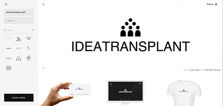
I am a big fan of the web design tool Squarespace and am currently turning a restaurant web site template into the marketing site for my presentation app. Hidden inside Squarespace is a cute free quick logo design tool that uses icons from the noun project. If you are a startup on a tight budget, it could be a good source for your first graphical identity before you are ready to pay serious designers.

SlideMagic: a platform for magical presentations. Free student plan available. LEARN MORE