SketchDeck - overnight slides

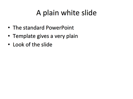
Most investment banks and management consultancies have the luxury of an overnight, low-cost slide production factory in countries such as India. Raw slides (even hand-drawns on the fax machine in the evening, the result in your inbox when you are back in the office the next morning.

SketchDeck is now opening this production capacity to everyone. Prices are very attractive, and they can ramp up capacity quickly to work under very tight timelines.

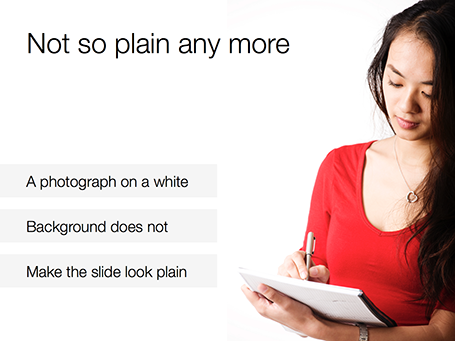
Not every presentation is an all-or-nothing investment pitch or TED talk, and most PowerPoint presentations are visual documents that are put together quickly to support decision making inside big corporates (Nancy Duarte calls them SlideDocs in her new book). It is for these types of presentations that SketchDeck is a good solution.

As it competition for me? Yes and no. For long-standing clients, I have done slide make-over work helping them in emergency situations, going at such a speed that I could probably be price competitive with an India operation on a s $-per-slide basis (I have the advantage tough of having the confidence/ability to edit/cut/change wording put in by very senior executives in a company, something they might not appreciate from everyone). But ultimately, my 1-man operation will not be able to keep up with the race to the bottom (as Seth Godin calls it). I will continue to focus on bespoke work that is in a different price category, and - in my spare time - am busy developing a web app that can hopefully automate a large part of the work that a mass volume slide production facility typically does.

Over time, SketchDeck could grow into a competitor for larger presentation design firms (such as Duarte) if they manage to train up and retain (=pay more for) talented designers, and develop long-term relationships with big volume clients. But at that stage they would have manage the big company challenge of maintaining a large sales pipeline to fund the cost of an increasingly larger fixed cost base.

Time will tell!

SlideMagic: a platform for magical presentations. Free student plan available. LEARN MORE

Slide design TV

Fellow presentation designer Nick Smith is starting a weekly series of short videos with presentation design lessons. Worth checking out and encouraging him to keep on going! Watch Advance Your Slides TV here.

SlideMagic: a platform for magical presentations. Free student plan available. LEARN MORE

Executive Summary RIP

An executive summary that sits on top of a management consulting document is usually a page that summarises the recommendations, next steps, and decisions. It is meant for an insider, the executive reading it is likely to have a 90% understanding of what is inside the document. There is no need for graphics here, a few dry bullets with decisions will do the trick to remind everyone of what will happen next, and who will do it.

So, this is totally the opposite of the other use of an executive summary that I come across often: a short teaser to someone who has no understanding at all of what you want to achieve. Here, a dense text, or a dry list of bullets will do the opposite of attracting attention.

Feel free to step away from the habit of sending dense text pages to get people excited about your project. Instead, think of the time you want the recipient to spend on your document. Now, fill that time with the most visually pleasing and exciting way to present your case. Lower your expectations, you do not want to close a deal at this stage, you want a phone call, or a next meeting. Sending a short, visual presentation that can stand on its own without verbal explanation is a perfect reply to the request for an executive summary.

SlideMagic: a platform for magical presentations. Free student plan available. LEARN MORE

Advice for investors

I see (and work on) a lot of presentations that investors use to raise their own money from high net worth individuals or institutional money managers.

Pitching an venture capital (VC) fund is harder than pitching a regular company. Companies are different by nature, different market, different product, different type of people. Investment funds on the other hand, or more or less the same when you listen to pitches “from a distance”, i.e., with the same level of attention that VCs would use themselves when opening the email inbox in the morning and page-downing some decks that hopeful startups have sent overnight.

Most VC/PE (private equity) pitches would talk about that there are lots of great companies out there that cannot get financing, that the team has a stellar track record, and that - unlike all other VCs - this fund will work hands on with their portfolio companies to create value (strategic help, contact network, access to more financing).

So when to the untrained ear all of these pitches sound the same, it is really important to bring out the distinctions. Bring hard data that show that your target companies cannot get financing. Discuss example deals and show why other investors would not be interested in them, and why you can turn them around. Beef up your track record with quantified exits (unlike most presentations, here the more detail, the better). And - sometimes - reconsider your investment strategy and make it very focused and specific, because believe me, you are not the only one out there pitching for money.

SlideMagic: a platform for magical presentations. Free student plan available. LEARN MORE

Bit by bit

Listing pages and pages of market size numbers that are related to your industry are hard to digest for the novice (for example, a potential investor in your company). This number includes devices, that number is 2011 only, this number excludes Eastern Europe, that one is number of users, that one is in Euro, and this is the percentage growth, but the growth of the average basket size.

An investor who is seriously considering putting money in your company will try to piece this data together to come to some consistent picture. You might as well do the work for her with reasonable assumptions. Size up the 2011 market to 2013, add your estimate for Eastern Europe, convert everything to dollars, etc. etc.

Start with some sort of overall market estimate, compare it to something the investor can relate to, then start adding complexity, break things into pieces.

Obviously your estimate will biased and very optimistic, but your analysis has at least provided the investor with a framework of how to think about your market. Put all the raw data that you used in the appendix so that the investor can do her own homework when she returns back to her office.

SlideMagic: a platform for magical presentations. Free student plan available. LEARN MORE

Getty Images - free embed

Getty Images (a huge database of both stock and news photos) is open sourcing non-commercial use of its collection if you publish an image via their embed widget. Web sites only for the moment, presentation design software will have to wait...

SlideMagic: a platform for magical presentations. Free student plan available. LEARN MORE

White <> plain

No one likes the plain, white, standard PowerPoint slide. And sometimes when I design a slide with an image on a white background and a lot of white space I get the comment that it looks very similar to a boring, plain PowerPoint slide. I beg to differ.


SlideMagic: a platform for magical presentations. Free student plan available. LEARN MORE

"I need a conference presentation"

You have a sales presentation that - despite the fact that it is loaded with bullet points - has been very successful in 1-on-1 meetings with customers. Now you have an invitation to speak at a conference for an audience of more than 100 people for a maximum of 20 minutes. What next? Here is a recipe.
  1. Trim down the content. In the conference audience are competitors, analysts, journalists, all kind of people that might not be suitable to receive the ins and outs you would discuss with a prospective customer. Remember, the object of a conference presentation is not to close a deal, it is to tease people into calling/emailing you to set up a first meeting.
  2. Flatten the story. Take out overview/summary slides, and spread them out: one slide covers one bullet. We want a story, not a structured table of contents of a business school text book.
  3. Beef up the “problem” section of your presentation to let the audience connect with the issue you are trying to solve. The problem might be totally obvious to you, and 60% of the audience, the other 39% is not there yet.
  4. Avoid repetition. If you talk early on in the presentation how highly accurate your product is, group that together with the a slide in the back that shows test data confirming accuracy.
  5. Find big bold visuals that support your points (one point per slide). Stretch images to a full page size, and cut text.
  6. Take out any live demos or demonstrations
  7. Use your videos (if you have them), BUT only if you can integrate them seamlessly in your presentation flow. Embed it and test it 300 times to make sure there are no technical glitches. Think where you want to insert the videos. Videos are excellent wake up calls, anticipate where in your story the audience runs the risk of getting bored.
  8. Practice, practice, practice, until you can deliver the whole talk in 15-17 out of the allocated 20 minutes.
Good luck!

SlideMagic: a platform for magical presentations. Free student plan available. LEARN MORE

Historical images - CC

Another source of images that are in the public domain: the publicdomainreview.org You could pick one set of images and use them throughout a presentation to get a consistent look and feel of all your slides. Below a preview of a car polo game in the early 1900s.


Thank you Joann Sondy

SlideMagic: a platform for magical presentations. Free student plan available. LEARN MORE

Unsplash: CC image library


Unsplash is a frequently updated blog of creative commons images. Mostly background and nature shots. Via Orli. Image by Dyaa Eldin Moustafa. 

SlideMagic: a platform for magical presentations. Free student plan available. LEARN MORE

Should we do a video?

I get this question often from startups who are in the process of fund raising. If you are on a tight budget, you might be able to hold off the big expense of producing a video.
  1. There are videos and videos. Many of the animated videos you see today on the web (“So, you want to [FILL IN UNMET NEED]”) are presentations in disguise: an animated sequence of static slides. For some products, showing moving footage of the product is really useful. Examples are gadgets and other hardware that you often see on sites such as Kickstarter. If your product does not depend on a live demonstration, a sequence of presentation slides can be as effective.
  2. Unlike consumers, investors are usually perfectly happy to click through a sequence of slides instead of playing a video
  3. Videos are permanent and very hard to edit. Startup stories always evolve and change.
So, the best approach might be to start with an animated series of static slides. You perfect the flow over time and if you really feel you nailed the story flow (and you have the budget), you can make the expensive of creating a pitch video.

SlideMagic: a platform for magical presentations. Free student plan available. LEARN MORE

Who are you?

I am in the process of beefing up my software skills (Logic Pro X, nothing to do with presentations), and am spending a lot of time watching screen shot movies. I am just wondering why in these training sessions, the face of the presenter is not shown? OK, the screen real estate needs to be as big as possible, and a constant “talking head” on your screen distracts, but maybe a small introduction, at the beginning of a lesson?

This could be an idea for presentations that are used in cold email approaches: put a very short, very short, intro video of yourself on page 1 (to keep file size emailable and not take away the attention from the slides that follow).

SlideMagic: a platform for magical presentations. Free student plan available. LEARN MORE

Slidedocs by Duarte

Nancy Duarte published her fourth book: Slidedocs, about how to design visual documents in PowerPoint (or Keynote) that are meant for reading rather than presenting.

She is on to something. Business communication is getting shorter and shorter, and the role of word processors that used to write long boring memos is taken over by presentation design software that is used to create more visual documents.

Slidedocs is a free download (it is actually a PowerPoint file) that talks you through an approach to make these documents better. Most useful might actually be the file itself, that can serve as a template for your next Slidedoc!

SlideMagic: a platform for magical presentations. Free student plan available. LEARN MORE

"I need only 10-15 slides"

Some clients ask me whether a project can be cheaper if we cut the number of the slides, the answer is: not really. If your presentation designer is charging you by the slide, it means that she is likely to focus only on beautifying graphics page by page, rather than turning your entire story upside down and designing it from scratch.

Every presentation design project has a big fixed cost component: getting to know the client, getting to understand the story, setting up the overall look and feel of the presentation. After this, you need to put in however many slides it takes to tell the story, and I tend to err on putting in more than less. 30, 40, or even 50 slides, it does not make a lot of difference in the cost of a project.

SlideMagic: a platform for magical presentations. Free student plan available. LEARN MORE

The wow intro

Bombastic animated introductions are often used to promote movies, and some people might think they make spectacular product presentations. However, I think that a 3D animated product name with loud music does not make a good connection with the audience.

SlideMagic: a platform for magical presentations. Free student plan available. LEARN MORE

Always beautiful

I try to keep ugliness completely out of my design work. Ugliness tends to spread like a virus that wants to take over your work.

Even if you make a quick mockup or even a paper sketch of a slide, it should look orderly, balanced, clean. This is what I learned on my first day at McKinsey, when a client walks in you should be able to talk her through the hand-written deck.

SlideMagic: a platform for magical presentations. Free student plan available. LEARN MORE

PPT for Mac colour bug workaround

Microsoft PowerPoint 2011 for Mac renders colours of shapes and text differently, it has given me many headaches and inspired many blog posts over the years. So - finally - here is the simplest fix: create a thin outline in the same colour as the text around your characters, done!

The screen shot below shows how normally text get rendered differently even if you apply the same colour code to it (#!@$#@). Below that, the same text, with the same colour, but now with a tiny outline (same colour) around it. In the small preview window at the right you can see that the text and the shape have the same colour.You can see how I selected the text, and picked the line option from the format ribbon to do it.


Microsoft, please acknowledge this as a bug and not a feature (which you suggested in the past) and fix it in the next Office 2011 patch.

SlideMagic: a platform for magical presentations. Free student plan available. LEARN MORE

Web site = company presentation

Now and then I get stuck on the border of web site design and presentation design. And increasingly, the border is blurring. I am not talking about big eCommerce sites or sophisticated web applications here, I deal with a straightforward web presence for a high tech startup.

How can a presentation designer be helpful here?
  1. There is hardly any need for extensive technical content. Viewers are looking for a simple and professional looking page that quickly answers a few basic questions: what do you do and who are the people behind the company. If your page looks like a 800-pixel wide website from 2002, your company is probably from that time as well. If I cannot find details and names of the management team, nor a postal address then the company might actually not be real.
  2. Web-based presentations and web sites have the same audience: click, click, click-ing to find out what you were looking for. Elaborate text, buzzwords, spectacular videos, auto-play music all distract and delay in exactly the same way as animation and bullet points do in a PowerPoint deck.
  3. There are great what-you-see-is-what-you get tools out there for novices to build web sites. Wix has a very consumer non-professional feel, Webydo is like Adobe InDesign put online, and my favourite is Square Space. My own web site is still based on Wordpress, which missed a great opportunity I think to become a simple web site creation platform.
Basic web presence design will become increasingly standardised, but I still encounter many web designers who continue the bespoke route of the past decade. Prediction: something similar will happen to presentation design and enterprise communication: you can instantly recognise two types of presentations: 1) the bullet list by the non-designer, 2) the presentation that is prettied up by a professional graphics designer (icons, banners, logos, effects). I am working hard to eradicate both.

SlideMagic: a platform for magical presentations. Free student plan available. LEARN MORE

Feature laundry lists

Many tech presentations contain have the feature laundry list table in them: 15-20 great things your application can do. Here is how to make them better:
  • For reading: reduce the font and add more text to make the feature and its benefit explicit: from “historical overview” to “Compare usage levels over the last 30 days and spot unusual drops in demand”
  • For presenting: Option 1: if you only want to show that you have lots of features, keep the text short and put 20 boxes in a nice 4x5 grid on the slide, do not even bother to go into the specifics. Option 2: if you want to go into the specifics, create 20 slides addressing one feature/benefit each, make sure you can present each slide in 10 seconds while at the same time being specific enough so people can understand things beyond a vague description.

SlideMagic: a platform for magical presentations. Free student plan available. LEARN MORE

Icons in PowerPoint

With smaller screen sizes, icons are becoming an increasingly important element of user interface design. Not everyone of you is likely to be using PowerPoint to design a web app (hey I do), but icons can also be useful in regular presentation design.

I am not talking about floppy disks and other ancient icons we still use, but stylised symbols that can be an effective visual short cut to a category of (pick the appropriate) products, benefits, user problems, etc.

One option is to create your own icons in PowerPoint, set the zoom to 400% and create miniature shapes using shape booleans. Often you can use a quick Google Image search to find inspiration for your icon.

Stock photo sites sell endless amounts of icons, but there are compatibility issues when using them in PowerPoint or Keynote. Most icons are design as a vector graphic in Adobe Illustrator. It makes them infinitely scalable (like a PowerPoint shape), but PowerPoint does not read this file format. Copy-pasting Illustrator objects (if you have the software installed) is unpredictable and results in a shape that is hard to manipulate (changing colour for example).

Cropping icons out of a JPG or PNG file is not a solution either, if you forget to compress the small image file, you end up storing a huge image file with all your icons multiple times on a PowerPoint slide. Cropping also kills the vector-like scaling of icons, and background transparency.

A recent trend in web design might provide a solution: custom icon fonts. Modern successors of Zapf Dingbats (what?) provide clean icons that are scalable and can be manipulated (colours, shadows, and - do not use this - reflections).

The web is full of free icons fonts but not all of them work with PowerPoint and Microsoft Office (Font Awesome for example). There is a solution for this problem: custom font creation tools such as Fontastic. You can select icons from multiple sources and use them to create your own custom fonts. If you do not see the icons you need available, you can upload your own SVG files from stock image site purchases.

Obviously, using custom fonts in PowerPoint has its issues: users need to have your font installed in order to see the characters correctly rendered. PowerPoint has an option to embed fonts inside presentation files, but unfortunately this does not work on Mac OS X.

It is interesting to see that a software trick to scale Arial in a web browser is turning into a broader software solution for scalable graphics, including very large objects across different display engines.

SlideMagic: a platform for magical presentations. Free student plan available. LEARN MORE