Are you comfortabie with work in progress ambiguity?

Are you comfortabie with work in progress ambiguity?

Over the years I have discovered that different people can tolerate different levels of work in progress. Some clients freak out if I send an incomplete draft, others welcome the opportunity to discuss my work early on in the project.

My own preferences:

  • Incomplete headlines and text: For me text is a mental place holder for a concept in a slide. I actually need to force myself to get into the detail and get the wording of a line exactly right. I think visual, not verbal
  • Provisional story flow: again I do not mind that much, story flows can be fixed quickly. 
  • Ugly, early slide designs: this is a huge deal for me. The wrong photos, a misaligned composition, it bothers me very much.

When working with new clients, I need to find out quickly how they respond to incomplete work. Most clients have the opposite preferences:

  • Very worried about the exact formulation of text
  • Very worried about the exact flow of the story
  • Not that concerned about slide design early in the project

This client set of preferences puts you in writing mode (sequencing bullet points and slide titles), my preferences puts you in visual design mode. As a result, most of the times, I finish a presentation almost 70% before showing it to a client. In this way we can discuss visual design. Otherwise we might be stuck in story line editing forever.


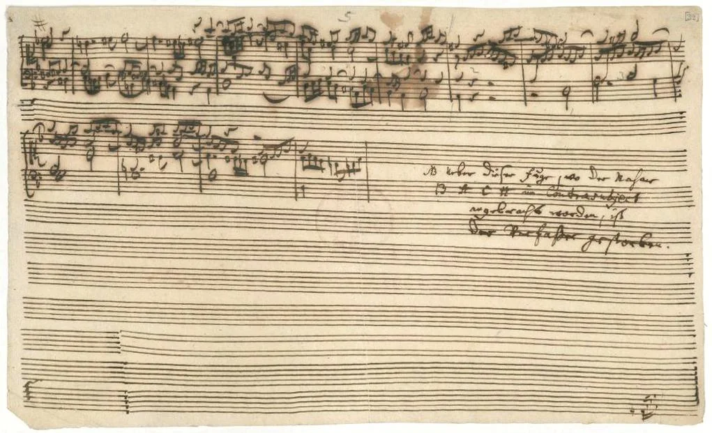
Image: J. S. Bach's The Art of Fugue breaks off abruptly during Contrapunctus XIV. Sign up for SlideMagic. Subscribe to this blog. Follow me on Twitter.

SlideMagic: a platform for magical presentations. Free student plan available. LEARN MORE
You do not really need animations in presentations

You do not really need animations in presentations

As professional presentation designer, I hardly use animations, and my presentation software SlideMagic does not have animation functionality.

  • Animations do not show well on mobile devices and/or in PDF files
  • Most animations are used for slide transitions or spectacular intros and exits of slide objects. These just distract the audience and reduce the level "seriousness" of your pitch. Flying text boxes work in MBA class, but giggling venture capitalists are less likely to invest in you.
  • Layered animations are a pain to edit

If I need to build up the content on a slide slowly, I duplicate a slide multiple times and add a bit more on each page. To the audience, it looks like an animation, it shows on mobile devices/PDF, and it is easy to edit/change.


Art: Georges Seurat, The Circus, 1891. Sign up for SlideMagic. Subscribe to this blog. Follow me on Twitter.

SlideMagic: a platform for magical presentations. Free student plan available. LEARN MORE
Presentation or procrastrination?

Presentation or procrastrination?

A bit more elaboration on yesterday's post.

A lot of time is spent on presentation design in corporations. There are many mid-level managers and analysts that have PowerPoint open on their screen all day. For the wrong reasons. Here is a strong statement: I think managers are using PowerPoint as a tool to keep subordinates busy. Boom, I said it.

Big corporates work in the leveraged hierarchy model. Commands trickle down the line. Every manager has a lot of issues to worry about and subordinates to manage. It is like a giant juggling exercise. The key idea is that a manager could do each individual task faster/better herself, but can't complete all of them. It is more efficient to delegate work to others, check in now and then, spot mistakes or correct the direction. Although the total amount of time spent on a task is higher, and there is a lot of work wasted (someone going down the wrong track before being corrected), overall - at a company level - things get done faster. 

A manager's day gets divided up in meeting slots (see Paul Graham' post). In every unit of time, the manager has an opportunity to provide input into one of her issues, talk with one of her subordinates. If there is not a lot of time, meetings get shorter, and input gets more cryptical. PowerPoint is the conduit. "Make it a bit more polished, add a section on the competition, combine these 2 slides into one, show the breakdown by month" All instructions that cost of a lot (PowerPoint time) but add very little to the story or the decision the company needs to take.

Subordinates love it as well. You can work really hard on the PowerPoint slides, sit there until late in the evening and everyone around you sees how ambitious you are. A good employee delivers the goods the next morning, all changes are perfectly incorporated in the deck. But is this really energy spent right? No real decision has been taken. And a lot of discussion among the team is usually about "what does she mean?", trying to interpret the cryptical instructions of the senior manager. People's own thought and input have been switched of.

I think there is a bigger revolution going on in the corporate world, where mid-level management positions are eliminated and/or outsourced to freelancers (I built my presentation design business on this over the past decade). Slowly corporates see that this paper/PowerPoint shifting army of middle managers adds a lot of time/cost to a company, but not a lot of return on investment.

Presentation software SlideMagic is my attempt to help end this "presentation procrastination". It is goes beyond a software solution, it is a platform for a different, more effective corporate communication and decision language. If presentations become more uniform, do not contain bullet points, and are really easy/quick to make, there is more time for things that really matter.


Art: Workers in the canteen, Ethel Léontine Gabain. Sign up for SlideMagic. Subscribe this blog. Follow me on Twitter


SlideMagic: a platform for magical presentations. Free student plan available. LEARN MORE
What takes the time?

What takes the time?

Presentation design can take a long time. But most of that time is not spent on the physical activity of putting slides together. The time consuming bit is to come up with the design itself. 

Now we have hard data. A SlideMagic beta tester deleted the wrong presentation and had to re-create it from a PDF export. Time spent to create the presentation: 6 hours. Time spent to recreate it from the PDF example: 30 minutes. (Of course, SlideMagic's grid structure made it easy...).

Think about how you can spend those 6 hours most productively.  I would take 30 minutes to start thinking about your presentation way before the deadline. Then drop it. Spend time sketching ideas on paper, and then putting the whole thing on slides. And maybe you could have shortened that 6 hours a bit?

I think business presentations should have more standardised slides (a list, a transition, a contrast, an overlap, a growth path). You might say that that will will cause all presentations to look the same. But remember, that standardisation is already happening today: most PowerPoint users only know how to make bullet point slides, even if they wanted to be more creative.

That is what SlideMagic is trying to do: offer easy customisable slide building blocks that are more creative than bullet points but less complicated than hard-to-modify PowerPoint templates.


Art: Henri Rousseau – The Football Players (1908). Subscribe to this blog. Follow me on Twitter.


SlideMagic: a platform for magical presentations. Free student plan available. LEARN MORE
"On each slide we have a line with the key message..."

"On each slide we have a line with the key message..."

...but it is not the headline.

Over time, many slide decks becomes so cluttered and messy that I have seen people adding a sentence or a bubble on each slide with a sentence that summarises the message of the slide. (I have even seen them in the footnotes on every page). "What we really want to say is this".

Why do this last, instead of first? If you start with the sentence, and you build your slide just to support that message, the slide will be a lot more effective.

Why not write this as the slide title? Many PowerPoint templates are so poorly designed that people do not use the headline. The headline is set in such a big font that you can only write 3 words. Two thirds of the headline space is taken up by the corporate logo. The elaborate graphic background of the title makes it hard to read what is written there.

In short: clean up the template, start with the headline, and write it where it is supposed to be.


Art: Hans Krell, Battle of Orsha, 1525. Subscribe to this blog. Follow me on Twitter. 

SlideMagic: a platform for magical presentations. Free student plan available. LEARN MORE
SlideMagic is in public beta, anyone can sign up

SlideMagic is in public beta, anyone can sign up

Two years after having the first idea about creating a PowerPoint alternative from scratch, I now have taken the invite wall down on presentation software SlideMagic. Anyone can now sign up for the beta version.

Here is how to get hooked:

  1. Go to the "templates" tab and clone one of the template presentations to start
  2. Customise your own accent colour and logo
  3. Go all the way to the end (beyond playing around) and create one real presentation for your next meeting. It can be a short presentation. It can be low-risk presentation.

Step 3 is the important one. You will see how incredibly easy it is to create a presentation, especially when you think you should go back to PowerPoint for your next presentation.

Let me know your thoughts and share SlideMagic with like minded people who you think might enjoy it as well.


Art: Claude Monet, La rue Montorgueil à Paris. Fête du 30 juin 1878. Subscribe to this blog. Follow me on Twitter. Sign up for SlideMagic

SlideMagic: a platform for magical presentations. Free student plan available. LEARN MORE
Why SlideMagic is different

Why SlideMagic is different

I created a quick presentation (hey, in SlideMagic) that highlights some of the features I have put inside that you will not get in other presentation design apps. Some of them you will never find there (even if people try to copy them) because of the fundamentally different way SlideMagic works. Less designer freedom and more uniformity allows you to do great things!

  • Keyword search across all your slides, no more opening and closing files
  • Image-based search: "get me all the slides that contain this image"
  • Explanation slide-out drawer to turn an abstract visual presentation that needs verbal explanation into a document that you can email.
  • A strictly enforced grid that makes sure everything is always lined up and distributed properly. And the most tricky part: that includes the columns and bars of data charts as well.
  • Instant conversion from a light to a dark background and back (switch between a conference room and a keynote hall setting)
  • And, a template bank that is constantly updated by a McKinsey/Idea Transplant designer!

Give SlideMagic a try yourself, you can request an invite here.


Art: Albert Gleizes, 1912, Les Baigneuses, oil on canvas, 105 x 171 cm, Musée d'Art Moderne de la Ville de Paris. Published in Du "Cubisme"
Subscribe to this blog, follow me on Twitter

SlideMagic: a platform for magical presentations. Free student plan available. LEARN MORE
2x2 matrix clarity in presentations

2x2 matrix clarity in presentations

The 2x2 matrix is a favourite layout for differentiating yourself from others. 'We, the good guys, are in the top right corner".

But people sometime force the framework somewhat. If you are having trouble filling the bottom left box, consider using a Venn diagram (a "best of both worlds concept").

If it is going to be a 2x2 matrix and your axis choice is a bit tricky, write things out in full. Rather than "ease of deployment, low, high" consider ignoring the axis name and write the 2 categories: "Big system integration project", "Up and running in 5 minutes". You can also write explicitly in the 4 boxes what they are about (BCG did that with their brand matrix: "dogs, cows, stars, question marks")

Framework in pitch presentation are different from those in a micro economics Phd thesis.


UPDATE January 2018: we have now added 2x2 presentation templates to the SlideMagic template store.


Art: Peterka Vlada, Sunset at Liberty Square, Oil on canvas, 40x28 inches ( 100x70 cm ), 2012
Subscribe to this blog, follow me on Twitter

SlideMagic: a platform for magical presentations. Free student plan available. LEARN MORE
"We can skip the problem"

"We can skip the problem"

Often, this is what a confident sales rep says when discussing the brief for a sales presentation. For industry insiders, it is true that you do not have to elaborate much about issues they already know. But I think plunging straight into features, benefits, and solutions is the wrong approach.

It is much easier to sell a problem than to sell a solution. Almost all my sales and investor presentations elaborate on the problem.

  • For sales presentations, it is a good opportunity to discuss individual issues the client has. The best sales presentations talk about the client, and not about the seller. Even if it is old news for the audience, it is good to start your story on common ground. And most importantly, I often present the solution using a slide layout that I already introduced during the problem part of the presentation. "Here is that same slide we discussed before but now with that big messy part ripped out".
  • For investor presentations, you actually need to educate the audience about the issue that your innovation is solving. So here the problem section is actually very important.

So, next time push back when they tell you to skip the problem.


Art: Dalí Atomicus (1948) by Halsman in an un-retouched version
Subscribe to this blog, follow me on Twitter

SlideMagic: a platform for magical presentations. Free student plan available. LEARN MORE
The final clean up

The final clean up

Some things to check once you think you have finished your presentation:

  • Are the fonts consistent throughout the presentation? Are have default Arials/Calibris managed to sneak in? 
  • Are font sizes in comparable boxes the same?
  • Are the headlines all in the same place on every slide?
  • Are objects in each slide aligned, and properly distributed?
  • Are the proper colours used on every slide, including data charts, or do you still see standard PowerPoint colours anywhere?
  • Are all images in the proper aspect ratio, without distortion?
  • Did you include an attribution to creative common images?
  • In case you will be displaying the presentation on another computer, have you checked Windows/Mac rendering issues? Sometimes fonts are rendered in slightly different sizes, causing words to drop to the second line.
  • Is data properly rounded up?

Now you see why SlideMagic has 1 font, 1 accent colour, and a strict grid that makes it impossible to misalign objects or put titles in the wrong places.


Art: Berthe Morisot, Hanging the Laundry out to Dry, 1875
Subscribe to this blog, follow me on Twitter

SlideMagic: a platform for magical presentations. Free student plan available. LEARN MORE
Squarespace versus wix

Squarespace versus wix

There are two popular web site template providers: squarespace and wix. I like to think of presentation design software SlideMagic as "squarespace for presentations". Many other PowerPoint alternatives (such as prezi) are "wix for presentations". What is the difference?

  • Wix offers a lot of features, colours, fonts, pre-programmed templates for specific sectors (vets and pets for example)
  • Squarespace is muted, has far fewer choices, fewer colours, bells & whistles.

The great thing is that the design restrictions of squarespace actually result in better web designs. People have to think how (whether) to put that content on the page. A professional designer will pick a style and restrict herself to stay in that framework. That is why it looks so good. The layman designer cannot resist to add more stuff. Squarespace and SlideMagic protect the non-designer from herself.

P.S. Squarespace powers the SlideMagic landing pages and blog.


Art: The Stadhuis under construction, by Johannes Lingelbach, 1656
Subscribe to this blog, follow me on Twitter


SlideMagic: a platform for magical presentations. Free student plan available. LEARN MORE
You cannot force creativity

You cannot force creativity

I tend to work on presentation design projects in bursts: dive in, get stuck, put it away, work on another project, get back to it, put it away again.

Even when you stop working on something consciously, your subconscious mind continues to chew on things. This article discusses recent research that proves that the subconscious brain can solve real problems.

There is another benefit of this delayed approach. When you get back into things some details of the story have faded to the background a bit. It is this "numb" state of mind that is useful to piece together the story that really matters, you have to explain it to yourself again and it might come out clearer without the distraction of these details. In addition, other details might come to the forefront which you thoughts were not important.

All of this explains why presentations that are created at 3AM at night before the 9AM meeting are not very creative (most management consulting projects). It also explains why an outsider or senior executive/partner can walk into a room and articulate a story much better in 3 minutes than an entire team who has been working on it 24/7 for the past 3 months. It not all experience, it is also being able to take some distance from the subject.

What to do? Start thinking early about the presentation of your results. The problem of how to communicate your project, is a different one from the problem that your project solved (read that sentence again). While you still might end up finishing your presentation at 3AM, if you started early enough to think about it, your presentation will be much more effective. 


Art: The Inspiration of Saint Matthew by Caravaggio, 1602
Subscribe to this blog, follow me on Twitter

SlideMagic: a platform for magical presentations. Free student plan available. LEARN MORE
Should you work for free?

Should you work for free?

I design a lot of investor presentations (hey, Google views me as the #1 investor presentation designer!), including pitches for startups. And companies that need to talk to investors are by definition short of budget. Many startups ask me whether I consider working for a delayed fee. Usually, I say "no" and that sounds harsh to a boot strapping startup. Here is a ruthless profit seeker trying to extract money from a small, fragile, company that could do amazing things for the world.

Here are some points to remember, and I invite all freelancers to use them where appropriate:

  • Deferred payment is real money. Yes, you are not selling a physical product (nobody would walk into a car showroom and have the guts to ask for free vehicles with payment after the next fund raising round, if it happens), you sell time. But there is a real opportunity cost to working on one project: you cannot work at the same time for a client who does pay cash.
  • Deferred payment is your own money. Most startups have some sort of funding, which means that they benefit from OPM (other people's money). Freelancers cannot. It is their own cash. (In my case where I am funding SlideMagic from own personal savings this argument is especially true).
  • Startups do not equal charity. Startups want to become a commercial success. Doing pro bono work fore a cause you belief in does not equal providing free work to a company that is raising money.
  • Success fees have to be so large that no startup will pay them. Venture capitalists require that their investments need to return 3, 5, 10 times their money. And VCs invest in a stage of a company where at least one risk has been eliminated: funding risk. The designer working on an investor presentation comes in before that, which would merit an even higher return. No startup has agreed to pay 10x the price of a regular project.
  • The carrot, we will generate lots of work for you in the future does work for a big company that needs to feed a big fixed cost infrastructure. A successful freelancer will have no problem filling her work pipeline with other clients.
  • This startup is not the only one. I get these type of requests every week. If I would say yes, I could spend 120% of my time working on a deferred payment basis. Why should I say "yes" to this startup and turn down the other 10?

And finally, there is a psychological argument here. Over the past 10 years, I have had very little success with deferred payments. Usually the startups who believe in themselves, pay cash, and stay happy clients for many years. The ones that seek deferred payments somehow don't make it, as if they know something already.

What is the solution? Some startups are happy to pay for a good investor presentation and see it is a crucial investment to get through the very first stages of their company. In other situations, I try to find a working model where I can be involved less to get to an acceptable result for a much better price.


Art: Giacomo Francesco Cipper - Peasant Repast with a Young Beggar, 1725
Subscribe to this blog, follow me on Twitter

SlideMagic: a platform for magical presentations. Free student plan available. LEARN MORE
One story

One story

There are two ways that a presentation that originally had one story can get diluted with a second one.

  • Old slides are not replaced. As soon as you say, "this is an old slide, I still like to use it, but now things are a bit different, let me explain". It is time to chuck it and design a slide that does represent what you want to say
  • Not deciding on a clear story/audience. Most startups do not have a clear market positioning yet. It can be this, it can be that. This doubt gets reflected in the slides. The result a confusing story with 2 messages that are diluted. Best solution: pick one. Second best option: explain the basic idea and/or underlying platform, and tell 2 stories one after the other and be honest about the fact that you have not decided yet.

Art: Painting of Dazzle-ships in Drydock at Liverpool, by Edward Wadsworth, 1919
Subcribe to this blog, follow me on Twitter

SlideMagic: a platform for magical presentations. Free student plan available. LEARN MORE
Benefits versus features: the cart before the horse?

Benefits versus features: the cart before the horse?

Benefits of enterprise high tech products are usually pretty similar: you save cost, time, increase productivity, security, scalability, flexibility. Starting your presentation with these benefits will not really make them stick. Everyone is saying exactly the same thing on their page 1 of the their presentation.

You have to reveal a bit of what it is you do before plunging into the benefits. "We automate all manual processes in order picking". Right, now I can see where all these benefits come from and tell me how big they are.

In business and marketing seminars we are always told to talk benefits, not features. Talking product gets you boxed in as too detailed, too middle management, too engineering, too much missing the big picture.

I disagree, people who have a story with real substance have an edge here. There is too much hollow marketing speak out there.


Art: Edgar Degas, Aux courses en province (At the Races in the Country) c. 1872; Museum of Fine Arts, Boston 
Subscribe to this blog, follow me on Twitter

SlideMagic: a platform for magical presentations. Free student plan available. LEARN MORE
Convincing the center

Convincing the center

Here in Israel the election campaign is in full swing with mud slinging and charged advertising campaigns everywhere. The surprising thing is that very little effort is targeted at convincing the voter at the political centrum, because she will decide the election.

Targeting your existing supporters with messages they already have bought in to will get you lots of likes and support, but will make little impact on new potential voters. Think about those voters that sit on the edge, how can you tip the balance in your favour?

The same is true for almost any presentation. Your followers are already on your side. The haters will never agree. You need to target the ones that have not decided yet. 


Art:  Annibale Carracci, The Choice Of Hercules, 1596
Subscribe to this blog, follow me on Twitter

SlideMagic: a platform for magical presentations. Free student plan available. LEARN MORE
Rediscovering Evernote

Rediscovering Evernote

I was an early user of Evernote on a PC (a couple of years ago) and used it to organise bookmarks for reading later. Then I stopped using it for some reason until recently. Not as a bookmarking service, but to organise life across multiple devices. It has specific advantages over bookmarking sites, Dropbox/Box/iCloud/Google Drive, online presentation apps

  • My demo presentations. It is easy to maintain and access a folder with all my demo decks ready and up to date on all my devices. This is the folder that I set to sync/download to my devices so it is available without internet connectivity. I have run pitches on my iPhone to potential clients.
  • On the go note taking. Away from the office it is hard to capture stuff and not lose it. I use the Penultimate hand writing app for iPad that gets synced into Evernote. Evernote itself has notes screen where you can jot down quick thoughts (an idea for a blog post for example). The Evernote scan app (Scannable) is perfect for capturing receipts, doodles, and white boards. It is actually faster to search through hand written notes than typed ones.
  • Screenshots have become a big part of my design workflow. I just can't be bothered to convert between different image file formats. Skitch, the Evernote screen shot app has a very used cross hair few that the standard Mac function is missing.

I did not get paid a single $ for writing this (unfortunately).


Art: The Elephant Celebes by Max Ernst. Oil on canvas. 125.4 x 107.9 cm. Tate Gallery, London
Subscribe to this blog, follow me on Twitter

SlideMagic: a platform for magical presentations. Free student plan available. LEARN MORE
The catch up slide

The catch up slide

Here is a concept that you can use in many investor and/or sales pitches for technology:

While [a] and [b] have moved on, [c] is still pretty much stuck in the 1950s despite a lot of technological development. Our company is going to fix that.

I have added a slide to the SlideMagic startup pitch template library that reflects this idea, Two "arrows" moving to the right, and a third one which is catching up. Look at the simplicity of the graphics which exactly fits the philosophy of SlideMagic. It looks pretty, it gets the message across, is easy to design. A new business language that does not need arrows, drop shadows, and gradients. It is almost a Lego-like abstractification (is that a word?) of a complex visual.


Art: Le derby d'Epsom, painting by Théodore Géricault, 1821
Subscribe to this blog, follow me on Twitter

SlideMagic: a platform for magical presentations. Free student plan available. LEARN MORE
Smaller screen, better presentations

Smaller screen, better presentations

There is a nice side effect of people ditching their laptop and carrying a small tablet device instead: presentations get better. But it has nothing to do with technology, it is the setting of the presentation that has changed.

In the absence of a big projector screen or LCD monitor, that small conference room just changed from a mini cinema theater to a discussion table. The attentions is shifting back from the screen to the presenter. The presenter vaguely points at the device and continues "what this chart wants to say is [and out comes the story]". Only when you have to, the iPad gets passed around the table to show that important piece of data on page 37.

Good stuff until Airplay-enabled projects are hooking up our mobile devices to projectors again.


Art: Roy Lichtenstein, The whole room, 1961
Subscribe to this blog, follow me on Twitter

SlideMagic: a platform for magical presentations. Free student plan available. LEARN MORE
Your requests for SlideMagic templates

Your requests for SlideMagic templates

I am keen to make the templates in presentation software SlideMagic as useful as possible. Let me know if you have specific requests for templates and/or story flows that I should include. Two conditions for this free presentation design help:

  • You do not get angry with me when I could not find the time to work on your request and prioritised another template 
  • The result of your request will be publicly available for everyone to use, so strip it of any specific/confidential information

Send your requests to jan at slidemagic dot com, start with TEMPLATE PLEASE in the subject line.


Art: Henri Matisse, The Open Window, 1905
Subscribe to this blog, follow me on Twitter

SlideMagic: a platform for magical presentations. Free student plan available. LEARN MORE