Learning from Swiss graphic designers

Learning from Swiss graphic designers

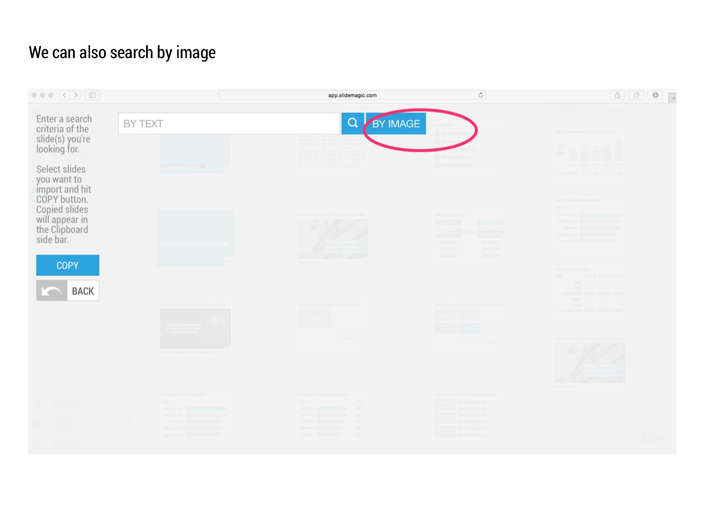
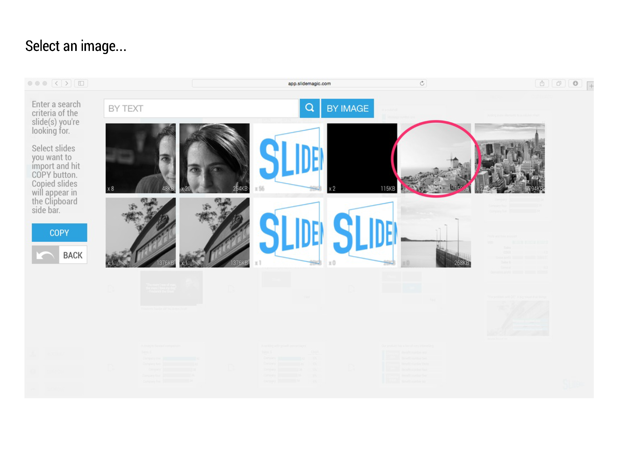
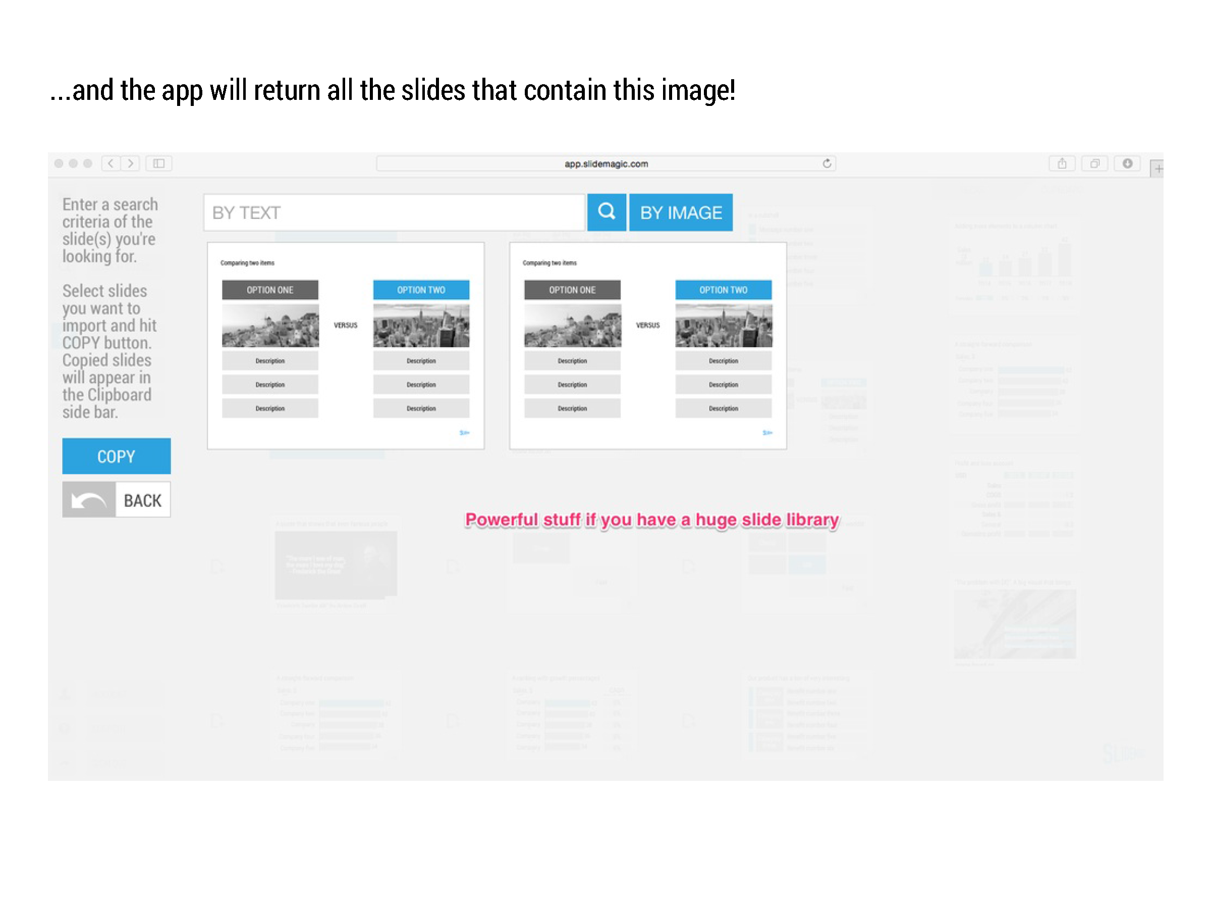
Most presentation design software today is the result of someone in the 1980s thinking: "hey, this mouse is cool, you can use it to draw things!". We can move, drag, stretch, place things freely across our drawing canvas.

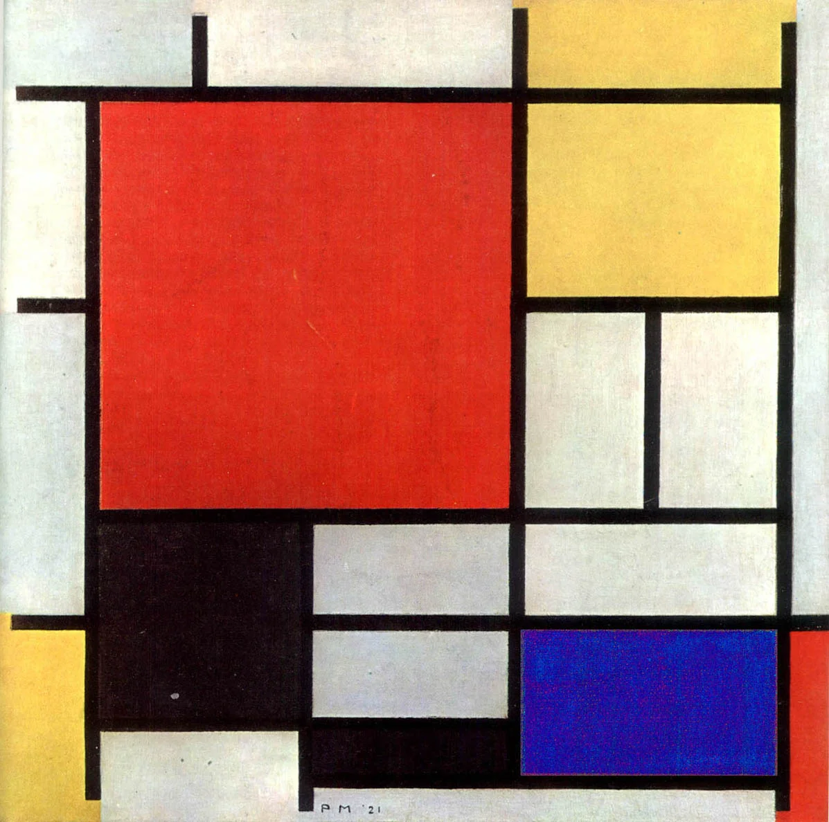
Presentation software SlideMagic aims to close this tangent and go back 20 years earlier to the 1960s when graphics designers in Switzerland developed a clean and crisp style of communication and design that does in many cases the exact opposite of the freedom the mouse offers: tight grids, limited font choices, limited colours. simple shapes.

Eyeball the posters on this Pinterest board by Misswyss and see what you can learn form them for your own designs. Which one do you like? Which one does a better job at communicating than others? Why is it that some of these very simple designs look very pretty?

Examples of posters designed in the Swiss style

Examples of posters designed in the Swiss style

Some of the features they have in common:

  • Limited number of colours
  • Sans serif font (only one)
  • A strict grid alignment throughout the page
  • Relatively small headlines
  • De-emphasising (making things grey) rather than emphasising (making things bold) text
  • Flat shapes, no gradients, drop shadows, textures
  • Big silhouettes, simple shapes

Why not steal some of these ideas in your slide designs?


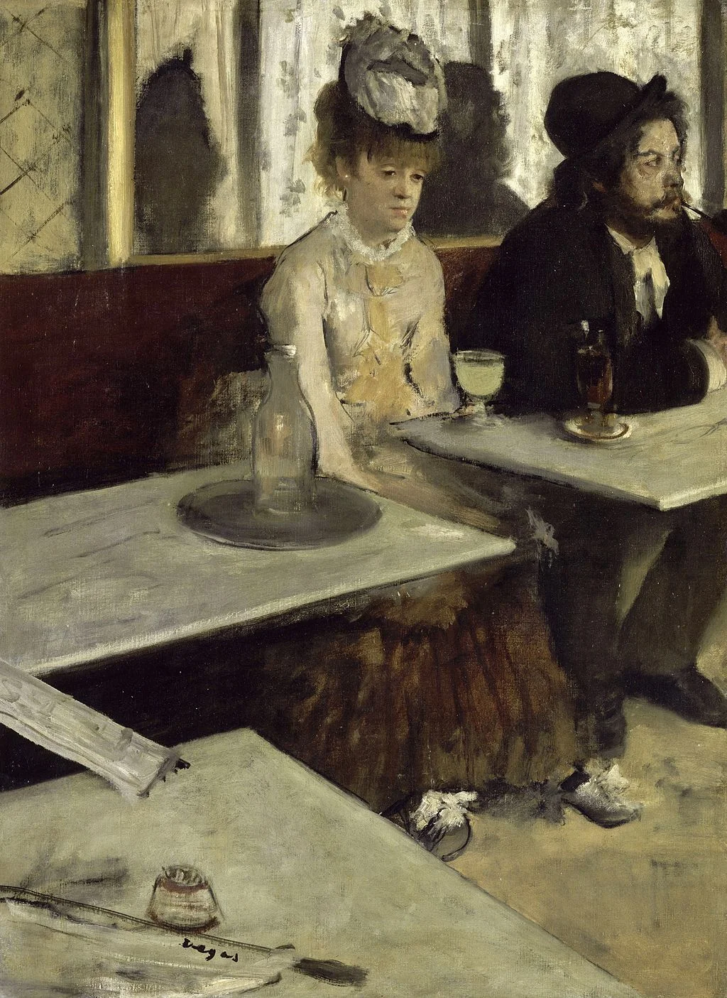
Art: Albert Anker, The walk to school, 1872, 90 x 150 cm
Subscribe to this blog, follow me on Twitter

SlideMagic: a platform for magical presentations. Free student plan available. LEARN MORE
Working with data charts in SlideMagic

Working with data charts in SlideMagic

Data charts in SlideMagic work a bit different than in other presentation software:

  • Charts come in a beautiful, simple, formatting without the clutter of value (y) axes, tick marks. Charts are automatically adjusted to your own branding (the right colours, the right font). 
  • SlideMagic only supports those data charts that I regularly use in my own presentation design project. No pie charts for example (sorry)
  • Best of all: SlideMagic data charts line up with the grid of the slide. In most business presentations, data charts are part of a broader slide design. There is an extra column on growth percentage bubbles next to the bar chart. There is more than 1 bar chart on a page. In PowerPoint it is very tricky to get these things to line up properly. In SlideMagic, it is not possible, not to line them up

Click through the slide sequence below to get an idea of how you can work with data charts in SlideMagic. Feedback and comments are welcome (comment below, or email me at support @ slidemagic dot com).


Art: Melencolia I. Print by Albrecht Dürer, 1514
Subscribe to this blog, follow me on Twitter

SlideMagic: a platform for magical presentations. Free student plan available. LEARN MORE
Alcohol against stage fright?

Alcohol against stage fright?

The supply of liquor in this tweet below probably was more symbolic than functional, but I have heard other stories about people getting offered a drink back stage before appearing in a major TV broadcast.

A bit of alcohol relaxes nervousness, but it is actually not the sort of relaxing you want on stage. You need to be sharp and switched on to remember your story and react to audience feedback. Some other things you can do to deal with nervousness:

  • Know your story inside out, rehearse, rehearse, rehearse. Seth Godin suggests that you can even start with dogs as your risk free audience. Work especially hard on the opening of your presentation, since these are the most difficult moments. Once you are on a roll, the rest will follow much easier.
  • Remember that everyone (including the pros) is a little nervous before going on stage, remember that a bit of nervousness gives you the right alertness to deliver a good performance (alcohol does the opposite), remember that the audience wants you to succeed there, remember that for most people stage fright is like that first chill when jumping into a pool, it is over in 2 seconds once you get going.

Art: Edgar Degas, L'Absynthe, 1876
Subscribe to this blog, follow me on Twitter

SlideMagic: a platform for magical presentations. Free student plan available. LEARN MORE
Investors, it is your track record

Investors, it is your track record

Many of my clients are venture capitalists themselves who need to go out and raise money from big pension funds or wealthy individuals.

There are usually two big components in their own investor presentations:

  1. The concept of the fund (where/what/how much it invests)
  2. The investor track record of the team.

Investors tend to spend a lot of time on number 1, but the thing that really matters is number 2. Unfortunately, most investors cannot say that they were seed investors in Facebook, Google, Twitter, and Uber. So the challenge of the presentation is to convince institutional investors that you can be trusted with their money.


SlideMagic: a platform for magical presentations. Free student plan available. LEARN MORE
Working with templates in SlideMagic

Working with templates in SlideMagic

Many beta testers ask me how to use templates in presentation software SlideMagic. The series of screen shots below explain how you can access and use them. You can:

  • Clone an entire template presentation into a new presentation
  • Import selected template slides into your presentation

SlideMagic stores all presentations in one big database which created the opportunity for a really cool feature: the ability to search through ALL your slides like a Google web search. And not only with keywords, you can also ask SlideMagic to return all slides that use a specific image.


SlideMagic: a platform for magical presentations. Free student plan available. LEARN MORE
Overpolishing

Overpolishing

Some stories are best served raw. The other day, a client pitches a wonderful startup idea to me. The company solves two broken issues (sorry for the cryptical language), and has a solution that changes something that has not been changed since the 1950s.

During the design process I felt somehow that we made it too polished, adding too many "and also, and also, and also" points. It is the full story, the full picture, but the additions kill the energy of the pitch. I think we should go back to the raw version and accept that in a 20 minute pitch we do not have time to cover everything.


Art: Vertumnus, a portrait depicting Rudolf II, Holy Roman Emperor painted as Vertumnus, the Roman God of the seasons, c. 1590

Click here to subscribe to this blog

SlideMagic: a platform for magical presentations. Free student plan available. LEARN MORE
To answer or not to answer?

To answer or not to answer?

What do you do when your presentation gets interrupted by a question from the audience and you were planning to answer the point a few slides down? Answering it will disrupt your carefully designed story flow. Not answering it might upset the audience. My suggested approach differs by presentation setting.

  • For huge audiences (a big TED talk for example), you are unlikely to be interrupted.
  • For slightly smaller audiences, you can say that people should hold of questions until the end of the presentation. After that, only hacklers can still decide to interrupt you.
  • If you get a question in a presentation for a big group of people, I would answer it really briefly (yes, good point, we do have a blue colour option) and say that you will get to it in more detail later on, look a way from the asker to stop the dialogue.
  • In smaller meetings, you can sometimes completely go off script and let the audience guide your presentation. A good example would be a pitch to partners in a VC firm, where they read the material beforehand and have a number of very specific questions they want to see answered. Being stubborn here and sticking to your script will upset the meeting.
  • In one on one meetings you need to read the body language of the person sitting in front of you. When someone keeps on asking what it is that your product actually does, it is better to kill off the issue rather than have the person sitting and guessing with a frown on her face until you get to the right point in your presentation. A person who is guessing, is not listening to what you say.

In short, the smaller the audience, and the better prepared they are, the more story flow disruption you can allow. 


SlideMagic: a platform for magical presentations. Free student plan available. LEARN MORE
A summary presentation should not just summarise

A summary presentation should not just summarise

You have finished this huge strategic or business plan and you need to present it to the top management team of your company. You sent the deck before the meeting and they probably page-downed the slides. How to create a good summary presentation for the meeting?

Just summarising the big document (and then we did this and then we did that and then we went on to do this), is not going to get you a decision. The opposite, a super high-level presentation with generic buzzwords is also not going to cut it.

Your presentation should be a deck specifically for the meeting, not one for reading later (you sent that one already). It can be based on your big document, but it will be different.

  • Make it very clear what you actually want (more budget, more people, permission to explore M&A opportunities, etc.)
  • If your project involves some decision (maybe even with a controversial recommendation), make the trade off very clear. Some sort of pro and con overview.
  • Your manager is not a complete outsider who comes in cold to the subject. So you can cut the emotional, stunning visuals, and focus on those elements of the trade off that she might not know about yet. Show the new and original analysis you did that support conclusions that are new. Leave out the obvious analysis that confirm things everyone already knows.
  • Feel free to deviate from the structure of your big document. The big document is reference material, the presentation is your tool to get an important decision approved.

Do not summarise a document, get a decision approved.


SlideMagic: a platform for magical presentations. Free student plan available. LEARN MORE
Your audience is not ignorant

Your audience is not ignorant

In education, teachers start most of the times with a completely ignorant audience. In mathematics we start with the basics and slowly, slowly, build our story from the ground up towards higher algebra and advanced geometry.

Many presenters use this mindset when pitching a business idea and/or investment. Their presentations resemble a 101 text book on the market.

But in most cases, your audience will know quite a lot. Venture capitalists see dozens of pitches of internet-related businesses every day. Surgeons get pitched everyday with new drugs and medical devices.

Think about that when designing your pitch. What thought process would an intelligent, knowledgeable person go through when confronted with my idea? First she needs to understand what it actually is. In her mind she probably tries to compare it to a concept she already knows. Then she probably starts asking herself the big obvious questions. Does the world need this? Why is this so special / has no one else done this before? Can these guys pull it of?

Do not try to educate your audience, instead try to answer the obvious questions she cannot answer herself.


SlideMagic: a platform for magical presentations. Free student plan available. LEARN MORE
Common laymen mistakes in SlideMagic

Common laymen mistakes in SlideMagic

By now I have seen a number of real presentations that beta testers of my presentation software SlideMagic have produced. The results are very encouraging! Without exception, all presentations look "pretty decent" to "very good". All of these decks were designed by complete laymen designers. 

Even more interestingly, it is possible for someone like me (a pro), to upgrade these "pretty decent" to "very good" presentations to something really good in just 15 minutes of polishing. (The user base of SlideMagic is still small, so beta testers can benefit from the luxury of my input here and there).

Here are the common mistakes I usually fix:

  • Cutting / re-editing text. Taking out unnecessary tangents, side comments, indirect sentences saves space and allows you to make text bigger
  • Making text in similar boxes the same font size. I considered freezing font sizes in the app but that would take too much design freedom away from you guys. A simple rule, if text boxes are part of a group (a list, a diagram) try to give them the same font size
  • Fixing left alignment and centred alignment. It is hard to give a rule, but in some cases one looks better, and other cases the other (yes, that is vague).
  • Fixing inconsistent header formatting across slides (font size, colours). I gave you guys the freedom to play with this and make them different across slides, but I am considering freezing it (sorry).
  • The biggest one, fixing poor grid compositions. In many cases users select axis definitions that leave a large number cells empty. (One row, criterion, product, has a lot of attributes that are irrelevant for the others). White space in a slide is good, but if that means that all the other cells in your chart are tiny/unreadable we have to be pragmatic.

Keep up the good work! I have temporarily stopped the intake of new beta testers as I am fixing some UI issues. Hopefully I can soon go from a private beta to a public beta where the invite-only wall can be taken down.


SlideMagic: a platform for magical presentations. Free student plan available. LEARN MORE
The impossible stock image

The impossible stock image

The other day, a client requested a very specific image: someone handing over a box with envelopes, paper files, a bunch of DVDs and some memory sticks. An image this specific cannot be found in stock image databases. And even if you could, the audience would not recognise these specific items on the photograph.

Your options:

  • Take your own picture and get it exactly right
  • A generic guy-with-box image blurred out in the background and use text to describe to the audience what's in it.
  • A collage of stock images of the individual items that are required on white backgrounds

Art: Balthasar van der Arst, Fruit still life with shells, 1620

Click here to subscribe to this blog

SlideMagic: a platform for magical presentations. Free student plan available. LEARN MORE
Do they care how you are organised?

Do they care how you are organised?

Many corporate presentations include organisation charts, what are the main business units, and who are the people running them, and who reports to whom.

For some presentations, this relevant. If you are trying to sell a company or a business unit, it is important to see the people assets that an acquirer is getting. If you are presenting to a financial analyst it is important that she knows what financial data belongs to what business unit.

If you are trying to explain what your company does however, the organisation chart might not be the best way to do that. Most of the times, there is not a 1-1 match between business units and products. There are far more exciting ways to present what your company does than organisation chart boxes.

To you, the structure of your organisation is really important. The audience is likely to have another view.


Art: "Puppet Show", a painting by Chinese artist Liu Songnian (1174-1224 AD)

Click here to subscribe to this blog

SlideMagic: a platform for magical presentations. Free student plan available. LEARN MORE
One case study throughout

One case study throughout

Case studies or examples are a great way to explain your idea or technology. And by case study I mean something different than the empty, generic, meaningless quotes you find in many technology white papers. We need real stories.

Wherever possible, I try to stick to one big case study throughout the presentation, avoiding many smaller case studies. I can use this one case study to highlight different aspects of the technology.

  • It saves time, I do not have to introduce a new story setting all the time
  • It saves time, because I can re-use visual concepts. (For example, the red stars are the dangerous computer viruses)
  • I can afford to take a really detailed deep dive if needed
  • In case of complex science (healthcare technology for example) I can afford to take the time to introduce a few advanced scientific concepts and use them throughout my presentation
  • Images and visuals will look consistent throughout the presentation

The key challenge in these type of presentations is not so much the visual design, it is finding that case study that says it all. And once you are thinking about that, you are actually trying to find your story,


SlideMagic: a platform for magical presentations. Free student plan available. LEARN MORE
The future of the PC

The future of the PC

Technology analyst Ben Evans was pondering the next possible revolution in computing platforms: the PC, the smartphone. This triggered me to give my thoughts about the future of the desktop or laptop computer (I will call them PC). I posted a quick comment, but will elaborate here a bit more.

It is important to separate device from the usage setting. There will always be a need for a creative, focussed work environment to capture your ideas. I do not think that we will ever witness the moment where we can do serious design work on the go on a small device. Creative means, focus, concentration, and an organised clutter free spacious environment.

No, smartphones and tables (current screen sizes) are not going to be the dominant platform for design work (that is why I am launching SlideMagic for bigger screens first).

Having said that, the PC as we know it could totally change. Design work requires some form of big visual interface, and some form of human-machine interaction. What is in between can be completely different from the form factor that we know today.

Technology might advance to such a level that all PC-type processing power, storage requirements, and power supply can easily fit in a smart phone-sized device. And I think that is the future. Everyone carries one piece of hardware with them that contains these functions, but also serves as a wrapper for our security credentials.

Screens could evolve drastically (remember that touch screens were the big driver behind the smartphone revolution). We could see very large tablet style devices for design work. But maybe e-ink technology will enable the creating of super thin, super light, paper-like foldable screens The same is true for keyboards and mouse controllers. Maybe that same screen can spread out in front of you and creates a combined input device and visual screen for your work?

Screen innovation should go along software user interface innovation. Many of today's productivity tools are still based on old working practices. Mouse-based drawing, type writer-style keyboards. 

SlideMagic is already working to innovate the user interface. Now the screens need to follow suit.


Art: Georges de la Tour, The Cheat, 1630

Click here to subscribe to this blog

SlideMagic: a platform for magical presentations. Free student plan available. LEARN MORE
The difference between presenting and showing

The difference between presenting and showing

Sometimes, I still put slides in a presentation despite the fact that they are far too busy to be presented. Rather, these slides are there to be shown. 

  • A busy Gantt chart shows that we are completely on top of things and know exactly what we need to do the next 3 months
  • An endless list of filed patents shows that our IP is rock solid
  • Positive customer comment after positive customer comment makes that point that we are doing something right in customer service
  • A really complex IT architecture that shows how clever the technology is

It is important though to spoon feed the audience what you want them to take away from the chart that is shown to them. You need to write the correct headline, or put the right emphasis with a big circle and/or arrow on what they should be looking at.

Another approach is to design the chart in 2 levels. Level 1 is the level for presenting. Colour coding and grouping elements together gives the big picture message of the slide that can be picked up by a keynote audience. The detail inside the dots (level 2) is interesting for a viewer who reads the presentation on a screen at her desk. Level 1 is the keynote slide, level 2 is the ponder slide.


Art: Paul Signac, The Papal Palace, Avignon, oil on canvas, 1909, Musée d'Orsay

Click here to subscribe to this blog

SlideMagic: a platform for magical presentations. Free student plan available. LEARN MORE
Transitioning in and out of a movie

Transitioning in and out of a movie

The chance is high that when you are using a movie in your presentation, it is a fragment of a longer feature film that you cut out using iMovie or another movie editing software. Make sure to create a seamless transition between the movie fragment and the presentation.

The start. Someone who is watching the full length movie has gone through the process of transitioning into the movie story. Usually the director will take you there slowly, step by step. The presentation audience lacks that context. Landing them straight into that massive shootout scene at minute 14:49 will create confusion, and requires 30 seconds or so to grasp what is going on, and during that time they are probably not paying attention to that critical punch line that you want them to hear.

What can you do? Carefully select your cover image of the movie. It does not have to be the first scene, it can be a frame that comes later in the movie, or even a frame that is not part of the scene you selected. Do not set the movie to autoplay, but take a few seconds to tell the audience "where they are going next".

The end. A cut out movie fragment often has an abrupt ending. Again, dampen the transition by putting another image at the end of the sequence that gives you the opportunity to lead the audience back into the story of your slides.


Art: David Hockney, A Bigger Splash, 1967. Image: Ian Burt.

Click here to subscribe to this blog

SlideMagic: a platform for magical presentations. Free student plan available. LEARN MORE
Not every presentation slide needs an image

Not every presentation slide needs an image

Yes, visual slides with stunning images are more powerful than boring lists of long bullet points. But that does not mean that designing good presentations is the equivalent of finding a stunning image for every page (sorry).

  • A powerful quote can look beautiful on its own, in naked typography. The image of the person might distract the audience, especially if it is a relatively unknown author of an airport book best seller.
  • A simple information slide (here are the 3 priorities for next year), but just be best visualised with a simple list of 3 priorities. 
  • Section breaks can be done in 2 ways: a dramatic visual to show the transition, or an almost blank page that brings the attention of the audience back to you
  • It is very hard to find dozens of images that are more or less similar in style or look and feel. As a result, presentations with lots of images look inconsistent.

It does require though that you find a way to make a typography-only slide look good. A nice full colour plain background, and some elegant stealing from the Swiss graphics design masters in the 1960s is a good way to start.


SlideMagic: a platform for magical presentations. Free student plan available. LEARN MORE
Another free stock image site

Another free stock image site

I only now discovered startupstockphotos.com, a site with creative commons images of workplaces with a startup feel to it (aero chairs, lofts, Apple laptops, wooden tables). They look great! I added this source to my list of sources of free stock images.

Art: Degas, The Cotton Exchange, 1873

Click here to subscribe to this blog


SlideMagic: a platform for magical presentations. Free student plan available. LEARN MORE
When to use tracker icons on presentation slides

When to use tracker icons on presentation slides

Consulting presentations often use a little icon on the top right corner that is a miniaturised version of some framework. As you click through different sections of the presentations, another part of the icons gets highlighted. The "tracker".

When to use, and when not to use a tracker?

  • Your short 20 minute pitch should be such an exciting naturally flowing story, that trackers should not be necessary, at least not on every page. If you feel that you need to remind the audience of where they are in the story, use full-page repeats of the framework, with different sections highlighted
  • In very long presentations, and especially presentations that are intended for reading, a tracker can be useful. The tracker has more of a reference function. Keep your finger on page down and stop when the right part of the icon gets highlighted. In these cases, keep the tracker really, really, small to minimise the damage to screen real estate.

Often you might find that early on in the design process you feel a need to use trackers (because you do not understand the story structure very well yourself), and as you progress, your confidence to take the trackers of increases.


Art: Léon Cogniet, oil sketch for details of Scenes of July 1830

Click here to subscribe to this blog

SlideMagic: a platform for magical presentations. Free student plan available. LEARN MORE
Adding a bit of humour to annual kick off presentations

Adding a bit of humour to annual kick off presentations

January is the month of sales kick off events in companies (I see it in the Idea Transplant client inquiries). These presentations are usually for a very large audience, and are pretty important because they set the tone what the company will be doing for the next year. The good thing is that the audience is internal to the company, so you can encourage the speakers to take a bit more risk with the content than they would be doing for an external audience.

One challenge is to add a bit of humour and inspiration to all the sales target data. What used to be innovative a couple of years back (I am guilty myself as well) has become outdated and cliche:

  • (Random) inspirational quotes from famous people
  • (Random) inspirational quotes from business best seller authors
  • (Random) inspirational quotes from social media experts
  • Low res pictures of slap stick-type scenes that are forcefully linked to one of the concepts in the presentation
  • Cheesy stock images of people in suits (usually men) staring into the future, pondering whether to take the left or the right turn, pictures of applause, well, you have all seen them.

What to do differently? It is hard to say, but here are some pointers of what you can do.

I love it when presentations have an overall visual theme to it. It can be a movie, it can be an era (the 1950s), it can be a place, it can be an inside joke, something that happened in your company over the past year, it can be sport you enjoy, it can be a central analogy you are using in your presentation, it can be art (pssst, see my blog).

The advantage of the a theme is that all of a sudden all visuals can have some sort of consistent look. They appear to be similar and related. You all of a sudden have an infinite supply of visual material available to you. And also, it all of a sudden becomes a lot easier to put quotes and statements against a comic background. A bone-dry 2015 strategic goal repeated on a slide with an unexpected background image on the next page gives a nice opportunity for the audience to relax a bit. And all of this does not look or sound forced.

Try it!


Art: Frans Hals, The Lute Player, 1623

Click here to subscribe to this blog

SlideMagic: a platform for magical presentations. Free student plan available. LEARN MORE