Hearing a story for the first time, versus the 100th time

Hearing a story for the first time, versus the 100th time

Someone who hears a story for the first time needs to create the whole picture in her head from scratch. Give background, introduction, examples, then bring it all together.

People who have heard the story millions of times before, check your presentation against their existing mental picture. Summary upfront, neatly structured, logical.

Presentation designers fall in the second category, while most of your audience is in the first. Think about that.


Art: Gustav Klimt, Beech Grove

SlideMagic: a platform for magical presentations. Free student plan available. LEARN MORE
How to use multiple monitors

How to use multiple monitors

On my desk I use 3 monitors: 2 big 27" screens and my laptop screen. While it is tempting to put all your live Twitter, Facebook, and email feeds blinking on the left and right screen, I keep them blank most of the time (well, that is a good use of the monitor) to minimise distraction.

I use them when I need a little extra desk space for a slide I am working on: a previous version of a presentation with comments, comments in email, the Finder window with images, a spreadsheet to copy data from. As soon as I am done with that, I close the window with only the wallpaper left.

In a recent software update, Apple has added a new feature: right-click an icon in the dock, click options, and you can now select the default screen the application will open. I set the default for all my smaller utilities (1Password, Evernote, the Finder window) to the small laptop screen.


Art: Gustave Caillebotte, Young man at his window, 1875

SlideMagic: a platform for magical presentations. Free student plan available. LEARN MORE
Hillary's stock campaign video

Hillary's stock campaign video

The video in which Hillary Clinton announced her intention to run for President is too well executed. The messages are incredibly clear, you can almost reverse engineer the PowerPoint slide that contained the briefing bullet points for the script. 

But the execution is also staged and lacking raw emotion that it is unlikely to resonate with voters. I don't think it will leave a negative impression, just a neutral one. It sounds and looks like almost all advertising we see around us. This review on the Huffington Post captures it correctly.

In a similar way, Apple product videos, once admired, now almost look funny after the many parodies

A better way to do this? Interview "real people" on camera. It is a lot harder to do though.

It is a warning sign for those who think that big budget productions (videos, presentations) automatically translate into audience impact. The more people have been disappointed by slick presentations, photoshopped ads, spectacular videos, the harder it is to convince them that in your case they should believe you.

P.S. What do I think about the campaign logo? I don't think it is very pretty, but it will be very recognisable as an avatar on social media sites. Functional.


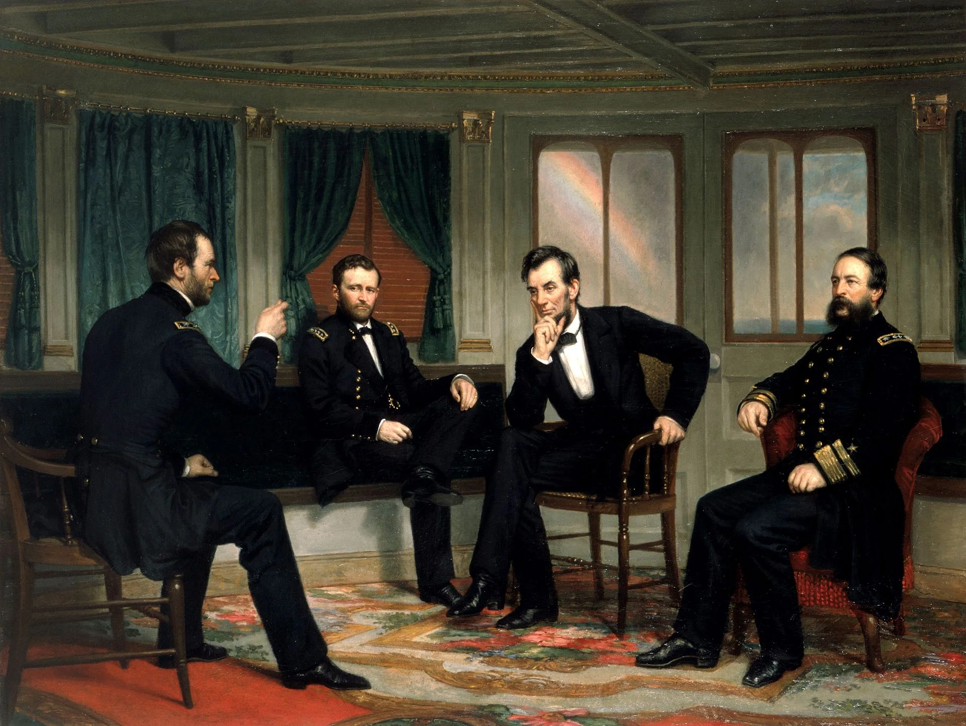
Art: The Peacemakers (1868) painting by George P.A. Healy

SlideMagic: a platform for magical presentations. Free student plan available. LEARN MORE
Idea camouflage

Idea camouflage

Often, when I meet a high tech client, I get presented with an existing company presentation that contains all the required information but conceals the big idea behind the company. As a result, we usually push the slides away and start talking, and after a few minutes, that big idea comes out.

First versions of the redesigned presentations are all about that big idea. It is in your face. But there is a risk that over time we start diluting that pure story again. The world out there (and Gartner and IDC reports) are used to defining the technology world in certain boxes, using certain language. And as we get a lot of questions about how you compare to this, to that, we slowly, slowly, get back to a presentation that resembles the one we started of with. It looks prettier, but the big idea is hidden again.

My (and your responsibility) is to prevent that from happening.


Art: RMS Olympic in dazzle at Halifax, Nova Scotia painted by Arthur Lismer

SlideMagic: a platform for magical presentations. Free student plan available. LEARN MORE
Data overload in startup pitches

Data overload in startup pitches

My startup clients who have customers/sales and are raising a follow-on investment round are swimming in data. Every click, of every customer segment, at any time is recorded and can be analysed. How to use this in an investor pitch?

  • Standard metrics. Some investors are highly specialised professionals who can X-ray an internet startup by analysing just a few statistics (comparing them to the other 500 startups they have seen). Google what the metrics are for your type of business, or even better scrutinise blog posts by a particular VC to see what she is really focussed on.
  • Your own metrics. Before even getting into the data, understand what really makes your business tick. Back in the good old days at McKinsey, we used to spend months at this for big corporates. Customer acquisition cost, churn, repeat purchase, basket size, etc. etc. Which driver has an impact on your business, and which can you influence. Is your business national or even global (SlideMagic), or has it more of a city-by-city regional character (Uber). Once you figured out your metrics, write the entire financial section around those.
  • Anticipate the obvious questions. Be one step ahead and anticipate the obvious questions. If your chart shows a dip in February, you can guess the question that is coming. If Vancouver lags behind Portland, guess what a VC is going to ask. Have answers before the meeting start and/or show the data in a different way if these hick ups are minor distractions and not key drivers of your business. And a question by one VC in a meeting does not mean that it merits rewriting the whole pitch around that for your next meeting. Within infinite amounts of data, there are an infinite number of questions, but we only have a finite amount of time.

Art: Gustave Courbet, Waves, 1870

SlideMagic: a platform for magical presentations. Free student plan available. LEARN MORE
Should you use title capitalisation in presentations?

Should you use title capitalisation in presentations?

Most American newspapers use title capitalisation in their headlines: Every Important Word is Written with a Capital. Should you do the same in presentations?

My opinion: no, I think it does not look very good. The only exception: titles of books or research papers you are quoting as a source in the footnote.


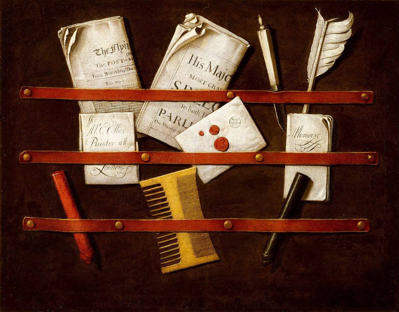
Art: Edwaert Collier, Still Life, 1696

SlideMagic: a platform for magical presentations. Free student plan available. LEARN MORE
"What I want to say early on"

"What I want to say early on"

Many clients stress that they want to get a number of points across in their presentations right at the beginning of the presentation. Sometimes they are right, sometimes not.

The fear that you are not getting your points across early enough stems from experiences with PowerPoint marathon sessions: slide, after slide, after slide with bullet points. A human attention span is short and points that have not been made before minute 10 of the 60 minute monster session will not stick. Legitimate concern.

But, some messages need a bit of preparation before you can make them. "We are flexible" as a first message is unlikely to stick. People get used to the accent of your voice, need to understand what flexibility (everyone talks about that in their presentations) actually means in the context of your particular product, and finally they need to know why over the past 50 years nobody has managed to deliver that flexibility.

There is a big risk that you will run your presentation 3 times:

  1. First pass on slide one. You spend 10 minutes on this first slide, making all your points, but do it in a too generic way so nobody really internalises why they are so special. You actually spend too little time on them.
  2. You spend too much time on the body of the presentation, where you repeat most of the messages of slide but now add detail after detail after detail. Thirty minutes in, you have lost your audience.
  3. Then, there is always the opportunity to repeat the presentation on the final summary slide (can be the same as page 1), where you spend too much time repeating the key messages in too generic language.

How to do it better?

  • Avoid PowerPoint marathons all together and keep your presentation short. Even if you get offered a 60 minute slot, don't fill it.
  • Make a big point on slide 1 without giving in to the temptation of running your whole story. "We are actually the first company in 50 years that managed to offer 45 different sizes of  shoes and this flexibility is a huge deal, which I will point out to you later"
  • Then run the story at such a length/pace that it fills but not exceed the audience attention span.  Make the points "you want to make early on" properly, but nothing more than that.
  • Close with a reference to the opening slide: "know you see why these 45 different sizes are such a big deal"

"What I want to say early on" equals "what I really want to say". Just say it, and not much more.


Vincent van Gogh, A Pair of Leather Clogs, 1888

SlideMagic: a platform for magical presentations. Free student plan available. LEARN MORE
HTML to PowerPoint?

HTML to PowerPoint?

I am considering adding a one-way PowerPoint conversion to SlideMagic (i.e., you can export SlideMagic slides to PowerPoint, but not the other way around). The big migration from Windows to Mac happened when Apple allowed you to run Windows on it. In the end, few people did, but the thought that you could encouraged more people to make the switch.

My question. Are there any developers reading this post who can point me to useful open source converters to start with, and/or people that have gained experience with HTML to PowerPoint conversion somehow? Feel free to reach out via jan at slidemagic dot com.


Art: Froanna, the artist's wife: by Wyndham Lewis 1937

SlideMagic: a platform for magical presentations. Free student plan available. LEARN MORE
Role descriptions do not fit in 2 words anymore

Role descriptions do not fit in 2 words anymore

Descriptions of jobs, professions, roles, used to be simple: graphics designer, lawyer, head of sales. In a dinner party conversation, you could usually explain in 2 words how you spend your days in the office.

Not anymore.

Our roles and jobs are fragmenting. Labels are inflated or overused (everyone is a consultant, a founder, etc.). Even companies might have difficulty describing who they are. Are we private equity or venture capital? Are we in the business of consulting or marketing services?

I had the problem myself after leaving McKinsey. It was hard to describe what I actually did. Strategy consulting? Not really. Design? Not really? Business development? Not really. Manage a fund raising roadshow? Not really.

In the end, I stopped trying to fit myself into a specific box. Rather than trying to define what I do by comparing it to known labels (explaining the things I do not do), I actually pitched what I do by well, explaining what I do. My opening is usually "I am a presentation designer, but a slightly unusual one". Then comes a more elaborate explanation.

I think that model works well in almost all pitches, give a people a very rough idea of the box they should put you in, which makes them open to understand what you are all about in more detail.


Art: The Open Door, Peter Ilsted, 1920.

SlideMagic: a platform for magical presentations. Free student plan available. LEARN MORE
Two types of spectacular

Two types of spectacular

Which one?

  1. A spectacular, interactive, 3D, infographic, animation, video, drum rolls, effects, polished visualisation of a pretty well known fact ("smart phone penetration is huge")
  2. A sober representation of an amazing fact ("relapse rates dropped from 75% to 5% with our drug")

If you manage to isolate what is truly spectacular about your story, visualising that is pretty straightforward. Your only challenge with number 2 is to get the basic chart hygiene right (hey, SlideMagic can take care of that)


Art: Knud Bergslien, Skiing Birchlegs Crossing the Mountain with the Royal Child.

SlideMagic: a platform for magical presentations. Free student plan available. LEARN MORE
Be less busy with presentations

Be less busy with presentations

This memo that was sent to the team behind Slack before its preview release resonated with me. 

We are unlikely to be able to sell “a group chat system” very well: there are just not enough people shopping for group chat system (and, as pointed out elsewhere, our current fax machine works fine).

I love the "be less busy" tag line of Slack. I love the stress relief that search provides in Slack (you can always find things if you have to). 

The more I think about it, SlideMagic might actually not an alternative to PowerPoint, it is a broader concept of change in how people in enterprises should communicate, and how they spend their time preparing for this communication. My tool enables this, but it is not the main thing of what it is all about.

SlideMagic enables you:

  • To be less busy with meetings: you can have short, to the point meetings where ideas can be communicated clearly, and decisions can be taken quickly. Documents are simple and clear, and more or less standardised. It becomes a very efficient corporate language.
  • To be less busy with preparing for meetings, Most of the time will go into forming your idea. Once you have your idea, it only should take an hour or so to jot it down in beautiful slides. And a powerful keyword search function across all your slides ensures that you will never have to do double work, rework slides.
  • To lift the spirits of a company by eliminating poor design. Employees work better in a beautiful office. Seeing depressing dense bullet point presentations on every screen, on every printer, on every fax machine, on every projector, in every email inbox, does not add to employee morale.

Now I need to rework somehow in the SlideMagic marketing web site. You do not have to wait for this, you can sign up for SlideMagic right now to be less busy with presentations.


Art: Portrait of an unknown woman, Ivan Kramskoi, 1883

SlideMagic: a platform for magical presentations. Free student plan available. LEARN MORE
New image search habits

New image search habits

There are a number of problems with stock images:

  • Most of them are staged, cheesy, unrealistic images
  • Stock image search algorithms no push up results for photos that include some design elements (some words for example), stuff that is better being taken care of by the presentation designer
  • Many people are over doing the images, trying to use a photograph to visualise a concept that does not really need visualising. The result: an endless string of "stunning" images that distracts the audience rather than support your story
  • Stock images are so over-used that a presentation who uses them now almost look as bad as one that consist of list of bullets. It is an instant recognition: you see the first page of a bullet point presentation, you see the first page of a stock image presentation and you think "uh oh, the next 30 minutes it is going to be one like these"

Here are the steps I go through when trying to find an appropriate visual concept for a slide:

  1. Do I need an image at all? Or can a simple box composition with some text do the job?
  2. If I need images, is there some consistent set of photographs I can use throughout the presentation? Art? People using mobile phones? Retro? Paris?
  3. Do a quick Google Image search with search tools set to "labeled for re-use" to see whether there are any good free/real images out there (always check the actual image for re-use rights, Google might have it wrong)
  4. Try some other free image sources (see my list of free image sources here).
  5. Dive into stock image sites

The free images that are available become better and better by the day. For icons and basic vector diagrams there is now almost a 100% hit rate.


Art: Paris On a Rainy Day, Gustave Caillebotte . Sign up for SlideMagic, subscribe to this blog, follow on Twitter

SlideMagic: a platform for magical presentations. Free student plan available. LEARN MORE
Selling professional services

Selling professional services

Not every product or service is the same, not every sales presentation is the same. Professional services are different from products that roll of the conveyor belt. They have a high level of (human) customisation. Here are some things to keep in mind when designing a presentation for professional services:

  • The look and feel should be serious; think law firm, think management consulting firm
  • Since it is all about customisation, the pitch is all about understanding the client's problem, being able to ask intelligent questions about it, hinting at what a solution might look like.
  • Clients buy the skills of people. Having the people who will be working on the project in the room will help. The presentation becomes almost an excuse to figure out the people on the team

So, in short, the presentation is more a background for the presentation meeting, not the driver of the meeting itself.


Art: Frans Hals, portrait of an unknown man, 1665. Sign up for SlideMagic. Subscribe to this blog. Follow on Twitter.

SlideMagic: a platform for magical presentations. Free student plan available. LEARN MORE
Market sizing in startup pitches

Market sizing in startup pitches

Where to put the market size in your startup pitch? It depends.

  1. Option one is early on in the pitch, when you are convincing investors of the need for your invention. In many cases however, investors will not doubt the size of the market, they doubt whether you can get a share of it. When you claim you have a cure for cancer, the issue is not whether there will be demand, the issue is: does it work. The exception is for cases where everyone thinks a market is small/non-existent: you might have to pull out stats about the number of patients that suffer from a rare disease x the amount of money that people spend on a therapy.
  2. Option two is to put the market sizing towards the back of the presentation together with the business model and revenue scenario forecast of your company. Market size is used to sanity check your financial numbers, rather than convincing investors of the need of your product. For most businesses a bottom up market forecast, works better than a $1b top down number copied from a random research report.

Art: Jean Siméon Chardin, La Brioche, 1763 - sign up for SlideMagic - subscribe to this blog - follow on Twitter

SlideMagic: a platform for magical presentations. Free student plan available. LEARN MORE
Little productivity hacks in SlideMagic

Little productivity hacks in SlideMagic

Recently, I have focussed most of the development work for SlideMagic on improving the workflow. It is the small differences that can make a big difference. Here are two features that you might not have discovered yet:

You can select multiple boxes and edit their design (colours, font size, etc.) at the same time. Great for creating tables quickly or clean up inconsistent font sizes.

In the shape change menu you can tackle multiple shapes in one go. Click another shape and you can adjust its perimeter as well without leaving and re-entering the menu.

You can give SlideMagic a try yourself, the beta version is free to use. Sign up here.


Art: Rabbits by Johann Georg Seitz, subscribe to this blog, follow on Twitter

SlideMagic: a platform for magical presentations. Free student plan available. LEARN MORE
Ban social media speak

Ban social media speak

Self-proclaimed social media experts have taken all credibility out of buzzwords such as engagement, social, conversation, sharing, etc. etc. Clean your investor pitch from social media speak or you run the risk of sounding like a social media expert.

Instead, to describe what users actually do, use human language. To explain how your business gets traction use really hard, quantitative, measures that add up to the bottom line. "Buzz" does not necessarily bring dollars.


Art: Shepherdess With a Flock of Sheep, Anton Mauve, sign up for SlideMagic, subscribe to this blog, follow on Twitter.

SlideMagic: a platform for magical presentations. Free student plan available. LEARN MORE
Kawasaki: the only 10 slides you need in a pitch

Kawasaki: the only 10 slides you need in a pitch

Guy Kawasaki (the person behind the 10/20/30 rule) listed these 10 slides as the only ones you need in a startup pitch to investors. I agree and disagree with him.

I agree that these are more or less the 10 points you need to hit. But in order to hit these points, you might need more (visual) slides. Especially number 2: the problem/opportunity. A one slide explanation might not make the point emotionally. Or number 4: the magic, might take more than one slide.

The biggest problem is not which slides you need, the challenge is how to design them. Design is easy for the straightforward slides: title, business model, go-to-market, management team, projections. The other ones are a bit more tricky.


Art: Rothko number 10, sign up for SlideMagic, subscribe to this blog, follow on Twitter

SlideMagic: a platform for magical presentations. Free student plan available. LEARN MORE
Investors read the blogs as well

Investors read the blogs as well

When pitching your startup it is a waste of time to dwell on educating investors about things that you can pick up by reading the major tech blogs: smart phone penetration, sharing economy, etc. etc. A smart investor is likely to read the same posts as you do.

Put in a place marker slide to make the generic point in 10 seconds, then move on and explain why your particular application of the sharing economy (or another major trend) is so innovative and clever?

If the idea is good, you might convince investors of this point as well very quickly. Then, we move into the territory if you, your partners, and your plan to make it all happen. And that is the toughest part of the pitch. Not from a design perspective (it is easy to draw a few Gantt charts), but the difficult bit is getting your plain straight and convincing investors that you can pull it of.


Art: Old Woman Reading, Rembrandt, 1655 - Sign up for SlideMagic - Subscribe to this blog - Follow on Twitter

SlideMagic: a platform for magical presentations. Free student plan available. LEARN MORE
What did you remember?

What did you remember?

It is a good exercise to go back in your memory and try to recollect presentations you saw, and what you still remember of them.

Chances are that you forgot:

  • The names of the 7 forces affecting that guy's industry
  • That complex logical argument structure
  • The mission statement
  • That inspirational quote
  • The benefits: flexible, scalable, cost efficient, and customisable
  • Etc.

There is a good chance that you still remember:

  • That personal story
  • That detailed but unexpected fact
  • That French accent
  • The Skype message notification icon
  • That image of a container ship that summarised the big idea
  • The button that was missing on the shirt
  • That clever analogy that ran through the entire presentation
  • That unexpected turning/break point in the story
  • The benefit that you get that whole thing up and running 7 minutes 30 seconds
  • Etc.

Now look back at the presentation you are working on.


Art: Gilbert Stuart's unfinished 1796 painting of George Washington, also known as The Athenaeum. Sign up for SlideMagic, subscribe to this blog, follow on Twitter.

SlideMagic: a platform for magical presentations. Free student plan available. LEARN MORE
Fancy management theory

Fancy management theory

Your Group CEO has asked you to present her your strategy for the next 3 years. While you have a pretty good idea what you want to do, you are not sure how to present it on slides. You call in the Internet to the rescue and Google delivers an endless stream of Harvard, McKinsey, and other management gurus' perspectives of what a strategy should contain.

The problem is when you put it on a slide, your strategy sounds like a page out of a management theory book. All is in there: visions, missions, governance, change management, stakeholder involvement. In the middle of all the buzzwords it is hard to find your own story.

The other way to present it? Do not use the frameworks to tell the big idea behind your strategy. Tell it in your own way. Once you have done that, use the fancy frameworks as a check list to compare your full strategic plan against. Have you thought about everything?

Frameworks are great for work planning, not for making convincing presentations.


Art: Nicolas de Largillierre, (Details of artist on Google Art Project), Portrait of a Boy in Fancy Dress, 1710. Sign up for SlideMagic, subscribe to this blog, follow on Twitter.

SlideMagic: a platform for magical presentations. Free student plan available. LEARN MORE