Follow these simple steps:
- Apply the "blur" photo filter to your background image
- Create a very light grey box
- Add 45% transparency


SlideMagic: a platform for magical presentations. Free student plan available.
Fast. Easy. Beautiful.
Follow these simple steps:
Strategy consultants or IT architects love the diagram-that-brings-it-all-together. Customer needs, key capabilities, competitive differentiations, routes to market, all glued together in harmony to describe that perfect concept. It makes perfect sense to you.
The problem: it is too much to digest for the person who sees the diagram for the first time.
One better approach is to start with stories for the individual bits of the concept, and only in the end stitch everything together. If you feel it hard to part with that diagram early in the presentation, you can put it up and jokingly brush it aside/apologise and say you are taking it a bit slower. After you have explained a component of the diagram you can slowly build the picture up step-by-step.
Art: Portrait of a Philosopher (Artist's brother, Pavel Sergeyevich Popov), 1915
A few things are going on in startup land, especially for consumer facing apps:
What does all this mean for investor pitches?
In biotech, enterprise IT, I continue to see the traditional startup pitch (pain, market, etc.). In consumer, things are different.
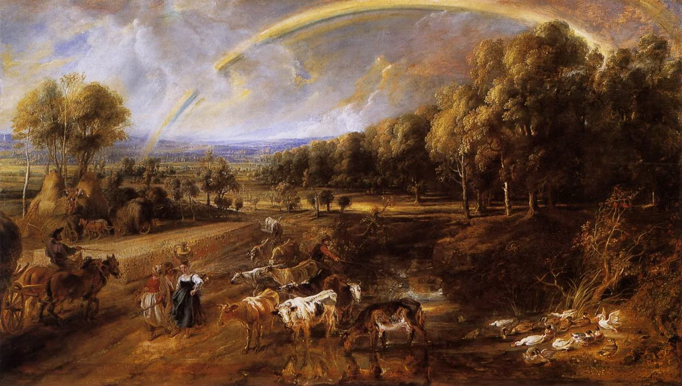
Art: The Rainbow Landscape or is a c.1636 landscape painting by Peter Paul Rubens
These 10 tips by Josh Bernoff to write better are spot on. In presentations, I would take it easy with the sign posts though.
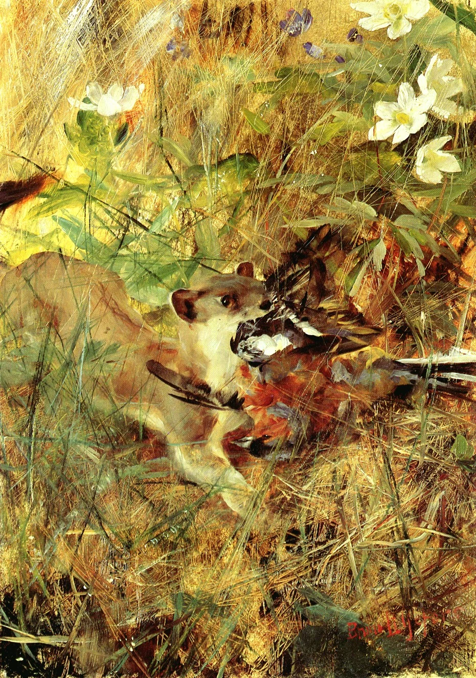
Art: Bruno Liljefors (1860–1939), Weasel with Chaffinch, 1888
Things are changing over at Microsoft: Microsoft interfaces on new apps look great, and it is getting rid of old dogmas, opening up software to a wide range of platforms. At the same time, Apple (while still great) is taking the foot of the gas here and there.
Feld Thoughts: Outlook on My iPhone http://t.co/MZyoFCSf5R
— Brad Feld (@bfeld) May 3, 2015My mini review: new PowerPoint 2016 for Mac can beat Keynote if some bugs are ironed out: http://t.co/zq09OewVBx @Office
— Jan Schultink (@ideatransplant) March 12, 2015Using new @surface and @msonenote to draw next book. This is really good. Sorry iPad. pic.twitter.com/RFagpL8vWD
— Dan Roam (@dan_roam) April 30, 2015Pigs fly over a frozen Hell scape dropping leaflets announcing the release of Microsoft Code for Mac & Linux.
https://t.co/EeeJrMIz6T
— Guy English (@gte) April 30, 2015Using Microsoft and Open source in the same sentence used to be an oxymoron. Not so much anymore. https://t.co/aBPZv6A0Jt. #GOOD15
— Adam Daniels (@adamrdaniels) May 1, 2015#Microsoft integrates #Dropbox- now add, edit and save file with Office online http://t.co/MSFG7jQEtV pic.twitter.com/4kgHF5lxvz
— ZotheniX (@zothenix) May 3, 2015Personally I am still a big Apple fan and will continue using their products. (Although I am one of the unlucky people who bought a Mac Book where the screen is completely peeling of, visit www.staingate.com to sign up for the petition if you suffer from this as well). But it is good to see that Microsoft is trying to compete.
Nicholas Chevallier, Race to the Market, 1880
Millions of web pages and PowerPoint presentations contain images of an empty Board room with plush leather seats. While this room might be the prettiest and most tidy one in your office, the image has appeared so frequently that lots of leather Board seats no longer radiate power.
Image credit: the FAEF Board Room
News media usually go for the next alternative, the name tag at the front door. I think better images are those of the company in action, a truck delivering goods, a plane taking of on the runway, a store interior, an assembly line in action, a nice group photo of employees at work.
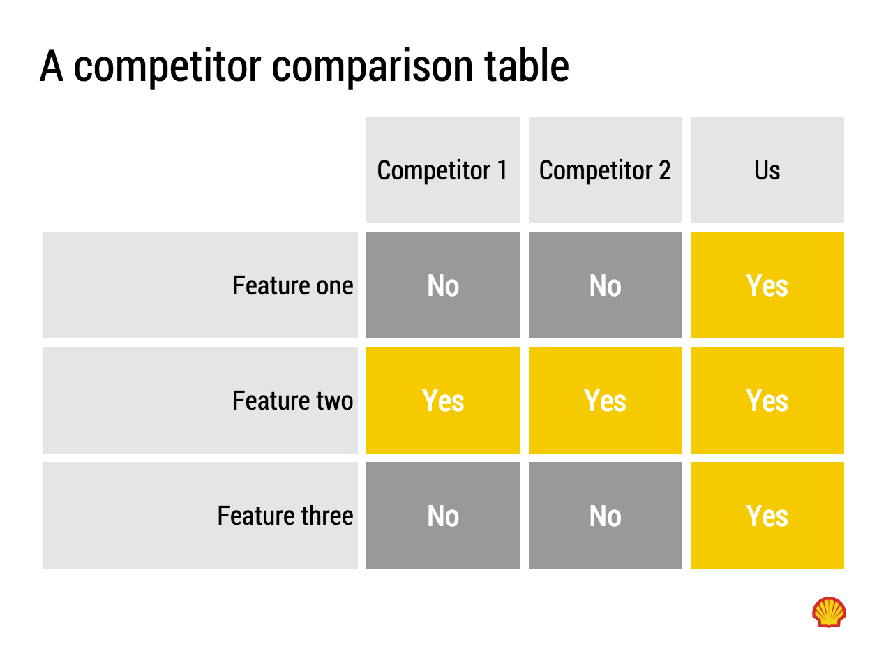
You can do better than the empty Board Room
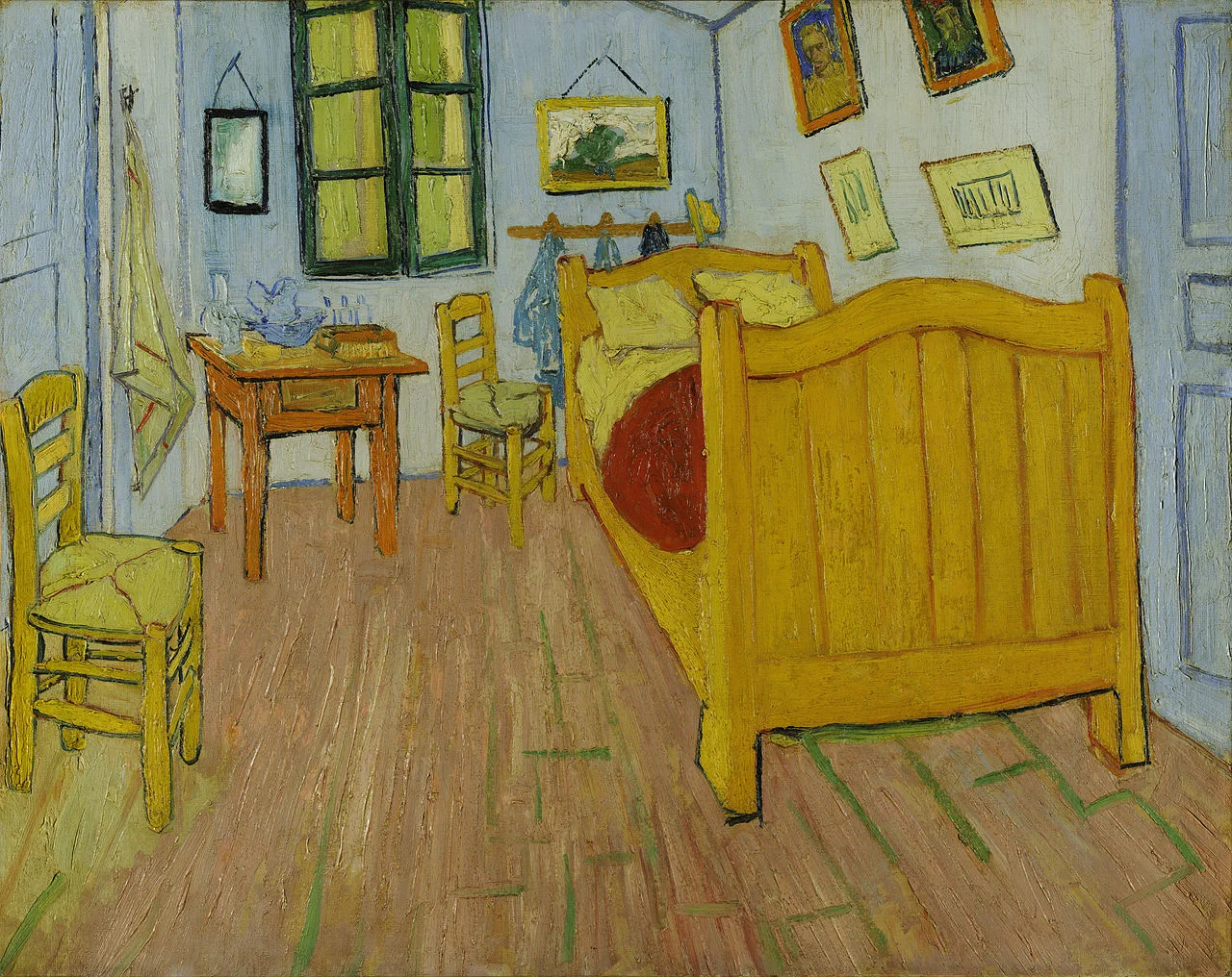
Art: Vincent van Gogh, Bed room in Arles, 1888
I get this feedback from early SlideMagic beta testers. SlideMagic supports one accent colour, one font, and encourages you to work in a strict slide layout grid. For certain presentations, this feedback is valid. I think we will not see any Apple product launch presentations designed in SlideMagic (yet).
For 99% of presentations though, it is actually precisely what I tried to achieve:
Today, I would argue that PowerPoint presentations look more similar to each other than the SlideMagic decks: lists of bullet points on a white background using the standard Microsoft Office (olive, blue, red, green) colour scheme.
Below are examples how the same SlideMagic chart would look when used in different companies. You see the impact of consistent use of colours. All SlideMagic charts will be updated instantly after a colour and logo change.
If you want to try SlideMagic for yourself, you can sign up here as a beta user.
Art: Salomon de Bray, The Twins Clara and Aelbert de Bray, 1646
Presentation templates in SlideMagic have 3 big advantages:
I want to add more templates.
Let me know what templates, concepts, you need. Put requests in the comments are send them to me at [email protected]. You can even send me PowerPoint slides if you want. If you have not done so, I will strip the slides of company specific information before publishing them in the SlideMagic template library.
Art: Henri Toulouse-Lautrec, Sescau photographe, 1896
In investor pitches there are usually 2 types of financial forecasts:
Why do investors want to see some sort of short-term budget?
A short term cost budget does not need to contain 25 lines of Excel, by month. A simple x% of revenues number is a bit too simple though.
Art: Marinus van Reymerswaele, The moneychanger and his wife (1539), Museo del Prado, Madrid
Repeating the whole story of your presentation on the last slide is boring. You want to end with a "boom" and quickly remind people of the most important message in the presentation. I usually do that with repeating a key visual (just one). Using (the cliche) that a picture says more than a 1,000 words, the repeated image brings back the full richness of the discussion you had in one millisecond. Much more efficient than writing a bullet point.
If you have to repeat multiple messages, here is another trick: use small screen shots of slides. At the end, the audience does not need to be able to read the entire slide anymore. The thumbnail is a quick visual reminder of the content. Below an example that I created in SlideMagic.
I have added this slide design to the template file of all slides I created for the blog. You can open it in the SlideMagic app here and use it for your own designs. Just change the images.
Art: The Flute Concert of Sanssouci by Adolph Menzel, 1852, depicts Frederick playing the flute in his music room at Sanssouci. C. P. E. Bach accompanies him on the harpsichord.
The Comcast-Time Warner Cable merger fell through. Fred Wilson makes the case that this is probably a good thing, not so much because of consumer choice, but on the other side of the business: content providers trying to get through to consumers with their offering (Netflix, etc.).
This article in the NYT provides some interesting background on the failed $25m lobbying and pitching effort. Some quotes:
"He was smothering us with attention but he was not answering our questions"
"And I could not help but think that this is a $140 billion company with 130 lobbyists — and they are using all of that to the best of their ability to get us to go along"
1) If there are elephants in the room, huge obvious issues that need to be addressed, you have to deal with them, somehow. Avoiding the issue will not make the issue go away.
2) Beyond a certain point, "slick" is actually working against you, when you try to convince a human. (The same point I made with respect to highly sophisticated videos).
Art: The colossus, Francisco de Goya, 1808–1812
The economics of most Internet startups are sort of the same. You invest CAC (customer acquisition cost per user), you convert the free user to a paying user (conversion rate), and you hope she sticks around long enough (churn rate) to get a decent LTV (customer life time value). With a decent growth rate, you have a good business.
Seasoned venture capitalists are tempted to dive straight into these figures and skip the bit what your business is all about. I would encourage you not to give in. It is important to establish that emotional connection with the problem you are trying to solve, how great your product is.
In the end, they will be investing in a business that consists of people and users, not just a spreadsheet that delivers LTV-CAC.
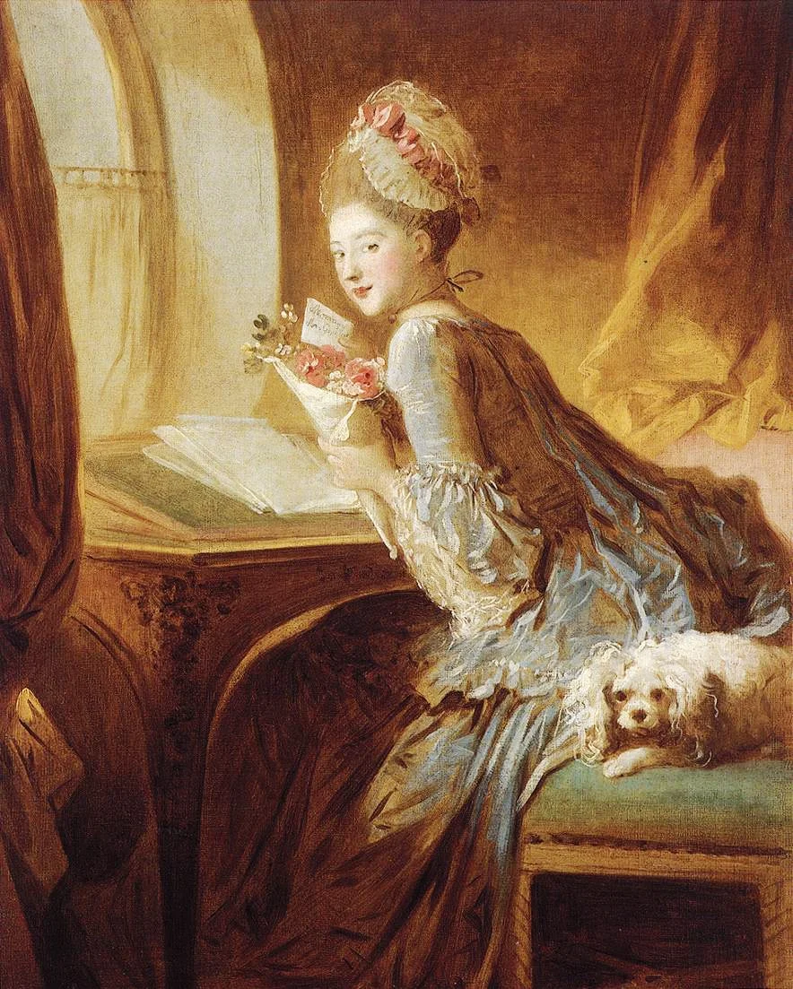
Art: Jean Honore Fragonard, The Love Letter, 1770.
Should you bend the truth to make your investor pitch more attractive? Answer: no.
Should you put out all your weaknesses for everyone to see? Of course not. Tell when asked. Think about how to visualise data. Leave facts that require an elaborate explanation out of the cold email deck, you should be in the room with the investor when it comes up.
Trust is a big asset, don't waste it.
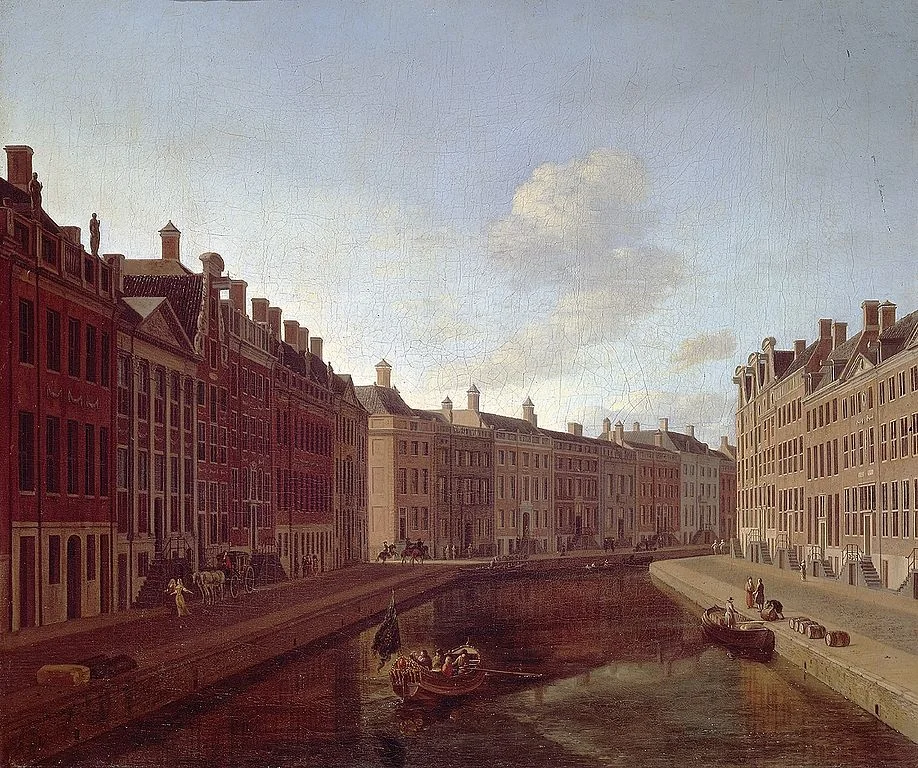
Art: Gerrit Adriaensz. Berckheyde The bend in the Herengracht, Amsterdam, 1685
You show your deck to 10 people, you get 10 different sets of feedback. Feedback is useful, but you have to make the call to whom to listen, and whom to ignore. People have different backgrounds. Experts, colleagues, and insiders give different feedback than your close family. Listen more carefully to feedback from people that resemble your target audience before putting all your fundamental charts in the appendix.
The more often you give a presentation, the more you start developing your own flow. When you reach a stage where you can deliver a pitch without going back and forth between slides, and are not getting audience questions you were about to answer 3 slides later, you probably got it right. Even if people walk up to you afterwards and suggest to collapse a few slides into one to reduce the slide count.
Art: Escaping Criticism by Pere Borrell del Caso, 1874
Someone who hears a story for the first time needs to create the whole picture in her head from scratch. Give background, introduction, examples, then bring it all together.
People who have heard the story millions of times before, check your presentation against their existing mental picture. Summary upfront, neatly structured, logical.
Presentation designers fall in the second category, while most of your audience is in the first. Think about that.
Art: Gustav Klimt, Beech Grove
On my desk I use 3 monitors: 2 big 27" screens and my laptop screen. While it is tempting to put all your live Twitter, Facebook, and email feeds blinking on the left and right screen, I keep them blank most of the time (well, that is a good use of the monitor) to minimise distraction.
I use them when I need a little extra desk space for a slide I am working on: a previous version of a presentation with comments, comments in email, the Finder window with images, a spreadsheet to copy data from. As soon as I am done with that, I close the window with only the wallpaper left.
In a recent software update, Apple has added a new feature: right-click an icon in the dock, click options, and you can now select the default screen the application will open. I set the default for all my smaller utilities (1Password, Evernote, the Finder window) to the small laptop screen.
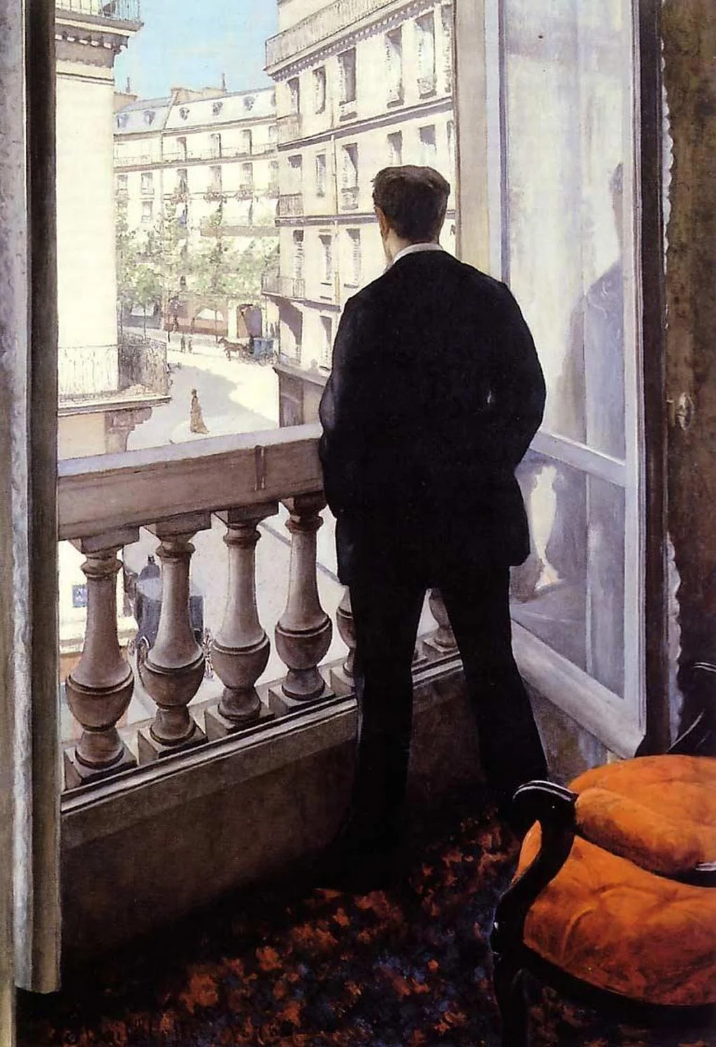
Art: Gustave Caillebotte, Young man at his window, 1875
The video in which Hillary Clinton announced her intention to run for President is too well executed. The messages are incredibly clear, you can almost reverse engineer the PowerPoint slide that contained the briefing bullet points for the script.
But the execution is also staged and lacking raw emotion that it is unlikely to resonate with voters. I don't think it will leave a negative impression, just a neutral one. It sounds and looks like almost all advertising we see around us. This review on the Huffington Post captures it correctly.
In a similar way, Apple product videos, once admired, now almost look funny after the many parodies.
A better way to do this? Interview "real people" on camera. It is a lot harder to do though.
It is a warning sign for those who think that big budget productions (videos, presentations) automatically translate into audience impact. The more people have been disappointed by slick presentations, photoshopped ads, spectacular videos, the harder it is to convince them that in your case they should believe you.
P.S. What do I think about the campaign logo? I don't think it is very pretty, but it will be very recognisable as an avatar on social media sites. Functional.
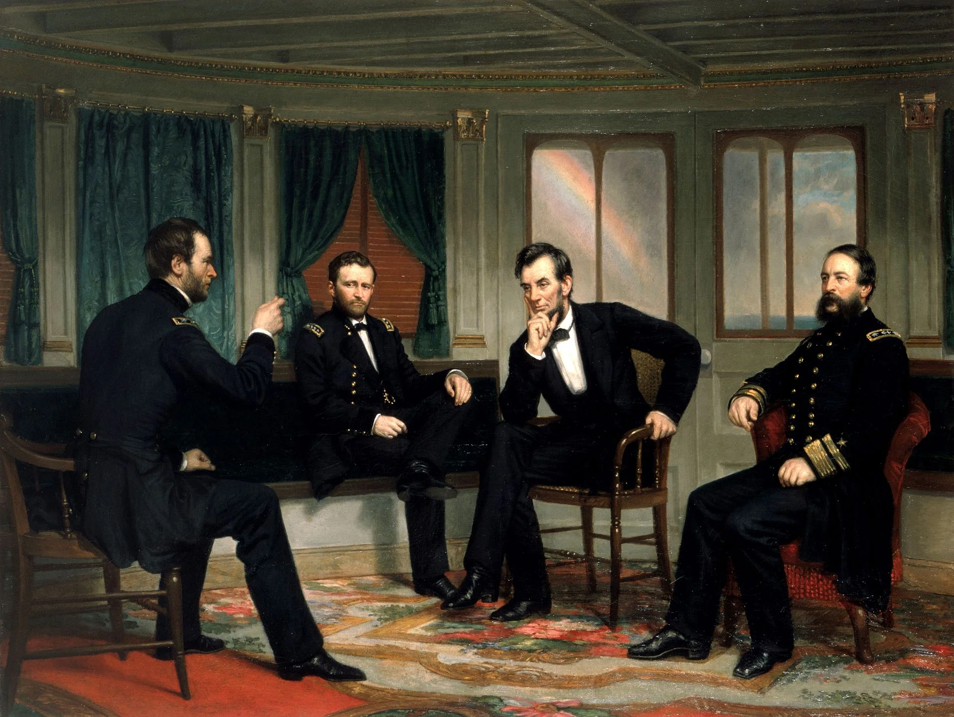
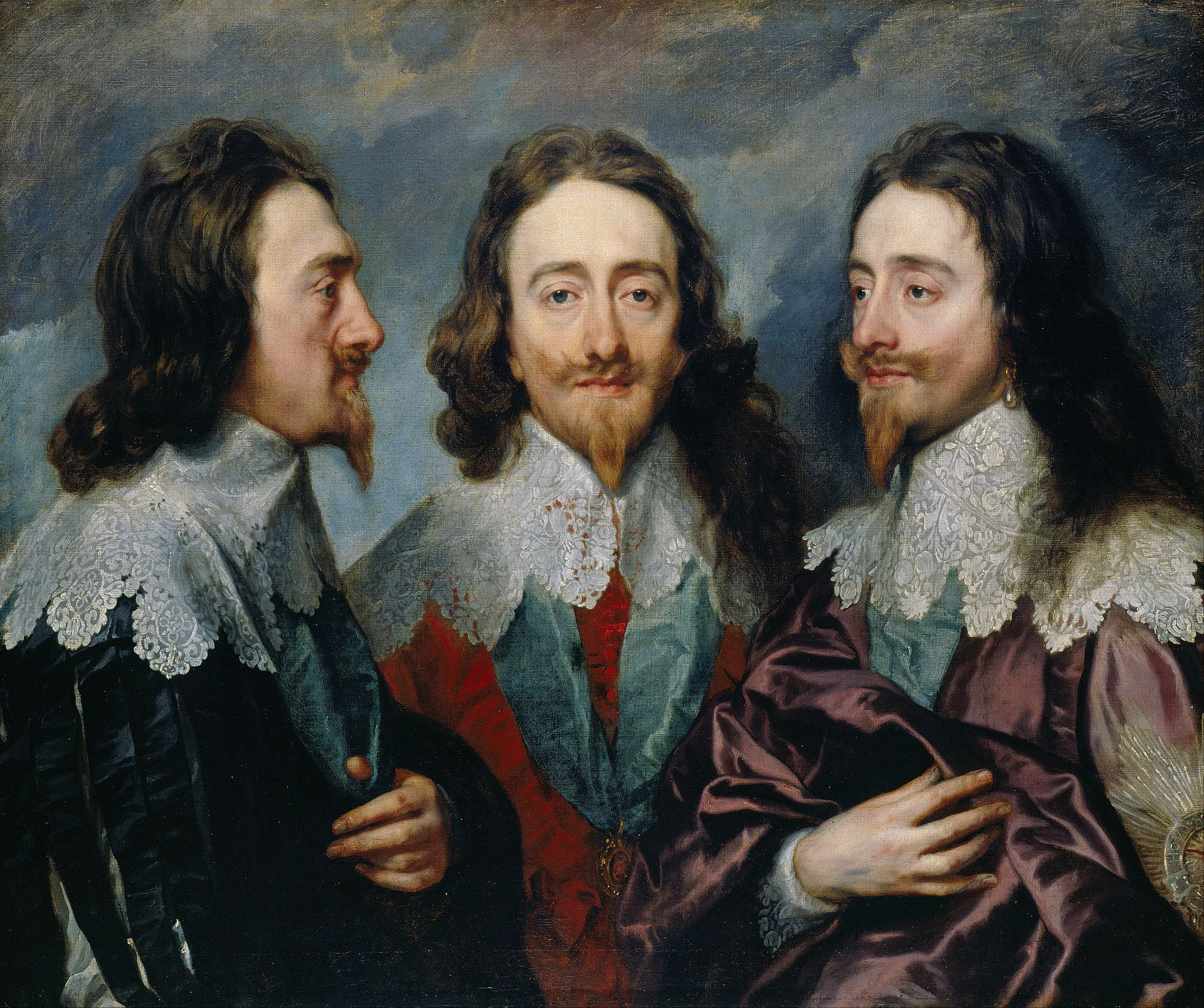
Art: The Peacemakers (1868) painting by George P.A. Healy.
Often, when I meet a high tech client, I get presented with an existing company presentation that contains all the required information but conceals the big idea behind the company. As a result, we usually push the slides away and start talking, and after a few minutes, that big idea comes out.
First versions of the redesigned presentations are all about that big idea. It is in your face. But there is a risk that over time we start diluting that pure story again. The world out there (and Gartner and IDC reports) are used to defining the technology world in certain boxes, using certain language. And as we get a lot of questions about how you compare to this, to that, we slowly, slowly, get back to a presentation that resembles the one we started of with. It looks prettier, but the big idea is hidden again.
My (and your responsibility) is to prevent that from happening.
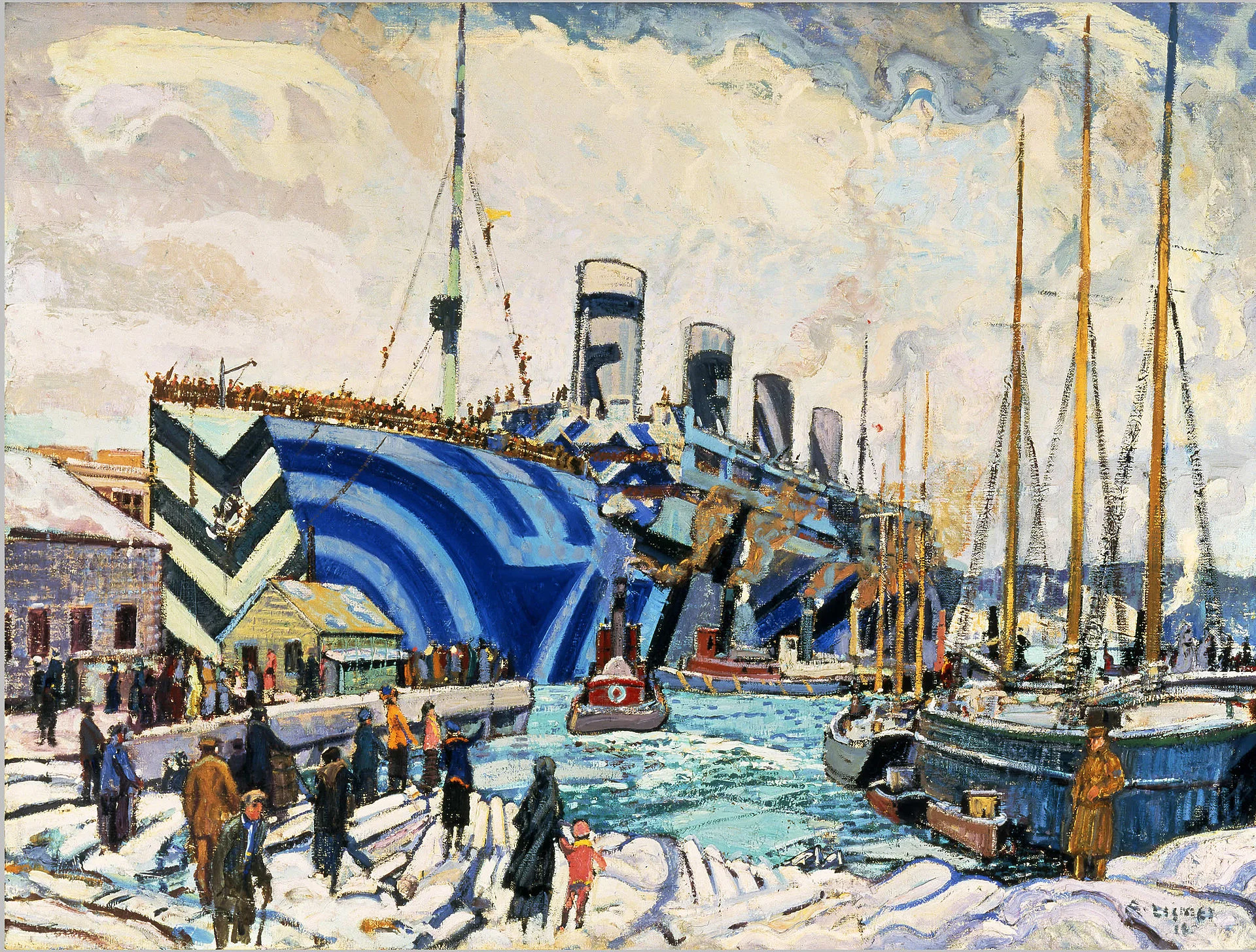
Art: RMS Olympic in dazzle at Halifax, Nova Scotia painted by Arthur Lismer
My startup clients who have customers/sales and are raising a follow-on investment round are swimming in data. Every click, of every customer segment, at any time is recorded and can be analysed. How to use this in an investor pitch?
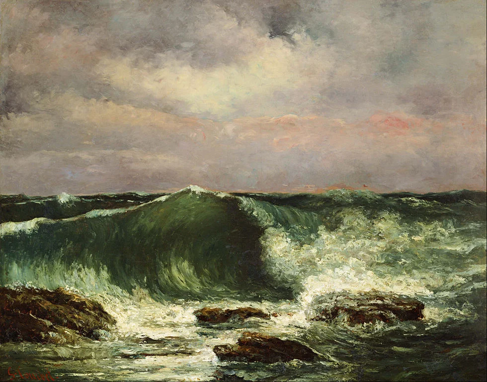
Art: Gustave Courbet, Waves, 1870
Most American newspapers use title capitalisation in their headlines: Every Important Word is Written with a Capital. Should you do the same in presentations?
My opinion: no, I think it does not look very good. The only exception: titles of books or research papers you are quoting as a source in the footnote.
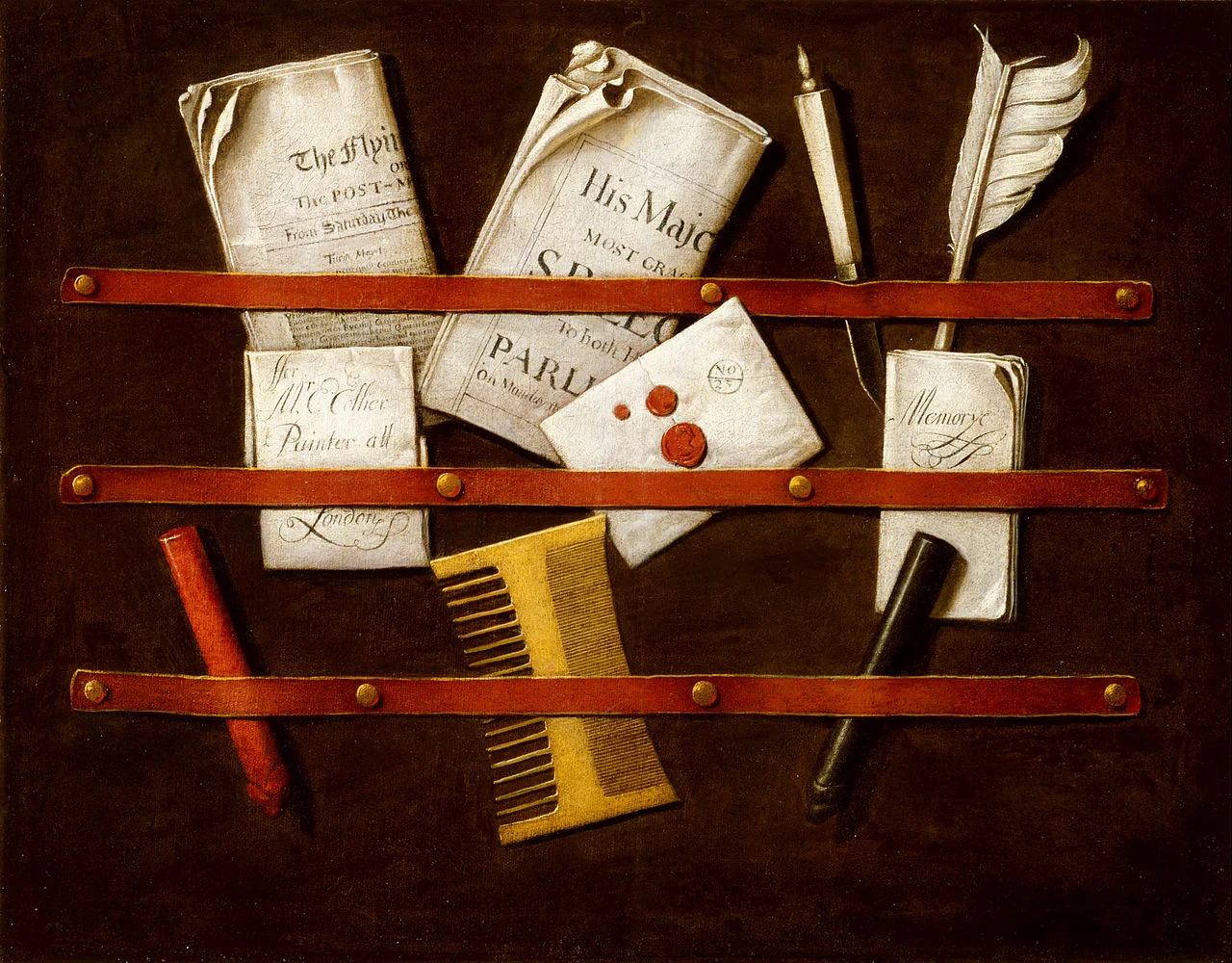
Art: Edwaert Collier, Still Life, 1696