Still relevant today:

SlideMagic: a platform for magical presentations. Free student plan available.
Fast. Easy. Beautiful.
Still relevant today:
Quotation marks never come out right when you use large, bold, typography. Below is a nice idea by the designer of Gary Vaynerchuck. One huge, big, quotation market centred across the text. Note that the quotation mark is in a far bigger font size than the rest of the text.
Most quotes in presentations do not add to the story:
What can you do better? Find the right person, and get them to say something specific, clear, and simple: "This solution saved the launch of product [x]!"
UPDATE February 2018: I have added a new post about using quotes in PowerPoint to the blog
I get a lot of queries from startups on a tight budget that want the best presentation possible to raise their next round of financing that pretty much determines the survival of the company. Many of these projects I actually turn down when I see that the presentation is actually pretty decent. Extracting fees for a bespoke presentation design will not give them the right return on investment.
Here are some things I watch out for when deciding when a presentation is pretty decent for an early-stage VC round (which is a different audience than a major late-stage growth round, a TED talk, a pitch to a major customer)
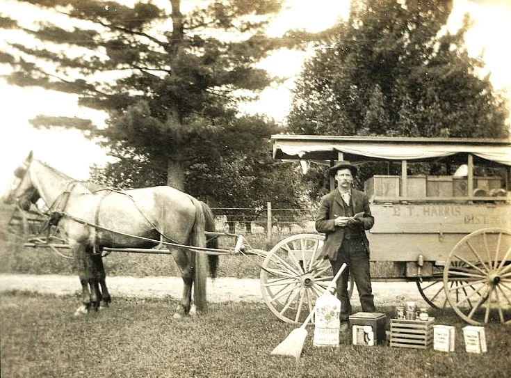
Image from WikiPedia
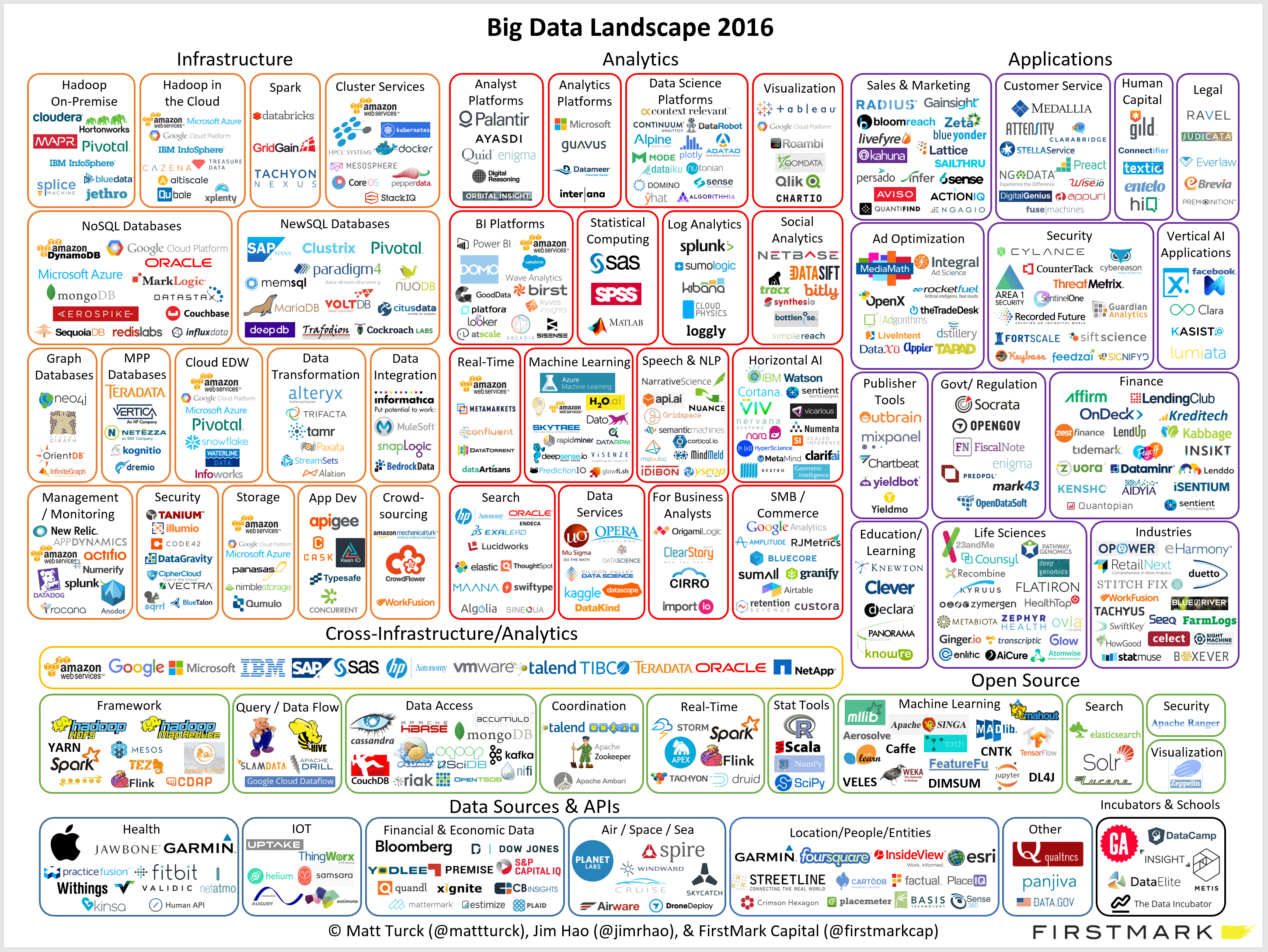
Not every PowerPoint slide is meant for presentations to a big audience. Some charts are meant for pondering behind a big screen. The one below is an example (made by FirstMark Capital).
Venture capitalists love these industry overviews full of logos and sectors. You could make this chart cleaner:
But that chart would be less fund to ponder....
This blog is read by many fellow presentation designers. Here are some of my clues that warn me when a potential project could be difficult to get right.
Designers should look out for these warning signs and people tendering project should look in the mirror.
This picture by Anouk Zwager has an interesting list of common management vocabulary in the Netherlands. Part of these words sound perfectly fine to an English speaking audience, but in a Dutch context, with many words in the Dutch language available it just does not feel right.
I will try to translate, some of them might not work:
Imagey by Jaci XIII on Flickr
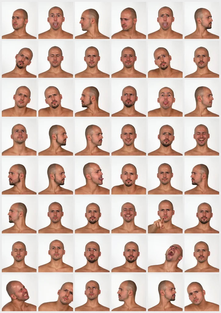
Cheesy stock photos look worse than a list of dense bullets. If you need an image of a normal-looking person here some things I try:
Image from WikiPedia
The standard cloud shape in PowerPoint is not very pretty. Especially if you need a different aspect ratio, there is no option but to stretch the shape, making it look even worse. My solution is to combine multiple cloud shapes into one to get a decent new shape (SHAPE FORMAT, MERGE SHAPES, UNION). See the example below.
It is interesting to see that merging shapes also kills the "inside" cloud contours.
You can get more sophisticated and design your own cloud shape based on circles. Here is my attempt in 2011 to recreate Apple's iCloud logo in PowerPoint.
Art: View of Haarlem with bleaching fields, Jacob van Ruisdael, 1670
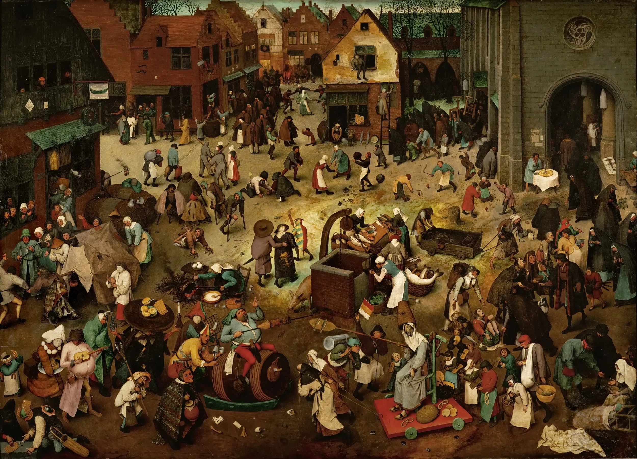
Chart loaded with detail are usually not the best way to convey a message. Except, when your message is that things are actually very busy, complex, interrelated. Then by all means make a busy chart. When presenting, don't feel tempted to go into the detail of its content though, the message stays "things are busy" and [click] you can go on to the next chart.
Art: The Fight Between Carnival and Lent, by Pieter Bruegel the Elder in 1559
Many of my high tech clients hire me to design a product presentation that gets them higher up in the client organisation, the so called C-suite (CEO, CTO, CFO, etc.). The IT department buys features and equipment in a tight budget, the CEO can spend more money on what she sees as strategic priorities for the company.
The approach that vendors typically take is to frankenstein "business benefits" slides to the existing technical slide deck.
I usually try to go for a different approach. Start with a blank sheet of paper. Trash the traditional system architecture charts. Cut the "business benefits" slides. Instead, I create a presentation that explains why this particular IT problem is so hard to crack, and how clever the client solution is.
The result is a presentation that looks "simple" to techies. "Simple" does not mean "simplistic". It just does not use the complex looking visual language that engineers have gotten used to since graduating form university: network diagrams and acronyms. Two engineers can communicate using these slides, but the content that is transferred actually has little to do with the network diagram on the slide. If you are not an engineer, you don't get it. And as a result, most of the C-suite will not get it and send you back down stairs to IT.
Here is a question I was asked to answer on Quora:
"I heard a famous silicon valley investor saying that "the investors and the VCs are able to see if there is something going on through a bad pitch". That being said, why should the entrepreneur care about having a good pitch?"
Here is my answer:
Image by Wystan on Flickr
In a pitch there is always pressure to keep things as short as possible. It is therefore tempting to compress the problem you are solving is as few words as possible: "[x] is not very flexible", because hey, people know this, right?
I tend to drag out the problem section of the pitch a bit:
Now you have set up the audience to show why your solution is so clever.
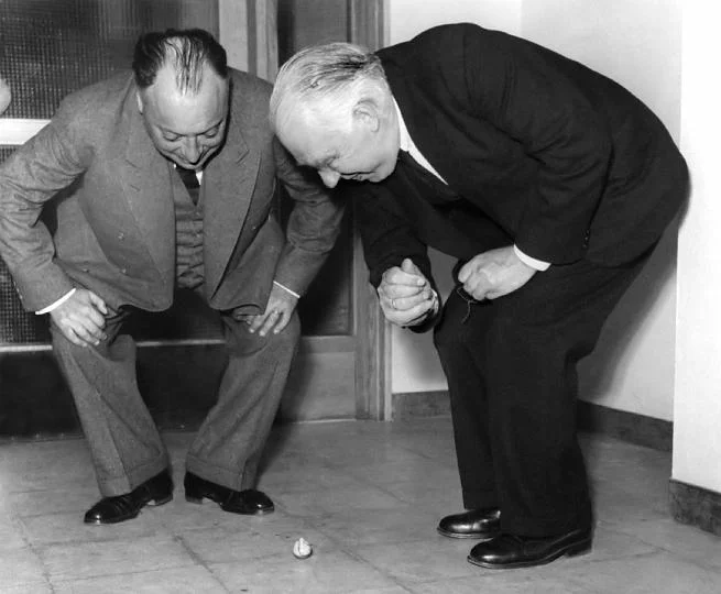
Image: Wolfgang Pauli and Niels Bohr demonstrating 'tippe top' toy at the inauguration of the new Institute of Physics at Lund; Sweden
Many people start of a presentation design project with "we want a presentation like Apple". A great intention. But after you come back with a first version (black background, a few words per slide, no bullets, no agenda pages, no summaries, no logo, no page numbers), people feel that it looks too dark, the flow is not clear, they want to summarise upfront what they are going to say, it is hard to refer to pages, it needs some branding, and to make sure that a certain point comes across, you better spell it out word for word on the slide.
Image by Danny Lion
On Quora, I see questions like which presentation software did [company X] use at [event Y]. For the audience there is no difference. The same simple, good slide can be made in PowerPoint, Keynote, Google Slides, and Adobe InDesign. The exception is probably Prezi and its complex zooming capabilities.
The process that got you there makes a big difference though. How easy is it set up a basic presentation template (colours, fonts, positions of titles, page numbers, aspect ratio), how is it to create a basic slide layout other than a list of bullets, how easy is it to align items properly on a grid, how easy is to create basic data charts, how easy is it to keep everything consistent page after page, how easy is it to do basic image manipulation (cropping and repositioning).
Either the audience cannot tell in which program the presentation was made and you were either a design pro or have made a huge effort to master the software. Or, the audience can spot your software instantly (most likely PowerPoint), which means that you did not get much further than the standard slide template.
(A secret: you can get away with taking design short cuts in my presentation app SlideMagic and no one will notice).
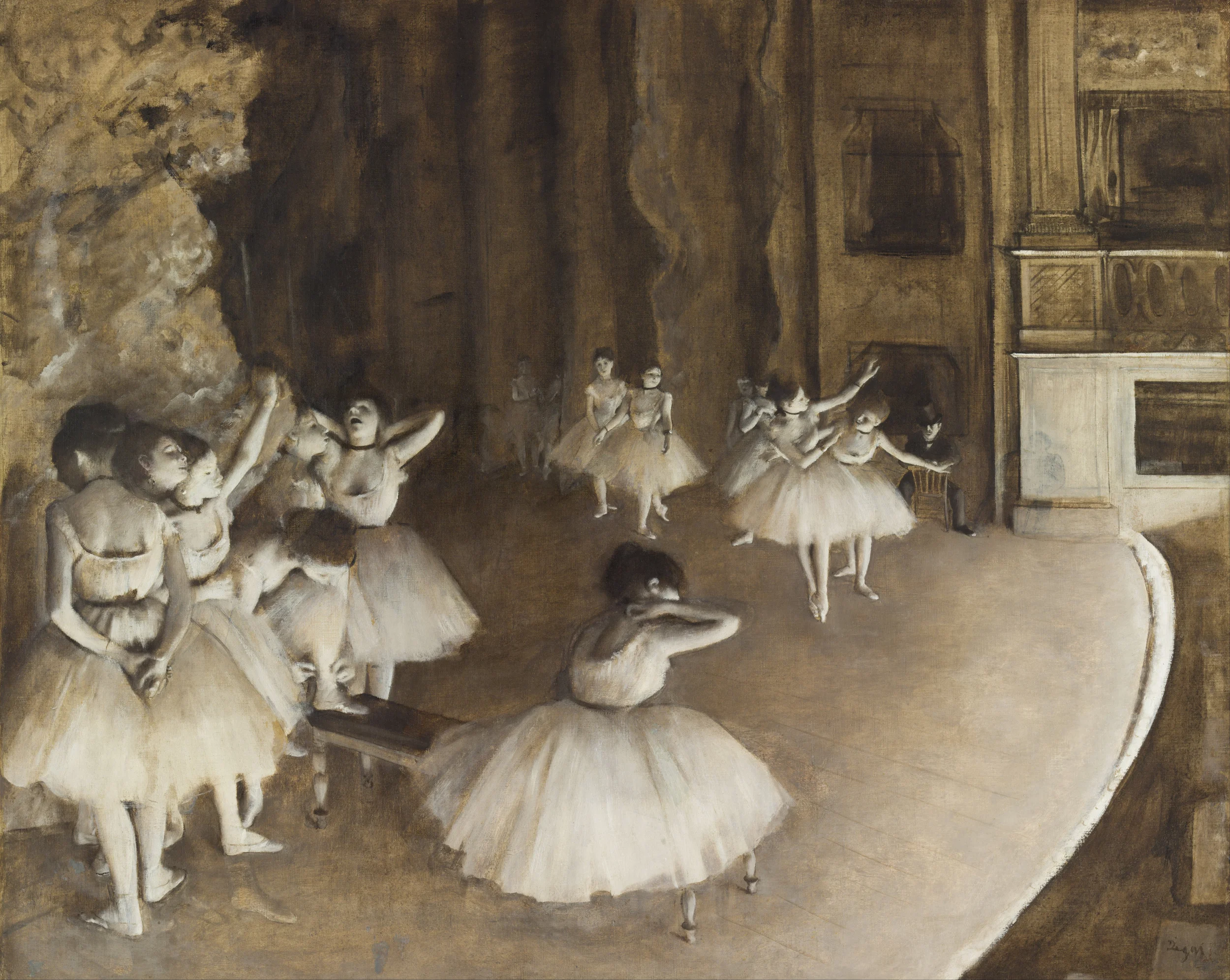
Edgar Degas, Rehearsal on stage, 1874
One of our clients back at McKinsey in the 1990s used to say that "the paper in McKinsey documents is always warm", i.e., they came of the printer only minutes before the meeting. Now that documents/presentations are all in digital form there is even greater opportunity to make last minute changes, especially if you travel by taxi to the meeting.
It comes at a price though. First of all, last minute analysis is prone to mistakes. But secondly: "frankensteining" quickly a chart into a presentation might break that super professional and impeccable look of the presentation.
If the change does not involve the correction of a major error, it might be better to make that missing point verbally.
I get this question a lot from (potential) clients in Europe and here in Israel. Ten years ago, I would have answered the question with a usual rundown of presentation design basics: not too many bullet points, visual slides, etc. etc.
But in 2016, I think the playing field has levelled. Audiences in any country now recognise a good or a bad presentation.
There are still differences between audiences though, but they do not differ across geographical boundaries. Here are some contrasts that I often come across. It is especially in these situations that an outside presentation designer can help to bridge the cultural gap.
When presenting to someone outside your typical circle of "audiences" it is important to put yourself in their shoes. Simply recycling your usual presentation is unlikely to work.
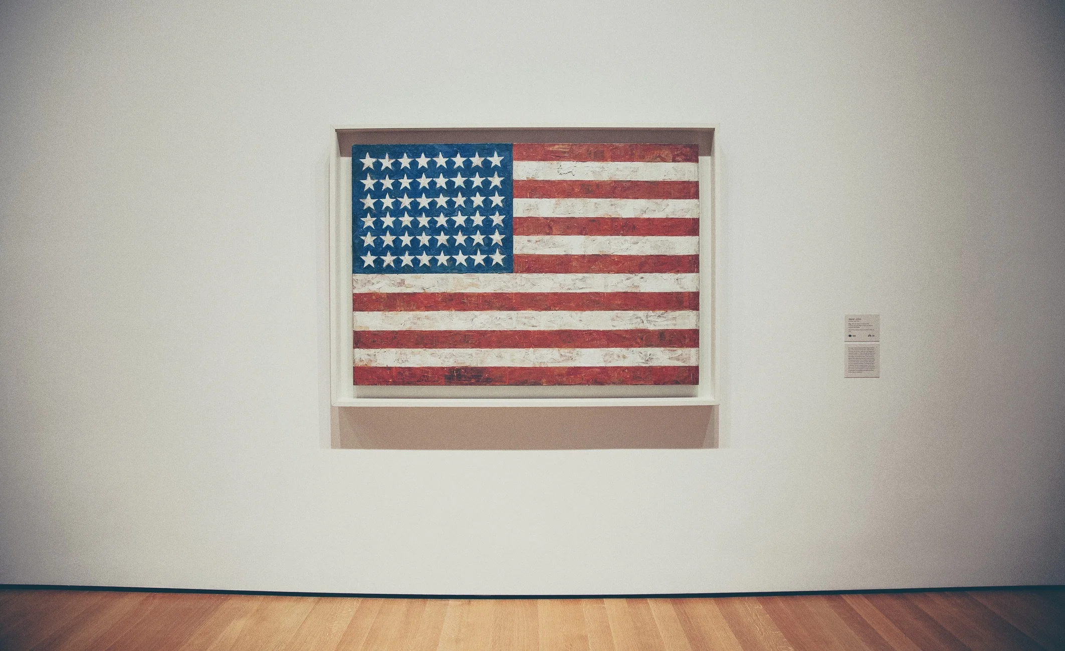
Art: Jasper Johns, Flag, 1954
Management consultants produce tons of charts that might look professional, but in most cases, they are actually not that good. (Most management consultants will admit this if you ask them).
Why does this happen?
PowerPoint is a slide design tool that can be used in many ways.
Management consultants use PowerPoint as 2. and 3., and forget to make the jump to 1. after they are done with the analysis. Most verbal presentations go OK, management consultants are usually reasonable presenters and when a horribly dense slide goes up on the screen, the explanation is usually clear.
Still, the visuals can be better, and here are some steps to clean things up based on the work I did for a management consulting client yesterday.
A fairly random list with tips to make better consulting presentations. There is one theme though. Separate slides you use to solve a problem/do your analysis, from slides you use to communicate a recommendation. They are completely different.
I usually spend 80% of the production section of a pitch on the problem, and 20% of the solution. That might seem an uneven balance. But in fact, these two sections are one and the same thing, they go hand in hand. The way you frame the problem, sets up the way you introduce the solution.
Image: Wikipedia
I have been working with a client on a presentation with 2 different pieces of software: she on Keynote, me on PowerPoint. She kept importing and exporting. The conversion is actually pretty accurate (a compliment to Keynote). The only glitches are in drawing guides and page numbers and the occasional font here and there.
Image by Kreg Steppe on Flickr