Using templates in SlideMagic

Using templates in SlideMagic

In little bursts of work I will be updating my presentation app SlideMagic over the coming weeks. I noticed that many users stick to the 9 box grid that is the default blank layout of a new slide. Yesterday we released a new insert routine. You now get presented with a number of slide layouts to choose from when inserting a new slide, without having to import and/or clone template slides.

Try it out and let me know what you think.

SlideMagic: a platform for magical presentations. Free student plan available. LEARN MORE
Humorous conference presentations

Humorous conference presentations

When people get invited to speak at a conference about their specific expertise and/or profession, they usually have no problem creating an industry story. It is easy to understand why: they are their home turf, feel very confident, have lots of interesting things to say and are in a relatively risk-free environment (there is no business proposal that could be rejected).

The draft presentations I receive from these type of clients usually need very little work. Here is what I usually end up doing:

  • Switch to a big conference white on dark template, without any logos, banners
  • Replace the standard Calibri or Arial font to something safe (i.e., no custom fonts that can cause trouble on foreign computers). Usual choices: Arial Black in all caps, or Century Gothic
  • Replace cheesy stock images
  • Replace low resolution images
  • Replace images with copyright issues (Google image search, search tools, "labelled for re-use"
  • Restore original image aspect ratios and stretch/crop images to full screen
  • Spread out slides with multiple messages across multiple slides
  • Cut text and reposition text boxes in the context of the underlying image

Art:  Johannes Moreelse, Democritus, 1630

SlideMagic: a platform for magical presentations. Free student plan available. LEARN MORE
Presenting to later-stage investors

Presenting to later-stage investors

Early stage investors make a risky bet: 1 or 0, either the company will work, or it doesn't. Later stage investors don't take that make or break risk, they invest in companies that have gotten some traction but need capital to finance growth and expansion. Which markets are you going after, how are you going to sell to them, what new products can you launch. 

Valuation of early-stage startup is usually a mysterious process in the absence of sales and profits. For growth-stage companies it usually boils down to some sort of discounted cash flow analysis.

This is important to remember when presenting to these type of investors. In the end, a junior analyst will sit down, take your presentation and try to come up with some sort of financial business forecast for your company.

One way to deal with this is to email your own business forecast ready in Excel. But by definition, the buy side will never believe the assumptions of the sell side in a transaction, and worse, the potential buyer might just use your own spreadsheet to salami slice every single assumption down in order to end up with a value of $5.

The best approach is to feed the buyer the assumptions (market growth, market share growth, pricing, number of sales people you need) without doing the adding up of all the numbers. And feed those assumptions in the form of stories about your business plan, rather than a dry set of numbers.

Prioritise your sources of growth according to likelihood of success, first existing customers, existing products, then maybe new geographies, new verticals, and finally completely new products.


Art: Paul Cezanne, The Card Players, 1890

SlideMagic: a platform for magical presentations. Free student plan available. LEARN MORE
Against all the other options

Against all the other options

During a TED talk, most presenters have the luxury of bringing a totally new, surprising, inspiring story to an audience who cannot wait to hear it.

When you pitch a business initiative it is unlikely that it will come as a total shock or surprise to the audience, Investors have seen similar ideas before, potential customers have heard your competitor sales pitches, senior management heard you talk about this plan in last quarter's strategic planning presentation, market sizes look roughly the same as in yesterday's pitch, payback time is again around 6 months.

Why is your idea different than all the other ones out there?


SlideMagic: a platform for magical presentations. Free student plan available. LEARN MORE
Grasping data charts

Grasping data charts

Here is what a first time viewer needs to go through when looking at a data chart:

  • What's the unit on the y-axis
  • What's on the x-axis
  • What do the legend colours stand for
  • What is "good" or "bad", are things supposed to go up or down?
  • What is actually happening
  • Is the y-axis broken or does it start on zero?
  • Why is this unexpected, interesting, counter-intuitive, amazing, terrifying?

If you did the analysis then you live and breathe the data in the chart, the only thing you watch out for is how the line/column/bar looks different from the previous version of the chart you saw. For a completely new audience it is a different story.

There are 2 types of data charts:

  1. Charts to ponder and refine research and analysis
  2. Charts to communicate the result of the pondering and refining

If you make a presentation of result, you deal with scenario 2. Make a diagram completely from scratch. Start with "what is actually happening" and only put that piece of data on the chart.

For example if a complex stacked line diagram shows that the % of returning visitors gets smaller over the past 5 years, you can replace all that monthly visitor data with 3 data points: % of return visitors in the last 3 years.


SlideMagic: a platform for magical presentations. Free student plan available. LEARN MORE
Great and difficult starting points

Great and difficult starting points

There are a number of starting points for my presentation design projects that almost always result in great presentations:

  • The enthusiastic CEO with a strong story who is all over the place with bullet point charts, skipping/jumping left, right, and centre
  • The scientist with a strong idea that is buried in dozens of unreadable data charts
  • The engineer with a great product, presented in a presentation that looks like a deck used to present the result of a school end of year craft project
  • The Fortune 500 investor relations manager with a quarterly results deck in a standard PowerPoint 2007 template that is more of a general company introduction than a razor sharp story updating investors about the key business drivers in the last quarter.

Difficult starting points:

  • A confident CEO, with a visual deck (lots of big pictures) that spends too much time on explaining a relatively obvious point, ignoring the "elephant in the room" practical questions that investors might have (yes, we get the idea, but how can you build this realistically in 3 months).
  • A scientist who is so used to her existing slides that her pitch would not change much, even when equipped with the world's most beautiful slide deck.
  • An inventor with a great idea, but no team, no plan, no technical approach

Never a dull moment in my profession!


Image from WikiPedia

SlideMagic: a platform for magical presentations. Free student plan available. LEARN MORE
Scientific diagrams

Scientific diagrams

I found myself designing presentations in the beautiful world of protein synthesis recently. This is a very complex field of science and diagrams that researchers use reflect that.

While it takes decades of study and research to discover and develop them, the mechanism of action of these drugs can be explained relatively easily. The key is to forget about all the conventional diagramming approaches you see in scientific papers. Leave out any piece of science that is not relevant to the problem that causes the disease, and the way the drug solves it.

I actually start with writing down what the key steps are. Then just visualising what is written down, and not a detail more. The resulting diagrams are unusual and I often get feedback from medical professionals that it all is too simple. A great compliment I think.

SlideMagic: a platform for magical presentations. Free student plan available. LEARN MORE
Book tip: Porcelain by Moby

Book tip: Porcelain by Moby

The biography "Porcelain" by musician Moby is a nice addition to your summer reading list. The book covers the period from when he left home to the eve of the release of his album "Porcelain" that was his major breakthrough.

Many celebrities use ghost authors to write their books. This one is written by himself. The style of the sentences exactly matches those of his social media posts and video interviews.

The book paints a good picture of the prolonged creative struggle you need to go through in order to find your individual style. If you look at his career from a distance this is the picture that I get:

  • Moby got an extensive classical guitar training (not at all mentioned in the book) which his musical foundation
  • Then he got his decade or so to look for his style:
    • DJ-ing, absorbing a huge amount of music
    • Playing around with sequencers, drum machines which were relatively new inventions in the late eighties
    • Because of his low "burn rate" (living in abandoned factories) he could somehow sustain himself without a daytime job, freeing up time for creative experimentation
    • Again lack of financial resources forced him to extract the maximum out of the equipment he had.

My own efforts to get SlideMagic off the ground feel a bit like this. I try to process all those presentations I designed during my decade at McKinsey, and the decade as a professional presentation designer into a useful tool. In V2.0 I am now slowly moving from a pure focus on grid-based design to a generic, minimalist, visual language to express business concepts. Work in progress.

SlideMagic: a platform for magical presentations. Free student plan available. LEARN MORE
The problem with political "presentations"

The problem with political "presentations"

Large parts of the world are in a political impasse at the moment. Part of the issue is related to communication of ideas:

  • The business of government is complicated, but the political debate is fought with simplistic TV sound bites and tweets
  • There is an almost total absence of facts. Yes, facts and logic are not always the best weapons to convince people, but they can be effective in a targeted strike to zap a populist, simplistic argument
  • Political speeches or live debates are poor platforms to discuss a balanced trade off between two options. In controversial business presentations, I like to use some sort of pro/con table that compares the 2 options, isolating "no brainer" data points from points that are more subjective.
  • Audiences are fragmenting. I remember back in the Netherlands when I grew up there were basically 3 types of parties: workers, business owners, and religious people. Within these 3 groups, people had very similar perspectives on how to tackle issues. That is no longer the case. There is no longer one philosophy, or person, that can unite the viewpoints of a large majority of the population.
  • Arguments focus on the extreme cases: demonstrating how totally and utterly stupid the other side is. This will resonate with people who are on your side, but is unlikely to win over the mind of the person who is doubting the issue in the centre of the political spectrum.

And finally, the 18th century nation state is losing its ability to control things. Movement of talent and money across the globe is hard to control. We are part of a global system that is driven by small economic decisions of millions voting with their money.

Interesting times.


SlideMagic: a platform for magical presentations. Free student plan available. LEARN MORE
The real cost of presentation design

The real cost of presentation design

Many of my prospective clients think that the cost of presentation design is variable: the longer the presentation, the more slides, the more expensive it gets. 

The cost of presentation design is actually pretty  much fixed. The big cost is getting to know the company, the story, the science, the technology, the market. Once you have done that, designing the actual slides is not that much work anymore for a professional designer.

So the most costly presentations are usually those where the story is not very clear.


Art: Marinus van Reymerswale, The money changer and his wife, 1539

SlideMagic: a platform for magical presentations. Free student plan available. LEARN MORE
The latest cool presentation app

The latest cool presentation app

I saw this Tweet by Garr Reynolds (Presentation Zen):

I agree fully, and as the CEO of an aspiring presentation app (SlideMagic), I am not contradicting myself. SlideMagic is of course cool, but not because it adds spectacular features. It makes you design slides in a very strict grid so that your slides look good regardless of your design experience. Try it yourself.


SlideMagic: a platform for magical presentations. Free student plan available. LEARN MORE
Text balance

Text balance

Shapes, their sizes, and the layout grid set the balance of a slide. But text as well and is often overlooked. Watch out for these:

  • One word that drops to the second line
  • A very long word that makes a sentence break halfway the page
  • 3 boxes in a row, 2 with little text, one crammed with characters
  • Long descriptors in column headings that break line after line after line

The solution in these cases is not reducing the font size, reducing the margins, it is redesigning your slide layout and content:

  • Take out filler words
  • Replace long words (management, manufacturing) with shorter ones
  • Splitting a point in 2 points that are more balanced
  • Making a sentence actually longer to restore balance
  • Flipping the rows and columns of a table
  • Using a different shape (circles and long text do not go together for example)

SlideMagic: a platform for magical presentations. Free student plan available. LEARN MORE
"We don't care"

"We don't care"

The little details in a presentation might not make or break its message, but they do count. A spotless presentation shows you made an effort, that you take your audience seriously.

The result of some maintenance work downstairs in the parking lot of my building

The result of some maintenance work downstairs in the parking lot of my building

Here are some things to look out for: typos in common words (if your spell checker flags something, there is probably something wrong), typos in names of people, inconsistent use of fonts and/or colours, small misalignments of objects, a text wrap gone wrong, or making sure that the positions of titles on all slides is the correct. I remember the senior partner on my first McKinsey project coming into the graphics design room to hold all the paper slides against a strong light to check these things.

Yes, I know that I am contradicting myself now and then as I get reminders about typos in my blog posts...


SlideMagic: a platform for magical presentations. Free student plan available. LEARN MORE
Start with counting

Start with counting

The most fundamental feature of my presentation design app SlideMagic is the strict use of a grid to layout your slide. And there is a good reason for that.

Every slide I design start with counting. How many points. How many options. How many pro's and con's for each argument. How many years. How many competitors. How many types. How many team members. How many steps.

Even or odd number of items? If you end up with a nasty number (11, 13 for example), you find ways to combine 2 points, leave one of, split one up. 

Then think of shapes, which boxes are "long" (text), which boxes are square (images, icons), which boxes vary in text content, which are the same.

Then comes the thinking about layouts: 3x3 5x1, 1x4, 2x2?

Almost every slide has a table hiding in it.


Image from WikiPedia

SlideMagic: a platform for magical presentations. Free student plan available. LEARN MORE
Authentic videos

Authentic videos

Today the Israeli startup Airobotics came out of stealth mode. They made a very good introduction video. Not only because of the graphical production quality and the story line. It is narrated by the company founder (foreign accent, some grammar mistakes) instead of a slick professional voice over. It makes the whole communication so much more authentic. Well done!

SlideMagic: a platform for magical presentations. Free student plan available. LEARN MORE
Communications around the Brexit debate

Communications around the Brexit debate

I have been observing the debate in the UK about whether it should stay in or leave the EU from across the Mediterranean.

  • Like most big decisions, the debate is all emotional and "shooting from the hip". Bureaucracy, immigration, sovereignty are all candidate topics for huge debates even in the absence of facts. Most people decide based on gut feel and it will be impossible to force 60m voters to sit through a micro-economics lecture about the impact of the EU. But the other extreme, 5 seconds sound bites by politicians will not work either. In a conference room, a well-designed presentation can offer a solution, in politics, I have no solution I am afraid.
  • The biggest problem is the option that is offered. Instead of a simple "leave" or "remain", the voter should vote on 2 specific plans with all the economic and political arrangements worked out, or at least, in a slightly more advanced stage.
  • Arguments of both camps are often targeted at the believers, the people who already have bought in to a specific choice. You win elections by convincing the doubters. 

Maybe politicians need to communicate like John Oliver. It still takes 14 minutes though.

Direct democracy has its problems:

  • You can cherry pick issues to vote on without the context/constraints of all policies ("are you for or against a tax hike?")
  • You ask people to make decisions on simple black/white choices, without presenting the practical, day to day consequences, or a nuanced compromise
  • Voter turnout is an issue
  • And yes, voters don't take the time to understand options fully

There is an opportunity for technology here to change how we govern our countries. An online polling system could guide people through a set of complex decisions and force them to make trade offs. But to make this legally binding and practical will be a challenge.


SlideMagic: a platform for magical presentations. Free student plan available. LEARN MORE
Customisable toolbar in PowerPoint (finally)

Customisable toolbar in PowerPoint (finally)

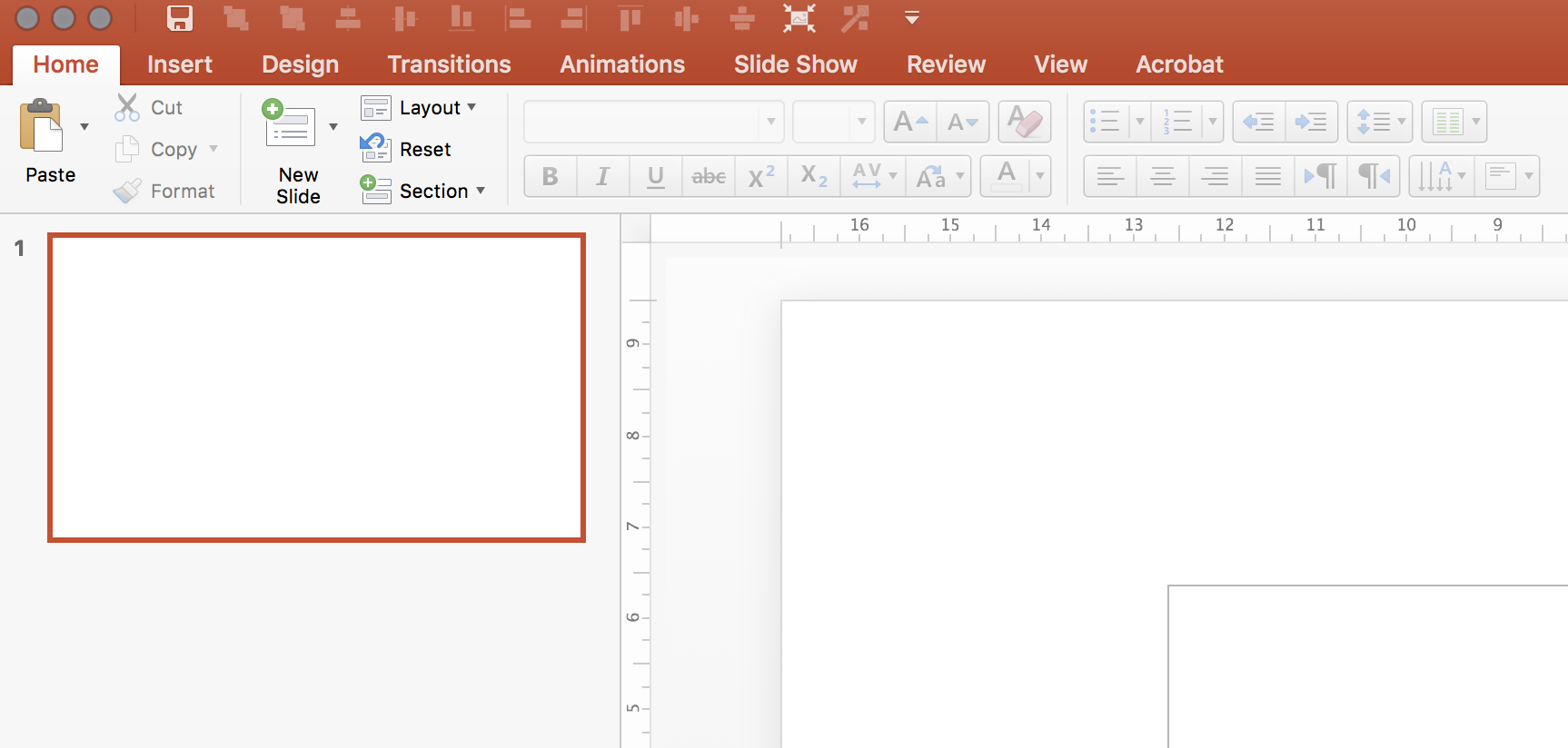
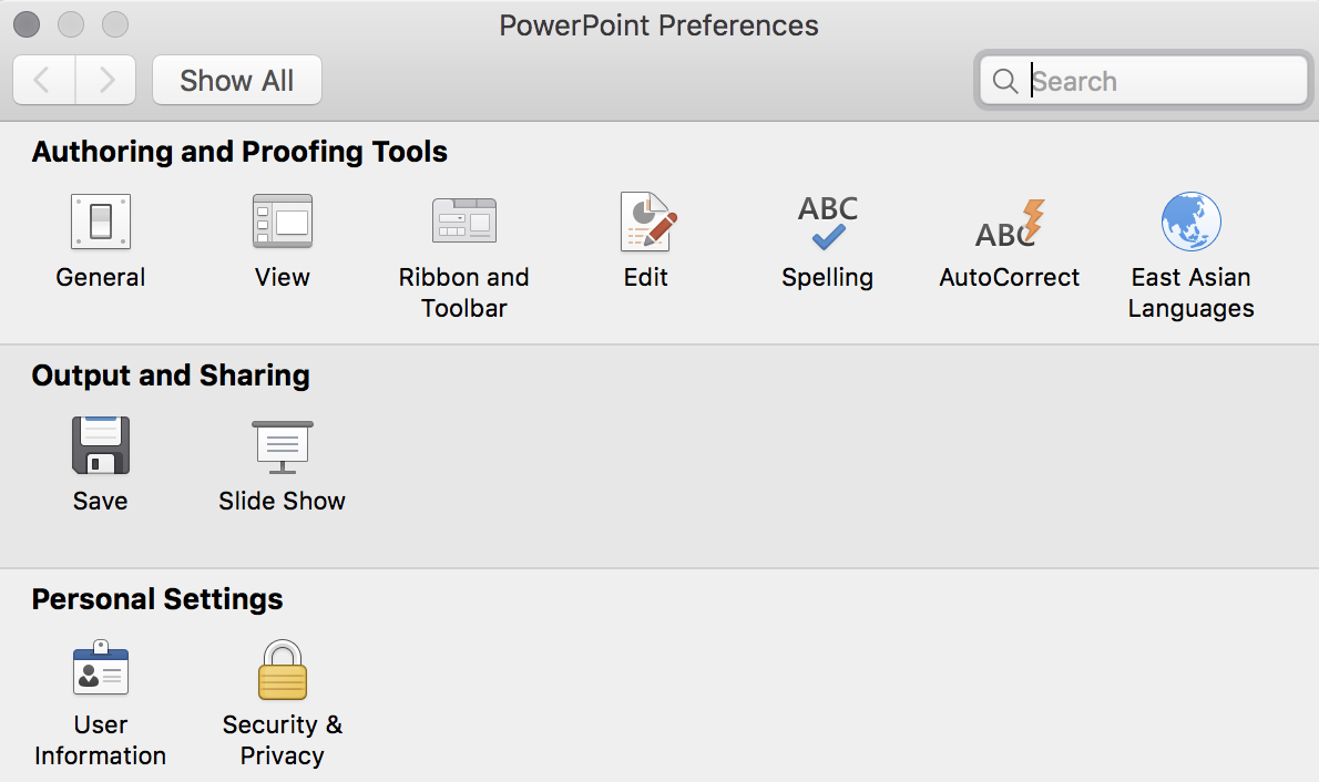
It looks like Microsoft has been listening. You can now completely customise the top quick access tool bar. For PowerPoint power users this will save a lot of time. Especially for aligning and distributing objects.

Make sure you have the latest update installed, and you will have access to a new icon in the PowerPoint preferences dialogue box.

For some reason, I still cannot find all the functions though. Flipping and rotating for example. Maybe I have not looked good enough, and/or there is still a small bug that needs to be ironed out. 

I would like to recreate that ideal tool bar I posted about back in 2008.


Top image from WikiPedia.

SlideMagic: a platform for magical presentations. Free student plan available. LEARN MORE
More complicated slides

More complicated slides

For some reason, I find myself designing more complicated, busy slides recently. Busy does not mean more text and bullet points. Busy means showing complex arguments in diagrams: boxes that overlap, are interwoven, move from one into the next.

My guess there are a number of potential reasons:

  1. My presentations are mostly investor decks, and the most important use of my slides is actually the moment when the recipient opens and reads them on the computer. The standup presentation that follows (if the first screening was successful), is almost a formality in terms of slide content, it is more about having the opportunity to get the know the people behind the slides.
  2. Misuse of cliche stock images or forced visual analogies have started to make people tired of certain big picture slides. "Oh, it's going to be this type of presentation, let's page down to the meat quickly".
  3. Larger, and higher resolution screens create a temptation to design more complicated slides (thinner fonts, thinner lines, more subtle colour shadings). Today, these slides even look great on a retina iPad. (Old crappy VGA projects are a different story though).
  4. Big, page filling image slides, are actually not that hard to make and this might be a segment of work that gets done more and more in-house.

So, not a return to crammed bullet points, but diagrams lifted to a higher level.


SlideMagic: a platform for magical presentations. Free student plan available. LEARN MORE
How do you do it?

How do you do it?

A question I often get after a very simple make over of a slide. Answer:

  • Make boxes the same size
  • Line everything up in a grid
  • Cut excess filler words and passive verbs
  • Us one accent colour
  • Harmonize fonts
  • Reset image aspect ratios
  • Fit everything inside a frame with white space around it

"You make it sound so simple, but it is not.". It actually is. If you struggle doing it in PowerPoint, use SlideMagic, my presentation app.

SlideMagic: a platform for magical presentations. Free student plan available. LEARN MORE
Slide makeovers are not always enough

Slide makeovers are not always enough

Most of my clients actually know how to present visual slides. Their problem: they don't have the slides. But once I create them, they get used quickly to the new presentation format without a lot of training. This is probably because they can identify with the target audience. A CEO pitching a startup idea is the sort of person you would pitch a startup idea to.

Scientists have a double problem. Yes, their slides need work, but the bigger problem is that they often need to cross into a different audience type than they are used to presenting to. Scientist, engineers, lawyers, have their own language for talking to each other, which can actually be every effective. But if you put a scientist with newly designed visual slides in front of an investor audience things start to break down without the proper training.

When deadlines were very short, I have recommended these clients to stick to their existing slides and practice their delivery, postponing the make over of their entire slide deck for the next conference a few months down the road.


Art: Louis Pasteur by Albert Edelfelt, 1885

SlideMagic: a platform for magical presentations. Free student plan available. LEARN MORE