The mix is almost perfect

The mix is almost perfect

In my spare time I am (finally) making efforts to lay down musical tracks that were playing in my head for a long time. Part of the learning process is watching documentaries of musicians going over and over and over again until that mix is just perfectly right. (This skeleton in the studio image says it all). And these are the 1980s and 1990s, for many of today's electronics musicians, it is all about polishing and mixing so it seems.

There is a parallel here in presentation design. Instead of editing the footnotes the night before the presentation, get a good night of sleep or do one more live rehearsal of your story. Time better spent.


Cover image by João Silas on Unsplash

SlideMagic: a platform for magical presentations. Free student plan available. LEARN MORE
First impressions

First impressions

An investor double-clicks an attachment, you make a first impression already which is totally disconnected from the idea you are trying to pitch:

  • The slides have a reasonably professional feel: not the standard Microsoft Office template, not a 1990s bevel and gradient template, no times roman font, slide formats are more or less consistent throughout the presentation, images are not cheesy and/or stretched
  • The slides have a grown up language, which shows that the author understands the audience: no padding with buzzwords, no 101 introductions to a subject that any VC is supposed to master, no presentation cliches ("in this ever faster changing world where we all have become digital nomads")
  • Early in the deck it is at least clear what you are doing
  • The email addresses are not gmail, and the company domain has some sort of place holder in a consistent look & feel with the presentation. LinkedIn pages of founders are consistent and up to date.
  • You are sending a PDF, not a PowerPoint document, and it fits in a 10MB file

These are examples of the digital equivalent of the first impression you get with a handshake. Your deck is compared to all other decks this VC has seen in her career in more or less a second. And she has developed the intuition, what sort of decks usually are associated with good deals, and which ones to avoid.


Cover image by rawpixel on Unsplash

SlideMagic: a platform for magical presentations. Free student plan available. LEARN MORE
Presentation = agenda

Presentation = agenda

In some cases, a stand up presentation is an emotional story telling performance that moves your audience to do something they did not know they wanted to do 60 minutes before.

However, not every presentation is like this. The majority of slides are presented in small conference rooms, the "trenches" of the economy, where middle management tries to get a decision agreed in the middle of opposing viewpoints, office politics, and interpersonal meeting dynamics.

In these meetings your deck is actually the agenda for that meeting. Make sure things get discussed, make sure people have the facts, make sure the right trade offs are presented, and make sure a decision is made in the end.

Think about this when putting your deck together. Which facts are obvious, which facts are disputed, what info is counter intuitive, what is likely to spark a big debate, what not, etc. etc.

The presenter is telling a story, but also orchestrating a number of humans.


Cover image by Vincent van Zalinge on Unsplash

SlideMagic: a platform for magical presentations. Free student plan available. LEARN MORE
Recycling the presentation

Recycling the presentation

Cities are recycling their presentations to lure Amazon to put a new HQ there to pitches other candidates. 

I see this many times, a company that needs to pull out all the stops to present at a major conference or pitch competition. Ideas and energy of that pitch are re-used numerous times in other presentations. It is often that wake up call to get your act together, take more creative risk to present your idea with "nothing to lose".

There is a cost element to it as well. How can you get more return on that expensive video work? You need to try to find the balance between a personal and relevant pitch (rule #1 of sales presentations), and re-usable content. For videos, I usually request to have a clean version of the file without specific text banners or voice overs that cannot be separated. In that way you can re-use the assets for other projects.

Btw, these city pitches are very interesting. Here are 3 very different pitches. I think Detroit is the most inspiring. What do you think?

Cover image by Steve Harvey on Unsplash

SlideMagic: a platform for magical presentations. Free student plan available. LEARN MORE
Send decks, not links

Send decks, not links

A short summary of Mark Suster's blog post where he argues that startups should send VCs the entire file, not a link:

  • Tracking, tracing, monitoring, of who read what where and how long actually discourages people
  • He likes to file his documents to come back to them later to look at development and self-destructing links to not allow that
  • It adds friction to an already short 3 minute process
  • (And I would add: do what the VC is used to, and most of them have been dealing with decks since the 1990s)

What is a good deck for sending? Well, one that does not contain confidential information: product pipelines, salaries, etc. Assume that your competition will read the slides sooner or later, and there should be no harm when this happens. I have seen it on the other side with my clients, they would forward me a deck of a competitor and we would actually not get any info out of it, but rather admire that powerful pitch that the others created. So, it might actually be a benefit if your competitors see your slides :-)


Cover image by Dmitry Ratushny on Unsplash

SlideMagic: a platform for magical presentations. Free student plan available. LEARN MORE
How to start a new presentation slide

How to start a new presentation slide

When starting a new slide, most people think of what to write in it, then worry about composition which usually involves moving text boxes around so that everything still fits on one page.

Next time, start with the composition, then do the writing. Think how a few boxes and arrows can visualise common business concepts in a slide:

  • Something is bigger than another
  • Something is growing
  • Torn between opposing forces
  • Reinforcing loops
  • Ideal fit or a mismatch
  • Trade off
  • Dead end
  • A sequence

Put the shapes, align and distribute them, now add some text


Cover image by dylan nolte on Unsplash

SlideMagic: a platform for magical presentations. Free student plan available. LEARN MORE
"Factoids"

"Factoids"

Often your manager will ask you to put some more "factoids" on the slide: small, vaguely relevant bits of information related to the topic that have no natural home on any specific slide in the deck. Read that description again, and think whether the audience really needs more of them.


Cover image by quan le on Unsplash

SlideMagic: a platform for magical presentations. Free student plan available. LEARN MORE
"Please upload your slides 30 days in advance"

"Please upload your slides 30 days in advance"

This tweet says it all:

Yes conference organisers want to 1) ensure that the presentations they offer are decent, 2) make sure the workflow of decks one after the other works on the conference desktop, but... most speakers will make changes to slides (especially the slide order) when they are rehearsing for the performance.

Suggested strategy:

  • Ask for a rough draft, outline, or old presentation well in advance of the conference to eliminate potential issues in terms of presentation style and technicalities (fonts, etc.)
  • Create a very credible deadline shortly before the conference for the actual slides.

Cover image by Curtis MacNewton on Unsplash

SlideMagic: a platform for magical presentations. Free student plan available. LEARN MORE
Microsoft VBA versus Applescript

Microsoft VBA versus Applescript

I am dusting of my coding skills that were pretty much put on hold in the early 1990s and have started to program macros to automate the mechanics of the template store: creating individual slides and thumbnails for PowerPoint and Keynote in different aspect ratios of these design.

Things in the Microsoft Office ecosystem run smoothly ("VBA"), for Mac, a lot less so. Applescript is a language that aims to automate pretty much everything you can do in Mac OS. It has been around for a very long time, but it is falling short.

At first sight, the language looks very friendly, almost human-like. And here is a problem: human language is ambiguous. It is incredibly hard to use it to program computers. When I look at example Applescript code, it looks very easy to adjust and re-use, but it is an incredibly pain to get it actually working and iron out the last bugs. Writing macro scripts will never be something that the average Apple user will do, so you might as well stick to a programming language that an engineer can work with.

The second problem is the what Applescript can actually do. As Apple put development of Mac OS on the back burner and gave priority to its iOS devices, the functional power of Applescript has been watered down. Old tutorials online show functionality that has been removed in later versions of Keynote.

Now, I am not saying that all esoteric features should be supported in a scripting language, but I am struggling to get the most obvious and basic one that anyone wants to use a Keynote script for: batch conversion of PowerPoint files into Keynote.

I am not giving up, and will look for a solution. Let me know if you have any recent experience with Applescript and Keynote.


Cover image by Boris Stefanik on Unsplash

SlideMagic: a platform for magical presentations. Free student plan available. LEARN MORE
How to combat PowerPoint template "rot"

How to combat PowerPoint template "rot"

Most presentation drafts I receive from clients are a soup of different slide templates, with colours, fonts, and styles all mixed up. To clean things up takes so much time that in most cases, making a slide from scratch is faster.

The combination of PowerPoint's architecture (going back to the 1990s) and large groups of people collaborating on documents is the toxic cocktail that causes all of this. My app and my template store are my first attempts to put an end to this.

In the absence of a permanent solution, here is what you can do to vaccinate yourself against the worst cases:

  • Ask some one marketing communication to email you the original clean template, and see how it works. Likely, it does not. Delete master slides you do not need. 
  • Create a rectangular shape that you like: correct colours, correct font. Make sure the bullet points align when you drop to the next line. Right click the shape, and set as default
  • Repeat the same for a plain text box.
  • Now, every presentation that you create, either starts with this blank master totally empty, or you copy someone else's presentation into this master.
  • And share your clean template freely with anyone who is interested.

(Or, start with an empty SlideMagic template, download it here for free)


Cover image by Pascal Kahle on Unsplash

SlideMagic: a platform for magical presentations. Free student plan available. LEARN MORE
The "deck for sending" becomes more important

The "deck for sending" becomes more important

You used to design a deck for presenting live, and then tweak it a bit to make it suitable for sending / reading in an email. More and more, I end up doing the opposite (at least for fund raising pitches). You create a deck that can be understood without a live presenter, and then make adjustments for an in-person pitch.

  • Business communication gets more efficient in general: fewer, shorter meetings, informal communication
  • People (think they) know how to read a fund raising pitch, in a sense their structures are very similar
  • More and more pitches happen between fund raisers and investors in different locations (lots of pitches to Asian investors)

Your old enemy was the audience falling asleep, checking out by opening the smartphone, the new enemy is the mouse click (page down, or worse: "close"). Given this, it is as difficult to design a good deck meant for reading than it is to create a TEDTalk-style deck for stand up presentations. 


Cover image by Kristina Tripkovic on Unsplash

SlideMagic: a platform for magical presentations. Free student plan available. LEARN MORE
Writing macros in PowerPoint

Writing macros in PowerPoint

The last time I used macros in PowerPoint was probably back in the 1990s during my time as an analyst at McKinsey. Yesterday, I picked things up again where I left them of.

To my surprise, the record function is no longer available (at least on a Mac). This used to be my secret weapon: record something very roughly, analyse the automatically generated code, and re-write that in a better way. The fastest way to learn the macro language.

Now you have to go through the process of learning VBA via the MSDN website. For someone with a Computer Science degree (i.e., me), this is doable, but I am afraid, anyone else will get lost.

Macros are still very hard to make idiot proof. Giving non-technical users access to a neat button in their ribbon that does magic probably works 70%, but in 30% of the cases, it will either not work, or worse: do damage to their work.

I need macros to speed up my production time of slides for the template store. Highly repetitive work is the bottleneck: creating thumbnail images, creating the individual PowerPoint and Keynote slides, in different aspect ratios, and creating the product pages on the store.

I toyed briefly with the idea of outsourcing this to other designers, but after a few days of study, I might have found a way to automate the bulk of the work, which will save me a tremendous amount of time and reduce errors, and free up my hands to increase the speed at which I can add slides to the store dramatically.

Things look a bit trickier for Keynote, I am going to dive into Apple Script and see whether it can help me.

Stay tuned.


Cover image by Markus Spiske on Unsplash

SlideMagic: a platform for magical presentations. Free student plan available. LEARN MORE
Halving and doubling

Halving and doubling

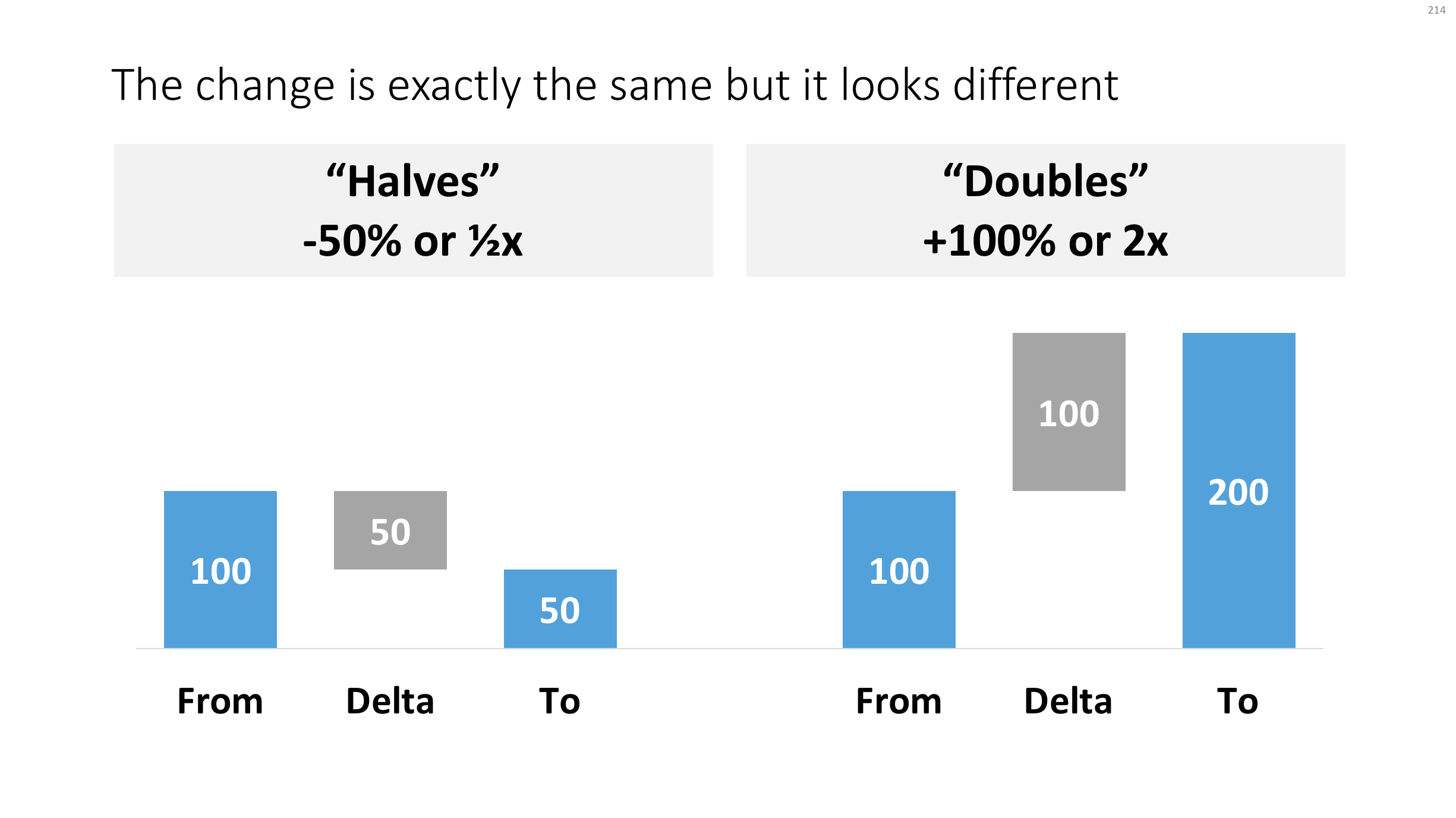
This tweet made me scratch my head, it seems so counter intuitive:

If you create a little waterfall, you can see the effect better. In both cases, the delta is half the size of the bigger column.

Waterfall.png

Yes, using logarithmic scales would be the correct mathematically thing to do, but they are very hard for people other than mathematicians to get their head around. 

Read an earlier blog post about constructing waterfall charts in presentations. Cover image by Ross Findon on Unsplash

SlideMagic: a platform for magical presentations. Free student plan available. LEARN MORE
Survey results in PowerPoint

Survey results in PowerPoint

Survey data can be tricky to present. So much data, so many breakdowns, where to start? Here is my take.

First, let Excel make "dumb" data visualisations, simply use the automated tools of the spreadsheet to visualise the results somehow. Use this data to analyse / what is actually going on. While a chart for a live audience should be clear in 5 seconds, these charts are for you, and it might take you a couple of hours before you have figured out what the most important trends in the data are. When finished, all these charts go in an appendix of the document.

Now write down what the key messages of the survey are, and find the data that specifically support that message. One message per slide! Next, find the most appropriate data chart that can present that data. I often see people mix up columns (time series), pies (harder to read than stacked columns), and bar charts (rankings).

Below are 2 designs that can be useful for survey data that cut across different segments. The first is the classical approach: a series of column charts. The first one shows the entire population, the second and third give a breakdown for specific segments.

Here is a slightly unusual variation for this chart. I went back to table and duplicated the axis labels for each segment. This table highlights the order/ranking stronger than the value of the actual data point. To add more clarity, I colour-coded the ranked data for one sub segment (not the total!). This brings out the contrast between the segments better.

Click the images to find the slides on the template store. Subscribers can download the slides free of charge. Cover image by Goh Rhy Yan on Unsplash

SlideMagic: a platform for magical presentations. Free student plan available. LEARN MORE
Clear legends to save the audience time

Clear legends to save the audience time

The standard Excel/PowerPoint legends for data charts are hard to decipher:

  • They are written in a small font
  • They rely on colours that the reader needs to match up with the corresponding data series
  • They are positioned away from the actual data

I usually switch off the legends and make them by hand. What I lose in automation, I gain in clarity. See in the example slide below:

  • I put the legend in big text to the right of a column chart (the last year is usually the most relevant for the audience)
  • Instead of color, I use the order of the legends to match them with the data. The color is received for highlighting a data series that is particularly important. This is easier on the eye, less clutter.

Click the image to see the column chart in the template store, subscribers can download it free of charge. Cover image by David Travis on Unsplash.

SlideMagic: a platform for magical presentations. Free student plan available. LEARN MORE
Flying through

Flying through

With a bit of Photoshop editing you can create an effect of a PowerPoint shape flying through some loop. I uploaded a new slide to the template store that uses this effect. Over the arrow, I positioned a second layer of the image, but just with a piece of rope with its background isolated. The arrow expanding outside the frame of the image (yes, I look those), adds to the motion feel in the slide.

Click the image to find the slide on the template store, subscribers can download it free of charge.


Cover image by Blake Wheeler on Unsplash

SlideMagic: a platform for magical presentations. Free student plan available. LEARN MORE
Looking into the future

Looking into the future

I added a nice image background with binoculars to the template store. When looking for images in presentations, try to find ones that have a lot of white space and/or depth, pay attention where you place your text, taking into account the overall composition of the slide and the contrast of the letters with their background.

Click the image to be taken to it on the template store, subscribers can download it free of charge.


Cover image by drmakete lab on Unsplash

SlideMagic: a platform for magical presentations. Free student plan available. LEARN MORE
Take the junior analyst to the CEO meeting?

Take the junior analyst to the CEO meeting?

Yesterday's meeting blog post made me think of an other topic: junior analysts (lots of them among my readers) and whether they should go to the meeting with the CEO or not.

During the early years of my McKinsey career, there were many, many occasions, where I did not get to go to meetings where my work would be presented, and it was explained to me that too many people in the room would harm the meeting dynamics. A valid point: sitting in a huge conference room full of consultants does not create the atmosphere for a candid discussion about strategy.

But there were other concerns my seniors might have had:

  • The junior analyst might not be able to present the slides, not having the right "CEO language", going of on a tangent, explaining how he did the analysis, without the so what
  • And even if we did not let the junior analyst present, he might come in with odd remarks that throws the discussion in the wrong direction, vent his uncomfortable feeling with the broad assumptions that were made in the analysis (that were actually justified), thereby undermining the credibility of the whole deck.

If you are just starting out as a consultant, it is worth your while thinking about the above. 

But there are advantages of taking a junior member to these meetings now and then (feel free to use the following with your seniors):

  • Taking turns makes sure that the entire 15 people team does not sit in the room at once
  • Analysts can actually learn a ton from these meetings that will make the whole team perform better:
    • You see how these analyses are actually used
    • You get to learn that CEO presentation skill that you can put to work even when presenting to more junior clients
    • You might come in handy when a very detailed question about the data comes up
    • You get credibility with your client team members
    • You will get a motivation boost
    • You will need less time briefing to follow up on next steps
    • (Junior analysts are always good at serving coffee, making copies when needed)

Good luck!


Cover image by Valeria Zoncoll on Unsplash

SlideMagic: a platform for magical presentations. Free student plan available. LEARN MORE
Simply "walk out of a meeting"?

Simply "walk out of a meeting"?

Elon Musk emailed some productivity suggestions for Tesla employees a few days ago:

[quote]

  • Cancel large meetings or if you have to have them keep them "very short"
  • Walk out of a meeting or end a phone call if it is failing to serve a useful purpose.
  • Avoid acronyms or nonsense words. "We don't want people to have to memorise a glossary just to function at Tesla"
  • Sidestep the "chain of command" to get the job done. Managers insisting on hierarchies will "soon find themselves working elsewhere"
  • Ignore the rules if following them is obviously ridiculous.

[/quote]

Corporate management styles are changing. Emails become informal, memos turn into visual documents, more and more people know how to avoid boring bullet point presentations, and the attitude towards meetings changes as well.

It is easy to simply walk out of a meeting if you are the one paying everyone's salary at the end of the month. A junior analyst is not expected to stand up say "my presence is not serving a useful purpose, goodbye". Instead, these people would just mentally leave the meeting by glancing on their phones.

However, there is something you can do. Especially in smaller project teams, you could include and agree a walk-out policy in the kick off meeting of the work. In that case, your superiors might actually feel embarrassed when it is time to exercise that walk out option.


Photo by Samuel Zeller on Unsplash

SlideMagic: a platform for magical presentations. Free student plan available. LEARN MORE
On top of the world

On top of the world

I added another slide to the store that is border line PowerPoint cliche: man-standing-on-top-of-the-world-wondering-what-is-next. Click the image to be taken to the template store, subscribers can download the slide free of charge.


Cover image by NASA

SlideMagic: a platform for magical presentations. Free student plan available. LEARN MORE