I own some pieces of music gear and most of these devices have a manual which is pretty much incomprehensible. Why is it so difficult to create a manual?
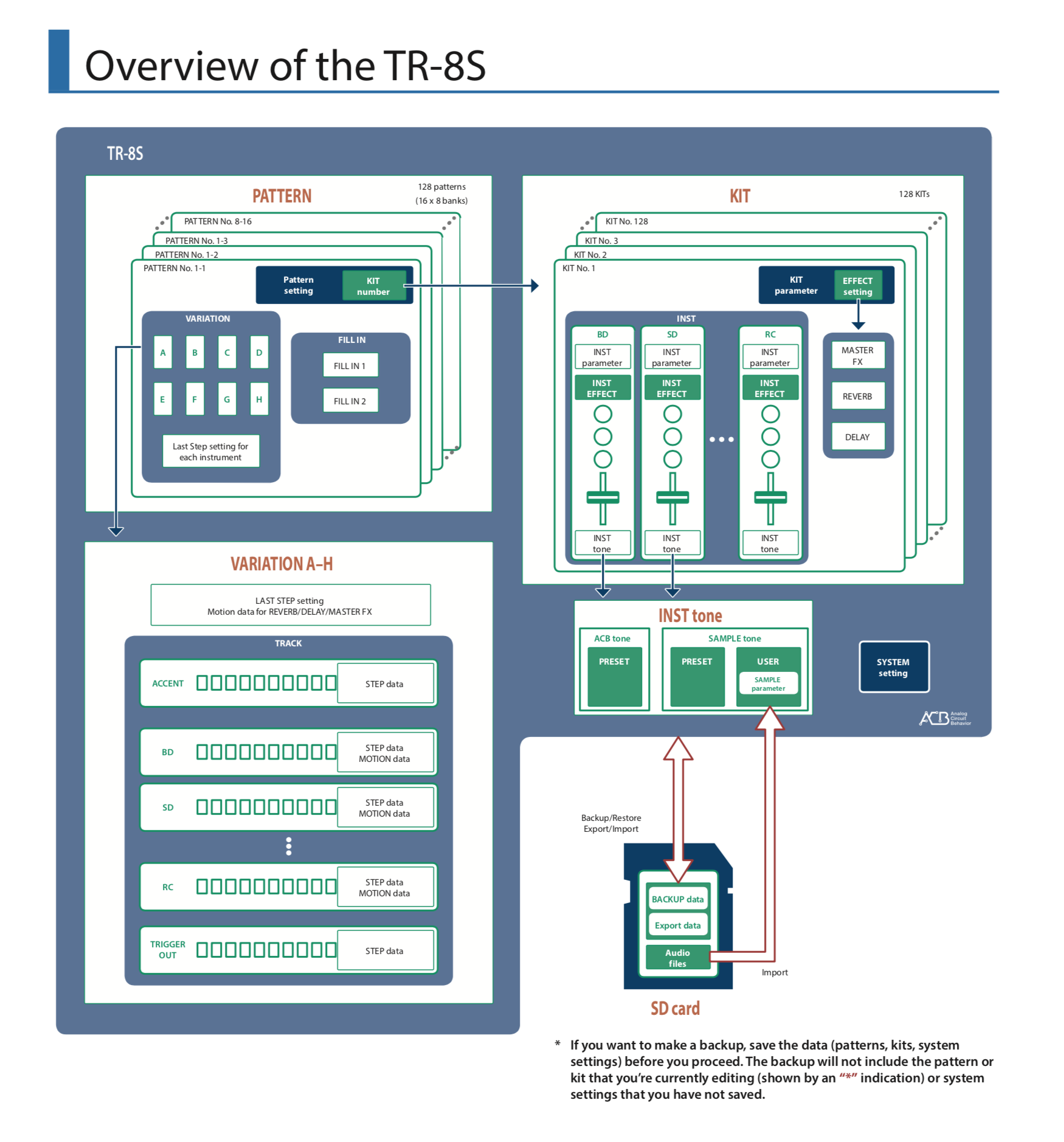
The opening page of one of my manuals
- Users have vastly different experience levels, some are just starting out, others are pros
- A manual serves different purposes ranging from a getting started tutorial, to a reference lookup for obscure featrues
- Sequential pages of A4 is a poor media platform to navigate complex technical content quickly
- Technical language is inherently boring and looks almost the same for descriptions of different features
- Manuals are written by people who understand the product in and out, they have reached a point where it is impossible for them to understand what issues a novice user might have when first encountering the product.
- Logical grouping of features usually do not correspond to the way people learn things. Some features in a certain category are more important (at first) than others.
Manufacturers try. Quick start guides, how-to videos, etc. etc. But still they are not pushing it far enough I think. They should take the perspective of an introduction course that someone would give in person. Forget about the logical structure of the device menus. Forget about the logical groupings of the content. Just record how you would go about creating something from start to finish and touching on all the device's essentials on the way. Basically, a presentation.
In the case of this drum machine, you could recreate the drum track of a well-known pop song, starting from the moment you switch on the device for the first time, all the way down to recording the full track.
Image via WikiPedia