Phone laptop convergence - 2019

Phone laptop convergence - 2019

Another blog post by an experienced technology user predicting the future where tablets and other mobile devices will take over from laptops. I disagree.

I think there are vastly different user segments in technology. Fred is a senior executive who is at the receiving end of a huge inflow of pitch decks, is probably on the road a lot, and has dozens of deal negotiations running in parallel most of which go via email. Tablets work great here.

Bloggers/journalists who can work all day from a coffee shop are probably best equipped with a tiny laptop or tablet with keyboard. Management consultants posted at a client out of town need a heavy duty work horse laptop with the biggest screen possible. Traveling salesmen need a device with lots of storage and good connectors to projectors. Developers need a high powered laptop with a big screen.

And… designers and analysts, they actually need a desktop… Having a calm creative space to create a new presentation. A big canvas to map out a new spreadsheet model. Being able to pull data from multiple sources you have open on your screen.

My own setup is a laptop, but it is hooked up to a big monitor. The laptop is just an insurance for the odd trip out of the office where I still need to access my data and/or make emergency edits / solve an issue for a template store customer.

You can see when people are working in the wrong device. The analyst making mistakes in the company valuation as she insists on working on that latest super thin/light laptop. The spelling mistakes in important emails written hastily on a mobile phone.

All these user segments have always been there, the available computers just did not match them. Now that the devices are proliferating people begin to discover their favourites.

Photo by Marvin Meyer on Unsplash

SlideMagic: a platform for magical presentations. Free student plan available. LEARN MORE
The emperor has no clothes

The emperor has no clothes

I am diving into the joys of user interface design and start to understand some of the anecdotes of Steve Jobs giving feedback to his design teams. That box that is just slightly, slightly off by a few pixels, or that slide that refuses to scale up to the exact size of the screen. You can spend days on getting the most trivial things right.

I am also looking around at a lot of user interfaces that were developed recently, and must say that, yes, things look prettier than in the 1990s, but are they easier? I am afraid not. Clunky fingers are not the best instruments to create business documents. Small screens are not the optimal canvas to be creative. Nobody remembers what a 3 finger touch press does, minimal interfaces look really cool but are useless if you can’t find what you need to find, it is weird to see how hard it can be to figure out how to create a new document, save it somewhere, find it again, and send it to a colleague. And most desktop software with mouse interfaces groups features by similarity, not by how often and when you use them.

In PowerPoint, I am using 25 years of experience and a custom toolbar at the top of the screen to bypass 90% of the regular user interface. And yes, my own web app has a few hick ups as well. I am working hard to fix things.

Photo by Ian Parker on Unsplash

SlideMagic: a platform for magical presentations. Free student plan available. LEARN MORE
Seed funding "slump": pitch deck implications

Seed funding "slump": pitch deck implications

Every founder should read this post by Mark Suster about the decline in seed funding:

  • It has become a lot cheaper to start a company

    • Less $$$ needed

    • VC can wait on the sideline a bit longer to monitor progress

  • VCs have gotten bigger because of institutional investors seeking alternatives to traditional asset classes, are lured by those big exits and IPOs

    • VC don’t have the people/patience to monitor a scattered portfolio of dozens of small bets

    • The small bet roulette economics don’t really stack up

Here is the deck:

So what does this mean for a seed founder:

Think whether you actually need the big VC check at the moment or can self-fund a bit longer. This will give you a bigger stake in your own company in the end, plus frees up a lot of time to focus on your product

Seed pitch decks with rosy stories that are just PowerPoint and no product and/or people are probably going to put in the “let’s monitor” box. A big bold vision is nice, but your deck should equally focus on the tangible progress you made with the product, and the credentials of the team.

This opens up an opportunity for a savvy angel investor though. Someone who really, really understands a specific market (better than VCs), and/or someone who has first hand experience of the talents/skills of an entrepreneur who might not “look good on paper” to VCs.

SlideMagic: a platform for magical presentations. Free student plan available. LEARN MORE
Every chart starts with a count

Every chart starts with a count

Most slide layouts for me start with counting:

  • There are 3 objectives to the strategy

  • There are 2 options with 3 evaluation criteria

  • The architecture consists of 4 layers

  • We are pulled in 2 different directions

  • The market can be segmented alongside 2 axes

  • The process has 3 steps

  • There are 2 reinforcing loops

That first observation pretty much decides the composition of the chart, which you can design without the actual content. Putting in content first, and then worrying about layout is the wrong order to do things.

Photo by Crissy Jarvis on Unsplash

SlideMagic: a platform for magical presentations. Free student plan available. LEARN MORE
Blogging in 2019

Blogging in 2019

I have been writing posts on almost every work day since 2008, and now and then I look back (like other bloggers do) and ahead. It has been instrumental in my career as a designer, without my blog, there would have been no way I could have sustained a presentation design business in Tel Aviv serving clients all over the globe.

The world of blogging has changed. When I started out, I was up against SEO-keyword stuffed marketing fluff, later the social media experts stuffing their feeds with links to stories.

I did basically my own thing, not worrying about any of this, and just creating a trail of stories that were mostly based on client work I did everyday. As a result, things will change a bit into the future, as my design work has now stopped and I am focusing fulltime on coding the 2nd version of my app.

Let’s see where it brings us.

Photo by Patrick Tomasso on Unsplash

SlideMagic: a platform for magical presentations. Free student plan available. LEARN MORE
Pay attention to PowerPoint theme color names

Pay attention to PowerPoint theme color names

Most people who customise a PowerPoint theme color template simply plop in new colors in the boxes without paying much attention to what they are called. It is worth doing that though to save time. When you copy a presentation with another color scheme into yours, PowerPoint will color the new presentation with specific rules. For example, text is set in “Text/Background - Dark 1”. If you colored that box with your logo accent color, you are going to spend a lot of time converting the pink text back to black every time you receive a deck from a colleague with a different template.

Screenshot 2019-02-11 07.57.00.png

Photo by Bruno Martins on Unsplash

SlideMagic: a platform for magical presentations. Free student plan available. LEARN MORE
Common make over fixes

Common make over fixes

I offered to do a quick slide polish on a deck of a long-standing client who gave the SlideMagic template store a go for a business plan. My objective was to learn how the slide templates are used “in the wild”. The results were encouraging, here are a few examples where I had to step in:

  • Set the exact accent color that matches the company logo

  • Put the occasional rogue bullet chart into a proper 3, 4, 5, or 6 box slide template

  • Move slide content a bit so they fit exactly in the same frame on each page

  • Reduce font sizes a bit here and there to give text a bit more space to breathe in busy tables

These were slides in a business plan, not a TED talk, and exactly the sort of every day presentation they were intended for.

Photo by rawpixel on Unsplash

SlideMagic: a platform for magical presentations. Free student plan available. LEARN MORE
2 presenters: difficult

2 presenters: difficult

You are 2 co-founders, or have both worked on a big project, and/or could not really decide who gets to shine in front of the audience and want to give a shared presentation. You can either split up the deck and go one after the other, or, try doing it as a true duo: presentation the slides together.

The latter option is tricky:

  • You very little room for improvisation or the hand over to the second speaker will go wrong

  • The audience needs to lock into 2 different presentation styles

  • It requires careful scripting…

  • …and a lot, lot, of rehearsing

As a result, most duo presentations feel a bit unnatural. Make a video of your rehearsals before making the final decision to do it

Photo by elen aivali on Unsplash.

SlideMagic: a platform for magical presentations. Free student plan available. LEARN MORE
Make over: managing complex change

Make over: managing complex change

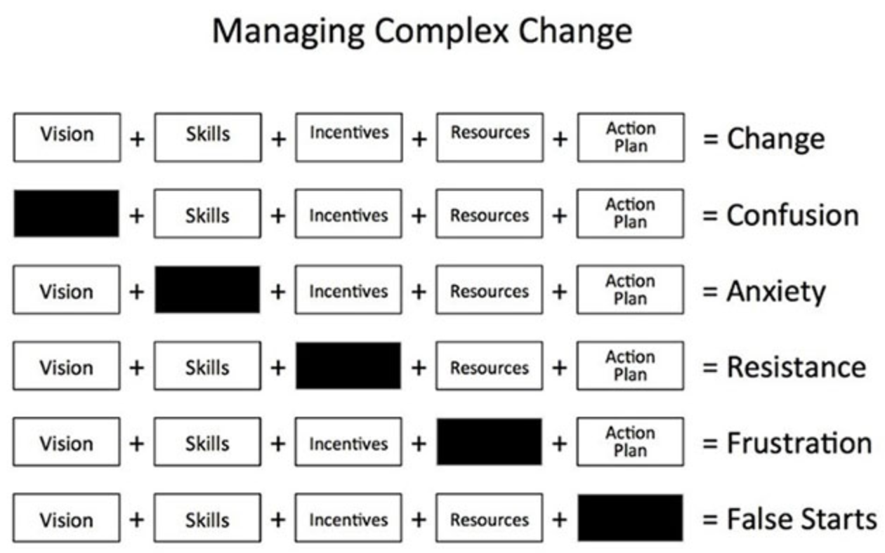
This diagram originally created by Mary Lippitt of Enterprise Management is floating around the internet in varies shapes of forms:

Managing complex change

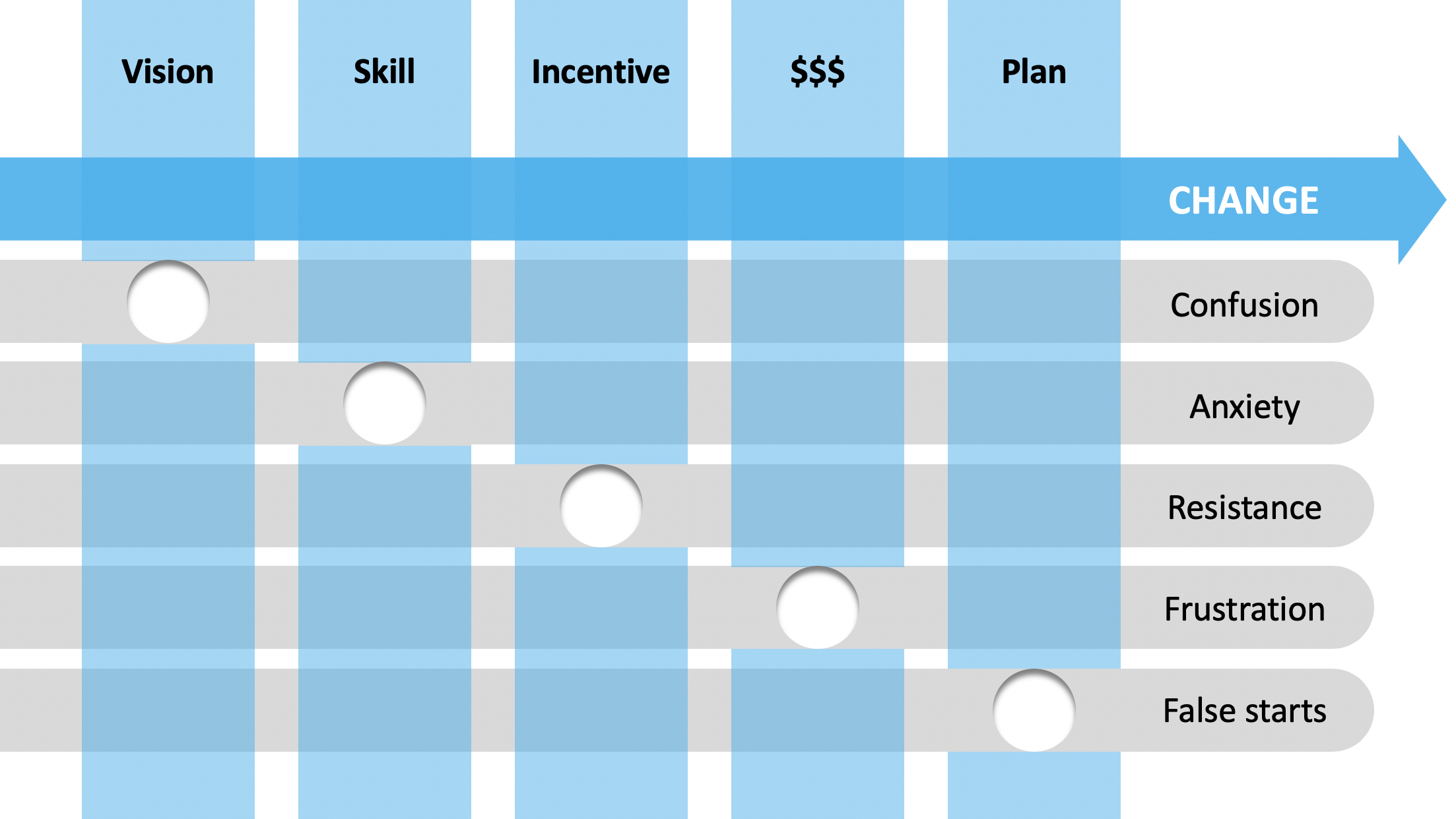
I attempted to give it a makeover by trying to do the following:

  • Cut the word repetition to reduce clutter

  • Simplify the labels a bit

  • Add some color

  • Add movement (the arrow) to show that other options are a dead end road

I have uploaded this chart to the SlideMagic template store, subscribers can download it free of charge.

SlideMagic: a platform for magical presentations. Free student plan available. LEARN MORE
White elephants

White elephants

A VC friend got sent a pitch the other day that sounded like an exact copy of a company that underwent a spectacular and well-known crash a few months ago. The pitch completely ignored this white elephant and followed the standard presentation structure.

It is unlikely that this copy was indeed an exact replica of the famous failure, and it is unlikely that the pitching entrepreneur would think that seasoned investors did not know about that crash.

So in your pitch, you might as well take it straight on. The highly publicised failure did already part of the work for you, that, if you get this company to work, the market expectations are pretty big. Now on to the more difficult part, why that one failed and this one won’t.

Photo by Lili Koslowksi on Unsplash

SlideMagic: a platform for magical presentations. Free student plan available. LEARN MORE
Most good presentations are repeats

Most good presentations are repeats

It is extremely hard to put a presentation together from scratch on a completely new subject and make it interesting. Come to think of it, most (maybe even every) good presentation you see, hear, read is a repeat: it has been given hundreds of time before.

Not necessarily with these slides, or in this format though. The startup founder starts building the story of his company the moment he puts the first line of code down. The CEO of that Fortune 500 giant has been selling cars since she joined the company 25 years ago, now she is selling the whole company to investors. The job applicant is pressing play on the story he kept on telling himself when he left his job to study an MBA 2 years ago.

Repeating makes you get better at the telling the story, learning from the verbal and non-verbal reaction of anyone you told it to. A good story is hardly ever born overnight.

Photo by Namroud Gorguis on Unsplash

SlideMagic: a platform for magical presentations. Free student plan available. LEARN MORE
Staying focussed (2)

Staying focussed (2)

No post today as I am out with a small fever. It is interesting to see that in my previous, non-freelance jobs, you could simply plough on as a kind of endurance test with tasks that require less focus when you are a bit sick. Writing code or coming up with a new design concept for a presentation: forget it when your mind is not 100% there.

Photo by Masaaki Komori on Unsplash

SlideMagic: a platform for magical presentations. Free student plan available. LEARN MORE
"The opposite..."

"The opposite..."

Many writers use this type of wordplay, for example Seth Godin in a recent post:

Just because it’s easy to measure doesn’t mean we should (and the opposite is even more true).

It can be a nice word play, but maybe it is me, I find it hard to understand. I actually need to reconstruct the opposite sentence, “read it to myself", and then go back to the original one.

When you use it, use it as a last sentence somewhere (like Seth did), to give the audience a little brain teaser.

Photo by Andrew Shiau on Unsplash

SlideMagic: a platform for magical presentations. Free student plan available. LEARN MORE
Staying focused

Staying focused

In my work as a designer, and now as a founder-coder, I have the luxury that most people working miss: hours of meeting-free, uninterrupted time to get things done. I think anyone who managed to build a career in this working model has proven to be able to stay focussed and disciplined, when there is no boss around who can remind you that watching Netflix episodes during work hours is not what you are supposed to do.

Still, my work is not an endurance test to resist temptations. I tend to group my work into different types and switch between them when I am stuck, bored, tired, energetic, full of inspiration, suffering from the downstairs neighbour who is drilling in the ceiling.:

  • Cracking a complicated problem (fundamental code architecture, the visual approach to a new presentation)

  • Just making something look pretty (user interface, that competitor slide)

  • Googling for solutions for that nasty, but actually unimportant, bug

  • Doing accounting

  • Writing a week full of blog posts in one go

In my time as a consultant when I was working with lots of people, I could not really set my own working schedule. Now that that noise has disappeared you start noticing there are huge differences when you do certain things during the day, and in what mood.

Photo by Raj Eiamworakul on Unsplash

SlideMagic: a platform for magical presentations. Free student plan available. LEARN MORE
Can you pull it off?

Can you pull it off?

That is a key question every investor is pondering while you click through the slides of your investor deck. But it might also go through the mind of a CEO of a big corporation who listens to the final results of a consulting project that talks about let’s say a major reorganisation.

There is often infinite amount of logic and data about how people should be grouped together, and when the the coin can fall right or left, it is probably the gut feel about you as a person that leads to the decision.

Photo by rawpixel on Unsplash

SlideMagic: a platform for magical presentations. Free student plan available. LEARN MORE
Visual mathematical proofs

Visual mathematical proofs

Like coding, mathematical language needs to be precise and as a result looks super scary to the outsider, turning of many people that might have had an interest in exploring more. Here is a great picture that should be an inspiration for the rewriting of mathematics education:

Photo by Antoine Dautry on Unsplash

SlideMagic: a platform for magical presentations. Free student plan available. LEARN MORE
Subscriptions update

Subscriptions update

I started the subscription slide template store almost a year ago, and the first subscribers will soon receive an email alerting them about the upcoming subscription renewal. I must admit that over the past few months I have not added as many new designs to the store as I had planned to, since I am investing a lot of time in developing the next generation of the SlideMagic app.

I have lots of ideas for new slides, but the underlying platform makes it very cumbersome to maintain everything, especially in multiple slide formats and aspect ratios. The Shopify platform I am using is built for selling t-shirts in different sizes, and is less suited for digital downloads.

A 1 year unlimited download is still a tremendous deal with the current library, but I understand if people decide not to roll over the subscription into a second year. The site should give you the tools to stop the subscription, if you need help please reach out. Obviously, you are invited to continue to support me as I am trying to change the world of presentation design.

The new app will include a better solution for accessing templates, now that my coding skills are reaching a point where I am less dependent on out-of-the-box platforms. Eventually we will get there.

Photo by freestocks.org on Unsplash

SlideMagic: a platform for magical presentations. Free student plan available. LEARN MORE
Split infinitives?

Split infinitives?

Back in the 1990s, as an “alien” Dutch person working in London, I got constantly corrected for my habit of splitting infinitives. Doing some more research now, I found that it basically does not matter what you do. They should have told me earlier…

There is one thing to think about though. There are still many people around who have not read this blog post and/or done the research. If you need to write something to someone you need to impress and don’t know very well (a job application for example), maybe splitting infinitives deliberately is not the best idea.

Photo by Drew Beamer on Unsplash

SlideMagic: a platform for magical presentations. Free student plan available. LEARN MORE
Learning from UI designers

Learning from UI designers

After diving into JavaScript, Electron, and Node.js to refresh my coding skills, it is now time to get into front end design. I never followed developments in this area very much and now discover the similarities between slide design and interface design. This article by Steve Schoger has recommendations that apply to presentation design as well:

  • Lots of grey shades

  • Only one real primary color, but use it with restraint

  • Super contrasting accent colours to highlight things

  • No lines around boxes

  • Make sure your color saturation palette looks good, and use it consistently

Photo by Harpal Singh on Unsplash

SlideMagic: a platform for magical presentations. Free student plan available. LEARN MORE
The dark background effect

The dark background effect

Dark or light background, it is a choice, and both can lead to overcrowded, ugly slides full of bullet points. For some reason, people do a better job when working on a dark slide background. Possible reasons?

  • The dark slide is a clear break from the colour format of most project working documents., there is less temptation to just copy/paste that spreadsheet and call it a slide?

  • The minimalist dark Apple product launch presentation is just etched in our brain and serves as an example?

  • Dense bullet points are actually harder to read on a dark background than a light one?

Who knows, but if it works, it works…

Photo by Good Free Photos on Unsplash

SlideMagic: a platform for magical presentations. Free student plan available. LEARN MORE