Simple - complicated - simple again (but different)

Simple - complicated - simple again (but different)

Coding a program, building a spreadsheet, and designing a presentation follows a similar pattern for me:

Coding: quickly put together something to see whether it works, then clean up to make the script more efficient, and the code better to understand (especially if I have to get back to it in a few months)

Spreadsheet: create the required calculations quickly, then optimise so that it becomes easy to generate multiple scenarios, multiple business units, and most importantly, I can regroup and slice the economic drivers of a company (per unit, per client, % of sales, fixed, per product, etc. etc.) so you get a great understanding of how the profit “engine” actually works.

Presentations: especially for complicated tradeoffs, my “pros and cons” diagrams go through many iterations of regrouping, consolidating, separating, re-ordering rows and columns until a very clear picture of the message emerges. Also flow diagrams can benefit a lot from repeated iterations until you get one that is clearly laid out with minimal crossing of lines.

We start from simple, the (over)complicate, in order to end up with something simple again, but that final simple version looks very different from the one you started out with.

Photo by chuttersnap on Unsplash

SlideMagic: a platform for magical presentations. Free student plan available. LEARN MORE
Designing for speed readers

Designing for speed readers

Most books, blogs, and courses about presentations aim at a setting where you present for a big audience. The role of the sides is the support the presenter, who is the central element of the full theatrical performance.

The majority of decks as I see them coming across my desk are meant to speak for themselves, as an attachment to an email for example. “Send me the deck”, says the investor after a 2 minute talk at a conference. Your audience here: impatient speed readers.

Think about yourself browsing a newspaper, or a piece of research. What do you pay attention to, what do you ignore? Some points to consider:

  • Like on the big keynote screen, a page full of dense text and bullet points will get skipped over

  • But, super short, summary statements will not be understood without context, since you are not there to explain them.

  • Anything that sounds like what everyone else is writing, full of cliches, will get skipped over.

  • Real photos attract the attention, people on the team, the prototype, the office, even small text surrounding it (you often read the small print under an image in a newspaper)

  • Arguments, comparisons, pros and cons, need to be made very visible in clear tables or graphs, remember how in car or consumer electronics reviews to skip right to the end to the red and green check marks.

  • Personal stories that sound interesting on stage, might look clumsy when written down in a deck.

  • Watch out for inconsistencies, errors, in financial data and/or market sizes, someone reading at a screen has more time to go back and forth than someone sitting in an auditorium. Errors cost you credibility.

  • Consider putting links in your deck so people can instantly go to LinkedIn profiles of team members, or the source behind market research.

  • The speed reader is a bit less patient to wait for the big punch in your story. Building excitement and anticipation can work great on stage (like a DJ building towards that drop), the speed reader can’t resist and will click through the last page to see how the story ends.

Think about the speedreader, you might have been one yourself while reading this post…

Photo by Isaac Jenks on Unsplash

SlideMagic: a platform for magical presentations. Free student plan available. LEARN MORE
Background videos on web sites

Background videos on web sites

Many company web sites feature some sort of video that plays in the background, covering the entire page. Some things to consider:

  • This is a background, and should not claim all the attention of the visitor. So pick calm videos, not highway car chases. Also, a series of 5 different short videos of lakes in New Zealand that loop every 10 seconds is still distracting.

  • A web site without content, but with a video in the background does not create a professional company presence. Content first.

  • Stock photos with model-turned happy diverse employees are boring, so are videos with the same people featuring in them.

If you have looked a web site (or presentation slide) for a long time as a designer you stop noticing things that a first time visitor will spot. Your brain knows the video loop by heart, filters it out, just to let you focus on that annoying DIV tag that refuses to line up. Force yourself to take that first time visitor perspective and ask yourself whether that video really adds something.

In the very early stages of a company, your website as actually aimed at investors. They want something that looks modest, professional, and with the essentials: a description what it is you are doing (consistent with the confidential pitch deck), a sense that you can communicate professionally and convincingly to future clients and investors, links to team bios, and hygiene factors such as a street address, proper domain name, etc. that shows that you are serious about your venture. Wild animations and spectacular videos do not always support this point.

Photo by ShareGrid on Unsplash

SlideMagic: a platform for magical presentations. Free student plan available. LEARN MORE
What sort of audience?

What sort of audience?

Before putting your pitch deck together in it is good to think about where your audience stands. Investors can have varying backgrounds and knowledge about a certain market. Also the stage in her due diligence process will make a difference.

  • Is she even aware of this market? “What, x million people in the world buy product y?

  • Does she understand that you are addressing a problem? “What, all this is still done manually in 2019?”

  • Is she overlooking a possible solution? “Hey, I did not know that you could apply technology x to do y!”

  • She has seen hundreds of your type of startups and wants to dive straight into the traction numbers to see how you stack up.

  • She gets the opportunity, but is wondering about the quality of the team (including you)

Different audience, different priorities in the deck

Photo by Hello I'm Nik on Unsplash

SlideMagic: a platform for magical presentations. Free student plan available. LEARN MORE
Design myths

Design myths

This is a useful list of design myths. Here are a few relevant for presentation design (I adjusted the wording a bit here and there):

  • Myth #34: Simple = minimal

  • Myth #28: White space is wasted space

  • Myth #19: You don't need the presentation content to design a presentation template

  • Myth #14: You are like your audience

  • Myth #13: Icons enhance slide clarity

  • Myth #10: If your design is good, small details don't matter

  • Myth #8: Stock photos improve the audience's understanding

  • Myth #7: Graphics will make a slide element more visible

SlideMagic: a platform for magical presentations. Free student plan available. LEARN MORE
"It started as a joke"

"It started as a joke"

The song “Bohemian Rhapsody” by Queen started as “joke” and trying to see how far people could push things with overdubs (180 in total, made on 24 channel mixers) and bringing opera influences into rock. A quote from Wikipedia:

“Baker recalled in 1999, "'Bohemian Rhapsody' was totally insane, but we enjoyed every minute of it. It was basically a joke, but a successful joke. [Laughs]. We had to record it in three separate units. We did the whole beginning bit, then the whole middle bit and then the whole end. It was complete madness. The middle part started off being just a couple of seconds, but Freddie kept coming in with more "Galileos" and we kept on adding to the opera section, and it just got bigger and bigger. We never stopped laughing.”

Some of the best presentations I designed for clients started like this. “Let’s try something completely different”. Often, these cases involved a relatively low-risk keynote for an internal audience. But many times these decks developed into serious presentations for outsiders.

Photo by Johnny McClung on Unsplash

SlideMagic: a platform for magical presentations. Free student plan available. LEARN MORE
Development update

Development update

Here is where things stand with the development of SlideMagic 2.0. I am making good progress with a new presentation design app that follows the same (patented) design approach as the current web app but a lot of the small inconveniences ironed out:

  • A native app that runs both on Windows and Mac and saves and loads files to a local hard drive, allows you to work offline, and deliver much snappier editing response times

  • Built-in, instant export to PowerPoint

  • Instant conversion between 4:3 and 16:9, back and forth

  • A more integrated user interface enabling the editing of grids, shapes, and text from one screen

The prototype is coming along nicely, but still a lot of effort is required to iron out the small glitches before I can let the genie out of the bottle…

Photo by Jorge Zapata on Unsplash

SlideMagic: a platform for magical presentations. Free student plan available. LEARN MORE
Lesson learned from learning

Lesson learned from learning

Here are some lessons learned along the way from my journey into coding:

Learning to code is not something you do on the side, this requires 100% of your attention

You can’t learn coding from reading or watching videos, you actually have to do it, understanding things passively is totally different from getting a machine to do what you want, which involves getting many small details right

You can get lost for days in endless searches to figure something out, and then all of a sudden everything falls into place over the course of 30 minutes

In the beginning, your code is fragile and you are hesitant to touch anything once it is working (but you don’t truly understand how), over time you get mor courage to perform drastic surgery as you are confident you can restore things to the way they were

Throughout the process your program UI needs to look “nice”, at least for me, staring at a horrible temporary user interface is not motivating. (I have the same with designing slide decks, I can’t stand ugly charts, even if they are drafts)

Coding an app involves a lot of challenges, if it starts to overwhelm you, pick one and completely nail it, even in a separate test app if necessary

I think it is OK to become lazy and “forget” how exact syntaxes work, there is always Google to fix that/remind you, as long as you understand the broader concepts

Google is a jungle: it has all the answers, but also many answers that are wrong, or highly dated, in which case the right answer might be lurking all the way down at the bottom of a page, written down by someone who does not really master English

The amount of computing power today is liberating compared to the 1990s, you don’t like how a browser renders a page? Just recalculate and render “by hand” at every mouse move and the user still does not notice.

Most importantly, when coding, everything is possible and can be solved!

Photo by Markus Spiske on Unsplash

SlideMagic: a platform for magical presentations. Free student plan available. LEARN MORE
Pitch advice

Pitch advice

Some useful guidance by Jason Lemkin, a VC. Two items on the list stand out:

The initial decision is made within 20 minutes of the first face-to-face. Make it exciting, speak with data, and get to the point. The initial Yes, Maybe or No decision is made within 20 minutes. So save slides 20–200 for questions and back-up.

Making stuff up is death, or close to it. If you don’t know the answer, just say that, it’s fine. But make something up that the VC knows the answer is otherwise … that’s almost always a No right there.

Photo by Jhonatan Saavedra Perales on Unsplash

SlideMagic: a platform for magical presentations. Free student plan available. LEARN MORE
Presentation hygiene

Presentation hygiene

Most technology investors have a decent understanding of the market context your startup is operating in. So there is no need for that awe-inspiring, eye-opening, TED-talk style introduction presentation that plants an idea in the audience head they never heard of 17 minutes before.

Most VCs I speak to value a deck that makes it clear what the company is doing, how to compare/contrast it to companies and technologies they already know, how for the development is and what the background of the team is.

So, an Apple product launch-style is not needed, but still there are some pitch deck hygiene factors. Your deck should look decent and professional, not only so that the VC understands it, but maybe even more that the VC gets confidence in you as a professional communicator:

  • Can you sell to potential customers?

  • Can you sell ideas to the board?

  • Can you sell to investors in future fund raising rounds?

The strategy “I sent a bare bone deck in standard PowerPoint format because we spend our time building a company instead of presentations” might look cool, but it will leave a lingering question in the investor’s mind.

Photo by Fancycrave on Unsplash

SlideMagic: a platform for magical presentations. Free student plan available. LEARN MORE
Phone laptop convergence - 2019

Phone laptop convergence - 2019

Another blog post by an experienced technology user predicting the future where tablets and other mobile devices will take over from laptops. I disagree.

I think there are vastly different user segments in technology. Fred is a senior executive who is at the receiving end of a huge inflow of pitch decks, is probably on the road a lot, and has dozens of deal negotiations running in parallel most of which go via email. Tablets work great here.

Bloggers/journalists who can work all day from a coffee shop are probably best equipped with a tiny laptop or tablet with keyboard. Management consultants posted at a client out of town need a heavy duty work horse laptop with the biggest screen possible. Traveling salesmen need a device with lots of storage and good connectors to projectors. Developers need a high powered laptop with a big screen.

And… designers and analysts, they actually need a desktop… Having a calm creative space to create a new presentation. A big canvas to map out a new spreadsheet model. Being able to pull data from multiple sources you have open on your screen.

My own setup is a laptop, but it is hooked up to a big monitor. The laptop is just an insurance for the odd trip out of the office where I still need to access my data and/or make emergency edits / solve an issue for a template store customer.

You can see when people are working in the wrong device. The analyst making mistakes in the company valuation as she insists on working on that latest super thin/light laptop. The spelling mistakes in important emails written hastily on a mobile phone.

All these user segments have always been there, the available computers just did not match them. Now that the devices are proliferating people begin to discover their favourites.

Photo by Marvin Meyer on Unsplash

SlideMagic: a platform for magical presentations. Free student plan available. LEARN MORE
The emperor has no clothes

The emperor has no clothes

I am diving into the joys of user interface design and start to understand some of the anecdotes of Steve Jobs giving feedback to his design teams. That box that is just slightly, slightly off by a few pixels, or that slide that refuses to scale up to the exact size of the screen. You can spend days on getting the most trivial things right.

I am also looking around at a lot of user interfaces that were developed recently, and must say that, yes, things look prettier than in the 1990s, but are they easier? I am afraid not. Clunky fingers are not the best instruments to create business documents. Small screens are not the optimal canvas to be creative. Nobody remembers what a 3 finger touch press does, minimal interfaces look really cool but are useless if you can’t find what you need to find, it is weird to see how hard it can be to figure out how to create a new document, save it somewhere, find it again, and send it to a colleague. And most desktop software with mouse interfaces groups features by similarity, not by how often and when you use them.

In PowerPoint, I am using 25 years of experience and a custom toolbar at the top of the screen to bypass 90% of the regular user interface. And yes, my own web app has a few hick ups as well. I am working hard to fix things.

Photo by Ian Parker on Unsplash

SlideMagic: a platform for magical presentations. Free student plan available. LEARN MORE
Seed funding "slump": pitch deck implications

Seed funding "slump": pitch deck implications

Every founder should read this post by Mark Suster about the decline in seed funding:

  • It has become a lot cheaper to start a company

    • Less $$$ needed

    • VC can wait on the sideline a bit longer to monitor progress

  • VCs have gotten bigger because of institutional investors seeking alternatives to traditional asset classes, are lured by those big exits and IPOs

    • VC don’t have the people/patience to monitor a scattered portfolio of dozens of small bets

    • The small bet roulette economics don’t really stack up

Here is the deck:

So what does this mean for a seed founder:

Think whether you actually need the big VC check at the moment or can self-fund a bit longer. This will give you a bigger stake in your own company in the end, plus frees up a lot of time to focus on your product

Seed pitch decks with rosy stories that are just PowerPoint and no product and/or people are probably going to put in the “let’s monitor” box. A big bold vision is nice, but your deck should equally focus on the tangible progress you made with the product, and the credentials of the team.

This opens up an opportunity for a savvy angel investor though. Someone who really, really understands a specific market (better than VCs), and/or someone who has first hand experience of the talents/skills of an entrepreneur who might not “look good on paper” to VCs.

SlideMagic: a platform for magical presentations. Free student plan available. LEARN MORE
Every chart starts with a count

Every chart starts with a count

Most slide layouts for me start with counting:

  • There are 3 objectives to the strategy

  • There are 2 options with 3 evaluation criteria

  • The architecture consists of 4 layers

  • We are pulled in 2 different directions

  • The market can be segmented alongside 2 axes

  • The process has 3 steps

  • There are 2 reinforcing loops

That first observation pretty much decides the composition of the chart, which you can design without the actual content. Putting in content first, and then worrying about layout is the wrong order to do things.

Photo by Crissy Jarvis on Unsplash

SlideMagic: a platform for magical presentations. Free student plan available. LEARN MORE
Blogging in 2019

Blogging in 2019

I have been writing posts on almost every work day since 2008, and now and then I look back (like other bloggers do) and ahead. It has been instrumental in my career as a designer, without my blog, there would have been no way I could have sustained a presentation design business in Tel Aviv serving clients all over the globe.

The world of blogging has changed. When I started out, I was up against SEO-keyword stuffed marketing fluff, later the social media experts stuffing their feeds with links to stories.

I did basically my own thing, not worrying about any of this, and just creating a trail of stories that were mostly based on client work I did everyday. As a result, things will change a bit into the future, as my design work has now stopped and I am focusing fulltime on coding the 2nd version of my app.

Let’s see where it brings us.

Photo by Patrick Tomasso on Unsplash

SlideMagic: a platform for magical presentations. Free student plan available. LEARN MORE
Pay attention to PowerPoint theme color names

Pay attention to PowerPoint theme color names

Most people who customise a PowerPoint theme color template simply plop in new colors in the boxes without paying much attention to what they are called. It is worth doing that though to save time. When you copy a presentation with another color scheme into yours, PowerPoint will color the new presentation with specific rules. For example, text is set in “Text/Background - Dark 1”. If you colored that box with your logo accent color, you are going to spend a lot of time converting the pink text back to black every time you receive a deck from a colleague with a different template.

Screenshot 2019-02-11 07.57.00.png

Photo by Bruno Martins on Unsplash

SlideMagic: a platform for magical presentations. Free student plan available. LEARN MORE
Common make over fixes

Common make over fixes

I offered to do a quick slide polish on a deck of a long-standing client who gave the SlideMagic template store a go for a business plan. My objective was to learn how the slide templates are used “in the wild”. The results were encouraging, here are a few examples where I had to step in:

  • Set the exact accent color that matches the company logo

  • Put the occasional rogue bullet chart into a proper 3, 4, 5, or 6 box slide template

  • Move slide content a bit so they fit exactly in the same frame on each page

  • Reduce font sizes a bit here and there to give text a bit more space to breathe in busy tables

These were slides in a business plan, not a TED talk, and exactly the sort of every day presentation they were intended for.

Photo by rawpixel on Unsplash

SlideMagic: a platform for magical presentations. Free student plan available. LEARN MORE
2 presenters: difficult

2 presenters: difficult

You are 2 co-founders, or have both worked on a big project, and/or could not really decide who gets to shine in front of the audience and want to give a shared presentation. You can either split up the deck and go one after the other, or, try doing it as a true duo: presentation the slides together.

The latter option is tricky:

  • You very little room for improvisation or the hand over to the second speaker will go wrong

  • The audience needs to lock into 2 different presentation styles

  • It requires careful scripting…

  • …and a lot, lot, of rehearsing

As a result, most duo presentations feel a bit unnatural. Make a video of your rehearsals before making the final decision to do it

Photo by elen aivali on Unsplash.

SlideMagic: a platform for magical presentations. Free student plan available. LEARN MORE
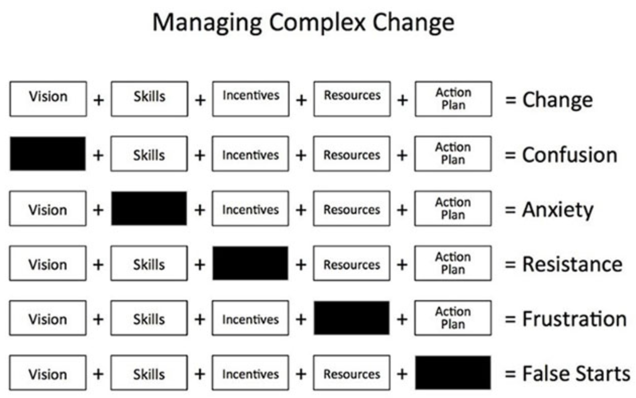
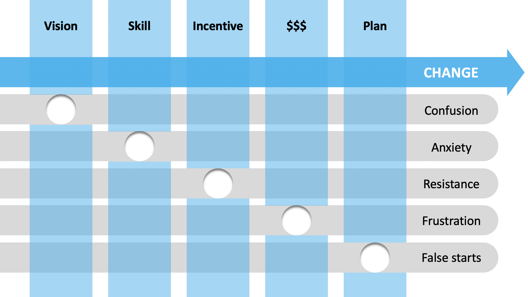
Make over: managing complex change

Make over: managing complex change

This diagram originally created by Mary Lippitt of Enterprise Management is floating around the internet in varies shapes of forms:

Managing complex change

I attempted to give it a makeover by trying to do the following:

  • Cut the word repetition to reduce clutter

  • Simplify the labels a bit

  • Add some color

  • Add movement (the arrow) to show that other options are a dead end road

I have uploaded this chart to the SlideMagic template store, subscribers can download it free of charge.

SlideMagic: a platform for magical presentations. Free student plan available. LEARN MORE
White elephants

White elephants

A VC friend got sent a pitch the other day that sounded like an exact copy of a company that underwent a spectacular and well-known crash a few months ago. The pitch completely ignored this white elephant and followed the standard presentation structure.

It is unlikely that this copy was indeed an exact replica of the famous failure, and it is unlikely that the pitching entrepreneur would think that seasoned investors did not know about that crash.

So in your pitch, you might as well take it straight on. The highly publicised failure did already part of the work for you, that, if you get this company to work, the market expectations are pretty big. Now on to the more difficult part, why that one failed and this one won’t.

Photo by Lili Koslowksi on Unsplash

SlideMagic: a platform for magical presentations. Free student plan available. LEARN MORE