Everyone or no one

Everyone or no one

If everyone is on a Zoom connection, the meeting works, we have gotten used how to deal with the new setup. If a few people are present in person, and a some others are “Zooming in”, the meetings dynamics are broken.

When planning meetings for next year, think about the time, money, and the environment wasted in travel, and prioritize which meetings really have to be in person, and which ones can be done remote. If you go for in-person, everyone has to show up though. Another reason to think twice about that option

Photo by Marvin Meyer on Unsplash

SlideMagic: a platform for magical presentations. Free student plan available. LEARN MORE
Dreading the start

Dreading the start

You have that big presentation coming up and you cannot get yourself to get started on it. Too many distractions, and too few ideas what to actually do.

Some ideas:

  • Open a little (paper or digital) scratch pad somewhere and start jotting down ideas weeks before your presentation. Presentation design and storytelling are creative processes that need some brain incubation time. Your subconscious mind will chew on ideas you started without you realizing it. It is possible to crank out slides the night before the presentation, it is not possible to crank out creative ideas under last minute time pressure. Start early, even with scribbles and notes

  • If you have a bit of time, postpone looking at existing decks and start fresh. Maybe the thought of having to iterate that same old boring, stale presentation is preventing you from getting into it.

  • The other extreme: make one really great “killer” slide for which you have a clear idea and push it all the way to the finished product. Ignore story flow and its overall context, just make it. This ice breaker or sneak peek of what slides in your deck could look like might get you over that initial writers block and get motivated to get started.

SlideMagic: a platform for magical presentations. Free student plan available. LEARN MORE
Making a sentence a bit longer than needed

Making a sentence a bit longer than needed

I just caught myself adding a few words to a sentence that added no meaning whatsoever to the slide, but the layout of the whole page just looked so much better… Usually, it’s the other way around.

Photo by Sharon McCutcheon on Unsplash

SlideMagic: a platform for magical presentations. Free student plan available. LEARN MORE
Why do the Bidens look so huge in this picture?

Why do the Bidens look so huge in this picture?

Something does not seem right in this photo:

The Bidens look gigantic compared to the Carters. What happened? The photographer used a wide angle lens to fit everyone in the frame, but was standing very close to the subjects. The result: distortion. Look at Jimmy Carter’s shoes, they seem at the scale scale as Jill Biden.

This is the opposite effect of the “Corona crop” where taking a picture of people with a zoom lens, and then cropping a small shot, suggests a very dense crowd when people are not that close to each other.

If you are not an honest journalist but rather need a picture of a dense crowd for your presentation, you can use the “Corona crop” effect to your advantage, the resulting image might not reflect the truth, but it does not look weird. The “Carter crop” on the other hand, will always look distorted and unnatural.

SlideMagic: a platform for magical presentations. Free student plan available. LEARN MORE
Your own style

Your own style

Musicians learn other people’s music, and then use it to create their own style. Architects, painters, writers, chefs, follow a similar trajectory. But even if you are not Beethoven, you have probably acquired skills this way. Carpenters, teachers, mechanics.

When it comes to presentations, use this process as well. Develop a (very small) set of slide layouts that you know how to use well. It becomes a visual vocabulary that you can use to express pretty much anything.

This is why people that spend some time at a management consulting firm can churn out all these slides without effort. This is why simply copying a slide template out of the blue and trying to fit it to your situation rarely gives good results.

SlideMagic has done the hard work for you. You get a consistent style that you can adopt as your presentation style, and each slide is simply a small tweak of a language you have learned to understand.

SlideMagic: a platform for magical presentations. Free student plan available. LEARN MORE
Aide memoire

Aide memoire

The highschool teacher of my daughter handed out small cards to the class. Every student was allowed to fill it with whatever they feel like and take it to the upcoming test, or… sell it to the teacher for 3 points extra. The teacher’s sneaky strategy: making that card is actually 80% of the work of mastering the material for the test.

This is a bit like holding a small piece of paper in your hand during the wedding speech, or peaking at the speaker notes when doing a stand up presentation. In the world of Zoom, it can even be more blunt: lots of cheat sheets around your screen that nobody can see.

There are 2 ways to approach these cheat sheets:

  1. Write down the actual content that you want to remember, literally.

  2. Fill it with little hints that make you remember things.

The second strategy is more effective, it is easier to remember things, it takes less space (or time to look at your cheat monitor) and you will present things in a more natural way (reading out bullets from your speaker notes is even worse practice than reading them from your slide).

Maybe write “P.O.P.” or “pop” when the three words you need to remember start with a P, an O, and another P. This is similar to the strategy that memory champions use: put things you need to remember in an imaginary 3D space. (Number 42 sits under the pink elephant, next to the grand piano).

The result of this is that the cheat sheet is only relevant for you, other people don’t know the context. As a result, it is not a good strategy to simply copy the piece of paper of the best student in class and think you do not have to put in the hard work to pass the test.

Photo by Kelly Sikkema on Unsplash

SlideMagic: a platform for magical presentations. Free student plan available. LEARN MORE
What is wrong with this picture?

What is wrong with this picture?

Zoom is introducing some “immersive” backgrounds to group video calls. A nice try, but something does not look completely right in this image:

Screen Shot 2021-04-27 at 8.54.44.png

It is very hard to get 3D photoshops right. If it does not look perfect, I recommend not even giving it a try in your presentation. It is like handing the pen to your 4 year old for one of your 30 slides. Instant loss of professionalism.

Why is it tricky for Zoom? Headshots are taking at different distances from the camera, and the camera position of the room is very high, in an environment with a very strong unnatural 3D distortion.

If I were Zoom, I would keep it simpler, with an artificial rendering of headshots, taking out their distracting backgrounds of bookshelves, kitchens and children’s toys, and paying careful attention to the relative size of the heads, position of the eye line.

SlideMagic: a platform for magical presentations. Free student plan available. LEARN MORE
Order of data series

Order of data series

Here is a (sad) chart from today’s Economist:

The Economist put the data series that carries the main message of the chart at the bottom, pushing up all the other data series. My preferred option is the other way around, put it on top. In that way you can see all other regions staying pretty much stable, while India grows strongly.

(Unrelated). India has a very large population, and you need to look at COVID in that perspective. In terms of caseload, it is still behind other regions (such as Europe). The problem is the quality of the healthcare system, and the availability of basics such as oxygen in emergency rooms. Europe could handle the load (more or less), India is in a far worse position. Also, the India stats are averages for the entire country. On a region-by-region basis, there are likely to be places with much bigger caseloads than Europe. Let’s hope that it gets better.

SlideMagic: a platform for magical presentations. Free student plan available. LEARN MORE
Busy economics slide in SlideMagic

Busy economics slide in SlideMagic

I stumbled on the slide below by @ING_economics.

Screen Shot 2021-04-21 at 15.16.25.png

This is a slide intended for reading, rather than serve as the backdrop for a TED Talk. It can be improved on a number of fronts:

  • Move the aspect ratio to 16 x 9 to make more space for text in the boxes

  • Actually reduce the font size (we are reading anyway), to make the text fit better in the boxes, with more white space, and less irregular sentence wrapping

  • Make the rounded edges less extreme

  • Make the dark colour accents a bit less strong

  • And most importantly, fix those misalignments that make me cringe…

I did a quick re-do in SlideMagic, with is particularly powerful when it comes to text tables. I added the slide to the SlideMagic library, search for “economics” in the desktop and it will show up.

Screen Shot 2021-04-21 at 16.35.58.png

SlideMagic: a platform for magical presentations. Free student plan available. LEARN MORE
Apple event - "auditorium camera position"

Apple event - "auditorium camera position"

Apple is known for setting the standard when it comes to product presentations. It is interesting to see what they produced in yesterday’s event within the constraints of COVID. A pre-recorded, pre-produced long-format “television commercial” without a live audience.

As we know from Zoom calls, webinars-style presentation of slides with a presenter voice over can be pretty boring. Adding a small picture-in-picture video of the presenter makes things a little bit more interesting, but it still does not capture the energy of a live presentation.

Apple used an auditorium-style camera position in some of the presentations:

Screen Shot 2021-04-21 at 10.24.52.png
Screen Shot 2021-04-21 at 10.26.44.png

This enables the speaker to walk around, to create a much more interesting presentation. Big budget, multiple camera editing completed the effort.

This is something you could copy, if your business has a large neutral wall, record yourself event without slides in the background, peeking at a small presenter laptop, and later on edit the slides in the background. Or if you have an amphitheater around (if you are a university student), you are lucky and can use that.

I guess this could also be a good idea for some future startup, that maybe can record you in a much smaller setting, and add the digitally created auditorium in a later stage. I see Prezi moving in the direction of video now, but it tries to make the slides more dynamic and exciting. I think this opposite approach is more effective: very calm slides with an energetic presenter.

SlideMagic: a platform for magical presentations. Free student plan available. LEARN MORE
Slide layouts and aspect ratio

Slide layouts and aspect ratio

The aspect ratio of a slide influences the type of layout you come up with. Over the years, presentation slide aspect ratio tend to follow the dimensions of computer screens. The first computers typically had a 4x3 screen ratio (80 x 25 characters of a punch card, sort of resembling an A4/letter format, and probably easier to design when you need to redirect electromagnetic beams in pre-LCD traditional televisions/monitors), while modern machines have wide screens in 16 x 9 ratios (the preferred format in movies).

A 4x3 canvas is very different from a 16x9 canvas when it comes to design (spoiler, I prefer the 4x3).

Most diagrams and frameworks work best when width and height are about the same. When you look at many of the classical management consulting frameworks, you can see that they were originally designed in a 4x3 aspect ratio. Modern interpretations simply stretch them out, making the whole thing look unbalanced.

Screen Shot 2021-04-20 at 7.53.18.png

Process diagrams and tables on the other hand, work great in widescreen format. There is a lot of space for left-to-right steps or columns with information.

What to do?

  • There is nothing wrong with white space. If your diagram needs a 1x1 aspect ratio, put it in the middle of your 16x9 slide and resist the temptation to fill the left and right sides with text or other distracting clutter

  • Alternatively, consider putting the titles of your slide on the side, creating a mover vertical canvas for the body of your slide (SlideMagic can switch seamlessly between different slide title layouts).

Screen Shot 2021-04-20 at 8.02.21.png
Screen Shot 2021-04-20 at 8.04.50.png

SlideMagic: a platform for magical presentations. Free student plan available. LEARN MORE
CMMI template

CMMI template

One of the users requested a template for the Capability Maturity Model Integration framework (more information on the site of ISACA’s CMMI Institute).

I worked of the following original (not created by CMMI):

Screen Shot 2021-04-18 at 13.04.47.png

Next to the general layout, there is also a lot of improvement possible in the text. Overlaps, and jargon can be removed. Here is the template that I added to SlideMagic, search for “CMMI” and it will pop up in the SlideMagic app.

Screen Shot 2021-04-18 at 13.07.15.png

This is my interpretation of the framework, and not endorsed by the Institute. But this reflects how I think you should treat all these diagrams by consulting firms, academics, and business schools: use and adapt them for your own situation. If the jargon does not make sense for you, take it out.

SlideMagic: a platform for magical presentations. Free student plan available. LEARN MORE
Communication culture

Communication culture

Most presentations are not IPO roadshows or TED Talks, so it does not make sense to invest a lot of time and money in them (i.e., hiring expensive designers). But that does not mean that they need to look horrible and boring.

If almost all the documents a company’s employees work with are hacked together, poorly structured, boring lists of bullet points, you start eroding the place’s culture. The energy of a meeting is zapped by a quick glance of the PowerPoint slide sorter (“oh no, 90 minutes of this coming up”). Young trainees learn that this is the standard they should aspire to. At the same level of office supplies running out, poor cleaning, crappy laptops, cheap coffee. Everything points to the work environment where it is OK to cut corners, and only give things your best when you leave the place in the evening. Eventually, it will impact presentations and documents for an external audience as well.

The idea behind SlideMagic is that these every-day presentations can still look organised, fresh, and inviting without a big investment.

Photo by Adrian Curiel on Unsplash

SlideMagic: a platform for magical presentations. Free student plan available. LEARN MORE
Forget about folders

Forget about folders

Filing and categorisation systems are a pain. It is tedious to put things in the right folder on your hard drive, put the data of a file in year, month, day format to make them sort, and final versions always become final final, final final final, really final v2. Google replaced Yahoo’s internet categorisation with search.

Back in the 1990s there was a Partner in McKinsey’s London office who gave up on filing (mostly paper at that time) and simply shoved everything chronologically in his cupboard, all clients mixed. Finding something was as simple as looking into your calendar and going back to the appropriate time. Usually, you roughly remember. It takes a tiny bit longer to find something, but save a ton of time doing, and nothing falls through the cracks because of a misplacement.

The same strategy might also work for your digital files in 2021. Your calendar becomes the index to dig something up from the “pile”.

Photo by Viktor Talashuk on Unsplash

SlideMagic: a platform for magical presentations. Free student plan available. LEARN MORE
The five ingredients of a successful startup pitch

The five ingredients of a successful startup pitch

I added the slide used in this tweet to the SlideMagic library. In SlideMagic it is super easy to quickly create a grid with lots of boxes. There is a lot of redundant information on the slide, but the repetition on the other hand serves a purpose here.

Screen Shot 2021-04-11 at 10.17.42.png

Search for “pitch” in the SlideMagic app and it will pop up for you to use (alongside some other investor and musical pitch related slides).

Screen Shot 2021-04-11 at 10.16.00.png

SlideMagic: a platform for magical presentations. Free student plan available. LEARN MORE
Pondering SlideMagic 3.0

Pondering SlideMagic 3.0

Over the past month or so I have been slightly ‘distracted’. My wife (a life science investor) and I are working on an exciting new business that can change the way the pharma industry works (and cure a lot of patients in the process).

It is amazing to see how quickly I can now put things together compared to when I started the work on SlideMagic 2.0. Product development and prototyping is now really fun, as you can try out different things, make 180 degree design changes overnight without the need to re-brief large development teams.

This new confidence, combined with taking a step back from everyday development on SlideMagic is sparking some ideas that could ultimately turn into SlideMagic 3.0. Unlike 2.0, ideas are no longer held back with my ability to implement them, which is an interesting freedom to experience.

The gradual SlideMagic development process might not be a textbook startup case, but I believe this tinkering is the only way to get to a credible alternative presentation design tool. I am convinced that it will get there slowly, and then suddenly.

Photo by Allec Gomes on Unsplash

SlideMagic: a platform for magical presentations. Free student plan available. LEARN MORE
Live demo in presentations, should you?

Live demo in presentations, should you?

It is tempting to show a live demo of your product in your pitch presentation: look, we have a real product, this is not just “slideware”.

There are downsides too though. Murphy’s law, if a technical issue could happen, it will happen, especially in important pitch presentations. Demoing a product involves all kind of time consuming steps that are not really adding to your pitch: log-in screens, clicking through various settings pages, loading dummy data. If you have only 20 minutes, each and every minute is very valuable. Fifteen minutes of demo might be too much.

So, what to do?

  • Include a series of relevant screen shots in your pitch deck that show the key features of the product. The objective is not proof of technology, just educating the audience what it is that you actually try to build. Choose the screens wisely and put them in the right sequence. Add arrows and markups to make things clear if needed. (App screens are not presentation slides).

  • If possible, have a live demo of your product running on your machine, and in that first 20 minute pitch, simply click through a few screens. The objective is not to use it to explain what you are trying to build, but proof that there is actual technology. “Look, here it is!”

  • If the audience is interested, schedule a second meeting that is entirely dedicated to demoing your product, leaving sufficient time for solving technical glitches.

Photo by Rhett Noonan on Unsplash

SlideMagic: a platform for magical presentations. Free student plan available. LEARN MORE
Blocked! Fifteen puzzle slide

Blocked! Fifteen puzzle slide

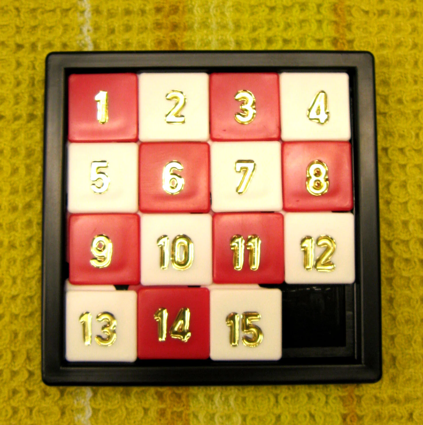
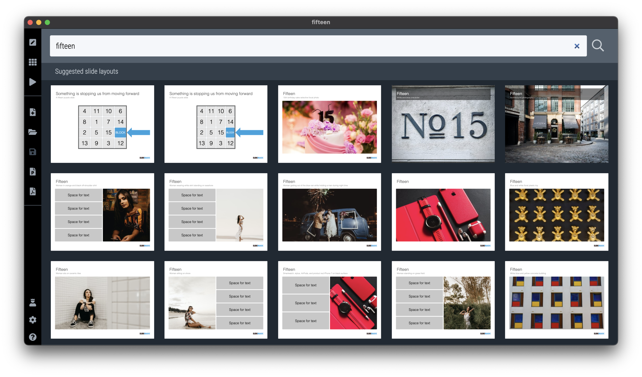
The fifteen puzzle was a popular download on the legacy SlideMagic PowerPoint template store (RIP). It is easy to recreate in SlideMagic 2.0 and I have just added it to the library of slides. Search for something like “fifteen” or “block” in the app and it will show up. This slide can be tricky to make in traditional presentation software as you need to get 16 boxes to line up nicely in a square.

Screen Shot 2021-04-06 at 6.31.19.png
Screen Shot 2021-04-06 at 6.45.18.png

PS: This is probably the only slide in SlideMagic so far where you have to make an adjustment when you switch aspect ratio. A wider slide layout will stretch the square into a rectangle. I added 2 versions of the slide to the library.

Image by Micha L. Rieser

SlideMagic: a platform for magical presentations. Free student plan available. LEARN MORE
Will the designer change your text?

Will the designer change your text?

When I started making pitch decks 15 years ago, there were not many people who called themselves “presentation designer”. Now the world is flooded with them. But “designer” is a very broad term used by people with varying skills.

Most “before and after” examples on designer’s web pages are beautiful makeovers of slides. Better fonts, better colours, a nice image. It all looks a lot better. But makeovers are makeovers: the fundamental layout of the slide almost always stays the same, and the text always stays the same.

Maybe this is the question you should ask a potential presentation designer: do you rip up the slide, change the headlines, round up numbers, regroup boxes (these 4 points are actually 3), etc.

The text changer is a very different designer from the makeover artist. And very often the text changer might not be very good at design. (The SlideMagic bespoke design pitch was the unusual combination of skills in one pair of hands).

There are different types of designers, but there are also different type of projects, and different types of clients. I had clients who were not that happy that the first draft of their redesigned pitch deck had almost no resemblance to the original.

The SlideMagic presentation software is designed to reduce the dependence on a makeover designer. The average corporate presentation creator can focus on structuring her story, putting the right messages in, and slides will look pretty decent without the need for a drastic cosmetic overhaul.

But, if you are looking for “presentation designer”: know what type of client you are, know what type of project you have, know what type of designer you need.

Photo by Hannah Lim on Unsplash

SlideMagic: a platform for magical presentations. Free student plan available. LEARN MORE