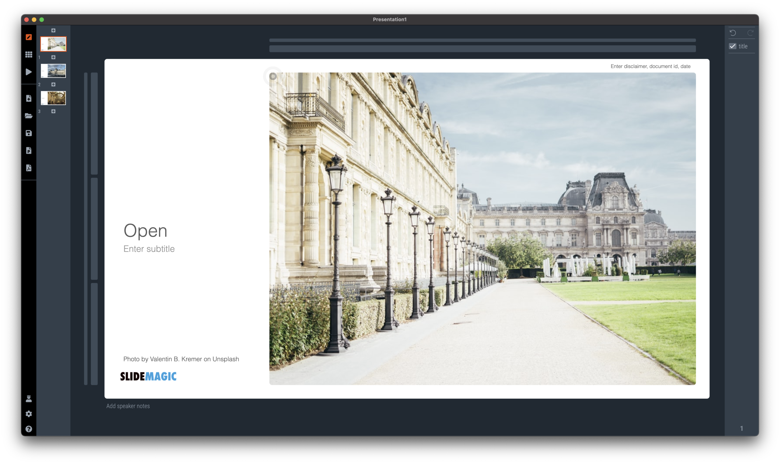
Getty buys Unsplash

Getty buys Unsplash

Getty Images who is in the business of licensing photographs to professional media is acquiring Unsplash, the open source image library (which is also powering the image search on SlideMagic). I remember how Getty acquired iStock as well back in 2006. With VC investors coming on board in the Unsplash Series B financing an exit would eventually happen.

The press release states that Unsplash will remain an independent unit inside Getty. Only the future will tell how this pans out. It would be a shame to see “suggested” (maybe more cliche) Getty or iStock premium images alongside Unsplash search results. Or open source photographers being lured in some sort of licensing-only revenue model.

Two things make me optimistic:

  • The current photographers on Unsplash submitted their images under an understanding about how they are allowed to be used, it is not possible I think to change that across the board retrospectively

  • Now in 2021, it is very easy for “another Unsplash” to pop up if the culture and spirit of the current site changes.

But some well-known photographers on Unsplash think differently:

Let’s see what happens.

SlideMagic: a platform for magical presentations. Free student plan available. LEARN MORE
"Producing yourself"

"Producing yourself"

I just returned from a short Passover holiday, a first in a year. (Hotels, restaurants, here in Israel are now completely open while virus cases continue to fall towards zero).

During the break I watched a Master Class series by Alicia Keys about “producing yourself”. In music production there are usually 2 roles: the creative contribution of the artist, and the editing and arranging part by a producer. They usually happen in 2 spaces, the artist is in the recording part of the studio, the producer sits on the other side of the glass in the control room.

Screen Shot 2021-03-30 at 8.31.53.png

There is an interesting parallel to presentation design: I think most presentation designers are producing themselves, doing both the creative and the editorial part, pretty much like Alicia does.

At least, they are supposed to do so. In practice, when it comes to presentations, people are more arrangers than creators.

How does Alicia go about balancing both side of the process?

  • She creates to completely different mindsets, amplified by the different locations: the vocal booth, the control room

  • In creative mode she lets herself go completely, mistakes are OK, crazy things are OK (similar philosophy to corporate brainstorming sessions)

  • But, she actually prefers to be totally alone, in order to “embarrass” herself freely, and to avoid being put in the position of an artist who has to entertain and perform (completely the opposite of a corporate brainstorming session).

  • She records and captures everything, if you want to capture a creative idea in the flow / moment, you are too late. (As opposed to the brainstorm flip chart where someone else tries to capture and rephrase ideas that multiple people are “shouting” out).

  • After all this, she takes a break, goes to the control room, and listens back with a completely different mindset.

I have helped clients on a number of occasions where they needed a presentation for a “risk free” internal audience. We could go for bolder visuals, colors, concepts. In the end, that bolder presentation often ended up being the backbone of a presentation for an external audience.

SlideMagic: a platform for magical presentations. Free student plan available. LEARN MORE
Do you need the table headings?

Do you need the table headings?

Spreadsheets and databases need table headings. Humans not always. Look at the two slides below

Screen Shot 2021-03-22 at 11.11.20.png
Screen Shot 2021-03-22 at 11.24.09.png

We know how to recognise car brands, colors. Pretty much every car has 4 wheels. Think of replacing the boring tables with cards or labels, making the slide easier to read, and creating more space for information that is more important to show.

Photo by Valdemaras Januška on Unsplash

SlideMagic: a platform for magical presentations. Free student plan available. LEARN MORE
Everything to the front page

Everything to the front page

So you got some feedback on your pitch deck: “You need to ‘hit them hard’ with your strongest points early in the presentation”

Ok, bring this to the front, bring that to the front, this the front as well. Hmmm, now we have a lot of pages at the front, maybe summarize all of these messages on the first page, then we get to all of them really early.

The result: a dense, boring bullet point page. And it will take you 20 minutes to go through it, since it contains the entire presentation.

Most investment ideas have very few ideas that are truly distinctive, or better phrased: ideas that do not sound like all the other pitches an investor listens to. Be very honest and selective. Often, you might have to deal with an “elephant in the room” early in the presentation. Addressing competition from Google if you are building an internet search engine on page 27 is not a smart idea.

Photo by Georgi Kalaydzhiev on Unsplash

SlideMagic: a platform for magical presentations. Free student plan available. LEARN MORE
The mood of an image

The mood of an image

Paintings and other piece of art affect your mood. Happy, depressing, scary, cute, funny. Often you cannot pinpoint why, but it happens.

The same is true with photographs. When selecting images for your presentation, go beyond the functional specs of the photo: it needs to contain a self driving car, a person on a mobile phone, a clock.

How does the picture make you feel? Colors, perspective, proportions. Pictures can be beautiful and depressing at the same time. When given a choice, maybe the slightly less pretty but more uplifting image is the one to go for.

Screen Shot 2021-03-16 at 15.12.41.png
Screen Shot 2021-03-16 at 15.12.44.png
Screen Shot 2021-03-16 at 15.12.47.png

SlideMagic: a platform for magical presentations. Free student plan available. LEARN MORE
To share or not to share?

To share or not to share?

Every potential investor will probably reply with “sure” to the question if she is interested in a copy of the pitch deck. But what should you share? Some of your slides could be highly confidential, others might be too detailed. It is impossible to give a conclusive answer to this question, but here are some points to consider, given a number of possible investor profiles.

  • Investor profile: angel investor who invests as a hobby and loves networking and being involved in the buzz of the startup world. She is incredibly friendly and wants to be helpful, but you don’t know her that well. She was asking fairly high level questions and you had to give her a 101 on the industry you are working in. Maybe a short summary deck with non-confidential information will do. She probably does not have a deep technological understanding of your niche, and is likely to forward material to many of her friends to see if they can help you as well.

  • Investor profile: junior analyst at a specialized VC firm who keeps on asking about very detailed financial growth benchmarks. She is begging you to provide all the ammunition you can find to convince her boss. No, they don’t sign NDAs. You probably have to provide the details as it sounds like an all-or-nothing shot with a highly relevant investor.

  • Investor profile: you happen to sit next to her at a post-COVID dinner party and find out she is actually an investor with a potential fit. The setting was not right for an in-depth pitch. Maybe here you should send a very short “business card” presentation, slides that look great, give a brief explanation of the idea, plus additional background on you as an entrepreneur. The objective is not to land the investment, but to get an opportunity to do that proper pitch.

  • Investor profile: someone who makes it pretty clear that the possibility of investment is close to zero: wrong industry, wrong stage, wrong geography. Saying that she is interested in the deck is her being polite. Maybe better not to send anything at all.

The above is not a binding advice, just to let you think about that the fact that every investor, and every conversation with an investor is different. Do not simply “attach and send” your standard pitch deck.

Photo by Hello I'm Nik 🍔 on Unsplash

SlideMagic: a platform for magical presentations. Free student plan available. LEARN MORE
Dashboard syndrome

Dashboard syndrome

I am following a number of amateur statisticians here in Israel to get insight in how the vaccination campaign is going. This ‘underground’ information sources gives a for better picture of what is going on than the main news media can provide. A better explanation and earlier detection of trends.

Most of these statisticians use the same chart that they update every day. And I noticed that after a few weeks, you actually stop seeing how poorly the chart is designed, your eyes will zoom straight to that one figure that has been updated.

Stock brokers spot the latest share price instantly on a busy ticker board. Mathematicians see the crucial line in the proof on the blackboard.

You , the presentation designer, have become used to your own dashboard. It might be time to take a step back.

Photo by Neil Martin on Unsplash

SlideMagic: a platform for magical presentations. Free student plan available. LEARN MORE
PPT templates: adding 1 more person to "The Night Watch"

PPT templates: adding 1 more person to "The Night Watch"

Prefab PowerPoint templates can look incredibly pretty. The problem is editing and customizing them. It is easy to change text, but if your message requires 5 instead of 4 bubbles, you need to make drastic changes to the layout of a slide.

  • There are the technical skills of duplicating and placing that shape.

  • There are design skills, “somehow the proportions of the slide don’t look right anymore and I can not pinpoint what causes it”.

  • There could be a more fundamental problem, maybe a 5 bubble chart requires an entirely different slide than a 4 bubble one

  • There is the problem of fitting things in with the right fonts and colors that fit your corporate identity (corporates usually do not use the cute fonts found in powerpoint templates).

1280px-Netherlands-4167_-_The_Night_Watch_(11715123333).jpg

Changing a PowerPoint template is a bit like handing a paint brush to a random person with the request to add one more person to The Night Watch on the canvas, and change the coloring from dark to light (the scene is set in the middle of the day, but got darker over the years).

What I am trying to achieve with SlideMagic:

  • Lower the ambition on the complexity of slide designs, and make sure that the designs that do make the cut look pretty good

  • Offer an editor that makes it easy to change layouts without leaving any traces


SlideMagic: a platform for magical presentations. Free student plan available. LEARN MORE
Limited time...

Limited time...

This chart lays out the philosophy behind SlideMagic: spend more time pitching, less time editing. There are only a limited number of productive hours in a day, it is a waste to spend them on slide design…

Screen Shot 2021-03-03 at 12.28.01.png
  • If you are preparing for an all-or-nothing pitch, you free up time to really, really rehearse your story.

  • If that quarterly report is sitting on the top of the to-do list and preventing your from doing other things, get it out of the way quickly.

P.S. I have add this slide to the database here, or search for ‘slidemagic’ in the desktop app to use it in your own presentation

SlideMagic: a platform for magical presentations. Free student plan available. LEARN MORE
Updates to the settings

Updates to the settings

As of version 2.6.27, the way settings are stored in SlideMagic. I rely on open source software and the previous engine I used to save settings on your machine was not maintained very well by its developer and started to cause more and more bugs over time.

If you are a pro subscriber, please log in again after you update. Also, you might have to re-enter your accent color to store it on your machine. Apologies for the inconvenience.

Photo by Rima Kruciene on Unsplash

SlideMagic: a platform for magical presentations. Free student plan available. LEARN MORE
Emphasizing by de-emphasizing

Emphasizing by de-emphasizing

Recently, a SlideMagic user asked for some help with adding “some more color” to a slide. (A table to be included in an internal strategy document).

My response was the opposite, rather than adding color and accents, I took things out. To make things stand out, you can either emphasize these things, or de-emphasize everything else.

Here is the starting point (confidential text removed). Btw., look how neat and organized it already looks, thanks to SlideMagic…

Screen Shot 2021-03-02 at 8.26.36.png

Below my suggestion:

Screen Shot 2021-03-02 at 8.27.22.png

The things I did:

  • Changed color accents

  • Grouped and de-duplicated text boxes that contained the exact same text

  • Changed relative heights of rows

  • Moved title category labels to the top

  • Added the arrows to visualize that the bottom item supports everything else

SlideMagic: a platform for magical presentations. Free student plan available. LEARN MORE
Presentations is culture

Presentations is culture

I remember doing a project for a TV broadcaster back at my days at McKinsey. Because the client was in the business of communication, it was very picky on how reports should be written and presented.

Presentations are part of your corporate culture. If they look sloppy, are full of pages with boring bullet points, contain incomprehensible diagrams, are loaded with buzzwords, it says something about the organisation that produces them, especially when you requires staff and customers to sit through them.

Maybe you invested a lot in that first meeting sales presentation, but you can’t keep it up in the decks for the 2nd, 3rd or 4th due diligence meeting. This is where you show your real face.

These follow up decks do not have to be master pieces of graphics design, they still should look decent, consistent and on-brand.

(SlideMagic is here to help).

Photo by Raphael Renter on Unsplash

SlideMagic: a platform for magical presentations. Free student plan available. LEARN MORE
"Ah, that one"

"Ah, that one"

When you page down through all the slides after you completed your deck, you can feel the excitement (or lack of it) they bring up to tell your story.

  • Great slide

  • Great slide

  • Great slide

  • Ahh, here we go into the clinical data

  • Great slide

  • Great slide

Certain slides ended up in your deck at a certain spot for a good reason at the time. But your story might have moved on, things that were an issue might have become obvious, or maybe the message that chart brings is now a different one. When you get that “aah, that one” moment when clicking through your deck, it is time to make some changes.

Every slide should be an invitation for you to jump in add something exciting to what you already presented.

Photo by Priscilla Du Preez on Unsplash

SlideMagic: a platform for magical presentations. Free student plan available. LEARN MORE
The last page = a billboard

The last page = a billboard

That’s the one that is sitting on the Zoom screen for 30 minutes when you take questions. Here are things that are a bit boring to look at during that time:

  • THANK YOU!

  • Q&A

  • Appendix

  • A super detailed recap of the entire presentation in 15 bullet points

  • A super detailed Gantt chart of the next steps

  • The chart with your weakest data that you had to pull up to answer a question

  • The chart with the calculation mistake that triggered a question

The last slide is a billboard that can get engraved in people’s memory like a Super Bowl ad (with a slightly smaller audience). So better choices are a memorable visual that you used somewhere in your presentation to explain the opportunity, a nice product shot. Make sure you navigate back to it when needed.

Photo by Jaxon Lott on Unsplash

SlideMagic: a platform for magical presentations. Free student plan available. LEARN MORE
Pop the suspense

Pop the suspense

I came across a pitch for a business idea that involves a few different businesses, with a number of different people.

The natural way to tell the story is a build-up: here is this interesting problem, that is a massive opportunity, that only we can solve with this interesting technology.

Investors are different from viewers of an action-packed thriller. The moment the “opening title” starts rolling, they start evaluating the investment opportunity, trying to identify the obvious strengths, the obvious weaknesses, and the question marks.

So for investors, you might have to skip to the last page of your thriller and uncover the mystery, before starting your pitch. Here are the 3 businesses, this is what they roughly do, and these are the people involved for each one of them. No let’s start from the beginning.

Photo by Quinn Buffing on Unsplash

SlideMagic: a platform for magical presentations. Free student plan available. LEARN MORE
Pick your battles

Pick your battles

Professional designers can do it all:

  1. Give slides a professional look

  2. Come up with innovative visualisation concepts that make messages stand out

  3. Use advanced software features to craft technically complex slides

The amateur designer is in a different position and needs to pick her battles. That amazing visual concept of the elephant riding a convertible car does not really work if it does not look picture perfect. That very clever consulting diagram does not really contribute when it actually does not support your message.

You do not need to be a graphics designer to ensure number 1, a decent professional look of your slides. Simple designs can look great (look at Swiss graphic design for example).

When in doubt, drop ambitions on point 2, and 3, and but never compromise on 1. (And this is exactly what SlideMagic is trying to do).

SlideMagic: a platform for magical presentations. Free student plan available. LEARN MORE
Psychology of young people pondering the COVID vaccine

Psychology of young people pondering the COVID vaccine

I am intrigued by the dynamics surrounding how people make the decision whether to take the COVID vaccine or not. Unlike most other countries, people have the luxury to ponder this decision here in Israel. The government has a real communication challenge here.

We spoke about segments before. If you are a fundamental anti-vaxxer, or have severe doubts about the vaccine safety, you are unlikely to be convinced.

There is a segment of young people though that “can not be bothered”. The personal risk of getting severe COVID is very low. They consider it the same as joining public roads every day. You consciously take this calculated risk, knowing that the probability of getting stuck in a severe accident is very small, especially when you drive safely.

What people forget, is the indirect impact. Big number of people x tiny percentage is still a big number of people at country level. And filled up intensive care units, trigger more lockdowns, more closed restaurants, bars, parties, zoom schools, etc.

I compared the two scenarios in the chart below (search “COVID” in the SlideMagic app to use something like this logic flow in your own presentations for other topics, also put it in the web template bank, download it here).

SlideMagic: a platform for magical presentations. Free student plan available. LEARN MORE
Observations from a slide magician...

Observations from a slide magician...

“Slide magician”, that is what you become right after using SlideMagic for a while?

Recently, I had to go back to PowerPoint for wireframing some new app screens (it is this “free hand” doodling that is made impossible by design in SlideMagic). Here are some of my impressions.

  • PowerPoint has gotten much more polished. I do not use PowerPoint that often anymore, and you see improvement in the details of the UI elements (I have developed an eye for app design now).

  • Some elements are a bit intrusive. I had to work hard to save my work on a local drive rather than the Azure cloud folder, and the “AI-powered” design ideas with bold pictures and graphics took some time to switch off.

The biggest change was in my head though and has nothing to do with PowerPoint. I have become so accustomed to making slides in the SlideMagic-style (boxes and grids), that I started trying to make these slides in PowerPoint as well. And here I noticed how hard that was.

Something interesting is happening. I start to ‘forget’ certain workflows in PowerPoint, things are getting a bit rusty, compared to 3 years ago when I would fly across the user interface with the help of my custom toolbars. Maybe that is the same starting position as most PowerPoint users who are not professional designers.

Photo by Almos Bechtold on Unsplash

SlideMagic: a platform for magical presentations. Free student plan available. LEARN MORE
Knowing your audience

Knowing your audience

A follow-up on yesterday’s post about convincing the center when it comes to COVID vaccines.

Most people who create presentations are not marketeers or PR professionals. They hear people (including presentation designers like me), talk about how important it is to think about your audience when crafting slides. And when thinking about the audience, they don’t have much sophisticated data. Insights are likely to be basic: “They do not believe that we can get traction with our search engine that needs to beat Google”.

Global Web Index did research in people’s attitudes towards a COVID vaccine, the results of the findings are put in this visualisation by Visual Capitalist. The main message to me about this pretty but busy graphic is that it is complex, things are not clear cut.

global-attitudes-towards-vaccines.jpg

Here is my summary of the segments, and a possible communication strategy. (You can find this slide in the online template bank, or search for ‘covid’ in the SlideMagic desktop app)

Screen Shot 2021-02-11 at 8.22.16.png

Most business presentations will not have the luxury of a detailed audience analysis, but it is an interesting thought process of running through an imaginary one.

SlideMagic: a platform for magical presentations. Free student plan available. LEARN MORE
Convincing the center (redux)

Convincing the center (redux)

This posts keeps on coming back, usually around elections. This time around the trigger is the debate among “younger” Israelis (below 60) whether they should take the COVID vaccine or not (widely available here in Tel Aviv).

Normally speaking, the risk of serious COVID complications should be relatively low for individuals in this group. With the immediate threat out of the way, people can start arguing. Messaging groups are now a favorite channel for heated debates about the pros and cons of vaccination.

Some points to remember when persuading people:

  • Focus on the center, the people who are in doubt. It is 100% certain that you can convince a die-hard anti-vaxxer, or genetics professor to change her mind in a few message exchanges

  • “Screaming”, aggression, calling people on the other side of your argument stupid and incompetent is not going to score you sympathy points (and help you become more convincing).

  • People in the center are likely to be reasonable people, so wild conspiracy theories or unusual scientific “evidence” might not stick very well

All the above applies to investor and sales presentation as well. Pick your battles and focus on the people who could change their minds

Photo by Marcos Paulo Prado on Unsplash

SlideMagic: a platform for magical presentations. Free student plan available. LEARN MORE