Making sense of Israeli vaccination data

Making sense of Israeli vaccination data

Here in Tel Aviv, I was lucky enough to receive my second vaccination with the Pfizer COVID-19 vaccine. The whole world is watching us:

  • High vaccine availability

  • Advanced healthcare infrastructure, with a centralized IT system (any medical professional can punch in my ID number in her computer and get all my medical records on the spot, this would raise some privacy issues in other countries)

  • (Unfortunately) we are set up to deal with national crises and get organised quickly

There is lots of data available, cases, hospitalizations, difficult cases, casualties, by age, religious background, location, total cases, new cases, etc., etc. And everyone is looking at the top line number, will the big case graph go down and can we declare victory over the virus. Unfortunately so far, it stays more or less stable (at high levels).

This is a typical case of data overload. If you want to see whether the vaccine works you need to compare 2 things like for like: people who got vaccinated, and people who did not. And when you do that (pretty much like a clean medical trial), it shows that the vaccine is overwhelmingly effective, the same size is just not the entire Israeli population.

One such example is hospital admission data from a Tel Aviv hospital. Not millions of people, but a small, isolated group that you can compare. The original chart is here:

COVID19-vaccination-efficacy-telaviv

I did a quick makeover of this slide in SlideMagic.

  • Colours are consistent

  • Everything is properly spaced

  • A better way to communicate the ‘1’ exception case

But this is the raw data, mainly of interest to scientists / statisticians. The average person just looks at the big blue “2” next to “442”. You can simplify things a bit more, see the following chart:

What did I do?

  • Use a data chart instead of a table (bar charts are best for comparing)

  • Lump the 7 days before and 7 days after data together, they are almost the same

  • Change the metric to something that people are used to, everyone talks in terms of “vaccine efficacy is x%”. I reworked the numbers to reflect that.

I included these vaccination charts in the online SlideMagic slide template bank (click on the images), or simply search for ‘vaccination’ in the desktop app to use charts like this in your own presentation.

SlideMagic: a platform for magical presentations. Free student plan available. LEARN MORE
PowerPoint conversions back to Arial

PowerPoint conversions back to Arial

I changed the font that SlideMagic uses for PowerPoint conversions from Calibri to Arial as of version 2.6.22.

The thought behind Calibri was that when converting slides to PowerPoint, I wanted to stick as close as possible to the box-standard Microsoft format as possible, and Calibri is the standard font for Microsoft Office applications. SlideMagic users “complained” that the PowerPoint conversions did not look very similar to the beautiful originals. So I made the change.

Helvetica (especially thin variants) looks more elegant but gives compatibility issues on Windows machines. Hence Arial it is….

Obviously when you convert your SlideMagic .magic files to PDF, you get the exact same look & feel as in the SlideMagic app. This is the workflow we should aim for. SlideMagic .magic files are the source code of your documents, PDF is how you share the result with external audiences.

Photo by Natalia Y on Unsplash

SlideMagic: a platform for magical presentations. Free student plan available. LEARN MORE
Updates to the SlideMagic PowerPoint Add-in (alpha)

Updates to the SlideMagic PowerPoint Add-in (alpha)

Microsoft made some updates to its Office API (and SlideMagic made some changes to its server), and as a result, the SlideMagic PowerPoint add-in starts working a lot better.

The SlideMagic PowerPoint add-in is especially useful for users who download PowerPoint templates from the SlideMagic web site. Most of you are people who were subscribers to the legacy template store (RIP). Since PowerPoint conversions are a pro feature of SlideMagic, the add-in is only useful for pro subscribers.

What has changed?

  • The add-in now remembers your login details across PowerPoint files No need to constantly log in (again).

  • More importantly (thank you Microsoft), the SlideMagic add-in now adds slides straight into your existing PowerPoint presentation

The add-in is still an alpha phase, and things are tested for the moment in the online PowerPoint environment. I will submit it for another go for Microsoft approval to get it working with PowerPoint desktop versions as well.

Here is how to install the add-in:

  1. Download the file slidemagic.xml from this link

  2. Log in to your online Microsoft 365 account, click PowerPoint, and open a new presentation

  3. Select “insert”, then “add-ins”

  4. Select “my add-ins”, then “upload my add -in” in the top of the window (it is not available in the Microsoft store yet)

  5. Select the slidemagic.xml file you just download and upload it

  6. Go back to the '“home” ribbon

The add-in is installed. To use it:

  1. Click the SlideMagic button and the side panel loads

  2. Enter your log in details

  3. Search for a template, and click the design you like

  4. Click “insert” and the slide should appear in your PowerPoint presentation

While the slide is a perfect conversion from SlideMagic, you are obviously missing out on the customization features that make SlideMagic stand out from other presentation apps.

Below are the screenshots of the installation process

Screen Shot 2021-02-04 at 15.29.19.png
Screen Shot 2021-02-04 at 15.31.11.png
Screen Shot 2021-02-04 at 15.31.16.png
Screen Shot 2021-02-04 at 15.31.26.png
Screen Shot 2021-02-04 at 15.32.19.png
Screen Shot 2021-02-04 at 15.32.25.png

SlideMagic: a platform for magical presentations. Free student plan available. LEARN MORE
"10 happy users"

"10 happy users"

This tweet sums up SlideMagic’s strategy at the moment:

Ten happy users who use the product for hours every day and pay for it. Presentations is a very tricky segment, and existing solutions (including those with lots and lots of installs) suffer from one of these problems:

  • Users don’t think making presentations with it is fun

  • Users don’t use it as their go-to presentation platform

  • Users don’t see the value to pay for it

The strategy of buying millions of users and then waiting for 0.5% who might end up as a user is expensive, risky, and probably leads to the wrong product.

Photo by engin akyurt on Unsplash

SlideMagic: a platform for magical presentations. Free student plan available. LEARN MORE
In-app tutorials

In-app tutorials

Since v2.6.18, SlideMagic has in-app onboarding tutorials. Click the ‘?’ icon in the bottom left of the app, and you will be taken around the features of the screen that is currently active. The slide edit screen also covers the general navigation inside the app. Next to the edit screen, there are page walkthroughs for the story, settings, presenter, image/icon search, and template search screens.

There is still some formatting to do, and the tutorial needs a more prominent position when you start SlideMagic for the very first time, but all in all, very useful I think. The real-time examples work much better than static tutorial pages, and now, the tutorial will always be up to date with the user interface (which is still changing now and then).

Screen Shot 2021-02-02 at 15.52.15.png
Screen Shot 2021-02-02 at 15.56.30.png

SlideMagic: a platform for magical presentations. Free student plan available. LEARN MORE
"Let's put that slide in the appendix"

"Let's put that slide in the appendix"

These were the dreaded words of your McKinsey project manager when she ripped out your analysis masterpiece from page 10 to page 57 in the document. Then, as a junior analyst, I felt depressed as I interpreted this that my work has been for nothing.

Here are some things that project manager could have said in addition:

  • Most of the time, slides that communicate the answer are completely different from slides that show how you got to the answer.

  • Related: the project is moving on now, we have convinced the client that our assumptions are correct, now we need to get them to move and take action

  • Without that slide that sits now on page 57, we would never have gotten where we are now. If we still had to talk about that analysis on page 10, we probably were doing something wrong

Photo by Nana Smirnova on Unsplash

SlideMagic: a platform for magical presentations. Free student plan available. LEARN MORE
SlideMagic analytics

SlideMagic analytics

Over the weekend I re-wrote the entire analytics engine of SlideMagic. (Apologies for the frequent app updates).

I had a whole bunch of tools installed, some of them dating bask a long time when I just started out with the blog. They were spitting out a lot of data that was never really used. Web analytics brings back memories of my time as a McKinsey consultant. The client having a massive and sophisticated business intelligence (“BI”) information system that could produce any breakdown of any segment at any time. Our work was to find what actually mattered, which often was a surprisingly simple chart.

If you are running a massive web site with billions of hits, then A/B testing the colour of buttons might make you money. You hire the web analytics consultant, let her do her work, and in the end your return on investment is a 0.005% uptake in conversion on a billion of clicks minus the cost of the data analysis project. The result is a massive amount of trackers that follow you across the internet.

SlideMagic no longer has them. I went back to basics, and put a very simple system in place, that gives me the information I need given the growth stage SlideMagic is in (making sure that the product works flawlessly). In the process I could also eliminate any possible information that could, if you really wanted to, identify a user. All is clean now, and I understand/control 100% what is actually going on with your data.

Photo by Nick Loggie on Unsplash

SlideMagic: a platform for magical presentations. Free student plan available. LEARN MORE
Are TAM slides useful?

Are TAM slides useful?

The question is raised in this tweet:

My perspective:

  • As a point estimate, they are probably not useful. Forecasting something that does not exist yet is hard, and ‘TAM’ is not interpreted in a consistent way like ‘next year’s revenue’ is.

  • But as a framework to think about things, it could be useful. Forget about the exact definition of TAM. Instead help yourself and a potential investor think about one more approach to think about the potential of your business. “What would you have to believe in order to…”

In the SlideMagic app, search for ‘TAM’ and you will find a few templates that can get you started. Another good framework to use are waterfall charts where you can peel off market segment layers. To put your chart in context, you can add some sort of crystal ball image…

Photo by Sasha • Stories on Unsplash

SlideMagic: a platform for magical presentations. Free student plan available. LEARN MORE
Growth percentages

Growth percentages

Most financial slides show an absolute number and its percentage growth for things like revenues, gross profit, operating profit, and operating income. But they also show margins: operating profit, gross profit, operating income as a % of sales. If the gross margin grows from 50% to 55%, is that 5% growth, or 10%?

Microsoft did it right in its last earnings presentation: explicitly name increases in margins as ‘points’. So going from 50% to 55% gross margin is a 5 points increase. See the example slide below

Screen Shot 2021-01-27 at 8.05.11.png

Mmm, now that we have a slide here, let’s talk about it. What is good:

  • Clean font, clean layout, even without a logo

  • Numbers are rounded up

What could improve:

  • Use the full space of the slide, the table (probably coming out of Excel) is tilted to the left

  • The titles of the table are a bit “heavy” with that blue colour splashed on them. It is better to use an accent colour to highlight a piece of data that is important for your message

  • The dark grey font on light grey background looks sophisticated, but hurt the contrast that is important in financial slides

In SlideMagic, I put the following together quickly (in the SlideMagic spirit)

Screen Shot 2021-01-27 at 8.12.11.png

What did I do?

  • Use the entire slide

  • Accent colour is used for important data

  • Light column headings

  • Re-shuffled the order of the table items, yes, gross profit and gross margin are related, but I think it works better to group billions and margins

  • Add small bar charts to highlight the comparison of the growth numbers

I have added my slide to the template bank, you download it for free, or simply search for ‘Microsoft’ from within the SlideMagic app.

SlideMagic: a platform for magical presentations. Free student plan available. LEARN MORE
A better way to edit speaker notes

A better way to edit speaker notes

I made the user interface for speaker notes a bit clearer in version 2.6.12 of SlideMagic. The mysterious bullet point icon at the bottom of the slide has been replaced with a simple text link. Click and you will see a big and bold overlay over the slide where you can add your notes.

Screen Shot 2021-01-27 at 6.07.07.png
Screen Shot 2021-01-27 at 6.20.17.png

Speaker notes will show up in the presenter view window when you present the slides and are only visible to you the presenter, not to the audience. On a Zoom call, share the audience window to the video call participants, while you keep an eye on your private presenter view with important reminders of the points you want to make when presenting the slide.

Screen Shot 2021-01-27 at 6.10.39.png

In SlideMagic, you can edit your speaker notes also in this presenter view window. This is not only great for last minute fixes of your story, but also gives you a platform to edit the flow of your story slide by slide. Increase the size of your presenter view window, and click through your presentation. You see a small thumb of your slide, an even smaller one of the next slide up, and a big text box to write down your points.

Screen Shot 2021-01-27 at 6.25.13.png

When you return to the normal view of the slide, you will see that the speaker note edit link has changed colour, to remind you that there are speaker notes in this slide. This is important when you share .magic files with other users, because they will be able to read those speaker notes as well. (This prevents you from sending “Better not share our 50% churn with investors in the first presentation with investors if they do not ask for it….” to well, an investor attending your first presentation)

Screen Shot 2021-01-27 at 6.31.38.png

When convert a SlideMagic .magic file to PowerPoint .pptx (a ‘pro’ feature), the speaker notes will be transferred as well. (Of course, a PDF conversion will have no speaker notes.)

Screen Shot 2021-01-27 at 6.30.09.png

SlideMagic: a platform for magical presentations. Free student plan available. LEARN MORE
"What are the best presentation templates for business models?"

"What are the best presentation templates for business models?"

Some questions on Quora seem to be a setup for people with a solution to answer them. SlideMagic is not in the business of selling slide templates, still, I could not resist answering:

I think it is the wrong question to ask first. You should start with “What is my business model?”

A business model can have an endless number of options, no one is the same, hence it is hard to fit into a standard template. Even worse, trying to fit your business model into a PowerPoint template that actually does not fit gets your audience confused of what your business model actually is.

Once you have decided on your business model, you can find a suitable template, and it can be very simple and straightforward. For example, if you charge a set up fee, and an hourly rate, that is a table with 4 boxes… Clean simple, unambiguous.

Photo by Element5 Digital on Unsplash

SlideMagic: a platform for magical presentations. Free student plan available. LEARN MORE
"Why are 2x2 so popular in consulting firms?"

"Why are 2x2 so popular in consulting firms?"

I answered a question on Quora:

I can think of a number of reasons:

  1. A 2x2 is a nicer way to present options than a slide with 4 bullet points, a 5 dimensional space can get very complicated

  2. It forces you to think things through thoroughly for holes and overlaps, maybe you start with 2 options, add a third, take a step back and think what actually defines these 3 options, come up with the 2 axis, and then realise you overlooked option number 4 to be complete

  3. A 2 dimensional framework allows you to think about what happens if you move things around, and makes it easy to visualise.

  4. In most cases there are more than 2 dimensions to a problem, but it is hard to visualise (see point 1), and think about. The 2x2 forces you to choose the 2 most important dimensions.

  5. Cultural habit, if you are in a place that uses a lot of 2x2s, you will use it more often, it is a language that people understand easily.

SlideMagic has lots and lots of 2x2, 3x3 and other matrices as slide templates for your to get started. Download the app and get started.

SlideMagic: a platform for magical presentations. Free student plan available. LEARN MORE
Making Bernie memes, and image positioning in more serious presentations

Making Bernie memes, and image positioning in more serious presentations

Everyone is super imposing the image of Bernie on other photos at the moment. Why do certain images look realistic, others not? Some pointers that might help with your Bernie creations, but can also be useful when you need to make more serious presentations.

  • Think of the size of Bernie versus reference objects close to thim. Putting him next to other people makes it easy to get it right. In the absence of reference people, focus on other objects to compare the size to. The size of Bernie versus objects that we know the size of, tricks the brain in getting the perspective of the image right.

  • See at what angle the image of Bernie is taken. The legs of his chair show the angle at which the floor should run. Bernie’s image is taken from a long distance with a zoom lens, therefore you will see that most compositions that you took with a phone (lens 1.7m above the ground, subject probably 5-10 meters away) will not work.

It is hard to get these right. Simply move and zoom the image around a lot until you see that it fits right. Here is Bernie in my living room keeping Grifin company, In SlideMagic I put the living room as a ‘frame’ image, and made one big grid box as the foreground for Bernie. Then, I switched off the titles.

Screen Shot 2021-01-22 at 9.20.17.png

(@taber has already done the hard work for you, download a Bernie image with transparent background here).

SlideMagic: a platform for magical presentations. Free student plan available. LEARN MORE
"This is the part I always skip..."

"This is the part I always skip..."

<click><click><click><click><click>

If you always skip that part, maybe it is time to reshuffle your slides to a flow that comes more natural to you.

There was probably nothing wrong with the original slide flow you used, but things can get stale:

  • You switched from a project flow, where the series of charts reflected the sequence of the project work, to the story that sells the outcome

  • You have a much more powerful presentation opening with a real life customer story than the usual market data slides that are sitting there

  • You are still using the same slides that you put in 3 years ago

  • The audience of your presentation has changed, they either have caught up and know more things now, or you are presenting to different people.

Time for spring cleaning of your pitch?

Photo by Jeremy Sallee on Unsplash

SlideMagic: a platform for magical presentations. Free student plan available. LEARN MORE
A faster way to edit slides

A faster way to edit slides

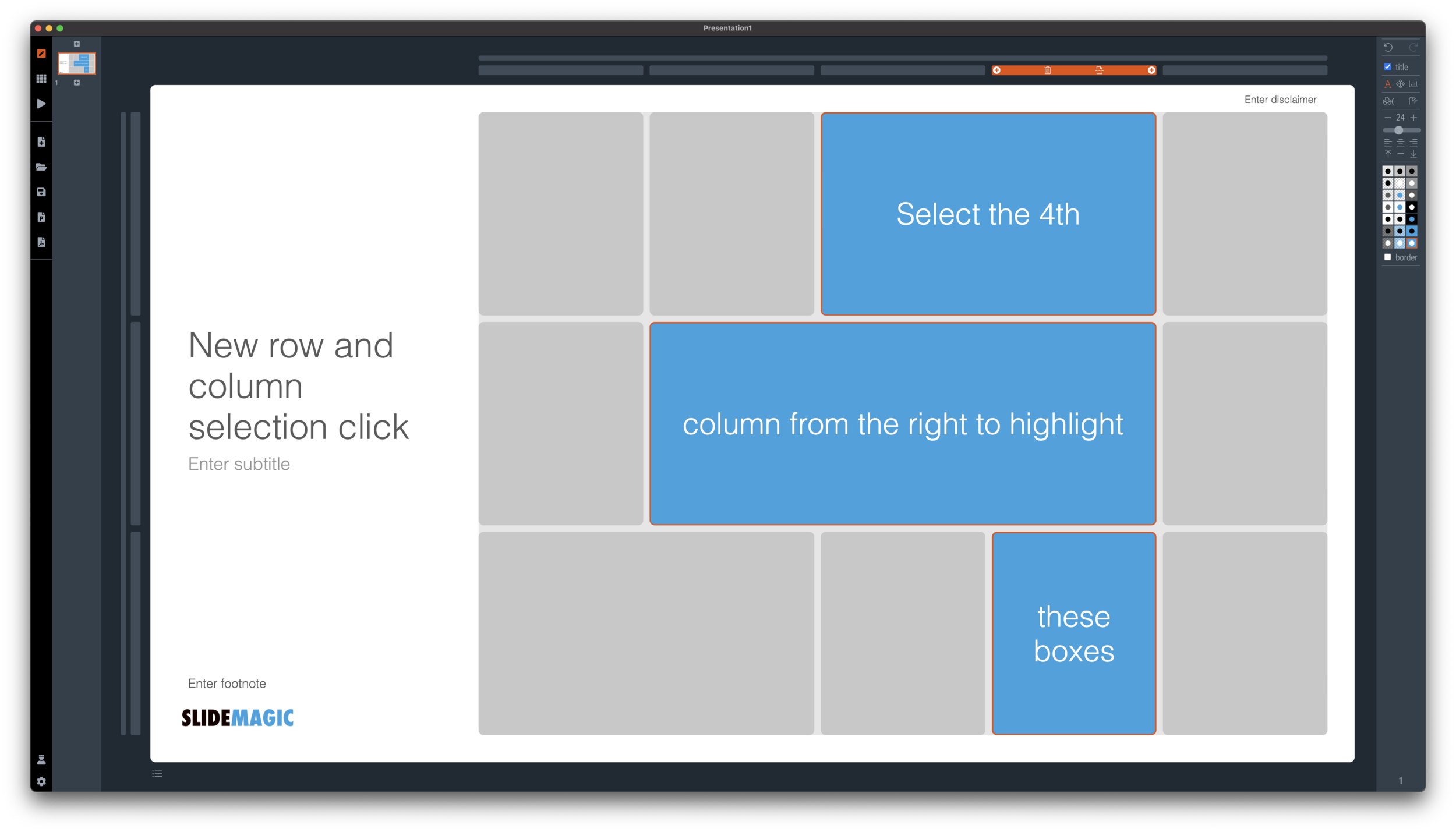
I have made more improvements to the SlideMagic user interface. Is is now easier to select multiple cells, especially in fine grids.

If you select a column marker at the top of the slide, all boxes in your slide that “touch|” the column will be become selected, and you can apply formatting to them in one go (for example, make them all blue).

Screen Shot 2021-01-18 at 17.36.19.png

The same applies for rows, click a row marker, and all relevant boxes in the row line up.

Screen Shot 2021-01-18 at 17.37.58.png

Finally, you can select whole areas of boxes by first clicking a top-left element, then clicking a bottom-right element, and SlideMagic will light up all the boxes that are in between. See the example below.

Screen Shot 2021-01-18 at 17.38.42.png
Screen Shot 2021-01-18 at 17.38.46.png

SlideMagic: a platform for magical presentations. Free student plan available. LEARN MORE
New 'no-title' layout

New 'no-title' layout

SlideMagic works with fixed positions for slide titles, subtitles, footnotes, and logos. Each slide looks organised, consistent, and the same.

Some slides call out for a slightly differently layout. Tracker pages for example. A simple text box that sites right in the middle of the screen. Up until now, SlideMagic would push these text boxes a bit down or to the right because of the required space for the slide title.

With a very simple check mark, I now created the option to remove titles from the slide on a slide-by-slide basis. It is a tiny adjustment to the user interface that can improve the look of layouts significantly. I am still putting a high hurdle when it comes to complicating SlideMagic. This is definitely not a complication!

While the user interface adjustment is easy, behind the scenes, there is a lot going on. Removing the the titles from a slide requires recropping of all the images on a slide. With SlideMagic’s new automatic cropping algorithm, this has now become possible. Imagine doing this for a slide with 40 client logos in a regular presentation design software, after which you come to the conclusion that the slide looked better with a title: re-cutting, re-cropping, re-distributing 40 images again. In SlideMagic, this is a button click.

You can check out the new features as of version 2.6.9

Screen Shot 2021-01-18 at 16.57.04.png
Screen Shot 2021-01-18 at 16.57.31.png
Screen Shot 2021-01-18 at 16.56.44.png
Screen Shot 2021-01-18 at 16.55.56.png

SlideMagic: a platform for magical presentations. Free student plan available. LEARN MORE
Should you put 'confidential' on every slide of your presentation?

Should you put 'confidential' on every slide of your presentation?

For years I tried to resist the pressure from lawyers to fill every slide with legal disclaimers. They do not look very pretty. But SlideMagic aims to be practical and as of version 2.6.8, you can do so, if you have to.

To make them still look OK:

  • I made the font really small, in all caps, so the disclaimer looks more like some sort of a document id

  • All disclaimers are exactly the same and at exactly the same place

  • The placement of the disclaimer changes based on what sort of aspect ratio / slide layout you are using

Screen Shot 2021-01-18 at 9.46.17.png

Should you put disclaimers? (Warning, I am not a lawyer). There are certain situations where you probably should. Certain confidentiality agreements state that information needs to be marked as being confidential to be covered by the agreement.

But, if there is no such agreement in place, I am not sure how much leverage you have if people are sharing pages despite all the scary warnings on the page. Also, if you are using slides with a big TED talk or product launch, the whole world can see them, making the disclaimers pretty useless.

Most investors do not sign NDAs, and you actually you want the junior VC to forward your pages to a partner in the firm. Assume that when you send your slides to investors, there can be leaks, so be careful what you put in there. In most cases the actual content of your super secret technology will not make the difference when it comes to evaluating your pitch deck in the early stages of the investment process.

So, consult your lawyer, push back if she insists, and give in if she has a reasonable argument.

Photo by Kristina Flour on Unsplash

SlideMagic: a platform for magical presentations. Free student plan available. LEARN MORE
It is all about box counting

It is all about box counting

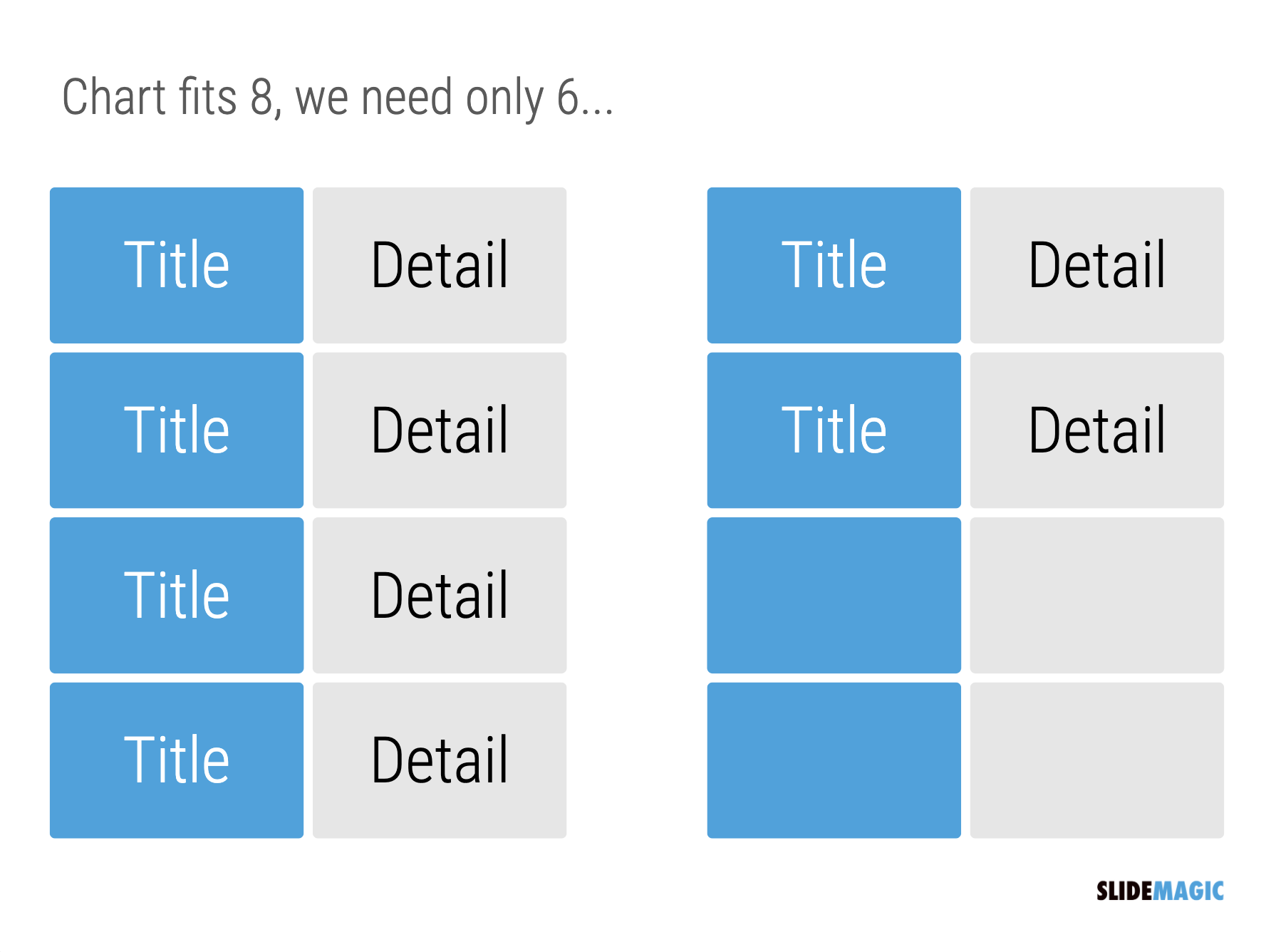
One of the biggest issues in business presentation design is adjusting frameworks to the amount of boxes you need. You had this great slide that fats 8 things, but thing number 5 and number 6 is no longer relevant, so now you need to rehash the whole slide layout…

Screen Shot 2021-01-15 at 10.05.00.png

I think this “bug” in the design process might be one of the biggest reasons for the popularity of bullet point lists: it is super easy to add and subtract things on your slide. And this is also the reason why pre-fab PowerPoint templates are so hard to use. The designer made that super pretty 8-box slide with sophisticated shapes, and 5 minutes before your meeting, you need to get rid of one without destroying the design of the slide…

In SlideMagic things are super easy. Option one: it is easy to adjust the grid layout to match your new box count. Or even better: a new box count might merit an entirely new slide layout. In the latter case, you will have to copy-paste your boxes, but at least SlideMagic takes care of the fiddly task fo lining things up.

Screen Shot 2021-01-15 at 10.05.11.png
Screen Shot 2021-01-15 at 10.05.21.png

Here is a pro tip: box counting is the first thing I do when staring a new slide. How many items, how do they spread across horizontal and vertical dimensions? Can we consolidate points? Should we break them up across multiple slides? Once you have your count, it is easy to find a matching design.

SlideMagic: a platform for magical presentations. Free student plan available. LEARN MORE
Chart make-over: the US restaurant industry

Chart make-over: the US restaurant industry

A slide came flying by on Twitter:

The original chart:

ErdEYVXXYAYbxeO.jpeg

Below a the same chart, but now in SlideMagic style. A few modifications:

  • Toning down the colors

  • Switching to regular bars instead of the stacked bars for the detailed sector breakdown. The boxes are more or less equal in size, so the stacked bar does not really add that much information, while making the whole thing much harder to read.

  • I cleaned up the categories and totals, they did not add up properly. This is probably the result of the analyst who had to work with multiple conflicting data sources. I am a strong believer of pushing through one, consistent, view of reality when it comes to a final presentation. Either you add your own interpretation to multiple sources and come up with a new one, or you stick 1-on-1 to a consistent source. The in-between ambiguity is useful when you do the analysis, it is confusing when you make the final presentation.

  • The segment concentration numbers are actually very interesting in this chart. In the original, they are very hard to read and compare in the boxes. The SlideMagic chart gives them much more space
Screen Shot 2021-01-11 at 16.44.23.png

I added this slide to the SlideMagic template database (download it here), or simply search for “restaurant” in the desktop app and it will pop up.

SlideMagic: a platform for magical presentations. Free student plan available. LEARN MORE