Making SlideMagic more Zoom-friendly

Making SlideMagic more Zoom-friendly

Up until now, playing a SlideMagic presentation would trigger a full screen view of your slide, plus second full screen window on the presenter machine (if available). Switching back and forth to full screen, swapping monitors can be a bit disorienting, and in the area of Zoom, it does not work well when you want to share your audience window, but not your presenter view.

Screen Shot 2021-01-06 at 10.10.07.png

As of version 2.6.3, entering a presentation will now always trigger 2 windows (not in full screen): the slide and a smaller presenter view with timer, counter, and a thumb of the next slide coming up. You can re-rearrange them to monitors as you see fit, and go to full screen manually if needed.

This also ‘solves’ the issue of deciding which screen is the audience screen, and which one the presenter’s when many on screen projectors (not replaced very frequently) have lower screen resolutions than most computers.

SlideMagic: a platform for magical presentations. Free student plan available. LEARN MORE
How to crop headshots in your presentation

How to crop headshots in your presentation

The ideal design for a slide that shows your team is a group picture, all taken together. Unfortunately, these are almost impossible to produce. Teams change, and people are hardly ever in the same room (especially now with the virus).

The next best thing is a collage of headshots. Professional graphics designers have a specific approach to line these up properly:

  • Make sure that the eye line of all the head shots is more or less the same (at 25-33% of the image height

  • Make sure that the sizes of the heads are more or less the same

In PowerPoint and Keynote, this is an absolute pain to do. Getting different images to have the exact same size is tricky. Cropping images to position eye ines is tricky to do, and might undo part of the work that you did to get them to be all the same size.

In SlideMagic, things are easier, because it works with fixed shapes and smart cropping.

Below I plopped in 3 portrait images from the built-in image search engine of SlideMagic. In 2 of the 3 cases, the “AI” smart cropping algorithm did already a reasonable job, in the last case, totally not. But first things first, all images have the exact same size, and are spaced out absolutely perfect.

Screen Shot 2021-01-10 at 15.12.31.png

Next, we are going to drag the central dot at eye level for each of our team members and drag the images inside their boxes so the eye lines line up.

Screen Shot 2021-01-10 at 15.12.51.png

Now we can zoom the headshots to the right size by dragging the zoom slider at the bottom of the slide. SlideMagic keeps the eye line at exactly the level you set it to when zooming.

Screen Shot 2021-01-10 at 15.13.04.png

SlideMagic remembers the layout and crop of your image, for example if you change the aspect ratio of your slide to 4:3, the image still looks OK

Screen Shot 2021-01-10 at 15.13.11.png

SlideMagic: a platform for magical presentations. Free student plan available. LEARN MORE
SlideMagic, now with "Artificial Intelligence"

SlideMagic, now with "Artificial Intelligence"

SlideMagic is getting smarter. As of version 2.6.4, the software will analyse images before pasting them in a slide and suggest a good crop, taking into account what’s in the image (which you can always change and override later). if your image is in “auto crop” mode, it will continue to adjust things when you change the aspect ratio of your slide, or make changes to the slide layout.

For example, if you start of with a 3 x 1 grid of images and move to a 5 x1 one (you added two new members to your team for example), the images will have a narrower aspect ratio. SlideMagic now tries to re-crop your images automatically to make sure everything lines up properly.

Below is a search result when you search for “portrait” using SlideMagic’s built-in image search engine. Various images show up in different aspect ratios. See what happens when you select one with a horizontal and vertical aspect ratio. SlideMagic puts them both more or less correct in the shapes of the slide. (The crop is pretty good, the sizing of the headshots could be slightly more uniform, you can fix this manually by fine tuning with the zoom slider).

Screen Shot 2021-01-10 at 13.19.42.png
Screen Shot 2021-01-10 at 13.19.36.png
Screen Shot 2021-01-10 at 13.18.42.png


Auto cropping is not always perfect, but at least I have put in the infrastructure in place now to upgrade its capabilities over time. Results are best with images with a very strong separation between the subject in the foreground, and the background in which it is placed.

SlideMagic: a platform for magical presentations. Free student plan available. LEARN MORE
New focal cropping now out of beta

New focal cropping now out of beta

I released version 2.6.1 as a regular SlideMagic app update, which includes the new focal cropping image rendering engine. I have been testing it extensively over the past few days and things are working smoothly.

If you are working on slide decks that you made a long time ago with SlideMagic, briefly check whether the image positioning is exactly as you intended it to be. (Including a possible logo image at the bottom right of the slide). An image that you thought was cropped “fill” or “fit” might just show a tiny gap around the borders. Hitting “fit” or “fill” again should solve the problem.

SlideMagic: a platform for magical presentations. Free student plan available. LEARN MORE
Seth Godin chart make-over: Venn vs. 2x2

Seth Godin chart make-over: Venn vs. 2x2

Seth Godin opened the 2021 blog with a post that argues not to put all your eggs in one basket when it comes to picking projects. (You could argue that my own bespoke presentation design projects fit in the “rut” category, and the SlideMagic software is a “lottery”, but on balance the risk of the overall portfolio is small with an option to win the lottery, even if it is modest).

To illustrate his point, he used a 2x2 matrix.

Screen-Shot-2020-12-31-at-9.34.48-PM (1).jpg

The 2x2 works, but when looking for these type of charts consider a Venn diagram as well. In many cases, the low-low option is not really realistic (in this case picking projects with a low probability of succeeding, and with a low potential upside).

Screen Shot 2021-01-05 at 9.57.08.png
Screen Shot 2021-01-05 at 9.57.21.png

I added 2 charts to the SlideMagic database to show the 2 options, in a different colour scheme this time. Download them from the web or search for “seth” inside the desktop app to access them.


SlideMagic: a platform for magical presentations. Free student plan available. LEARN MORE
Weave effect in slides

Weave effect in slides

See the slide below. A weave effect shows how vertical and horizontal things are interconnected (in this case stuff I did back at McKinsey). It is impossible to weave shapes in programs such as PowerPoint or Keynote, they cannot be on top in one spot, and at the bottom in another,.

Screen Shot 2021-01-05 at 6.50.59.png

One way to get around this is the visual trick I applied here. Stick to a flat grid of boxes and colour/connect them to fake the visual effect. Super easy to make, super easy to change (adding, removing rows and columns). Below is the basic grid structure I used for this chart:

Screen Shot 2021-01-05 at 7.02.09.png

In PowerPoint and Keynote it can still be fiddly to line up all the boxes, especially when you want to make changes to a grid. You might have to resort to tables with very fat white margins between cells,. In SlideMagic it is super easy and even fun to create these charts. (Pro tip: SlideMagic converts to PowerPoint and can do the hard work for you).

I have added a variant of the slide to the SlideMagic template database (find it here, or simply search for “weave” in the desktop app)

SlideMagic: a platform for magical presentations. Free student plan available. LEARN MORE
Saving time when making slides

Saving time when making slides

Yesterday’s slide about the UK’s vaccine priorities is a good example of the SlideMagic philosophy to creating presentations: making something that looks decent, very quickly, so you can get on with more important things than making slide decks. SlideMagic is for every-day-presentations.

Screen Shot 2021-01-03 at 10.37.09.png

What is done right:

  • You get the message instantly

  • The design is preserved in whatever screen or aspect ratio you choose

  • It is super easy to add/remove columns from the design without creating mayhem in your layout

  • Fonts and colors are sorted and fit instantly with the corporate branding

What the pro designer would have done differently for a big keynote address:

  • No duplication of shape labels

  • Line up the shape labels 1-2-4-6-X in a straight diagonal line

  • Nice L-shaped boxes by either creating a custom shape, using different padding margins across the slide, or using a clever stacked overlay of rectangles

  • Label the columns between the breakpoints, rather than “>70” labels

Adding each of these finishing touches would have added a lot of time, and make it a lot harder to apply changes to the slide (“oops, we have a 45+ category now as well, please fix it, I am on in 5 minutes”).

Maybe I find ways to solve some of the compromises above in the future in a different way, but in the mean don’t be embarrassed by this result and get on with the work that is really important. Spending slides is no longer an excuse for procrastination.

I have added this vaccin priority slide to the SlideMagic template database. You can access this slide for free by simply searching for “vaccine” from within the SlideMagic desktop app.

Photo by Brett Jordan on Unsplash

SlideMagic: a platform for magical presentations. Free student plan available. LEARN MORE
Chart make-over: UK vaccine priorities

Chart make-over: UK vaccine priorities

I took on the challenge from this tweet:

The embedded tweet is obscuring the image, here is the original taken from the BBC:

_115770677_who_gets_covid_vaccines_first_640x2-nc-3.png

I think these icons are very cute, but are very hard to understand. I quickly put the following together in SlideMagic.

Screen Shot 2021-01-03 at 10.37.09.png

In the philosophy of SlideMagic, not the design of a pro, but very clear and very quick to put together. Notice how I kept things simple, by including the theoretical 0-16 years in nursing home residents, there won’t by any but the big horizontal bar shows the message “everyone” and maintains the visual harmony.

I have added this vaccin priority slide to the SlideMagic template database. You can access this slide for free by simply searching for “vaccine” from within the SlideMagic desktop app.

SlideMagic: a platform for magical presentations. Free student plan available. LEARN MORE
Focal point cropping!

Focal point cropping!

******* UPDATE: The new focal cropping is now out of beta and part of the regular SlideMagic release ********

Happy new year to you all, 2021 has already an important feature update.

I am testing an exciting new feature for SlideMagic: focal point cropping. (I first spoke about this back in August.) For each image in SlideMagic, you can set a focal point, a dot on the most important part of the photo. This can be a face, a feature of your product, a quote on a screen shot for example. If you subsequently change the size or shape or zoom level of the image, SlideMagic will re-crop the image so that your focal point appears in the right spot.

I have seen many examples of focal crops in other applications, but no one did get it completely right. That small house on the mountain you focused still disappears on certain screen sizes, or pictures get completely stretched and distorted when resizing screens or changing the composition of your slide. In SlideMagic, everything stays in place.

A particular design decision in web technology standards made it particularly hard to do (without having to divide by zero). Over the winter break, I rewrote the entire image rendering engine of SlideMagic, which was a bit like replacing the foundations of a house while people continue to live in it.

A lot is going on here, in terms of underlying math and how the user interface works. I won’t spell it out in detail here, the app should respond naturally without you having to think about it. The basics are in place now, but I still see a lot of improvement opportunities to the image cropping algorithm including automatic object detection.

I have released the feature only as a beta version at the moment, it will not update for non-beta users. Before the official release I want to make sure everything works for new presentations, maintain backward compatibility for older presentations, that there are no hiccups when downloading templates from the SlideMagic template database. If you want, you can install the latest beta version via Github here, the next time you start SlideMagic again, the latest current version will install back.

Below some screen shots where you see the feature in action:

Screen Shot 2020-12-30 at 12.51.23.png
Screen Shot 2020-12-30 at 12.51.29.png
Screen Shot 2020-12-30 at 12.51.35.png
Screen Shot 2020-12-30 at 12.51.41.png
Screen Shot 2020-12-30 at 12.51.46.png
Screen Shot 2020-12-30 at 12.51.58.png

This new cropping engine also enables me to take out this “hack” to deal with different image aspect ratios and images


SlideMagic: a platform for magical presentations. Free student plan available. LEARN MORE
Winter break 2020

Winter break 2020

More or less every year since 2008 when I started this blog, I posted around the winter break that I would pause writing to enjoy a holiday with my family. This year is a bit different. I am currently completely rewriting the image rendering engine for SlideMagic with a number of objectives:

  1. To finally enable proper smart cropping of images: if you scale an image, change its aspect ratio, crop, resize, whatever, SlideMagic will do the right thing and keep the item you want to be in focus, where it should be: in focus. The math for this is actually tricky, let’s hope I get it to work.

  2. Improve the performance of the application dramatically, especially when zooming/resizing and repositioning images. I should be able to match “video game”-type response rates

  3. (To remove a dependency on a very weird 1990s specification standard how images are rendered on web pages).

Non-beta SlideMagic users will not be guinea pigs for my plumbing changes, don’t worry.

Happy holidays everyone!

Photo by Mike Kotsch on Unsplash

SlideMagic: a platform for magical presentations. Free student plan available. LEARN MORE
Off topic - teaching kids how to code

Off topic - teaching kids how to code

As I went through to the process of refreshing my 1990s computer science degree, I am now trying to help to teach my teenage kids the basics of coding as well. Not as obligatory homework, but something that is fun to do. Some observations.

  1. Unlike in 1986, it is actually very hard today to get a basic environment up and running to write a few lines of code. All the stuff you need to install. The HTML screen rendering complexity that is great to produce web sites on different devices, but an absolute pain to put something basic on the screen. So I actually need to deploy a fair share of my own coding horse power to build some basic functions that my kids can use to do something like plotting an ‘x’ in a coordinate system, reading keyboard inputs, getting code to wait for a few seconds. And there is of course the challenge of getting a small web site you build on your own machine to show up on a real URL.

  2. I don’t believe in special kid programming languages or programming tools. I see the big problem with language for grown-ups as described in point 1, understanding the actual concept such as variables and loops is pretty much the same. And once kids get into it, they can continue to build out their skills that are useful in the real world, and are everywhere around them (inspecting code in web sites they visit for example). So HTML, Javascript, and CSS it is.

  3. Coding is all about doing. Watching videos or in-person lessons is boring. Doing algorithm homework-style problems is boring. You want to get that frog move across the screen, and you try everything to get it to work because you want to, not because you have to.

  4. Learning how to learn from others online is an important skill. Answers posted online can be wrong, outdated, not relevant. Sifting through information overload and tolerating ambiguity is important.

  5. I found that the key to getting kids started is the presence of interesting problems for them to solve. Here are a few:

    • Tools that solve complicated formulas that come in handy for math homework

    • Tools that generate practice questions to prepare for tests

    • Retro games (or game elements) on grids with a small resolution: get things to walk around, eat each other, etc.

    • Doing things with huge datasets. For example you can download all the English words in 5MB on your kid’s. machine, put it in an array, and let them have fun with it. (Scrabble cheating, other apps)

All great fun, especially now that we are pretty much stuck at home during the holidays.

Photo by Alexander Sinn on Unsplash

SlideMagic: a platform for magical presentations. Free student plan available. LEARN MORE
"I forgot how to do PowerPoint..."

"I forgot how to do PowerPoint..."

Overheard in a conversation. “I used to create lots of PowerPoint decks 10 years ago, but would not know how to do this anymore today”.

Graphics designers need to learn how to use Sketch, InDesign, and yes, PowerPoint. Coders need to learn how to work with software development tools.

Twenty years ago, mastering presentation software was a skill. First, dedicated graphics designers and/or secretaries would translate hand-drawn designs into PowerPoint. Then, the junior analysts on teams started to figure it out.

Putting a presentation together is now as normal a task as sending an email: it is a required skill for everyone (from new recruit to CEO) without the need for extensive training. If training (or memory) is required, then it is a software problem. SlideMagic is trying to solve it.

SlideMagic: a platform for magical presentations. Free student plan available. LEARN MORE
Update: V2.5.19

Update: V2.5.19

I have been keeping a low profile here over the past week as I continue to improve the performance and stability of SlideMagic. I feel a bit like a construction contractor: putting up the house is easy with very visible progress, but getting those last tweaks done is time consuming and relatively below the radar work.

Under the hood things improve very well. The tool gets used more intensely now so every corner it will soon be tried and tested. I notice that I am fixing some of issues that are similar to the ones I encountered with PowerPoint’s public software releases (as an industrial user, I hit them first). My software development budget is a bit lower than Microsoft’s but we are getting there.

Photo by Cesar Carlevarino Aragon on Unsplash

SlideMagic: a platform for magical presentations. Free student plan available. LEARN MORE
Stack charts with tighter grid integration

Stack charts with tighter grid integration

Stack charts are very useful. So useful in fact, that SlideMagic does not support pie charts (by design).

They are very easy to make in Excel, but using them straight in a presentation is tricky. First there is the overall formatting of the chart, then there is the legend which is never connected to the chart itself, and does not leave enough space for text other than ‘new’, ‘old’.

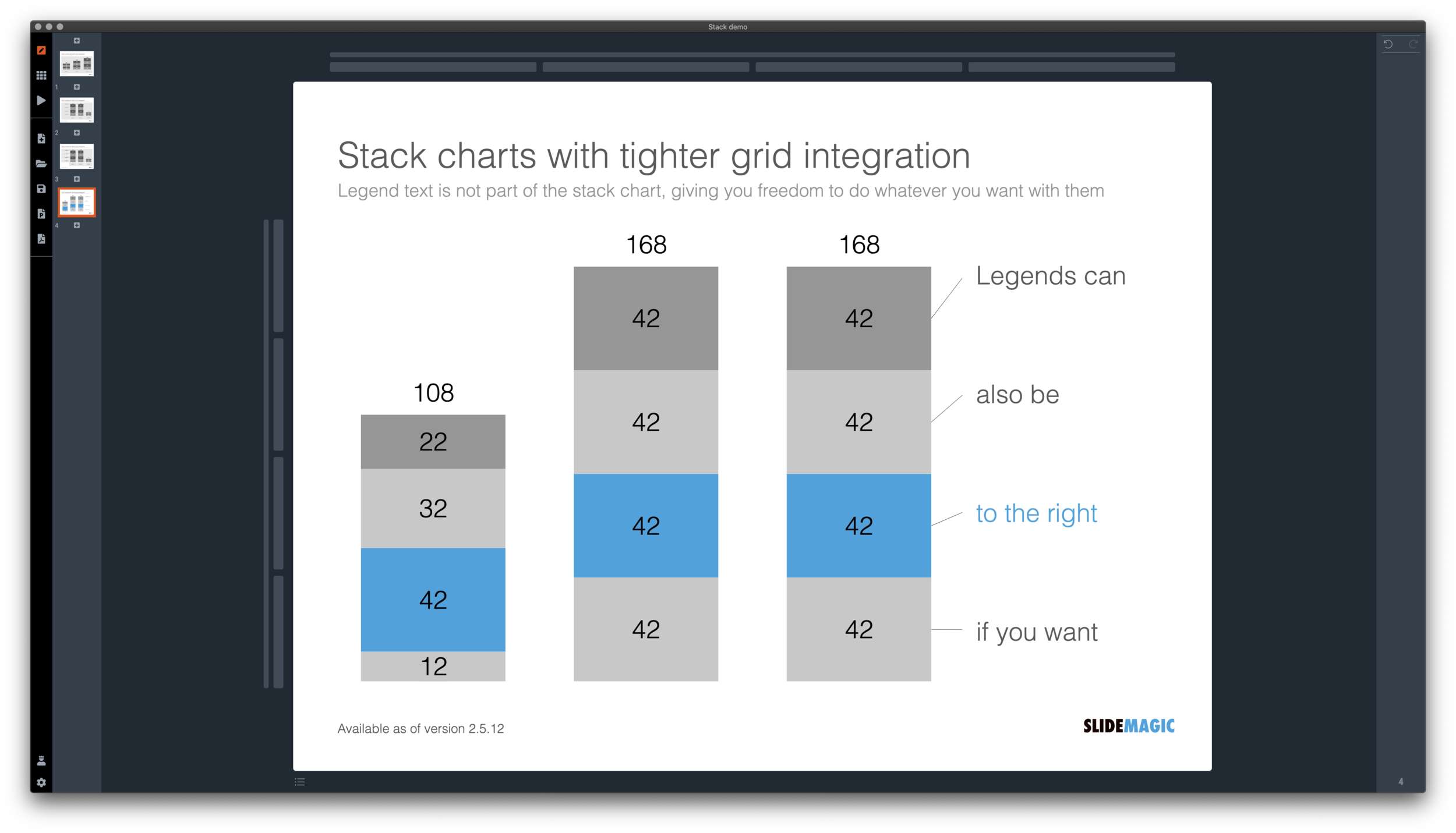
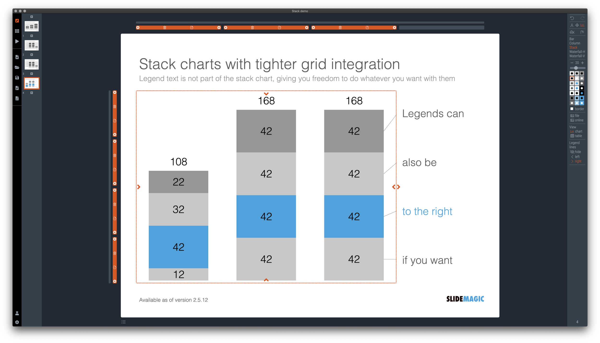
I just overhauled the stack chart in SlideMagic and forced to be tightly integrated with the slide grid. Adding/deleting rows to your slide will add/delete data series to your stack chart. Furthermore I have actually removed the legend from the stack chart shape itself, what is left is only the option to add lines that point to boxes outside the chart. This gives you total freedom to do whatever you want with the chart legend, small, big, or even huge text boxes. Everything lines up, you can even fit stack charts in tables if you want.

The charts below give you a sense of what the new engine does:

Screen Shot 2020-12-02 at 9.44.35.png
Screen Shot 2020-12-02 at 9.49.56.png
Screen Shot 2020-12-02 at 9.51.28.png
Screen Shot 2020-12-02 at 9.51.36.png

The old stack charts will continue to work in SlideMagic for the moment. If your charts have them, you can edit them. If you want to make new ones, click <SHIFT> + <STACK> and you can still make them. An old stack chart can instantly be converted into a new one by selecting it and clicking the <STACK> icon.

Stack charts in the template database are still in the old format, I will convert them over the coming weeks to the new format.

Stack charts convert to native Excel charts when saving your presentation as a PowerPoint file (the connecting legend lines are still missing for the moment). In PDF, you have exactly “what you see is what you get”.

SlideMagic: a platform for magical presentations. Free student plan available. LEARN MORE
A box for each point

A box for each point

It is really easy and quick to add bullet points to a text slide: hit return and start typing away, boom, you found a place for that other thing you want to say. Check.

SlideMagic does not support automatic text bullets, and you need to put each item in a separate box. Bummer.

This is by design. (Let me explain in a number of bullet points).

  • Boxes look a lot better on a slide than a list of sentences. The equal size and background colour compensate for different length of text content. Everything is always lined up and spaced out

  • More importantly: the box hurdle is a little ‘brake’ in your writing process. Do I need 3 or 4 boxes? Should the points be one, or multiple slides? Are the points equal in weight, or is one a sub point of the other?

  • The list is hardly ever the post visual layout for a slide, maybe boxes should be lined up next to each other, centred around some central box, go up, go down? When writing text lines, you are not even considering these layouts.

When designing slides, I spend most of my time thinking about the layout, the amount of rows and columns in the page and how everything fits. Once that is settled, the rest follows. I want you to do the same.

Photo by 🇨🇭 Claudio Schwarz | @purzlbaum on Unsplash

SlideMagic: a platform for magical presentations. Free student plan available. LEARN MORE
Regenerating the PowerPoint slides

Regenerating the PowerPoint slides

For subscribers who are using SlideMagic to download PowerPoint templates only: I have re-run the conversions of the entire database to solve some issues with arrows not being rendered correctly. All should be working fine now, let me know if you still find a slide that does not download correctly.

Pro-tip: try the SlideMagic app, a much more convenient way to work with the template database, convert to PowerPoint (if needed) as the very last step in your workflow.

SlideMagic: a platform for magical presentations. Free student plan available. LEARN MORE
Creative with bar labels

Creative with bar labels

Below a screenshot from an Economist instagram post:

Screen Shot 2020-11-29 at 12.07.13.png

The labels of the first 2 bars have been placed over the bars themselves to save space: there is now more room for the bars themselves. Other labels to the right of the bars.

I am not a fan:

  • The white over red of the top labels is hard to read

  • There is no nice and simple list of the top players, aligned in a consistent way

  • The names inside the chart area makes it harder to relate the bar to the axis

  • (I also prefer to put data labels in the chart rather than having a very imprecise value axis)

Here is a quick illustration of a bar chart in SlideMagic (The Eonomist did not provide the exact values, hence the dummy data).

Screen Shot 2020-11-29 at 12.30.44.png

SlideMagic: a platform for magical presentations. Free student plan available. LEARN MORE
A dedicated browser

A dedicated browser

Many people are surprised that SlideMagic is a desktop app. “Hey, it is 2020, not 1995?” Well, the SlideMagic desktop app is a bit different than the things you would run on your machine in 1995. It updates frequently (sometimes daily), and constantly is in touch with the slide data base server. I would actually call it a “dedicated browser”: a front end for the SlideMagic server with features such as dropdown menus and drag/drop between multiple windows that you cannot find in a regular browser.

People agree that on phones and tables, a dedicated app gives a better experience than a web page. The same is (still) true on a desktop.

Photo by Ilse Orsel on Unsplash

SlideMagic: a platform for magical presentations. Free student plan available. LEARN MORE
Use the whole page

Use the whole page

White space is a good thing in design. It makes text breathe, the whole page looks calmer somehow.

This applies to business presentations as well. Cut text that is not required, make images as big as possible, and your slide starts to look like a well-designed ad on a billboard.

However, in some cases, a business presentation slide is not meant to be a fashion ad. Think of the sales target data for the next quarter, or the new IT system architecture that you need to get approved. What I often see in SlideMagic is a “left over battlefield” with the final product of a complex table or system diagram. After many iterations it finally looks like it should look and everyone agrees to it.

In the process, the designer forgot to clean up, and remove rows and columns that are no longer needed. In SlideMagic, you can get rid of them with a few clicks and your entire diagram or table will scale up instantly, in the right proportions.

Screen Shot 2020-11-18 at 10.08.53.png
Screen Shot 2020-11-18 at 10.09.03.png
Screen Shot 2020-11-18 at 10.28.27.png
Screen Shot 2020-11-18 at 10.28.41.png
Screen Shot 2020-11-18 at 10.28.46.png
Screen Shot 2020-11-18 at 10.09.10.png

Yes, you gave up some white space around the edges, but overall the chart is more practical. To make things calmer, consider cleaning up data and text in the cells of your diagram instead.

SlideMagic: a platform for magical presentations. Free student plan available. LEARN MORE
Final final final final versions

Final final final final versions

Unlike in the case of a printed book, digital documents are never finished or final (despite being called “final version v3 - final”). Instead they have “committed versions” like programmers use when working with git to manage iterations of code. For most presentations these committed versions are documents you deemed good enough to share with someone at some stage in the project. That’s why the email sent box is becoming the new file archiving system. (Where is that document I sent out last week?). Sent it, or it did not happen.

Photo by Ben Wicks on Unsplash

SlideMagic: a platform for magical presentations. Free student plan available. LEARN MORE