Stack charts are very useful. So useful in fact, that SlideMagic does not support pie charts (by design).
They are very easy to make in Excel, but using them straight in a presentation is tricky. First there is the overall formatting of the chart, then there is the legend which is never connected to the chart itself, and does not leave enough space for text other than ‘new’, ‘old’.
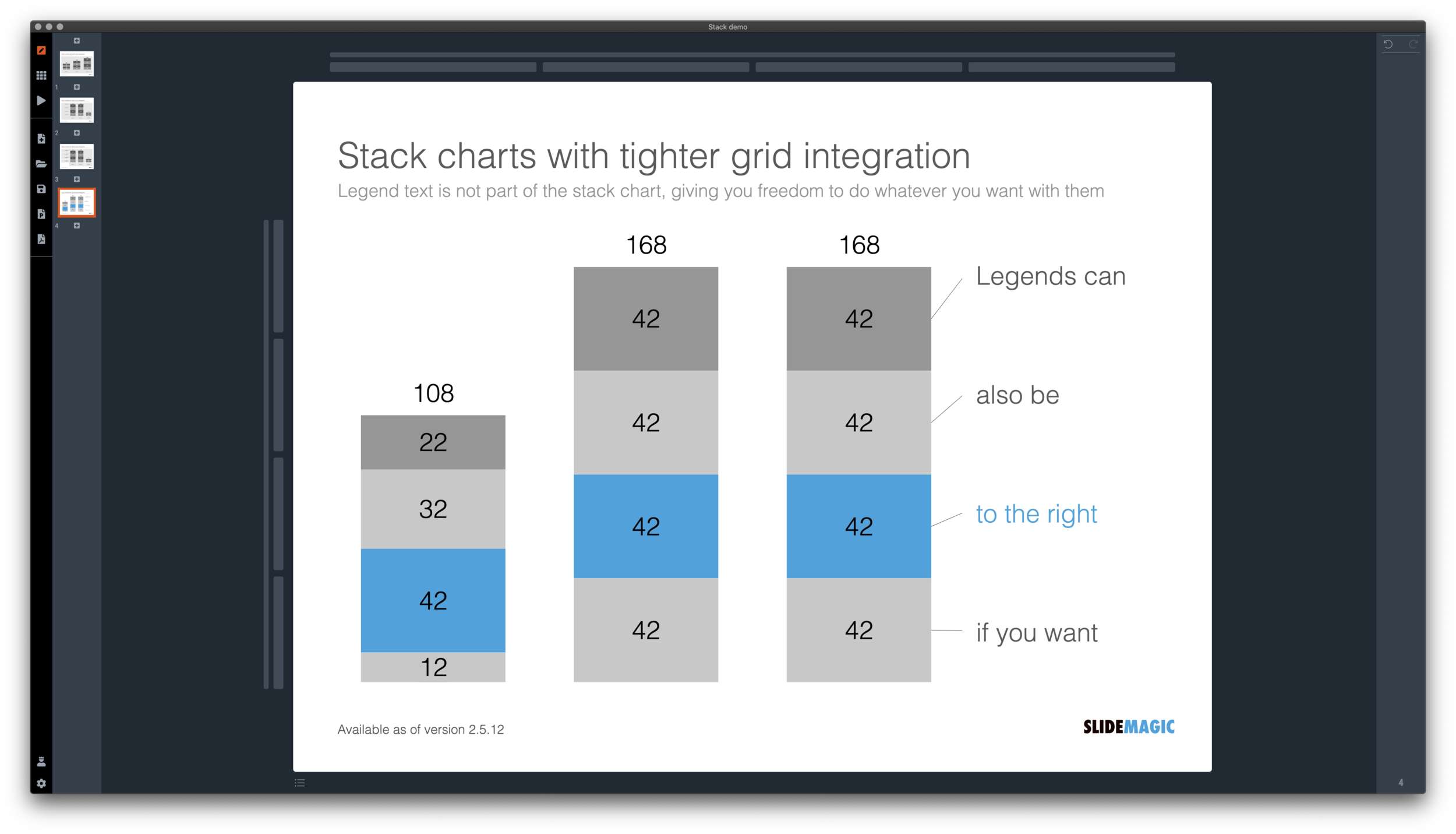
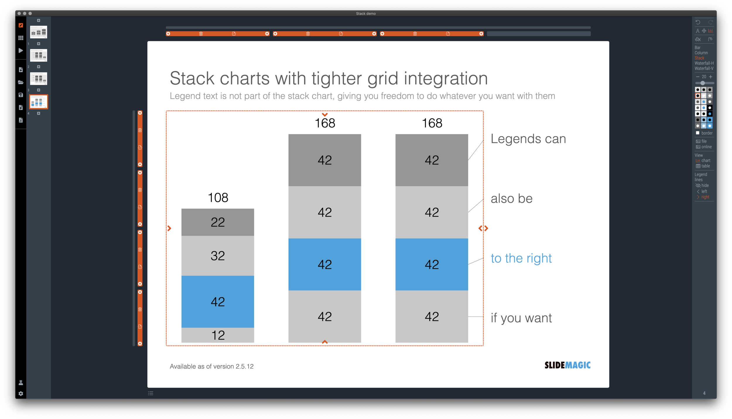
I just overhauled the stack chart in SlideMagic and forced to be tightly integrated with the slide grid. Adding/deleting rows to your slide will add/delete data series to your stack chart. Furthermore I have actually removed the legend from the stack chart shape itself, what is left is only the option to add lines that point to boxes outside the chart. This gives you total freedom to do whatever you want with the chart legend, small, big, or even huge text boxes. Everything lines up, you can even fit stack charts in tables if you want.
The charts below give you a sense of what the new engine does:
The old stack charts will continue to work in SlideMagic for the moment. If your charts have them, you can edit them. If you want to make new ones, click <SHIFT> + <STACK> and you can still make them. An old stack chart can instantly be converted into a new one by selecting it and clicking the <STACK> icon.
Stack charts in the template database are still in the old format, I will convert them over the coming weeks to the new format.
Stack charts convert to native Excel charts when saving your presentation as a PowerPoint file (the connecting legend lines are still missing for the moment). In PDF, you have exactly “what you see is what you get”.


