The bullet point trap

The bullet point trap

How do we end up with so many presentations that are mainly slides with bullet points?

A pitch usually has 2 types of slides. The clear cut ones: head shots of the team, columns with revenue forecasts, pictures of the product, screenshots of the app, table of the budget.

Then there are the ones that are less clear, the ones that need to tell the story behind your idea. When we start off,:

  1. we don’t exactly know what they need to say,

  2. we don’t know exactly what they should look like

These are 2 big challenges. It is not obvious to craft the story line with messages, and after you did that, it is not obvious to design a slide that delivers the message.

What happens? We open a slide editor and start putting in sentences on slides, move slides around. We can’t think about design, because we don’t know the content of the slide yet. As a result, the default bullet point list becomes the design that actually sticks.

We work really hard on the messages, get our colleagues to comment on them, get our boss to “sign off” that exact message (after we added the qualifying comment on line 3). And more and more, the presentation starts to make sense to us (the writer). The slides become mental placeholders, and in our bullet point frame of mind, every new slide will look exactly like the previous one. This is the mental model we are working with.

How to break the trap?

Maybe don’t use presentation software to make that story line. Write things in a Word processor. Deliberately use short, grammatically incorrect sentences (‘The “we are bigger” point here’) to avoid discussions among colleagues to finalize sentences (like you would do in a legal contract).

Once that is done and agreed, you take the whole thing away and really start thinking what is the best way to visualize everything you have just written down. As soon as you start copying the bullets from the Word document, you know that you are on the wrong track.

SlideMagic: a platform for magical presentations. Free student plan available. LEARN MORE
6 months, then 30 minutes

6 months, then 30 minutes

We have been iterating a presentation for our new venture for months and months, and then just before we had to send out the first deck to a very serious potential partner, I re-wrote the whole pitch in just 30 minutes. New format, new colours, new sequence, new everything.

Unfortunately, you need those 6 months of pondering in order to pull of 30 minute trick. There are no shortcuts.

But on the positive side: if you have been using a deck for a very long time, you could give it a try and come up with a completely new visual approach for your story.

SlideMagic: a platform for magical presentations. Free student plan available. LEARN MORE
Even better than I did

Even better than I did

This Venn diagram is a great visualization of why you still see vaccinated people in the hospital.

I gave it a go myself a while ago, but this visualization is better. Source of chart: RIVM, source of image. One improvement suggestion: switch the colors red and green.

SlideMagic: a platform for magical presentations. Free student plan available. LEARN MORE
The case for not rounding numbers

The case for not rounding numbers

In 99% of slides, it is better to round financial data. $1.9m is easier to read than $1,898,456.34. Also the rounded number is more in line with a financial model that relies on rough assumptions. If you project your company sales in 10 year down to the dollar, you lose some credibility with your audience.

In some situations, the opposite approach can work. Look at this poster below of an Israeli anti-vax group who makes the argument that the money that is spent on encouraging hesitating Israelis to get a vaccine, could have been used better in a different way. (I leave pro and anti-vax debates out this blog, although you might guess in which camp I sit).

Here the big number actually works. Anyone looking at this big amount of money instantly starts comparing it to other lump sums you know: how much do you make as an individual in a year, how much does a car cost, how much does an apartment cost. Also, the precision and suggested accuracy of the number adds to the drama. This is a similar effect that National Debt Clocks try to convey.

The correct way to look at these numbers is to relate them somehow: $ per citizen, % of total corona-related cost, compared to other government advertising campaigns, etc. etc. After that, you might still conclude that it is high, but you used the correct metric.

SlideMagic: a platform for magical presentations. Free student plan available. LEARN MORE
No pitch is the same

No pitch is the same

The internet is full with standard layout for pitch decks. Yes, they mention all the ingredients of your story that should be covered. Many of these topics will be “hygiene checks”, the audience will get them instantly and you can cover them with a placeholder slide.

Where your story is different from others, you have to elaborate with some good visuals.

  • A business model that nobody has ever seen before (think eBay when it just started out)

  • Photos of your the prototype of your hyper car which prove that it actually exists

  • A detailed CV timeline to show that you are perfectly able to run this company at the age of 21

  • A collection of the standard KPIs for online retailers that every investor is expecting

  • A market size that nobody realized existed, “wait, what, $5b per year on erasers?”

  • Etc.

SlideMagic: a platform for magical presentations. Free student plan available. LEARN MORE
The psychology of images

The psychology of images

An almost 50 page scientific article was published last month that looks at the impact of images, on financial investment decisions. A quote from the article:

We demonstrate that positive images significantly increase and negative images significantly decrease investment, despite the fact that the images do not provide additional information relevant to the investment tasks and should be disregarded by rational investors.

It all seem statistically relevant and scientifically sound.

It makes intuitive sense as well. A boring presentation without any images is not very effective. But people sometimes ignore the ‘mood’ of an image. Even if the visualisation of a concept is perfect, but you picked an image that is ugly, scary, gross, its visual impact will be the opposite of what you want it be.

Does this mean that you should plaster an financial presentation with meaningless pictures of rainbows? Probably not, everything in moderation.

See the results of the study here.

SlideMagic: a platform for magical presentations. Free student plan available. LEARN MORE
What your audience does not know

What your audience does not know

It is a waste to spend presentation on things your audience already knows, or already assumes is the case.

  • Already knows: common knowledge among informed audiences. A specialized investor who invests in crypto knows the basics of what is going on in that market.

  • Already assumes: something that people guess instantly, you IPO-ed both of your 2 previous startups, so the question can she be a startup CEO does probably not need any more time

You can score the obvious points very quickly with a snap reminder slide. Now it is time to move on to things that might surprise the audience (in a good way).

But remember, things can work the other way:

  • Already knows: “It is impossible to make good returns in healthcare diagnostics”

  • Already assumes: “She looks like she just got out of college, she cannot sell to big pharma”

Put yourself in the shoes of the adience.

SlideMagic: a platform for magical presentations. Free student plan available. LEARN MORE
Don't make them study the graph

Don't make them study the graph

A random chart on Twitter made me pause to see what is actually graphed. The chart title suggested a positive correlation, but the line is actually sloping down.

On closer inspection you see that the vertical axis is “low is good, high is bad”, and the horizontal axis is “left is bad, right is good”, also the horizontal axis talks about “decline” instead of “growth”, so a positive number is actually a decline.

To analyze data, it is OK to ponder and study a chart. In a presentation of final results, not.

SlideMagic: a platform for magical presentations. Free student plan available. LEARN MORE
Sorting text by length

Sorting text by length

In slide design, every detail counts. Pay attention to the length of text blocks when putting them on a page. Sorting them by length can give an interesting visual effect. Or the other extreme, picks words on purpose so that the length of each text box is more or less the same.

PS. How did I get the picture? Search for “diagonal" in the SlideMagic app and you get lots of suggestions

SlideMagic: a platform for magical presentations. Free student plan available. LEARN MORE
Smile with your eyes

Smile with your eyes

The current requirements to wear masks in public places shows that you can still smile without revealing your mouth. Do it when posing for a picture with a mask, and without one!

Me and my (disguised) daughter in Paris

In art, smiling with your eyes is taken to another level entirely though…

SlideMagic: a platform for magical presentations. Free student plan available. LEARN MORE
Stuck!

Stuck!

I needed a chart today that showed how things are in a deadlock, everyone is waiting for each other, and as a result, nothing happens. I added this new design to the SlideMagic library for you to use.

SlideMagic: a platform for magical presentations. Free student plan available. LEARN MORE
The interviewer who wants you to shine

The interviewer who wants you to shine

Unless you are a politician, powerful CEO, or another controversial person, most interviewers for podcast, video interviews, TV interviews, conference panels probably want you to shine on stage. She is likely a media pro, you are not appearing on screen every day.

A good interviewer has a little chat with you before the show, gets a quick ideas of the interesting points you can share with the audience, and then will proceed to give you the best possible setup question to tell your story.

In this friendly environment, you can patiently wait for the question to finish, and deliver the punch line that you might have practiced before (practice it a lot in order to be spontaneous). No need to jump in early, deviate from the question, or be surprised because you did not see the question coming and need to think about the answer after you started answering the question.

In some sales or investor pitches, the role of this friendly interviewer might be the person you convinced of your story, and now needs to sell it to her superiors. Help her out if you can.

SlideMagic: a platform for magical presentations. Free student plan available. LEARN MORE
The brain is predicting

The brain is predicting

Here is an interesting article about how our mind works. The brain is constantly predicting impressions to save energy. It has a number of layers. A higher layer creates a prediction based o a lower layer. The lower layer can report inconsistencies to the layer above, in case we can go a level deeper.

This is probably the same mechanism that intuition uses, as long as we observe something that is in lie with our prediction, we maintain low energy mode, if things start moving apart, we add brain power.

Remember that this is how an audience will be looking at you when presenting.

SlideMagic: a platform for magical presentations. Free student plan available. LEARN MORE
Fitting text in circles

Fitting text in circles

It is very tricky to fit paragraph text into a circle. Line breaks are never smooth, especially when you have long words. My approach is to use a larger circle, but fit the text inside an imaginary square that just fits inside the circle.

For math geeks, the ratio between the side of the square and the diameter of the circle is the square root of 2. I had to use this proportion recently to fix a web site layout.

Obviously very short headings fit perfectly well inside a circle.

(Yes, yes, circles will come to SlideMagic)

SlideMagic: a platform for magical presentations. Free student plan available. LEARN MORE
Changing the color of the French flag

Changing the color of the French flag

President Macron of France changed the blue color of the French flag. He made the blue darker again, after it was set to be the same blue as that of the European Union flag back in the 1970s. (Then president Giscard d’Estaing thought the different shades of blue clashed during photo ops).

I agree with Macron, the darker blue looks better, flags have a history, and i don’t think the two shades of blue clash at all. When doing design work, pay attention to flags. They have very specific colors (like logos), and very specific aspect ratios.

SlideMagic: a platform for magical presentations. Free student plan available. LEARN MORE
Organized randomness

Organized randomness

This is a tricky thing to do: create a layout of seemingly random elements that look good together. I need to deal with this now for the new venture I am setting up

It is a process of constant iteration. Put one type of elements, put another. Add text and titles. They shift the weight of the page, so everything has to move around again, different screen aspect ratio, another shuffle. Repeat, repeat.

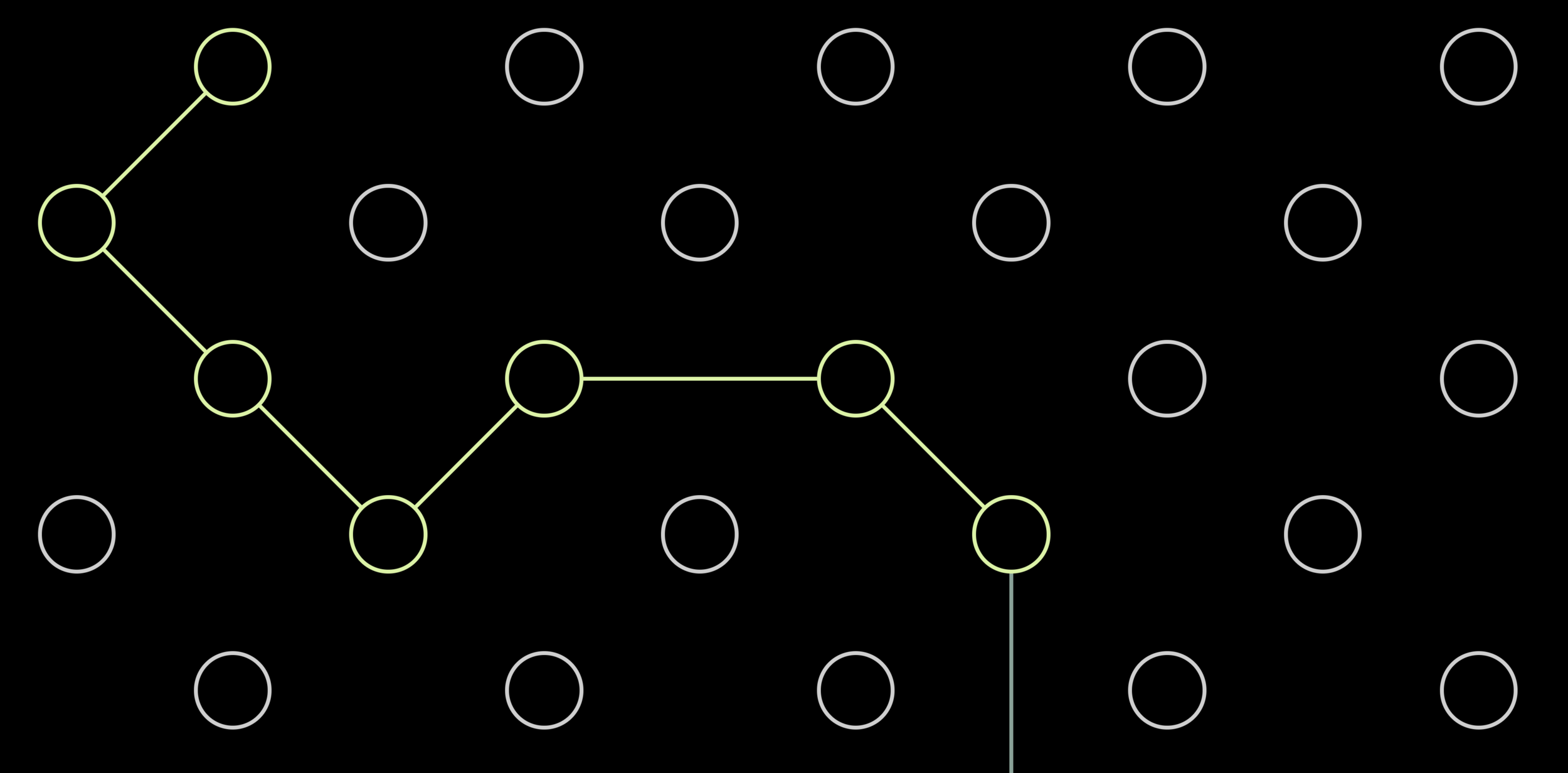
Subconsciously, your brain is scanning for anomalies in the unwritten rules of a layout. You don’t know what they are, but you see it when you break them. For example, including one angle in the path above that is “sharp” (i.e., smaller than 90 degrees, would stand out.

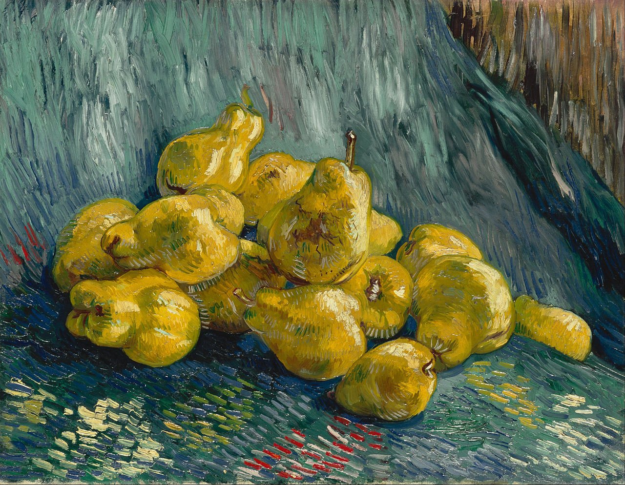
Architects have to deal with this a lot, or painters laying out the “random” elements of a still life painting.

In the end, we are all artists.

SlideMagic: a platform for magical presentations. Free student plan available. LEARN MORE
On-screen app demos

On-screen app demos

I just went through a live on-screen application demo, some things I learned, some things I knew already.

  • If the meeting is very short, consider doing a demo using screenshots on slides. This prevents losing time in technology glitches and the less interesting part of your app (logging in etc.). Have a live version of your app running on your machine as a proof that the real things is there.

  • Rehearse the exact scenario you will be running. Which demo users will log in, what will they do, in what sequence. Again, this will eliminate technical issues, but also makes sure your story fits with the overall pitch (no dead ends, no duplications, repetition of things you already explained using slides).

  • Make sure that the app looks right. For some apps, this is a full screen rendering on a very large monitor, for other apps this might be rendering of your app on a smaller screen on the big monitor. In the latter scenario, remove visual distractions from your laptop desktop.

  • Pay attention to the details of your demo environment. Add avatars for your demo users that fit nicely with your app colors. Fill out optional text (even with lorem ipsum) that might not be crucial to your app, but make the whole screen look more balanced.

  • Laptop track pads feel strange when you have to look at a giant monitor at the other end of the room. Consider bringing a mouse so you can ignore your laptop all together, or mirror your screen.

  • Pay attention to your monitor configuration when using dual screens. If the big screen is to your right, make sure your computer thinks it is there as well. Every time you have to “think” where your mouse is, you take your attention away from the pitch.

  • Think of your “background screen”, what is the view of the app you want to be sitting on the monitor when the demo is not really running. A blank login screen, or a blinking cursor of your localhost server does not do much to pitch your app…

SlideMagic: a platform for magical presentations. Free student plan available. LEARN MORE
The genie is out of the bottle

The genie is out of the bottle

I was a bit worried about Unsplash after the Getty acquisition, and the current home page of my favorite photo site confirms some of these worries, 50% of the space above the fold is devoted to promoting iStock (scroll down and they take another chunk at the bottom of the page). I think the genie is out of the bottle when it comes to free, open source images. And this page actually shows that there is no quality difference at all between images for which you pay, and images that are free. Unsplash has a responsibility to all the photographers that made their images available under a certain expectation of the spirit of the site. Hopefully it can find a suitable business model that will work for everyone. If Unsplash does not succeed, a new Unsplash will emerge somewhere.

SlideMagic: a platform for magical presentations. Free student plan available. LEARN MORE
Changing the engine while driving

Changing the engine while driving

This is the approach I take when making drastic changes to computer code, a presentation, or a spreadsheet. When you decide to turn a big piece of work upside down, you can’t simply tear up the whole thing. Instead, you change things carefully, constantly monitoring whether the program keeps functioning, and/or the spreadsheet still produces more or less the same answer. When it does, take the old stuff out bit by bit.

This is the only way to manage mistakes. If you changed 5 things and see that all of a sudden your average price per bottle is way off, you cannot tell which of the five is the culprit.

What if all of a sudden your boss, customer, or user wants an intermediate new version of the model. If you are mid-way in some major rewrite, you cannot produce it quickly.

Or, maybe you discover halfway through that the 2nd change of the 5 you pushed through actually does not make sense. Unwinding everything is hard.

SlideMagic: a platform for magical presentations. Free student plan available. LEARN MORE
Another slide makeover

Another slide makeover

McKinsey’s social media activity provides an excellent stream of slides to work on. The one below could have come straight out of SlideMagic.

I created a proper SlideMagic version with a few improvements:

  • Emphasized the “from to” theme of the chart with arrows, and two contrasting colors, and a bigger distance between the two options

  • Lighten the colors a bit, especially the dark top row of the original puts a lot fo weight in the chart

  • Actually reduced the font size a bit to give the text more breathing space in the boxes

  • Re-shuffling the bars to get a more pleasing overall composition

  • I eliminated the left column, the audience can guess the description, to add more balance to the composition and gain some extra space

SlideMagic users can use this chart, simply search for a relevant keyword (operations, consulting), and it will pop up for you to adjust to your own project.

SlideMagic: a platform for magical presentations. Free student plan available. LEARN MORE