From point estimates to drivers

From point estimates to drivers

Making a company business plan is tricky. Nobody can predict the future. Everyone can argue about the validity of a point estimate of sales in year 5: $45m…

I tend to remove as many of these hard coded point estimates as possible from my spreadsheet, and instead build the whole thing up from drivers or factors that ‘you can touch’. Instead of a hard sales number it is # of potential clients x market share x price per client.

Here is my approach, starting top down, then building a bottom up model

  1. Start with the hard coded number (top down)

  2. Back out of the number the implied number of clients, price per client

  3. Make an assumption what market share that number of clients implies

  4. Now hard code the market size, market share, and price numbers and tweak those to calculate the top line number

Now that you have set the revenue forecast, apply a similar approach to cost. Given the amount of clients you need to get every year, how much would it cost to get them? Sales trips, sales people, conferences to visit etc. etc. How much would it cost to support each client? This is a much better cost planning tool that simply adding a number in your P&L.

The result of this exercise is that you get a dynamic company model which logically makes sense, the only wild card being that number of clients that you put in.

SlideMagic: a platform for magical presentations. Free student plan available. LEARN MORE
Black flags

Black flags

Many visual identities use a dark or even black background. It looks great on web sites, or presentation slides, or print ads, even billboards. One place where it does not work: flags. Flags should be happy and/or vibrant. A row of black ones looks depressing and even scary.

If your identity does not have any happy colours: go for black on white which should work fine.

SlideMagic: a platform for magical presentations. Free student plan available. LEARN MORE
My other project...

My other project...

Over the past year I have been working on another project together with my co-founder Anat Naschitz (my partner in life as well). This week we are quietly revealing things to the public: 9xchange is a marketplace for molecules. There are a lot of molecules on the shelves of pharmaceutical companies, biotechs, and academic institutions that never get turned into drugs. It takes a lot of effort, and requires you to reveal your pipeline strategy to start selling these assets to players who could use them. 9xchange is going to make that easier.,

I have not spent a huge amount of effort on the design of the landing page, most energy went into coding a secure B2B marketplace (a much bigger technical challenge than the SlideMagic app). But I like the graphical language which is very different from most corporate websites. Have a look here. The messaging of the front page is likely to change as we interact more with users.

Membership of 9xchange is still by invitation only at the moment. Contact me if you work and/or invest in the healthcare industry and would like to try it out.

This project does not mean the end of SlideMagic, which will continue to be developed, don’t worry,.

SlideMagic: a platform for magical presentations. Free student plan available. LEARN MORE
The river

The river

An important lesson from my negotiation class in business school was the concept of ‘the river’. When two parties battling in a war are negotiating a ceasefire line it is often not the relative power of the armies that dictates where the line is drawn, it is a geographical feature that is the natural separation line between the two forces. You can argue as much as you want, you know where the compromise is going to land in the end. Useful to remember when negotiating a business deal as well.

P.S. I was reminded of this by one of the endless tweets about the conflict in Ukraine today.

SlideMagic: a platform for magical presentations. Free student plan available. LEARN MORE
Political messaging done right

Political messaging done right

This Zelensky speech will be studied alongside “I have a dream” type of presentations in the future.

  • It establishes common ground with the audience (comparing Ukraine today to the histories of many other countries)

  • Draws you in to act (hey, your ancestors did this for you, now it is your turn)

  • Then paints a picture of what can be

Very well written, and very well directed with the setting and the black and white colouring.

SlideMagic: a platform for magical presentations. Free student plan available. LEARN MORE
Writing the whole thing again in 30 minutes

Writing the whole thing again in 30 minutes

Writing a good presentation is a process that takes time. There is the time to complete the analysis and make the graphs and tables, but also time to ponder the story and the flow.

If you somehow end up rewriting your whole deck in 30 minutes the day before the presentation, and leaving out many of the data charts that took you days to make, then it does not mean that you made mistakes, got it wrong, or wasted your time. You actually had to go through the whole loop in order to pull off that 30 minute rewrite.

SlideMagic: a platform for magical presentations. Free student plan available. LEARN MORE
WeCrashed

WeCrashed

I have been watching a few episodes of “WeCrashed”, the Apple TV+ series based on what happened to WeWork. Lots of investor pitching here, as Adam is raising money to keep his business going.

People often use this high profile entrepreneur case studies as inspiration for writing investor decks. But these were very specific types of deals. A specific entrepreneur, a specific funding and expansion strategy, a specific stage the company was in, and and very specific type of investor bet: putting in huge sums of money and hope to get your return out before the bubble pops.

Your might be a different type of entrepreneur, with a different growth strategy, in a different phase, and pitching to a different profile of investor

P.S. I wrote a few posts about WeWork on this blog before.

SlideMagic: a platform for magical presentations. Free student plan available. LEARN MORE
AI in presentation design

AI in presentation design

AI is making an entry in office applications. See this article with a funding announcement for a company. The idea is to analyse human computer input (text, clicks) and try to automate routine tasks (think booking a flight, making a quarterly financial report).

What about presentation design?

Artificial Intelligence is a very generic buzz word, and we need to be highly specific when talking about its application in any area. What the technology does is analyse vast amounts of inputs and outputs and then reverse engineer their relations without “understanding” anything of the underlying thought process that a human would go through.

I can see one type of presentation design that could be subject to automation, the 1-on-1 slide makeover. There are many designers, design agencies out there that take your slides, do not edit their content at all, but simply make them look prettier:

  • Align and distribute layouts

  • Fix inconsistent fonts and colors

  • Change font sizes

  • Etc. etc.

Feeding thousands of before and afters will ultimately lead to a computer system that could do this automatically.

They key to slide design is though to have the courage to start editing in the content. Rephrase text. Break up slides into multiple layouts. Remove table columns. Round up numbers. Change the type of graph. Etc. etc. And that is at slide level, in most cases deeper surgery is required: a reflow of the whole story line.

SlideMagic: a platform for magical presentations. Free student plan available. LEARN MORE
Bar chart formatting

Bar chart formatting

This chart can be improved in many ways (source), you can see it without understanding German…

  • No need to repeat “Mrd. Euro” (billions of Euros) at every data point, just put the unit at the top

  • The data labels of the second data series is missing, as is the total

  • The color of the 2nd data series is too light (probably to make the text readable)

  • I would right-align the row labels

SlideMagic: a platform for magical presentations. Free student plan available. LEARN MORE
Free student plan for SlideMagic

Free student plan for SlideMagic

SlideMagic will be offered for free to students. I am working to set up a partnership with a student validation service to create a streamlined automated signup process. In the meantime readers of the blog can already apply for a free SlideMagic membership:

  • Create a regular free SlideMagic account with your school/university email address

  • Verify that email

  • Visit this link to apply for a free subscription

This process is still partly manual, so response will not be instant. Student memberships will run until Aug 31, after which you need to apply for a new one.

SlideMagic: a platform for magical presentations. Free student plan available. LEARN MORE
McKinsey chart make-over

McKinsey chart make-over

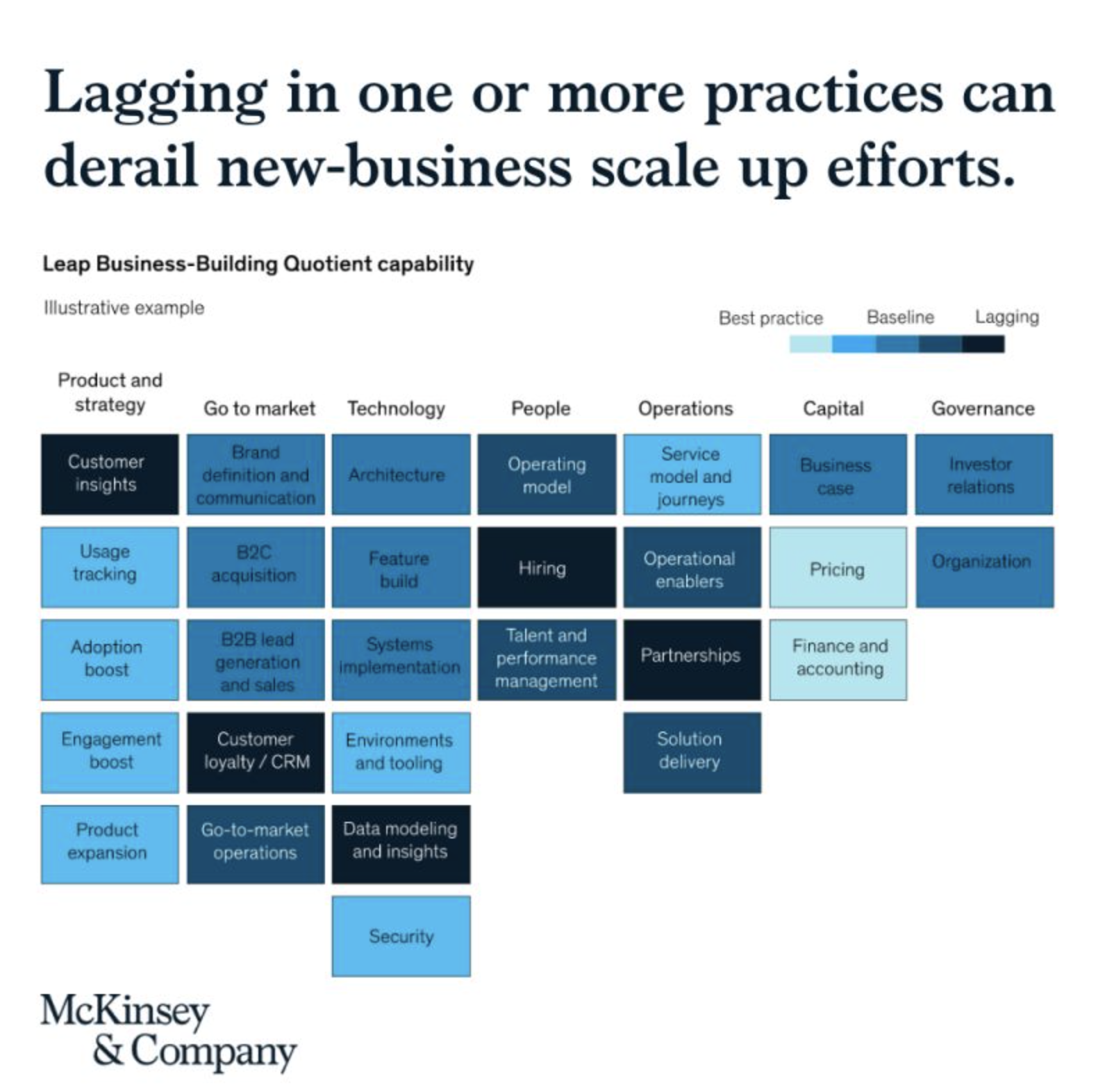
See the following McKinsey framework (background here):

The slide does not look bad, but there are a few things that I would change:

  • Flipping the columns and rows of the table, there are more columns than rows, I tend to put the axis with the most data in rows

  • Sorting the categories by number of boxes, to get a more visually pleasing line (McKinsey probably sorted the columns by importance)

  • Sorting the boxes within a category by color (and not by importance)

  • Fixing the color coding, the dark colour is actually the worst score.

Below is a quick makeover in SlideMagic, you can find this chart in the SlideMagic slide library for you to use.

SlideMagic: a platform for magical presentations. Free student plan available. LEARN MORE
Landscape photos

Landscape photos

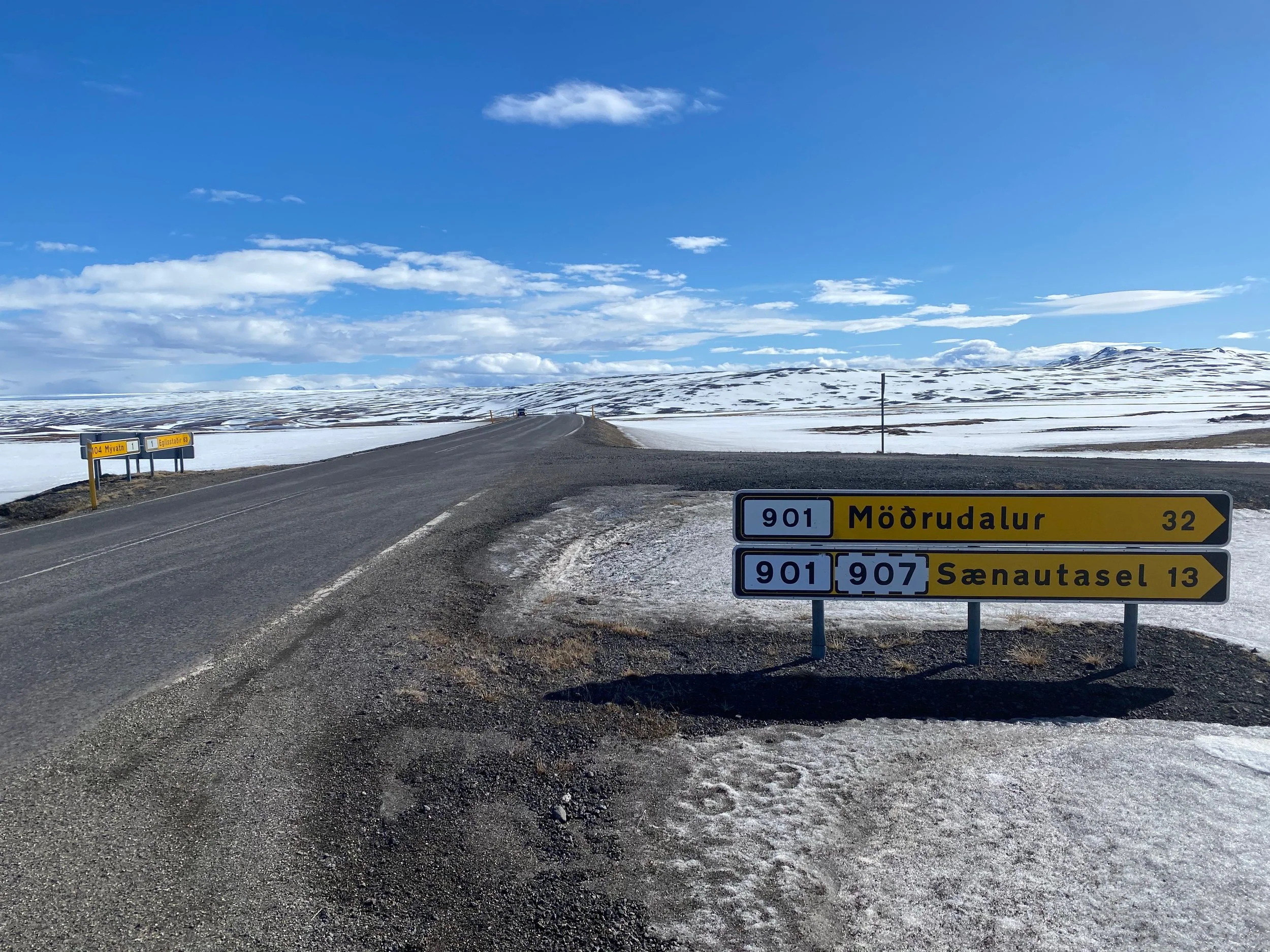
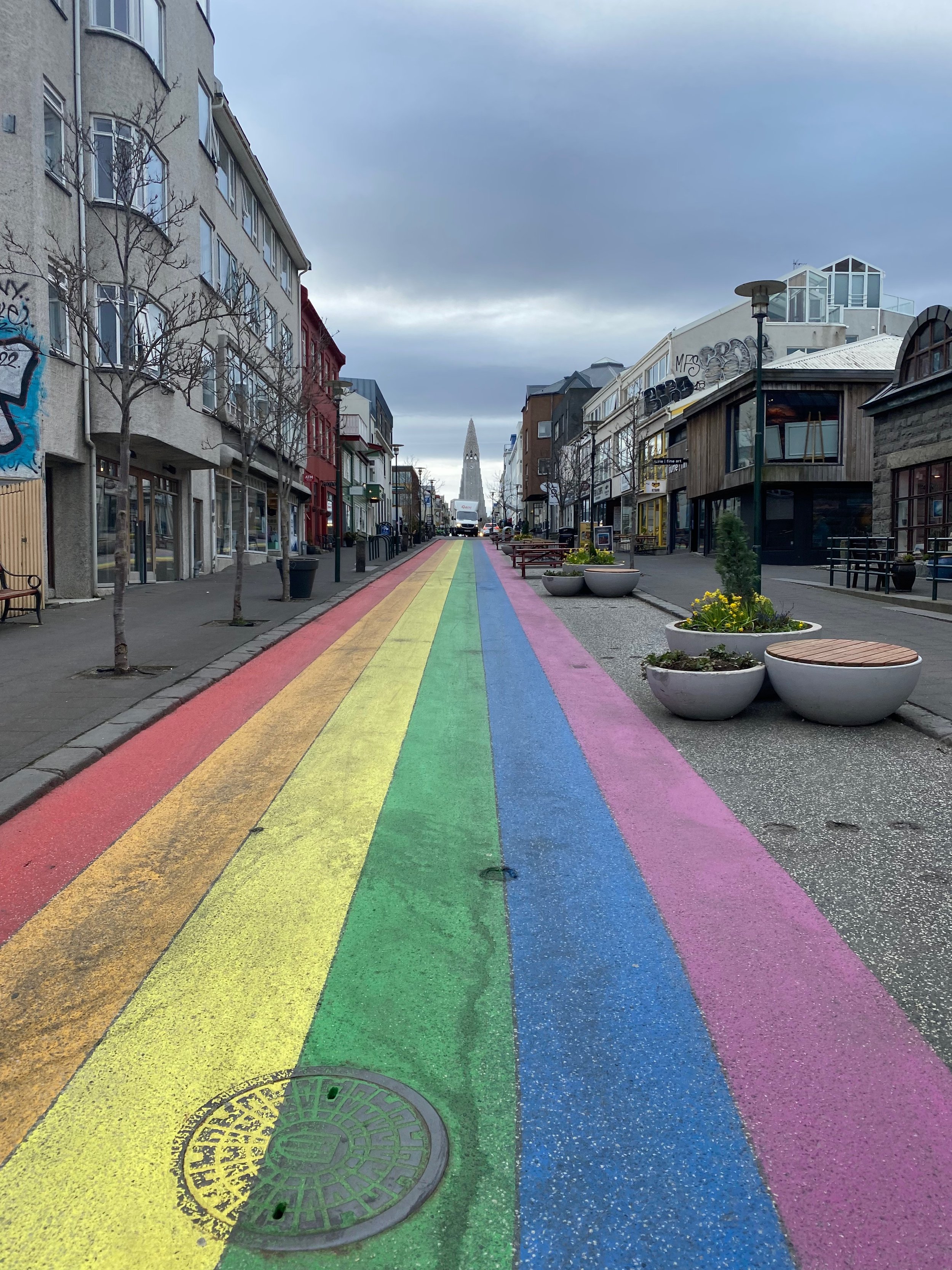
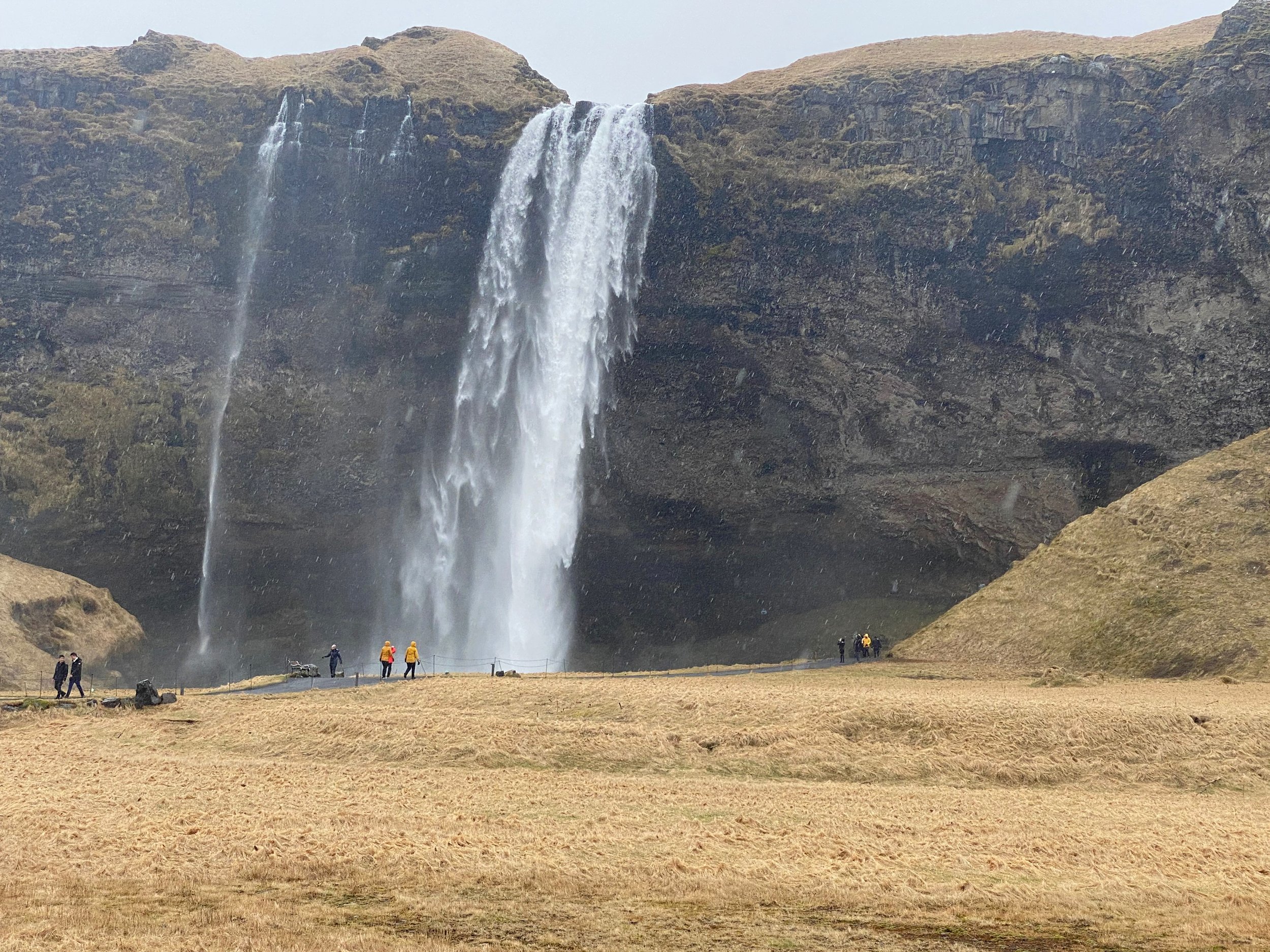
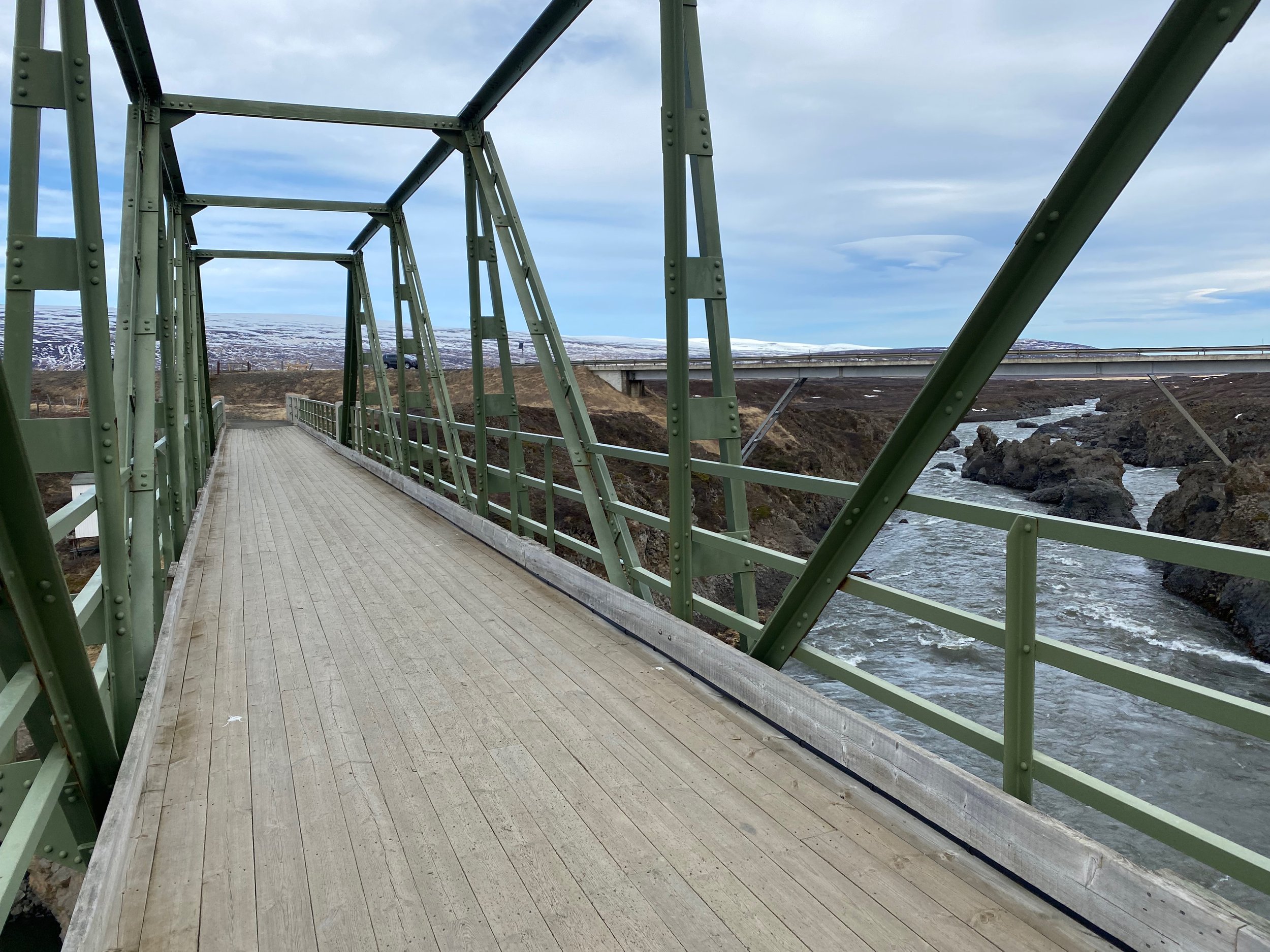
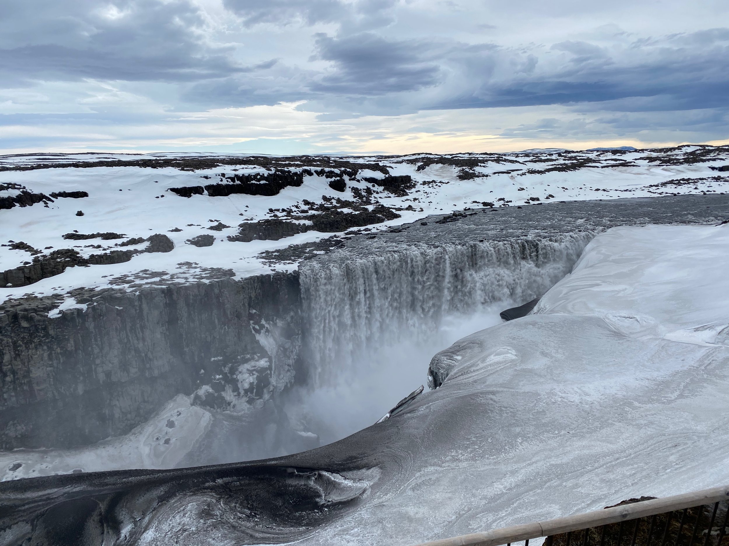
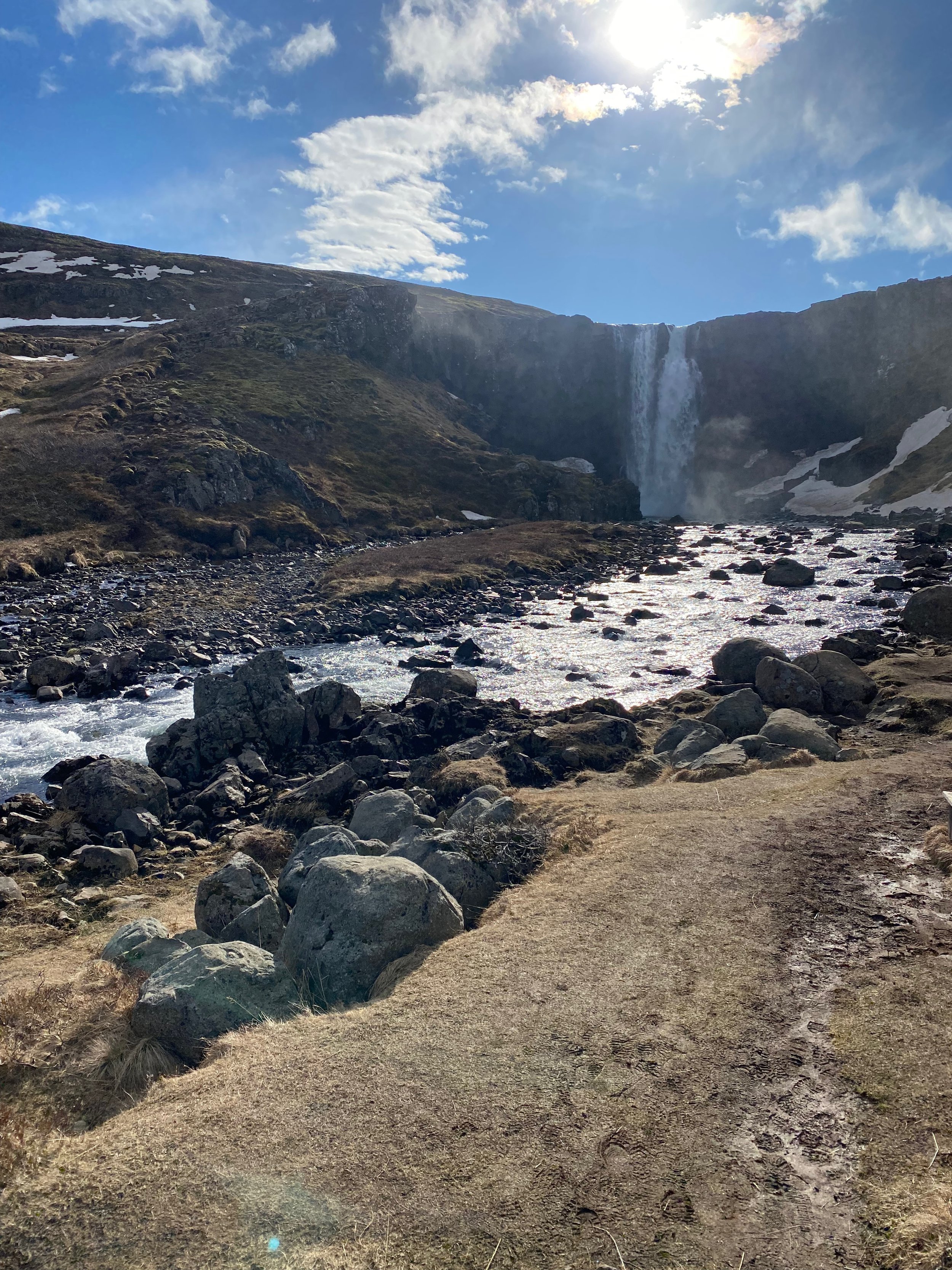
I just returned from a wonderful spring holiday in Iceland (this explains the silence on the blog here). Below is a quick subset of the images I took with my phone (the ones without family members).

These are the raw shots, without cropping or any colour/light adjustment. What is my approach to making these landscape shots:

  • I actually do not overthink my photographs: just snap to catch the moment

  • I hardly ever use the zoom function on my phone. If needed, I can always crop images later to get a zoom effect. Live zooming reduces the image quality and makes the image more sensitive to an unsteady hand / shaking.

  • I tend to look for lines (roads, rock formations, etc.) to force some sort of eye movement in the images

  • Where possible, I try to catch a small element in the foreground to create a sense of depth. (Often a family member taking the same photo, pictures of family taking pictures is one of my favorite themes)

  • Painters already discovered this, often the sky is one of the most interesting visual elements. Try dropping the horizon in one of your shots.

  • Most photos are taken at eye height. Create unexpected perspectives by lowering or lifting your camera

  • Pay attention to the sides of your image. Adding a tiny bit of a wall or other structure in your shot can make the image feel “closed” or “trapped”, leaving it out gives a much more open feel.

Very often, it is impossible to capture a vast landscape in an image. The view is stunning, the image looks bland. This is only a problem for your audience though, for you, the image will trigger the memory of the real thing and therefore it is still worth taking.

SlideMagic: a platform for magical presentations. Free student plan available. LEARN MORE
The cultural differences...

The cultural differences...

Communication cultures differ widely across countries. I experienced it myself in multiple situations:

  • Working as a Dutch national in McKinsey’s London office, people found me somewhat ‘blunt’

  • Living as a foreigner in Israel, I would sometimes be surprised that the first thing some says to you is “how old are you?”

  • Participating in a large Zoom call with many American participants who pretext a point of criticism or disagreement with a 1-2 minute apology before getting to the point

It is important to be aware of these differences:

  • As someone who is presenting

  • But also as someone who is in the audience and needs to put the presenter in perspective

Some of these differences might actually not be down to culture or character. Not all languages have words for specific nuances, so things literally get lost in translation: Language 1 has 5 options on a scale, language 2 only 2. If you are the native speaker in the 2-option language it is hard to pick (or even know) which of the 5 options to pick.

Read body language and ask for clarification when in doubt, or use some self deprecation to preempt possible issues.

SlideMagic: a platform for magical presentations. Free student plan available. LEARN MORE
COVID isolation policy

COVID isolation policy

A quick re-make of a graphic with the Israeli COVID isolation policy, here is the original

Below is my version in SlideMagic. I tilted the diagram, to put more emphasis on the timeline. Search for ‘COVID’ in the SlideMagic template bank and the slide will show up for you to use, either exactly as is, or as the basis for another timeline chart.

SlideMagic: a platform for magical presentations. Free student plan available. LEARN MORE
Zelensky's roadshow

Zelensky's roadshow

Ukrainian president Zelensky is ‘touring the world’ via video calls to parliaments to drum up support for his country in the conflict with Russia. Each speech is tailored specifically to a country. Here are some of the patterns:

  • Establish a connection, giving a compliment about the country: “I have been there”, “What a beautiful city”

  • Make you feel what it would be if all the agresion happens to you: “What would you do if the port city of Genua would be destroyed?”

  • Link the struggle of the Ukrainian people to a historic struggle of you (“You stood up after Pearl Harbour, we are in a similar situation now”)

  • Making you part of the event: “This is not about Ukraine, but a struggle of the entire world against evil”, i.e., you are not just an audience

  • Rubbing it in that he is doing something, and taking the hits (for you, see previous point), while you ‘sit back and relax’

  • Appealing to personal moral standards, this is not about business, country or world politics, this is about innocent people dying

  • Addressing individuals directly, i.e., the Prime Minister of the Netherlands was singled out by name in today’s address to the Dutch Parliament.

  • Asking for very specific things that a country can do

  • Rather than begging for help, he projects strength and determination and is inviting people to join the winning side

All of this is delivered in a short speech, with short sentences that are to the point.

SlideMagic: a platform for magical presentations. Free student plan available. LEARN MORE
Will they, or won't they?

Will they, or won't they?

Some presentations involve a big, black and white outcome: who hosts the next Olympics, will the trip go through, etc. etc.

In the world of entertainment, the tension is part of the show, think Oscars or talent shows. In most other cases, postponing and building up to the long awaited verdict does not serve a clear purpose. People might actually be distracted and not really listening to your arguments, as they are frantically trying to figure out where you are heading to.

Better to say the answer straight in the first sentence, and then explain why.

SlideMagic: a platform for magical presentations. Free student plan available. LEARN MORE
Print bug fixed

Print bug fixed

For users who print their decks on physical paper, I patched a bug that was caused by the underlying software platform ‘Electron’. Everything should work now. Windows users might get a message that the developer SlideMagic is ‘unknown’. You can safely ignore that, I am working on getting rid of this warning. At your service.

SlideMagic: a platform for magical presentations. Free student plan available. LEARN MORE
Super Venns

Super Venns

Below an attempt to show what countries belong to what organisation. (A bit outdated, the UK has left the EU). A good start with the groupings of the countries, and the circular layout of the flags. Also note that flags are displayed in their correct aspect ratios (Switzerland for example is square).
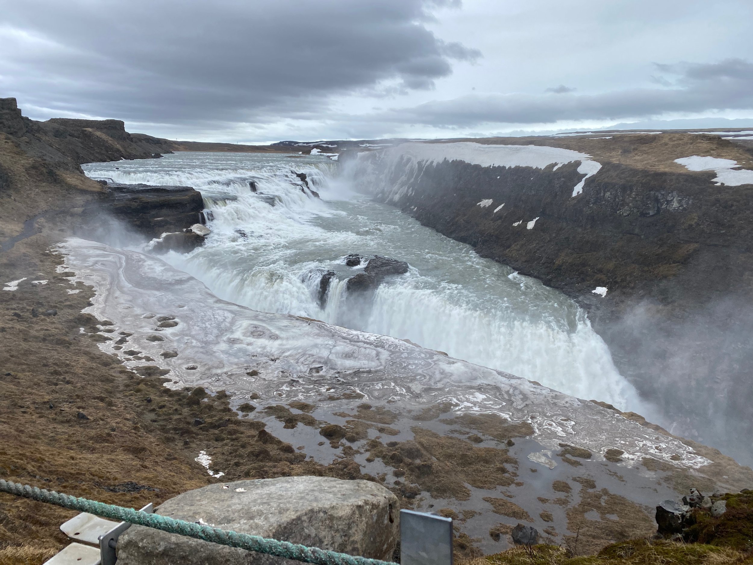
Image found here, probably by Nato

What to do better?

  • Not a big fan of the gradients and shadows

  • I would put the Council of Europe label also on the right

  • It should be possible to get an even more harmonious and distributed layout by moving some flags, labels and circles around

The other approach to make this chart is to use a map and color code countries according to their memberships

SlideMagic: a platform for magical presentations. Free student plan available. LEARN MORE
Your true colors

Your true colors

My wife and I are pitching the services of (a still very) small startup (with a big idea) to some pretty big corporations. Big corporations are busy and overloaded with requests of small companies to talk to them. It is fine to play hard to get, but if you accept a meeting/call, don’t cancel at the exact minute the meeting is about to start unless there is some medical emergency.

The world is small and memory is surprisingly good. Personally, I had a few cases of poor interactions with people as a presentation designer (not paying agreed invoices for example) with people that re-appeared 5-10 years later with a request for another presentation (‘‘Hey, I am doing my own startup now and got a meeting with these investors next week, can you help?”), or were the subject of a reference call (‘Do you think I can trust this person with my investment?’)

Basic human interaction hygiene.

SlideMagic: a platform for magical presentations. Free student plan available. LEARN MORE
Add an optional message

Add an optional message

Most online services have some sort of invite-a-friend functionality that triggers a pre-populated email. Read through that message one more time. It is probably loaded with marketing jargon (“added value”), and uses superlatives to show how excited the user is (“super excited to finally have everything in one place”).

But is that really the words the user would use?

As an exercise imagine what a good friend of you would write to another good friend of you in her own words to talk about your product.

  1. It might inspire you to write a better pre-populated email message

  2. It might give you some honest product feedback without actually asking these users

SlideMagic: a platform for magical presentations. Free student plan available. LEARN MORE