Let them climb down the ladder

Let them climb down the ladder

I have been posting less on the blog over the past weeks. Given the current events in Ukraine, it would just not look right when the SlideMagic twitter account posts happy titles such as “A new and exciting way to crop your images” amid all the other stuff that is going on.

The current war is also a big communication war. And in times of conflict, it might be wise to count to 10 before saying things after seeing these horrible images coming out of the battlefield. Western leaders have been very aggressive in their language: ‘total economic war’ etc. etc. The problem is with all of this is that you need to keep a ladder for the other side to climb down, rather than throwing oil on the fire. The world already knows that you are (rightfully) upset.

The better strategy:

  • Use a more matter of fact tone in communicating sanctions: “we don’t like what you are doing, here is what we do to show that we mean it, we will reverse if you do”

  • Show unity and resolve

  • Go after economic targets that really hurt, rather than things that are high profile but don’t actually mean very much

  • Instead of leaking to the press how many arms you supplied or might supply, brief them on how to calculate the economic impact of the sanctions, now, in 1 week, and one month from now

  • Maintain a cold and rational calculation of the financial damage done and communicate it

  • Maintain a cold and rational evidence trail of wire crimes committed and communicate it

  • Keep on ratcheting up the sanctions, without the polemic rhetoric.

Day by day the pressure to climb down the ladder will become stronger, and that will also not go unnoticed in other governments in the world that are evaluating geopolitical strategies

SlideMagic: a platform for magical presentations. Free student plan available. LEARN MORE
Zelensky changes world leaders' minds in a 5 minute video call

Zelensky changes world leaders' minds in a 5 minute video call

A very interesting background story in the Washington Post how Zelensky changed seasoned politicians’ minds in a 5 minute video call

After a perfunctory debate, the presidents and prime ministers quickly approved sanctions on Russian President Vladimir Putin, Foreign Minister Sergey Lavrov and some of Russia’s biggest banks. Talk of barring Russia from the global financial messaging system known as SWIFT, however, stalled amid skepticism on the part of Scholz and the leaders of Austria, Italy and Cyprus, according to officials familiar with the deliberations who spoke on the condition of anonymity to discuss the sensitive negotiations.

Then Ukrainian President Volodymyr Zelensky dialed into the meeting via teleconference with a bracing appeal that left some of the world-weary politicians with watery eyes. In just five minutes, Zelensky — speaking from the battlefield of Kyiv — pleaded with European leaders for an honest assessment of his country’s ambition to join the European Union and for genuine help in its fight with the Russian invaders. Ukraine needed its neighbors to step up with food, ammunition, fuel, sanctions, all of it.

“It was extremely, extremely emotional,” said a European official briefed on the call. “He was essentially saying, ‘Look, we are here dying for European ideals.’” Before ending the video call, Zelensky told the gathering matter-of-factly that it might be the last time they saw him alive, according to a senior European official who was present.

We can all learn from a presenter like this.

SlideMagic: a platform for magical presentations. Free student plan available. LEARN MORE
Take the meme celebrities out of your decks

Take the meme celebrities out of your decks

The current meme culture has created a number of stock photo heros that people may now recognize in the street. Cliche stock photos are bad, meme celebrities are worse. Time to double check your sales decks and web sites. Some of your older colleagues might not be aware of these yet…

Here is the background on the Hide the Pain Harold meme

Here is the background story about the Distracted Boyfriend Meme

SlideMagic: a platform for magical presentations. Free student plan available. LEARN MORE
A sense of space

A sense of space

Consistency between slides is important in your presentation. There are the obvious elements that need to be consistent: fonts, layout, colours, etc. But also pay attention to more subtle ones in images. Color vs B&W, and the style of images. Peaceful landscapes, busy ‘real’ images, threatening thunder clouds, stylised super stock photo model images, “funny” face expressions, etc. etc.

Modern movies are a good analogy. In the good old days, movies would be filmed on an actual location. The story is set in a city, village, a house, a place where characters roam around and visit places from multiple angles all the time. Bit by bit, you start to understand the space in which the story is et.

New technology allows you to create pretty much any movie background you want, projected behind actors saying their lines in front of green screens. The result is that that sense of place is lost. The movie is set against a series of random backgrounds that do not seem connected. High resolution screens emphasize the disconnect between characters in the foreground, and the backgrounds. Something does not seem right…

Interestingly, I do not find this effect with classic cartoons, with totally artificial backgrounds, but the whole story seems cohesive

SlideMagic: a platform for magical presentations. Free student plan available. LEARN MORE
Slides in English, present in another language

Slides in English, present in another language

English has become the default language in business. I would recommend anyone designing a deck for an external audience to use that language for the slides, but still present in your local language if that works for the people you are speaking to.

  • Your business might be dealing with local contacts at the moment, but that could change in the future.

  • Building on this. Increasingly, people use remote talent for certain tasks, having your documents in English helps these people getting on board

  • People have gotten used to English text in advertising. A presentation in Hebrew (weird characters, written right-to-left, even looks strange to Hebrew speaking investor audience here in Tel Aviv.)

And there is another benefit. If you slides are in English, but you need to tell. your story in another language, you cannot easily fall back to just reading the text on your slides. Instead, you need to make it your own story.

SlideMagic: a platform for magical presentations. Free student plan available. LEARN MORE
The graphical business card

The graphical business card

The presentation’s look and feel says a lot about you.. Here are some examples of look and feels that I encountered over the years.

  • “I don’t care” bullet point slides in the bare opening format of PowerPoint, but actually written in a smart way. Basically a text document from someone who focuses on building her business rather than making pretty slides.

  • That same bare format, but now with a presentation that clearly cost a lot of time and effort to make. A few randomly placed pictures and colorful shapes to add some spice.

  • The management consultant deck full of theoretical and irrelevant frameworks and buzz words

  • A super cutesy deck (curly graphics, pastel colours, quirky language) that pitches a company in a traditional engineering market

  • The corporate deck consistent of slides that were harvested from multiple presentations, in slightly different formats, and for which all the paragraphs and footnotes have been extensively edited, and signed off by the CEO (including placement of commas)

  • A super polished (and expensive to make) deck that looks like a 5 star hotel brochure that pitches a product that only exists in PowerPoint (the PowerPoint you are looking at).

  • A set of system architecture diagrams, or the clinical trial results data

  • A business plan template filled out literally, including slides and boxes that don’t really fit the product

  • Web site has the new logo and colours, deck still has the old one

  • Big and bold images, every slide has a visual analogy that sometimes is a bit stretched, no coherence between the slides

  • Logos, graphical elements, confidentiality disclaimers, slogans take more space on each slide than the content itself

SlideMagic: a platform for magical presentations. Free student plan available. LEARN MORE
Business plan - story mismatch

Business plan - story mismatch

In business school we learned how to write a business plan and which slides go with it: market size, competitors, business model, etc. etc. The resulting slide deck is usually the first “presentation” of the company and often used as the basis for an investor or sales pitch deck as well. (Same happens when the last Board strategy deck gets recycled into a sales presentation for a more mature company).

Board presentations and business plan presentations are well, sets of slides that serve Board and strategy meetings. A sales or investor meeting requires a sales or investor presentation.

If you noticed that you always deviate from your slides when pitching your company, you might have the wrong slide deck in front of you,

SlideMagic: a platform for magical presentations. Free student plan available. LEARN MORE
SlideMagic 2.6.34

SlideMagic 2.6.34

I pushed a new update of SlideMagic yesterday with security patches. The app should update itself automatically on your machines. Let me know if you encounter any issues.

SlideMagic: a platform for magical presentations. Free student plan available. LEARN MORE
Tape vs disk

Tape vs disk

Exactly my view as well:

Videos and podcasts are sequential tapes, text is a hard disk where you can access specific sections instantly. The first is great for a story, the latter is better for a quick reference.

Think about this for your pitch presentation as well, both have different advantages

  • A short introduction video (sequential):

    • Gives a glimpse of who you are as a person/CEO, especially useful in the absence of personal meetings

    • Enables you to re-record your elevator pitch until you get it absolutely right, live presentations are a one-shot game

    • Eliminates storyline hiccups and tangents that you might not spot when shuffling slides in a deck.

  • A short pitch deck:

    • Is the “graphical business card” of your idea, the look and feel

    • Enables people to skip through your story very quickly, especially useful for investors who are deeply specialized in a particular field

    • Allows quick repeat access to reference slides: key metrics, team bios, current investor profiles, etc.

    • Can be viewed on mobile devices on the go without the need for audio

SlideMagic: a platform for magical presentations. Free student plan available. LEARN MORE
Audience - stage (mis)match

Audience - stage (mis)match

The COVID pandemic has put big performances with live audiences on hold. Some companies continue to produce them: big sets, with spectacular music, light effects, and eager presentation hosts, just without the audience. A good example are the launches of the new 2022 Formula 1 race cars that are happening now. Big drum rolls, no audience. The space in which the presenters are sitting (huge production hall), and in which the audience is viewing (small room) do not match.

The opposite is true for a number of YouTubers that have moved beyond the ‘kitchen studio’. For example: online guitar teachers. They create a simple but highly professional video background environment by carefully selecting objects and lighting. The result is a setting that matches that of the audience. You are sort of sitting in the same room.

SlideMagic: a platform for magical presentations. Free student plan available. LEARN MORE
Sticky story lines

Sticky story lines

It is difficult to communicate a complicated message to a large audience, and once something sticks, it is hard to change it. Like trying to change the direction of a fully loaded oil tanker at speed. The COVID pandemic gives some good examples:

  • From no human to human transmission, to, yes there is

  • From just wash your hands, to the disease is airborne

  • From natural immunity works to only zero COVID works to only vaccine immunity works

  • From where masks everywhere, to masks are only useful in places without ventilation

  • From we are flattening the curve, to we are protecting you, to we are protecting the elderly

  • From masks protect you to masks protect others

  • From kids don’t get very sick to kids are the driver of infections in the overall population (including vulnerable people)

  • From the new variant is really dangerous, let’s ban all flights, to it is actually less dangerous

  • From boosters are not needed to boosters are essential

  • From we need green passes to stop infection, to vaccinations don’t really stop infection, no green passes needed

Personally, I love to dive into statistics and read the most recent research and am perfectly fine with changing my mental model about the disease instantly. But the vast majority of people are not.

The public is confused and frustrated:

  • Governments are incredibly slow to pick up new information and don’t spread their net wide enough, by ingesting information of countries that are further along the curve. Well-informed citizens see that the government is “wrong”. Once you lose credibility it is very hard to regain it.

  • Policy ‘borders’ (national, state, city) are useless in pandemics. People move frequently in and out of different areas, and are confronted by different policies everywhere. (EU countries, US states).

The result is that people follow the rules (or try to avoid them) because they have to, not because they believe in their objectives. (Ooh, there are sharks in the water, luckily the swimming ban goes into effect only tomorrow, time for a final dip).

And the current polarised political environment tends to make stereotypes of people. If you agree with a political view of an opinion leader, then you are probably also taking her view on masks as the right one. And once you have identified yourself with one of the stereotypes, it is very hard to change your view on specific aspect, without losing your sense of identity.

I have no clear solution here. The only thing governments can do I think is admit being wrong and have a consistent message that is up to date.

SlideMagic: a platform for magical presentations. Free student plan available. LEARN MORE
Follow the chart

Follow the chart

For the analysts who are in the trenches crunching the numbers behind slides (often after 18:00).

Presentations of financial data often evolve. You start with a relatively naive model, create some slides and iterate the numbers. Slowly, your team starts understanding what actually matters and discovers with drivers to focus on.

Instead of the exact numbers in your spreadsheet, your manager asks you to group this, that, and that into one number, quickly offline. Then another scenario, put that number in, quickly off line. Then another one.

In each round, you re-run your model, take out a calculator, scribble the summarized numbers, and update your slides. This takes a lot of time and is prone to errors.

Instead, build a quick layer on top of your ‘old’ model that spits out the required numbers quickly. In fact, make it a habit that every number in your presentation is pulled directly out of a cell in a spreadsheet.

My financial models would usually have these layers:

  1. Data dump: straight copy-paste of raw input data, or data entered straight from a financial report without thinking, make sure the total is correct at the bottom. You get a new set of data: simply overwrite the entire worksheet, or add a column.

  2. Model engine, this one does the hard lifting and runs your analysis

  3. Bridge: this worksheet pulls numbers out of the engine and produces the required numbers for the charts (relevant to the scenario I described above)

  4. (Optional) Slides. A small box that matches exactly every page in your presentation, with the exact numbers that appear in each slide. Useful if you need to run periodical updates of your presentation (weekly, monthly, quarterly results for example).

SlideMagic: a platform for magical presentations. Free student plan available. LEARN MORE
'Ponder' charts in the age of Zoom

'Ponder' charts in the age of Zoom

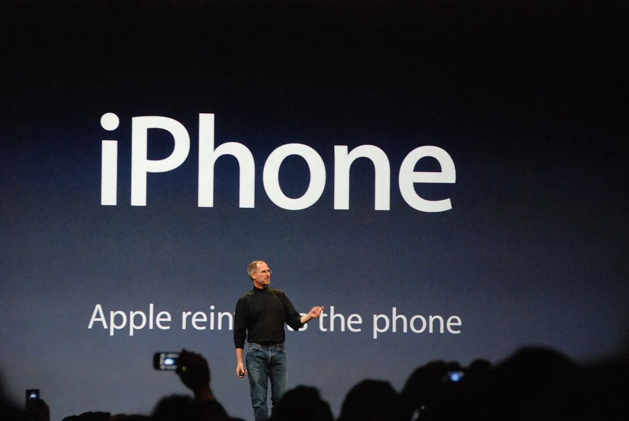
Most presentation experts (me included) describe the ideal slide layout as something similar to what Steve Jobs used to use in his big product announcements. Super minimal.

This type of slide works in auditorium or conference room settings. People sit relatively far from the screen, and the slide is competing for attention with the physical speaker (gestures, eye contact). Glance at chart, understand it in 5 seconds, focus back on speaker. The speaker and the slide are probably about the same size for someone sitting in the back of a conference room.

In a video call , the setting is a bit different. The slide is “in your face” on the screen, and the presenter is usually a small “talking head” in the corner of the screen (if present at all). Maybe the slide can carry a bit more information than the words “1.5 billion installs”.

I am not arguing to bring back the dense bullet points. The audience can read them faster than you can present both in a live setting and in a video call. But a Zoom call does open the way for slides that carry more information. Breakdowns of financial data, matrices with competitors plot in them, pros and cons tables.

Consider building them up in multiple slides to slowly add detail to support your story.

Image credit

SlideMagic: a platform for magical presentations. Free student plan available. LEARN MORE
Vintage presentation software

Vintage presentation software

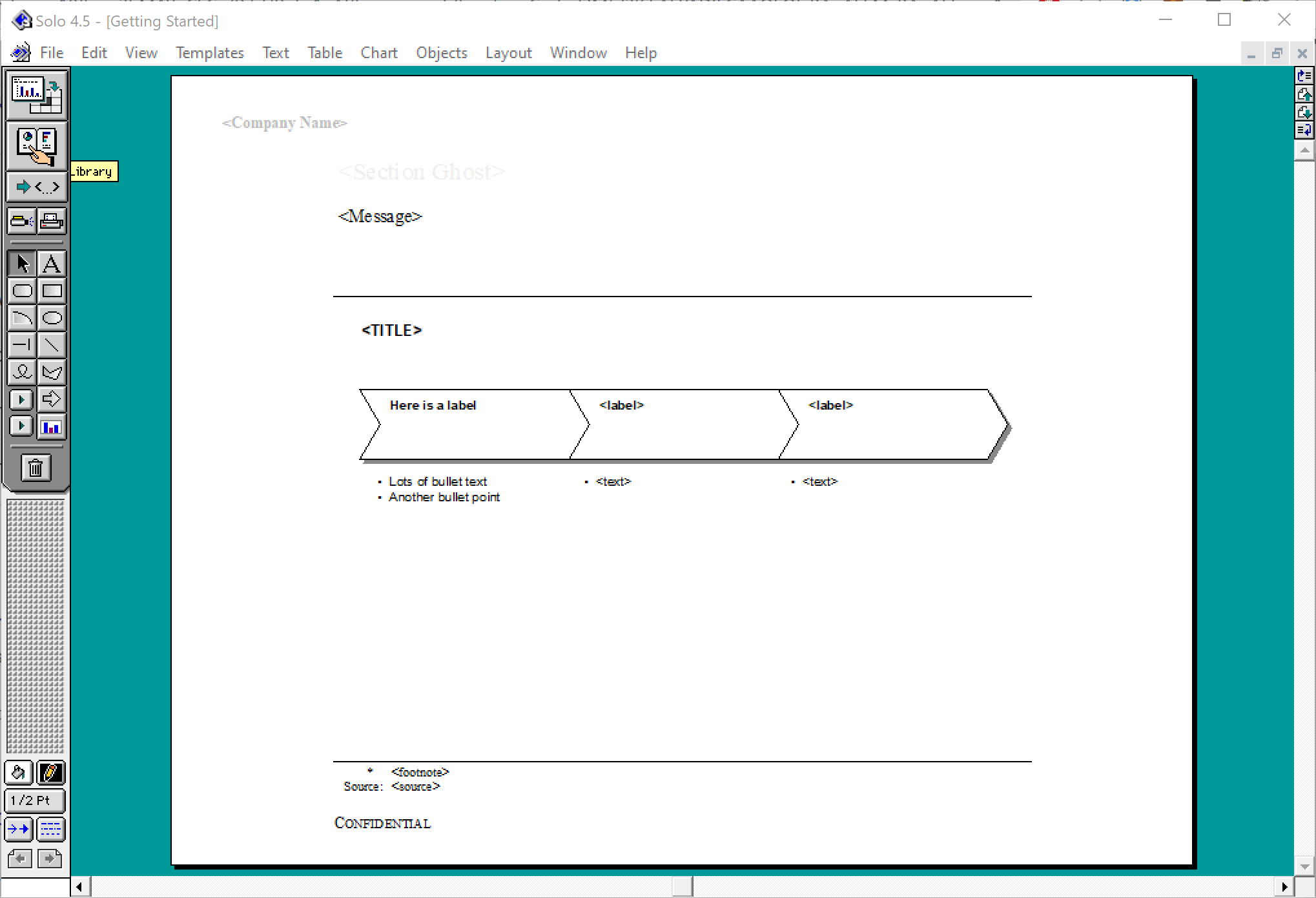
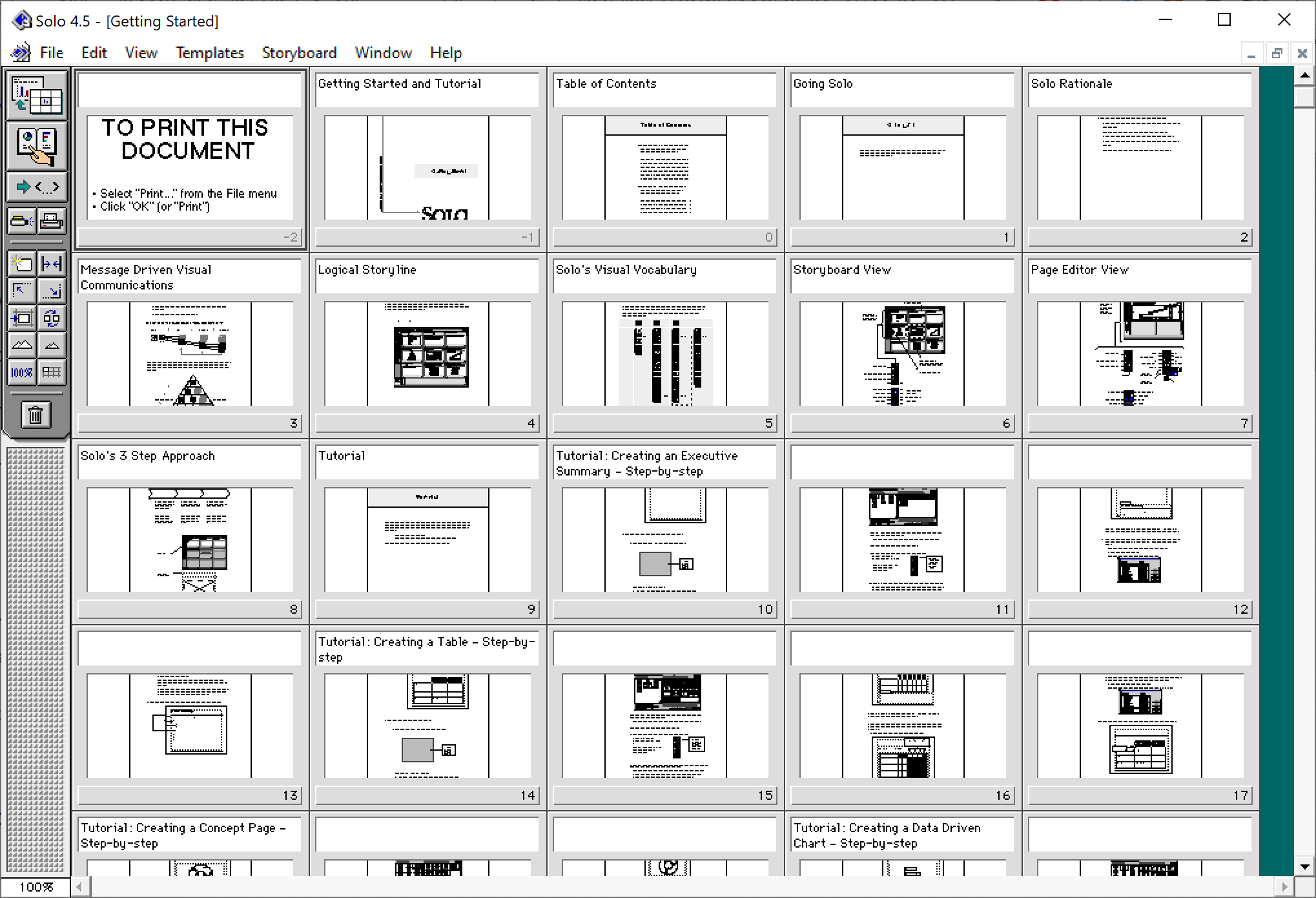
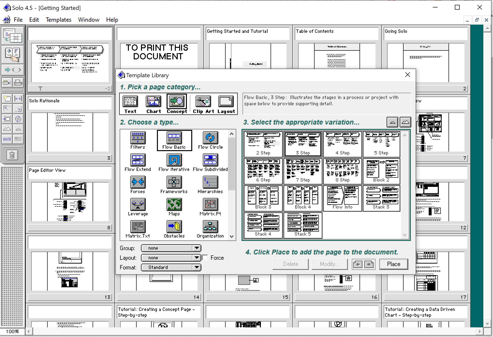
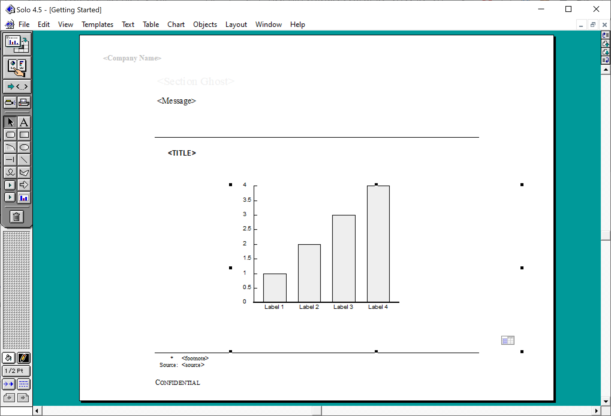
At McKinsey in the 1990s, we used ‘Solo’ presentation software to make slides. It was far ahead of its time (before PowerPoint became the standard). It had a very advanced template engine that enabled you to recreate charts in the McKinsey style. The software required some skill, and charts were usually created by professional graphics designers who took hand-drawn charts as an input. Back then, Solo would run on Macs only. Which was the reason that McKinsey issued Macbooks to their staff at the end of the 1990s, so that consultants could edit (and create) their own slides if they had to.

Ultimately PowerPoint was the end of Solo. Not because of its capabilities, but because McKinsey’s clients would have this installed on their machines, and these clients wanted to edit slides themselves. And with the advent of PowerPoint, the slide format became less consistent in McKinsey. (Both the result of a less sophisticated template library, and the reduced influence of professional graphics designers to create the slides).

I checked this morning, and Solo is still around, here is the web site: https://www.axoninc.com/. Support has ended in 2020 though. I tried installing the demo on Mac, but failed. The PowerPC engine no longer works. It does work on Windows 10 though, but I had to click a button 587 times because the license of the trial version expired 587 days ago (on 7 February 2022). Those clicks were rewarded with some good memories though, I have added some screen shots.

SlideMagic: a platform for magical presentations. Free student plan available. LEARN MORE
Vintage ad

Vintage ad

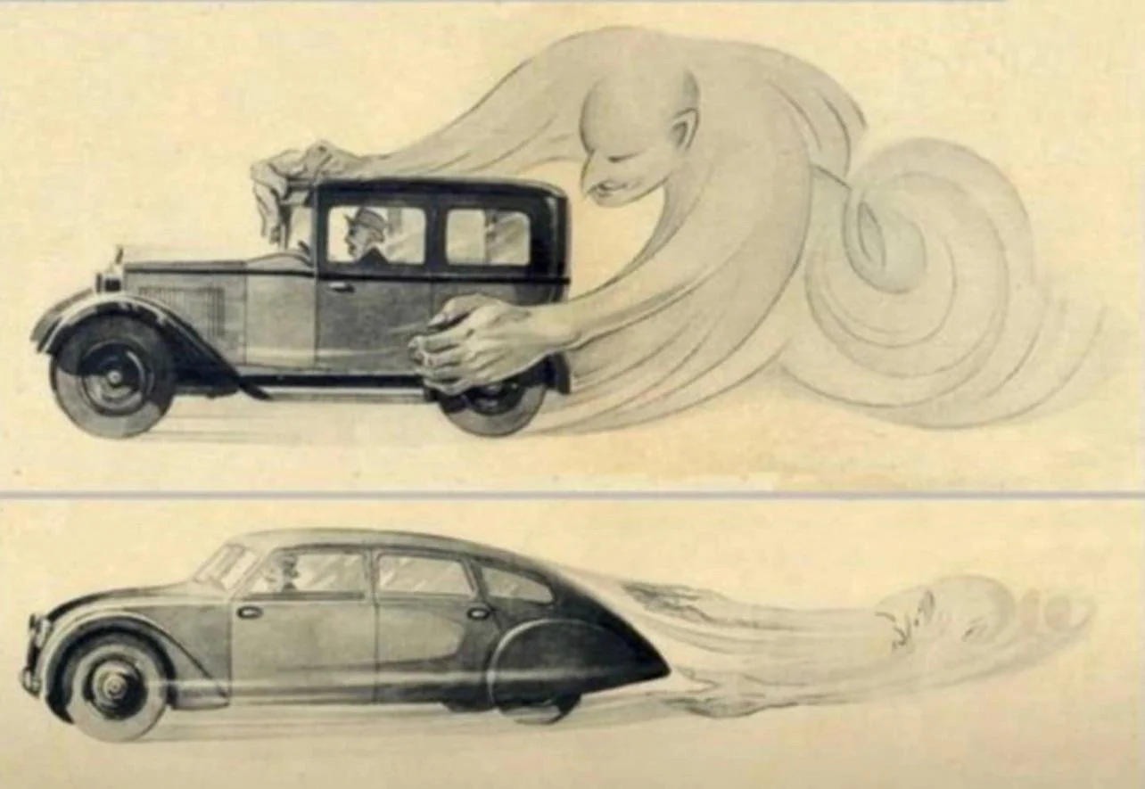
This vintage ad explaining the benefits of aerodynamics is making the rounds online. It is promoting cars by Czech manufacturer Tatra, which at that time, looked dramatically different than other vehicles.

Tatra could have been a very different car manufacturer today if the communist government did not force it to switch to building trucks…

A great resource for vintage advertising is the Vintage Ad Browser, careful with copyright though.

SlideMagic: a platform for magical presentations. Free student plan available. LEARN MORE
The anchorman in the days of Zoom

The anchorman in the days of Zoom

Up until the early 2000s, TV programs in The Netherlands would be announced by an ‘anchorman’, often a woman (Dutch people can refresh their memory here).

I was reminded of them by watching a number of high schools pitching themselves to my son via Zoom. Some schools had a fully prepared introduction video, linked by a pre-recorded ‘anchorman’. Others had a live anchorman that connected the various videos together.

The latter approach worked much better in my opinion, creating a stronger bond with the audience. But you got to rehearse that switching between anchorman, slide show, and video stream though. In the 1980s, this was the job of the TV control room…

SlideMagic: a platform for magical presentations. Free student plan available. LEARN MORE
De-cluttering axes

De-cluttering axes

In scientific documents, there are chart making conventions that make sense, clearly labelled axes, titles, etc. etc. Use these charts in your article that you submit for publication in a prestigious paper. For an on-screen slide show however, you could deviate from this standard. Your objective is to communicate the findings as best as possible, referring to the paper for the details.

See the example below (source), lots of duplication in axis labels.

You can make the page a lot calmer be omitting some of these labels. I quickly cut and paste the elements in the image below. (This is not a makeover, just a super rough reshuffle to show you what I meant).

SlideMagic: a platform for magical presentations. Free student plan available. LEARN MORE
What, how, why?

What, how, why?

I saw these headings of a well-known story line structure being put up literally on a website in a big font size. What? Paragraph of text, how?, paragraph of text, why?, paragraph of text.

I like to use these frameworks in a more indirect way. Use them as guidelines to set up your story. Use them as a checklist to see that you covered everything, use them as a starting point if you are stuck in writer’s block, and most importantly, if they don’t work for your specific situation, pick another one or use your own.

The same applies to visual frameworks (SWOT, etc. etc.). They are designed to help you get started with grouping ideas, but if you find yourself forcing things in boxes that do not really fit, pick another one.

SlideMagic: a platform for magical presentations. Free student plan available. LEARN MORE
Statistics: vaccine effectiveness might seem higher than it is

Statistics: vaccine effectiveness might seem higher than it is

I love digging into COVID-related statistics. Recently, this paper was published that shows how vaccine effectiveness in local communities can be a lot lower than at the national level. Seems counter intuitive, but this chart explains the math.

I have added this slide to the SlideMagic library, so you could use it in your own presentations as well.

SlideMagic: a platform for magical presentations. Free student plan available. LEARN MORE
Public corona data dashboards

Public corona data dashboards

BI (“Business Intelligence”) dashboards with data used to be a corporate thing. Firms such as my previous employer McKinsey would advice clients what metrics to put on them, and how to display them. This is tricky, there is an infinite amount of data to choose from, and even more options to slide and dice the figures.

The COVID outbreak has created many country-wide public dashboard with data. In Israel where I am based, a large tribe of “amateur” statisticians has emerged that runs and discusses analyses on Twitter. The other dashboard I had a look at is the Dutch one (part of my family still lives there).

The approaches are different, and I prefer the Israeli one.

  • The Dutch board looks very pretty, has lots of explanations in text, and has useful maps of regions with color coding. The problem is that it stretches out over many, many, pages, and priotises static data over time series.

  • The Israeli one is just one page, with lots of time series graphs, so you can see things develop over time. And not for basic statistics such as overall cases, benchmarks can get very specific. Benchmarks are normalised so you compare apples with apples (i.e., cases / 100,000 by vaccination status). Also, government policy and benchmarks are tightly integrated. The government wants to encourage parents to vaccinate children, so there are statistics specifically aimed at that target segment. Another example: after discussions whether to close the airport or not, stats about airport tests were published (split by country, so citizens can make the call to travel somewhere or not based on their personal risk appetite).

The biggest advantage of the all-on-one-page approach is that people start to understand it, and come back to it very often to get the latest data, even venting anger when it is not updated on a day.

Data visualisation to involve the public in decision making and/or influence day to day behavior.

——-

PS. Israel does a PCR test for every single arrival at its airport, so the arrival statistics on the Israeli dashboard are probably one of the best global indicators of what is going on in a particular country.

SlideMagic: a platform for magical presentations. Free student plan available. LEARN MORE