The excitement indicator

The excitement indicator

You probably have a generic pitch deck that you have been using over and over again. You eyeball the slides before emailing to yet another potential client or investor. If you have given this presentation a thousand times, it is worth to have a look at each slide and ask yourself the question, are you excited to present it, do you want to surprise the audience with this unexpected insight?

If the answer is “yes”, keep it in, if not, considering taking it out. Here are examples of slides that can provoke a luke warm response…

  • Repetitions. You have already explained on slide 4 that “X” was a major issue, and now on slide 14, you introduce your product feature that kills this issue. No need to explain that issue again, and you probably notice that in your presentation you tend to apologize for this slide: “ah, yes, as I said before…”

  • Feature check lists. If your products has all the standard features that are expected from an offering in this product category, there is no need to walk through each single one of them. You are probably dreading having to go through these 5 slides (here is the user profile, here is the contact book, etc. etc.)

  • Historical baggage. In the early days, talking about your company foundation used to be really exciting. Now, 5 years later, that slide has become sort of dense, and the opening of the new office 3 months ago does not really add anything to the story anymore.

Keep things exciting and fresh!

SlideMagic: a platform for magical presentations. Free student plan available. LEARN MORE
Windows on Mac 2022

Windows on Mac 2022

Another software-related post after my computer swap. SlideMagic is an app that runs both on Mac OSX and Windows machines, so I need a Windows computer to compile and build the software (luckily from one code base). Some observations:

  • Desktop operating systems are very mature pieces of software, and sliding more and more in the background. On my old Mac, I did not even bother to upgrade to Monterrey as of now, because of compatibility issues of some very old music production software that I use. Having used Monterrey for a week now, I still hardly notice the difference.

  • I used the opportunity to upgrade to Windows 11. Windows is now totally at par with the Mac when it comes to look and feel. The whole experience looks great and works well.

  • On Macs with an Intel chip, I would install Windows using Bootcamp. Starting the machine with Windows would leave no trace of anything Mac: you are working on a pure Intel-based Windows machine. Now that Apple switches to different chips, I have opted again for a virtual machine. Windows 11 runs nicely inside a window alongside my Mac software. It is easy to exchange files, very quick going back and forth between the systems, and most importantly, it is easy to adjust the hard disk space your Windows machine takes on your Mac, nothing is set in stone.

  • More and more software is written like SlideMagic, one code base creates identical looking apps for both Windows and Mac.

  • With the differences in software / UI disappearing, the main differentiator between Mac and Windows is actually the hardware: build quality, design, and most importantly the quality of the screen. Macs are usually great, but in the world of Windows, there is a huge range of machines, from really poor/cheap to fantastic/expensive.

It is amusing to read earlier posts on the same topic, some of them going back for more than a decade.

SlideMagic: a platform for magical presentations. Free student plan available. LEARN MORE
Computer update 2022

Computer update 2022

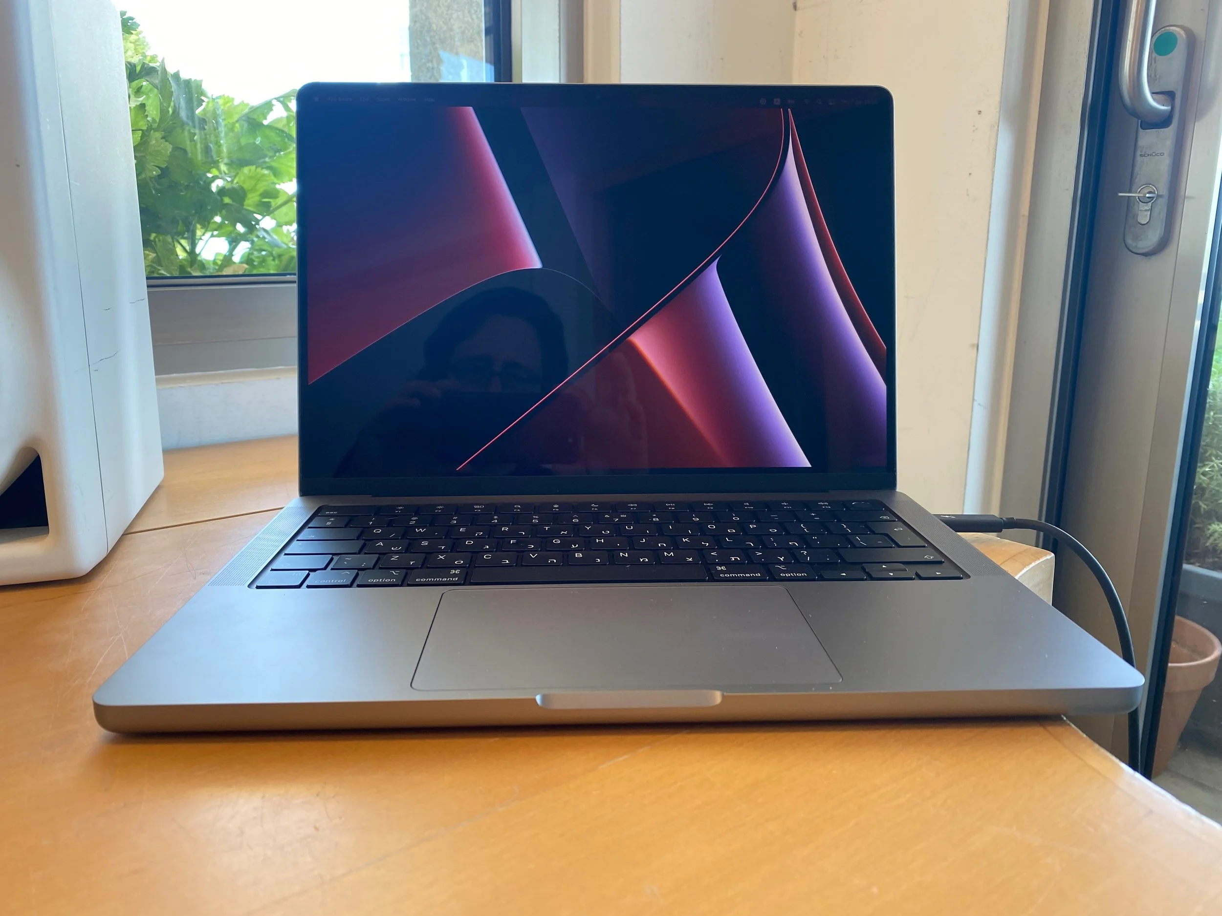
After 4 years, my MacBook died on me during a holiday abroad last week. A flat battery would not recharge again to bring it back to life. I upgraded to a new computer instead of fixing my old one.

I am trying to remember the Macs I went through since 2008:

  • Air

  • 17” MBP

  • 15” MBP

  • 27” iMac

  • 15” MBP

  • And now: 14” MBP

Of these, the iMac is still running in great shape as the living room computer.

Updating a computer used to be a huge deal in the 1990s and 2000s, because you had to get your data across, or worse, recover your data, or even worse: give up on your data. Now, computers have become a disposable tool. Get a new one, quickly install your software, and you are good to go with all data being available and backed up online.

Some thoughts on the 2022 machine:

  • Again a laptop. Mobility is important. Even more now than in my previous life as a designer, a critical bug in one of my sites might need patching instantly, no matter the place on earth or time of day.

  • I am on continuing my 1 big monitor, laptop as side screen setup. There was a time I would run 2 giant 27” monitors side by side. Just too much stuff: I would use the space to add Twitter feeds, email inboxes and other distractions. It is better to focus. The small screen is my “copy paste” scratch pad.

  • I went for the more compact 14” screen. The 16” machine is too bulky. Especially given my monitor setup in the my day to day office. Less heavy, and it fits in antique hotel room safes that have not been updated over the past 20 years.

  • I took it easy on the performance upgrades. Some of my earlier machines had custom high end specs. I think it makes more sense to upgrade more frequently. This M1 processor is a huge step in performance for example, easily outperforming a few extra MHz on an i7 CPU.

Let’s hope this one will last a few good years.

P.S. It is good to see that SlideMagic is running snappy on the new machine….

SlideMagic: a platform for magical presentations. Free student plan available. LEARN MORE
Two pitches, two pitchers

Two pitches, two pitchers

When pitching our new venture in the healthcare industry, we discovered that there are 2 totally different pitches, one to industry insiders, and one to complete outsiders.

  • The insiders usually get the idea in a second, so the pitch switches to why they should join (and change the way they have been working for decades)

  • The outsiders do not have the context and don’t understand the jargon of what we are doing. It requires an extra step back to explain the idea. When that is done though, they understand instantly why people should join.

In meetings, my partner and I are adjusting. I step forward in discussions with industry outsiders, while she leads the story for healthcare insiders.

SlideMagic: a platform for magical presentations. Free student plan available. LEARN MORE
Presenting for the phone camera

Presenting for the phone camera

Over the past 2 weeks I have visited 2 large conferences in the fields of software and healthcare (apologies for the lower posting frequency here). During the latter, I witnessed something I have not really seen before: the presentation for the phone camera.

Companies get 13 minute presentation slots which are filled with sequences of slides loaded with scientific data. The presenter flicks through them at super high speed, I could barely read their headlines.

The audience does not seem to mind. Each slide is captured with a smartphone camera and saved for viewing later, back in the office. The more data on a drug’s efficacy and safety the better. Large pharma companies seeking to buy molecules, competitors wanting to check in on the market, countries seeking inspiration for their own research, and investors wondering where to invest their money are totally happy with the approach.

SlideMagic: a platform for magical presentations. Free student plan available. LEARN MORE
Proportions

Proportions

It is extremely hard to make a digital composition of multiple images look credible as a realistic scene. See in the ads below, the sizes of the objects are not right in relation to each other, and the angle of lens is inconsistent.

Alternative approaches:

  • An illustration

  • Make the actual shot in the field

  • Use proper 3D animation software

SlideMagic: a platform for magical presentations. Free student plan available. LEARN MORE
This could have been a better video

This could have been a better video

Israel caught Iran stealing IAE documents and using them to conceal dubious nuclear activities. Israel put Iran’s plan in a Google Drive folder for everyone to read.

The video to explain all this to the world is not very strong though:

  • The graphics are really basic and childish (no, not the same as South Park)

  • The story in the video does not tell very much

  • These dark Holywood trailer style voice over is not really working either.

There is a better way to do it I think. First of all, the audience does not consist of Israelis and other people who already are on Israel’s slide. The target segment are the ones who are sitting on the fence in the middle. The message ‘look at these dark and evil people’ will not stick. What might work though is a message of ‘these people who seem so friendly in your negotiation meetings do something completely different behind your back when you are not looking’.

To create this effect:

  • A lighter, friendlier and factual voice (I would use a female one)

  • ‘Documentary style’ movie

  • Add a bit about the story on how you got the documents (news media love spy stories)

  • Use a much more factual approach with screenshots from the documents and satellite images of desert landscapes (Ken Burns zoom) to show what happened.

SlideMagic: a platform for magical presentations. Free student plan available. LEARN MORE
Typography tutorial

Typography tutorial

Why does certain typography look great and others not? When a designer ‘get its right’, she is intuitively adjusting a great number of parameters. And the most important ones are not the obvious ‘in your face’ ones (such as the font type). Paragraph width, line height, lots of subtle adjustments that can make a big difference to your layout.

This online typography tool lets you experiment with some of these parameters and get feedback on the result

SlideMagic: a platform for magical presentations. Free student plan available. LEARN MORE
Google Lens for images in your browser

Google Lens for images in your browser

When you right click an image in Google Chrome, you now get an extra option to search the image with Google Lens, which generates similar images, find places where the same image is used (often including the original source), translations etc.

SlideMagic: a platform for magical presentations. Free student plan available. LEARN MORE
"Picking your brain"

"Picking your brain"

Often used as an excuse for a meeting, but is it really?

Every meeting should have an objective. Just casually chatting is a waste of time (in a professional context). The PYB sentence has been abused so many times that many investors and other people receiving such requests will instantly turn it down. There are better things to do.

  • Do you really think you need to pick someone’s brain? Maybe think again, and there might be a very specific objective that you are actually after. Adjust your pitch, pitch deck, and meeting invite accordingly. It makes things clearer for everyone.

  • Maybe you have a specific agenda and are afraid to reveal it. In the age of Zoom, people have become more efficient and open. Maybe your meeting target is actually totally happy to take a short Zoom call and brainstorm which of her contacts could help you in a job search.

SlideMagic: a platform for magical presentations. Free student plan available. LEARN MORE
From point estimates to drivers

From point estimates to drivers

Making a company business plan is tricky. Nobody can predict the future. Everyone can argue about the validity of a point estimate of sales in year 5: $45m…

I tend to remove as many of these hard coded point estimates as possible from my spreadsheet, and instead build the whole thing up from drivers or factors that ‘you can touch’. Instead of a hard sales number it is # of potential clients x market share x price per client.

Here is my approach, starting top down, then building a bottom up model

  1. Start with the hard coded number (top down)

  2. Back out of the number the implied number of clients, price per client

  3. Make an assumption what market share that number of clients implies

  4. Now hard code the market size, market share, and price numbers and tweak those to calculate the top line number

Now that you have set the revenue forecast, apply a similar approach to cost. Given the amount of clients you need to get every year, how much would it cost to get them? Sales trips, sales people, conferences to visit etc. etc. How much would it cost to support each client? This is a much better cost planning tool that simply adding a number in your P&L.

The result of this exercise is that you get a dynamic company model which logically makes sense, the only wild card being that number of clients that you put in.

SlideMagic: a platform for magical presentations. Free student plan available. LEARN MORE
Black flags

Black flags

Many visual identities use a dark or even black background. It looks great on web sites, or presentation slides, or print ads, even billboards. One place where it does not work: flags. Flags should be happy and/or vibrant. A row of black ones looks depressing and even scary.

If your identity does not have any happy colours: go for black on white which should work fine.

SlideMagic: a platform for magical presentations. Free student plan available. LEARN MORE
My other project...

My other project...

Over the past year I have been working on another project together with my co-founder Anat Naschitz (my partner in life as well). This week we are quietly revealing things to the public: 9xchange is a marketplace for molecules. There are a lot of molecules on the shelves of pharmaceutical companies, biotechs, and academic institutions that never get turned into drugs. It takes a lot of effort, and requires you to reveal your pipeline strategy to start selling these assets to players who could use them. 9xchange is going to make that easier.,

I have not spent a huge amount of effort on the design of the landing page, most energy went into coding a secure B2B marketplace (a much bigger technical challenge than the SlideMagic app). But I like the graphical language which is very different from most corporate websites. Have a look here. The messaging of the front page is likely to change as we interact more with users.

Membership of 9xchange is still by invitation only at the moment. Contact me if you work and/or invest in the healthcare industry and would like to try it out.

This project does not mean the end of SlideMagic, which will continue to be developed, don’t worry,.

SlideMagic: a platform for magical presentations. Free student plan available. LEARN MORE
The river

The river

An important lesson from my negotiation class in business school was the concept of ‘the river’. When two parties battling in a war are negotiating a ceasefire line it is often not the relative power of the armies that dictates where the line is drawn, it is a geographical feature that is the natural separation line between the two forces. You can argue as much as you want, you know where the compromise is going to land in the end. Useful to remember when negotiating a business deal as well.

P.S. I was reminded of this by one of the endless tweets about the conflict in Ukraine today.

SlideMagic: a platform for magical presentations. Free student plan available. LEARN MORE
Political messaging done right

Political messaging done right

This Zelensky speech will be studied alongside “I have a dream” type of presentations in the future.

  • It establishes common ground with the audience (comparing Ukraine today to the histories of many other countries)

  • Draws you in to act (hey, your ancestors did this for you, now it is your turn)

  • Then paints a picture of what can be

Very well written, and very well directed with the setting and the black and white colouring.

SlideMagic: a platform for magical presentations. Free student plan available. LEARN MORE
Writing the whole thing again in 30 minutes

Writing the whole thing again in 30 minutes

Writing a good presentation is a process that takes time. There is the time to complete the analysis and make the graphs and tables, but also time to ponder the story and the flow.

If you somehow end up rewriting your whole deck in 30 minutes the day before the presentation, and leaving out many of the data charts that took you days to make, then it does not mean that you made mistakes, got it wrong, or wasted your time. You actually had to go through the whole loop in order to pull off that 30 minute rewrite.

SlideMagic: a platform for magical presentations. Free student plan available. LEARN MORE
WeCrashed

WeCrashed

I have been watching a few episodes of “WeCrashed”, the Apple TV+ series based on what happened to WeWork. Lots of investor pitching here, as Adam is raising money to keep his business going.

People often use this high profile entrepreneur case studies as inspiration for writing investor decks. But these were very specific types of deals. A specific entrepreneur, a specific funding and expansion strategy, a specific stage the company was in, and and very specific type of investor bet: putting in huge sums of money and hope to get your return out before the bubble pops.

Your might be a different type of entrepreneur, with a different growth strategy, in a different phase, and pitching to a different profile of investor

P.S. I wrote a few posts about WeWork on this blog before.

SlideMagic: a platform for magical presentations. Free student plan available. LEARN MORE
AI in presentation design

AI in presentation design

AI is making an entry in office applications. See this article with a funding announcement for a company. The idea is to analyse human computer input (text, clicks) and try to automate routine tasks (think booking a flight, making a quarterly financial report).

What about presentation design?

Artificial Intelligence is a very generic buzz word, and we need to be highly specific when talking about its application in any area. What the technology does is analyse vast amounts of inputs and outputs and then reverse engineer their relations without “understanding” anything of the underlying thought process that a human would go through.

I can see one type of presentation design that could be subject to automation, the 1-on-1 slide makeover. There are many designers, design agencies out there that take your slides, do not edit their content at all, but simply make them look prettier:

  • Align and distribute layouts

  • Fix inconsistent fonts and colors

  • Change font sizes

  • Etc. etc.

Feeding thousands of before and afters will ultimately lead to a computer system that could do this automatically.

They key to slide design is though to have the courage to start editing in the content. Rephrase text. Break up slides into multiple layouts. Remove table columns. Round up numbers. Change the type of graph. Etc. etc. And that is at slide level, in most cases deeper surgery is required: a reflow of the whole story line.

SlideMagic: a platform for magical presentations. Free student plan available. LEARN MORE
Bar chart formatting

Bar chart formatting

This chart can be improved in many ways (source), you can see it without understanding German…

  • No need to repeat “Mrd. Euro” (billions of Euros) at every data point, just put the unit at the top

  • The data labels of the second data series is missing, as is the total

  • The color of the 2nd data series is too light (probably to make the text readable)

  • I would right-align the row labels

SlideMagic: a platform for magical presentations. Free student plan available. LEARN MORE
Free student plan for SlideMagic

Free student plan for SlideMagic

SlideMagic will be offered for free to students. I am working to set up a partnership with a student validation service to create a streamlined automated signup process. In the meantime readers of the blog can already apply for a free SlideMagic membership:

  • Create a regular free SlideMagic account with your school/university email address

  • Verify that email

  • Visit this link to apply for a free subscription

This process is still partly manual, so response will not be instant. Student memberships will run until Aug 31, after which you need to apply for a new one.

SlideMagic: a platform for magical presentations. Free student plan available. LEARN MORE