I am off the grid for a few days (finally had a chance to see the northern lights, see the image below). All the best for 2023!

SlideMagic: a platform for magical presentations. Free student plan available.
Fast. Easy. Beautiful.
I am off the grid for a few days (finally had a chance to see the northern lights, see the image below). All the best for 2023!
My venture 9xchange is new in the world of healthcare, wo we need to establish credibility by showing that we have significant experience and are backed by significant people. Here is what I came up with (see the 2 screenshots below).
I put up a dense grid with the bios of the people involved. Below this table, are a few recognizable brands from the world of healthcare. When you hover (or click on a tablet) over a person’s bio, a relevant subset of the brands light up.
Alternatively, when you hover over, or click the brands at the bottom, relevant people get highlighted, including the relevant small print in their CV.
You can check out the progress of the work on the 9xchange website.
In most cases, it is not worth the time and effort in a short presentation to take the audience through a demo or a series of screenshots of your application. At this stage in the pitch process, understanding the exact flow of your application is not critical.
What can matter though is the simple question of whether you have a decent product or prototype or not. The role of a screen shot here is not to show the exact detail of your app, but more a proof point.
One way to make this point is to use an office background with some screens, and paste a number of screens on the monitors. That’s what I did in a recent deck for my other venture 9xchange. I made the office background black and white, to make the screens pop a bit more.
(Look how I managed to Photoshop the screen shot behind the standing desk light)
I find the world of marketing and branding agencies very confusing. You ask them what they do, and you get a description of a process that sounds and looks very similar to everyone else you ask the same question. But in practice, people are actually very specialized. Defining the personality of a brand, creating the competitive strategic positioning of a company, making the pitch deck, generating leads, designing ads, running online campaigns, designing logos, etc .etc.
The best strategy to find out what people do is to ask them to describe a project, and see where in this whole jungle they played a role, and most importantly, at what stage in this description see you light up the eyes of the person you are considering working with.
There is a lot of science and analytics available for eCommerce web sites. Changes in layout, design, and content immediately translate into changes in clicks and sales. The story is a bit different for a corporate web site that is not transactional, it does not sell anything, it does not have a big signup button, but plays the role of a digital business card for a company. Let’s say the first web site of a startup aimed at investors and the first enterprise customers.
Some things to look at:
The most important aspect is probably the look and feel of the site, regardless of the content. Does it look professional and serious (as in of a serious company). If that funky or complex graphic somehow does not look quite right and you can’t put your finger on the spot why, take it out. A professional looking simple graphic is always better than a botched attempt at a complex one. Make sure that copyright year is the current one.
This seems obvious, but is often lacking, the site should actually state what it is you do. Try it on people that have no background at all in the market you work in, try it on people that love to put you in well known boxes (i.e., venture capitalists)
Different companies need to emphasize different things. For most companies, the founding team and its head shots will be buried in some ‘about’ section of the web site, for very early stage startups, it might need to feature prominently on the first page since it is basically the only asset it has.
No one reads a web site top to bottom like a newspaper article. Instead, people glance. Read a headline, look a the small text below a photo, read a random paragraph. Don’t arrange content in order of importance solely, but think about the visual hierarchy. A small picture might grab more attention than the big cliche headline.
It is tempting to lift stories from presentations and translate them to the web site. The founding story of how it all began to where you are now including that big pivot in 2020, the market gap analysis that is the start of your investor pitch deck. These stories need a place, but maybe not on the home page of your web page.
Avoid jargon. “Ah, this site is filled with blah blah” and people will stop reading. But do include language that is common in the industry you are working in.
Make sure that the site has the details that should be there: contact details, etc.
Most people visit ChatGPT, create an account, type in something, are amazed by the results, and then move on. But how could you actually use it for real?
One obvious use case is “homework cheating”: copy-paste entire pieces of text to save time and effort. But the results will still be a bit impersonal. (I suspect that in future versions of the program, you could feed it your own writing style so that the bot adjusts to you personally, the back archive of my blog since 2008 would be great for that :-))
But there are a few others:
The bot answer might be a great way to get a basic structure/setup for your text. You copy they layout of the argument to start, but then fill in the paragraphs with your own language.
The algorithm can create a check list to see whether you covered everything that should be covered
ChatGPT can be better than Google to get tutorials or “how to” articles. At the moment the pages that are best optimized for search engines float to the top. This might not always be the best articles. ChatGPT has read them all and will summarize them for you.
The software can be a great source of examples or analogies that you would not have thought of.
“Google it” is now an essential part of writing pretty much anything. “ChatGPT it” will have to be added to the list.
CONFESSION: Yesterday’s post about the use of humor in presentations was a complete homework cheat…
Using humor in a presentation can be a great way to engage your audience and make your message more memorable. When done correctly, humor can help to break the ice, lighten the mood, and make complex concepts easier to understand. However, using humor in a presentation can also be risky and, if not done well, it can easily backfire and make you appear unprofessional or insensitive. Here are a few tips for using humor in a presentation:
Know your audience: Before incorporating humor into your presentation, it's important to understand your audience and what they find funny. Different people have different senses of humor, so what may be funny to one group may not be funny to another. Consider the demographics, cultural backgrounds, and experiences of your audience when choosing your jokes.
Be appropriate: It's important to remember that humor is subjective and what one person finds funny may be offensive to another. Avoid using humor that is based on stereotypes, is sexually explicit, or is overly political. Stick to jokes that are clean and relatable to a wide audience.
Use humor sparingly: You don't want to overdo it with the jokes in your presentation. A few well-placed jokes can add some levity to your presentation, but too many can become overwhelming and take away from the overall message. Use humor sparingly and strategically, and save the majority of your presentation for the information and insights that you want to share.
Practice: Before delivering your presentation, make sure to practice your jokes and delivery. This will help you to feel more comfortable and confident when presenting, and will also allow you to gauge how your audience reacts to your humor. If a joke falls flat during your practice, consider leaving it out of your final presentation.
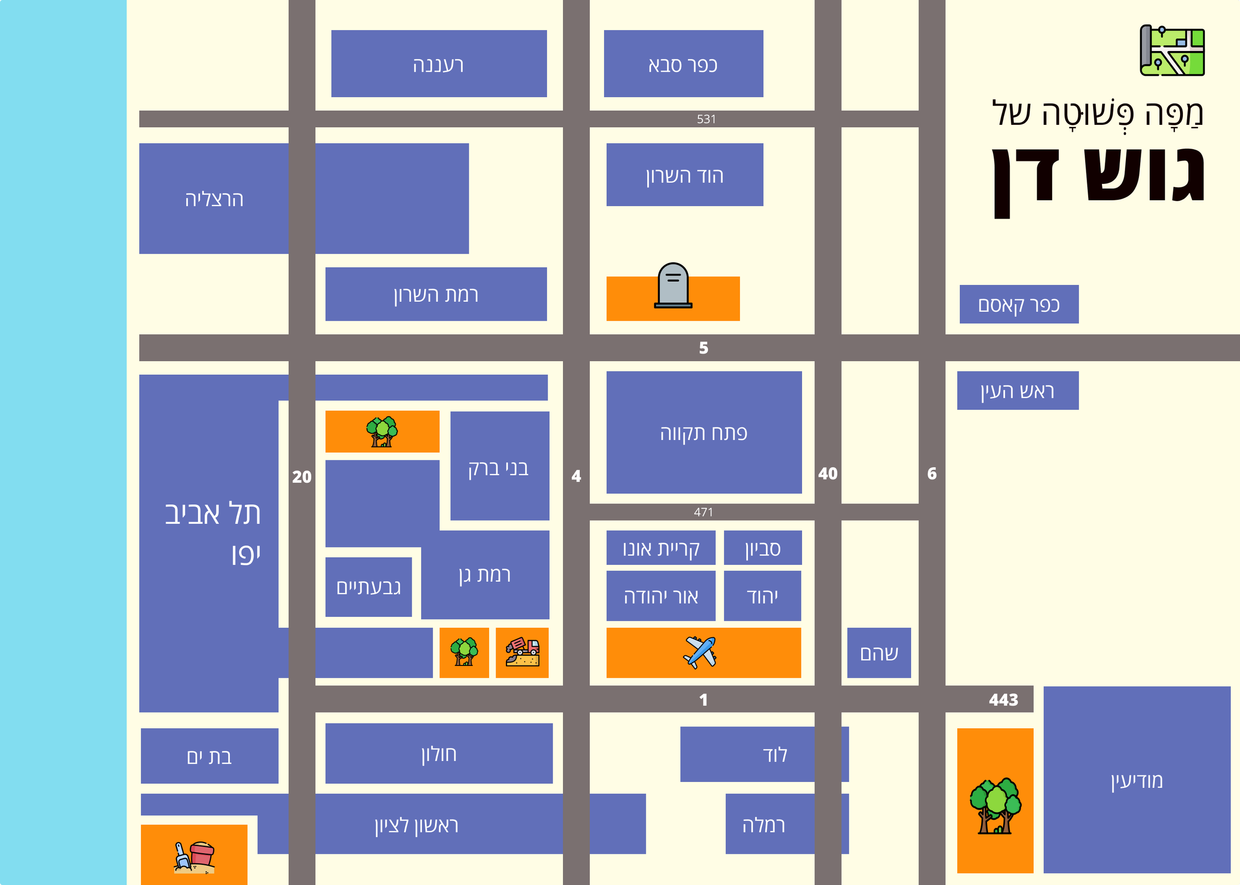
People accept that subway maps do not reflect the topographical reality of a city. They show how to travel from A to B, which lines you should take, and where you should switch stations.
The generation of my children has grown up with navigation apps and when they are behind the wheel of a car, they actually have very limited awareness of where things are, the only thing they know well is how much time it roughly takes to get to different places.
This map of Tel Aviv and its surroundings might be a useful too for them (credit: Yaron Shemesh)
This is actually how your brain likes to store information in general, not just maps
A company brand has at least 3 audiences:
Employees (including the founders), that need an inspiring and cool place to work
Users that are looking for a brand that fits and appeals to the target market
Investors who are looking at a fundable organization with fundable founders
Think about conflicting requirements when picking your name. Priorities might also change over time. Investors are very important early on, users a bit later. Your first collaterals (decks, a web site) are probably directed at investors.
This post was sparked by overhearing two conversations: one about whether picking a cartoon character as a company name would hurt appeal to investors, and one where a company named itself after an industry it explicitly claimed not be in.
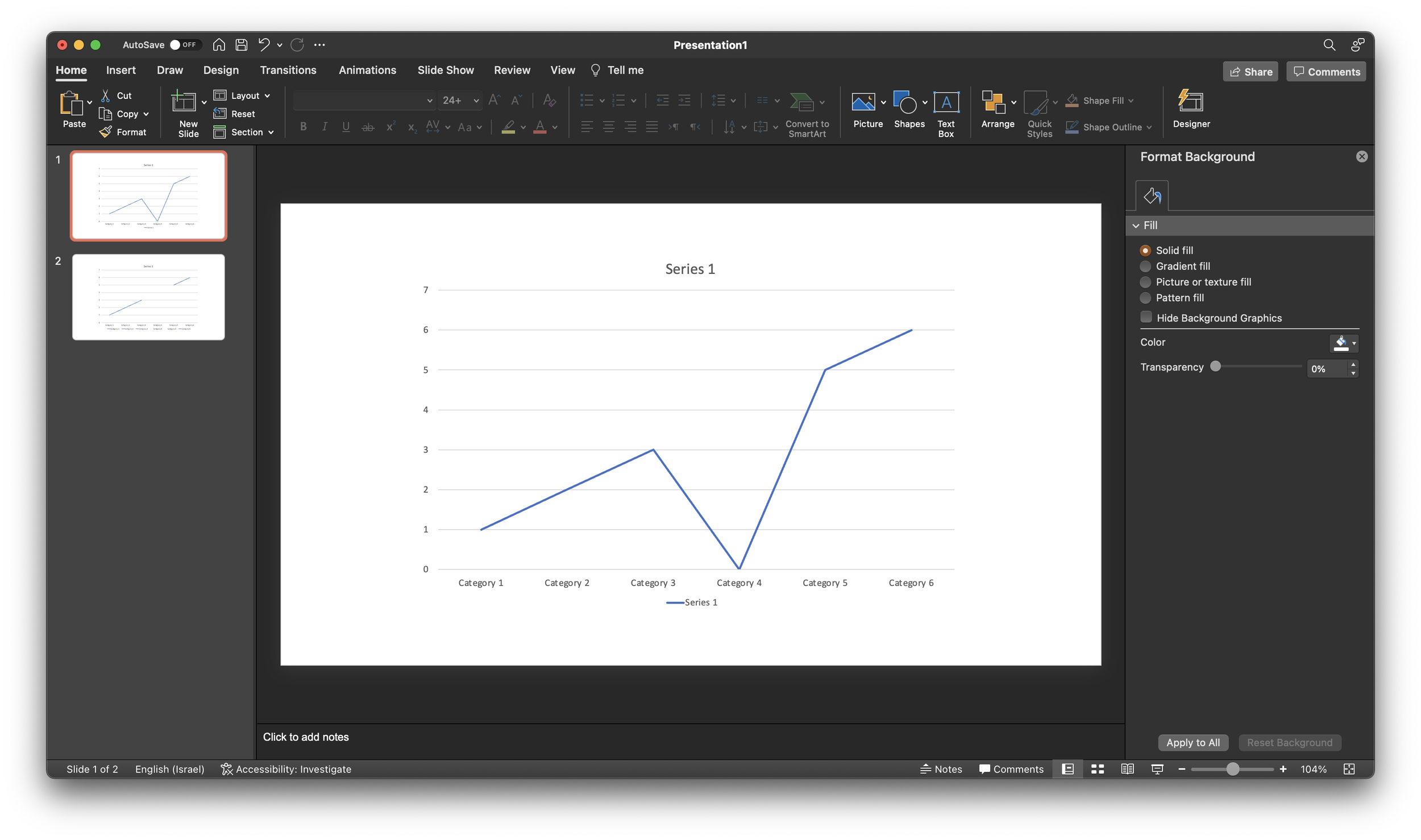
A PowerPoint post today, why not… Someone showed me a little trick to remove a point in a line graph. Useful when you have one year with missing data, and simply interpolating the value between the 2 neighbors would be bending the truth. Putting a zero leaves an odd line (see below).
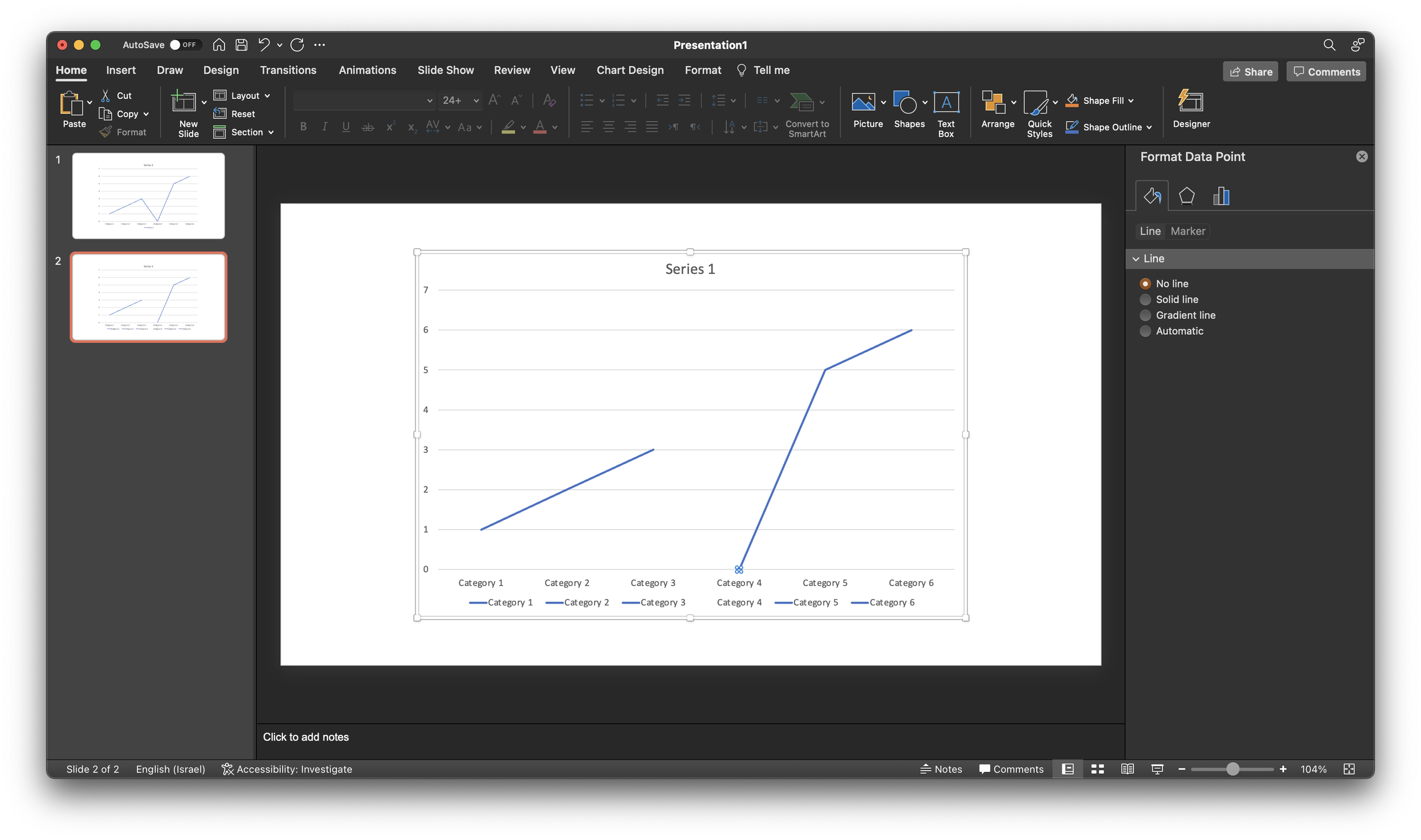
If you select the data point, (not the data series), and go into format data point and the paint bucket, you can set the line to “no line” (see below).
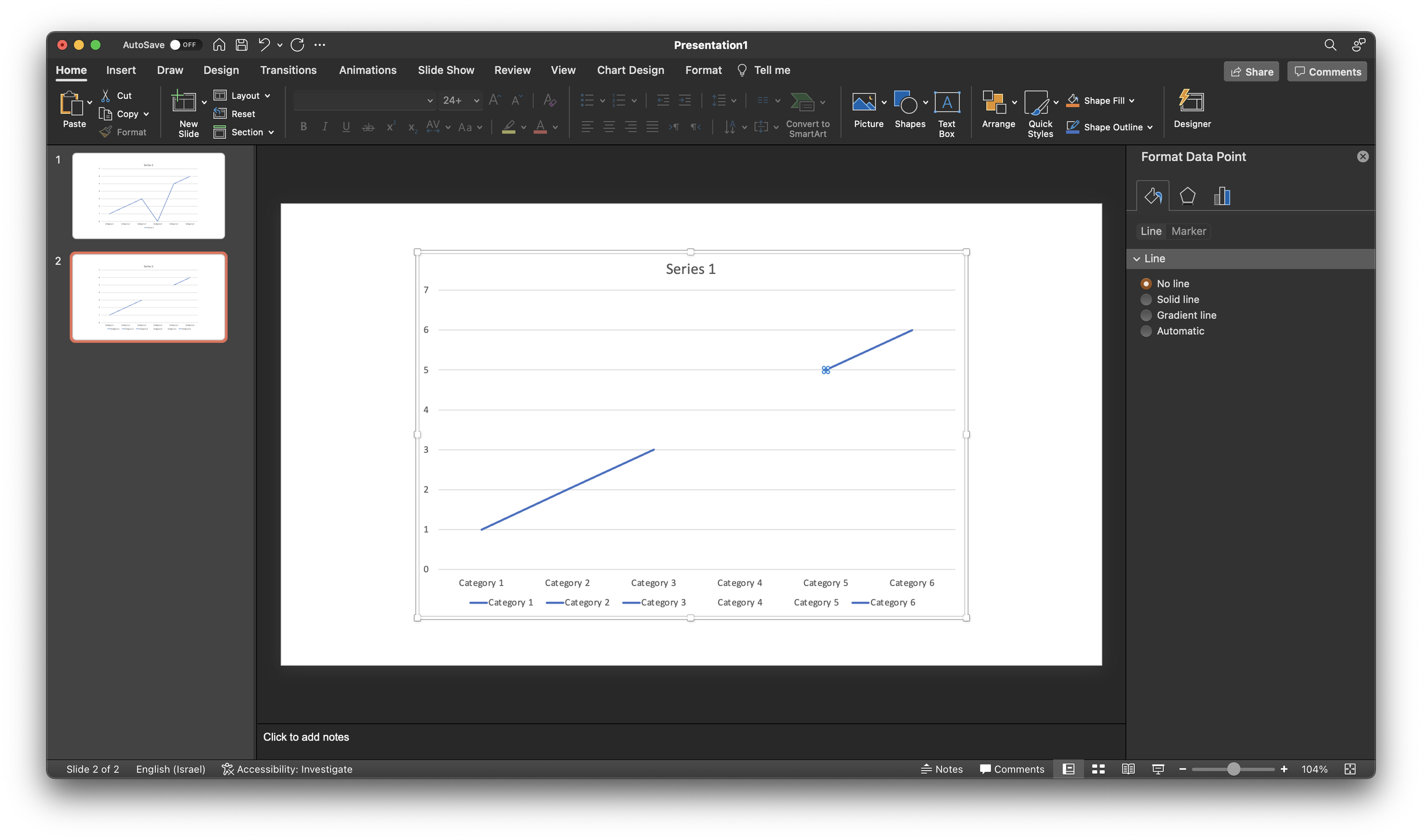
Repeat the process for the neighbor to the right (see below).
As a result, some weird things are happening to the data series labels though. Also, this standard PowerPont/Excel chart is far from presentable in your slide deck. An alternative approach in SlideMagic? Put in a column chart with a zero column value.
I have been playing around with ChatGPT, here is what it suggest to do to make a presentation more interesting:
Here are some tips for making your presentation more interesting:
Use visuals, such as images, graphs, and videos, to supplement your presentation and make it more engaging. Visuals can help to illustrate your points, provide examples, and make the presentation more memorable.
Tell stories or use examples to illustrate your points and make the presentation more relatable and engaging. Stories and examples can help to bring your ideas to life and make them more interesting and understandable.
Use humor or other emotional appeals to connect with your audience and make the presentation more engaging. Humor and emotional appeals can help to grab the audience's attention, break the ice, and create a more dynamic and engaging presentation.
Engage the audience by asking questions, inviting participation, and encouraging feedback. This can help to make the presentation more interactive and engaging, and can help to create a more dynamic and interactive experience for the audience.
Use a variety of presentation techniques, such as changing your tone, pace, and volume, to keep the presentation interesting and dynamic. This can help to keep the audience engaged and prevent them from becoming bored or distracted.
Overall, making your presentation more interesting requires using a variety of techniques and approaches to engage the audience and make the presentation more dynamic and engaging.
Here it is me writing again. Pretty good and useful, albeit a bit impersonal. OpenAI is creating APIs for which I have some interesting ideas how to use them in SlideMagic. Watch this space
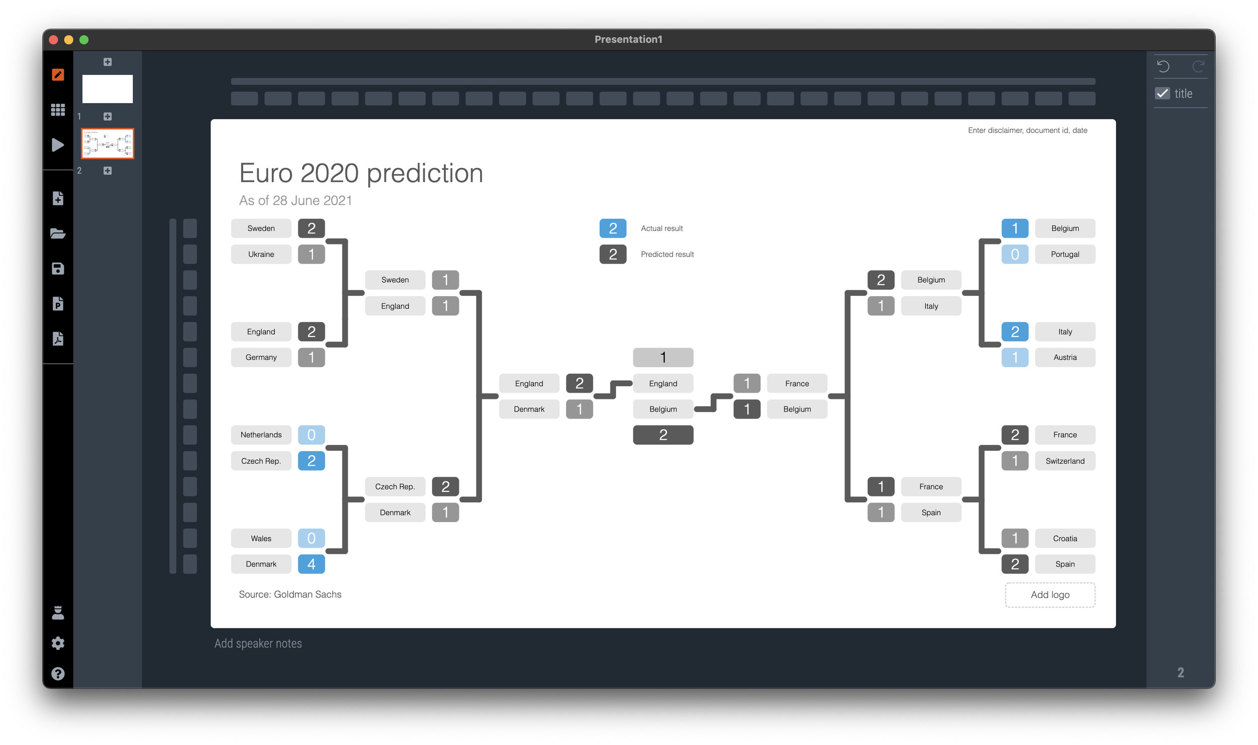
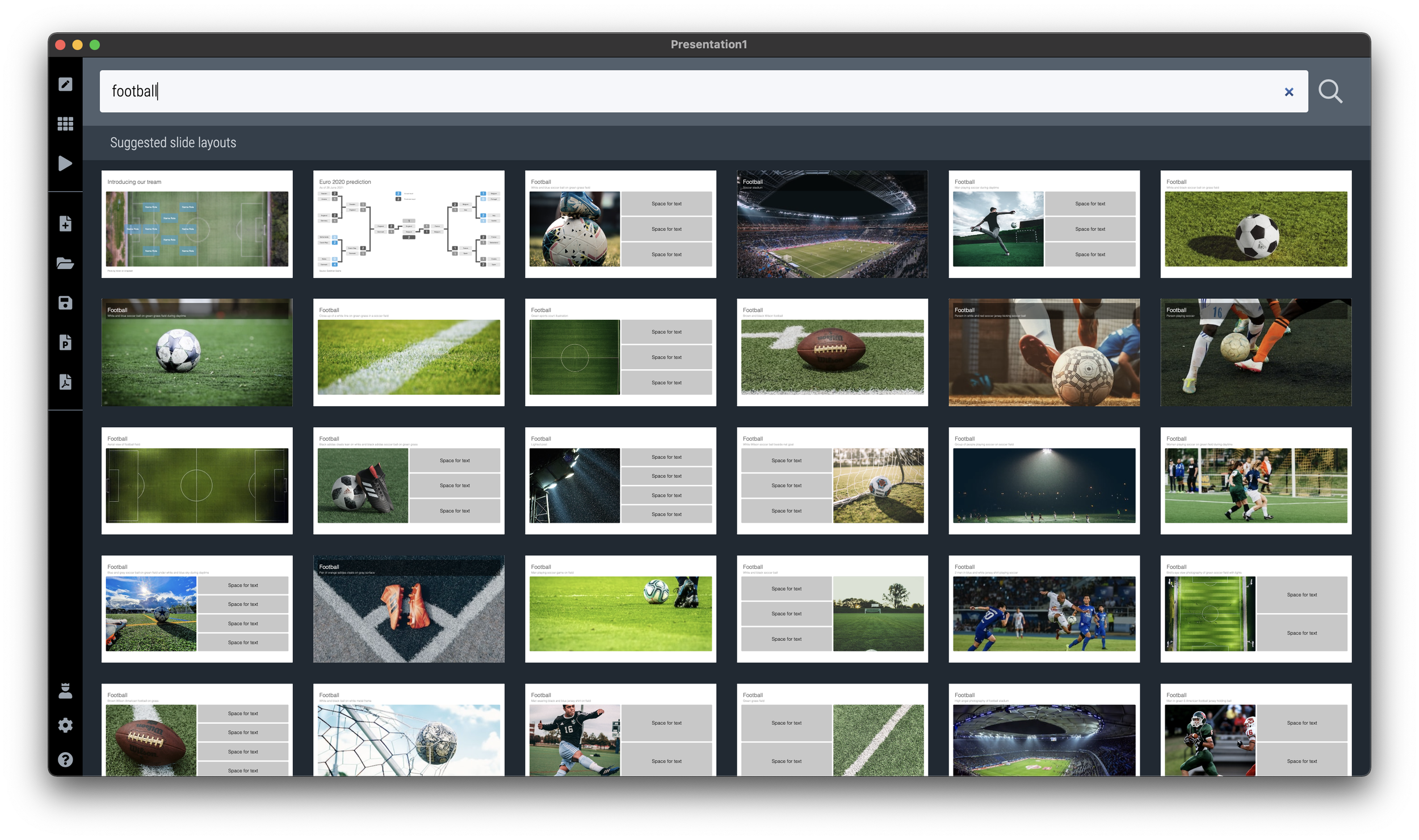
If you need to plot the progress of your team in the FIFA World Cup, SlideMagic is there to help you. There are a number of football charts in the library, including a tree where you can add teams in the knock out race to the final (see below).
Simply search for football in the SlideMagic app and the charts will show up (see below).
SlideMagic Pro users can convert these slides to PowerPoint or PDF. Free student plan available
Scientists seem to agree that humans are not really able to multi-task. Checking your phone messages while driving, or replying to every email the second they pop up is not very healthy.
This got me thinking. The stereo types are as follows: the extravert manager proudly claims that the above rule is incorrect, she can easily maintain dozens of email, phone, and live conversations in parallel. The introvert coder thinks the above is absolutely true, the buzzing of the microwave in the background kills her concentration.
I think the manager is actually not multi-tasking that much, and the coder might do a bit of it. If you are a manager, your task is to juggle lots of people and keep everything moving. I would consider this as one task.
If you are coding, you might find yourself rewriting 10 different modules, updating a database, fixing the front end, all in one, all components are open in the editor and the system won’t work unless you fixed all of them. That’s a bit more than one task.
So, I think it all depends on what you all a task.
There are 3 roles that video can play in a presentation
Recording. This video does not add anything to the presentation, it is simply a narrative of what you want to say. Especially useful when you are not there to present slides. Example: a TED talk video.
Decoration. Spectacular visual and sound effects (try to) enhance something that can also be expressed using “regular” slides. Example: an expensive introduction commercial of a new iPhone.
Explanation. The video does a better job at explaining something than a regular slide. Example: an animation of how a vaccine impacts a virus.
Think about these when the question “do we need a video” comes up.
When using images from Google Maps, pay attention to the direction of the sun light and shadows the moment the picture was taken. Only 1 of the four possible orientations is the right one, and this is by no way the default north up. Example below. These are 2 pictures of the same are, and you can clearly see that one just does not feel right.
When looking for images, pay attention to how they can lead the eye of the audience. Below are 2 examples of images that draw the eye to a certain spot. (RSS email readers might have to open the link to the blog post to see the images).
I have added the images to the SlideMagic slide library so you can use them in your own presentations. (Search for example for “direction” and they will show up, see the example image below).
Pro users can convert these slides to PowerPoint or PDF
My daughter’s school concert was disrupted by a small toddler in the audience that ran out of patience and starting screaming. The chorus teacher decided to press on while the embarrassed parents tried to leave the audience with the kid (who got even more upset). The whole operation took 2 minutes out of a 4 minutes performance
I would have paused the concert for two minutes and continue with a relaxed audience. Presentation interruptions happen…
After the meeting you promised to send the slides of your presentation in an email. But the deck you used, was the short one, and you have a better/longer one sitting on the shelf. It does have a different structure and graphical look and feel though. Should you send it instead?
Probably not. The slides you send are a quick reminder of the meeting, a permission to email the meeting attendees with your follow up question. Very few people might actually look at the slides in detail. And if they do, each slide is a visual placeholder for the story you told in the meeting. Sending a completely different deck might confuse them.
If you want to send the other presentation, do so in addition, and clearly mark it as something different from what they have seen.
More pro tips for follow up decks:
If slides contained semi-confidential information that was OK to show for 5 seconds, you can take them out in this version to prevent people from studying things in detail (financials, roadmaps, etc.)
Always send things in PDF, not the source file (PowerPoint .pptx, or SlideMagic .magic)
If you are using SlideMagic, consider expanding the explanation panels on each slide, and write the summary of the messages of the slide in a few paragraphs, handy for people to understand a page better when you are not there in the room to explain things verbally.
PowerPoint slide templates originate from the 1980s. “Slides” would mainly be data charts: graphs and tables to show information. At the top of these pages would be a descriptive title (Economic output in the EU), and the subtitle would give the unit of measurement ($ billion).
Slide templates evolved. Business school professors and management consultants invented frameworks, more conceptual slide layouts, and people started using presentation software to layout their entire story on the big screen, often in bullet points. Descriptive titles became messages.
In most cases the title stayed. Every slide always has a title at the top. But this layout does not always work. People started adding a big arrow, with another big message next to it to make sure that the audience gets the point (it is spelled out 2x on the slide).
Titles take up valuable screen real estate, especially on widescreen 16x9 layouts. They make the chart body space even longer, more stretched. A loooong sentence in small font across a 16x9 slide can be hard to read.
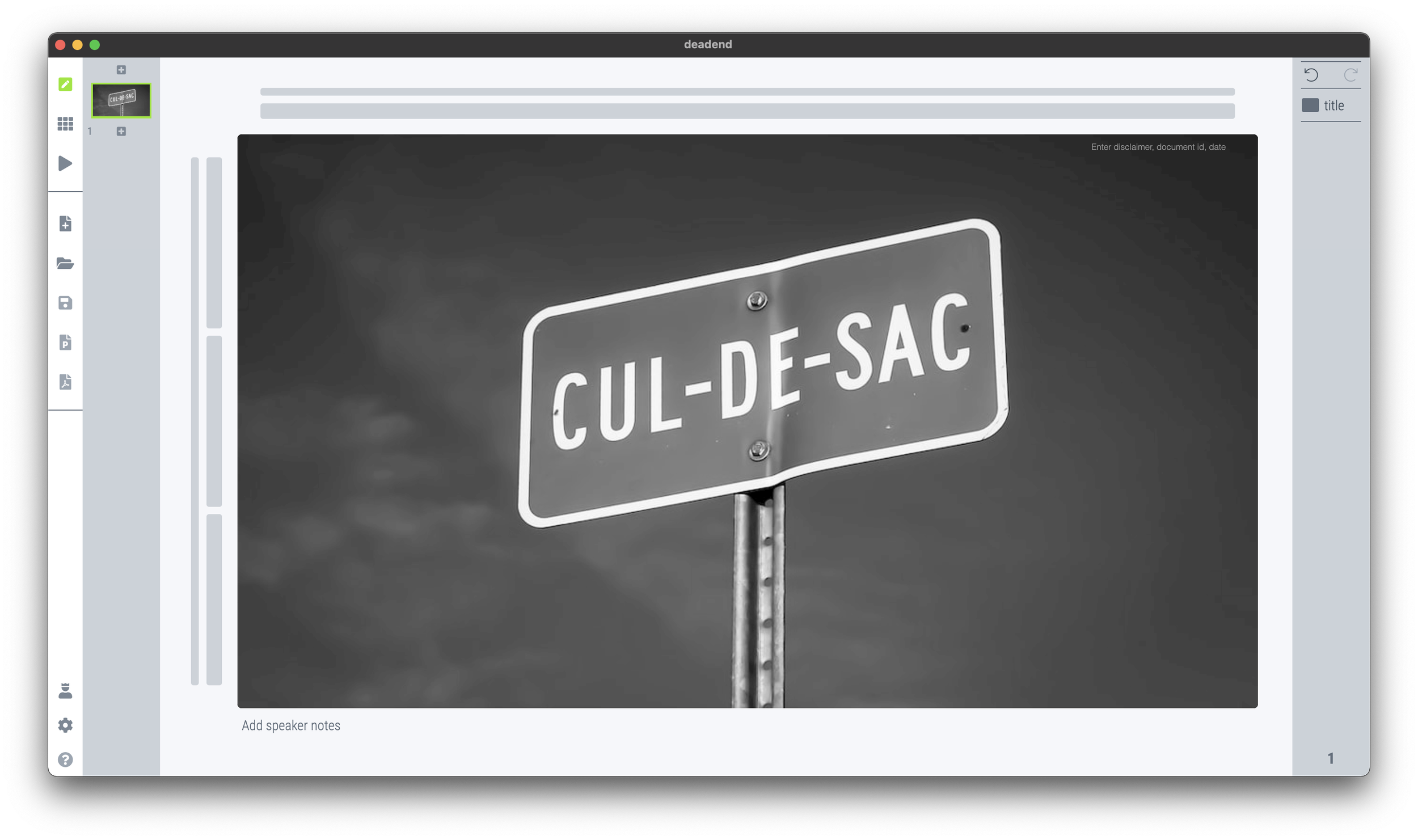
I have become more flexible when it comes to titles. Data charts still have them. But other slide layouts might have none, instead, just an image, or a big text box somewhere else on the page. Or a message that is actually a few paragraphs long, on the side of the slide.
In SlideMagic, you can instantly change the layout of slides, and switch the fixed title on or off. It is time to let go of the obligatory title. See the the examples below. (If you are reading this as an email blog update, you might have to click through to the original post to see).
No title at all
Big box of text
SlideMagic’s side title view
Traditional title and subtitle
The message in a SlideMagic explanation box
I have added this slide to the SlideMagic slide library, so you can use it in your own presentation. Simply search for “dead end” in the app and it will show up. Pro users can convert this slide to PowerPoint or PDF.
Make sure you maintain a consistent graphical language throughout your slides. Here is a thumbnail view of a section of a deck I used in recent meetings.
Here are the guidelines I used:
Dark background, white text, purple accent
Page-filling, black and white images
No capitals
Selectively bolding a word in a sentence
No slide titles in a fixed position
Every slide blends right in without, complicated graphics, and SlideMagic makes it really easy to apply this style.