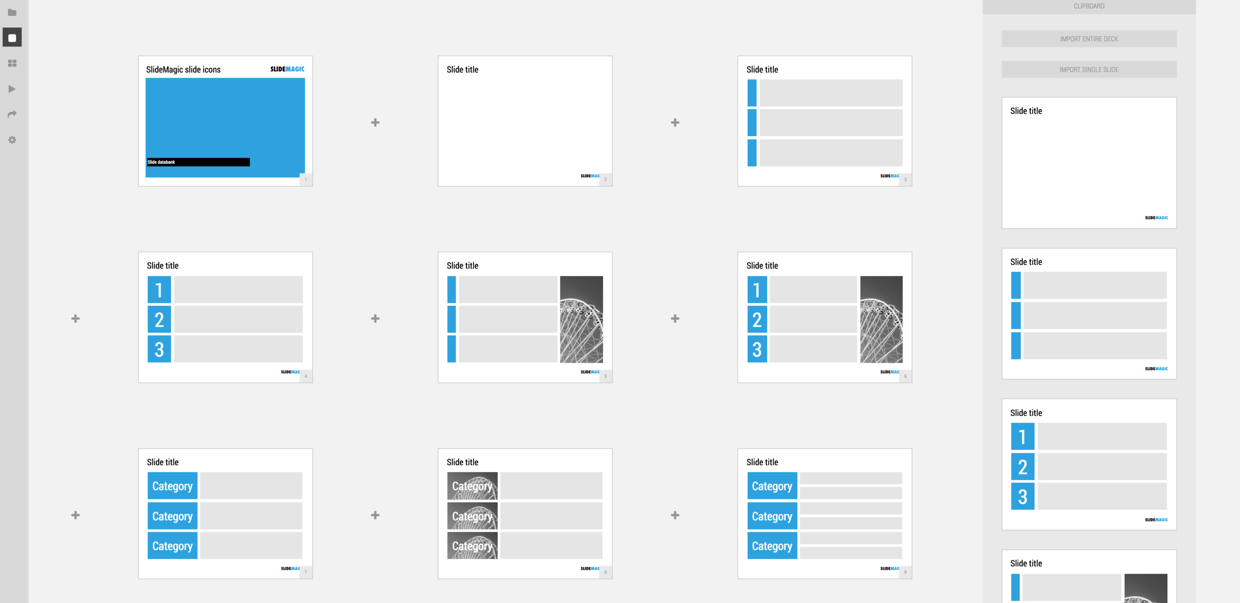
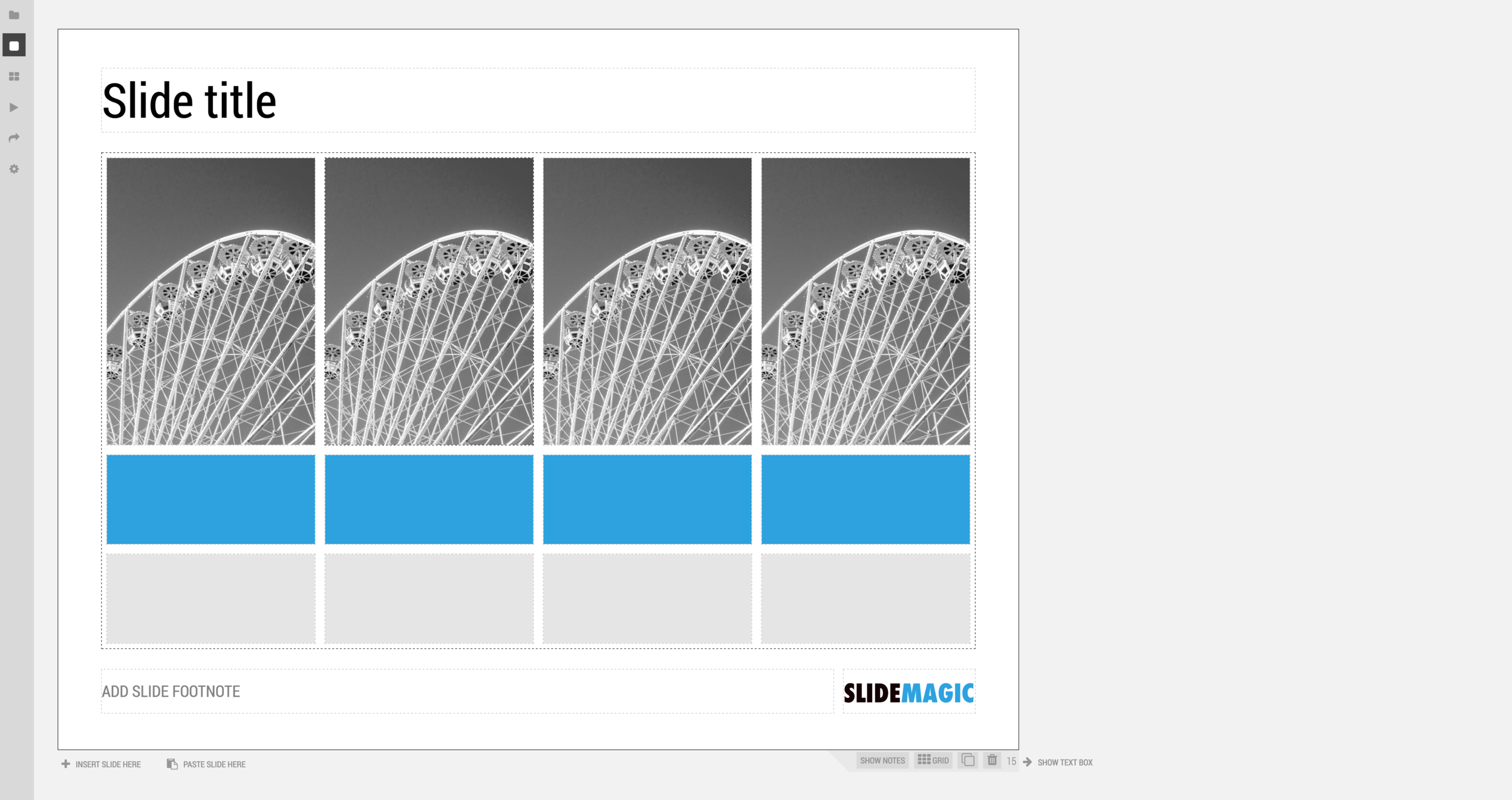
We just deployed a new, more minimalist user interface for presentation app SlideMagic. Have a look!. Some of the things that have changed over the past weeks:
- Simpler menus: a very short set of tabs on the left side to help you switch between the application modes
- A more intuitive approach to the slide clipboard where you can import single slides or entire decks
- Smart insertion of rows and columns in the grid: new rows/columns will now copy color/layout settings from their neighbors
Let me know what you think.
SlideMagic: a platform for magical presentations. Free student plan available.


